IMainButtonItem
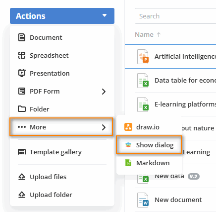
Describes an item that will be embedded in the More item of the main button menu. It is available only inside a room (folder) and is not available for the room list.
Items are registered by a plugin implementing
IMainButtonPlugin.

Examples
PDF export functionality with progress feedback
const exportToPdf: IMainButtonItem = {
  key: "export-pdf",
  label: "Export to PDF",
  icon: "pdf-icon.svg",
  onItemClick: async (folderId) => {
    try {
      const result = await exportFiles(folderId, "pdf");
      return {
        actions: [Actions.showToast],
        toastProps: [{
          type: ToastType.success,
          title: "Files exported to PDF | Processing complete | Ready to download"
        }]
      };
    } catch (error) {
      return {
        actions: [Actions.showToast],
        toastProps: [{
          type: ToastType.error,
          title: "Unable to export files | Check file permissions"
        }]
      };
    }
  }
};
File backup system with status notifications
const backupFiles: IMainButtonItem = {
  key: "backup-files",
  label: "Backup Files",
  icon: "backup-icon.svg",
  onItemClick: async (folderId) => {
    try {
      const backup = await createBackup(folderId);
      return {
        actions: [Actions.showToast],
        toastProps: [{
          type: ToastType.success,
          title: "Backup created successfully | Files archived | Ready for storage"
        }]
      };
    } catch (error) {
      return {
        actions: [Actions.showToast],
        toastProps: [{
          type: ToastType.error,
          title: "Unable to create backup | Check storage space"
        }]
      };
    }
  }
};
Properties
| Property | Type | Description |
|---|---|---|
key | string | The unique item identifier used by the service to recognize the item |
label | string | The item display name |
icon | string | The item display icon. The icon image must be uploaded to the assets folder. Only the image name with the extension must be specified in this field. The required icon size is 16x16 px. Otherwise, it will be compressed to this size. |
onClick? | (id: number) => void | Promise<void> | IMessage | Promise<IMessage> | A function that takes the folder/room id as an argument. This function can be asynchronous. Deprecated: Use onItemClick instead to support both string and number IDs. This method will be removed in a future major version. |
onItemClick? | (id: string | number) => void | Promise<void> | IMessage | Promise<IMessage> | Callback invoked when the main button action is triggered. Supports both string and number identifiers. Remarks: This is the preferred method over the deprecated onClick. |
usersType? | UsersType[] | The types of users who will see the current item in the main button menu. Currently the following user types are available: owner, docSpaceAdmin, roomAdmin, collaborator, user. If this parameter is not specified, then the current main button item will be displayed for all user types. |
items? | IMainButtonItem[] | The main button items that are added to the current item as a drop-down list. In this case, the onItemClick (and the deprecated onClick) event does not work. |
devices? | Devices[] | The types of devices where the current item will be displayed in the main button menu. At the moment the following device types are available: mobile, tablet, desktop. If this parameter is not specified, then the current main button item will be displayed in any device types. |