Avatar
Round picture of a person or a group, falling back to initials, with an optional role badge and
an edit menu. size and role are both required, and role is how you say "no badge".


Use this when / not when
- Use wherever a person or a group is named: a member list, a row, the author of a comment, a profile page.
- Not for a room or a file — that is
RoomIcon, which is square and takes a room's colour and logo. - Not as a plain icon holder. It is always round, always sized from
size, and always announced as a button. - Not while the person is still loading:
CircleSkeletonis the round placeholder.
Import
import {
  Avatar,
  AvatarRole,
  AvatarSize,
} from "@onlyoffice/apps-ui-kit/components/avatar";
Also exported from the root barrel @onlyoffice/apps-ui-kit.
Needs ThemeProvider from @onlyoffice/apps-ui-kit/providers/theme above it in the tree: the
backgrounds, the initials' colour and the badge colours come from the theme, and the built-in
illustration is chosen by whether the theme is the light one.
Stories
Default
An avatar with nothing to show yet: with no picture and no name it falls back to a camera icon on the neutral background. Change any prop live in the Controls panel below.
With Image
A picture with the admin badge at its bottom corner; hover the badge to read its tooltip (withTooltip, tooltipContent).
With Initials
Avatar showing initials generated from the user name. Uses first letter of first two words (JD).


With Icon
Avatar displaying an SVG icon instead of an image or initials.


All Sizes
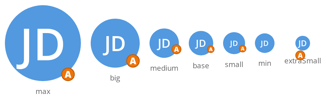
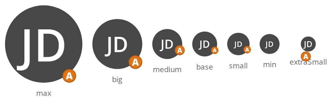
All seven sizes side by side: max (124px), big (80px), medium (48px), base (40px), small (36px), min (32px) and extraSmall (24px); the initials and the admin badge shrink with the avatar.
All Roles
Every role value on the same avatar: only Owner and Admin draw a badge at the bottom corner, User, Guest, Manager, Collaborator and None draw none.


Group Avatar
Group avatar with uppercase initials and specialized background color. Role icons are typically hidden for groups.


Editing Mode
A person with no picture yet: the plus button at the corner, or a click anywhere on the avatar, opens the file dialog straight away through the first model action, and the chosen file reaches onChangeFile. The button is drawn only at size max.


Editing With Avatar
A person who already has a picture: the pencil at the corner, or a click on the avatar, opens a menu of the model actions — Upload picture opens the file dialog, Delete picture runs its own handler.


With Custom Role Icon
Avatar with a custom role icon element instead of the default role badges.


Default Source
Avatar showing the default placeholder image when no source or userName is provided.


Right To Left
The same avatars under a right-to-left interface: the admin badge and the pencil move from the bottom-right corner to the bottom-left one, and the badge tooltip opens to the left of it. The direction comes from the theme's interfaceDirection (the Direction toolbar); the wrapper also carries dir="rtl" for the rules that read the DOM direction.
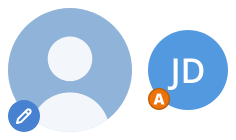
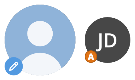
Css Customization
Four variables set on one wrapper -- the variables are listed under CSS variables on this page. The first avatar, with initials, shows the radius, the initials background and the weight; the second, with neither picture nor name, is there for --avatar-bg.


Minimal example
With no source, the initials of userName are drawn instead. AvatarRole.none is the way to
ask for no badge.
import {
  Avatar,
  AvatarRole,
  AvatarSize,
} from "@onlyoffice/apps-ui-kit/components/avatar";

export function MemberAvatar({ name }: { name: string }) {
  return (
    <Avatar size={AvatarSize.base} role={AvatarRole.none} userName={name} />
  );
}
Props
Enums
| Enum | Members |
|---|---|
AvatarSize | max, big, medium, base, small, min, extraSmall |
AvatarRole | owner, admin, guest, user, manager, collaborator, none |
Recipes
A picture, with a role badge
Only owner and admin draw a badge; the other members of AvatarRole render nothing.
import {
  Avatar,
  AvatarRole,
  AvatarSize,
} from "@onlyoffice/apps-ui-kit/components/avatar";

export function OwnerAvatar({ photo, name }: { photo: string; name: string }) {
  return (
    <Avatar
      size={AvatarSize.medium}
      role={AvatarRole.owner}
      source={photo}
      userName={name}
      withTooltip
      tooltipContent="Room owner"
    />
  );
}
A group
import {
  Avatar,
  AvatarRole,
  AvatarSize,
} from "@onlyoffice/apps-ui-kit/components/avatar";

export function GroupAvatar({ title }: { title: string }) {
  return (
    <Avatar
      size={AvatarSize.big}
      role={AvatarRole.none}
      userName={title}
      isGroup
    />
  );
}
Editable, with an upload menu
editing is read at size max only, and the first entry of model is the upload action.
import {
  Avatar,
  AvatarActionKeys,
  AvatarRole,
  AvatarSize,
} from "@onlyoffice/apps-ui-kit/components/avatar";

export function ProfileAvatar({
  photo,
  onFile,
  onRemove,
}: {
  photo?: string;
  onFile: () => void;
  onRemove: () => void;
}) {
  return (
    <Avatar
      size={AvatarSize.max}
      role={AvatarRole.none}
      source={photo}
      isDefaultSource
      editing
      hasAvatar={Boolean(photo)}
      onChangeFile={onFile}
      model={[
        {
          key: AvatarActionKeys.PROFILE_AVATAR_UPLOAD,
          label: "Upload a photo",
          icon: "",
          onClick: (ref) => ref?.current?.click(),
        },
        {
          key: AvatarActionKeys.PROFILE_AVATAR_DELETE,
          label: "Remove",
          icon: "",
          onClick: onRemove,
        },
      ]}
    />
  );
}
Behaviour the types don't state
- Four things can fill the circle, and the first match wins: a
sourceelement as given; asourcestring —.svgfetched as an icon,default_user_photoswapped for the kit's illustration, anything else an<img>; thenuserNameas initials; thenisDefaultSourceas the illustration; and failing all of those, a grey camera. - Only
ownerandadminhave a badge.guest,user,managerandcollaboratorare members ofAvatarRolethat draw nothing at all, so a "user" avatar and anoneavatar look the same. PassroleIconfor a badge of your own. editingis ignored belowsize="max". The edit button, the pencil and the menu render only at 124px; at every other size the prop has no effect and the role badge takes that corner instead.onClickreplaces the editing behaviour. The element's handler isonClickor the built-in one, never both, so an avatar with your own click handler no longer opens the upload menu howevereditingandmodelare set.withTooltipbuilds its anchor id fromMath.random()on every render, so the id changes between renders and between server and client. It also only attaches to the role badge, which means no badge, no tooltip.- The hidden file input has a literal
idofcustomAvatarInput. Two editable avatars on a page produce two elements with the same id. editAction,idandstyleare ignored. They are declared and never read; a class name is the only way in, andclassNamelands on both the outer element and the picture.sizefixes the box: 24, 32, 36, 40, 48, 80 and 124px. The role badge and the initials have no rule forextraSmall, so that size is for pictures.- Initials take the first letter of each word of
userName, two at most, and are uppercased only whenisGroupis set — "jane doe" stays "jd" for a person. - In a right-to-left interface the role badge and the edit button sit in the bottom-left corner, and the role tooltip opens to the left.
- A middle-button press calls
onClickas well, through amousedownhandler. - The component is memoised.
AvatarPureis the same component withoutmemo, exported for tests.
CSS variables
Behind a source the background is a theme colour that none of these overrides. The kit's
illustration stays round whatever --avatar-radius says, and so does the edit button.
The badge colours (--avatar-owner-fill, --avatar-administrator-fill and their strokes) are
set from the theme on the avatar element and can be overridden the same way.
Accessibility
- The element carries
role="button"at all times — including when nothing is clickable — and has neither atabIndexnor a key handler, so it is announced as a button that cannot be reached or activated from the keyboard. - A picture is rendered with the literal alt text
"avatar", not the user's name, so a screen reader announces the same word for everyone. Put the name next to the avatar in text. - The edit button is not in the tab order either and handles no key, so a host that makes the avatar editable or clickable must offer a keyboard path to the same action.
- Initials are plain text with no label, and the role badge is an inline SVG with none either — the badge's meaning is available only as a hover tooltip.
tooltipContentis not translated by the component; pass text you have already translated.
Test ids
| Element | data-testid |
|---|---|
| The avatar | avatar, overridable with dataTestId |
| The edit button | edit_avatar_icon_button |
| The file input | file-input |
Each entry of model becomes a menu item whose test id is that entry's key.
Related
RoomIcon— the square equivalent for a room.CircleSkeleton— the placeholder to show while the person loads.IconButton— what the edit button is made of.