CollapsibleCard
Panel whose header is a button that expands and collapses the body under it. One card, one section: a title, an optional line under it, a chevron on the trailing edge, and the body that appears when the header is pressed. It keeps its own open state unless you take it over.


Use this when / not when
- Use for an FAQ entry, an optional settings group, or anything long enough that a reader should get to choose whether to read it.
- Not when the panel never collapses — use
Card, the same surface without the button. - Not for switching between several panels where one is always open — use
Tabs. Several cards open at once is an accordion this component does not coordinate; the state is per card. - Not for a whole page section with its own heading and controls — that is layout, not a card.
There is no accordion behaviour, no animation on the body and no disabled state. Opening one card does not close another, the body appears and disappears instantly — only the chevron animates, over 0.15s — and a card that should not open has to not be rendered.
Import
import { CollapsibleCard } from "@onlyoffice/apps-ui-kit/components/collapsible-card";
Also exported from the root barrel @onlyoffice/apps-ui-kit.
Needs ThemeProvider above it in the tree. The background and all three text colours are
declared only under the light and dark classes the provider puts on <body>, so without one
the card has no background at all and the title, the description and the chevron take
whatever colour they inherit.
Stories
Collapsed
The card as it first appears: only the title and the description, with the body hidden until the header is clicked. Change any other prop live in the Controls panel below.


Expanded
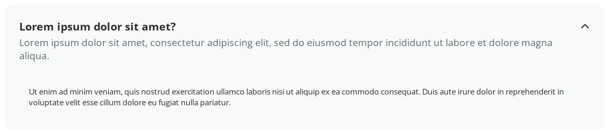
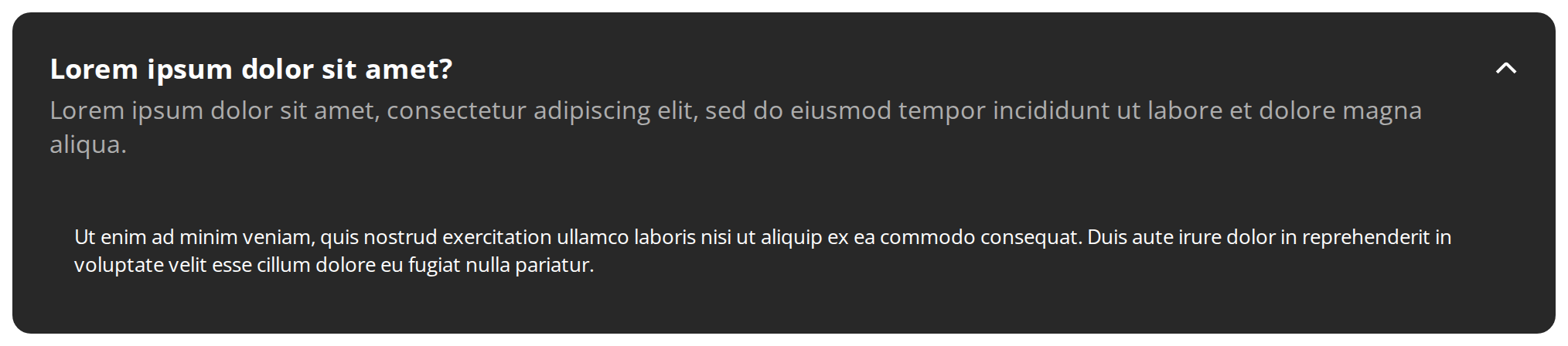
Content the reader needs right away can be shown from the start: the card opens with its body visible and the chevron pointing up, and still closes on a click (defaultOpen).
Title Only
A short header needs no second line: without a description the header shrinks to the title beside the chevron (description unset).


Controlled State
When something else on the page decides whether the card is open, the parent holds the state: the button above and the card's own header both open and close it, and the header only asks the parent to change it (isOpen, onToggle).


Minimal example
import { CollapsibleCard } from "@onlyoffice/apps-ui-kit/components/collapsible-card";

export function Faq() {
  return (
    <CollapsibleCard
      title="Can I use ONLYOFFICE with our existing storage?"
      description="No custom code, no migration."
    >
      <p>
        Connect S3, Nextcloud or a WebDAV share and keep the files where they
        are.
      </p>
    </CollapsibleCard>
  );
}
Props
Recipes
Open / close (controlled)
Pass isOpen and the card stops keeping its own state: it moves only when you change that
value, which is what makes an accordion possible.
import { useState } from "react";
import { CollapsibleCard } from "@onlyoffice/apps-ui-kit/components/collapsible-card";

const SECTIONS = [
  { id: "storage", title: "Storage", body: "20 GB on the Business plan." },
  { id: "sharing", title: "Sharing", body: "Rooms can be shared with a link." },
];

export function Accordion() {
  const [openId, setOpenId] = useState<string | null>("storage");

  return (
    <div style={{ display: "flex", flexDirection: "column", gap: 8 }}>
      {SECTIONS.map((section) => (
        <CollapsibleCard
          key={section.id}
          title={section.title}
          isOpen={openId === section.id}
          onToggle={(next) => setOpenId(next ? section.id : null)}
        >
          <p>{section.body}</p>
        </CollapsibleCard>
      ))}
    </div>
  );
}
Starting open
Without isOpen the card owns its state and defaultOpen is the starting value. onToggle
still fires, so this is also how you report the open state without owning it.
import { CollapsibleCard } from "@onlyoffice/apps-ui-kit/components/collapsible-card";

export function AdvancedSettings({
  onSeen,
}: {
  onSeen: (open: boolean) => void;
}) {
  return (
    <CollapsibleCard title="Advanced" defaultOpen onToggle={onSeen}>
      <p>These affect every room in the portal.</p>
    </CollapsibleCard>
  );
}
Behaviour the types don't state
- Passing
isOpenat all makes the card controlled,falseincluded. The internal state is still there but never read again, so a card givenisOpen={false}and noonTogglelooks interactive — the chevron is there, the button reacts to a press — and never opens. defaultOpenis read once. Changing it later does nothing; the card is already holding its own state by then.- The body is unmounted when the card is closed, not hidden. Anything in it loses its state,
its scroll position and its running effects on every collapse, and it is not rendered at all
while
childrenis empty — an open card with no children shows only the header. onTogglereceives the value the card is moving to, not the current one, and it fires in both modes — including the uncontrolled one, where the card has already changed its own state by the time your handler runs.- The whole header is one button, so the description is inside the click target and inside
the button's accessible name. Anything interactive in
titleordescriptionwould be a control nested in a button, which is invalid — put links and buttons in the body. - The card is as wide as its container and has no maximum:
width: 100%, a 12px radius, 24px of padding in the header and0 24px 20pxin the body. It brings no outer margin, so a stack of them needs agap. - The header sets its own type: the title at 18px bold, the description at 16px regular
under it. A falsy
description— empty string,null,0— leaves the second line out entirely rather than rendering an empty one. - The chevron is the kit's arrow asset rotated, 90° when closed (pointing down) and -90° when
open (pointing up), and its colour comes from the theme rather than from
currentColor— it cannot be recoloured by settingcoloron the card. - The focus ring is drawn inside the header (
outline-offset: -2px) and usescurrentColor, so it follows the inherited text colour rather than the accent. It is a:focus-visiblering: keyboard focus shows it, a mouse click does not.
CSS variables
None. The background, the text colours and the chevron's fill are written directly from the
theme's colour variables, so the only ways in are className and style.
Accessibility
- The header is a real
<button type="button">witharia-expanded, so it is reachable by Tab and operated with Enter and Space with no work from you. - It carries
aria-controlsonly while the body is in the document — the body is unmounted when the card is closed and never rendered withoutchildren, so naming a missing id would be worse than naming nothing. A reader is therefore told the header is expandable, but not what it controls, until it is open. - The title is not a heading. In a list of collapsible sections, put a
Headingin thetitleslot so the outline keeps the entries; it stays inside the button, which is allowed. - The chevron is
aria-hidden, so the button is announced by its text alone. - There is no Escape handling and no focus movement into the body: the reader continues to the body in reading order after the header.
Test ids
The outer element also carries data-open="true" | "false", which is what to assert on; the
header, the chevron and the body carry no ids of their own.