MCPIcon
Square icon for an MCP server: its logo, or the first letter of its name on a grey tile. Four fixed sizes, and a fallback that takes over by itself when the image fails to load.


Use this when / not when
- Use in a list of Model Context Protocol servers, or anywhere a third-party integration is shown by name and needs a square mark.
- Not for a room — use
RoomIcon, which takes two initials, a colour of your choosing and the room's own logo object. - Not for a person — use
Avatar. - Not as a loading placeholder — use
RectangleSkeleton.
The tile has one colour. There is no per-server palette: the letter sits on the kit's grey
unless you set --mcp-icon-bg yourself.
Import
import {
  MCPIcon,
  MCPIconSize,
} from "@onlyoffice/apps-ui-kit/components/mcp-icon";
Also exported from the root barrel @onlyoffice/apps-ui-kit.
Needs ThemeProvider above it in the tree for the dark theme, where the tile drops to 10%
opacity. Without a provider it renders in its light colours.
Stories
Default
A server with no image of its own: the first letter of its name on a grey tile. Change any other prop live in the Controls panel below.
With Image
Use when the server has a logo: the image replaces the letter and fills the whole square (imgSrc).

All Sizes
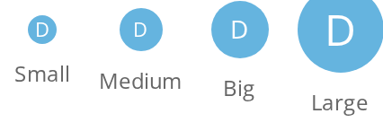
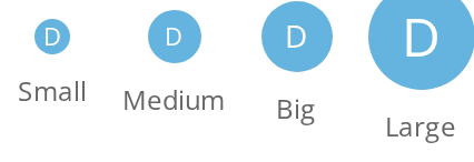
Pick the size that matches the row it sits in: 16px (Small), 24px (Medium), 32px (Big) and 48px (Large), the letter and the corner radius growing with it (size).


All Sizes With Image
The same four sizes with an image: it is scaled to the square, and no tile is drawn behind it (imgSrc).

Broken Image Fallback
Pass a server's image URL without checking it first: when it fails to load, the letter on its tile takes its place (imgSrc).
With Image Node
Use for an icon your bundler has already inlined as a component: the element is drawn in place of the letter, and nothing replaces it if it is empty (imgNode).
Css Customization
The variables are listed under CSS variables on this page. The four sizes share one wrapper that sets all five variables: a round, semi-transparent blue tile with a regular-weight white letter.
Minimal example
import {
  MCPIcon,
  MCPIconSize,
} from "@onlyoffice/apps-ui-kit/components/mcp-icon";

export function ServerMark() {
  return <MCPIcon title="Hugging Face" size={MCPIconSize.Medium} />;
}
Props
Enums
Recipes
A row of servers, letter fallback included
Pass the URL and forget about it: a broken image swaps itself for the letter, and the state
resets when imgSrc changes, so a list that re-sorts does not stay stuck on the fallback.
import {
  MCPIcon,
  MCPIconSize,
} from "@onlyoffice/apps-ui-kit/components/mcp-icon";

type Server = { id: string; name: string; iconUrl?: string };

export function ServerList({ servers }: { servers: Server[] }) {
  return (
    <ul style={{ listStyle: "none", padding: 0 }}>
      {servers.map((server) => (
        <li
          key={server.id}
          style={{ display: "flex", alignItems: "center", gap: 12 }}
        >
          <MCPIcon
            title={server.name}
            imgSrc={server.iconUrl}
            size={MCPIconSize.Big}
          />
          <span>{server.name}</span>
        </li>
      ))}
    </ul>
  );
}
An inline SVG instead of a URL
imgNode takes a node, which is how you pass an icon your bundler has already inlined. It wins
over imgSrc, and it has no failure path — whatever you give it is what renders.
import {
  MCPIcon,
  MCPIconSize,
} from "@onlyoffice/apps-ui-kit/components/mcp-icon";

export function LocalServerMark() {
  return (
    <MCPIcon
      title="Local"
      size={MCPIconSize.Small}
      imgNode={
        <svg viewBox="0 0 16 16" aria-hidden="true">
          <rect width="16" height="16" rx="3" />
        </svg>
      }
    />
  );
}
Behaviour the types don't state
- The grey tile is drawn only behind the letter. It is a
::beforeon the text variant, so an icon with an image has no background at all — and because the corner radius is not clipped (overflowis never set), a square image keeps its square corners whatever--mcp-icon-radiussays. Round your own artwork. - The image fills the box exactly,
widthandheightinherited from the tile, with noobject-fit— a non-square image is stretched, not letterboxed. imgNodewins overimgSrcwhen both are given, and it is never replaced by the letter: the failure fallback only watches the<img>'serrorevent.titleis used for one character and nothing else. It is uppercased, taken withat(0)— so a leading space or emoji is what you get — and an empty string leaves the tile blank rather than falling back to anything.- The sizes are fixed and come with their own typography: 16px at 11px text, 24px at 11px, 32px at 14px, 48px at 24px. Only the radius is a variable; the box cannot be resized.
- The tile stacks with
z-index: -1on its own background, which means az-indexof your own on the icon creates a stacking context and hides it.
CSS variables
Accessibility
- The outer element is a
<div>with no role and no ARIA, and the letter is rendered as text, so a screen reader announces a bare "H" next to whatever else the row says. - The
<img>'saltis the fixed English string"mcp icon", untranslated and not settable through a prop. - Nothing here is focusable. Treat the icon as decorative and make sure the server's name is in the row as text.
Test ids
The image and the letter carry none.
Related
RoomIcon— the same idea for a room, with colours and two initials.Avatar— for a person, with status and role decorations.RectangleSkeleton— the placeholder to show while the list loads.