QuickActions
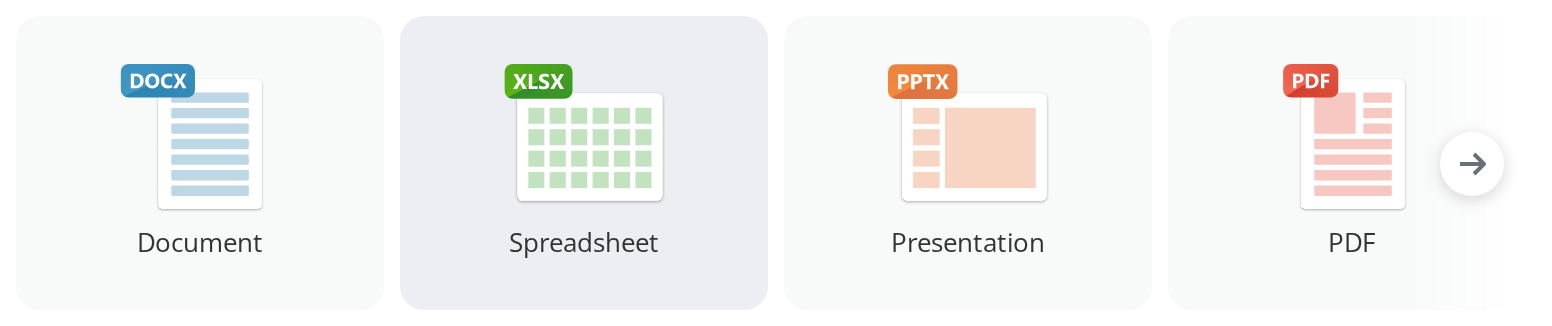
Horizontal strip of large icon tiles that scrolls when the tiles no longer fit. It is the banner of "create a document, create a room, start from a template" at the top of an empty section.
Use this when / not when
- Use for a small set of ways to start something, offered side by side and equal in weight.
- Not for a list of records: the tiles are 184×147 and carry one line of text.
- Not for a loading placeholder on its own —
RectangleSkeletonis what this component draws whileisLoadingis set, and you can use it directly. - Not for switching between views of the same screen;
Tabsis that. - Not for the whole empty state.
EmptyViewis the illustration, the title and the explanation; this strip sits next to one, not instead of it. - There is no heading, no "show all" and no wrapping to a second row. The strip is one row that scrolls.
Import
import { QuickActions } from "@onlyoffice/apps-ui-kit/components/quick-actions";
Also exported from the root barrel @onlyoffice/apps-ui-kit.
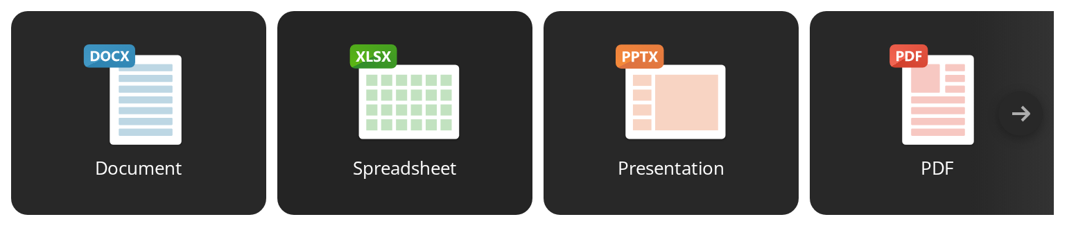
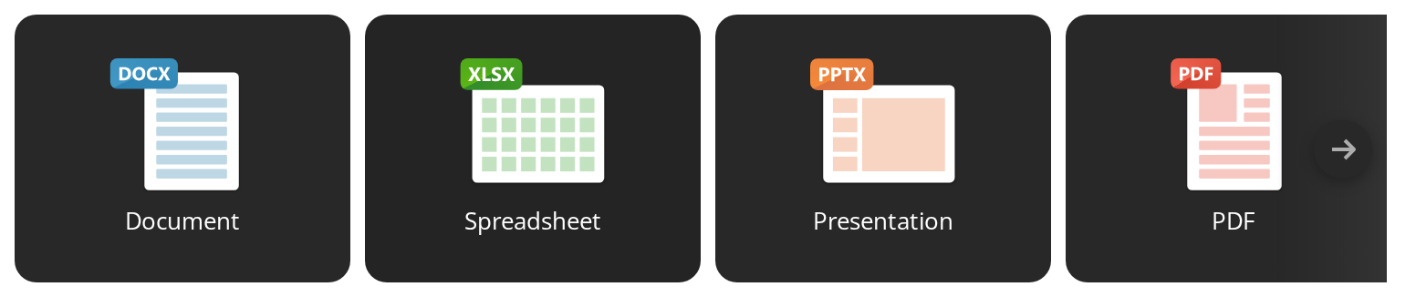
Needs ThemeProvider from @onlyoffice/apps-ui-kit/providers/theme for the tile and control
colours; the dark values are defined on the theme's .dark class.
Stories
Default
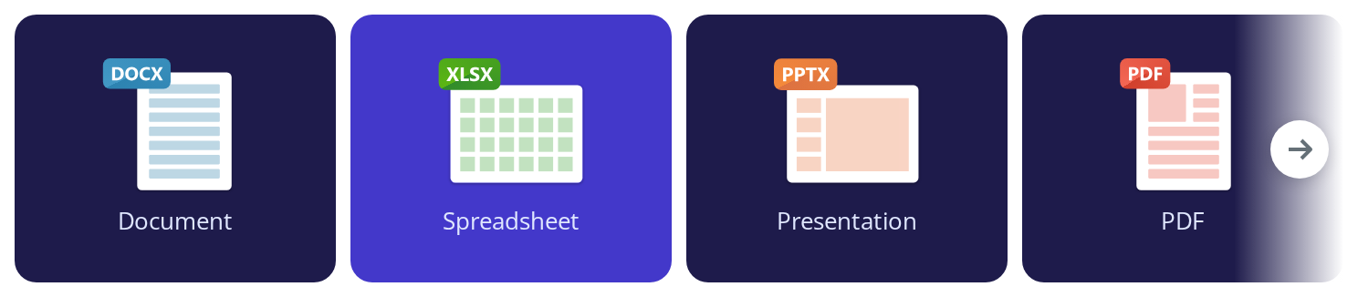
Four tiles in a banner 752px wide, the width a content column usually gives it. Click a tile to see its onClick in the Actions panel, and change any other prop live in the Controls panel below.
In AI Forms
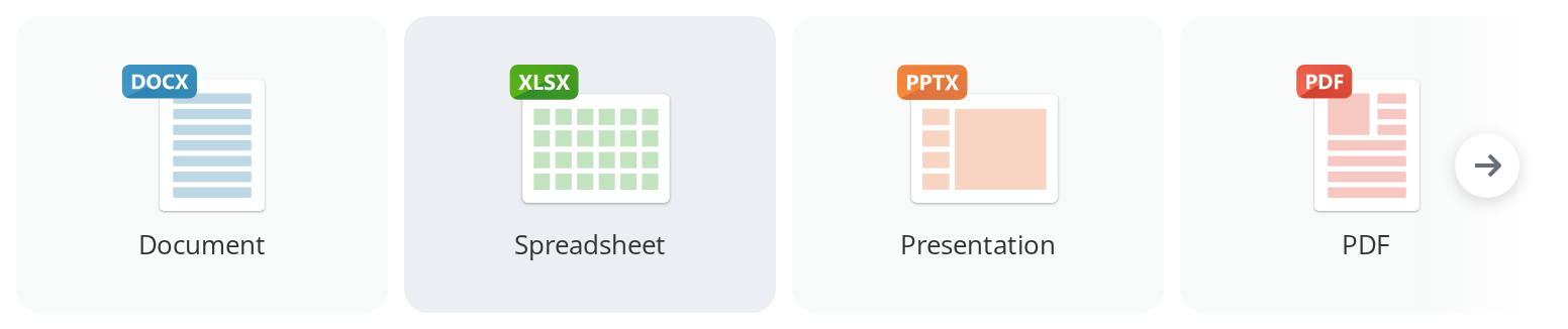
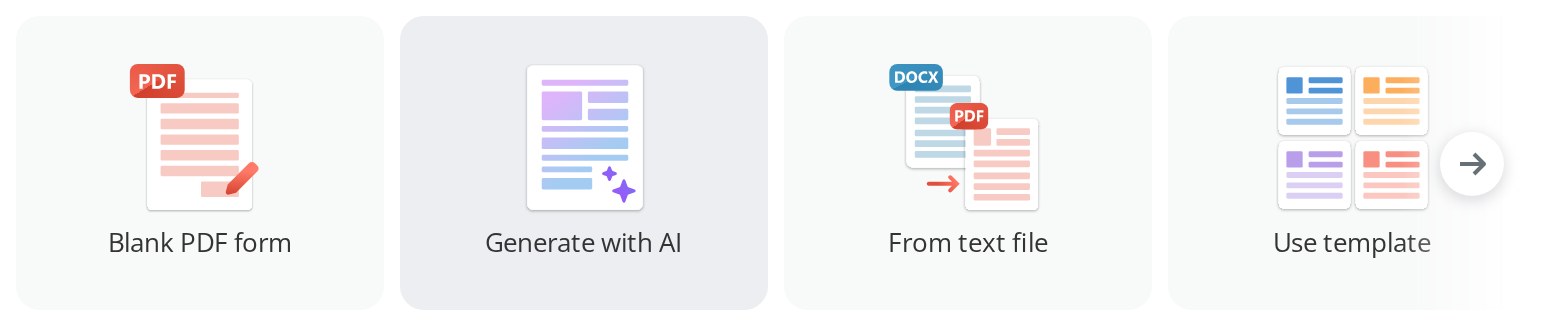
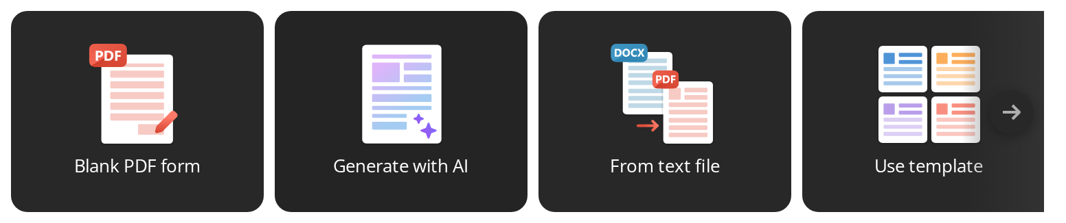
Four ways to start the same kind of file, each drawn with a different illustration from the set this folder exports: the icons differ in proportions, and each is fitted into the same box without being stretched.
In AI Chat
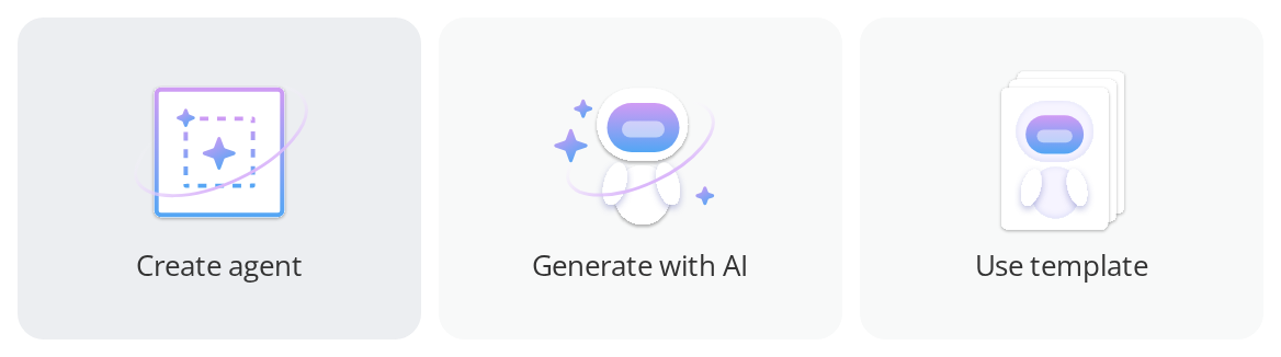
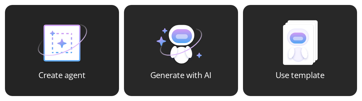
Three tiles, fewer than the banner has room for: the row stays centred in the banner and no arrow appears, because there is nothing to scroll.
Carousel
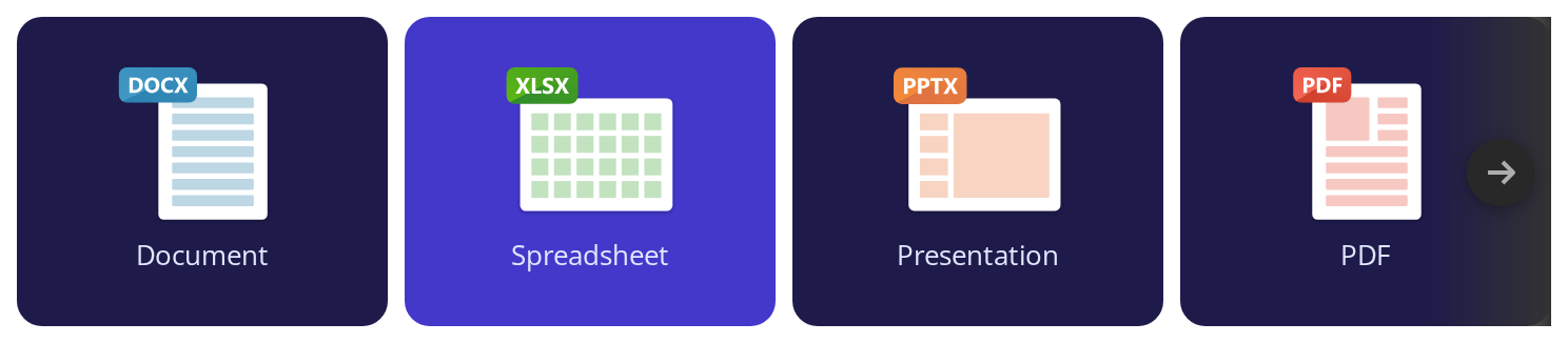
Five tiles, more than the banner holds. The tiles keep their width and the strip scrolls sideways; wheel, trackpad, touch swipe and the arrows all move the same strip.
At the start only the forward arrow is shown; scroll and the back arrow appears, and at the far end the forward one goes. The arrows float over the strip, so nothing moves when they appear. With a mouse they fade in while the banner is hovered or focused; on a touch screen they stay visible.


Dismissible
The close control in the top corner (onClose); hover the banner, then hover the control to read its tooltip, which is also its accessible name (closeLabel). A click shows up in the Actions panel.
The control is only rendered when onClose is given: a consumer with nowhere to persist the choice would otherwise offer a button that undoes itself on the next load. Hiding the banner is the host's decision to store and to reverse — the component only reports the click.


Link Tiles
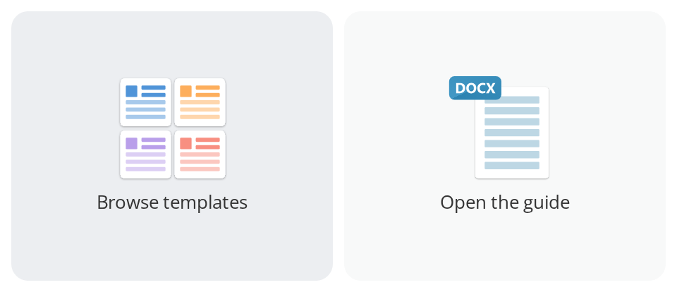
Tiles that go somewhere instead of doing something: each is a real link (href), so it can be opened in a new tab from the context menu and shows its address in the status bar. Open the guide opens a new tab (target="_blank") and gets rel="noopener noreferrer" without asking.
Disabled State
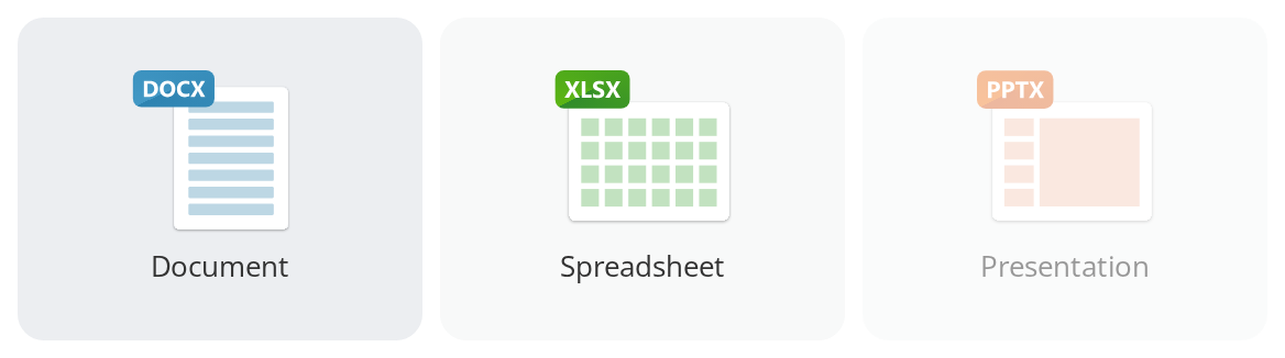
Presentation is faded and ignores clicks (disabled); hover it to read why (tooltipContent). Use it to keep an action in its usual place while it cannot be taken, rather than making the row shift by dropping it. A tooltip works the same on an enabled tile.
Loading State
Skeleton tiles of the real tiles' size, one per item, while the set of actions is still being worked out (isLoading). The banner keeps its height, so the content below does not jump when the tiles arrive. With an empty items four skeletons are drawn.


Right To Left
The strip in a right-to-left layout: the first tile sits at the right edge, the strip scrolls toward the left, and the fade and the forward arrow move to the left edge with the arrow pointing left. The wrapper carries dir="rtl"; the direction also comes from the theme's interfaceDirection (the Direction toolbar).


Css Customization
Every overridable variable but the row cap set on one wrapper -- the variables are listed under CSS variables on this page. The example narrows the tiles to 176px and holds the first one 24px off the banner's edge, which still leaves the fourth tile scrolling; hover a tile for the hover background and Tab into the strip for the focus outline.
Set the variables on any ancestor element — they cascade down to all tiles:
<div
  style={{
    "--quick-actions-tile-bg": "#1e1b4b",
    "--quick-actions-tile-bg-hover": "#4338ca",
    "--quick-actions-tile-color": "#e0e7ff",
    "--quick-actions-tile-max-width": "176px",
    "--quick-actions-edge-inset": "24px",
  } as CSSProperties}
>
  <QuickActions items={items} prevLabel="Previous" nextLabel="Next" />
</div>
Minimal example
import { QuickActions } from "@onlyoffice/apps-ui-kit/components/quick-actions";

export function StartHere({ onCreate }: { onCreate: (kind: string) => void }) {
  return (
    <QuickActions
      prevLabel="Previous"
      nextLabel="Next"
      items={[
        {
          id: "document",
          label: "Document",
          icon: <svg viewBox="0 0 81 75" aria-hidden="true" />,
          onClick: () => onCreate("document"),
        },
        {
          id: "spreadsheet",
          label: "Spreadsheet",
          icon: <svg viewBox="0 0 81 75" aria-hidden="true" />,
          onClick: () => onCreate("spreadsheet"),
        },
      ]}
    />
  );
}
Props
items takes QuickActionItem:
The folder also re-exports the portal's tile artwork as React components — BlankPdfIcon,
CreateAgentIcon, CreateDocumentIcon, CreateFormIcon, CreateFromTemplateIcon,
CreateFromTextIcon, CreatePresentationIcon, CreateRoomIcon,
CreateCustomRoomIllustrationIcon, UseRoomTemplateIllustrationIcon, QuickVdrRoomIcon,
QuickCollaborationRoomIcon, QuickPublicRoomIcon, QuickCustomRoomIcon,
QuickFormRoomIcon, CreateSpreadsheetIcon, GeneratePdfAiIcon, GenerateWithAiIcon,
UseTemplateIcon and AIChatIcon — and because the folder is in the barrel, so does
@onlyoffice/apps-ui-kit. They are authored at the tile's own proportions; your own SVG works
just as well.
Recipes
Loading
isLoading replaces the tiles with skeletons of the same box, so nothing moves when the real
ones arrive. It draws as many as items has, or four when that is empty, and renders no
controls — which is why prevLabel and nextLabel may be left out only when isLoading is
the literal true.
import { QuickActions } from "@onlyoffice/apps-ui-kit/components/quick-actions";

export function StartHereLoading() {
  return <QuickActions isLoading items={[]} />;
}
A banner that leaves the loading state passes both labels, because it will have arrows:
import { QuickActions } from "@onlyoffice/apps-ui-kit/components/quick-actions";
import type { QuickActionItem } from "@onlyoffice/apps-ui-kit/components/quick-actions";

export function StartHereAsync({
  items,
  pending,
}: {
  items: QuickActionItem[];
  pending: boolean;
}) {
  return (
    <QuickActions
      items={items}
      isLoading={pending}
      prevLabel="Previous"
      nextLabel="Next"
    />
  );
}
Dismissable
onClose adds the cross in the top corner, and the types require closeLabel with it.
Remembering the choice is yours: the component renders nothing different on the next mount.
import { useState } from "react";
import { QuickActions } from "@onlyoffice/apps-ui-kit/components/quick-actions";
import type { QuickActionItem } from "@onlyoffice/apps-ui-kit/components/quick-actions";

export function DismissableBanner({ items }: { items: QuickActionItem[] }) {
  const [hidden, setHidden] = useState(
    () => localStorage.getItem("quick-actions-hidden") === "1",
  );

  if (hidden) return null;

  return (
    <QuickActions
      items={items}
      prevLabel="Previous"
      nextLabel="Next"
      closeLabel="Hide these"
      onClose={() => {
        localStorage.setItem("quick-actions-hidden", "1");
        setHidden(true);
      }}
    />
  );
}
Links and disabled tiles
A tile with href is an <a>; one with disabled stays a <button disabled> whatever
href says.
import { QuickActions } from "@onlyoffice/apps-ui-kit/components/quick-actions";

export function StartHereMixed({ canCreateRoom }: { canCreateRoom: boolean }) {
  return (
    <QuickActions
      prevLabel="Previous"
      nextLabel="Next"
      items={[
        {
          id: "templates",
          label: "Browse templates",
          icon: <svg viewBox="0 0 81 75" aria-hidden="true" />,
          href: "https://www.onlyoffice.com/templates.aspx",
          target: "_blank",
        },
        {
          id: "room",
          label: "Create a room",
          icon: <svg viewBox="0 0 81 75" aria-hidden="true" />,
          disabled: !canCreateRoom,
          tooltipContent: canCreateRoom ? undefined : "Ask an admin for access",
        },
      ]}
    />
  );
}
Behaviour the types don't state
- An empty
itemsrendersnull— not an empty strip. Only the loading form draws anything without tiles. - The tiles never shrink and never wrap. They keep 184×147 (120px tall at tablet and below, 152px wide on mobile) and the row overflows into a horizontal scroll port, driven by wheel, trackpad and touch. The scrollbar itself is hidden.
- The arrows appear and disappear per end, each one only while the strip can still move that way. They are absolutely positioned over the strip and take no space, so nothing shifts when they come and go. Where hover exists they fade in with the banner or when focus enters it; on a touch device they are always drawn, because there is no hover to reveal them.
- The strip rewinds to the start whenever the set of
ids changes, so a new section does not open at the previous one's scroll offset. Rebuildingitemswith the same ids leaves the offset alone. - It is measured with a
ResizeObserveron the track and on every tile, so a late layout pass is caught; the measurement is throttled by identity, and a scroll that changes nothing does not re-render the tiles. - Paging keeps 64px of the current view on screen and asks for a smooth scroll; direction
is read from the track's computed
direction, so RTL pages the other way round. - A tooltipped tile is wrapped in an extra element that becomes the flex item, and the
tooltip is anchored by an id built from React's
useIdwith its colons stripped. onCloseonly hides the banner if you do. The component renders the cross and calls the handler; it keeps no state of its own.- The banner spans its container while the row is capped by
--quick-actions-row-max-width, which is what leaves the arrows room to stand outside the tiles rather than on top of them.
CSS variables
Set them on any ancestor.
The tile variables do not reach the icon: the bundled illustrations carry their own colours.
--quick-actions-row-max-width narrower than the tiles makes the row scroll inside the cap,
but the edge fades stay at the banner's edge, so the strip is cut off hard where the cap ends.
Accessibility
- Every tile is a real
<button type="button">, or an<a>when it hashref: focus, Enter and Space, anddisabled, all come from the platform. The focus ring is drawn with:focus-visible. aria-labelon each tile is itslabel, and the icon isaria-hidden, so it is announced once. The loading skeleton tiles arearia-hiddentoo.- A disabled tile sets the native
disabled, which takes it out of the tab order. - The arrows and the cross are named by you.
prevLabel,nextLabelandcloseLabelare required by the types rather than defaulted, so a missing translation is a compile error instead of an English word in a localized interface. - Tab moves through the tiles and then the controls — back, next, cross — which follow the
track in the DOM. The controls stay reachable by keyboard on a hover device: they are
revealed by
:focus-withinas well as by hover. The cross's tooltip is itscloseLabel, the same text as its accessible name. - The strip itself has no role and no keyboard scrolling of its own; a tile scrolled out of view is still reached by tabbing to it, which scrolls it in.
Test ids
The loading form renders the banner's id and nothing else.
Related
RectangleSkeleton— the placeholder this component draws while loading, on its own.Tooltip— the tooltip a tile opens, for anchoring one yourself.EmptyView— the empty state this banner usually sits above.