RoomIcon
Square room tile that shows the room's logo, or its initials on a colour when there is none. It is the thing at the left of a room row and at the top of a room tile: a logo image, an inlined cover glyph, or two letters cut from the room's name, with an optional corner badge and an optional pencil that opens the logo menu.


Use this when / not when
- Use wherever a specific room is shown by name — a row, a tile, a breadcrumb, a dialog header.
- Not for the icon that says what kind of room it is — that is
RoomLogo, which picks a fixed glyph fromRoomsTypeand knows nothing about a logo of the room's own. - Not for a person — use
Avatar, which has the role ring, the status dot and the person-shaped placeholder. - Not for a count or a marker on its own — that is
Badge. The badge here is a decoration on the tile, not a counter.
It is a square with no built-in spacing and no label. The room's name is drawn only as two initials, and only when there is no logo; the readable name next to the tile is yours.
Import
import { RoomIcon } from "@onlyoffice/apps-ui-kit/components/room-icon";
Also exported from the root barrel @onlyoffice/apps-ui-kit.
Needs ThemeProvider above it in the tree, and unusually it reads the theme in JavaScript as
well as in CSS: the colour of the initials is computed from isBase. Without a provider the
context falls back to the light theme, so the tile keeps light-theme initials on a dark page —
this is not something a stylesheet override can correct.
Stories
Default
A room with no logo is shown by its initials on its colour. Change the name, the colour or the size live in the Controls panel below.
Sizes
The same tile at 32px, 48px and 96px (size). Any px value works; the initials stay 14px at every size, so a large tile needs its own text style for them.


Colors
Each room gets its own colour (color, six hex digits without #), and the initials turn white or black to stay readable on it.


With Editing
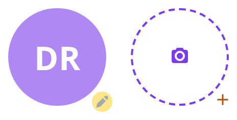
Lets the reader change the logo: click the pencil in the corner, or anywhere on the tile, to open the logo menu (withEditing, model); picking an entry shows up in the Actions panel.


Empty State
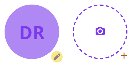
For a room that has no logo yet: a dashed frame with a camera glyph, and a plus button in the bottom-right corner that opens the logo menu (isEmptyIcon, model). The button takes its background from the host's accent colour, which Storybook does not define, so here only a click on that corner finds it.


Archive
An archived room is greyed out whatever its colour: this tile is given the same blue as the others (isArchive).


With Badge
Marks something about the room with a glyph in the bottom corner (badgeUrl); clicking it calls onBadgeClick, shown in the Actions panel.


With Tooltip
Explains the badge in words: hover it to read the text (tooltipContent), which the badge finds through tooltipId.


Template
Tells a template apart from a room: an outline in the tile colour instead of a filled square, with the initials inside (isTemplate).

With Hover
Hints that the tile can be clicked: hover it, and the initials slide away while a second image fades in (hoverSrc); a click opens the logo menu (model).


Long Title
However long the name, the tile shows two letters: the first of its first word and the first of its last (title).


With Logo
A room with a logo of its own shows it instead of the initials (logo):
- Image — a URL, drawn as it is
- Cover — an object with a
coverSVG, inlined and painted in the initials' colour on the tile - Broken URL — the image fails to load, so the tile falls back to the initials


Right To Left
The tile under a right-to-left interface: the pencil button and the badge move to the bottom-left corner. The direction comes from the theme's interfaceDirection (the Direction toolbar); the wrapper also carries dir="rtl" for the rules that read the DOM direction.


Css Customization
Every overridable variable set on one wrapper -- the variables are listed under CSS variables on this page. It covers two instances:
- Design review — an editable tile, for
--room-icon-bg-opacityon the tile and--room-icon-edit-bgon the pencil - Empty frame — for
--room-icon-bgon the plus glyph,--room-icon-button-icon-coloron the camera, and the frame's--room-icon-dashed-borderand--room-icon-empty-radius
Minimal example
import { RoomIcon } from "@onlyoffice/apps-ui-kit/components/room-icon";

export function RoomRow({ name }: { name: string }) {
  return (
    <div style={{ display: "flex", alignItems: "center", gap: 12 }}>
      <RoomIcon title={name} color="4781D1" showDefault />
      <span>{name}</span>
    </div>
  );
}
Props
The props type is an intersection of two unions. The first says a tile is either coloured
(color required, imgClassName refused) or image-backed (imgClassName allowed, color
optional); the second makes the four badge props all-or-nothing. The table below merges them.
Recipes
A room with a logo, falling back to initials
The logo is prefetched into an Image on mount, and a load failure switches the tile to the
initials on its own. You do not need to test the URL first.
import { RoomIcon } from "@onlyoffice/apps-ui-kit/components/room-icon";

export function RoomAvatar({
  name,
  logoUrl,
}: {
  name: string;
  logoUrl?: string;
}) {
  return <RoomIcon title={name} color="4781D1" logo={logoUrl} size="48px" />;
}
The editable tile
withEditing adds the pencil and the menu; model fills that menu; onChangeFile is what
renders the hidden file input. Only the entry whose key is
ROOM_ACTION_KEYS.CREATE_EDIT_ROOM_UPLOAD ("create_edit_room_upload", exported from the root
barrel) is handed that input's ref; every other entry's onClick is called with no argument.
import { RoomIcon } from "@onlyoffice/apps-ui-kit/components/room-icon";
import type { TModel } from "@onlyoffice/apps-ui-kit/components/room-icon";

export function LogoPicker({
  name,
  onUpload,
  onRemove,
}: {
  name: string;
  onUpload: (ref?: React.RefObject<HTMLInputElement | null>) => void;
  onRemove: () => void;
}) {
  const model: TModel[] = [
    {
      key: "create_edit_room_upload",
      label: "Upload",
      icon: "",
      onClick: onUpload,
    },
    { key: "remove", label: "Remove", icon: "", onClick: onRemove },
  ];

  return (
    <RoomIcon
      title={name}
      color="F97A0B"
      size="96px"
      withEditing
      model={model}
      onChangeFile={(e) => console.log(e.target.files)}
    />
  );
}
A tile with a corner badge
The badge renders when badgeUrl or badgeIconNode is set and withEditing is not — the two
share the corner and editing wins.
import { RoomIcon } from "@onlyoffice/apps-ui-kit/components/room-icon";

export function PublicRoomIcon({ name }: { name: string }) {
  return (
    <RoomIcon
      title={name}
      color="2DB482"
      size="48px"
      showDefault
      badgeIconNode={
        <svg viewBox="0 0 12 12" aria-hidden="true">
          <circle cx="6" cy="6" r="5" />
        </svg>
      }
      onBadgeClick={() => console.log("badge")}
    />
  );
}
Behaviour the types don't state
coloris six hex digits with no#. The component prepends it. Passing#4781D1yields##4781D1and no background at all.sizemust be a px string. It is parsed withparseFloatafter stripping"px"to scale the cover glyph, sosize="3rem"gives aNaNscale and the glyph disappears; the width and height themselves would still be honoured.- A click anywhere on the tile toggles the logo menu, not just on the pencil. The handler is
on the outer element unconditionally, so a tile inside a clickable row opens the menu on every
row click when
withEditing,isEmptyIconorhoverSrcis set — and silently flips an internal boolean the rest of the time. Clicking the badge does the same, because the badge's click bubbles. - The initials are the first letter of the first word and the first letter of the last, taken
after
-_[]{}()*+!?.,&\^$|#@%are stripped and runs of whitespace collapsed, then uppercased. A one-word name therefore gives one letter, and a name made only of punctuation gives none. - The "wrong image" state can never be reached. Its condition requires
imgSrcto be something other than a string, and the only valuesimgSrcever takes are a string orundefined— so thewrongImageclass is dead and a failed load falls back to the plain initials. - The badge is painted outside the square. It is absolutely positioned and pushed 24px (80px
at
size="96px") from the centre, so it overflows the tile's own box; a container withoverflow: hiddenclips it. - The file input carries the literal id
customFileInput. Two editable tiles on one page produce two elements with the same id. logowith acoveris turned into adata:image/svg+xml;base64URL and rendered throughreact-svg, which means the glyph'spathfill is recoloured from the theme. A plain string, or an object with onlymedium, is used as an ordinary image URL and is not recoloured.isTemplate,isEmptyIconandshowDefaultare checked in that order and each replaces everything below it, so a tile that is both a template and empty renders the template.- The initials' colour depends on the theme. In the light theme they are black on a
colorwhose brightness is above 202 (of 255) and white on anything darker; in the dark theme they are drawn incoloritself, on the same colour at 0.1 opacity. An inlined cover glyph is painted the same way. An archived tile in the dark theme keeps the black-or-white rule. hoverSrcanimates the tile. On hover the initials or the cover glyph slide up and fade out, the background darkens to 80% brightness and the hover image fades in over it.isArchiveremoves the pencil. An archived tile withwithEditingkeeps the 64px minimum width and the pointer cursor, but draws neither the pencil nor the menu behind it.- No
logomeans the initials, oncolor.showDefaultis for forcing them while a logo exists; it is not needed to get them.
CSS variables
All are read with a fallback, so setting any of them on an ancestor works.
--room-icon-bg fills the badge glyph only when badgeIconColor is unset; a badge that keeps
its own colours ignores it. --room-icon-button-icon-color paints the template outline only
when the tile has no color.
The tile's own size, radius and colour are written as inline custom properties from the props and cannot be overridden from a stylesheet.
Accessibility
- The outer element is a
<div>with no role and no ARIA, and it carries a click handler. It is not reachable by keyboard; the room's name has to be a real link or button next to it. - The initials are rendered as text, so a screen reader reads out "TR" rather than the room name. Treat the tile as decorative and label the row.
- Both images use fixed English
alttext —"room icon"and"room icon hover"— which is not translated and cannot be changed through a prop. - The pencil, the plus and the badge are
IconButtons and are focusable, but the menu they open is aDropDownthat closes on an outside click and offers no roving focus of its own.
Test ids
The outer element also carries data-is-archive, data-has-editing, data-is-template and
data-is-empty.