RoomType


Works only inside an ONLYOFFICE Apps portal: it needs the portal's API client, stores and translations, and is not part of the public API.
Row offering one kind of room, with its glyph, its translated name and its description. It is the "choose a room type" step of the portal's create-room flow, in three layouts: a card in the list, the collapsed button at the top of a dropdown, and an entry inside that dropdown.
Use this when / not when
- Use when you are reproducing the portal's room-creation picker and want its exact wording.
- Not for the glyph alone — that is
RoomLogo, which this component renders inside itself. - Not for a particular existing room — that is
RoomIcon. - Not as a generic option row: every string is a
Commontranslation key of the DocSpace portal, so a row about anything else comes out blank.
Portal-internal. All six titles and all six descriptions come from the portal's Common
namespace (CollaborationRoomTitle, VirtualDataRoomDescription, FormFilingRoomInfo and so
on). Without those translations loaded the row renders a glyph and two empty lines.
Import
import RoomType from "@onlyoffice/apps-ui-kit/components/room-type";
It is a default export, so the name is yours to choose. The root barrel carries it by name
as well — components/index.ts re-exports it as export { default as RoomType } — but prefer the
subpath: the barrel does not build without four optional peers, see
Which import form.
Needs TranslationProvider above it, with the portal's Common namespace, or every label is
empty and i18next logs a missing-key error. Needs ThemeProvider for its borders and hover
backgrounds.
Stories
Default
A single card as it appears in a list of room types to choose from; pick another type or layout in the Controls panel below.


Dropdown Button
The collapsed button at the top of a picker, drawn open: the border takes the accent colour and the arrow points up (isOpen). Clear isOpen in the Controls panel to see it closed, arrow pointing down.


Dropdown Item
An entry inside the picker's dropdown: no border and no arrow, only a background on hover.


Room Types
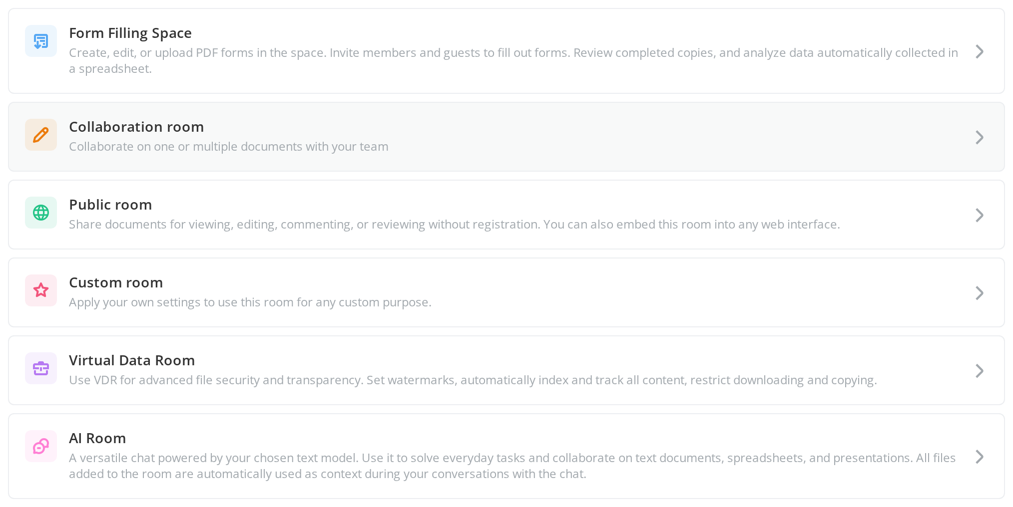
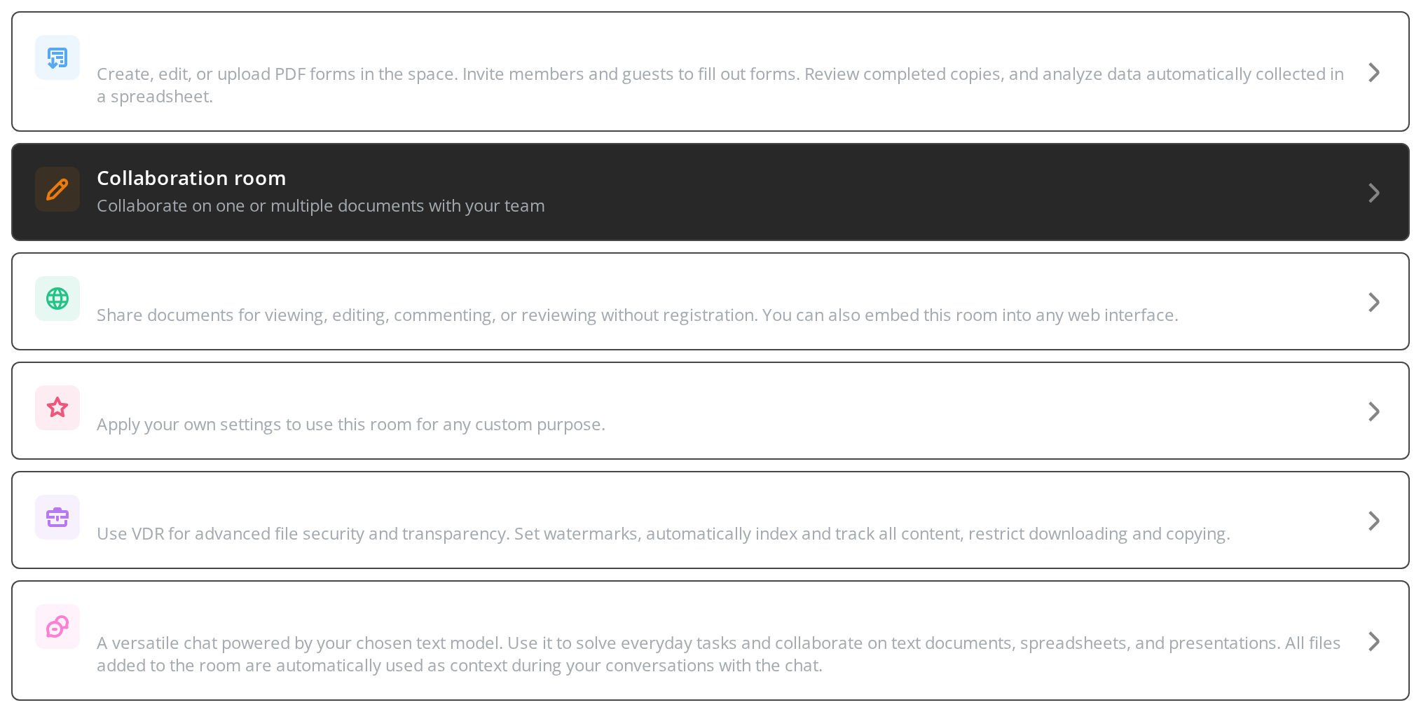
Every room type the row can describe, each with its own glyph, name and description (roomType) — what a room-type picker lists.
Disabled State
Rows for a room type the user may not create right now, shown but refusing the click:
- Form Filling Space — a list card on a grey background, with no hover change and no pointer cursor (
disabledFormRoom) - Public room — a dropdown entry with its glyph and text faded (
disabledPublicRoom)
Click either one: the Actions panel stays empty.


From Template
The two ways a template shows up in a picker:
- From template — the entry that starts a room from a template: both lines take the template wording and the glyph its template form (
isTemplate) - Collaboration room — a room type offered from a template: the glyph changes, the name and description stay (
isTemplateRoom)


Form Space
The row worded for a form space rather than a room, for a picker opened from the forms section (isFormSection). Turn on isTemplate in the Controls panel below to see the form-space template wording.


Right To Left
The card in a right-to-left interface: the glyph moves to the right edge, the text aligns right and the forward arrow sits on the left, pointing left.


Css Customization
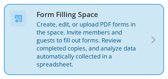
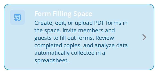
Every overridable variable set on one card -- the variables are listed under CSS variables on this page. Hover it to see --room-type-item-hover-bg.
Minimal example
import RoomType from "@onlyoffice/apps-ui-kit/components/room-type";
import { RoomsType } from "@onlyoffice/apps-ui-kit/enums";

export function RoomTypePicker({ onPick }: { onPick: () => void }) {
  return (
    <RoomType
      roomType={RoomsType.FormRoom}
      isOpen={false}
      selectedId=""
      onClick={onPick}
    />
  );
}
Props
Recipes
The list of types
The default layout is listItem: a bordered card, full width, with the forward arrow on the
trailing edge.
import RoomType from "@onlyoffice/apps-ui-kit/components/room-type";
import { RoomsType } from "@onlyoffice/apps-ui-kit/enums";

const TYPES = [
  RoomsType.FormRoom,
  RoomsType.EditingRoom,
  RoomsType.PublicRoom,
  RoomsType.VirtualDataRoom,
];

export function ChooseRoomType({
  onPick,
}: {
  onPick: (type: RoomsType) => void;
}) {
  return (
    <div style={{ display: "flex", flexDirection: "column", gap: 8 }}>
      {TYPES.map((type) => (
        <RoomType
          key={type}
          roomType={type}
          isOpen={false}
          selectedId={type}
          onClick={() => onPick(type)}
        />
      ))}
    </div>
  );
}
The collapsed picker
type="dropdownButton" is the chosen row with a chevron that points down, and up while
isOpen. The list under it is yours — a DropDown holding rows of
type="dropdownItem".
import { useState } from "react";
import RoomType from "@onlyoffice/apps-ui-kit/components/room-type";
import { RoomsType } from "@onlyoffice/apps-ui-kit/enums";

export function RoomTypeSelect() {
  const [open, setOpen] = useState(false);
  const [picked, setPicked] = useState(RoomsType.FormRoom);

  return (
    <div>
      <RoomType
        roomType={picked}
        type="dropdownButton"
        isOpen={open}
        selectedId={picked}
        onClick={() => setOpen((value) => !value)}
      />
      {open
        ? [RoomsType.FormRoom, RoomsType.EditingRoom].map((type) => (
            <RoomType
              key={type}
              roomType={type}
              type="dropdownItem"
              isOpen={false}
              selectedId={type}
              onClick={() => {
                setPicked(type);
                setOpen(false);
              }}
            />
          ))
        : null}
    </div>
  );
}
Behaviour the types don't state
- The arrow carries no handler of its own. It sits inside the row, which already handles the
click, so one click is one call. It is given
isClickableonly while the row is enabled, which is what keeps the pointer cursor on it. - A disabled row refuses the click.
disabledFormRoomanddisabledPublicRoomadd a class, swap the tooltip for the portal-widecreate-room-tooltipanchor, drop thetitle, mark the rowaria-disabledand return beforeonClick. It is still in the tab order —aria-disableddescribes the state rather than removing the element. A disabled list card turns grey; a disabled dropdown entry turns grey and fades its glyph and text to half opacity. dropdownButtonignores both disabled props. It passesonClickstraight through and never gets the disabled class, so a form room or public room in the collapsed button stays clickable and looks enabled.- The three layouts differ in their frame.
listItemanddropdownButtonhave a 1px border and rounded corners;dropdownItemhas neither, and hides the arrow. - Open is drawn on the button only. While
isOpen,dropdownButtontakes the accent border, turns its chevron from down to up and stops changing background on hover. The other layouts receive the class and do nothing with it. selectedIdis required and does nothing. It is written todata-selected-idand read nowhere in the component.- A fourth layout exists in the stylesheet and cannot be reached.
displayItem— a static card with no arrow — is the fallback branch, buttypedefaults tolistItemand its union has only the three names, so nothing can select it. - Some theme variables are never read.
dropdownButtonreads its own--room-type-dropdown-button-*set anddropdownItemits own hover, disabled and description values, butdropdownItem's background still falls back to the list item'snone, so it is transparent rather than the solid white or black--room-type-dropdown-item-backgroundgives it; the--room-type-display-item-*set belongs to the unreachable layout. - The accent border depends on the portal. The pressed list card and the open or pressed
dropdown button take
--accent-main, a portal token the component does not define or give a fallback, so outside the portal that border does not change colour. isTemplateoverrides the wording entirely, both lines, whateverroomTypeis, whileisTemplateRoomchanges only the glyph.isFormSectionis checked first: alone it gives the form-set wording, and withisTemplatethe form-set template wording.- Right to left, the arrow moves and mirrors. It sits on the trailing edge by
margin-inline-start: auto, so it moves to the left, and under.rtlit is flipped withscaleX(-1). - The row is
width: 100%with 16px of padding and no maximum, so it fills whatever holds it; the gap between rows is the container's. - The title is a tooltip too — it is passed to the wrapping
TooltipContainer, so the kit's shared tooltip repeats the type's name on hover, providedRootTooltipis mounted. A disabled row passes an empty string instead.
CSS variables
A disabled row keeps its grey whatever --room-type-item-bg and --room-type-item-hover-bg
say. The dropdown entry has no border and no radius, so the border and radius variables do
nothing to it.
Accessibility
- The row is a
<div>with a click handler and no role, notabIndexand no key handler, in every layout. It cannot be reached or activated from the keyboard, and a picker built from these rows is unusable without a pointer — wrap each row in your own button if that matters. - The arrow inside is an
IconButtonand is focusable, which makes the only reachable control a decorative one. - A greyed-out row carries
aria-disabled, so its state is announced — but it stays focusable and is not removed from the tab order, which is the usual tradearia-disabledmakes. - The glyph is decorative and unlabelled; the accessible content of the row is its two lines of translated text.
Test ids
| Layout | data-testid |
|---|---|
listItem | room-type-list-item |
dropdownButton | room-type-dropdown-button |
dropdownItem | room-type-dropdown-item |
Every layout also carries data-selected-id. There is no prop to change any of these.