SnackBar
Full-width notification bar that sits at the top of a section until it is dismissed. It is the portal's "your storage is almost full" strip — a message that stays until the user acts on it.


Use this when / not when
- Use for a persistent, page-level notice the user has to see: a quota warning, a scheduled maintenance window, a campaign banner.
- Not for the result of an action the user just took —
Toastis the transient one, and it stacks and dismisses itself. - Not for a message inside a form; put the text in the field's own
errorMessage. - Not for progress;
ProgressBarandLoaderare that.
Import
import { SnackBar } from "@onlyoffice/apps-ui-kit/components/snackbar";
Also exported from the root barrel @onlyoffice/apps-ui-kit.
Note the capital B: the component is SnackBar, while the folder and the props type are
spelled snackbar/SnackbarProps.
Needs ThemeProvider from @onlyoffice/apps-ui-kit/providers/theme — the background and the
accent stripe come from the theme class it puts on the tree.
Stories
Default
The bar as most pages show it: a warning icon, a header and a message, with a close cross at the end that calls onAction. Change any other prop live in the Controls panel below.


With Action
When the notice asks for one step, the bar offers it in place of the close cross: the underlined Take Action label after the message calls onAction (btnText).


With Countdown
For a notice that should not outstay its moment: the countdown after the message ticks down from 00:05 and calls onAction at zero, where the host removes the bar (countDownTime). Here nothing removes it, so only the timer disappears.


With Html Content
When the notice needs bold text or a link, pass it as HTML: it replaces the header and the message, and the markup is sanitized first, which also drops any style attribute (htmlContent).


Maintenance
A scheduled-maintenance notice is an ordinary bar with its own header and message; there is no separate maintenance look, and isMaintenance changes nothing.


With Additional Header Text
When the header needs a detail such as a time, the smaller Today, 10:00 line sits right after it (additionalHeaderText).


Right To Left
The same bar under a right-to-left interface: the accent stripe moves to the right edge, the icon and header start from the right, and the close cross moves to the left end. The wrapper sets the direction to right-to-left, and the bar's logical properties follow it.


Css Customization
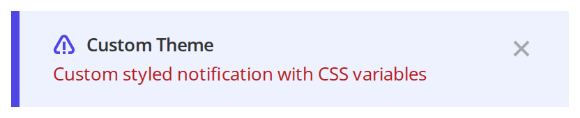
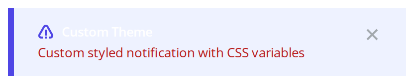
Every overridable variable set on one wrapper -- the variables are listed under CSS variables on this page. The message takes the red text colour while the header keeps the heading colour.
Minimal example
opacity is what makes the bar visible, and countDownTime={-1} is what keeps it from
dismissing itself. Both are easy to leave out and both are needed.
import { SnackBar } from "@onlyoffice/apps-ui-kit/components/snackbar";

export function QuotaBar({ onDismiss }: { onDismiss: () => void }) {
  return (
    <SnackBar
      opacity={1}
      showIcon
      headerText="Storage almost full"
      text="Free up space or upgrade your plan to keep working."
      countDownTime={-1}
      sectionWidth={0}
      onAction={onDismiss}
    />
  );
}
Props
BarConfig is SnackbarProps plus parentElementId, and is only used by the static
SnackBar.show described below.
Recipes
Dismissing it
The bar never removes itself: onAction is a notification, and rendering it is your decision.
The same handler is called by the cross, by the action text and by the countdown, so there is
one place to put the state change.
import { useState } from "react";
import { SnackBar } from "@onlyoffice/apps-ui-kit/components/snackbar";

export function MaintenanceBar() {
  const [shown, setShown] = useState(true);

  if (!shown) return null;

  return (
    <SnackBar
      opacity={1}
      headerText="Scheduled maintenance"
      text="The portal will be unavailable on Sunday, 2:00–4:00 AM."
      countDownTime={-1}
      sectionWidth={0}
      onAction={() => setShown(false)}
    />
  );
}
An action instead of a cross
Passing btnText replaces the close cross with an underlined label. There is then no cross at
all, so the only way out of the bar is the action itself.
import { SnackBar } from "@onlyoffice/apps-ui-kit/components/snackbar";

export function UpdateBar({ onUpdate }: { onUpdate: () => void }) {
  return (
    <SnackBar
      opacity={1}
      showIcon
      headerText="Update available"
      text="A new version is ready to install."
      btnText="Update now"
      countDownTime={-1}
      sectionWidth={0}
      onAction={onUpdate}
    />
  );
}
Auto-dismiss
countDownTime is in milliseconds and draws an mm:ss counter next to the message. When
it reaches zero the counter disappears and onAction fires.
import { useState } from "react";
import { SnackBar } from "@onlyoffice/apps-ui-kit/components/snackbar";

export function TimedBar() {
  const [shown, setShown] = useState(true);

  if (!shown) return null;

  return (
    <SnackBar
      opacity={1}
      text="This notice closes in 30 seconds."
      countDownTime={30000}
      sectionWidth={0}
      onAction={() => setShown(false)}
    />
  );
}
Behaviour the types don't state
- Without
opacitythe bar is invisible. The stylesheet isopacity: var(--opacity, 0)and the variable is only set from the prop, so a bar rendered without it occupies its space and shows nothing. Passopacity={1}. countDownTimeis milliseconds, and anything above-1starts a countdown.0is not "no countdown": the counter completes on the first frame and callsonActionimmediately, which is why a bar withcountDownTime={0}can look like it closes itself.onCloseis never called — the cross callsonAction, like everything else. So does the countdown, and so does a click that lands inside an iframe.- Clicking anywhere in an iframe dismisses the bar. A
blurlistener onwindowchecks whether the focused element is an<iframe>and, half a second later, callsonAction. SetskipBlurto turn that off. btnTextand the cross are exclusive. The cross is only rendered whenbtnTextis empty, so a bar with an action has no other way to be dismissed.fontSizeandfontWeightdo not reach the message. The message carriesfont-size: … !importantfrom--snackbar-text-size; the two props only style the countdown.htmlContentmeans two different things. On its own it replaces the whole text block — icon, header, message, action label and countdown — with HTML run through thexsssanitizer, and only the close cross is kept beside it; together withisCampaignsit is used as thesrcof an<iframe>and nothing else is drawn but a close cross.sectionWidthonly matters withhtmlContent— it is the iframe'smin-widthfrom the tablet breakpoint up, and is ignored by the text layout.- The bar takes the full width of its parent and has no margin of its own. It is
position: relative,width: 100%, with12px 20pxof padding inside and a 4px accent stripe on the leading edge. isMaintenancedoes nothing. It is declared, never read, and — like every other undestructured prop — spread onto the wrapper<div>, where React reports it as an unknown attribute.- The component is a class component, so it takes no
refand none of the hooks-era helpers apply to it.
The static SnackBar.show / SnackBar.close
SnackBar.show(config) mounts a second React root into the element named by
config.parentElementId, or into a <div id="snackbar"> it appends to document.body, and
stores the config on window.snackbar. It is how the portal shows a bar from outside React.
Prefer rendering <SnackBar/> yourself. If you do call it:
- every call creates a new root on the same node — React warns, and nothing unmounts the previous tree;
- without
parentElementIdevery call appends another<div id="snackbar">, so the document ends up with duplicate ids; SnackBar.close()does nothing unless the last config had aparentElementId, and even then it only removes#snackbar-containerfrom the DOM — the React root stays mounted and leaks.
CSS variables
Set them on any ancestor.
The header does not follow --snackbar-text-color: it is a Heading, which keeps its own
colour (--heading-text-color). The action label and the cross are fixed colours no variable
reaches.
--opacity and --background-image are written by the component from opacity and
backgroundImg; set those props rather than the variables.
Accessibility
- The bar is a plain
<div>: norole="status", noaria-live, so a screen reader is not told when it appears. Wrap it in your own live region if the message matters. - The close cross is a real
<button>, so it is focusable — but it hastype="submit", which submits the surrounding form if the bar is rendered inside one, and it has no accessible name at all. - The action text is not a button.
btnTextrenders a<p>with a click handler: it cannot be focused or activated from the keyboard. htmlContentis injected as HTML. It is sanitized withxss, but anything you interpolate into it is still your responsibility.
Test ids
None of them can be overridden by a prop. The bar also carries the literal DOM id
snackbar-container.