StatusMessage
A full-width bar with a danger glyph that fades one message out before fading the next one in. It belongs at the top of a form or a page, above the thing the message is about.


Use this when / not when
- Use for an error or a warning that stays on screen until the state changes — a failed sign-in, an expired licence, a quota that is nearly full.
- There is no visibility prop. A message shows it and an empty message hides it; once the fade is over the component unmounts itself.
- Not for something that should go away by itself —
Toastviatoastr, orSnackbarfor a dismissible banner. - Not for informational copy with a close button —
ColumnarInfoBarandPublicRoomBarare the bars with an action in them. This one has no close control at all. - It cannot be dismissed by the reader, only by the code that owns the message.
Import
import StatusMessage from "@onlyoffice/apps-ui-kit/components/status-message";
It is a default export, so the name is yours to choose; StatusMessage is also exported by name
and reaches the root barrel @onlyoffice/apps-ui-kit through it.
No provider is required: the light colours are declared on the bar itself, and the dark ones come
from the dark class the kit's theme provider puts on <body>.
Stories
Default
The error bar as a form shows it after a failed action. Type a new text in the Controls panel below to watch the old one fade out first; the warning switch there takes effect with the next text change (isWarning).
Warning Message
For a problem that does not block the user: the same bar in the warning colours (isWarning).


Toggle Visibility
Use this to see how the bar leaves and returns: Hide Message fades it out and removes it, Show Message brings it back (message set to an empty string and back).


Message Swap
Use this to see what a user sees when one message replaces another: Message A and Message B fade the current text out before the new one fades in, Clear hides the bar.


Css Customization
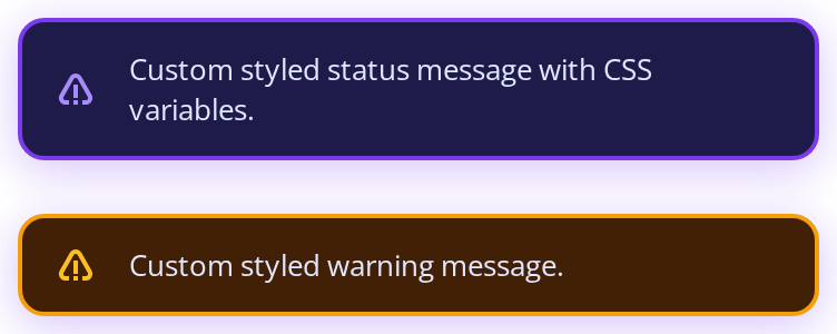
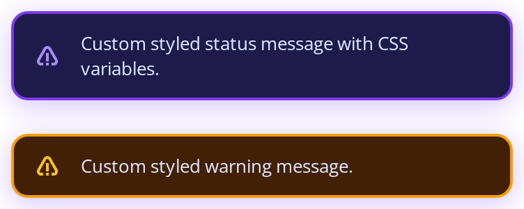
Every overridable variable set on one wrapper -- the variables are listed under CSS variables on this page. The first bar shows the shared variables; the second, with isWarning, is there for the three warning variables, and the gap between the two is the bottom margin. The max width caps both bars below the 400px wrapper.
Minimal example
import { useState } from "react";

import StatusMessage from "@onlyoffice/apps-ui-kit/components/status-message";
import { Button } from "@onlyoffice/apps-ui-kit/components/button";

export function SignInForm() {
  const [error, setError] = useState("");

  return (
    <div>
      <StatusMessage message={error} />
      <Button
        primary
        label="Sign in"
        onClick={() => setError("The password is incorrect")}
      />
    </div>
  );
}
Props
Recipes
Error
The message is the state. Set it to show the bar, set it to "" to fade it out and unmount it.
import { useState } from "react";

import StatusMessage from "@onlyoffice/apps-ui-kit/components/status-message";
import { Button } from "@onlyoffice/apps-ui-kit/components/button";

export function QuotaPanel() {
  const [message, setMessage] = useState<string>("");

  return (
    <div>
      <StatusMessage message={message} />
      <Button label="Fail" onClick={() => setMessage("Storage is full")} />
      <Button label="Clear" onClick={() => setMessage("")} />
    </div>
  );
}
Warning rather than error
isWarning swaps the background, the border and the glyph colour. Change it together with the
message — on its own it does not repaint.
import StatusMessage from "@onlyoffice/apps-ui-kit/components/status-message";

export function LicenceWarning() {
  return (
    <StatusMessage message="Your licence expires in three days" isWarning />
  );
}
Rich content
message takes nodes as well as a string, and they are rendered inside the bar's paragraph.
import StatusMessage from "@onlyoffice/apps-ui-kit/components/status-message";

export function RichMessage() {
  return (
    <StatusMessage
      message={
        <span>
          The file <strong>Report.docx</strong> could not be converted
        </span>
      }
    />
  );
}
Behaviour the types don't state
- What is on screen is the previous message, not the one you passed. A change fades the old message out over 0.3s, and only when that fade ends is the new one put in its place. A test that re-renders with new text and asserts immediately still finds the old text.
- The swap hangs off
transitionendandanimationend. Where those events do not fire — an ancestor that isdisplay: none, a browser or test environment with animations turned off — the bar stays at zero opacity and the new message never appears at all. - Changing
isWarningon its own does not repaint. It is kept in a ref and read during render, and the effect's only write in that path sets a state value to what it already is, which React discards. Change the message in the same update. - Rapid changes collapse. While a fade is in flight further messages replace one another silently; when it ends, only the latest is shown.
- Clearing the message unmounts the component, so anything you place after it moves up once the fade is over rather than immediately.
- The glyph is always the danger triangle.
isWarningchanges the background, the border and the fill colour; the shape is the same in both states. - It brings its own layout: full width up to 1200px, a 16px bottom margin, 8px by 12px of padding and a 12px gap between glyph and text. All four are custom properties.
- It has no close button, no timer and no queue — one message, for as long as you pass one.
CSS variables
Note the two border names: the ordinary state is --status-message-border, the warning state
--status-message-warning-border-style.
Accessibility
- Nothing is announced. The bar has no role and no live region, so a message that appears while
the reader is elsewhere on the page passes unnoticed. Wrap it in an
aria-live="polite"container of your own, or move focus to it. - The glyph is decorative and unlabelled; error and warning are told apart by colour alone, so the wording of the message has to carry the difference.
- Because the message is swapped only after the fade, a live region around it announces the change 0.3s late — which is usually what you want, but not instantaneous.
- The bar is not focusable and offers nothing to dismiss, so a keyboard user has no way to clear it.
Test ids
The component sets none, on any element. Render it inside a wrapper of your own and assert on that, or query the message text: it is the only paragraph in the bar.
Related
Toast— for a message that leaves by itself.Snackbar— a banner the reader can close.ColumnarInfoBar— informational, with room for an action.