Toast
Container the transient notifications are stacked in, driven by the imperative toastr. You
mount it once; every message after that is a function call from anywhere in the app.


Use this when / not when
- Use for the outcome of something the user just did: saved, copied, failed to upload.
- Not for a notice that has to stay on screen until it is acted on —
SnackBaris the persistent bar. - Not for a field's validation message, which belongs in the field's own
errorMessage. - Not for anything the user must confirm: a toast can be missed, so use
ModalDialogwhen an answer is required.
Import
import {
  Toast,
  toastr,
  ToastType,
} from "@onlyoffice/apps-ui-kit/components/toast";
Also exported from the root barrel @onlyoffice/apps-ui-kit.
Needs ThemeProvider from @onlyoffice/apps-ui-kit/providers/theme for the colours, and
TranslationProvider from @onlyoffice/apps-ui-kit/providers/translation for the default
titles ("Done", "Warning", "Alert", "Info") — without it those come out empty.
Stories
Default
The call most screens make: a short message after an action, with the title left to the type. Click Show Toast to open it, and pick another type or change the message, title or timeout live in the Controls panel below.
Success
Confirms that an action the user started has finished, such as a save or a move. Click Show Toast to open it, and change the message, title or timeout live in the Controls panel below.


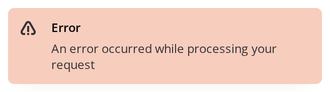
Error Toast
Tells the user that an action failed. Click Show Toast to open it; in code, pass the caught error itself and the message is read from it.

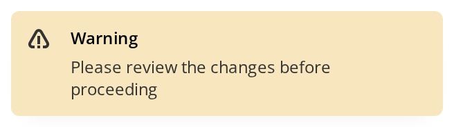
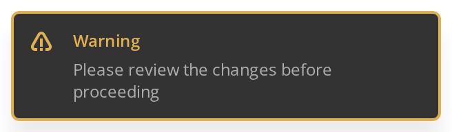
Warning
Asks the user to look at something before going on, without reporting a failure. Click Show Toast to open it.
Info
Reports something neutral the user may want to know, such as a finished background task. Click Show Toast to open it.


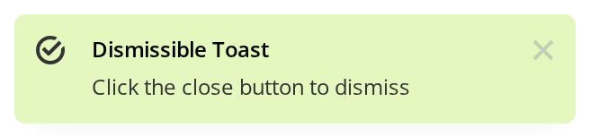
With Close Button
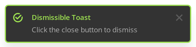
For a message the user must read before it goes: the toast stays until its cross is clicked (timeout 0, withCross), and a click on the toast itself no longer closes it.
All Types
Compares the four types side by side: Info on top, as the newest, then Warning, Error and Success, each on its own background. All four stay open until closed with their cross.

Custom Content
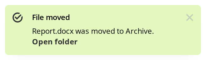
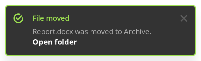
A message that needs more than a line of text, such as a link to what the action produced: any React node passed as the first argument is rendered as it is, under the title.
Default Titles
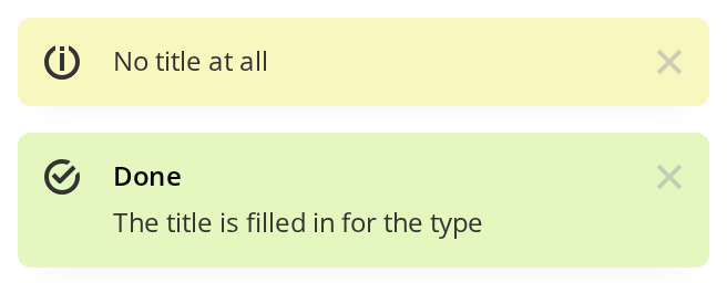
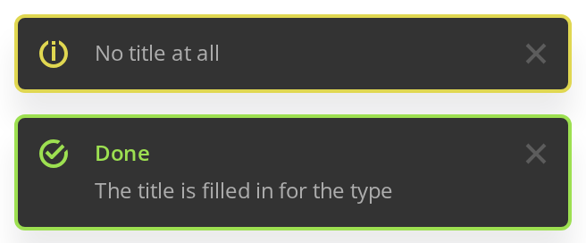
Most calls need no title of their own. No title at all — the info toast, given null as its title, shows the message alone. Done — the success toast below it left the title out, so the translated word for its type is shown.
Right To Left
Toasts in a right-to-left layout: they open in the top-left corner and slide in from the left, the icon moves to the right of the text and the cross to the left. The toasts are portalled outside the story, so the direction comes from the document, set here by the Direction toolbar, and a dir on a wrapper of yours would not reach them.


Css Customization
The variables are listed under CSS variables on this page; here they are set through the style prop of Toast, because the toasts are portalled outside any wrapper of yours. The example sets every one a string toast can show, all but --toast-text-size: open a toast to see the rounder corners, the wider padding and the wider container further from the edge.

Minimal example
<Toast/> renders no message of its own: it is the place the messages land. Mount it once, at
the root of the app, and call toastr from anywhere.
import { Toast, toastr } from "@onlyoffice/apps-ui-kit/components/toast";
import { Button } from "@onlyoffice/apps-ui-kit/components/button";

export function App() {
  return (
    <>
      <Button label="Save" onClick={() => toastr.success("Settings saved")} />
      <Toast />
    </>
  );
}
Props
Most of this type describes a single toast rather than the container, and the container reads
none of it — see "Behaviour the types don't state". What a toast looks like is decided by the
arguments of toastr.
Enums
ToastType names the four looks, but you do not pass it: each member has its own toastr
method.
Recipes
Showing a toast
Every method takes the same five positional arguments —
(data, title?, timeout?, withCross?, centerPosition?). Only the first is required.
import { toastr } from "@onlyoffice/apps-ui-kit/components/toast";

export async function copyLink(url: string) {
  try {
    await navigator.clipboard.writeText(url);
    toastr.success("Link copied to clipboard");
  } catch {
    toastr.error("Could not copy the link");
  }
}
One that stays until it is closed
timeout of 0 disables the auto-close, and withCross puts a cross on the toast; without
the cross the only way to close it is clicking the toast itself.
import { toastr } from "@onlyoffice/apps-ui-kit/components/toast";

export function warnAboutQuota() {
  toastr.warning("Your storage is almost full.", null, 0, true);
}
Passing null as the title is what removes it; leaving the argument out falls back to the
translated default for the type.
Reporting a failed request
toastr.error accepts the error object itself and digs the message out of it:
response.data.error.message, then statusText, then message.
import { toastr } from "@onlyoffice/apps-ui-kit/components/toast";

export async function removeRoom(id: number) {
  try {
    await fetch(`/api/rooms/${id}`, { method: "DELETE" });
  } catch (error) {
    toastr.error(error as Error);
  }
}
Dismissing from code
Each call returns the toast's id, which toastr.dismiss and toastr.isActive take.
toastr.clear() with no argument closes all of them.
import { toastr } from "@onlyoffice/apps-ui-kit/components/toast";

export async function uploadWithProgressToast(file: File) {
  const id = toastr.info(`Uploading ${file.name}…`, null, 0);

  await fetch("/api/upload", { method: "POST", body: file });

  toastr.dismiss(id);
  toastr.success(`${file.name} uploaded`);
}
Behaviour the types don't state
- Almost all of
ToastPropsis ignored. The container reads onlyclassName,styleandisSSR;title,type,data,withCross,timeoutandidare declared, never read, and describe a toast, not the container. Pass them totoastrinstead. - Nothing appears until
<Toast/>is mounted. Atoastrcall made while the container is absent is queued byreact-toastifyagainst the container idtoast-containerand is shown only once it exists. - Only one
<Toast/>renders at a time. Mounting more — one per story on a docs page, a plugin's next to the portal's — is safe: the first mounted draws the container and the rest render nothing, so theirclassNameandstyleare ignored. When the first unmounts, the next takes over, without the toasts the first was showing. - The arguments are positional, and the third one is a trap.
timeoutis in milliseconds;0means "never close by itself", but anything below 750 is silently replaced with 5000, sotoastr.success(msg, null, 300)stays up for five seconds. - A toast closes on click unless
withCrossis set. The two are exclusive: passingwithCrossturns off close-on-click and draws a cross instead. - The default title is translated at call time, through the
Commonnamespace —Done,Warning,Alert,Info. WithoutTranslationProviderthe title is an empty string, andsub-components/Toastr.tsx:93renders the title only when it is truthy — so the toast comes out with no title line at all rather than with a blank one. Passingnulldeliberately reaches the same result, which is why a missing provider is easy to mistake for a design decision. - Every method accepts more than a string, not only
toastr.error. A React element or an array is rendered as is under the title — a line of text followed by aLink, say; an object withresponse,statusTextormessageis unwrapped; anything else becomes an empty toast. - The container is rendered into
#root, not intodocument.body— it is aPortalwithappendToread fromdocument.getElementById("root"), falling back to the body when there is no such element. An app whose root node has another id gets the toasts on the body, outside the theme class, and the colours go with it. --toast-top-offsetis written on<html>, not on the container: the component sets it from avisualViewportlistener that only runs on a phone. It is a global side effect of mounting the container, and it does not move the toasts: the container declares its own--toast-top-offset: 16px, which shadows the inherited value.- Clicking any toast makes every toast
position: static. The container's own click handler rewrites the inline style of every.Toastify__toastin the document, which is how the stacked mobile layout is unstacked; it does not undo itself. - The container is
rtlin every language.react-toastify'srtlflag is hardcoded on, while the position is fixed totop-rightand mirrored byinset-inline-endin the stylesheet — the direction of your interface does not change it. - The container is
position: fixedatz-index: 9999, 320px wide, 24px from the trailing edge and--toast-top-offsetfrom the top. The newest toast is on top of the list. At tablet width and below the toasts overlap as a deck, each 8px below the one in front and the container 16px from the edge, and on a phone the container spans the viewport minus 32px. isSSRmakes the container rendernullon the first pass and appear after the first effect, so a server-rendered tree does not try to reach for#root.
CSS variables
Set them through the style prop of Toast. The container is portalled into #root, outside
any wrapper of yours, so a value set on a wrapper never arrives; #root or :root would work
for all but --toast-top-offset.
The per-type colours (--toast-success-bg, --toastr-title-error-color and their siblings)
are set by the theme class and are not meant to be overridden one by one.
Accessibility
react-toastifyputsrole="alert"on the body of every toast, so a screen reader announces its title and message as soon as it appears — but a toast that closes after five seconds may be gone before it is read. Anything the user must not miss belongs in aSnackBaror a dialog.- The whole toast is clickable and is not a button: without
withCrossit is a<div>that closes on click, unreachable from the keyboard. - The cross is an
IconButton, which is also a<div>with no role and no accessible name, so it cannot be focused either. A toast opened with atimeoutof0therefore cannot be closed from the keyboard at all. - The four types differ by colour and by icon — a check for success, an info sign for info, and one danger sign shared by error and warning, which only the colour tells apart. The icon is decorative, so the type is not conveyed to assistive technology — put it in the title.
Test ids
The body also carries data-type with the toast's type, which is how the colours are selected.
Neither id can be overridden by a prop.
Related
SnackBar— the persistent bar for a notice that has to stay.Portal— how the container leaves the React tree.IconButton— the cross drawn bywithCross.