ComboBox
Button showing the current choice, with a list of options under it. The choice itself stays in your state: the component reports a click and nothing more.


Use this when / not when
- Use to pick one value from a short, known list: a role, a time zone, a filter, a language.
- Not for a value the user types or searches. There is no search field here —
withSearchis declared and does nothing — so a long list wantsSelectoror an input of your own. - Not for a menu of actions. A menu is
DropDownwithDropDownItems; this one is about a value. - Not on its own in a form: a labelled field is
FieldContaineraround it. - Not for many values at once. It shows one option and a
+Nbadge you maintain yourself.
Import
import {
  ComboBox,
  ComboBoxSize,
} from "@onlyoffice/apps-ui-kit/components/combobox";
Also exported from the root barrel @onlyoffice/apps-ui-kit.
Needs ThemeProvider from @onlyoffice/apps-ui-kit/providers/theme for the button and list
colours, and TranslationProvider from @onlyoffice/apps-ui-kit/providers/translation because
the options are rendered as DropDownItems, which read a translated label for their paid badge.
Stories
Default
A fixed-width combo box with a placeholder in the button, as a form shows it before anything is chosen. Pick an option to see it replace the placeholder, and change any other prop live in the Controls panel below.
Different Sizes
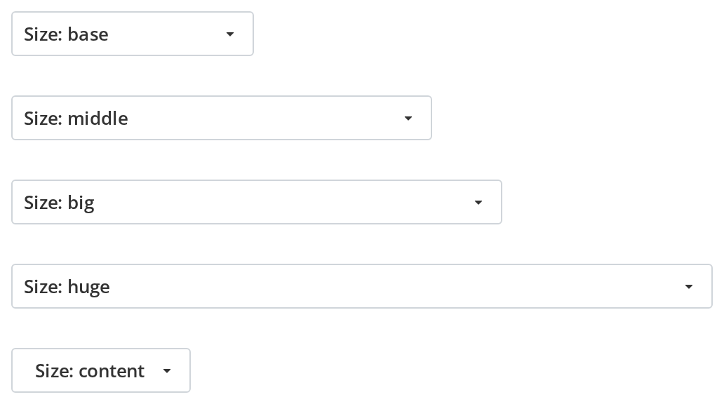
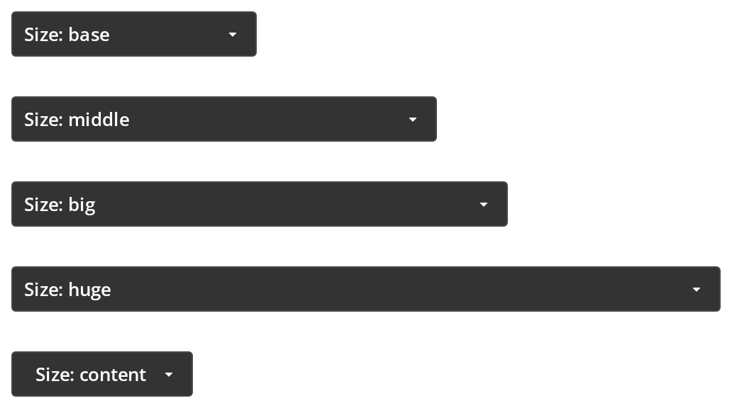
The fixed widths side by side, to pick the one that fits the longest label a form expects: base 173px, middle 300px, big 350px, huge 500px, and content, as wide as the label (size, with scaled off).
With Icons
Options with an icon each, so an action is recognised before its label is read; pick one and its icon moves into the button next to the label (icon on each option).


With Option Descriptions
Options whose label alone does not explain the choice: open the list and each row shows the label with a line of explanation under it (description on each option). The selected row is highlighted and stays clickable (displaySelectedOption).


Disabled
A choice that cannot be changed right now, kept on screen so the reader still sees the value: the button is greyed out and a click does not open the list (isDisabled).


With Selected Option
A form that opens with a value already chosen. Open the list: the chosen option is greyed out and cannot be picked again, because displaySelectedOption is off; turn it on to keep it clickable and highlighted instead.


Custom Styling
Colour-coded values, such as priorities, where the colour says more than the word: the button draws the chosen option as a badge in its own text and background colours (type="badge", with color and backgroundColor on each option). Pick another priority to see the badge change; the rows of the list stay plain.


Loading State
A value that is still being fetched or saved: the label and the arrow give way to a spinner and a click does not open the list until loading ends (isLoading).


Right To Left
The combo box under a right-to-left interface: the icon and the label start at the right edge, the icon is mirrored, and the arrow sits at the left end. Open the list to see its rows aligned to the right as well. The direction comes from the theme's interfaceDirection (the Direction toolbar); the wrapper also carries dir="rtl" for the rules that read the DOM direction.


Css Customization
The border colours, the radius and the padding set on one wrapper -- the variables are listed under CSS variables on this page. Hover the button to see the hover colour and click it to see the open one.


Minimal example
selectedOption and options are both required, and onSelect is what updates the first.
import { useState } from "react";
import {
  ComboBox,
  type TOption,
} from "@onlyoffice/apps-ui-kit/components/combobox";

const ROLES: TOption[] = [
  { key: "viewer", label: "Viewer" },
  { key: "editor", label: "Editor" },
  { key: "owner", label: "Owner" },
];

export function RolePicker() {
  const [role, setRole] = useState<TOption>(ROLES[0]);

  return (
    <div style={{ width: 240 }}>
      <ComboBox
        options={ROLES}
        selectedOption={role}
        onSelect={setRole}
        scaled
        scaledOptions
      />
    </div>
  );
}
Props
Enums
Recipes
Open and close, controlled
opened seeds the open state rather than owning it, and onToggle reports every click on the
button. Pass onBackdropClick as well, or a click outside stops closing the list.
import { useState } from "react";
import {
  ComboBox,
  type TOption,
} from "@onlyoffice/apps-ui-kit/components/combobox";

const SORTS: TOption[] = [
  { key: "name", label: "Name" },
  { key: "date", label: "Last modified" },
];

export function SortPicker() {
  const [sort, setSort] = useState<TOption>(SORTS[0]);
  const [open, setOpen] = useState(false);

  return (
    <ComboBox
      options={SORTS}
      selectedOption={sort}
      opened={open}
      onToggle={(_event, next) => setOpen(next)}
      onBackdropClick={() => setOpen(false)}
      onSelect={(option) => {
        setSort(option);
        setOpen(false);
      }}
    />
  );
}
Loading and disabled
import {
  ComboBox,
  type TOption,
} from "@onlyoffice/apps-ui-kit/components/combobox";

const PLACEHOLDER: TOption = { key: "none", label: "Loading…" };

export function RoomPicker({
  rooms,
  isLoading,
}: {
  rooms: TOption[];
  isLoading: boolean;
}) {
  return (
    <ComboBox
      options={rooms}
      selectedOption={rooms[0] ?? PLACEHOLDER}
      isLoading={isLoading}
      isDisabled={rooms.length === 0}
      onSelect={() => {}}
    />
  );
}
A long list that scrolls
dropDownMaxHeight is what gives the list a scrollbar; without it every option is rendered.
import { useState } from "react";
import {
  ComboBox,
  type TOption,
} from "@onlyoffice/apps-ui-kit/components/combobox";

export function TimezonePicker({ zones }: { zones: TOption[] }) {
  const [zone, setZone] = useState<TOption>(zones[0]);

  return (
    <ComboBox
      options={zones}
      selectedOption={zone}
      onSelect={setZone}
      dropDownMaxHeight={320}
      displaySelectedOption
      textOverflow
    />
  );
}
Behaviour the types don't state
- The selected option is matched by its label, not its key.
withLabelis true by default, and the comparison isoption.label === selectedOption.label, so two options that read the same are both treated as selected. PasswithLabel={false}to compare keys instead. - The option you are on is rendered disabled. Unless
displaySelectedOptionis set, the option matching the selection is greyed out and cannot be clicked, which is how the kit shows the current value — and why re-picking it does nothing. - Nothing selects anything.
onSelecthands you the option;selectedOptionis yours to update, and the component mirrors whatever you pass back. - The list is 200px wide whatever the button is.
manualWidthdefaults to"200px";scaledOptionsis what matches it to the button, and even then the width is measured from the button on a later render, so the first open can still be 200px. scaledis on by default, so the control fills its parent andsizehas no effect. Turn it off to get the 173px ofComboBoxSize.base.- The keyboard does not work. The component listens for ArrowDown and Enter on the document
and looks for options by the test id
drop-down-item— which its own options never carry, because it gives each one a test id of its own. The result is that the arrows and Enter do nothing while the list is open, and Enter is swallowed for the rest of the page as well. - Loading hides the choice.
isLoadingdraws a spinner in the button and hides its label, icon,childrenand arrow while keeping their space, so the button keeps its width but no longer shows the current value. - A list of four or more options becomes a bottom sheet on a phone.
hideMobileViewkeeps it anchored to the button. - An option's
iconhas to be a component or a URL: an element is ignored by the button, and a URL is fetched at runtime byreact-svg. searchPlaceholder,withSearch,showDisabledItems,withBlurandroleare declared and never read. Disabled options are always kept in the list.- The component is memoised with a deep comparison of all its props, so a new
optionsarray on every render costs a full walk of it rather than a re-render.
Sub-components
ComboButton is the button alone, exported for a control that needs the same shape without a
list of its own. It takes the selectedOption, size, type, isOpen and isLoading props
described above and calls onClick; everything else — opening, choosing, closing — is yours.
CSS variables
The four widths only apply with scaled off, and they size the wrapper, not the button: the
button keeps its own fixed 173, 300, 350 or 500px, so a larger value widens only the empty area
beside it. Under noBorder the button has no border and so no radius.
--combobox-bg and --combobox-open-bg are read by the stylesheet and paint nothing: the rule
that uses them waits for a noBorder class on the wrapper, which the component never sets.
The list is a DropDown and takes that component's variables.
Accessibility
- The button is a
<div role="button">witharia-haspopup="listbox", andaria-expandedandaria-pressedthat are both true while the list is open;aria-disabledfollowsisDisabled. ItstabIndexdefaults to0, so it is reachable. It used to default to-1, which left the control off the keyboard entirely. Focus gets there, but only a click opens the list: Enter and Space on the button do nothing, Escape does not close it, and the arrow keys do not move through it, as above. - The options are
role="option"rows in arole="listbox"that is not linked to the button byaria-controlsoraria-activedescendant. - The control's name comes from its content, the selected option's label, which says the value
but not what is being chosen. Put it in a
FieldContainer, or give it anaria-labelthrough a wrapper. titlerenders the kit's hover tooltip, which is not an accessible name and needsRootTooltipmounted.
Test ids
| Element | data-testid |
|---|---|
| The control | combobox, overridable with dataTestId |
| The list | set by dropDownTestId, otherwise dropdown |
| An option | the option's dataTestId, otherwise drop_down_item_<key> |
The button inside carries data-test-id="combo-button" — with hyphens, unlike everything else
in the kit — and so do its icon, badge and arrow.
Related
DropDown— the list this opens, and its own props.DropDownItem— what each option becomes.FieldContainer— the label and error text around it.