EmailInput
Text field that parses what is typed as an email address and colours itself when it does not
parse. It is TextInput with the kit's address parser attached.


Use this when / not when
- Use for a single email address that should be checked as the user types — an invitation, a contact, a login.
- Not for a list of addresses. The parser handles one address at a time; split the string yourself and validate each.
- Not when you only want the field's look.
TextInputwithtype={InputType.email}costs nothing and leaves validation to you. - Not to show why an address is wrong. The errors come back as translation keys, not as sentences, and nothing here renders them.
Import
import { EmailInput } from "@onlyoffice/apps-ui-kit/components/email-input";
Also exported from the root barrel @onlyoffice/apps-ui-kit.
Needs ThemeProvider from @onlyoffice/apps-ui-kit/providers/theme for the field's colours.
Stories
Default
An empty field that checks the address as you type: an incomplete one turns the border red, a complete one clears it (hasError left out). Change any other prop live in the Controls panel below.
Sizes
Pick the height that matches the rest of the form: base and middle share 13px text, large grows to 16px (size). Type into any of them to see the result of the check under the field.


States
The field in each state a form puts it in: user@example.com is valid and plain; disabled@example.com is greyed out and cannot be focused (isDisabled); readonly@example.com can be focused and selected but not edited (isReadOnly); invalid-email has its red border forced on (hasError), which the check would also have done on its own.


With Custom Validation
Enforce a rule the parser does not know, such as a single allowed domain: the function replaces the parser outright and its isValid decides the red border (customValidate). Type an address that does not end with @custom-domain.com to see the field turn red and the returned error key appear under it.


Automatic Error State
Without hasError the field decides for itself: name@example.com parses and stays plain, name@example has no top-level domain and is red from the start. Edit either one to watch the border follow the check.


Accepted Address Forms
Decide which forms of address count as valid: the same address with a display name is refused by the first field and accepted by the second, which allows names (emailSettings with allowName). Punycode, IP-address domains, spaces and local domain names are switched the same way.


Right To Left
Under a right-to-left interface both fields align to the right edge: the placeholder of the empty field and the address in the second one, which still reads left to right because an address is Latin text (dir="auto"). The direction comes from the theme's interfaceDirection (the Direction toolbar); the wrapper also carries dir="rtl" for the rules that read the DOM direction.


Css Customization
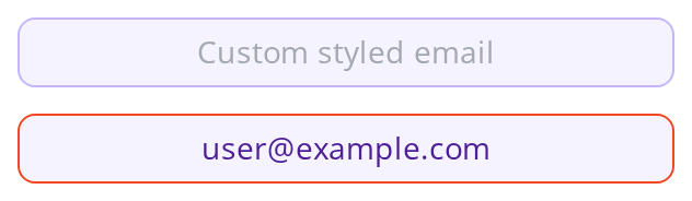
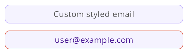
Every overridable variable set on one wrapper -- the variables are listed under CSS variables on this page. The first field shows them all; hover and focus it to see the two border variables. The second holds an address with its error border forced on (hasError), where the theme's error colour replaces the border variables and the rest still apply.
Minimal example
Leave hasError out and the field decides for itself, from the first character typed.
import { useState } from "react";
import { EmailInput } from "@onlyoffice/apps-ui-kit/components/email-input";
import { InputSize } from "@onlyoffice/apps-ui-kit/components/text-input";

export function InviteField() {
  const [email, setEmail] = useState("");

  return (
    <EmailInput
      size={InputSize.base}
      value={email}
      placeholder="name@example.com"
      scale
      onChange={(event) => setEmail(event.target.value)}
    />
  );
}
Props
Inherited from TextInputProps
Declared by components/text-input and accepted here too.
Plus 298 more props inherited from React.AriaAttributes, React.DOMAttributes, React.HTMLAttributes and React.InputHTMLAttributes, forwarded to the element.
Recipes
Error
hasError is the override: pass it and the automatic colouring stops entirely, which is what
you want when the error should only appear after the field is left.
import { useState } from "react";
import {
  EmailInput,
  type TValidate,
} from "@onlyoffice/apps-ui-kit/components/email-input";
import { FieldContainer } from "@onlyoffice/apps-ui-kit/components/field-container";
import { InputSize } from "@onlyoffice/apps-ui-kit/components/text-input";

export function InviteFieldOnBlur() {
  const [email, setEmail] = useState("");
  const [isValid, setIsValid] = useState(true);
  const [wasVisited, setWasVisited] = useState(false);

  const problem = wasVisited && !isValid ? "That is not an email address" : "";

  return (
    <FieldContainer
      isVertical
      labelVisible
      labelText="Email"
      hasError={Boolean(problem)}
      errorMessage={problem}
    >
      <EmailInput
        size={InputSize.base}
        value={email}
        scale
        hasError={Boolean(problem)}
        onValidateInput={(result: TValidate) => setIsValid(result.isValid)}
        onBlur={() => setWasVisited(true)}
        onChange={(event) => setEmail(event.target.value)}
      />
    </FieldContainer>
  );
}
Disabled / read-only
Both come from TextInput unchanged: isDisabled greys the field
and takes it out of the tab order, isReadOnly keeps it reachable but not editable.
import { EmailInput } from "@onlyoffice/apps-ui-kit/components/email-input";
import { InputSize } from "@onlyoffice/apps-ui-kit/components/text-input";

export function AccountEmail({ email }: { email: string }) {
  return (
    <EmailInput
      size={InputSize.base}
      value={email}
      isReadOnly
      scale
      onChange={() => {}}
    />
  );
}
Behaviour the types don't state
- The field is
type="text", nottype="email".typeis removed from the props on purpose and forced to text, so the browser does no validation of its own and a phone shows the ordinary keyboard.autoCompletedefaults to"email", which is the only hint the browser gets. hasErroris an override, not a starting value. Left out, the field colours itself from the parser as soon as anything has been typed — so a half-typed address is red. Passed at all, even asfalse, the automatic colouring is switched off completely.- Validation runs on every keystroke, and also whenever
valuechanges from outside, soonValidateInputfires more often than a user would expect a message to change. Gate the message on blur, not on the callback. errorsare translation keys, produced by the parser —EmailIsIncorrectand the like. They are not sentences, and this component renders none of them.customValidatereplaces the parser entirely,emailSettingsand all; return the same{ value, isValid, errors }shape.emailSettingsmust be anEmailSettingsinstance. The parser throws aTypeErroron a plain object, so build one withEmailSettings.parse({ allowName: true })from@onlyoffice/apps-ui-kit/utils/email. Left out, the parser refuses punycode, IP-address domains, display names, spaces and local domain names, and applies the strict local-part rules; each of those is oneallow…flag.isAutoFocussedis ignored on an iOS phone. The component forces it off there, because the on-screen keyboard opening on load hides the rest of the form.testIdis not a prop here — it is removed fromTextInput's props and replaced bydataTestId, which defaults toemail-input.- The value is held in the component's own state and re-synced whenever
valuechanges, so it behaves as a controlled field as long as you keep passingvalue.
CSS variables
The field is a TextInput, so its variables apply here; set them on
any ancestor. --email-input-align is this component's own.
While the field is in its error state the theme's error colour replaces all three border variables; the background, text colour, radius, font size and alignment still apply.
Accessibility
- The field has no label of its own — use
FieldContainerorLabelwithhtmlFor, or passaria-label. - Nothing is announced when the address is wrong. The only signal is the border colour, and
the field carries no
aria-invalid, so set it yourself alongside a message tied witharia-describedby. - Because the input is
type="text", assistive technology is not told the field wants an email address.autoComplete="email"is the only machine-readable hint. - Colouring the field before the address is finished is noise for everyone; gating the error on blur, as in the recipe above, is kinder.
Test ids
Related
TextInput— the field underneath, and where the rest of the props are documented.FieldContainer— the label and error message around it.InputBlock— for a field that needs an icon at its end.