FieldContainer
Layout wrapper for one form field: an optional label with a help tooltip, the control itself, and its error message. It owns the spacing between fields and the horizontal-versus-vertical arrangement of label and control.


Use this when / not when
- Use when a control needs a label, a help tooltip or a validation message — that is, for nearly every field in a settings or creation form.
- Not for a label on its own — use
Label, which is what this component renders internally. - Not for a standalone help icon outside a form — use
HelpButtondirectly. - Not as a general two-column layout: the horizontal arrangement collapses to vertical on tablet widths and below, and that is not configurable.
Import
import { FieldContainer } from "@onlyoffice/apps-ui-kit/components/field-container";
Also exported from the root barrel @onlyoffice/apps-ui-kit.
Needs ThemeProvider from @onlyoffice/apps-ui-kit/providers/theme above it in the tree:
the error message takes its colour from a theme-scoped custom property and falls back to an
unset value without the provider.
Stories
Default
The label sits in a fixed-width column beside the control, with a help icon that opens a tooltip on click. Click the caption to focus the input (labelFor); change any other prop live in the Controls panel below.
Required
Marks a field the form cannot be sent without: an asterisk follows the caption, and the label is announced as required (isRequired).


With Error
Tells the user what to correct right under the field: the message appears only while hasError is set, in errorColor, wrapped at errorMessageWidth. The red border belongs to the input, which gets its own hasError.


Vertical Layout
For narrow forms and long captions: the label stacks above the control, and both span the full width of the container (isVertical). The label column width does not apply here.


With Inline Help
Makes the help icon part of the caption: it is rendered inside the label, after its text, so it follows the caption's own layout instead of standing as a separate element beside it (inlineHelpButton).


Custom Styling
Sets the container apart from the page, here with a background, padding and rounded corners, through style and className.
Css Customization
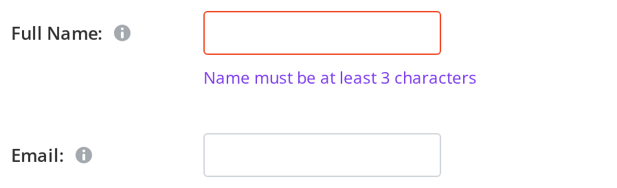
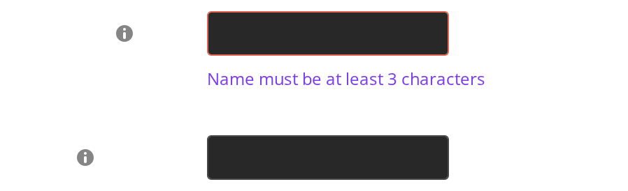
Every overridable variable set on one wrapper -- the variables are listed under CSS variables on this page.
- Full Name — the error message shows the custom colour and top padding
- Email — the gap between the two fields is the custom container margin
Minimal example
labelVisible is not optional in practice — without it there is no label at all. labelFor
and the control's id are the pair that makes the caption belong to the field.
import { useState } from "react";
import { FieldContainer } from "@onlyoffice/apps-ui-kit/components/field-container";
import {
  InputSize,
  InputType,
  TextInput,
} from "@onlyoffice/apps-ui-kit/components/text-input";

export function NameField() {
  const [name, setName] = useState("");
  const hasError = name.trim() === "";

  return (
    <FieldContainer
      isVertical
      labelVisible
      labelText="Room name"
      labelFor="room-name"
      isRequired
      hasError={hasError}
      errorMessage="Enter a name"
    >
      <TextInput
        scale
        id="room-name"
        type={InputType.text}
        size={InputSize.base}
        value={name}
        onChange={(e) => setName(e.target.value)}
        hasError={hasError}
      />
    </FieldContainer>
  );
}
Props
Recipes
Validation
The error message needs both hasError and errorMessage; either alone renders
nothing.
import { useState } from "react";
import { FieldContainer } from "@onlyoffice/apps-ui-kit/components/field-container";
import {
  InputSize,
  InputType,
  TextInput,
} from "@onlyoffice/apps-ui-kit/components/text-input";

export function EmailField() {
  const [email, setEmail] = useState("");
  const [touched, setTouched] = useState(false);
  const hasError = touched && !email.includes("@");

  return (
    <FieldContainer
      isVertical
      labelVisible
      labelText="Email"
      hasError={hasError}
      errorMessage="Enter a valid email address"
    >
      <TextInput
        scale
        tabIndex={0}
        type={InputType.email}
        size={InputSize.base}
        value={email}
        hasError={hasError}
        onBlur={() => setTouched(true)}
        onChange={(e) => setEmail(e.target.value)}
      />
    </FieldContainer>
  );
}
A stack of fields
The component already spaces itself 16px down. Do not add a gap to the parent — the two
add up.
import type { ReactNode } from "react";

export function SettingsForm({ children }: { children: ReactNode }) {
  // No gap here: each FieldContainer carries its own 16px bottom margin.
  return (
    <div style={{ display: "flex", flexDirection: "column" }}>{children}</div>
  );
}
With a help tooltip
import type { ReactElement } from "react";
import { FieldContainer } from "@onlyoffice/apps-ui-kit/components/field-container";

export function QuotaField({ children }: { children: ReactElement }) {
  return (
    <FieldContainer
      isVertical
      labelVisible
      labelText="Storage quota"
      tooltipContent="Applies to every room in this space."
    >
      {children}
    </FieldContainer>
  );
}
Behaviour the types don't state
labelVisibledefaults tofalse, and the whole label block is behind it. PassinglabelTextalone renders no label, no required marker and no help button — the field looks unlabelled and nothing reports a problem. PasslabelVisibleon every field that has a label.- The container carries its own
margin: 0 0 16px. A parent'sgapadds to it rather than replacing it, so a flex column withgap: 16spaces fields 32px apart. Either drop the gap, or passremoveMarginand own the spacing. The margin is also settable as a whole through--field-container-margin. - The error message needs
hasErroranderrorMessage. It is not rendered otherwise and no space is reserved for it, so the form below shifts down by the height of the message the first time a field becomes invalid. - Horizontal is not a guarantee. Without
isVerticalthe label sits beside the control, but at tablet width and below the stylesheet switches to the vertical arrangement. Layouts that depend on the two-column form must handle both. stylelands on two elements. It is spread onto the container and onto the error message, so astylemeant for the field also restyles the error text.maxLabelWidthonly does something in the horizontal arrangement, where it sets the label column's width. In vertical it is still written to the DOM asdata-label-widthbut changes nothing.labelForis what ties the caption to the control. Without it the label captions nothing: clicking it focuses nothing and a screen reader announces the field unnamed. Pass the control'sidhere and the sameidto the control.icon,helpButtonHeaderContentandoffsetRightare gone. They were accepted and read nowhere; passing one now fails to compile rather than doing nothing. Nothing changes at runtime, because nothing ever happened.
CSS variables
--label-width and --error-width are written onto the element from the maxLabelWidth
and errorMessageWidth props, so setting them from a stylesheet has no effect; set the
props instead. --error-color is written the same way from errorColor, but only when
that prop is given — without it, a value set on a wrapper reaches the message. The theme
fallback behind it, --input-error-color, is set on the message element itself for the
light and dark themes, so it cannot be overridden from outside.
Accessibility
- Associate the label with the control through
labelFor. Give the control anidand pass that sameidhere; the label then carriesfor, clicking it focuses the field and a screen reader announces the caption as the field's name. Left out, the label is a caption in appearance only — it used to be rendered with an emptyhtmlFor, which is the same thing and could not be fixed from outside. isRequiredputsaria-required="true"on the label element — again, not on the control. Setrequiredoraria-requiredon the control as well. The asterisk it draws isaria-hidden, so a screen reader hears the caption without it.- The error message is plain text. It is not a live region and is not referenced by
aria-describedby, so a screen reader will not announce it when it appears. Addaria-describedbyand anidyourself if the form must be accessible.
Test ids
| Element | data-testid | Override |
|---|---|---|
| Container | field-container | dataTestId |
| Help button | <dataTestId>_help_button | Only set when dataTestId is given; otherwise the help button keeps its own default |
The container also carries data-vertical and data-label-width, which the component's own
tests assert against.
Related
Label— the label element this component renders.HelpButton— the tooltip trigger it renders whentooltipContentis set.TextInput— the control most often placed inside it.