RadioButton
One option of a single-choice set, drawn as a labelled circle. It is a <label> wrapping a
visually hidden <input type="radio"> and the kit's own circle icon.


Use this when / not when
- Use for a single option you are placing by hand, usually alongside others that share a
name. - Prefer
RadioButtonGroupfor a set: it owns the selected value, wires every button to one handler and keeps them apart. Reach for this component only when the options are not a plain list. - Not for an on/off setting —
CheckboxorToggleButtonis that. - Not for more than a handful of options; a
ComboBoxis kinder past five or six.
Import
import { RadioButton } from "@onlyoffice/apps-ui-kit/components/radio-button";
Also exported from the root barrel @onlyoffice/apps-ui-kit.
RadioButtonProps is not exported — type a wrapper's props yourself.
Needs ThemeProvider from @onlyoffice/apps-ui-kit/providers/theme for the circle and text
colours, which differ between the light and the dark theme.
Stories
Default
A single labelled button, the starting point for any single-choice option; click it to fill in the circle, and change any other prop live in the Controls panel below.
Checked States
The two looks a button can take side by side, so the filled-in choice is easy to tell from the rest: an empty circle and a circle with a dot (isChecked).


Disabled States
A disabled button, empty or filled in, shows an option the user can see but not change: the circle and the label turn grey and clicks are ignored (isDisabled).


Custom Styling
Larger or smaller label text for a button placed in a heading or a dense list: Custom styled at 16px semibold, Small text at 11px light (fontSize, fontWeight).


With Spacing
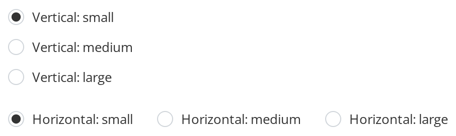
A set of buttons needs room between them, because without a gap they touch:
- Vertical — a column with 12px below every button but the last (
spacing, the defaultorientation) - Horizontal — a row with 24px before every button but the first (
spacing,orientation="horizontal")
The container still lays the buttons out; orientation only decides which side the gap goes on. Pick an option in each set with a click or the arrow keys.
Css Customization
The variables are listed under CSS variables on this page. The example is one checked button, so it shows every variable at once: the violet dot and outline, the light violet fill, the dark violet text and the wider gap. Hover it to see the darker outline.

Minimal example
A set is several buttons sharing one name, each told whether it is the chosen one.
import { useState } from "react";
import { RadioButton } from "@onlyoffice/apps-ui-kit/components/radio-button";

const ROLES = ["Viewer", "Editor", "Room admin"];

export function RolePicker() {
  const [role, setRole] = useState("Viewer");

  return (
    <div>
      {ROLES.map((option) => (
        <RadioButton
          key={option}
          name="role"
          value={option}
          label={option}
          isChecked={role === option}
          spacing="12px"
          onClick={() => setRole(option)}
        />
      ))}
    </div>
  );
}
Props
Recipes
Disabled / read-only
isDisabled disables the input and greys both the circle and the label. There is no read-only state: a radio the
user may see but not change has to be disabled, or rendered as text.
import { RadioButton } from "@onlyoffice/apps-ui-kit/components/radio-button";

export function LockedChoice({ chosen }: { chosen: string }) {
  return (
    <RadioButton
      name="plan"
      value={chosen}
      label={`${chosen} (set by your administrator)`}
      isChecked
      isDisabled
    />
  );
}
Fully controlled, with onChange
onChange replaces the component's internal toggle, which is what you want when the value
lives in your state — but it also switches onClick off, so move the handler across.
import { useState } from "react";
import { RadioButton } from "@onlyoffice/apps-ui-kit/components/radio-button";

export function ControlledChoice() {
  const [plan, setPlan] = useState("monthly");

  return (
    <div>
      {["monthly", "yearly"].map((option) => (
        <RadioButton
          key={option}
          name="plan"
          value={option}
          label={option}
          isChecked={plan === option}
          spacing="8px"
          onChange={(event) => setPlan(event.target.value)}
        />
      ))}
    </div>
  );
}
Behaviour the types don't state
onChangeandonClickare alternatives, not companions. The component installs its own change handler — which flips an internalisCheckedand then callsonClick— only whileonChangeis absent. PassonChangeandonClickis never called at all.- It keeps its own checked state.
isCheckedseeds it and re-applies on every change of the prop, so a click moves the dot even if your state never changes. WithonChangethe internal toggle is gone and only the prop moves it. - Without
spacingthe buttons touch. The gap is a custom property set from the prop, and the rule that uses it is only switched on when the prop is truthy. There is no default gap, whatever older documentation said. spacingskips an edge. Horizontally it is not applied to the first button, vertically not to the last, so the row or column is not padded at its ends.orientationlays nothing out. It only decides which sidespacingis applied to; the buttons follow whatever your container does. Its default here isvertical, whileRadioButtonGroupdefaults tohorizontal.idlands on the label, not on the input, so it cannot be the target of an external<label for>— the input is already nested inside this one.- The input is hidden but focusable (
opacity: 0.0001,z-index: -1), and nothing draws a focus ring. A keyboard user moving through the set gets no visible cue. labelfalls back tovalue, so a button with neither shows nothing beside the circle.
CSS variables
A disabled button ignores all of them except --radio-button-gap: it draws its own grey fill,
outline, dot and text, and its outline does not change on hover.
--radio-button-spacing is written by the spacing prop; set the prop rather than the variable.
Accessibility
- The markup is right — a real
<input type="radio">inside its<label>— so a screen reader announces a radio button with its checked state, named by the text beside the circle, and the set is reachable with Tab, traversable with the arrow keys and selected with Space as long as the buttons share aname. - There is no focus ring. The input is hidden with opacity, and no
:focus-visiblestyle replaces the browser's own outline, so keyboard users cannot see where they are. Add one in your application until the kit does. - Nothing groups the set: add a
<fieldset>and<legend>, or a container withrole="radiogroup"and a label, or the options are announced with no question attached. isDisableddisables the input properly, so it drops out of the tab order.
Test ids
Related
RadioButtonGroup— the set, with the selection handled.Checkbox— for choices that are not exclusive.ToggleButton— for a single on/off setting.