RadioButtonGroup
A set of radio buttons built from an array, with the selected value handled for you. It renders
one RadioButton per option and keeps them in step.


Use this when / not when
- Use for a short list of mutually exclusive choices — a role, a plan, a sort order.
- Not for a single option placed by hand;
RadioButtonis that. - Not past five or six options — a
ComboBoxcosts less room and is easier to scan. - Not for choices that are not exclusive.
Checkboxis that.
Import
import { RadioButtonGroup } from "@onlyoffice/apps-ui-kit/components/radio-button-group";
Also exported from the root barrel @onlyoffice/apps-ui-kit.
RadioButtonGroupProps is not exported — type a wrapper's props yourself.
Needs ThemeProvider from @onlyoffice/apps-ui-kit/providers/theme for the buttons' colours.
Stories
Default
The group as most forms use it: a row of options with one chosen. Click another option to move the choice and watch the Actions panel for the value onClick receives; change any other prop live in the Controls panel below.
Vertical Layout
The options stacked in a column only as wide as its longest label (orientation). Suits longer lists and labels too long to sit side by side; without spacing the buttons sit directly under one another.


Disabled States
Shows the two ways to take options out of play:
- Left — the whole group greyed out and unclickable at once (
isDisabled), for a setting that does not apply right now - Right — only "Disabled Option" is greyed out (
disabledon the option), while the other three stay selectable


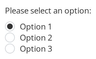
With Text Label
"Please select an option:" is a caption placed inside the group, not a button (an option with type: "text"). Use it for a heading or an instruction above the options, or between two runs of them.
Custom Styling
Larger, bolder labels (fontSize, fontWeight), 20px between the buttons (spacing) and a group 300px wide (width), to match the group to the text and layout around it.


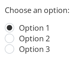
Css Customization
Both caption spacings set on a wrapper around a vertical group that opens with the caption "Choose an option:" -- the variables are listed under CSS variables on this page.
Minimal example
onClick receives the input's change event, so the new value is event.target.value.
import { useState } from "react";
import { RadioButtonGroup } from "@onlyoffice/apps-ui-kit/components/radio-button-group";

export function SortOrder() {
  const [order, setOrder] = useState("name");

  return (
    <RadioButtonGroup
      name="order"
      selected={order}
      spacing="16px"
      onClick={(event) => setOrder(event.target.value)}
      options={[
        { value: "name", label: "Name" },
        { value: "date", label: "Last modified" },
        { value: "size", label: "Size" },
      ]}
    />
  );
}
Props
Inherited from RadioButtonProps
Declared by components/radio-button and accepted here too.
TRadioButtonOption
Recipes
Disabled / read-only
isDisabled on the group disables every option; disabled on an option disables that one.
Both end up on the real <input>, so a disabled option leaves the tab order.
import { useState } from "react";
import { RadioButtonGroup } from "@onlyoffice/apps-ui-kit/components/radio-button-group";

export function PlanPicker({ canUpgrade }: { canUpgrade: boolean }) {
  const [plan, setPlan] = useState("free");

  return (
    <RadioButtonGroup
      name="plan"
      selected={plan}
      spacing="16px"
      onClick={(event) => setPlan(event.target.value)}
      options={[
        { value: "free", label: "Free" },
        { value: "pro", label: "Pro", disabled: !canUpgrade },
      ]}
    />
  );
}
Options in labelled runs
An option with type: "text" is not a button but a caption, so one array can carry several
labelled runs of choices.
import { useState } from "react";
import { RadioButtonGroup } from "@onlyoffice/apps-ui-kit/components/radio-button-group";

export function AccessPicker() {
  const [access, setAccess] = useState("viewer");

  return (
    <RadioButtonGroup
      name="access"
      orientation="vertical"
      spacing="8px"
      selected={access}
      onClick={(event) => setAccess(event.target.value)}
      options={[
        { value: "people-heading", type: "text", label: "People" },
        { value: "viewer", label: "Viewer" },
        { value: "editor", label: "Editor" },
        { value: "links-heading", type: "text", label: "Links" },
        { value: "public", label: "Anyone with the link" },
      ]}
    />
  );
}
Behaviour the types don't state
onClickis a change handler. It is wired to the input'sonChange, so it is given aChangeEventand the new value isevent.target.value— a string, even for an option whosevaluewas a number. It is also the one required callback.- The comparison is stringified.
selectedis matched against each option with template strings, so1and"1"both select the option whose value is1. - The group keeps its own selection.
selectedseeds it and re-applies on change, so the dot moves on click whether or not your state does. - Without
spacingthe options touch. The gap comes from each button's ownspacingprop, which the group passes straight through, and there is no default. orientationdefaults tohorizontalhere and toverticalon a loneRadioButton. Horizontal makes the group a flex row; vertical makes itinline-block, so a vertical group shrinks to its content rather than filling its parent.widthis applied twice — as the--radio-button-group-widthcustom property and as an inlinewidth— andstyleis spread after, so awidthinstylewins over the prop.- An option's
valueis its React key. Two options sharing a value collide, and a caption row uses a fixed key of its own, so twotype: "text"entries collide with each other. - Nothing groups the set semantically. The wrapper is a plain
<div>; add a<fieldset>with a<legend>, orrole="radiogroup"with a label, yourself. - An option's
dataTestIdfalls back to itsidfor the button's test id, while the caption row usesradio-button-group_text.
CSS variables
| Variable | Default | Effect |
|---|---|---|
--radio-button-group-subtext-top | 16px | Space above a type: "text" caption |
--radio-button-group-subtext-bottom | 8px | Space below it |
--radio-button-group-width is written by the width prop. The buttons' own variables are
listed on RadioButton.
Accessibility
- The buttons share a
name, so the browser treats them as one radio group: Tab reaches the set and the arrow keys move within it. - There is no focus ring, because the inputs are hidden with opacity and nothing replaces
the browser outline. See
RadioButton. - The group has no accessible name. Wrap it in a
<fieldset>with a<legend>, or give the containerrole="radiogroup"andaria-labelledby. - A
type: "text"caption is a plain paragraph, not a legend, so it does not name the options that follow it for a screen reader.
Test ids
| Element | data-testid |
|---|---|
| The group | radio-button-group, or dataTestId |
| A caption row | radio-button-group_text, or the option's dataTestId |
| An option | the option's dataTestId, else its id |
Related
RadioButton— one option, placed by hand.Checkbox— for choices that are not exclusive.ComboBox— for a longer list of the same choices.