Button
Labelled action button with an optional icon, a loading state and a tooltip, in a primary or
secondary variant. It renders a real <button>, so form submission and keyboard activation
work natively.


Use this when / not when
- Use when the user triggers an action in place: submitting a form, confirming a dialog, opening a panel.
- Not for an icon-only control that has to fit a fixed slot — use
IconButton, which is sized by ansizein pixels and keeps an accessible name without a visible label. - Not for reporting an operation already in flight —
LoadingButtonis a circular progress ring with a cancel cross, which is a different control from this component'sisLoading. - Not for the "create new" entry at the top of the portal's main menu — that is
MainButton.
Import
import { Button, ButtonSize } from "@onlyoffice/apps-ui-kit/components/button";
Also exported from the root barrel @onlyoffice/apps-ui-kit.
Needs ThemeProvider from @onlyoffice/apps-ui-kit/providers/theme above it in the tree.
Without it the button still renders, but always in the light palette and without the
portal's accent colour, because the dark rules are scoped under a global .dark class the
provider sets.
Stories
Default
The secondary button, for any action that is not the main one of a view; click it to see onClick in the Actions panel, and change any other prop live in the Controls panel below.
Primary Buttons
Primary buttons are used for main actions. They have a solid background color.


Secondary Buttons
Secondary buttons are used for secondary actions. They sit on the page background with a grey border that changes colour on hover.


With Icon Buttons
Buttons can include icons alongside text. Icons are displayed before the label.


Is Loading Buttons
Loading state displays a spinner and disables interaction. Use for async operations.


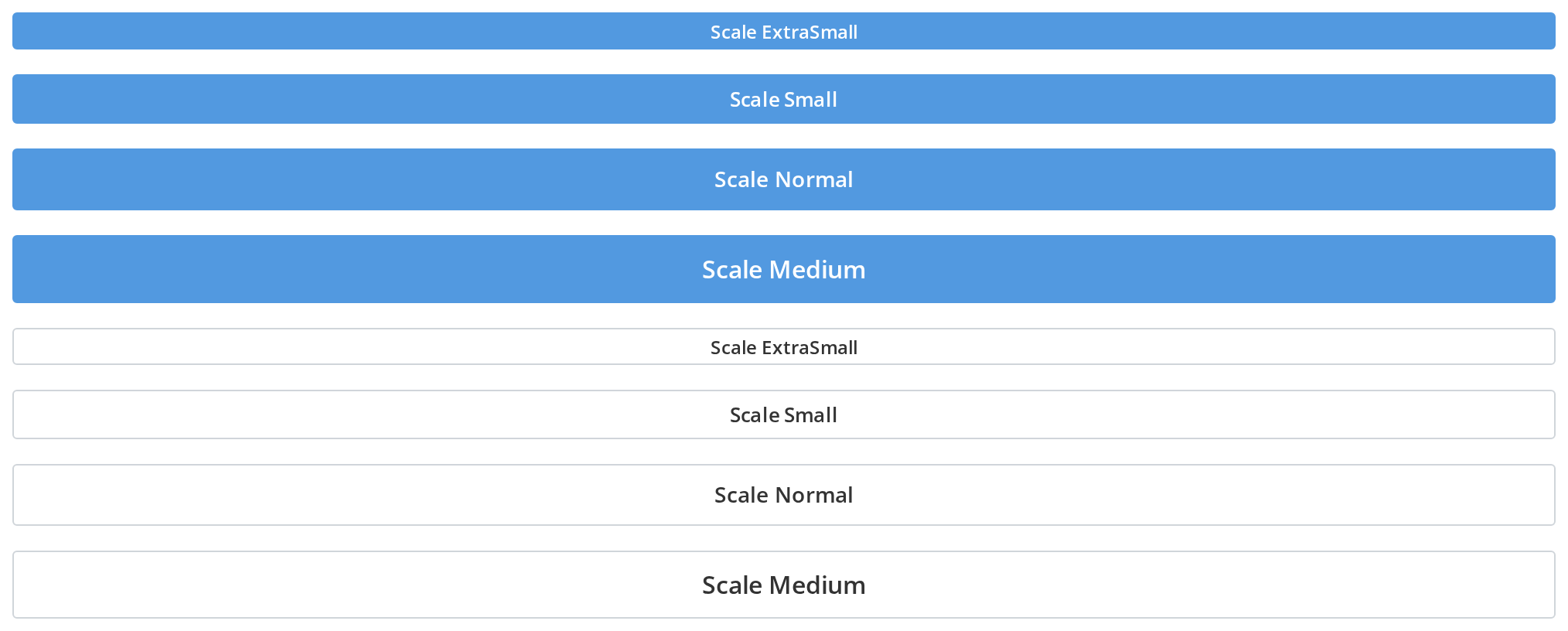
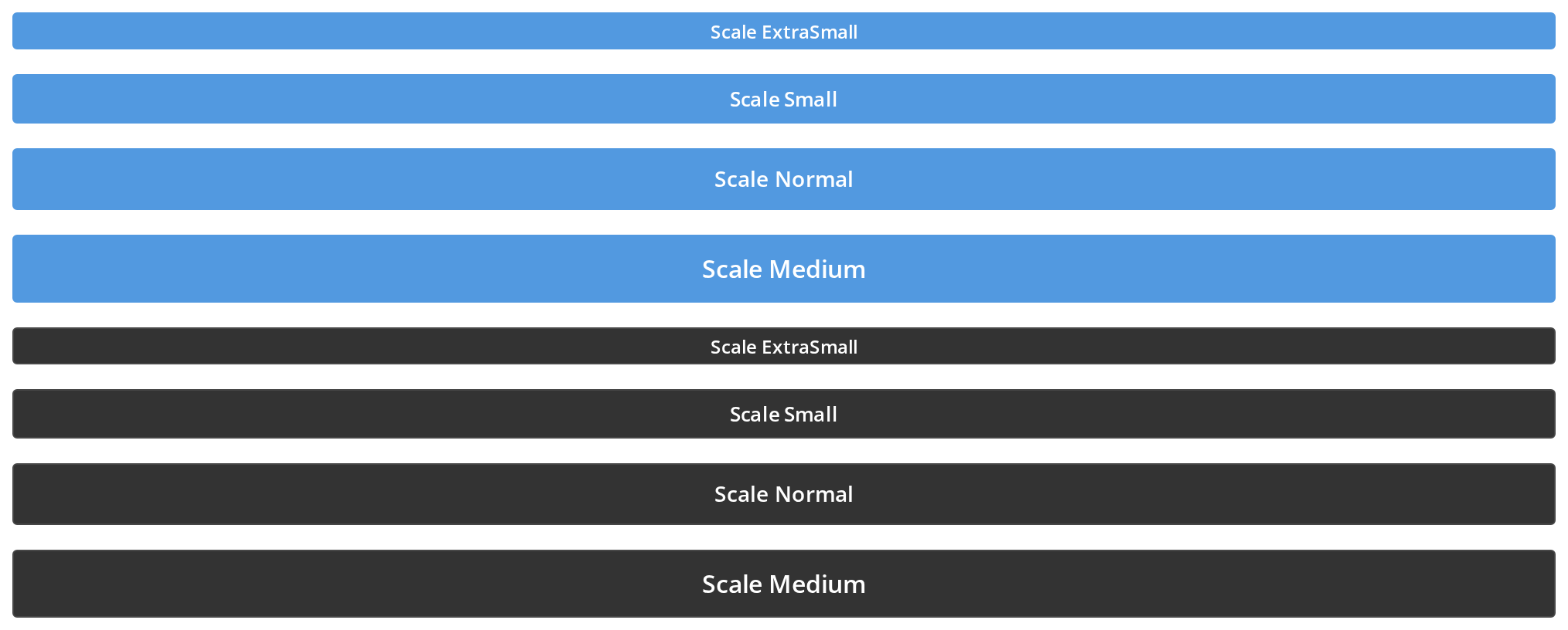
Scale Buttons
Scale prop makes buttons expand to 100% of their container width. Useful for mobile layouts.
Disabled Buttons
Disabled buttons cannot be clicked or focused: the secondary one turns grey, the primary one fades to 60% opacity (isDisabled).


Clicked Buttons
The pressed look drawn while nothing presses the button (isClicked), for a button whose action is already under way, such as the one that opened the menu now on screen.


Hovered Buttons
The hover look drawn while the pointer is elsewhere (isHovered), for a button that should light up together with the element it belongs to, such as a hovered row.


Filled Buttons
A quiet grey button with no border, for toolbar actions that should not compete with the content (filled). The first row shows that an icon is repainted in the text colour, whatever colour it was drawn in.


Filled Stroke Buttons
An outline-style icon on a filled button: in the first row the filled button paints the icon's shapes solid, in the second it keeps the outline (filled with filledStroke). filledStroke changes nothing without filled.


With Tooltip
Buttons can display tooltips on hover. Hover over the buttons to see the tooltip text.


Accent Buttons
An emphasised action that should stand out without taking the place of the primary one: a light accent tint with accent text, and an icon repainted in the same colour (accent).


Css Customization
Every overridable variable set on one wrapper -- the variables are listed under CSS variables on this page. Hover and press the buttons to see the hover and pressed values.
- Secondary — the
--button-root-*colours, the radius, the weight and thenormalsize's height and font size - Primary — the
--button-primary-*colours - Disabled — the
--button-root-*-disabledvalues (isDisabled) - Disabled primary — the
--button-primary-*-disabledvalues, faded to 60% opacity by the component (primarywithisDisabled)


Minimal example
import { useState } from "react";
import { Button, ButtonSize } from "@onlyoffice/apps-ui-kit/components/button";

export function SaveRow() {
  const [isSaving, setIsSaving] = useState(false);

  const save = async () => {
    setIsSaving(true);
    try {
      await fetch("/api/settings", { method: "POST" });
    } finally {
      setIsSaving(false);
    }
  };

  return (
    <div style={{ display: "flex", gap: 8 }}>
      <Button
        primary
        scale
        size={ButtonSize.normal}
        label="Save"
        isLoading={isSaving}
        onClick={save}
      />
      <Button scale size={ButtonSize.normal} label="Cancel" />
    </div>
  );
}
Props
Added by the wrapper the folder exports
The index module exports a wrapped component, so these are accepted on top of the props above.
Enums
Recipes
Loading
isLoading is yours to drive around the await — the button does not track the promise.
import { useState } from "react";
import { Button } from "@onlyoffice/apps-ui-kit/components/button";

export function DeleteButton({ onDelete }: { onDelete: () => Promise<void> }) {
  const [isDeleting, setIsDeleting] = useState(false);

  return (
    <Button
      primary
      label="Delete"
      isLoading={isDeleting}
      onClick={async () => {
        setIsDeleting(true);
        try {
          await onDelete();
        } finally {
          setIsDeleting(false);
        }
      }}
    />
  );
}
Disabled
import { Button } from "@onlyoffice/apps-ui-kit/components/button";

export function SubmitButton({ isValid }: { isValid: boolean }) {
  return <Button primary label="Submit" isDisabled={!isValid} />;
}
With an icon
icon takes a node, and the node is yours: the package does not publish its icon set, so
import the SVG through your own bundler. There is no iconName prop.
import DownloadIcon from "./icons/download.svg?react";
import { Button } from "@onlyoffice/apps-ui-kit/components/button";

export function DownloadButton({ onDownload }: { onDownload: () => void }) {
  return (
    <Button label="Download" icon={<DownloadIcon />} onClick={onDownload} />
  );
}
A row of buttons in a dialog footer
Primary first, then the secondary action; scale makes them share the width evenly.
import { Button, ButtonSize } from "@onlyoffice/apps-ui-kit/components/button";

export function DialogFooter({
  onConfirm,
  onCancel,
}: {
  onConfirm: () => void;
  onCancel: () => void;
}) {
  return (
    <div style={{ display: "flex", gap: 8, width: "100%" }}>
      <Button
        primary
        scale
        size={ButtonSize.normal}
        label="Delete"
        onClick={onConfirm}
      />
      <Button
        scale
        size={ButtonSize.normal}
        label="Cancel"
        onClick={onCancel}
      />
    </div>
  );
}
Behaviour the types don't state
type="reset"does nothing. The component narrows it totype === "submit" ? "submit" : "button", so a reset button renders as a plain button and never resets its form. Only"submit"and the default"button"are real.aria-label,aria-disabledandaria-busyare computed and overwrite what you pass. They are spread onto the element before the component sets its own, soaria-labelalways ends up equal tolabel,aria-disabledis set only whenisDisabled, andaria-busyonly whenisLoading. A customaria-labelalongside alabelis discarded.isLoadingalso disables the button. The element getsdisabled={isDisabled || isLoading}, and the content is hidden withvisibility: hiddenwhile the loader is laid over it absolutely — so the button keeps its width and the layout does not jump.- The label never wraps. The root is
white-space: nowrap; overflow: hidden; text-overflow: ellipsis. A label wider than the button is clipped with an ellipsis, and neitherscalenorminWidthhelps: both size the button against its container, never against its text. Give the button a width of its own if the label must fit. - There are two independent tooltips.
tooltipTextis rendered by the component itself, always below the button (place="bottom",offset={10}, floating).titleandtooltipContentare handled by thewithTooltipwrapper thatindex.tsxexports. Setting both shows two tooltips; pick one. - The props type is closed.
ButtonPropsdoes not extendButtonHTMLAttributes, soname,form,autoFocusand friends are TypeScript errors even though the component spreads unknown props onto the element at runtime. - The variants are not mutually exclusive in the type.
primary,filledandaccentcan all be passed together; the stylesheet decides, andaccent— declared last — wins. Pass one.
CSS variables
Set these on an ancestor to retheme the button. Everything else the stylesheet defines is private to it.
Each state colour also has an override. The secondary variant reads the --button-root-* set,
the primary one the matching --button-primary-* set; the filled and accent variants read
none of them, because their colours are set on the button itself and a wrapper cannot change them.
There is no destructive variant. The stylesheet has nothing red: a delete confirmation is
an ordinary primary button, and making it red means overriding --accent-button. Put it on
the button itself — style is forwarded to the <button> element, so
style={{ "--accent-button": "#f21c0e" } as CSSProperties} is enough, and it needs no wrapper
element. Do not set it on the dialog or the panel around the button: that recolours everything
accented inside, the close button included.
Reach for a wrapper element only when the variable has to cover several buttons at once, and
not inside a row that shares its width — a wrapped scale button stops being an equal flex
item and shrinks to its label.
Accessibility
- Renders a native
<button>, so Enter and Space activate it and it takes part in tab order without help. Both are covered by the component's tests. aria-labelis taken fromlabel,aria-disabledis set whileisDisabled, andaria-busywhileisLoading.- An icon-only button has no accessible name. With no
labelthere is noaria-labeleither, and a custom one would be overwritten. Give it alabel, or useIconButton. - The focus ring is removed and not replaced (
:focus { outline: none }), so keyboard focus is invisible unless the consuming application styles it. Add a:focus-visiblerule of your own if the button is reachable by keyboard.
Test ids
The root also carries data-size with the current ButtonSize, which is what the
component's own size tests assert against.
Related
IconButton— icon-only control for a fixed-size slot.LoadingButton— circular progress ring with a cancel cross, for an operation already running.MainButton— the portal's main-menu "create new" button.