DragAndDrop
Wrapper that turns whatever is inside it into a drop target for files, with no interface of its own. It is what the portal puts around a folder row so that files can be dropped onto that folder — not a visible upload area.
Use this when / not when
- Use to make an existing element — a row, a tile, a panel — accept dropped files.
- Not as the upload control itself —
Dropzoneis the bordered area with a picture, a prompt and a file dialog. - It draws nothing until you say a drag is happening. The background is painted only when you
pass
dragging; without it the stylesheet forces the background off with an!importantrule, so a drop target with nodraggingflag gives no feedback at all. - It filters nothing. There is no
accept, no size limit and no rejection callback: every dropped file arrives inonDrop. - It provides no file dialog. There is no click-to-browse and no input element; drag is the only way in.
Import
import { DragAndDrop } from "@onlyoffice/apps-ui-kit/components/drag-and-drop";
Also exported from the root barrel @onlyoffice/apps-ui-kit.
Needs ThemeProvider above it in the tree: the two drag colours are declared only under the
.light and .dark classes the provider puts on <body>, so without it the highlight resolves to
an invalid value and nothing is painted.
Stories
Default
The usual setup: the host keeps its own drag flag and passes it back. Drag files from your desktop over the box to see the background change and the dropped files arrive in the Actions panel (onDragOver, dragging, onDrop).
With Dragging State
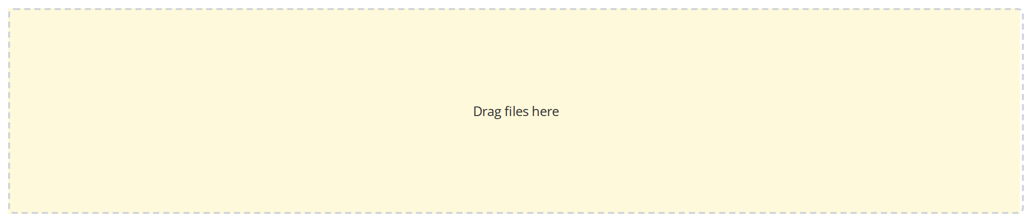
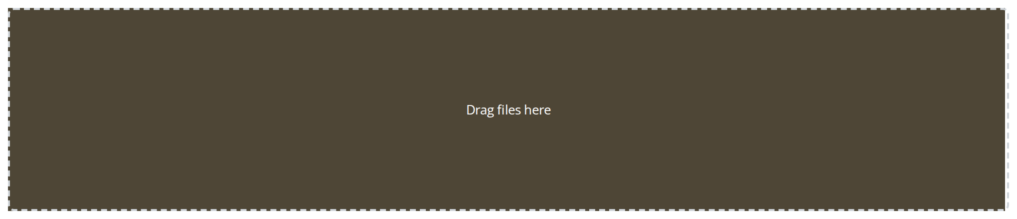
The drag background held on without an actual drag, to check how the highlight looks in each theme (dragging). Drag a file over it to see the stronger accept colour on top.
Disabled
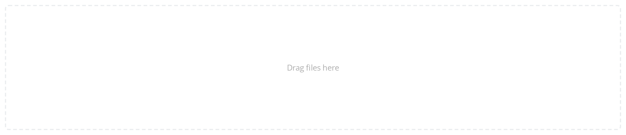
A target the user may not upload to, faded to 40% (isDragDisabled). The fade is only a look: drop a file and it still arrives in the Actions panel, so the host has to ignore it in onDrop.
Nested Targets
A folder row inside a panel that also takes files. Drop a file on the inner box: with isDropZone on, the outer counter goes up and the inner one does not, because the drop is handed to the outer target. Turn isDropZone off in the Controls panel below and the inner box keeps the drop.


Css Customization
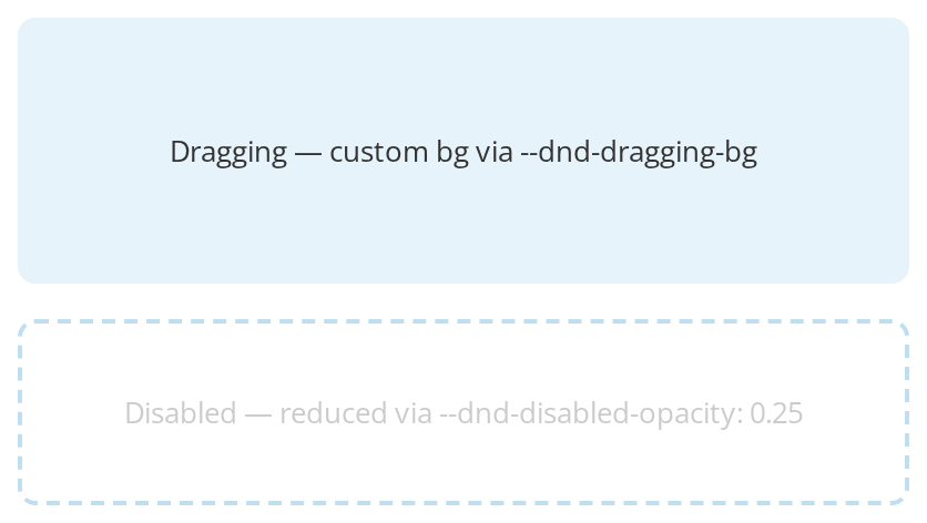
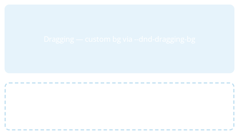
One wrapper sets all three -- the variables are listed under CSS variables on this page. The first box is held in the dragging state for --dnd-dragging-bg; drag a file over it to see --dnd-accept-bg. The second box is there for --dnd-disabled-opacity, which only isDragDisabled switches on.
Minimal example
import { DragAndDrop } from "@onlyoffice/apps-ui-kit/components/drag-and-drop";
import { Text } from "@onlyoffice/apps-ui-kit/components/text";

export function DropTarget({ upload }: { upload: (files: File[]) => void }) {
  return (
    <DragAndDrop style={{ padding: 24 }} onDrop={upload}>
      <Text>Drop files onto this folder</Text>
    </DragAndDrop>
  );
}
Props
Recipes
Showing that a drag is happening
dragging is yours to hold. The usual source is a page-level drag counter, because this component
tells you about its own element only.
import { useEffect, useState } from "react";

import { DragAndDrop } from "@onlyoffice/apps-ui-kit/components/drag-and-drop";
import { Text } from "@onlyoffice/apps-ui-kit/components/text";

export function FolderDropTarget({ upload }: { upload: (f: File[]) => void }) {
  const [dragging, setDragging] = useState(false);

  useEffect(() => {
    let depth = 0;
    const enter = () => {
      depth += 1;
      setDragging(true);
    };
    const leave = () => {
      depth -= 1;
      if (depth === 0) setDragging(false);
    };
    const drop = () => {
      depth = 0;
      setDragging(false);
    };

    document.addEventListener("dragenter", enter);
    document.addEventListener("dragleave", leave);
    document.addEventListener("drop", drop);
    return () => {
      document.removeEventListener("dragenter", enter);
      document.removeEventListener("dragleave", leave);
      document.removeEventListener("drop", drop);
    };
  }, []);

  return (
    <DragAndDrop dragging={dragging} onDrop={upload} style={{ padding: 24 }}>
      <Text>Contracts</Text>
    </DragAndDrop>
  );
}
Disabled / read-only
isDragDisabled fades the element to 40%, and that is all it does — the drop still goes through.
Guard onDrop yourself as well.
import { DragAndDrop } from "@onlyoffice/apps-ui-kit/components/drag-and-drop";
import { Text } from "@onlyoffice/apps-ui-kit/components/text";

export function ReadOnlyFolder({
  canUpload,
  upload,
}: {
  canUpload: boolean;
  upload: (files: File[]) => void;
}) {
  return (
    <DragAndDrop
      isDragDisabled={!canUpload}
      onDrop={(files) => {
        if (canUpload) upload(files);
      }}
      style={{ padding: 24 }}
    >
      <Text>Archive</Text>
    </DragAndDrop>
  );
}
Nesting one target inside another
By default a drop is handled here and goes no further. isDropZone lets the events bubble, so the
outer target takes the drop — its onDrop fires, and the inner one's does not.
import { DragAndDrop } from "@onlyoffice/apps-ui-kit/components/drag-and-drop";
import { Text } from "@onlyoffice/apps-ui-kit/components/text";

export function NestedTargets({
  toRoot,
  toFolder,
}: {
  toRoot: (files: File[]) => void;
  toFolder: (files: File[]) => void;
}) {
  return (
    <DragAndDrop onDrop={toRoot} style={{ padding: 24 }}>
      <Text>Everything else</Text>
      <DragAndDrop isDropZone onDrop={toFolder} style={{ padding: 12 }}>
        <Text>Contracts</Text>
      </DragAndDrop>
    </DragAndDrop>
  );
}
Behaviour the types don't state
- Without
draggingnothing is highlighted, ever. The accept colour is nested inside the dragging state, and a separate rule setsbackground: none !importantwhenever the element is neither dragging nor disabled. The library's own drag-active state alone changes nothing. isDropZoneis about bubbling, not about being a drop zone. It is inverted into the drop library'snoDragEventsBubbling, so the default —false— is the one that stops events here. With it set, the drop is handed on rather than shared: an outer target withoutisDropZonestops the event, and the inner target then skips its ownonDrop, so only the outer one fires.- An empty drop is silent.
onDropis called only when at least one file came through. onDragOveris given a stale flag. TheisDragActiveit passes is the value from the render in which the event fired, so the first drag-over of a drag still reportsfalse.- Three props are dead and two of them leak.
value,targetFileandforwardedRefare declared, read by nothing, and spread onto the outer element — React will warn about the function and the ref object arriving as DOM attributes. The element's ref belongs to the drop library. - Your own
onClick,onKeyDown,onFocusandonBlurare overwritten. The library's props are spread last, so anything it supplies wins over what you passed.onMouseDownis not among them and does survive. - It brings a negative margin.
margin-inline-start: -2pxabove 1024px,0below — meant to pull the target over a neighbouring border, and a surprise inside a grid. - It is
height: 100%, so it fills its parent rather than its content, and it is memoised with a deep comparison of all its props.
CSS variables
Accessibility
- The element is a
<div>that the drop library turns into a button: it getsrole="button",tabIndex="0"and click and key handlers, so it is announced as a button and sits in the tab order. Space, Enter and a click try to open a file dialog, but there is no file input, so nothing happens — there is no file dialog here at all. Provide a separate button that opens an<input type="file">when uploading has to be possible without a mouse. - Nothing announces that a drag is over the target: the feedback is a background colour, and it
only appears when you set
dragging. isDragDisabledchanges the opacity and sets noaria-disabled, so the state is invisible to a screen reader — and untrue besides, since the drop still works.
Test ids
The component sets none. It always carries the stable class drag-and-drop; select on that, or add
a data-testid through the props it spreads onto the element.