Dropzone
Dashed upload area with a picture, a prompt and a format list, which turns into a loader while the upload runs. Clicking anywhere in the area, the prompt included, opens the file dialog; dropping files on the area does the same thing without it.


Use this when / not when
- Use as the upload control on an empty screen or in an import dialog.
- Not to make an existing element accept a drop —
DragAndDropwraps a row or a tile and has no interface of its own. - Not for a single file in a form —
FileInputis the field-sized control with a text box and a button. - None of the text is translated.
linkMainText,linkSecondaryTextandexstsTextare required strings you localise yourself, and the ARIA labels are hard-coded English that you cannot. - It uploads nothing and tracks nothing.
isLoadinganduploadPercentare values you pass in; the component only draws them.
Import
import Dropzone from "@onlyoffice/apps-ui-kit/components/dropzone";
It is a default export, so the name is yours to choose. The root barrel carries it by name
as well — components/index.ts re-exports it as export { default as Dropzone } — but prefer the
subpath: the barrel does not build without four optional peers, see
Which import form.
Needs ThemeProvider above it in the tree: the border, the background and the accent on the
prompt all come from custom properties the provider's .light and .dark classes declare.
Stories
Default
The everyday setup: click the area to pick files or drop them onto it, and the accepted files appear in the Actions panel (onDrop). Change any other prop live in the Controls panel below.


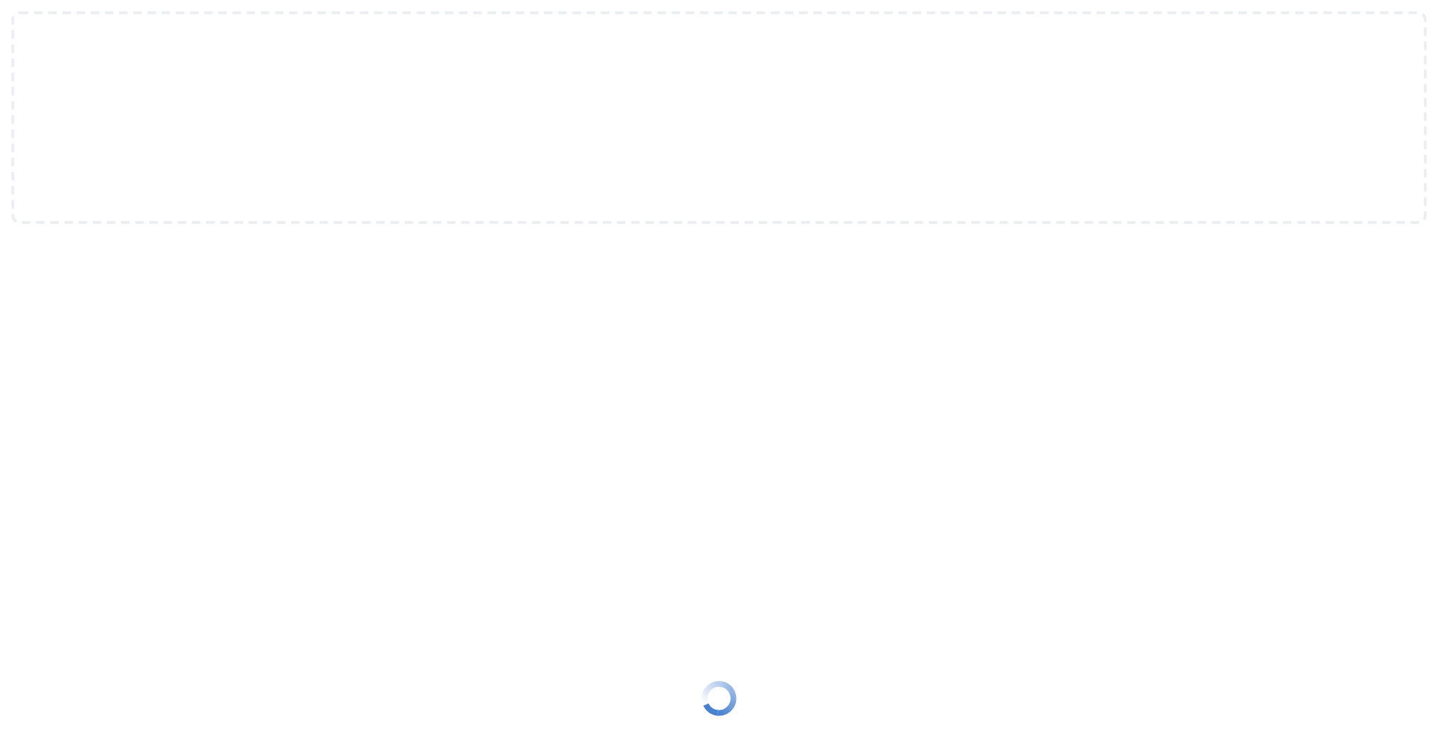
Loading
Use while the picked files are being prepared or sent: a spinner replaces the text lines and the drop target, so nothing more can be clicked or dropped (isLoading).

Disabled
Use when uploading is not allowed right now: the area looks the same as the default, but clicks, keys and drops do nothing (isDisabled).


Single File Upload
Use when the next step takes one file: a drop of two or more is refused whole and reported as rejected files instead of uploaded (maxFiles).


Image Upload
Use when only some types make sense: the file dialog offers only these types, and a dropped file of any other type is refused and reported as rejected (accept).


Folder Upload
Use to upload a directory tree: a click anywhere opens a folder dialog, each file arrives with its path inside the folder, and the format line is not shown (isFolderUpload).


Single Folder Upload
Use when one folder is expected: a drop holding two or more root folders is refused whole, and onSingleUploadError is called instead of onDrop (isMultipleUpload off in folder mode).


Single File Only
Use when one file is expected and you explain a larger drop yourself: two or more files are refused whole, and onSingleUploadError is called instead of onDrop (isMultipleUpload).


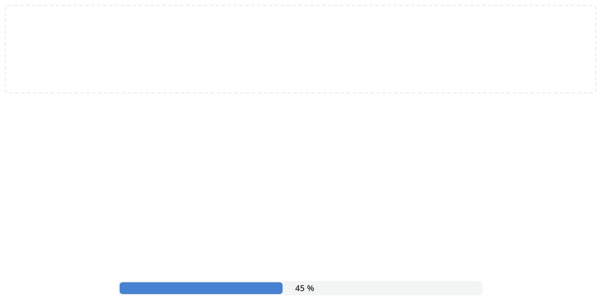
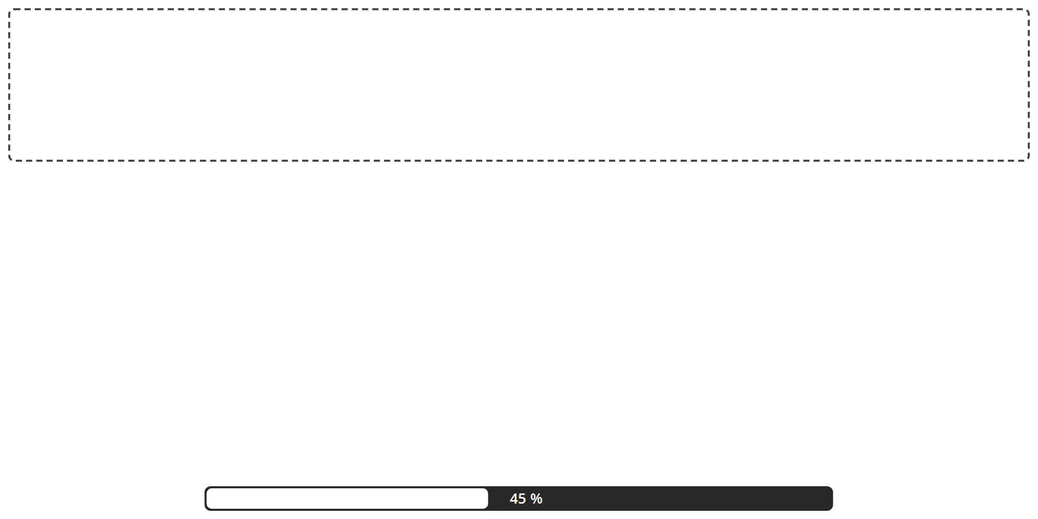
Upload Progress
Use when the upload can report how far it has got: a progress bar with the percentage replaces the spinner and fills to the given share (uploadPercent).
With Formats List
Use when the accepted formats do not fit on one line: the short line carries a +4 pill for the rest (formatsPlusBadgeValue); click it to open the full list in a drop-down, and click outside to close it (fullExstsText).


With Icon
Use to make the area recognisable at a glance: the picture sits above the two lines at 50 by 50 pixels, given as an SVG component or an image URL (icon).


Css Customization
Every overridable variable set on one instance -- the variables are listed under CSS variables on this page. Hover the format line, press it, and click it to open the full list for the hover, pressed and open variables; drag a file over the page, then over the area, for the two drag backgrounds.


Minimal example
import Dropzone from "@onlyoffice/apps-ui-kit/components/dropzone";

export function Upload({ send }: { send: (files: File[]) => void }) {
  return (
    <Dropzone
      isLoading={false}
      accept={[".docx", ".pdf"]}
      linkMainText="Select a file"
      linkSecondaryText="or drop it here"
      exstsText="DOCX, PDF"
      onDrop={send}
    />
  );
}
Props
Recipes
Loading
isLoading replaces the whole drop area with a loader — an indeterminate one on its own, a
progress bar when uploadPercent is also set. The file input is gone while it is on, so nothing
can be dropped or chosen.
import { useState } from "react";

import Dropzone from "@onlyoffice/apps-ui-kit/components/dropzone";

export function UploadWithProgress({
  send,
}: {
  send: (files: File[], onProgress: (p: number) => void) => Promise<void>;
}) {
  const [percent, setPercent] = useState<number | undefined>(undefined);
  const [busy, setBusy] = useState(false);

  return (
    <Dropzone
      isLoading={busy}
      uploadPercent={percent}
      accept=".docx"
      linkMainText="Select a file"
      linkSecondaryText="or drop it here"
      exstsText="DOCX"
      onDrop={async (files) => {
        setBusy(true);
        setPercent(0);
        await send(files, setPercent);
        setBusy(false);
        setPercent(undefined);
      }}
    />
  );
}
One file at a time
isMultipleUpload={false} refuses a drop of more than one file whole — nothing is uploaded and
onSingleUploadError is called instead. Say something to the reader from there; the component
does not.
import { useState } from "react";

import Dropzone from "@onlyoffice/apps-ui-kit/components/dropzone";
import { Text } from "@onlyoffice/apps-ui-kit/components/text";

export function SingleUpload({ send }: { send: (files: File[]) => void }) {
  const [error, setError] = useState("");

  return (
    <div>
      <Dropzone
        isLoading={false}
        isMultipleUpload={false}
        accept=".csv"
        linkMainText="Select a file"
        linkSecondaryText="or drop it here"
        exstsText="CSV"
        onDrop={(files) => {
          setError("");
          send(files);
        }}
        onSingleUploadError={() => setError("Only one file at a time.")}
      />
      {error ? <Text color="#f2675a">{error}</Text> : null}
    </div>
  );
}
A folder instead of files
isFolderUpload swaps the input for a directory picker. It also turns off the drop library's own
click and keyboard handling and ignores accept, so every file under the folder arrives.
import Dropzone from "@onlyoffice/apps-ui-kit/components/dropzone";

export function FolderUpload({ send }: { send: (files: File[]) => void }) {
  return (
    <Dropzone
      isLoading={false}
      isFolderUpload
      accept=""
      linkMainText="Select a folder"
      linkSecondaryText="or drop it here"
      exstsText="Any file type"
      onDrop={send}
    />
  );
}
The full format list
fullExstsText turns the short format line into a control: a chevron appears, and clicking it
opens a drop-down with the long list. formatsPlusBadgeValue adds the +N pill beside it.
import Dropzone from "@onlyoffice/apps-ui-kit/components/dropzone";

export function UploadWithFormats({ send }: { send: (files: File[]) => void }) {
  return (
    <Dropzone
      isLoading={false}
      accept={[".docx", ".pdf", ".xlsx", ".pptx", ".odt"]}
      linkMainText="Select a file"
      linkSecondaryText="or drop it here"
      exstsText="DOCX, PDF"
      fullExstsText="DOCX, PDF, XLSX, PPTX, ODT"
      formatsPlusBadgeValue={3}
      onDrop={send}
    />
  );
}
Behaviour the types don't state
isLoadingunmounts the drop area. The loader replaces it entirely, so the file input, the prompt and the format list are not in the DOM while an upload runs, and a drop during that time does nothing.acceptis react-dropzone 11's form, not the newer object one: a MIME type, an extension such as.docx, a comma-separated list, or an array of those.- Folder mode ignores
acceptand hands it to the drop library only whenisFolderUploadis off. It also sets the library'snoClickandnoKeyboard, and puts its own click handler on the area, which opens a hiddenwebkitdirectoryinput. - It listens to the whole document.
dragenter,dragleaveanddropare watched ondocumentwith a depth counter, so the area can highlight itself while a file is dragged anywhere on the page: a faint tint while the file is anywhere over the page, a stronger one once it is over the area itself. Each instance adds its own three listeners. - A refused single upload is silent. With
isMultipleUpload={false}, more than one file — or, in folder mode, more than one root folder — callsonSingleUploadErrorand drops everything; nothing reachesonDropand nothing is shown. maxFilesdefaults to0, which means no limit. A drop over the limit is refused whole: every file in it goes toonDropRejectedwith a too-many-files error, andonDropis not called.- Folder mode has no format line. With
isFolderUploadthe short list, the+Npill and the full-list drop-down are not rendered, soexstsText,fullExstsTextandformatsPlusBadgeValueshow nothing. - The icon is rendered two different ways. A string becomes an
<img>with the fixed Englishalt="Upload"; a component is called with the class and the test id as props. - The format line is only clickable with
fullExstsText. Without it the chevron, the drop-down and the pointer cursor are all absent. - The whole upload path goes through a custom file reader, which walks a dropped directory and
attaches each file's relative path. Replacing it with
getFilesFromEventreplaces that too.
CSS variables
Set these on the dropzone or any ancestor. Each one, when unset, falls back to the theme's own
value or to the default below; className, iconClassName and loaderClassName reach the three
parts for anything the variables do not cover.
The drop-down has no shadow unless you set one. Its theme shadow is declared on the drop-down while the fallback is resolved on the outer element, where that value does not exist, so the default comes out as no shadow at all.
Accessibility
- The area is the drop library's
<div>withrole="button", namedFile upload areaorFolder upload area; the library gives it atabIndexand Enter and Space handling, so the file dialog is reachable from the keyboard — except in folder mode, where the library's keyboard handling is switched off and only a pointer click opens the directory picker. - Every ARIA label here is hard-coded English:
File upload area,Folder upload area,File input,Folder input,Supported file types, and the image'salt="Upload". None of them takes a prop, so a localised application still announces them in English. - The prompt is the kit's
Linkwith a click handler and nohref, so it is not a focus stop of its own; the surrounding area is what takes focus. aria-busyfollowsisLoadingandaria-disabledfollowsisDisabled, both on the outer element, and the text block is anaria-live="polite"region.- The format drop-down opens on click on a
<div>with no role and noaria-expanded, so it is not reachable or announced.
Test ids
Only the outer one is settable, and all of them are absent while isLoading is set.
Related
DragAndDrop— to make an existing element accept a drop instead.ProgressBar— the bar this shows whileuploadPercentis set.FileInput— the field-sized single-file control.