ImageEditor
Works only inside an ONLYOFFICE Apps portal: it needs the portal's API client, stores and translations, and is not part of the public API.
Crop window with drag, zoom and a replace control, for turning an uploaded picture into an avatar or a logo. It holds nothing: the file, the crop and the rendered preview all live in your state and come back through callbacks.
Portal-internal. t is required and the labels are asked for by key, so the component needs
the portal's translation context. Outside DocSpace, supply a t of your own — see the example.
Use this when / not when
- Use when a picture has already been chosen and the reader needs to frame it.
- Not as the upload control — there is no drop zone and no browse button until a file is set;
use
Dropzoneor your own<input type="file">first. - Not if you want the whole dialog —
AvatarEditorDialogwraps this component in a modal with save and cancel. - Not for picking a room's cover — that is
RoomLogoCoverDialog, which is colours and glyphs rather than a photograph. - It renders nothing while
image.uploadedFileis empty, and nothing again when that value is a string containingdefault_user_photo. There is no placeholder and no message; the element is simply empty. - The cropper is a square with a rounded window. There is no free-form crop, no rotation and
no aspect-ratio choice — only
editorBorderRadius.
Import
import {
  ImageEditor,
  ButtonDelete,
} from "@onlyoffice/apps-ui-kit/components/image-editor";
Also exported from the root barrel @onlyoffice/apps-ui-kit.
Needs ThemeProvider above it in the tree: the cropper reads the theme in JavaScript to pick the
shade of the mask outside the crop window, and that context falls back to light rather than
failing, so on a dark page without a provider the mask stays light. TranslationProvider — or a
t of your own — supplies Common:ChooseAnother; without it the replace control has no label.
Stories
Default
A picture framed in a square window with slightly rounded corners, the starting point for a logo or a cover. Drag the picture to reframe it; the zoom row stays hidden because the picture is given as a URL, not a File. Change any other prop live in the Controls panel below.
Profile Avatar
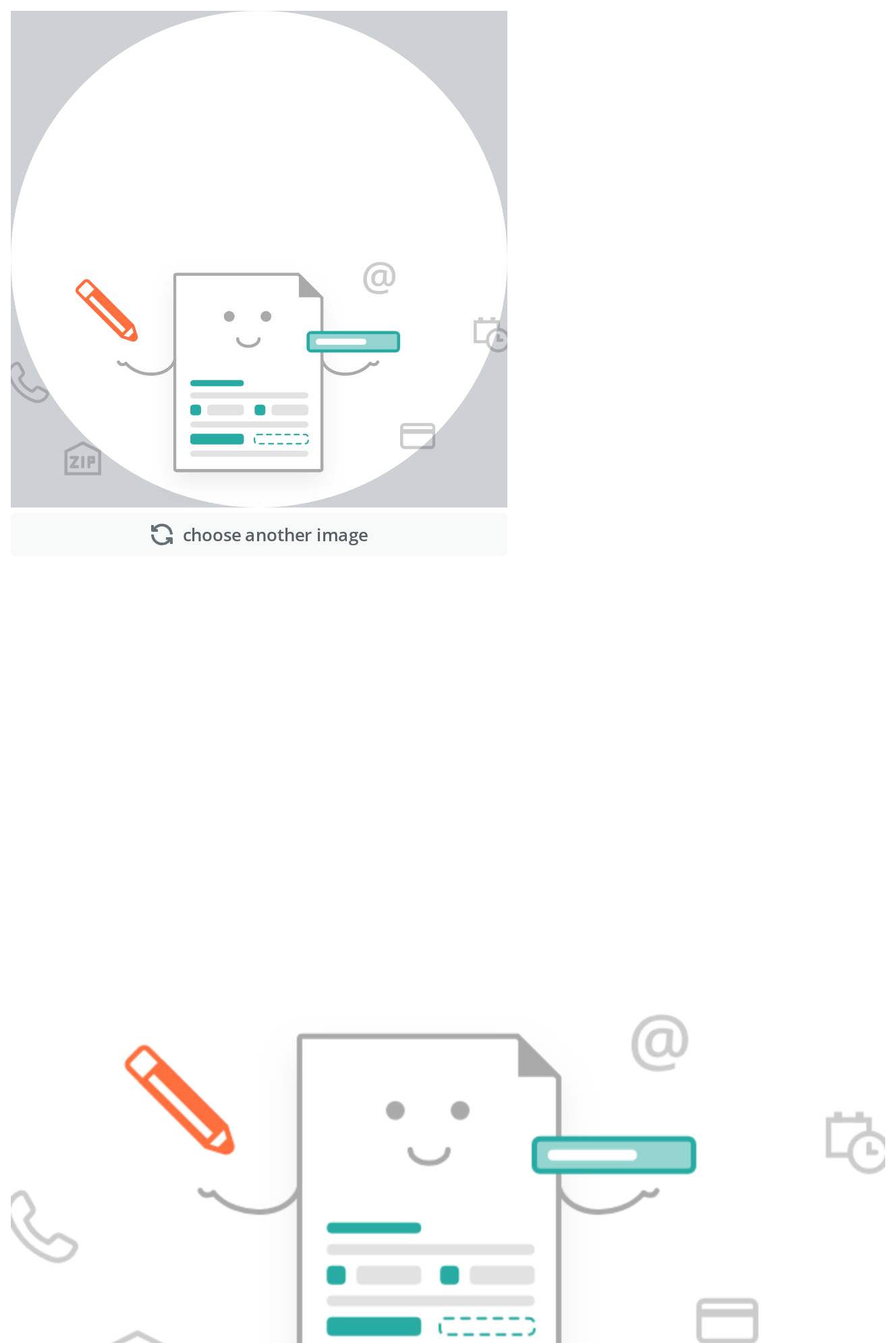
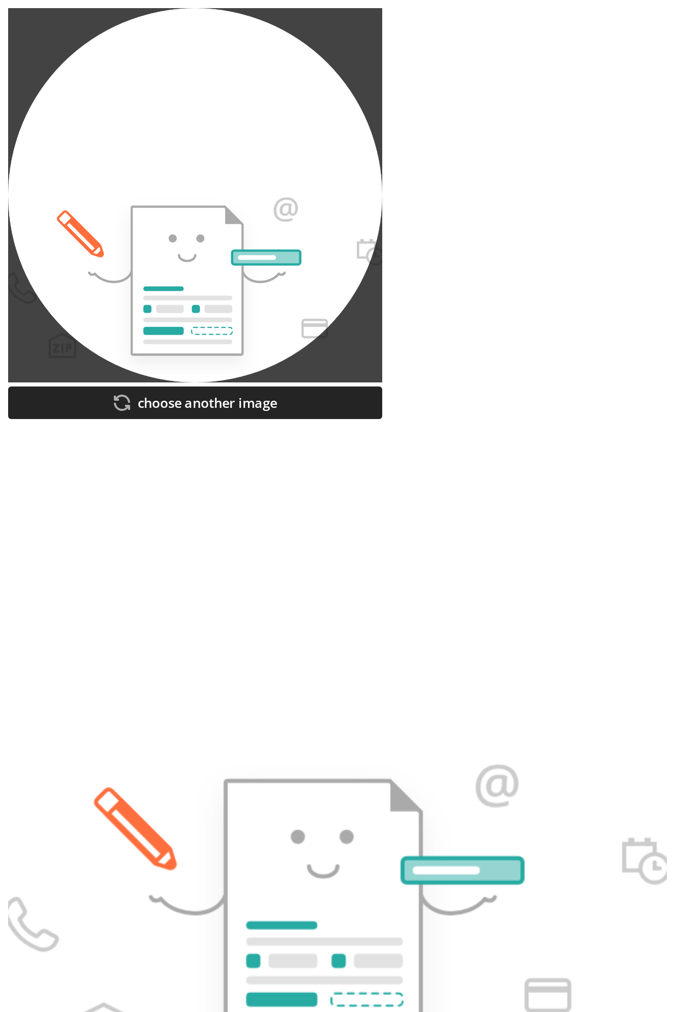
A round crop window, the shape a profile picture is usually cut to: any radius of half the 648px canvas or more (editorBorderRadius) turns the square into a circle.
With Zoom Controls
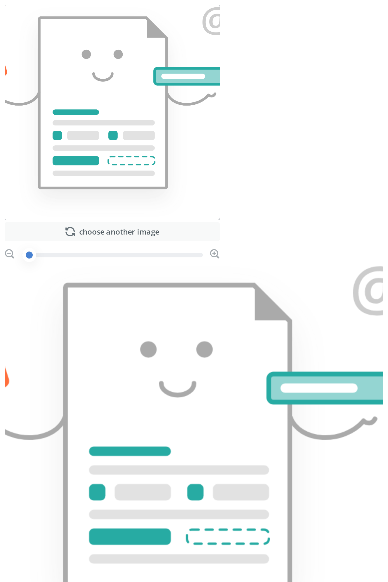
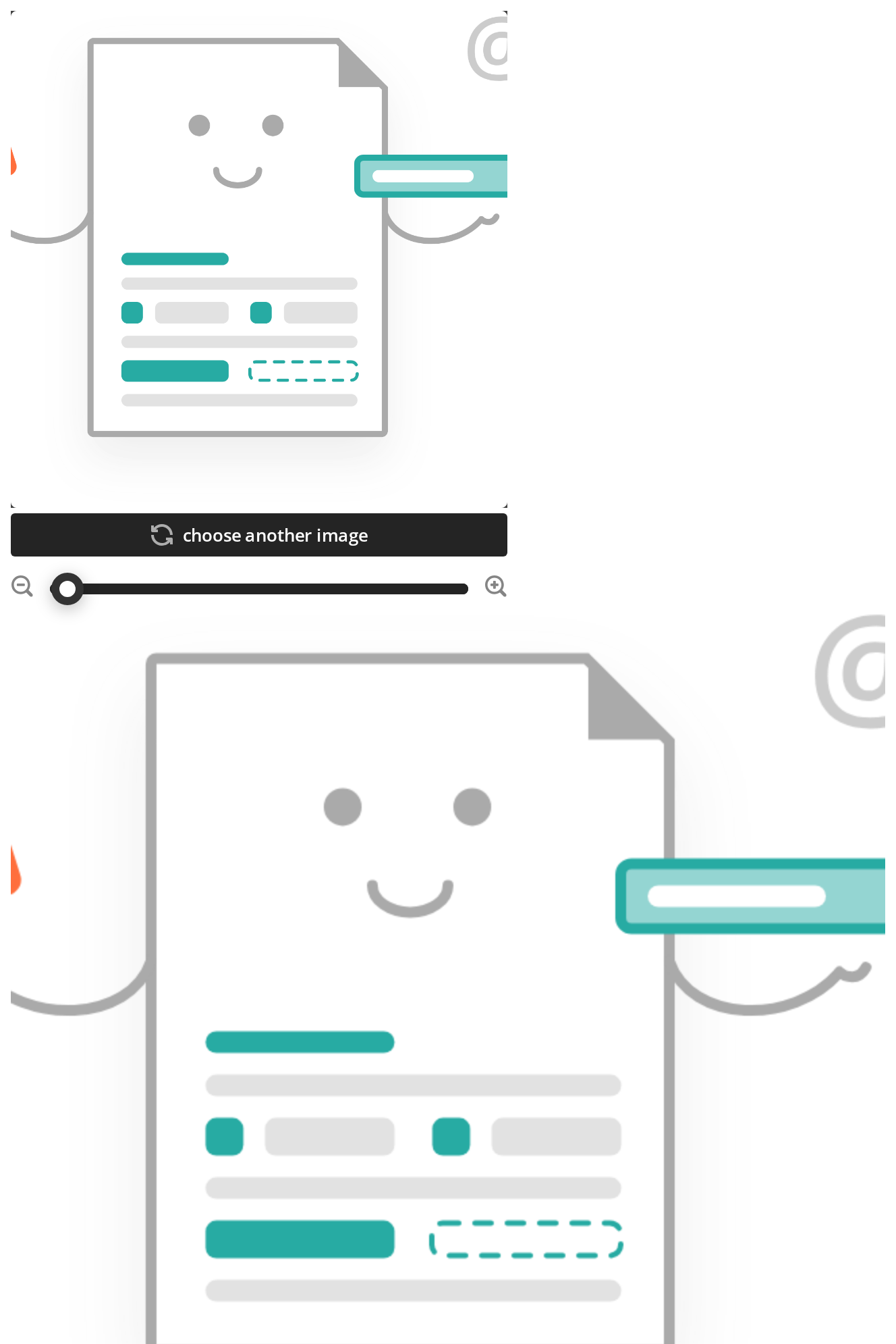
A picture given as a File, the way it arrives from a file input, gets the zoom row under the Choose another control: the slider zooms from 1x to 5x in fine steps, the minus and plus buttons by half a step each, and the preview below follows the crop (setPreview).
Disabled State
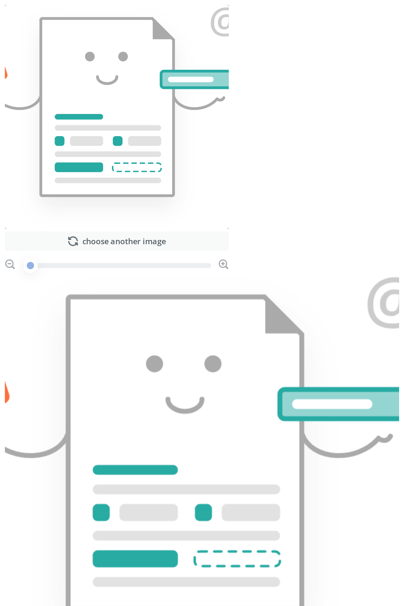
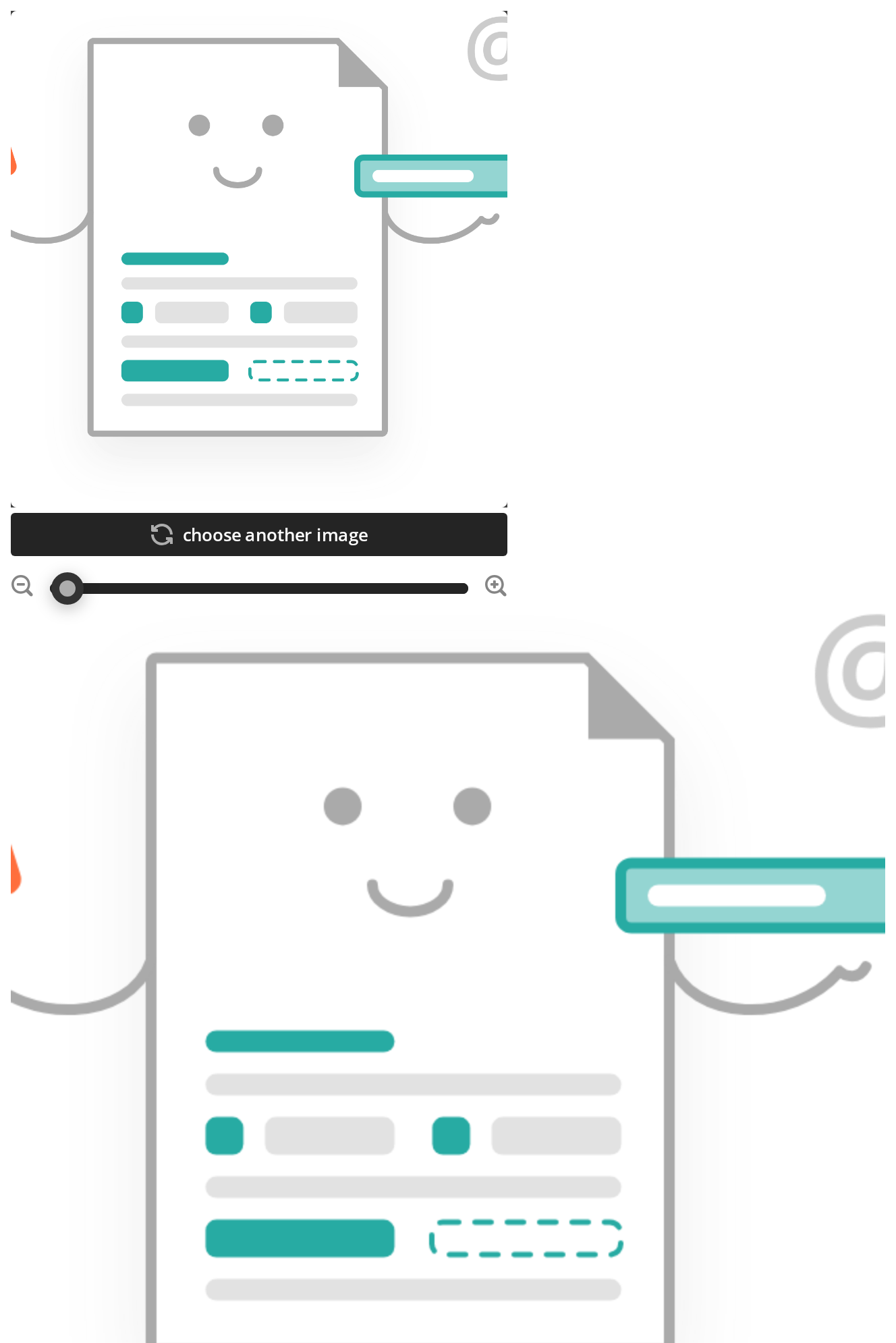
The editor while a save is in flight: the zoom row is greyed out, the picture no longer drags and Choose another opens no picker (isDisabled).
Fixed Framing
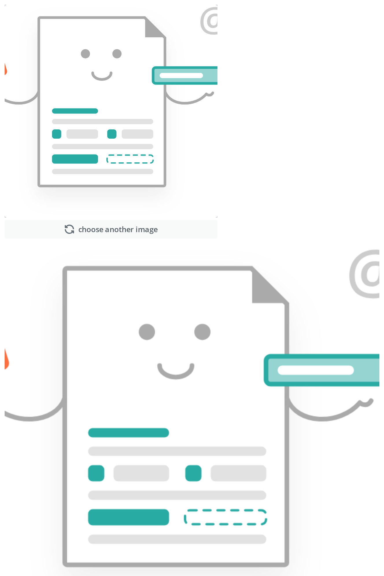
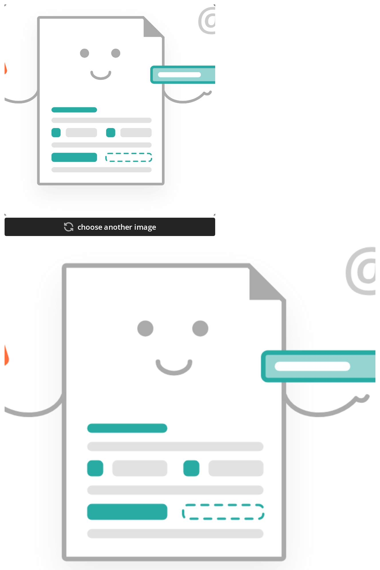
The same File with its framing locked: the zoom row is gone and dragging leaves the picture where it is, while Choose another still replaces it (disableImageRescaling).
Minimal example
import { useState } from "react";

import { ImageEditor } from "@onlyoffice/apps-ui-kit/components/image-editor";
import type { TImage } from "@onlyoffice/apps-ui-kit/components/image-editor";
import type { TTranslation } from "@onlyoffice/apps-ui-kit/utils";

export function AvatarCropper({ t }: { t: TTranslation }) {
  const [image, setImage] = useState<TImage>({ zoom: 1, x: 0.5, y: 0.5 });
  const [preview, setPreview] = useState("");

  const pick = (e: React.ChangeEvent<HTMLInputElement>) => {
    const file = e.target.files?.[0];
    if (file) setImage({ zoom: 1, x: 0.5, y: 0.5, uploadedFile: file });
  };

  return (
    <div>
      <input type="file" accept="image/png,image/jpeg" onChange={pick} />
      <ImageEditor
        t={t}
        image={image}
        onChangeImage={setImage}
        setPreview={setPreview}
        onChangeFile={pick}
        isDisabled={false}
        editorBorderRadius={324}
        Preview={
          preview ? <img src={preview} alt="" width={96} height={96} /> : null
        }
      />
    </div>
  );
}
Props
Recipes
Disabled / read-only
isDisabled is required and blocks everything: dragging, both zoom buttons, the slider and the
replace control. It is what the dialog sets while a save is in flight.
import { useState } from "react";

import { ImageEditor } from "@onlyoffice/apps-ui-kit/components/image-editor";
import type { TImage } from "@onlyoffice/apps-ui-kit/components/image-editor";
import type { TTranslation } from "@onlyoffice/apps-ui-kit/utils";

export function FrozenCropper({
  t,
  file,
  saving,
}: {
  t: TTranslation;
  file: File;
  saving: boolean;
}) {
  const [image, setImage] = useState<TImage>({
    zoom: 1,
    x: 0.5,
    y: 0.5,
    uploadedFile: file,
  });

  return (
    <ImageEditor
      t={t}
      image={image}
      onChangeImage={setImage}
      setPreview={() => {}}
      onChangeFile={() => {}}
      isDisabled={saving}
      editorBorderRadius={324}
      Preview={null}
    />
  );
}
The delete button
ButtonDelete is exported beside the editor but is never rendered by it: put it wherever the
layout calls for it, and clear image.uploadedFile from its handler.
import { useState } from "react";

import {
  ImageEditor,
  ButtonDelete,
} from "@onlyoffice/apps-ui-kit/components/image-editor";
import type { TImage } from "@onlyoffice/apps-ui-kit/components/image-editor";
import type { TTranslation } from "@onlyoffice/apps-ui-kit/utils";

export function RemovableCropper({ t, file }: { t: TTranslation; file: File }) {
  const [image, setImage] = useState<TImage>({
    zoom: 1,
    x: 0.5,
    y: 0.5,
    uploadedFile: file,
  });

  return (
    <div>
      <ImageEditor
        t={t}
        image={image}
        onChangeImage={setImage}
        setPreview={() => {}}
        onChangeFile={() => {}}
        isDisabled={false}
        editorBorderRadius={12}
        Preview={null}
      />
      <ButtonDelete
        t={t}
        onClick={() => setImage({ zoom: 1, x: 0.5, y: 0.5 })}
      />
    </div>
  );
}
Behaviour the types don't state
maxImageSizeis dead. It is declared here and passed down by the avatar dialog, and nothing reads it — there is no size check anywhere in the folder. Check the file yourself inonChangeFile.- The replace control only accepts PNG and JPEG. Its hidden input carries
accept="image/png, image/jpeg", and it also carries the literal idcustomFileInput, so two editors on one page produce duplicate ids. - The zoom row appears only for a
File. It is rendered whenuploadedFileis not a string and has aname, so a picture supplied as a URL can be dragged but never zoomed. SettingdisableImageRescalingremoves the row and freezes dragging as well. - The buttons and the slider move by different amounts: the slider steps by 0.01, each button by 0.5, and both are clamped to the range 1 to 5.
setPreviewis throttled to once every 300ms and is called with adata:URL of the cropped canvas. It also fires once as soon as the picture has loaded.- A cross-origin picture can stop the preview silently. The canvas is created with
crossOrigin="anonymous", so a remote image served without the matching header taints it,toDataURLthrows, and the failure is swallowed:setPreviewis simply never called again. - The crop canvas is 648px and displayed at 368px, so
editorBorderRadiusis measured on the 648px figure — 324 is a circle, and the value the avatar dialog defaults to, 110, is a rounded square. - The outer element and the cropper wrapper use
data-test-id, notdata-testid. Testing Library's default query does not see them; the cropper inside is the first element with a realdata-testid. - The replace control is a
<div>with a click handler, with no role, notabindexand no key handler, so it cannot be reached or operated by keyboard. The same is true ofButtonDelete. - The folder contains a
PreviewTilecomponent that nothing imports — not the editor, not the index. It is not part of the exported surface; build your own preview and hand it in throughPreview.
Sub-components
ButtonDelete — a trash glyph with a Common:Delete label, exported from the same subpath
and rendered by you, not by the editor. It takes onClick, the same t, and an optional
className, and it carries the class icon_cropper-delete_button for portal stylesheets. Like
the replace control it is a <div>, so it is not keyboard-operable.
ImageCropper and PreviewTile also live in the folder but neither is exported.
Accessibility
- The outer element is a
regionlabelled"Image editor"— a hard-coded English string with no prop to translate it. - Neither the replace control nor
ButtonDeleteis a button. Both are<div>s with click handlers: no role, no tab stop, no Enter or Space. A keyboard user cannot replace or delete the picture. Add your own controls beside the editor when that matters. - The crop area is a canvas dragged with the pointer and there is no keyboard equivalent for
positioning. The zoom slider is the kit's
Slider, a native<input type="range">: it is reached with Tab and moved with the arrow keys, in its 0.01 steps. The two zoom buttons come fromIconButtonand are<div>s as well. - The cropper sets
aria-disabledfromisDisabled, so the state is announced even though the controls inside it are not focusable to begin with. - Nothing announces that the preview has been re-rendered.
Test ids
| Element | data-testid |
|---|---|
| Cropper | image-cropper |
| Replace control | change_image_button |
| Zoom out | zoom_out_icon_button |
| Zoom in | zoom_in_icon_button |
ButtonDelete | cropper_delete_button |
None is settable. The outer element and the cropper wrapper carry image-editor and
image-cropper-wrapper under the misspelt attribute data-test-id, which the usual query does
not match; the hidden file input has the element id customFileInput.
Related
AvatarEditorDialog— this editor inside a modal with save and cancel.RoomLogoCoverDialog— for choosing a colour and a glyph instead of cropping a photograph.Avatar— what the cropped result is usually shown in.