MainButtonMobile
Floating round button in the corner of the screen that opens a full-width sheet of actions. It is the phone form of the portal's "create" button: a plus that becomes a minus while its sheet is open.


Use this when / not when
- Use for the one creating action of a mobile screen, when there is no room for a button at the top of a panel.
- Not on desktop —
MainButtonis the wide accent button that belongs at the top of a side menu. This component does not switch between the two forms; the portal renders one or the other. - Not for the progress of a background operation, even though it is built on one:
FloatingButtonis the disc that shows progress. - Not for an ordinary menu anchored to a control —
DropDownwithDropDownItemgives you the same items without the fixed corner placement. - There is no progress bar and no upload section any more.
percentandtitleare declared and ignored, and theProgressOptiontype has nothing that accepts it.
Import
import { MainButtonMobile } from "@onlyoffice/apps-ui-kit/components/main-button-mobile";
Also exported from the root barrel @onlyoffice/apps-ui-kit.
Needs ThemeProvider from @onlyoffice/apps-ui-kit/providers/theme. Everything this
component draws — the button's colour, the sheet's background and, under the light theme, the
sheet's whole placement — comes from custom properties defined on the theme's .light /
.dark class. See the dark-theme note under "Behaviour the types don't state".
Stories
Default
The button in the corner of the screen with both groups of items. Tap it to open the menu, tap outside or pick an item to close it, and change any other prop live in the Controls panel below.
With Alert
A badge on the closed button draws attention to something waiting for the user (alert). Click the badge to see onAlertClick in the Actions panel, which is called only while withAlertClick is set; the badge is hidden while the menu is open.


With Submenu
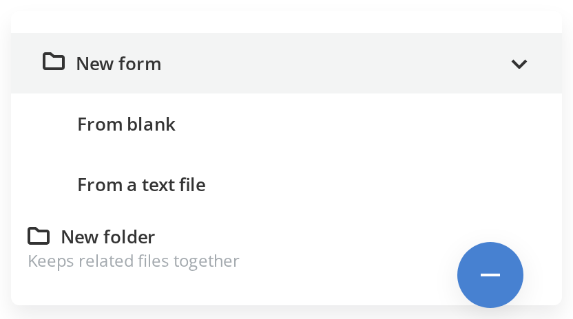
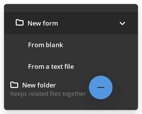
Groups related actions under one item without opening a second menu. New form opens its nested items in place under it, already expanded (items, openByDefault); New folder carries a second line under its label (description).
Without Menu
For a screen with only one thing to create, the button runs that action directly (withMenu). Click it to see onClick in the Actions panel; no menu opens.
Css Customization
The variables are listed under CSS variables on this page. One instance, with the alert badge on so the badge variables show. Open the menu to see the item padding and the lower group's background.


Minimal example
The component keeps the open state internally; opened seeds it and overrides it whenever the
value you pass changes.
import { useState } from "react";
import { MainButtonMobile } from "@onlyoffice/apps-ui-kit/components/main-button-mobile";

export function CreateSheet({
  onCreate,
}: {
  onCreate: (kind: string) => void;
}) {
  const [opened, setOpened] = useState(false);

  return (
    <div style={{ position: "relative", height: 400 }}>
      <MainButtonMobile
        opened={opened}
        isOpenButton
        onClose={() => setOpened(false)}
        actionOptions={[
          {
            key: "doc",
            label: "New document",
            onClick: () => onCreate("doc"),
          },
          {
            key: "folder",
            label: "New folder",
            onClick: () => onCreate("folder"),
          },
        ]}
      />
    </div>
  );
}
Props
actionOptions takes ActionOption and buttonOptions takes ButtonOption. Both carry
key, label, an optional icon URL, onClick, isSeparator and nested items; an
ActionOption also has action, which is handed back as onClick({ action }), a
description drawn under the label, and openByDefault for a submenu that starts open.
Recipes
Open / close (controlled)
opened is copied into state on every change, so it opens and closes the sheet — but the
button toggles that state on its own as well, and the only way to hear about it is onClose,
which needs isOpenButton and fires on opening too.
import { useState } from "react";
import { MainButtonMobile } from "@onlyoffice/apps-ui-kit/components/main-button-mobile";

export function CreateSheetControlled() {
  const [opened, setOpened] = useState(false);

  return (
    <div style={{ position: "relative", height: 400 }}>
      <button type="button" onClick={() => setOpened(true)}>
        Open the sheet
      </button>
      <MainButtonMobile
        opened={opened}
        isOpenButton
        onClose={() => setOpened(false)}
        actionOptions={[{ key: "doc", label: "New document" }]}
      />
    </div>
  );
}
As a plain button
withMenu={false} stops the sheet from opening and routes the click to onClick — the
floating plus becomes a single action.
import { MainButtonMobile } from "@onlyoffice/apps-ui-kit/components/main-button-mobile";

export function UploadFab({ onUpload }: { onUpload: () => void }) {
  return (
    <div style={{ position: "relative", height: 400 }}>
      <MainButtonMobile withMenu={false} onClick={onUpload} />
    </div>
  );
}
Two groups and a submenu
actionOptions is the upper group and buttonOptions the lower one, which has a background
of its own. An item with items becomes a submenu that expands in place rather than opening
to the side.
import { MainButtonMobile } from "@onlyoffice/apps-ui-kit/components/main-button-mobile";

export function CreateSheetGrouped({
  onCreate,
}: {
  onCreate: (action?: string) => void;
}) {
  return (
    <div style={{ position: "relative", height: 400 }}>
      <MainButtonMobile
        manualWidth="320px"
        actionOptions={[
          {
            key: "form",
            label: "Form",
            openByDefault: true,
            items: [
              { key: "blank", label: "From blank", action: "form-blank" },
              { key: "file", label: "From a text file", action: "form-file" },
            ],
            onClick: ({ action }) => onCreate(action),
          },
          { key: "sep", label: "", isSeparator: true },
          { key: "folder", label: "New folder", action: "folder" },
        ]}
        buttonOptions={[{ key: "upload", label: "Upload from device" }]}
      />
    </div>
  );
}
The alert badge
alert puts a badge on the button while the sheet is closed. Clicking it does nothing unless
withAlertClick is set as well.
import { MainButtonMobile } from "@onlyoffice/apps-ui-kit/components/main-button-mobile";

export function CreateSheetWithAlert({
  onOpenPanel,
}: {
  onOpenPanel: () => void;
}) {
  return (
    <div style={{ position: "relative", height: 400 }}>
      <MainButtonMobile
        alert
        withAlertClick
        onAlertClick={onOpenPanel}
        actionOptions={[{ key: "doc", label: "New document" }]}
      />
    </div>
  );
}
Behaviour the types don't state
- The sheet's placement is declared only under the light theme.
position,width,inset-inline-end,bottomandz-indexare all read from custom properties thatMainButtonMobile.theme.scssdefines on.lightand never on.dark, so under the dark theme those declarations are invalid and the sheet falls back into normal flow at automatic width. The button itself is unaffected. - The button positions itself only as much as
FloatingButtondoes, which is to say it is pinned to the bottom trailing corner of the nearest positioned ancestor. The wrapper takesz-index: 201, raised to211while the sheet is open, and the backdrop sits between them at210. - It reads
window.innerHeightduring the first render, so importing it into a server-rendered tree throws before any effect can run. - The sheet's height is measured, not set. Its content is measured with
getBoundingClientRectafter every open, submenu toggle and window resize, and capped atwindow.innerHeight - 48.dropdownStyleis applied before that height and cannot change it. manualWidthdefaults to400px, capped by the stylesheet at100vw - 48px, and replaced at the mobile breakpoint by100vw - 64px.- The browser's Back button closes the sheet. A
popstatelistener sets the state to closed without callingonClose. - A click anywhere outside closes it, through a
Backdropthe component renders itself.onCloseis only reached whenisOpenButtonis set. - On iOS the component reaches for
document.getElementsByClassName("section-scroll")[0]and attaches a scroll listener to it, to swap the sheet's background as the page moves. An iOS page without an element of that class throws on mount. - On a device
react-device-detectcalls mobile, the sheet's content is wrapped inScrollbarand every item's hover effect is turned off. withoutButtondoes not hide anything. It swaps the lower group's background for the plain wrapper colour; the button and both groups are drawn either way.- Choosing any item closes the sheet, before its handler runs. An
ActionOption's handler is called asonClick({ action }), not with the event; aButtonOption's handler takes no argument at all. refis an imperative handle, not an element ref: it exposescontains(target)andgetButtonElement(). Its typeMainButtonMobileRefis not exported from the folder, so it can only be typed by inference.
CSS variables
Set them on any ancestor. They are what the theme defines; the sheet's geometry is in the same set, which is why overriding it is the workaround for the dark-theme note above.
Accessibility
- The button is a
FloatingButton: a<div>with a click handler, norole, notabIndexand no key handler, so the sheet cannot be opened from the keyboard. - Its
aria-labelis the icon's name followed by the word "button" —"plus button", or"minus button"while the sheet is open — in English whatever the interface language. - The sheet is not a dialog. It is a
DropDown, announced as alistboxwith each item anoption(a separator aseparator) — not amenu— with no focus trap and no focus move; Escape does not close it, though the Back button does. - The alert badge is an SVG with a click handler and no accessible name.
- Nothing marks the button as expanded. There is no
aria-expandedoraria-haspopup, and unknown props are not accepted, so neither can be supplied from outside.
Test ids
None of them can be overridden by a prop; the sheet's id is the one
DropDown uses for every instance, so a page with more than one is
ambiguous.
Related
MainButton— the desktop form of the same action.FloatingButton— the disc this one is built on, showing the progress of a background operation.DropDown— the menu without the fixed corner placement.