EmptyScreenContainer
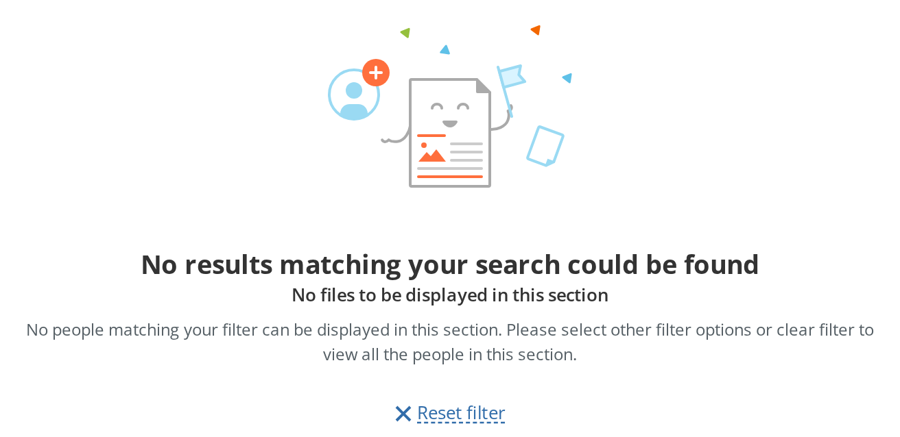
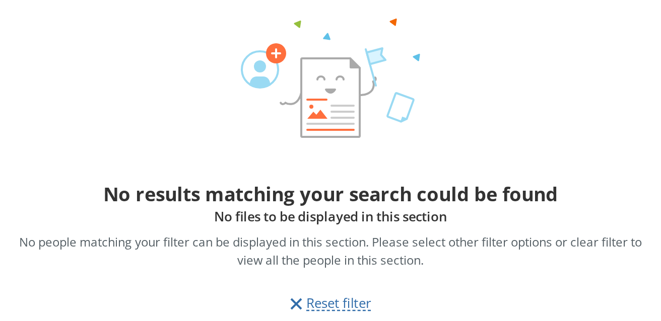
Centred empty state: an illustration, a heading, up to two lines of explanation and a column of actions. It is the older of the kit's two empty states and the one that takes an image URL of your own.
Use this when / not when
- Use when a list has nothing in it and you want to say why, with artwork you supply.
- Not for a new screen —
EmptyViewis the current empty state, takes an icon node rather than a URL, and lays its options out as rows. - Not for a failure —
ErrorContaineris the full-page error, with its own illustration. - Not while data is still arriving — show
RectangleSkeletonand switch to this only once you know the result is empty. - The image size is not a prop. The stylesheet pins it to 200×140, and
imageStyle— the one way past that — is ignored on tablet-width screens. See the note below.
Import
import { EmptyScreenContainer } from "@onlyoffice/apps-ui-kit/components/empty-screen-container";
Also exported from the root barrel @onlyoffice/apps-ui-kit.
Needs ThemeProvider above it in the tree. The header, description and link colours are
declared only under the .light and .dark classes the provider puts on <body>; without it
those declarations are invalid and every line inherits the surrounding text colour.
Stories
Default
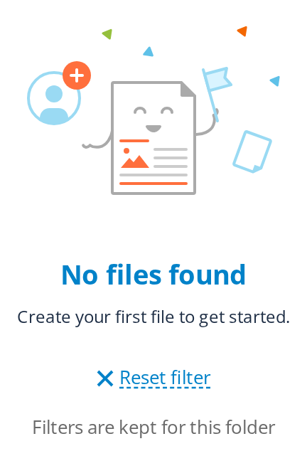
The full layout, for a list a filter has emptied: a header, a subheading and a description explain why nothing is shown, and a reset action under them offers the way back.
Minimal Content
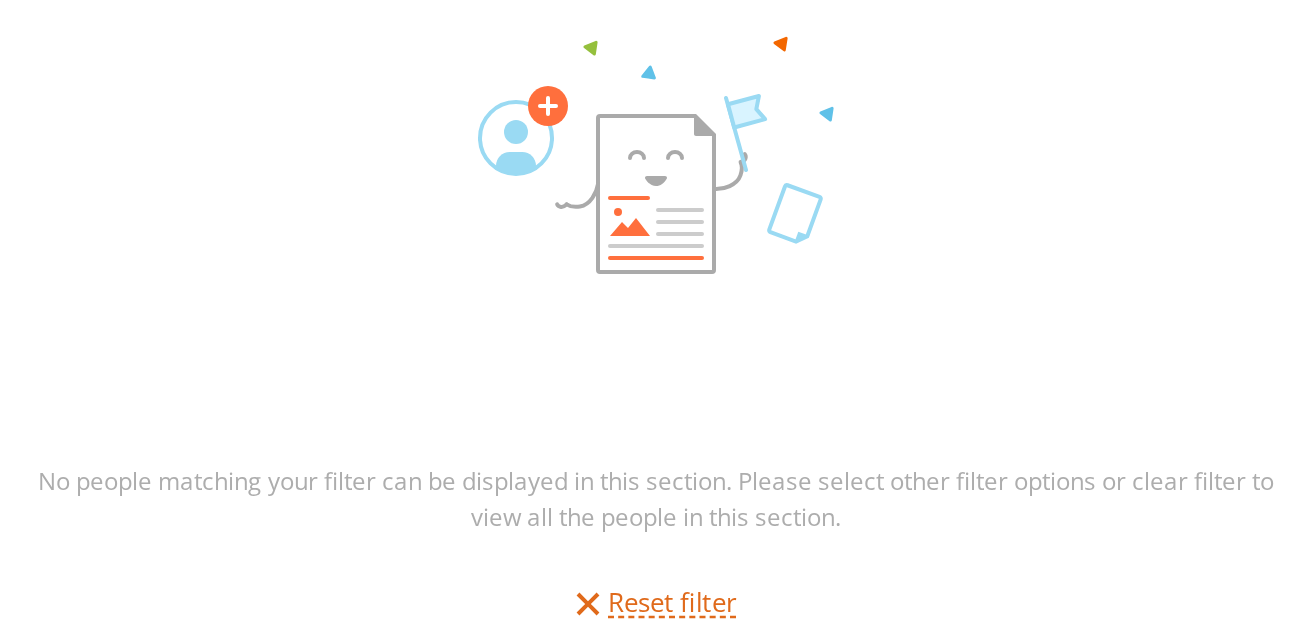
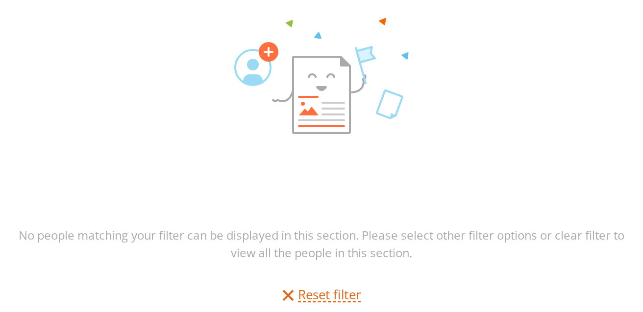
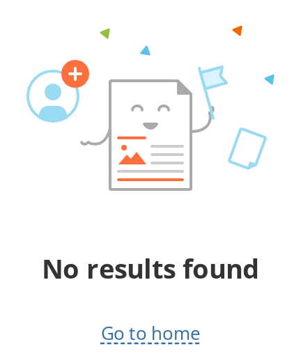
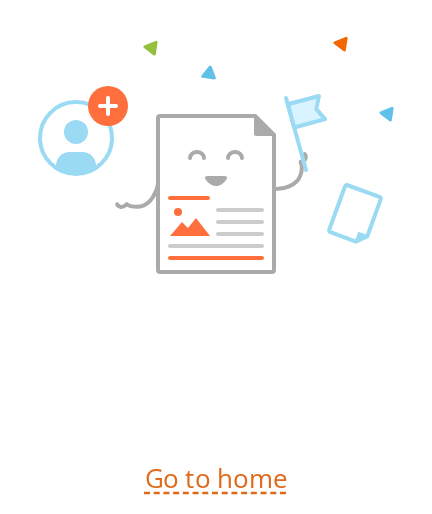
The least a screen needs, for a place where there is nothing to explain: the image, one header line and a single way out.
Custom Styles
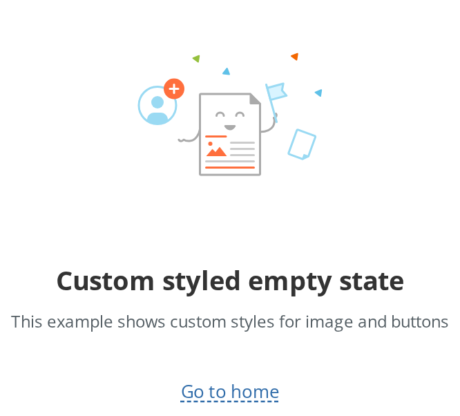
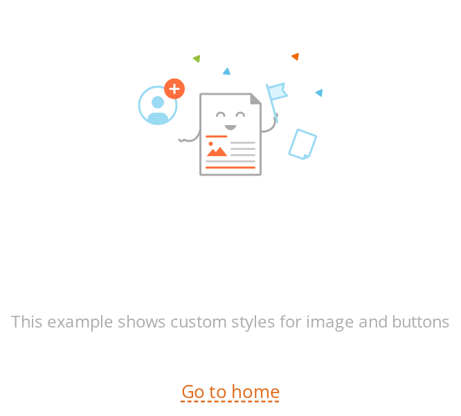
For artwork of another shape: the image is resized past its fixed 200×140 box (imageStyle) and the actions sit further down (buttonStyle). On windows between 601px and 1023px wide the image falls back to its fixed size.
Without Filter
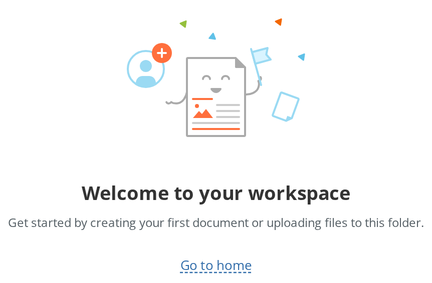
For a screen with no filter bar above it, such as a first-run view: the content starts 91px from the top instead of 52px (withoutFilter), so it sits as low as it would under a filter bar.
Css Customization
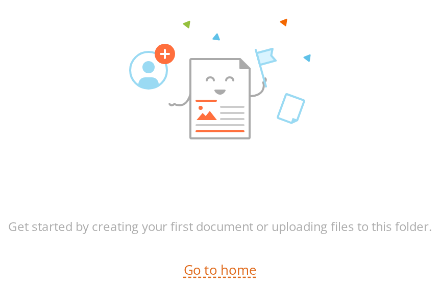
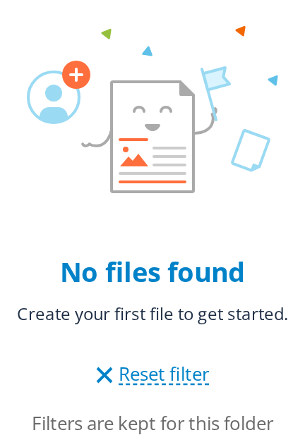
Every overridable variable set on one wrapper -- the variables are listed under CSS variables on this page. The reset action shows the link colour on both its icon and its text, the line under it the plain-text colour; the width applies only on a window wider than 1424px.
Minimal example
import { EmptyScreenContainer } from "@onlyoffice/apps-ui-kit/components/empty-screen-container";

export function NoFiles() {
  return (
    <EmptyScreenContainer
      imageSrc="/images/empty-folder.svg"
      imageAlt=""
      headerText="This folder is empty"
      descriptionText="Upload a file or create a document to get started."
    />
  );
}
Props
Recipes
With actions
buttons takes any node and stacks whatever is in it in a centred 16px column. A Button's
label keeps its own colour; a link inside this area is repainted to the kit's link blue.
import { Button } from "@onlyoffice/apps-ui-kit/components/button";
import { EmptyScreenContainer } from "@onlyoffice/apps-ui-kit/components/empty-screen-container";

export function NoDocuments({ onCreate }: { onCreate: () => void }) {
  return (
    <EmptyScreenContainer
      imageSrc="/images/empty-folder.svg"
      imageAlt=""
      headerText="No documents yet"
      descriptionText="Create your first document, or upload one you already have."
      buttons={<Button primary label="Create document" onClick={onCreate} />}
    />
  );
}
No filter above it
withoutFilter is about what is above the empty state, not about what it renders: it raises the
top padding from 52px to 91px to stand in for a filter bar that is not there.
import { EmptyScreenContainer } from "@onlyoffice/apps-ui-kit/components/empty-screen-container";

export function WelcomeScreen() {
  return (
    <EmptyScreenContainer
      withoutFilter
      imageSrc="/images/welcome.svg"
      imageAlt=""
      headerText="Welcome to your workspace"
      subheadingText="Nothing here yet"
      descriptionText="Everything you create will appear on this screen."
    />
  );
}
A different illustration size
imageStyle is the only way past the fixed 200×140, and it is dropped on screens between 601px
and 1023px — so pair it with a stylesheet rule of your own through className when the size
matters at every width.
import { EmptyScreenContainer } from "@onlyoffice/apps-ui-kit/components/empty-screen-container";

// In your stylesheet:
//   .wide-empty .ec-image { width: 320px; height: 224px; }

export function NoResults() {
  return (
    <EmptyScreenContainer
      className="wide-empty"
      imageSrc="/images/empty-filter.svg"
      imageAlt=""
      headerText="No results"
      descriptionText="Try a different search term, or clear the filter."
      imageStyle={{ width: 320, height: 224 }}
    />
  );
}
Behaviour the types don't state
idandstyledo nothing. Both are in the props type, neither is read, and the component forwards no unknown props — so neither reaches the DOM. Style the element throughclassName, and put anidon a wrapper of your own.imageStyleis dropped between 601px and 1023px. The component asks whether the window is tablet-width and passes an empty object if it is. That check runs during render and is not subscribed to resizes, so crossing the breakpoint with the component already mounted does not change anything until something else re-renders it.- The illustration is pinned to 200×140, and to 150×105 below 600px, by the stylesheet. Art of another shape is stretched into that box.
withoutFilteradds padding rather than removing anything: 91px instead of 52px at desktop width, 109px instead of 71px on tablet, 69px instead of 31px on mobile.- The 640px width only applies above 1424px. At or below that the element becomes
fit-contentcapped at 640px, then 480px below 1024px and 343px below 600px. Setting--empty-screen-widththerefore changes nothing on most screens. - The heading renders at 19px, not the 16px in the stylesheet. The size arrives as an inline
style from the
Textthe component renders, which beats the class rule. - The heading is a
<span>. Nothing here is a heading element, so the empty state does not appear in the document outline. subheadingTexthas no styling of its own beyond being 600-weight: the class the component puts on it is not defined in the stylesheet, and the two modifier classes that a subheading or a description add to the wrapper both set a rule the wrapper already has.- The buttons area repaints anything inside it:
aand anysvg pathtake the link colour, and a barespantakes the text colour. AButton's label is exempted by an explicit rule, so a primary button keeps its white label. - The element carries five stable class hooks for a consumer's stylesheet —
ec-image,ec-header,ec-subheading,ec-descandec-buttons— alongside the hashed module classes. headerTextis typed as required but is guarded in the code: an empty string renders no heading element at all rather than an empty one.
CSS variables
Accessibility
- The illustration is an
<img>whosealtyou supply. It is decorative in almost every case, and the heading below it already says what the screen means: pass an empty string rather than repeating the text. - Nothing here is a heading element. All three lines are spans, so a reader navigating by heading skips the empty state entirely — put your own heading above it when the screen has no other one.
- The actions are whatever you pass; their roles and labels are yours to get right. A link
styled as an action still needs an
hrefto be reachable by keyboard. - The element has no role and no live region, so replacing a list with this empty state is not announced. Announce the result count yourself when the change follows a search.
Test ids
The three text lines carry Text's own text id; the image and the buttons area carry none —
use the ec-image and ec-buttons classes.
Related
EmptyView— the current empty state, with icon nodes and option rows.ErrorContainer— the full-page error screen.RectangleSkeleton— what to show while you still do not know whether the list is empty.