ErrorContainer
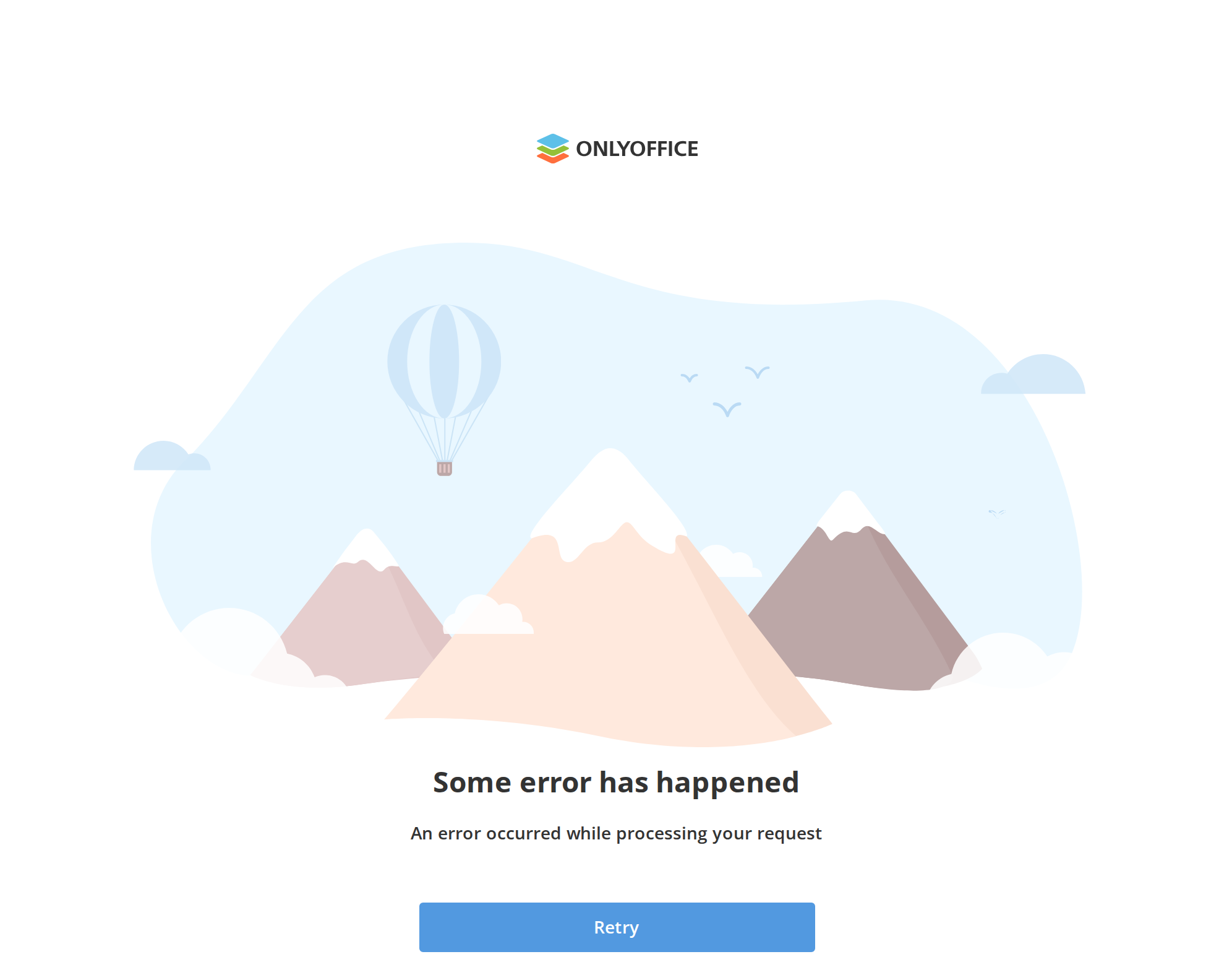
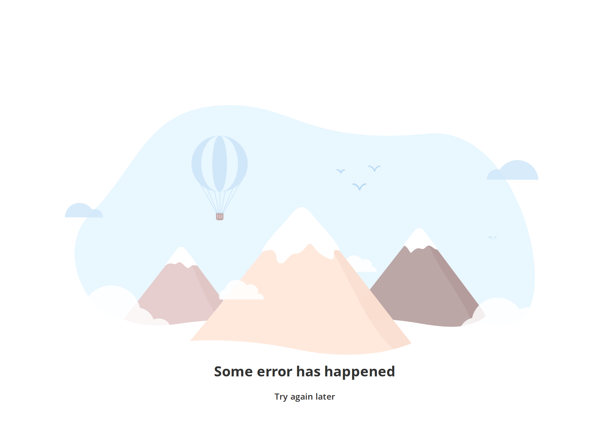
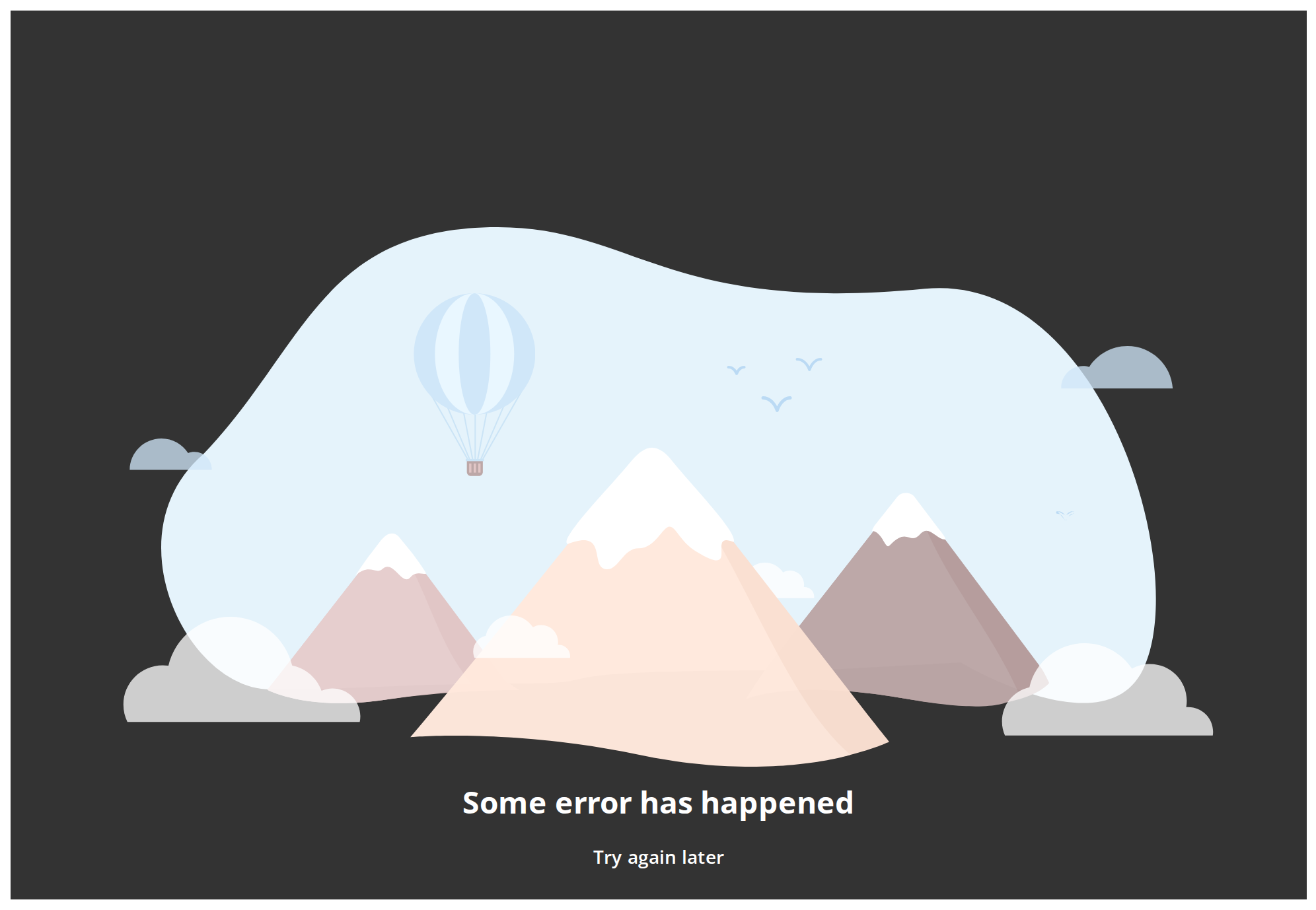
Full-screen error page: an animated landscape, a heading, an explanation and one action button. It is what the portal shows in place of a page it could not give you — a 404, an expired link, a browser it does not support.
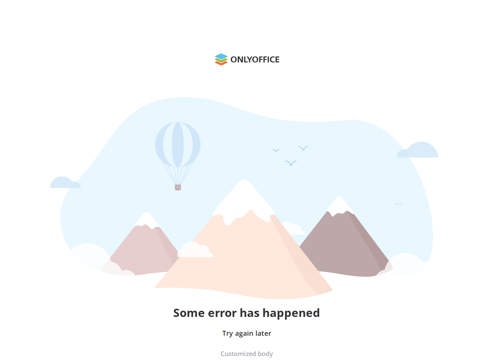
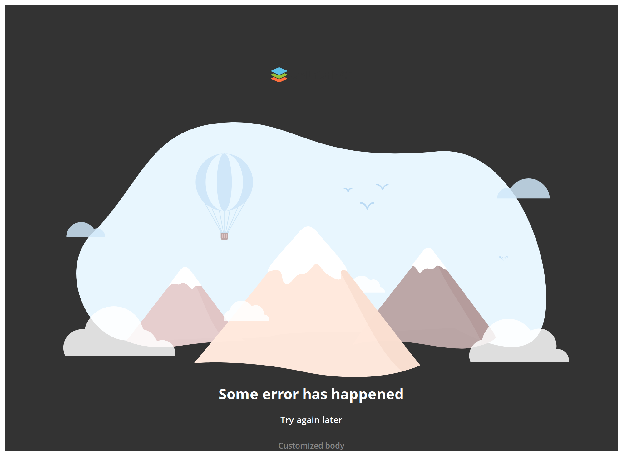
Use this when / not when
- Use as the whole screen, in place of the page that failed.
- Not inside a panel or a card — the component fills the viewport height and cannot be made
smaller. For a region that has no content, use
EmptyScreenContainerorEmptyView. - Not for a field that failed validation, and not for a request that failed in the background — that is a toast or an inline message.
- The illustration is fixed. There is no prop for it, it is inlined in the component, and its colours are hard-coded: the sky stays pale blue in the dark theme.
- Pass
hideLogooutside a DocSpace portal. By default the page is topped withPortalLogo, which asks a portal endpoint for the white-label mark.
Import
import { ErrorContainer } from "@onlyoffice/apps-ui-kit/components/error-container";
Also exported from the root barrel @onlyoffice/apps-ui-kit.
The component file has a default export, but the folder's index re-exports it under a name —
import ErrorContainer from … does not resolve.
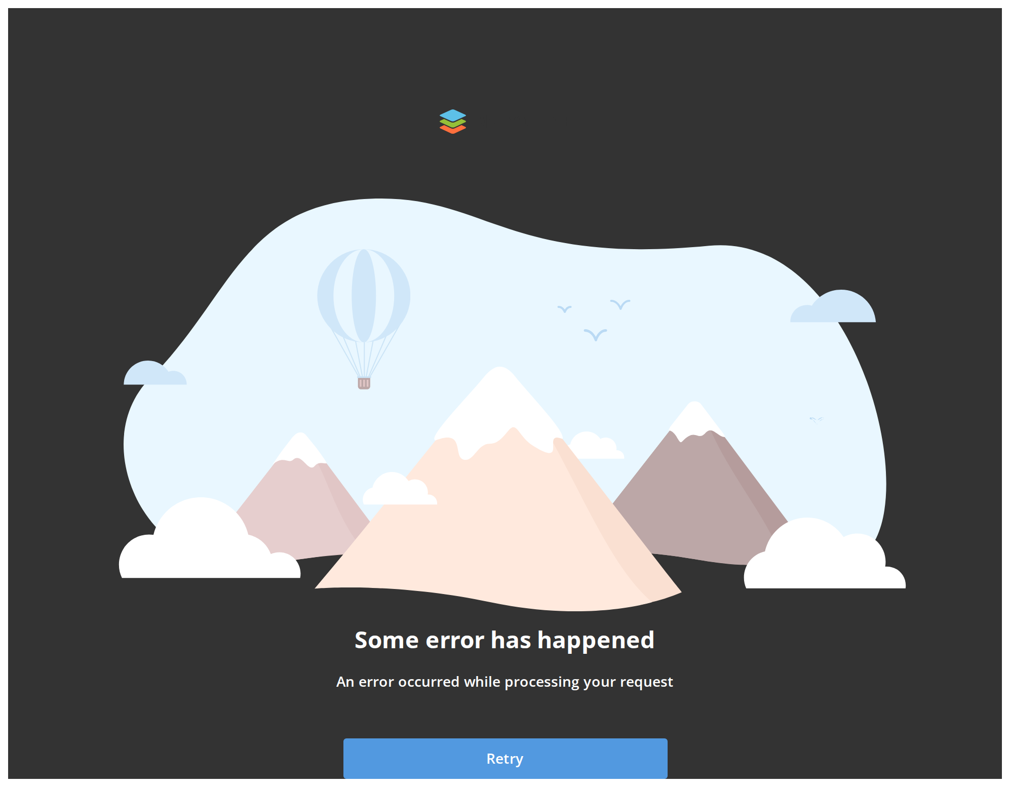
Needs ThemeProvider above it in the tree for the dark theme, where the page background becomes
black and the muted line lightens. The light values are declared unconditionally, so without a
provider the page renders correctly in light and never switches.
Stories
Default
The plain error page: the heading says what happened (headerText), the line under it says what to do (bodyText), and the muted third line carries a detail such as an error code (customizedBodyText). Change any other prop live in the Controls panel below.
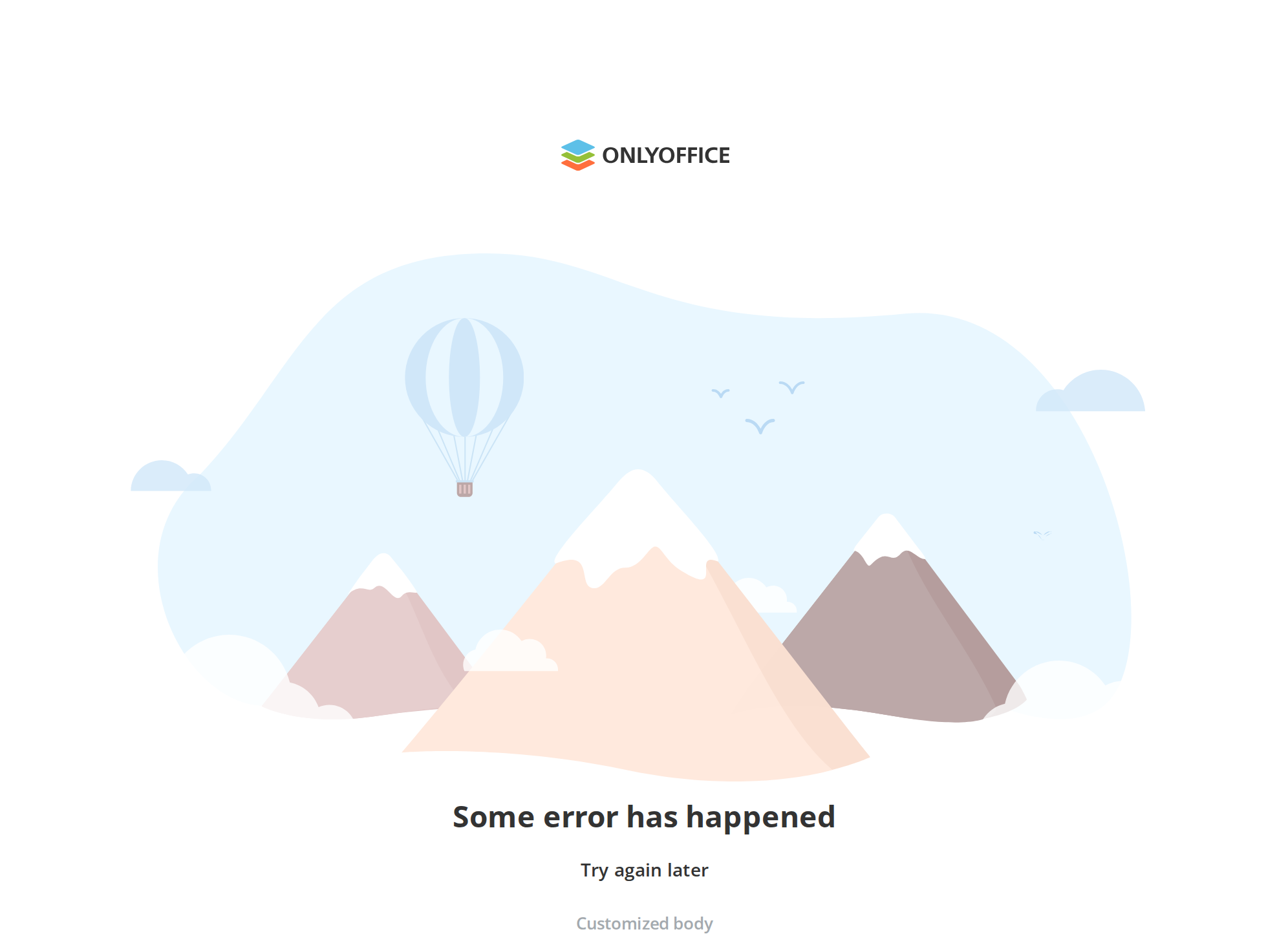
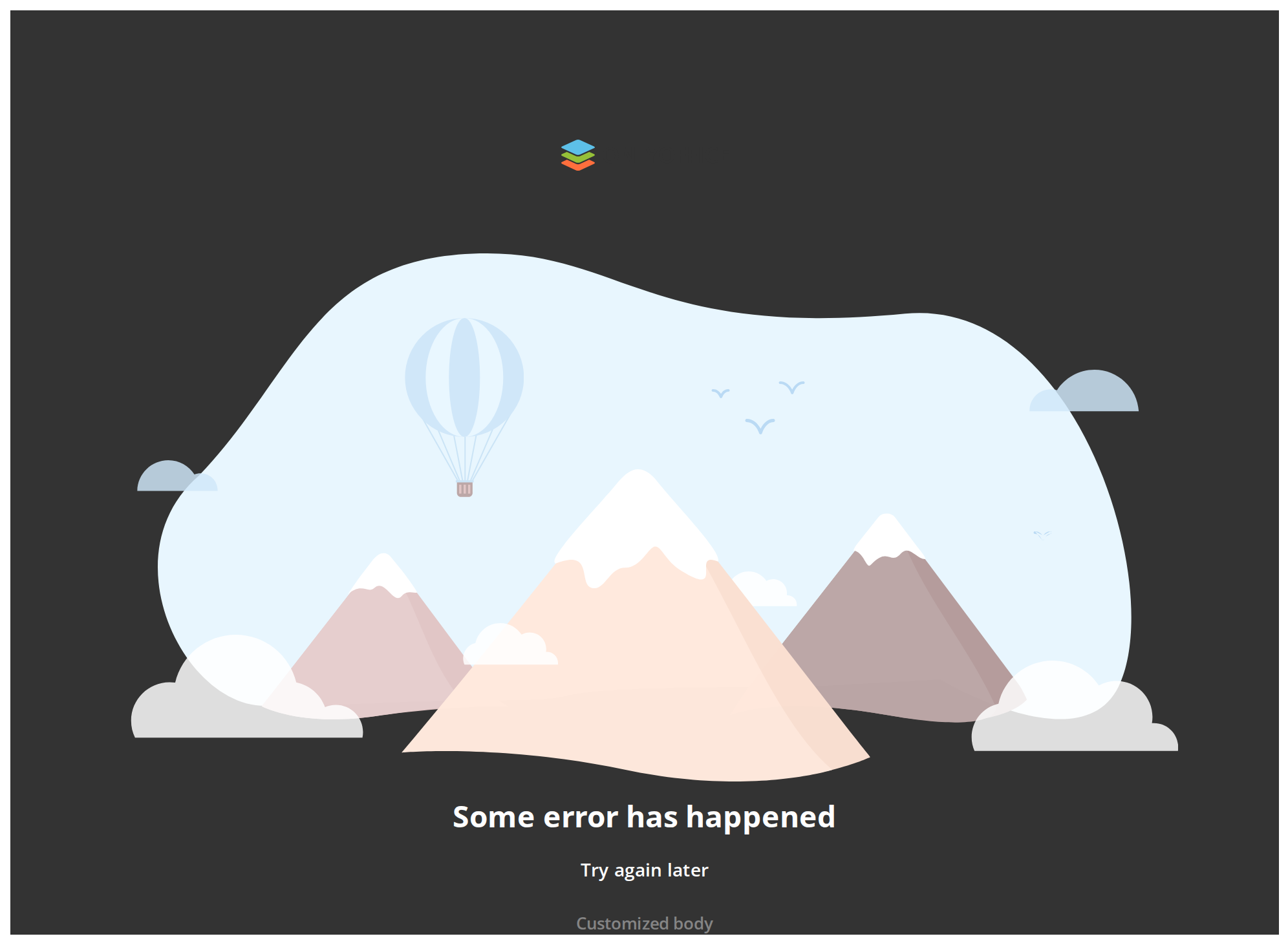
With Primary Button
Retry — a filled button under the message, for the one action that gets the user out of the error (buttonText with onClickButton). Without the handler the button is not rendered at all.
In Editor Mode
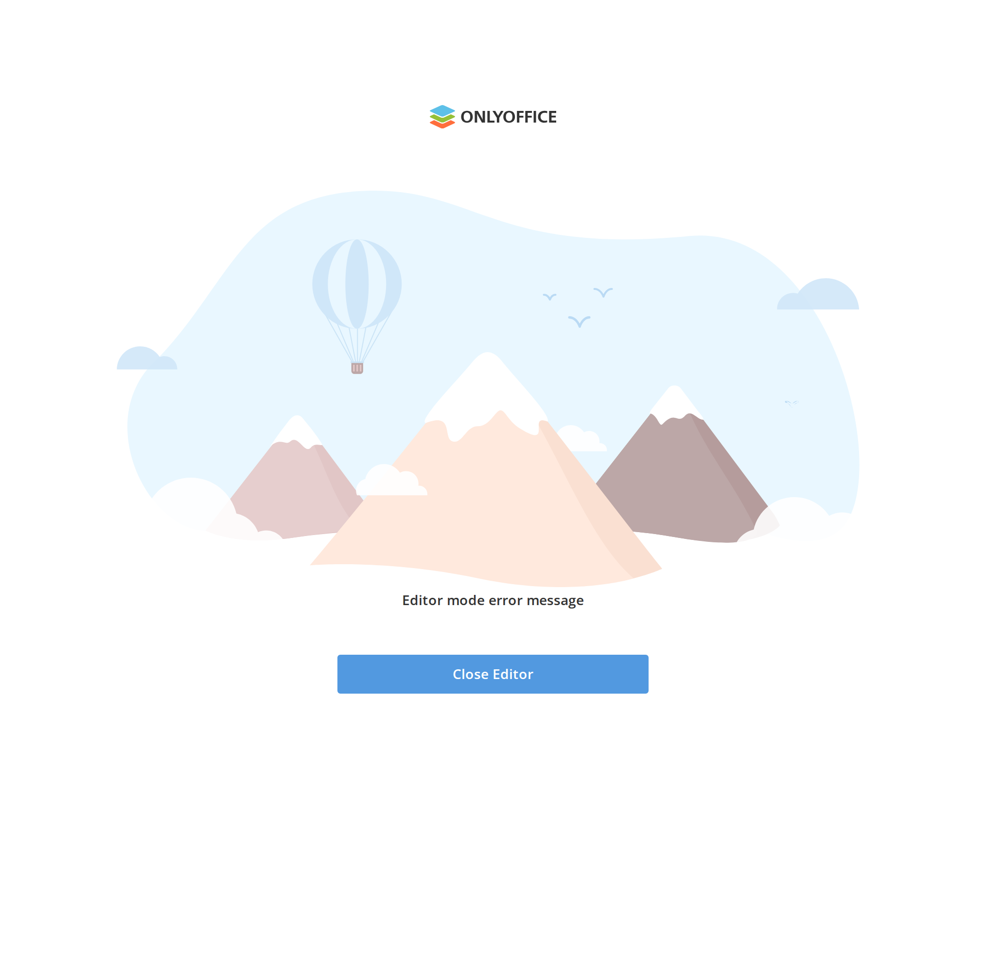
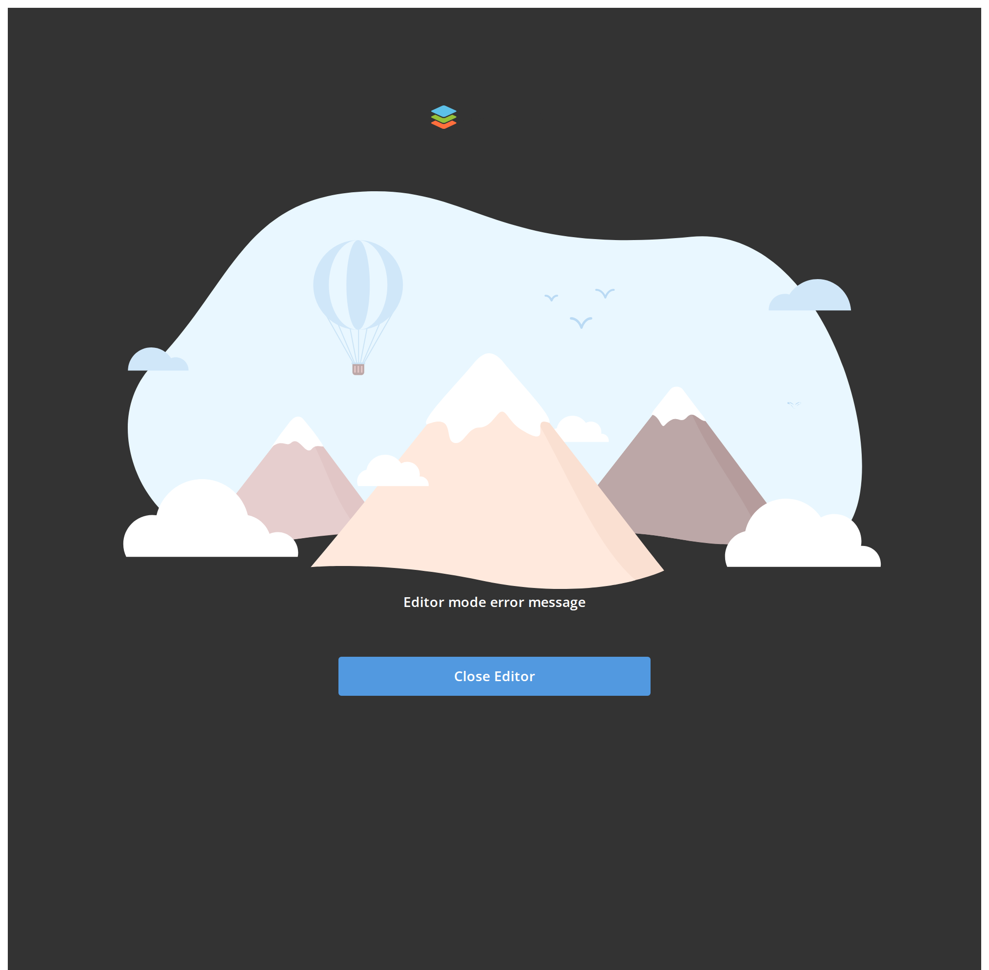
The same page laid over its host instead of pushing it down (isEditor), for a screen such as a document editor that mounts the error on top of a layout of its own.
With Children
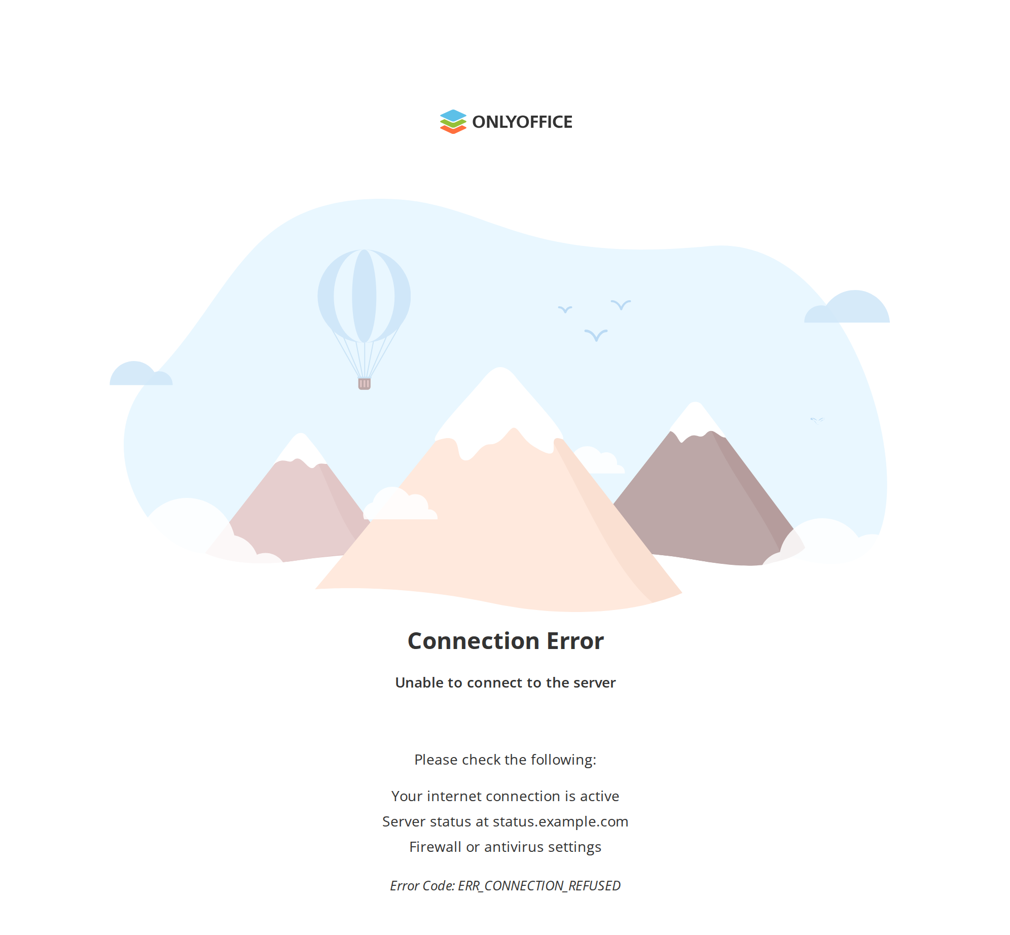
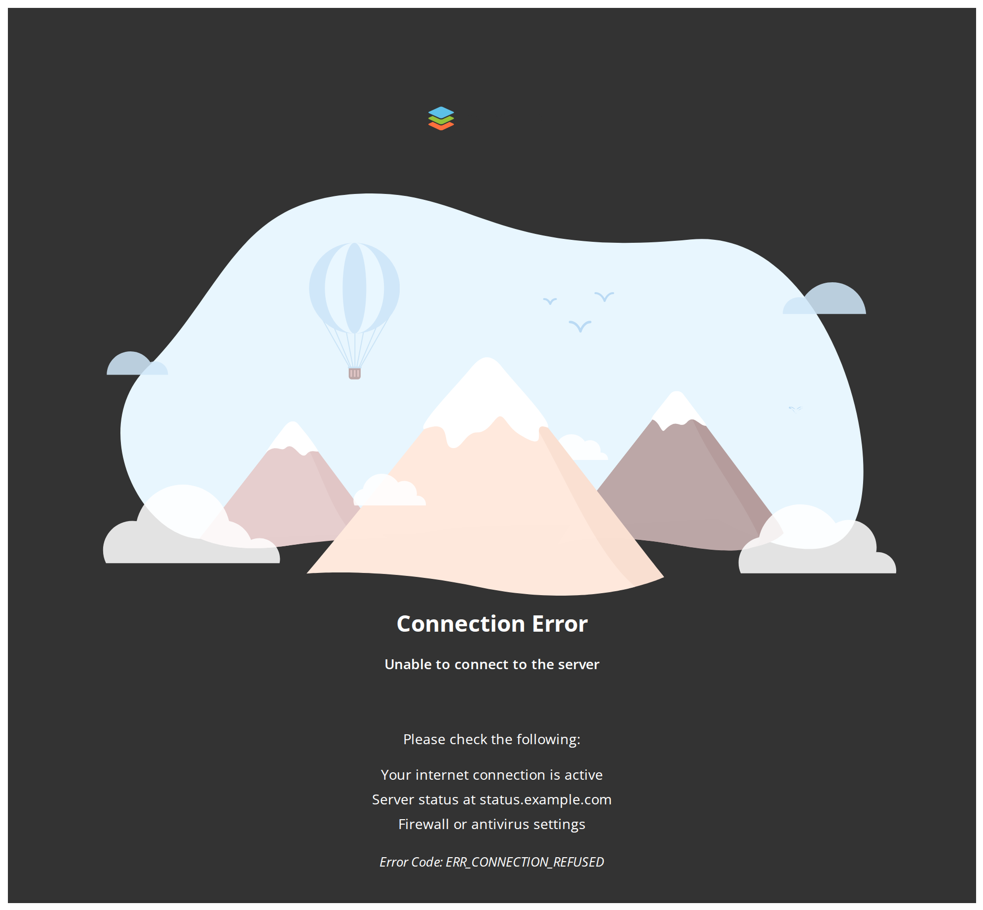
Please check the following — a checklist and an error code under the message (children), for guidance that does not fit into one line of text.
With Secondary Button
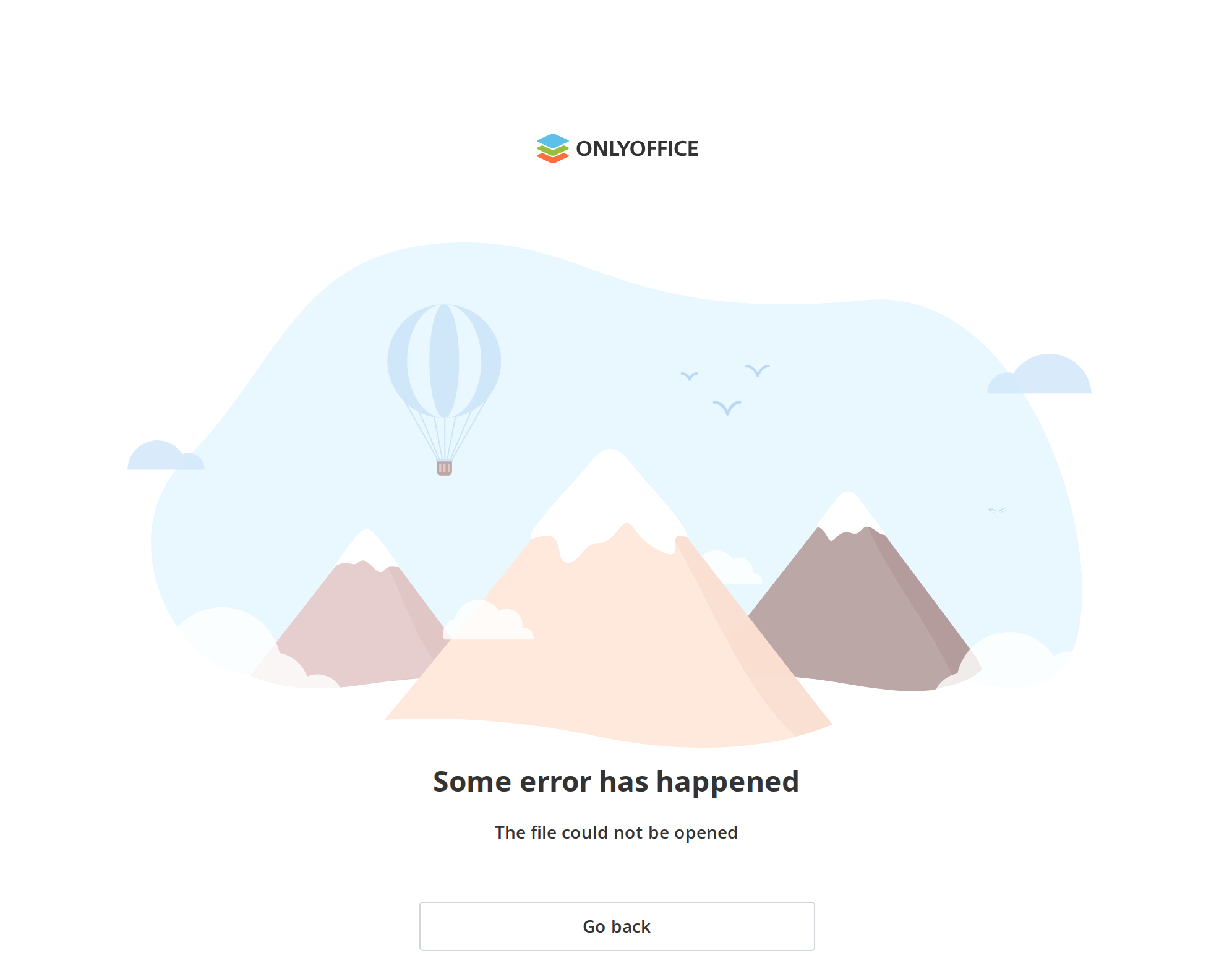
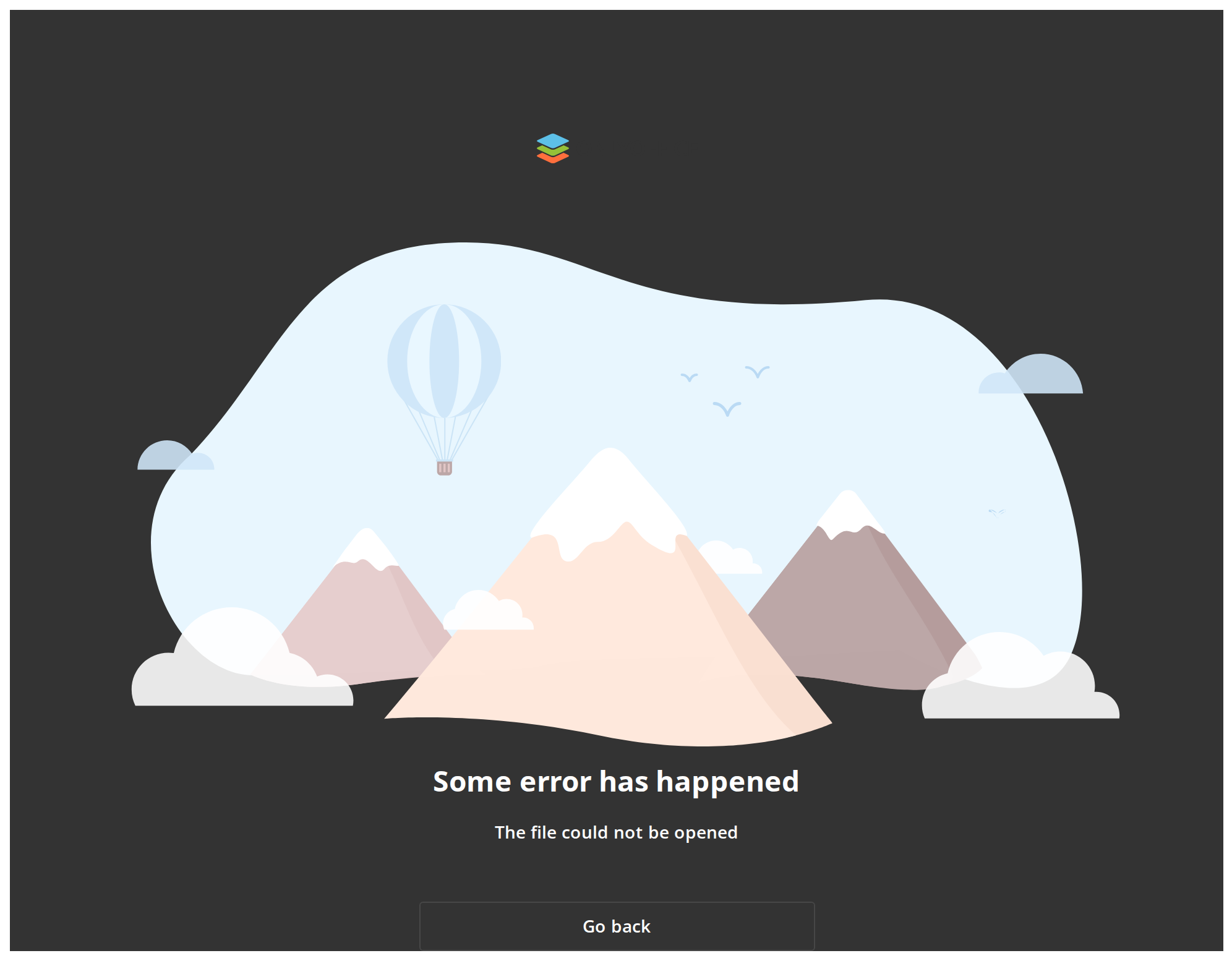
Go back — the same button, outlined (isPrimaryButton off), for a page where leaving is the way out rather than an action the user is expected to take.
Without Logo
The page starts with the illustration, with no logo above it (hideLogo), for a host that already shows its own brand or has no portal to take the logo from.
Css Customization
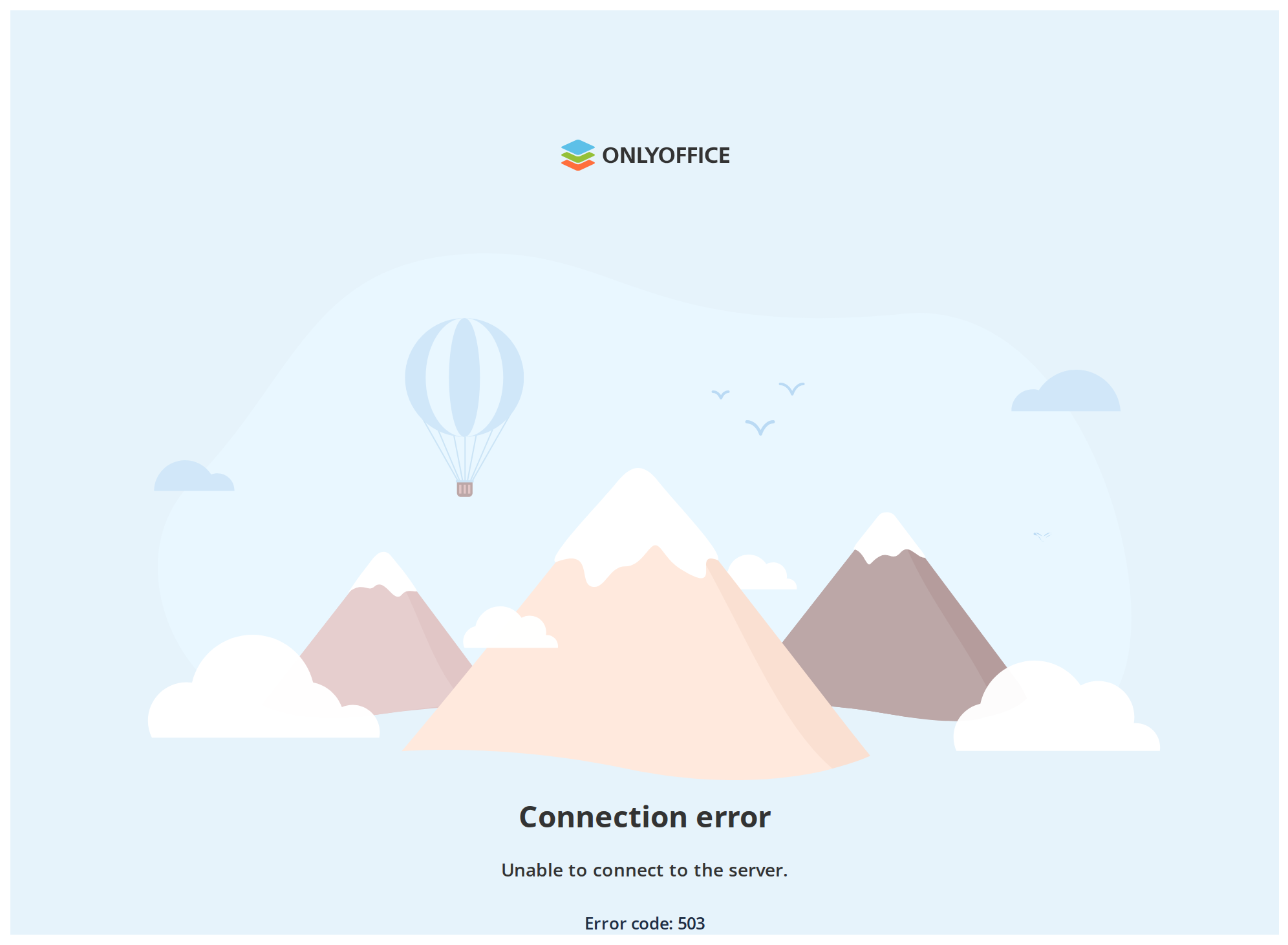
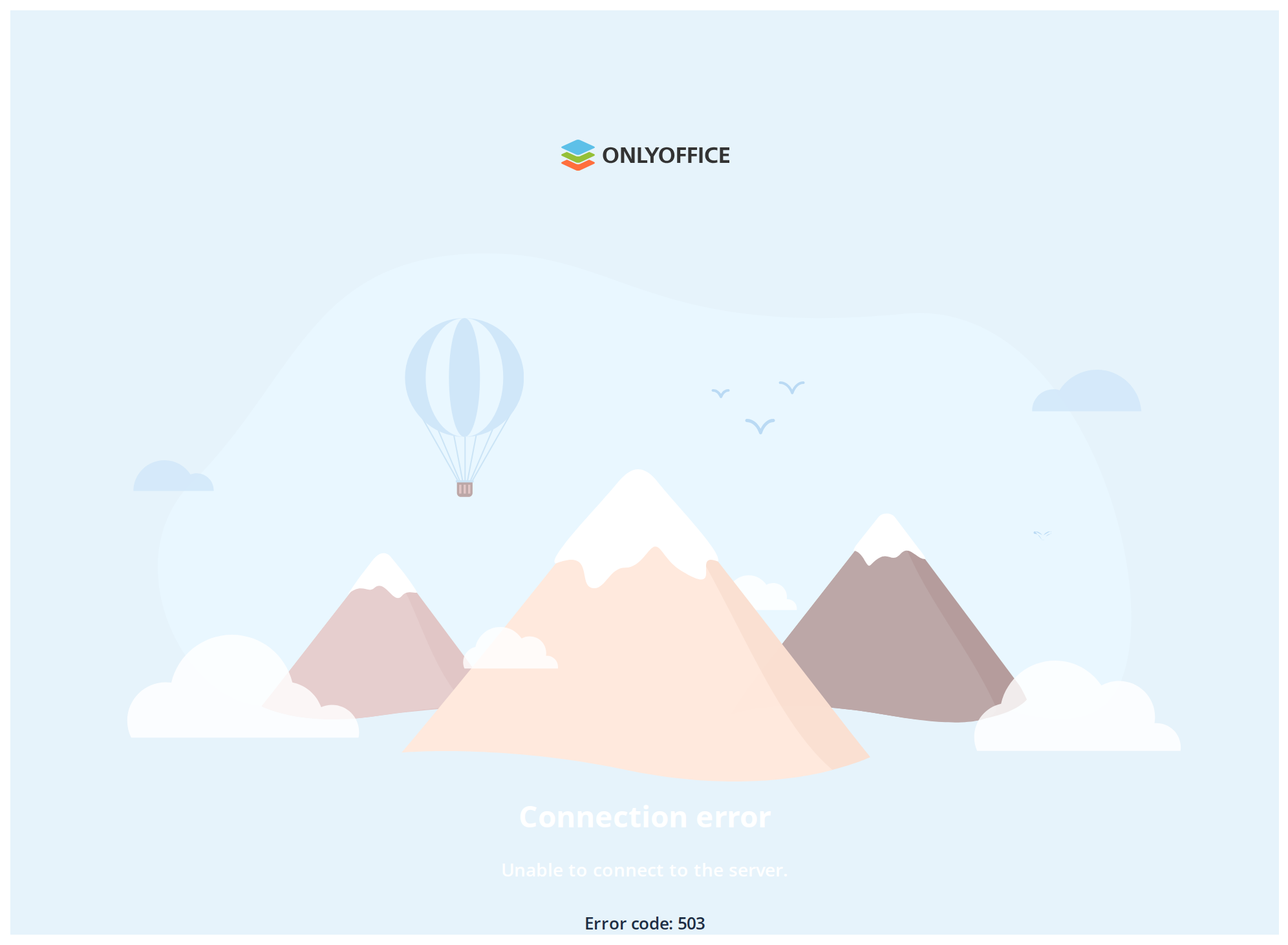
Both overridable variables set on one wrapper -- the variables are listed under CSS variables on this page. The example tints the page background and the customizedBodyText line.
Minimal example
import { ErrorContainer } from "@onlyoffice/apps-ui-kit/components/error-container";

export function NotFoundPage() {
  return (
    <ErrorContainer
      hideLogo
      headerText="Page not found"
      bodyText="The page you asked for does not exist, or you no longer have access to it."
    />
  );
}
Props
Recipes
With an action
The button appears only when buttonText and onClickButton are both set. It is stretched
to a 320px column, and to the full width below 1024px.
import { ErrorContainer } from "@onlyoffice/apps-ui-kit/components/error-container";

export function OfflinePage({ retry }: { retry: () => void }) {
  return (
    <ErrorContainer
      hideLogo
      headerText="No connection"
      bodyText="We could not reach the server. Check your connection and try again."
      buttonText="Try again"
      onClickButton={retry}
    />
  );
}
An extra line and your own content
customizedBodyText is a third line, smaller and bolder than bodyText. Anything richer goes in
children, which render below the button.
import { ErrorContainer } from "@onlyoffice/apps-ui-kit/components/error-container";
import { Link } from "@onlyoffice/apps-ui-kit/components/link";

export function ExpiredLinkPage() {
  return (
    <ErrorContainer
      hideLogo
      headerText="This link has expired"
      bodyText="Links are valid for seven days. Ask the person who shared it for a new one."
      customizedBodyText="Error code: LINK_EXPIRED"
    >
      <Link href="/support" isHovered>
        Contact support
      </Link>
    </ErrorContainer>
  );
}
Behaviour the types don't state
- The component always fills the viewport height. It is wrapped in the kit's scrollbar at
height: 100dvh, so it is a page, not a block: inside a card or a column it takes the whole screen anyway and scrolls within itself. - The portal logo is on by default, and it is fetched from the portal's own
logo.ashxendpoint, absolute from the site root. Outside DocSpace that request fails and the bundled fallback mark appears instead.hideLogoremoves it altogether. - It uses fixed element ids.
container-inner,header,text,customized-text,button-container,buttonand thirteen more on the illustration's pieces. Two error containers in one document therefore produce duplicate ids, and agetElementByIdof your own finds whichever came first. Theidprop names the outer element only; it does not prefix these. data-testidis the literal stringErrorContainerand cannot be changed. Anydata-testidyou pass is spread onto the element before that attribute is written.- The illustration has no dark variant. Every colour in it is a hard-coded hex value — the pale blue sky and the white clouds stay as they are on a black page.
- The landscape assembles itself on mount. For the first second the mountains, birds and clouds slide into place from off their positions and fade in, and the balloon drops in.
- Two clouds and the balloon animate forever, on a 1s alternating loop, and nothing wraps
them in a
prefers-reduced-motionquery. There is no prop to stop it. - The heading is 23px, not the 28px its preset would give. The component asks
Headingfor the portal'sheadertype and the stylesheet then overrides the size and line height. customizedBodyTextis plain text. Despite the name it is passed to aTextas a child, so markup in the string is escaped rather than rendered.--error-container-linkdoes nothing. The class that reads the link colour is defined in the stylesheet but is never put on any element the component renders, and it reads the internal variable rather than the overridable one.- Each text line is rendered only when its string is non-empty. An empty
headerText,bodyTextorcustomizedBodyTextleaves no element and no gap behind. - Below 1024px the page tightens: the top padding drops from 100px to 80px, the margins around the illustration shrink, and the button stretches to the full width.
- The element's own margin is
0 auto 8px 0— automatic on the trailing side only, so the page is not centred by that rule; the centring comes from the column layout inside it.
CSS variables
| Variable | Default | Effect |
|---|---|---|
--error-container-bg | white; black in dark | Background of the page |
--error-container-text | grey; lighter in dark | Colour of customizedBodyText |
The heading, bodyText and the button take their colours from Heading, Text and Button;
override those components' own variables to change them.
Accessibility
headerTextis rendered byHeadingand is an<h1>— the one heading on the page, which is right for a screen that has replaced a page.- The illustration is thirteen inline SVGs with no
aria-hiddenand no titles, so some screen readers announce each of them as an unlabelled graphic before the heading. There is no prop that suppresses this; when it matters, hide the whole region with your own wrapper and re-announce the message. - The action is a real
<button>fromButton, focusable and labelled bybuttonText. - The moving clouds and balloon ignore
prefers-reduced-motion. If your application honours that setting, add a rule of your own throughclassNamethat setsanimation: noneon the illustration's ids. - Nothing here moves focus when the page appears. Send focus to the heading yourself if the error replaces the previous screen in place.
Test ids
The heading, the lines and the button carry the ids of Heading, Text and Button; the
illustration's pieces carry only their element ids.
Related
EmptyScreenContainer— for a region with no content rather than a page that failed.EmptyView— the current empty state, with actions as rows.PortalLogo— the mark this page renders unless you passhideLogo.