Article
Works only inside an ONLYOFFICE Apps portal: it needs the portal's API client, stores and translations, and is not part of the public API.
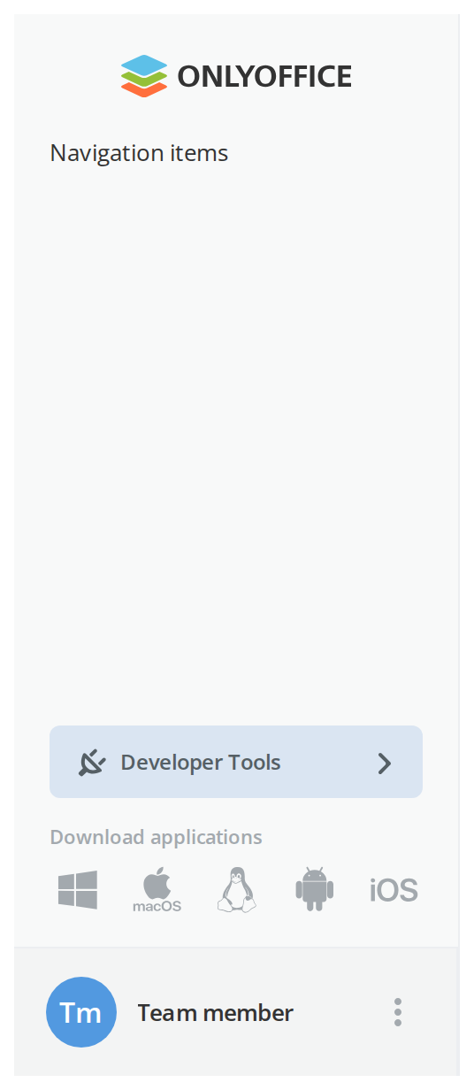
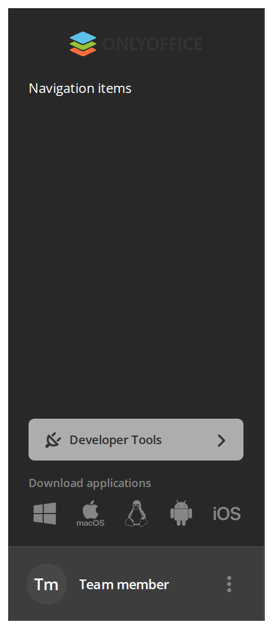
DocSpace's left panel: a fixed column with a header slot, a main button, a scrolling body and the profile block. Almost everything in it is decided by the portal — the tariff, the Zendesk account, the developer tools, the signed-in person — which is why it takes some thirty props.
Use this when / not when
- This is portal-internal. It is the DocSpace client's own sidebar, down to the Zendesk widget,
the
/developer-toolspath and the "download the apps" block. Outside that product most of its props have no source. - Use it when you are rebuilding that layout and can supply a portal-shaped set of props.
- Not for an application's own navigation — that is
NavMenu, which takes a tree of items and nothing else. - Not for the page body beside it — that is
Section. - It is not a container. Its
childrenare three marker components whose contents it lifts out and renders elsewhere; anything else you put inside is dropped.
Import
import Article from "@onlyoffice/apps-ui-kit/components/article";
It is a default export, so the name is yours to choose. The root barrel carries it by name
as well — components/index.ts re-exports it as export { default as Article } — but prefer the
subpath: the barrel does not build without four optional peers, see
Which import form.
Needs ThemeProvider above it in the tree — every colour and the panel's three widths are declared
only under the light and dark classes it puts on <body> — and TranslationProvider, because
the collapse handle, the apps block, the developer tools entry and the profile menu read their
labels from the kit's shared translations and render empty strings without it.
Stories
Default
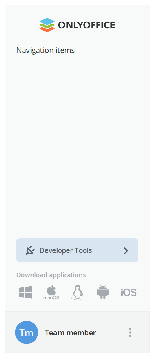
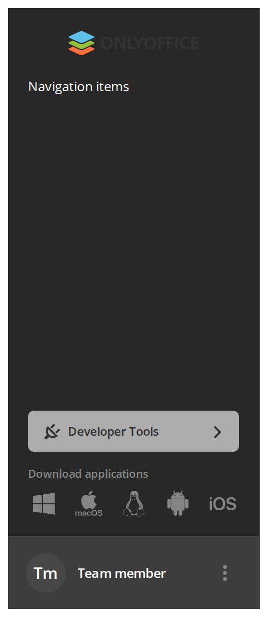
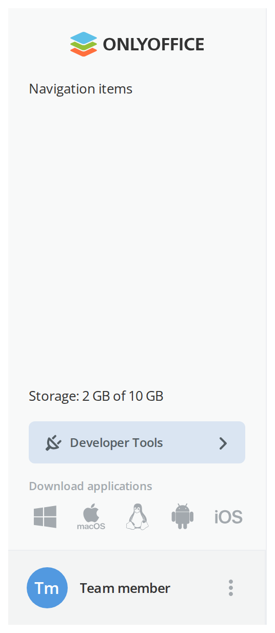
The panel as a desktop page shows it: the logo, the body, the developer tools entry, the download links and the profile block. Click the dots beside the name to open the actions menu (getActions), and change any other prop live in the Controls panel below.
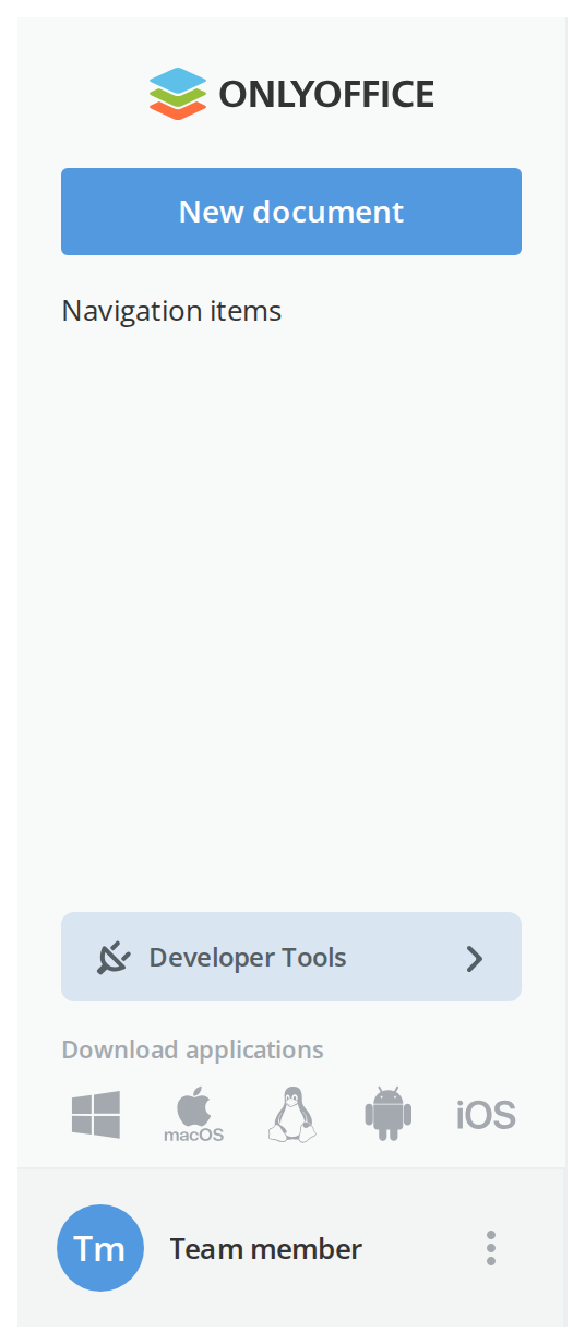
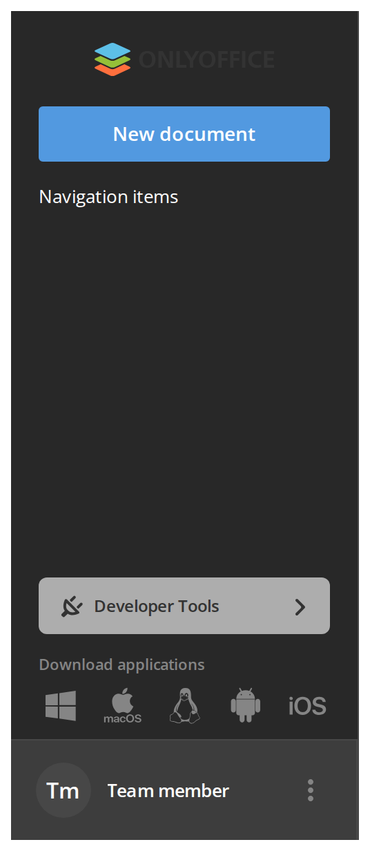
With Main Button
New document — the page's primary command, kept above the navigation where it is always in reach (withMainButton, Article.MainButton).
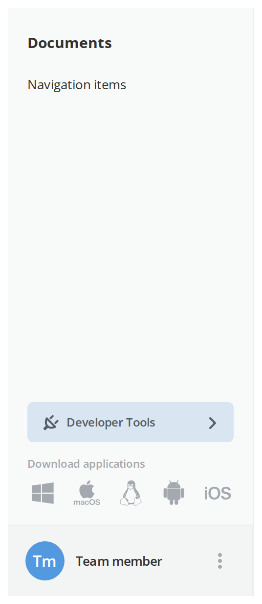
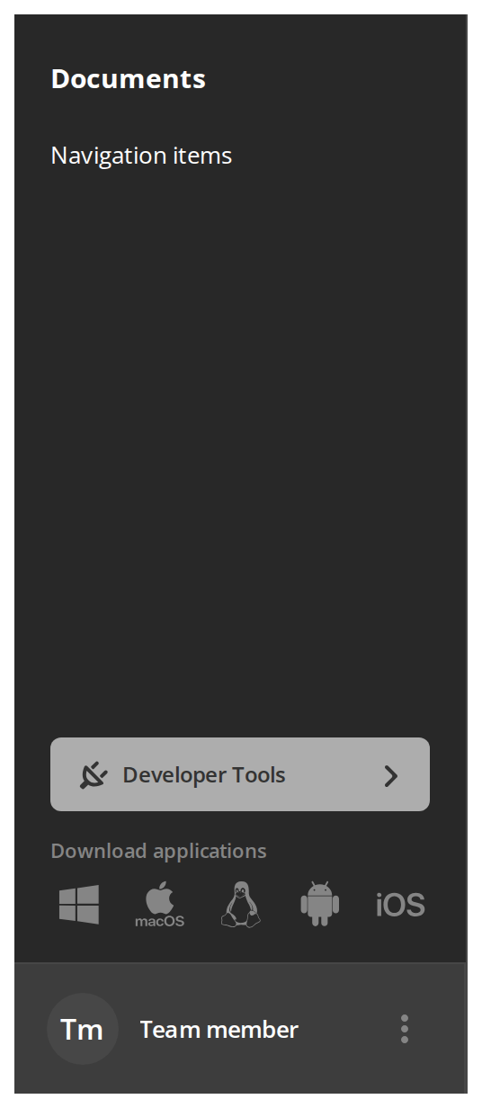
Custom Header
Documents — the application's own title in the header row in place of the logo, for a layout that names the panel itself (withCustomArticleHeader, Article.Header).
With Back Button
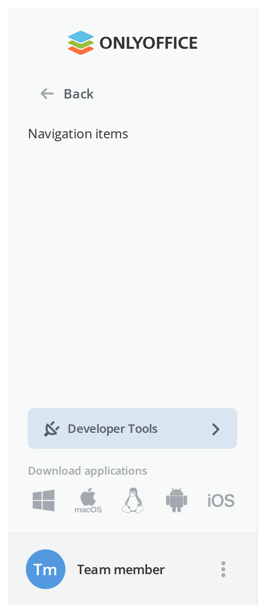
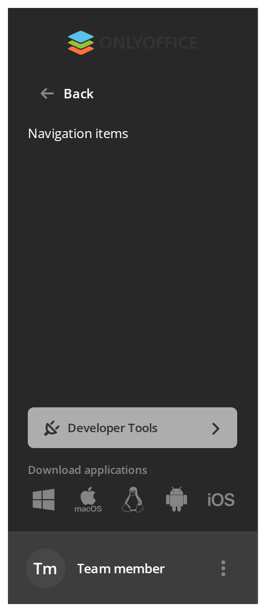
Back — a way out of a nested section at the top of the body. It calls onBack, or navigates home when there is none (showBackButton).
Loading State
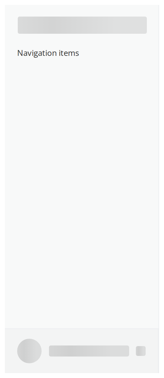
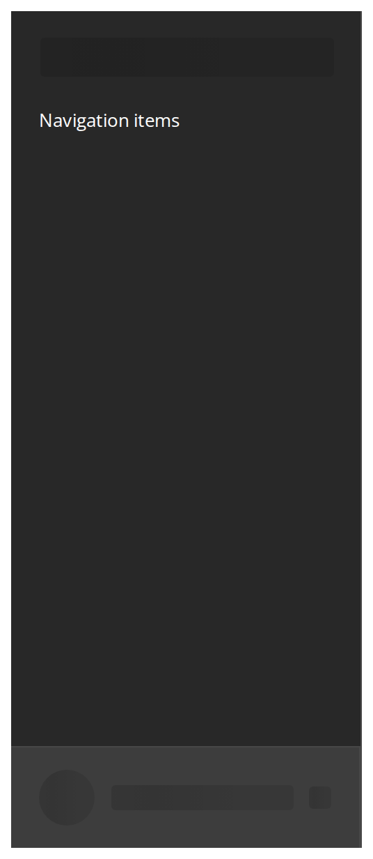
Skeletons in place of the logo and the profile block while the page's data is still arriving, so the panel keeps its shape; the body slot is still rendered (isBurgerLoading, showArticleLoader).
With Custom Slot
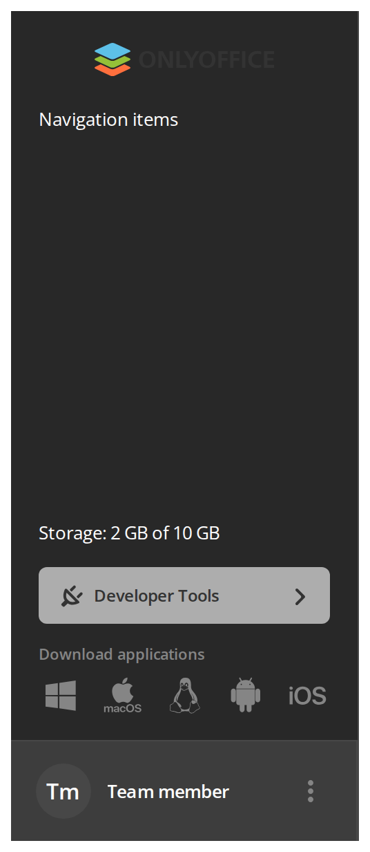
Storage: 2 GB of 10 GB — a notice that belongs to the panel rather than to the navigation, placed between the body and the developer tools entry (customSlot).
Without Footer Blocks
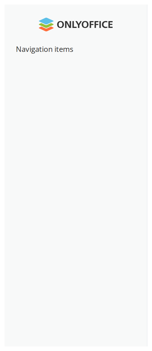
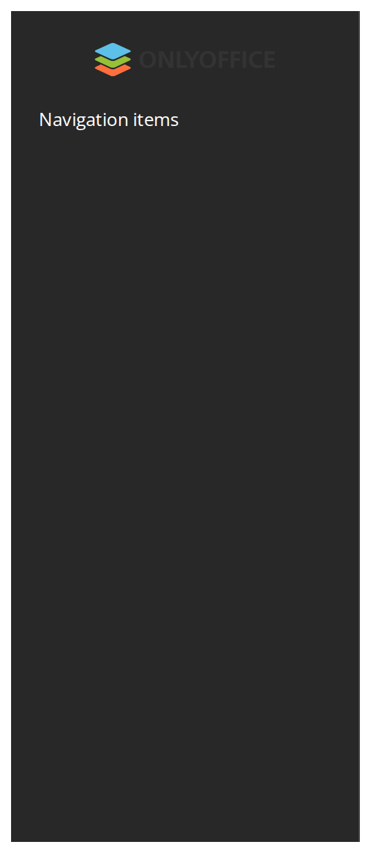
The body with nothing below it, for a page that shows the person and the download links elsewhere: no profile block (hideProfileBlock), no download links (hideAppsBlock) and no developer tools entry for a person who is not an administrator (limitedAccessDevToolsForUsers).
Collapsed On Tablet
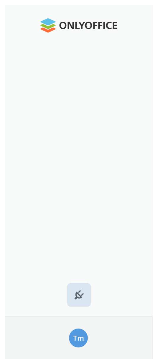
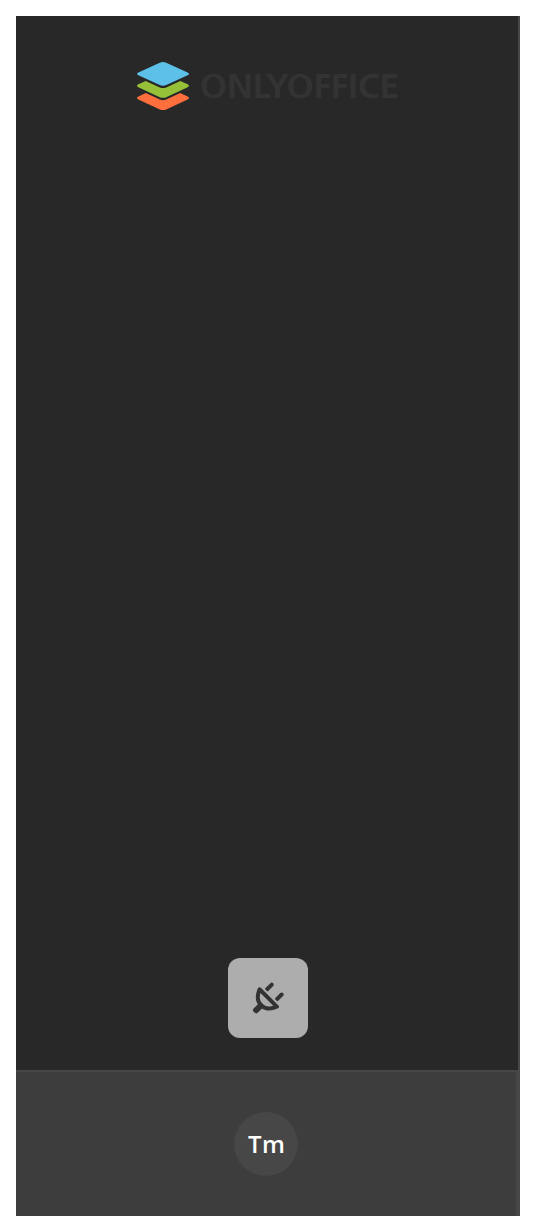
A 60px column of icons in a tablet-width window, which leaves the page most of the screen (showText off). Click the handle at the foot to expand it and again to collapse it (toggleShowText).
On Phone
The panel on a phone: it covers the page below a 64px top strip, over a backdrop, and drops the profile block. Close it with the cross in its header or a tap on the backdrop (toggleArticleOpen); switch articleOpen in the Controls panel of the story canvas to open it again.

Right To Left
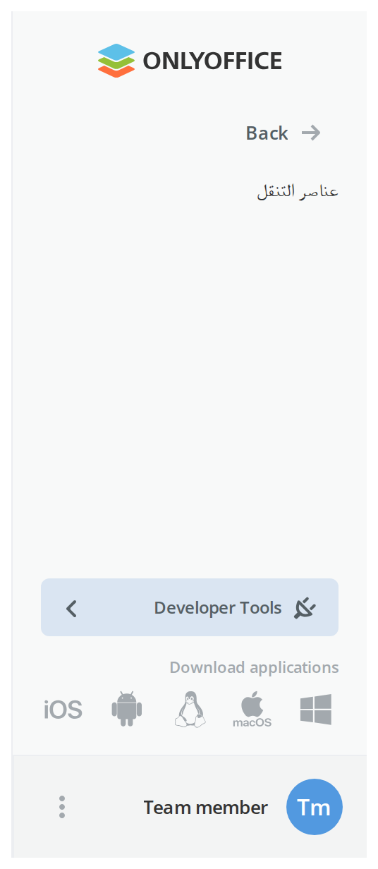
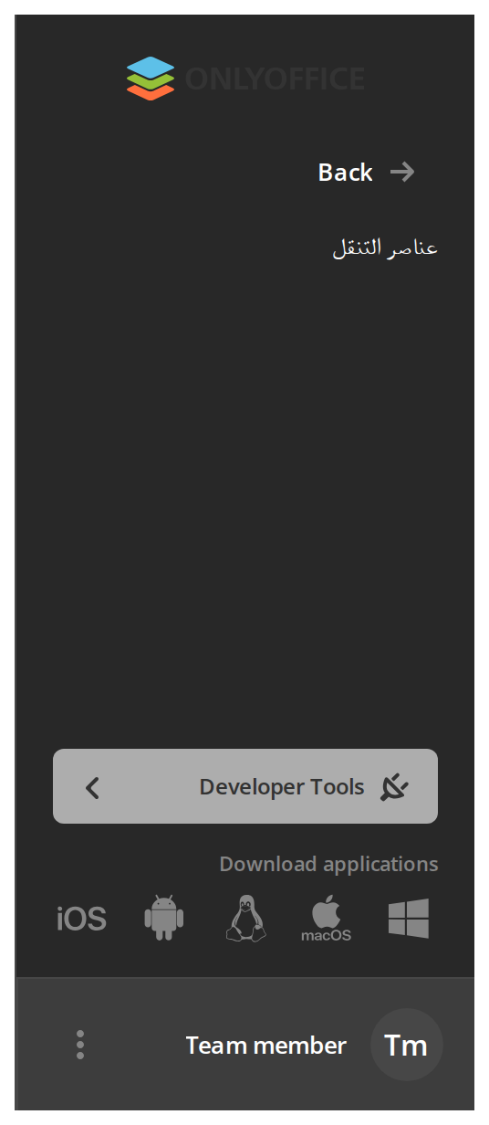
The panel in a right-to-left interface: its border moves to the left edge, the back arrow points right and the dots button sits on the left of the profile block.
Css Customization
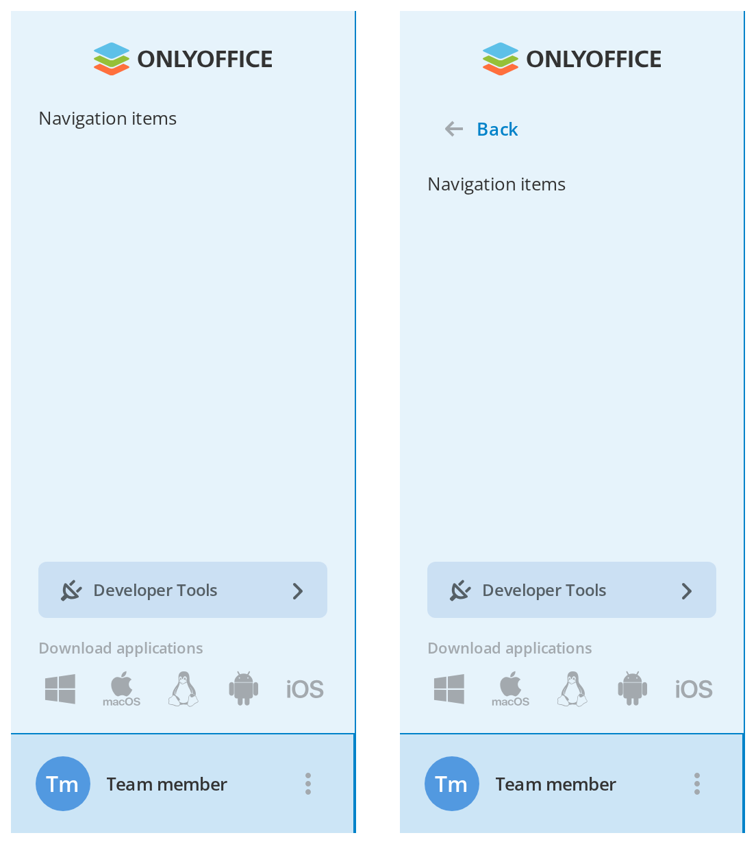
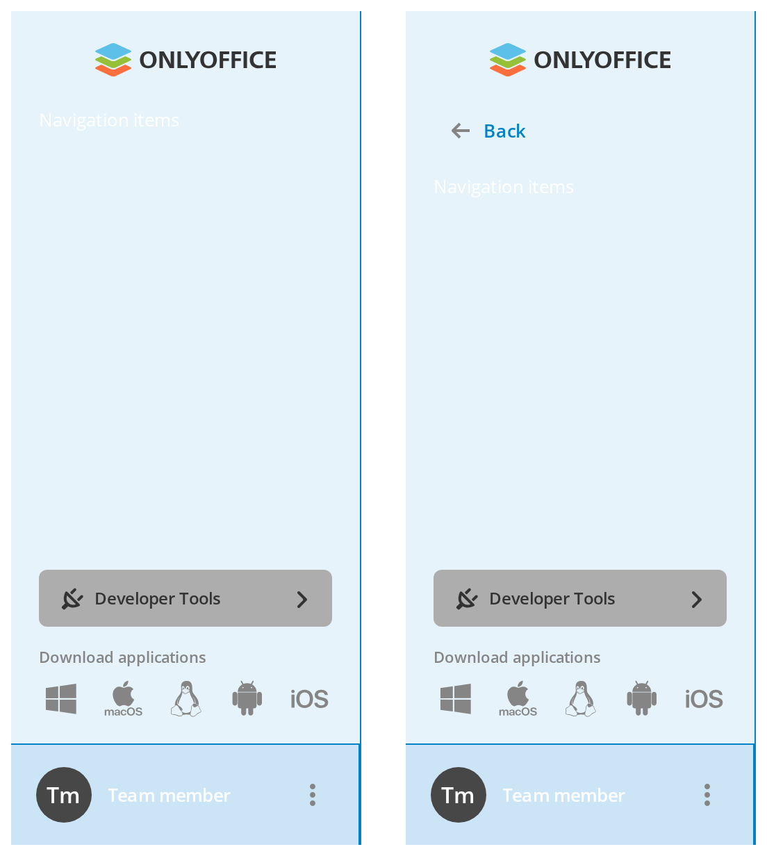
Five of the panel's variables set on one wrapper -- the variables are listed under CSS variables on this page. The first panel shows the background, the borders and the profile block; the second adds the back button (showBackButton) for --article-back-color.
Minimal example
import { useState } from "react";

import Article from "@onlyoffice/apps-ui-kit/components/article";
import { Text } from "@onlyoffice/apps-ui-kit/components/text";
import { DeviceType } from "@onlyoffice/apps-ui-kit/enums";

export function Sidebar() {
  const [showText, setShowText] = useState(true);
  const [articleOpen, setArticleOpen] = useState(false);
  const [isMobileArticle, setIsMobileArticle] = useState(false);

  return (
    <Article
      currentDeviceType={DeviceType.desktop}
      showText={showText}
      setShowText={setShowText}
      toggleShowText={() => setShowText((value) => !value)}
      articleOpen={articleOpen}
      setArticleOpen={setArticleOpen}
      toggleArticleOpen={() => setArticleOpen((value) => !value)}
      isMobileArticle={isMobileArticle}
      setIsMobileArticle={setIsMobileArticle}
      isBurgerLoading={false}
      withCustomArticleHeader={false}
      showBackButton={false}
      hideProfileBlock
      hideAppsBlock
      withCustomSlot={false}
      withSendAgain={false}
      mainBarVisible={false}
      isLiveChatAvailable={false}
      isShowLiveChat={false}
      isAdmin={false}
      limitedAccessDevToolsForUsers
      logoText=""
      downloaddesktopUrl=""
      officeforandroidUrl=""
      officeforiosUrl=""
      languageBaseName="en"
      zendeskKey=""
    >
      <Article.Header>
        <Text fontWeight={600}>Documents</Text>
      </Article.Header>
      <Article.Body>
        <div>
          <Text>Rooms</Text>
          <Text>My documents</Text>
        </div>
      </Article.Body>
    </Article>
  );
}
Props
Recipes
Loading
showArticleLoader swaps the profile block for a skeleton and removes everything the panel adds
below the body: the custom slot, the developer tools entry, the apps block, the live chat and the
collapse handle. The header, the back button and the three slots stay as they are, so the panel does
not jump when the data arrives. isBurgerLoading does the same for the logo and the back button,
which it draws as skeletons.
import { useEffect, useState } from "react";

import Article from "@onlyoffice/apps-ui-kit/components/article";
import { Text } from "@onlyoffice/apps-ui-kit/components/text";
import { DeviceType } from "@onlyoffice/apps-ui-kit/enums";

export function LoadingSidebar() {
  const [loading, setLoading] = useState(true);

  useEffect(() => {
    const id = setTimeout(() => setLoading(false), 1200);
    return () => clearTimeout(id);
  }, []);

  return (
    <Article
      showArticleLoader={loading}
      currentDeviceType={DeviceType.desktop}
      showText
      setShowText={() => {}}
      toggleShowText={() => {}}
      articleOpen={false}
      setArticleOpen={() => {}}
      toggleArticleOpen={() => {}}
      isMobileArticle={false}
      setIsMobileArticle={() => {}}
      isBurgerLoading={loading}
      withCustomArticleHeader={false}
      showBackButton={false}
      hideProfileBlock={false}
      hideAppsBlock
      withCustomSlot={false}
      withSendAgain={false}
      mainBarVisible={false}
      isLiveChatAvailable={false}
      isShowLiveChat={false}
      isAdmin
      limitedAccessDevToolsForUsers={false}
      logoText=""
      downloaddesktopUrl=""
      officeforandroidUrl=""
      officeforiosUrl=""
      languageBaseName="en"
      zendeskKey=""
    >
      <Article.Header>
        <Text fontWeight={600}>Documents</Text>
      </Article.Header>
      <Article.Body>
        <div />
      </Article.Body>
    </Article>
  );
}
Collapsing the panel
showText is the width, and the component writes it back through setShowText whenever the device
type changes — so it has to be state you own, not a constant. The handle at the foot of the panel
calls toggleShowText and nothing else; if that does not flip showText, nothing happens.
import { useState } from "react";

import Article from "@onlyoffice/apps-ui-kit/components/article";
import { Text } from "@onlyoffice/apps-ui-kit/components/text";
import { DeviceType } from "@onlyoffice/apps-ui-kit/enums";

export function CollapsibleSidebar() {
  const [showText, setShowText] = useState(true);

  return (
    <Article
      showText={showText}
      setShowText={setShowText}
      toggleShowText={() => setShowText((value) => !value)}
      currentDeviceType={DeviceType.tablet}
      articleOpen={false}
      setArticleOpen={() => {}}
      toggleArticleOpen={() => {}}
      isMobileArticle
      setIsMobileArticle={() => {}}
      isBurgerLoading={false}
      withCustomArticleHeader={false}
      showBackButton={false}
      hideProfileBlock
      hideAppsBlock
      withCustomSlot={false}
      withSendAgain={false}
      mainBarVisible={false}
      isLiveChatAvailable={false}
      isShowLiveChat={false}
      isAdmin={false}
      limitedAccessDevToolsForUsers
      logoText=""
      downloaddesktopUrl=""
      officeforandroidUrl=""
      officeforiosUrl=""
      languageBaseName="en"
      zendeskKey=""
    >
      <Article.Header>
        <Text fontWeight={600}>Documents</Text>
      </Article.Header>
      <Article.Body>
        <div>{showText ? <Text>Rooms</Text> : null}</div>
      </Article.Body>
    </Article>
  );
}
Behaviour the types don't state
- The slots render nothing themselves.
Article.Header,Article.MainButtonandArticle.Bodyare components that returnnull. Their children are picked out ofchildrenin an effect, by matchingdisplayName, and rendered in the panel's own places. - Wrapping a slot hides it. The match is on the child's own display name, so
<MyHeader />that renders anArticle.Header, or a memoised one, is never found and its content never appears. - A slot that disappears leaves its content behind. The lifted content is kept in state and only
ever written, never cleared: rendering without an
Article.Bodyafterwards keeps showing the previous body. Article.Bodymust hold exactly one element. A component child is cloned to receive ahasCustomSlotprop, so a fragment, a list or a string throws. A DOM element child (<nav>) is rendered as it is, without the prop.- Twelve props are dead.
withSendAgain,isNonProfit,isGracePeriod,isFreeTariff,isPaymentPageAvailable,isLicenseDateExpired,isTrial,standalone,currentTariffPlanTitle,trialDaysLeft,withCustomSlotandpathare declared, several of them required, and nothing reads any of them. - It writes to the props it is given. On mount and on every change of
currentDeviceTypeit callssetShowTextandsetIsMobileArticle; on a phone it also forcesshowTextto true. Both have to be backed by state you own. - It reads
localStorage. The keyshowArticleis parsed on mount; on a tablet the panel stays expanded unless that key holds a falsy JSON value, because an absent key parses to{}. - On a phone the whole panel is a portal into
#root, with a backdrop that callstoggleArticleOpen, and apopstatelistener that closes it when the browser goes back. - The developer tools entry is hidden by the URL. Besides
isAdminandlimitedAccessDevToolsForUsers, it is suppressed on any path containingdeveloper-tools,accounts, ormanagementwithoutprofile— read fromwindow.locationduring render. - The live chat block loads Zendesk. It is rendered only when
isLiveChatAvailableis set and the user agent is not mobile, and it injects a third-party script keyed byzendeskKey. - The layout follows
currentDeviceType, not the window. The only measurement it takes is the window height minus#main-bar, on every resize — and it does not use the result. The stylesheet is the exception: the widths, the collapse handle and the header rule are chosen by media queries at 600px and 1024px, so atabletdevice type in a desktop-wide window still gets the desktop column. - The collapse handle exists only in a tablet-width window (600–1024px). The stylesheet hides it
on desktop and phone widths whatever
currentDeviceTypesays. - The profile block shows the avatar, the name and a dots button that opens the
getActionsmenu. On a collapsed tablet panel only the avatar is left, and clicking it opens that menu instead of callingonProfileClick. On a phone the block is not rendered at all. - The panel is
height: 100%and its width is fixed by custom properties: 252px on desktop, 243px expanded and 60px collapsed on a tablet.
Sub-components
They are static properties of Article, not separate exports, and they accept nothing but
children.
The body's rows are usually ArticleItem, from components/article/item — one catalog entry with
an icon, a label and an optional badge. With showText off it shows only the icon, and its title
prop becomes the tooltip; isEndOfBlock closes a group with a bottom margin of 16px (24px
below 1024px). It has no README of its own; its variables are listed below.
CSS variables
ArticleItem reads its own set:
Accessibility
- The panel is not a landmark. It is a
<div>with an id, not a<nav>or<aside>, and it has no label — so it is not announced as a region and cannot be jumped to. - The collapse handle and the burger are
<div>s with anonClick, with no role, notabindexand no key handler: the panel cannot be collapsed or opened from the keyboard. - On a phone the panel is a portal over the page with a backdrop, and nothing moves focus into it, traps focus inside it or restores focus when it closes.
- The labels that are rendered come from the kit's shared translations; without a
TranslationProviderthey are empty strings, which leaves those controls with no accessible name at all. - The panel sets
user-select: noneover its whole area, so its text cannot be selected or copied.
Test ids
It is not settable. The panel also carries data-show-text, data-open and
data-with-main-button, and its element id is article-container.
Related
Section— the page body this sits beside, and the other half of the layout.Navigation— the header inside that body.NavMenu— a navigation panel that is not tied to the portal.