Portal
Renders a node into another part of the document, after mount, keeping it inside the React
tree. It is the escape hatch the kit's own overlays use to get out of overflow: hidden.
Use this when / not when
- Use for something of yours that has to escape a clipping or stacking ancestor: a popover anchored to a cell, a layer over a scrolling region.
- Not for the kit's overlays.
ModalDialog,DropDownandTooltipalready render through one; wrapping them again does nothing useful. - Not to position anything. This component renders no element and no styles — the node you pass positions itself.
- Not in a server-rendered tree, when the content has to be in the first HTML: it renders nothing on the server and nothing on the first client render.
Import
import { Portal } from "@onlyoffice/apps-ui-kit/components/portal";
Also exported from the root barrel @onlyoffice/apps-ui-kit.
No provider needed.
Stories
Default
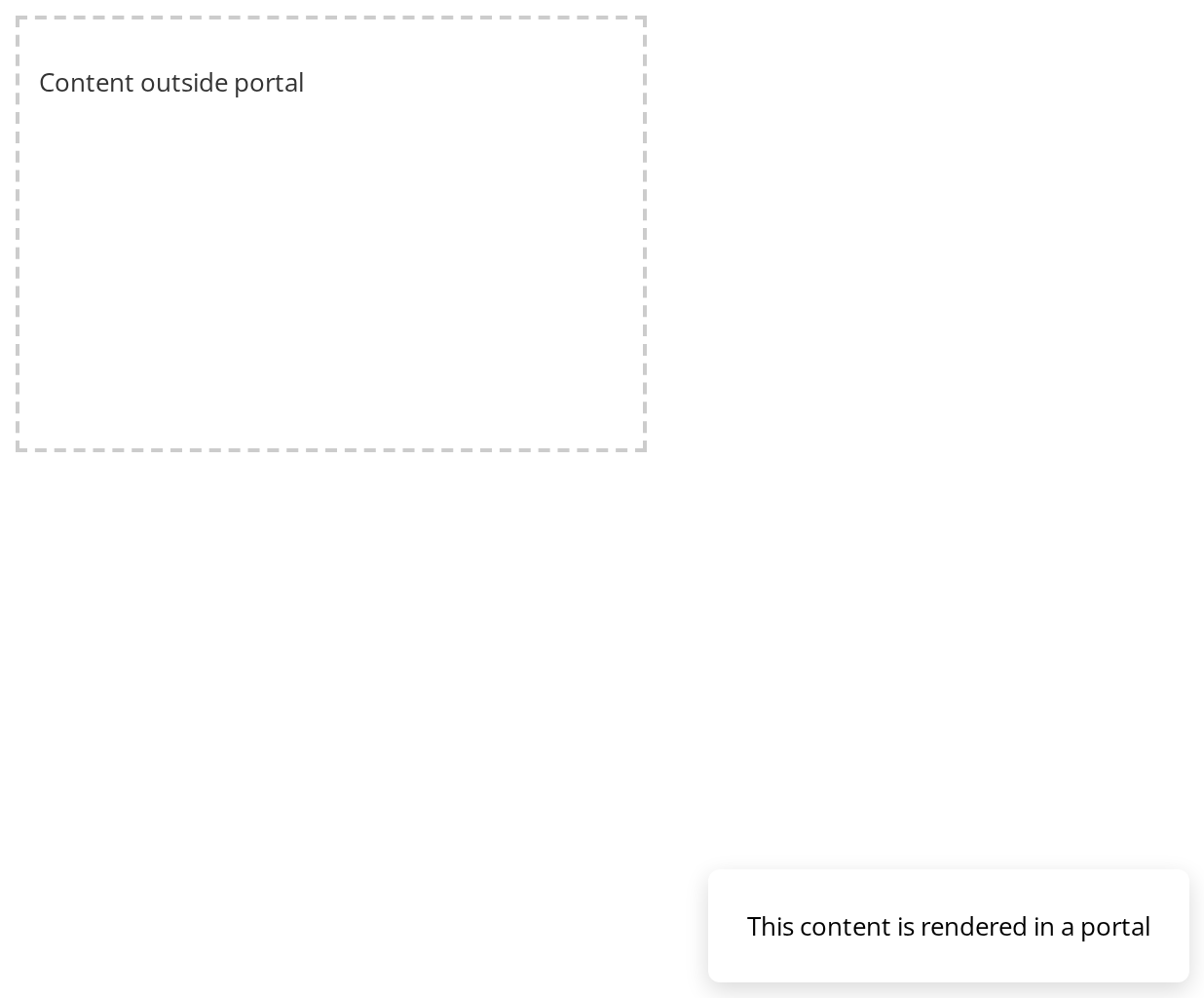
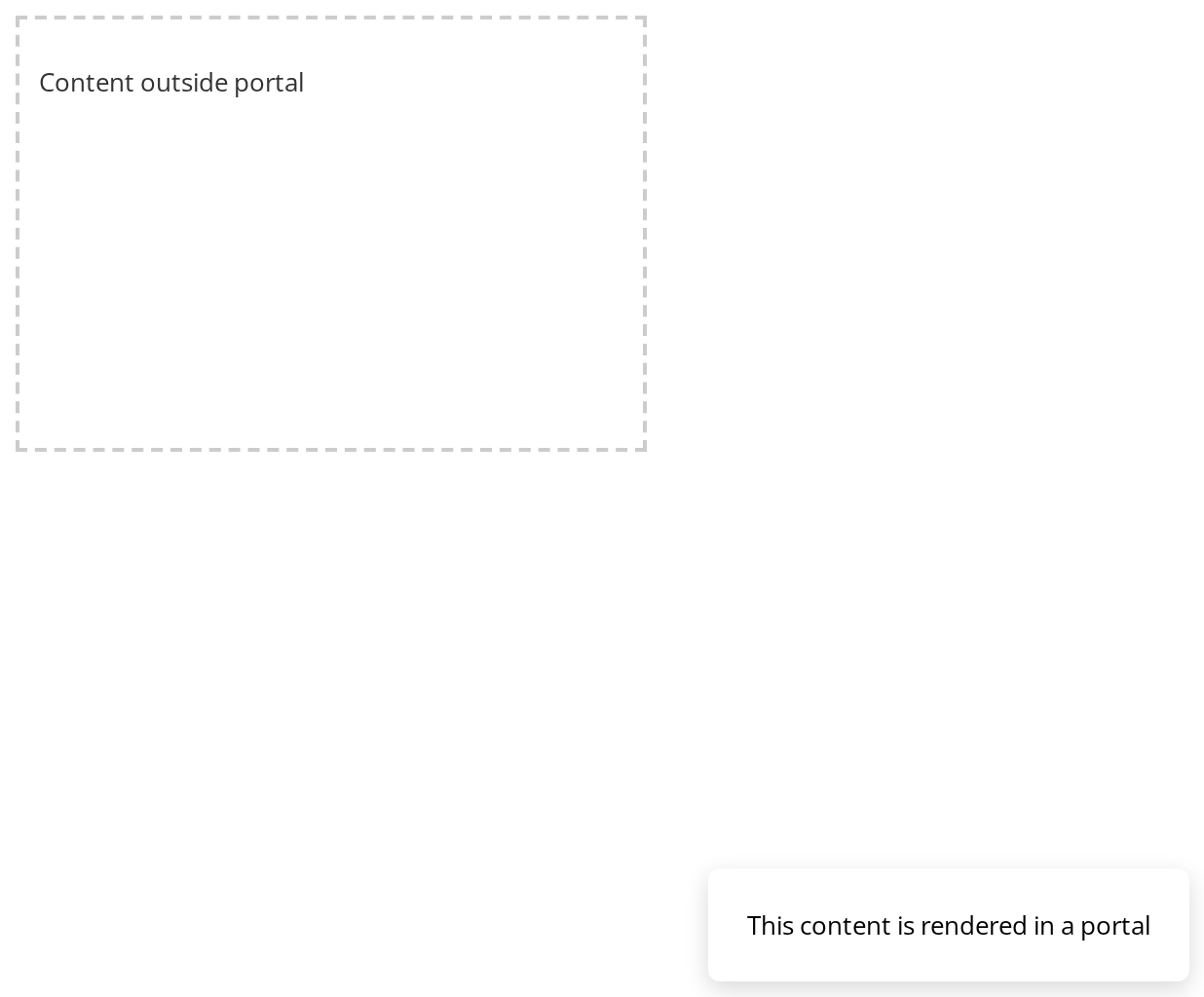
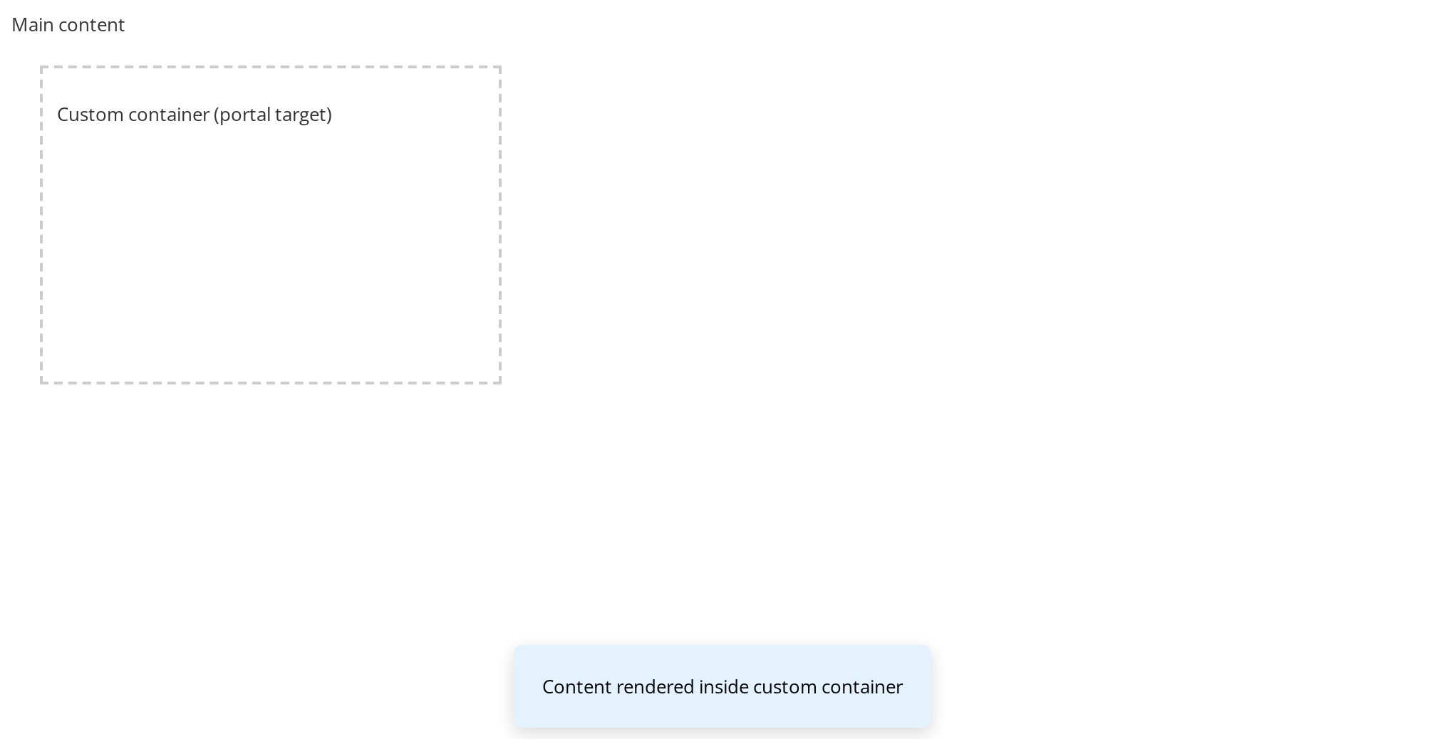
The content passed in element shows inside the dashed container that owns it, not beside the text it was declared next to (appendTo). Switch visible in the Controls panel below to unmount and mount it again.
Hidden
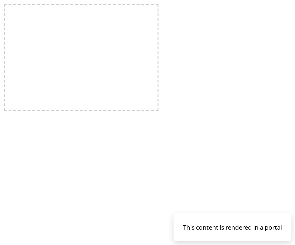
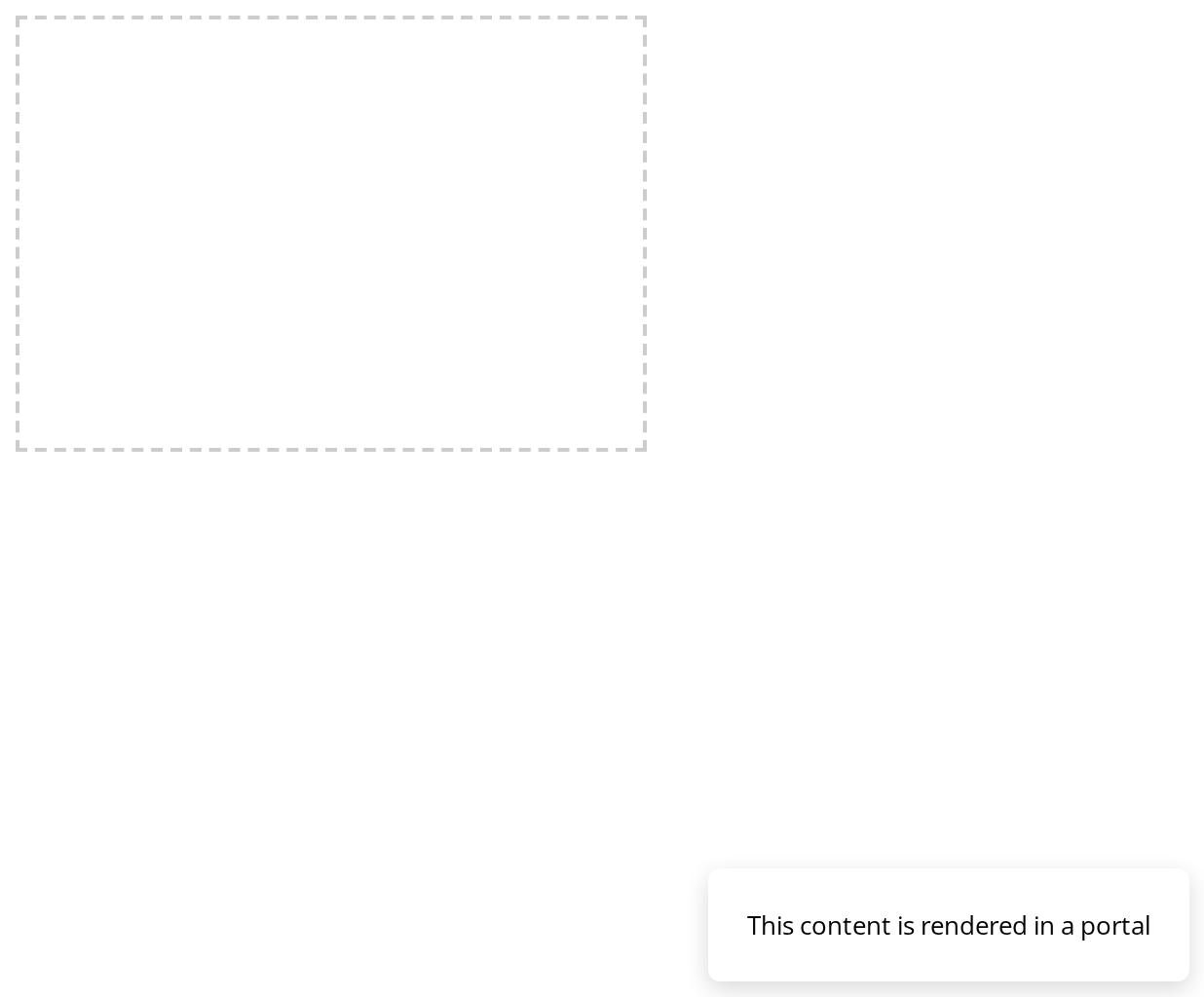
The container stays empty: with visible off the content is not hidden but not mounted at all, so nothing of it reaches the DOM.


Custom Container
Portal rendering into a specific custom container element instead of document.body.
Multiple Portals
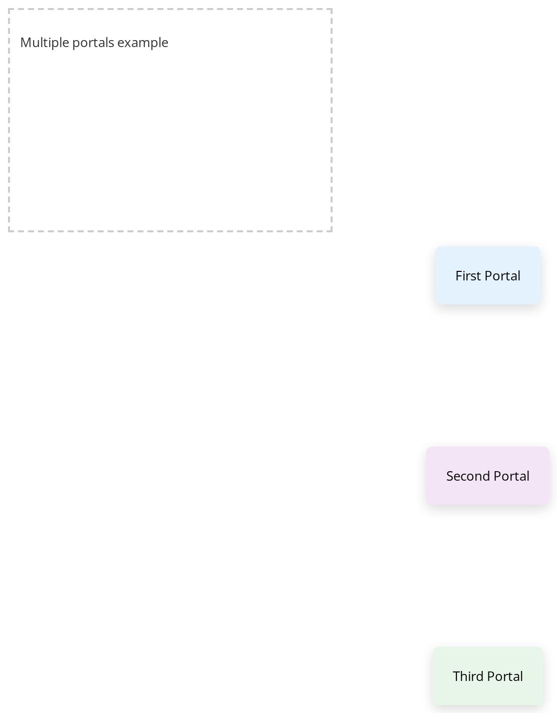
Three portals share one container: each is appended after the last, and the portals do nothing about overlap, so every node carries its own position.
Toggle Visibility
Click Show Portal and Close to open and close the content from outside and from inside it. Each close unmounts the content (visible), so state held inside it starts over on the next open.

Into Document Body
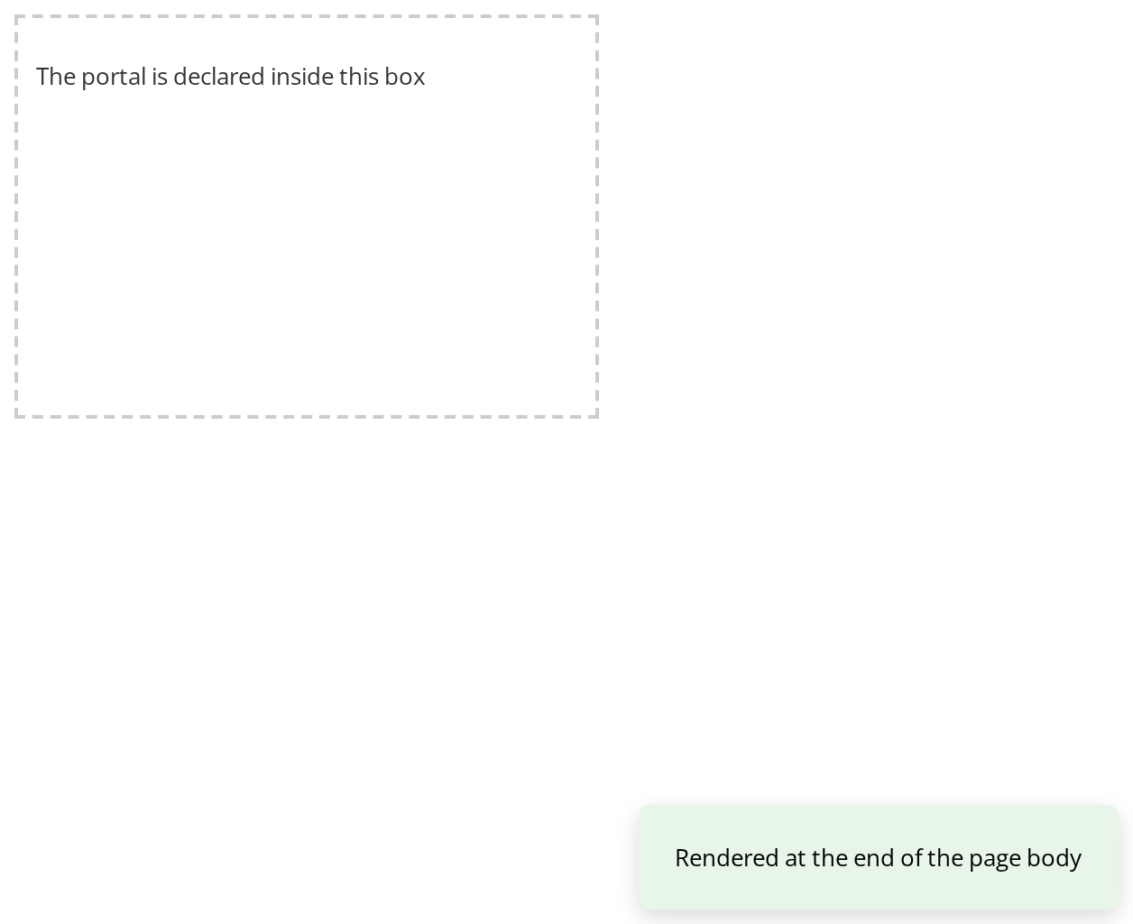
With no appendTo, the content leaves the dashed box it is declared in and lands at the end of the page body, centred on the window by its own fixed position.
Css Customization
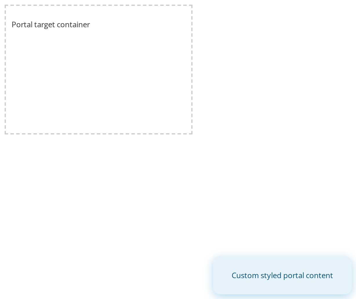
Portal has no styles of its own, so the README lists no CSS variables for it: the --portal-popup-* variables set here belong to this page's demo popup, and are set on the container the portal appends to so the content picks them up there.
Minimal example
The content goes in element, not in children, and lands at the end of document.body.
import { Portal } from "@onlyoffice/apps-ui-kit/components/portal";

export function FloatingNotice({ text }: { text: string }) {
  return (
    <Portal
      element={
        <div
          style={{
            position: "fixed",
            insetBlockEnd: 16,
            insetInlineEnd: 16,
            zIndex: 500,
          }}
        >
          {text}
        </div>
      }
    />
  );
}
Props
Recipes
Open and close, controlled
import { useState } from "react";
import { Button } from "@onlyoffice/apps-ui-kit/components/button";
import { Portal } from "@onlyoffice/apps-ui-kit/components/portal";

export function DetailsLayer() {
  const [open, setOpen] = useState(false);

  return (
    <>
      <Button label="Details" onClick={() => setOpen(!open)} />
      <Portal
        visible={open}
        element={
          <div
            style={{ position: "fixed", inset: "20% 20% auto", zIndex: 500 }}
          >
            <Button label="Close" onClick={() => setOpen(false)} />
          </div>
        }
      />
    </>
  );
}
Into a container of your own
The container has to exist when the portal renders, so keep it in state rather than in a ref.
import { useState } from "react";
import { Portal } from "@onlyoffice/apps-ui-kit/components/portal";

export function SidebarSlot({ label }: { label: string }) {
  const [container, setContainer] = useState<HTMLDivElement | null>(null);

  return (
    <div>
      <div ref={setContainer} style={{ position: "relative" }} />
      <Portal appendTo={container} element={<span>{label}</span>} />
    </div>
  );
}
Behaviour the types don't state
- It renders nothing until after mount. Mounting is recorded in an effect, so the first
render — and the whole server render — produces
null, and the content appears one render later. Anything that measures it has to wait a frame. appendTois read at render time and not remembered. A ref whosecurrentis still null on that render silently falls back todocument.body, which is why the container belongs in state.visible={false}unmounts the content rather than hiding it, so state inside it is lost and any animation out has to happen before you flip the prop.- The node is appended at the end of the container, after everything already in it, and nothing
is done about stacking — give it a
z-indexof its own. - React context still reaches the content: providers above the
Portalapply inside it, and so does event bubbling through the React tree, though not through the DOM. - The component renders no wrapper element, so there is nothing to give a class or a test id to.
Accessibility
- The content leaves its place in the DOM order, so screen-reader and tab order follow
document.body, not your layout. Move focus into it deliberately when it opens and back when it closes. - Nothing here marks the rest of the page inert or handles Escape. A layer that must be modal
needs
ModalDialog, which does both.
Test ids
The component renders no element of its own, so it carries no data-testid. Put one on the
node you pass as element.
Related
ModalDialog— a dialog that already portals itself.DropDown— a menu that portals unless you turn it off.Tooltip— always portalled, intodocument.body.