Section
Works only inside an ONLYOFFICE Apps portal: it needs the portal's API client, stores and translations, and is not part of the public API.
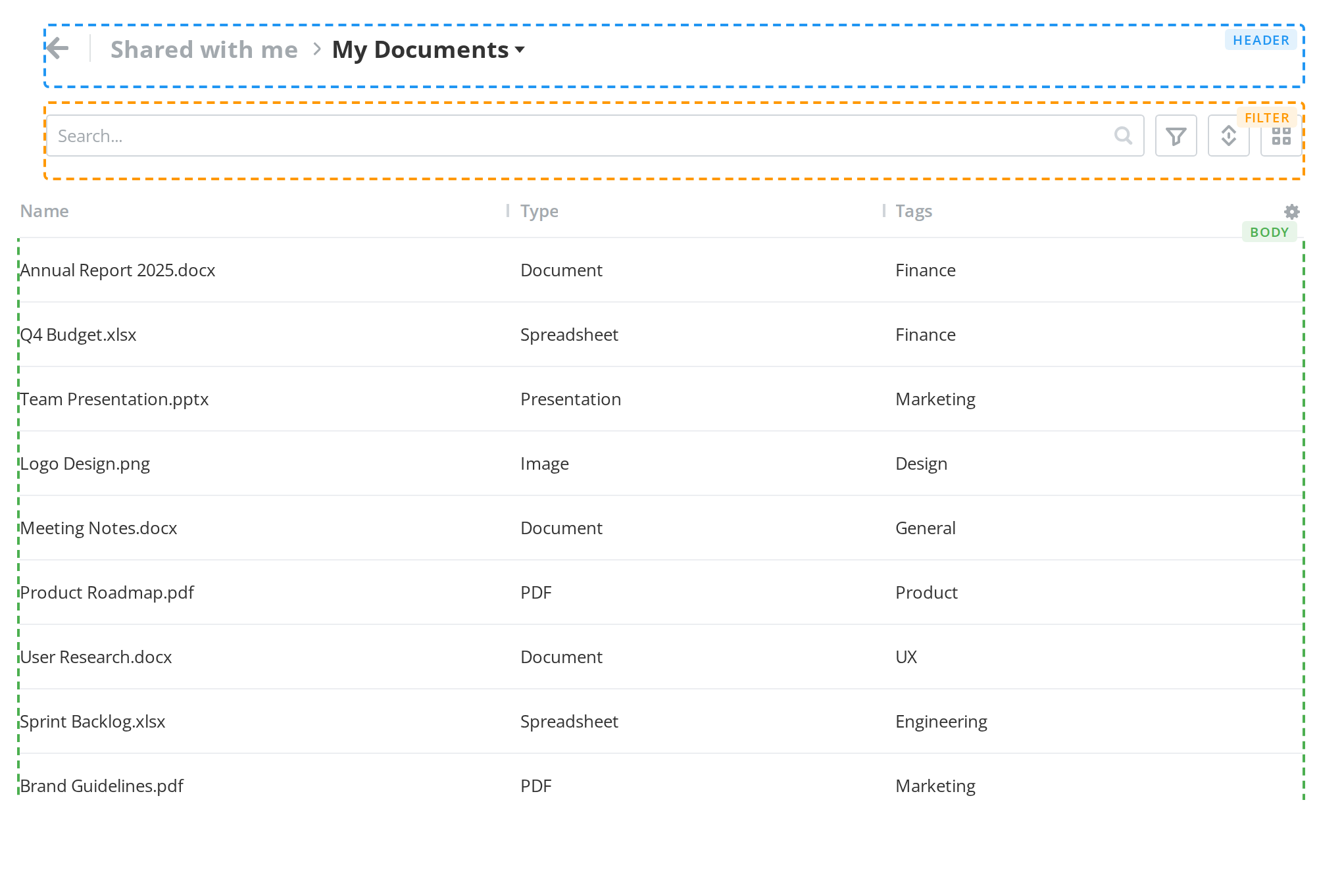
DocSpace's page body: a sticky header and filter, a scrolling body, and the info and chat panels
beside it. It is the other half of the portal's layout, next to Article,
and it is also what supplies the kit's layout context to everything inside it.
Use this when / not when
- This is portal-internal. Nearly ninety props, most of them wiring for the portal's upload and operations machinery, and about a quarter of them dead.
- Use it when you are rebuilding the DocSpace page layout and want the same header, filter, info panel and scroll behaviour.
- Several kit components need to be inside one. It is the only source of the layout context
sectionWidthandsectionHeight, whichNavigation's breadcrumb box reads, and it renders thesectionScrollelement thatSelectionAreaneeds. - Not for an ordinary page shell — a
<main>of your own with the kit's components inside it costs nothing and behaves predictably. - It is not a container. Its children are ten marker components whose contents it lifts out;
with no header, filter or body among them it renders
null.
Import
import Section from "@onlyoffice/apps-ui-kit/components/section";
It is a default export, so the name is yours to choose. The root barrel carries it by name
as well — components/index.ts re-exports it as export { default as Section } — but prefer the
subpath: the barrel does not build without four optional peers, see
Which import form.
Needs ThemeProvider above it in the tree for its colours, and TranslationProvider once any
operation is in flight — the progress button it renders reads its labels from the kit's shared
translations and shows empty strings without one.
Stories
Default
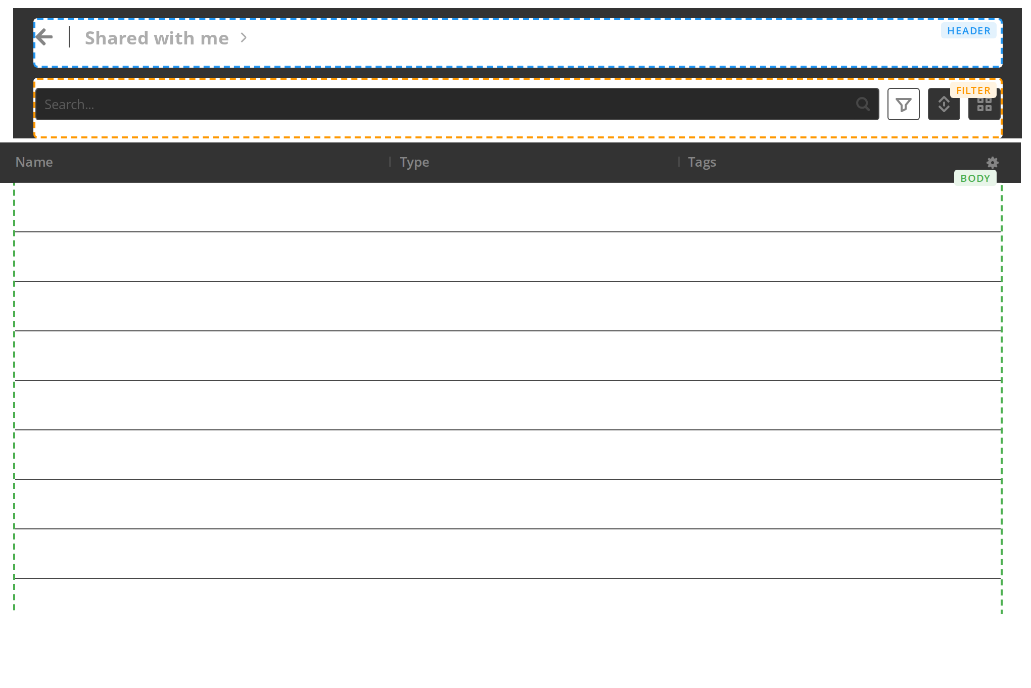
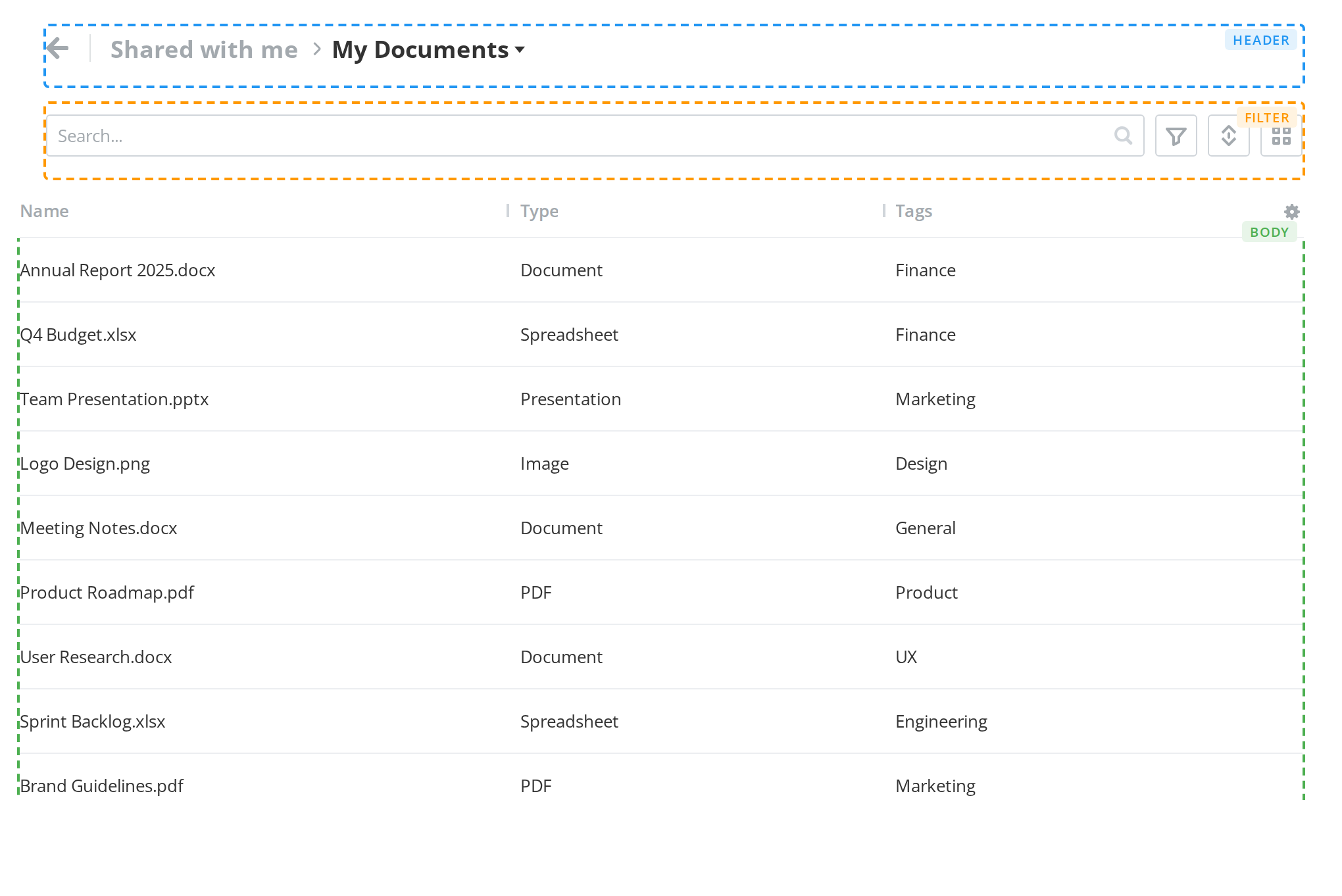
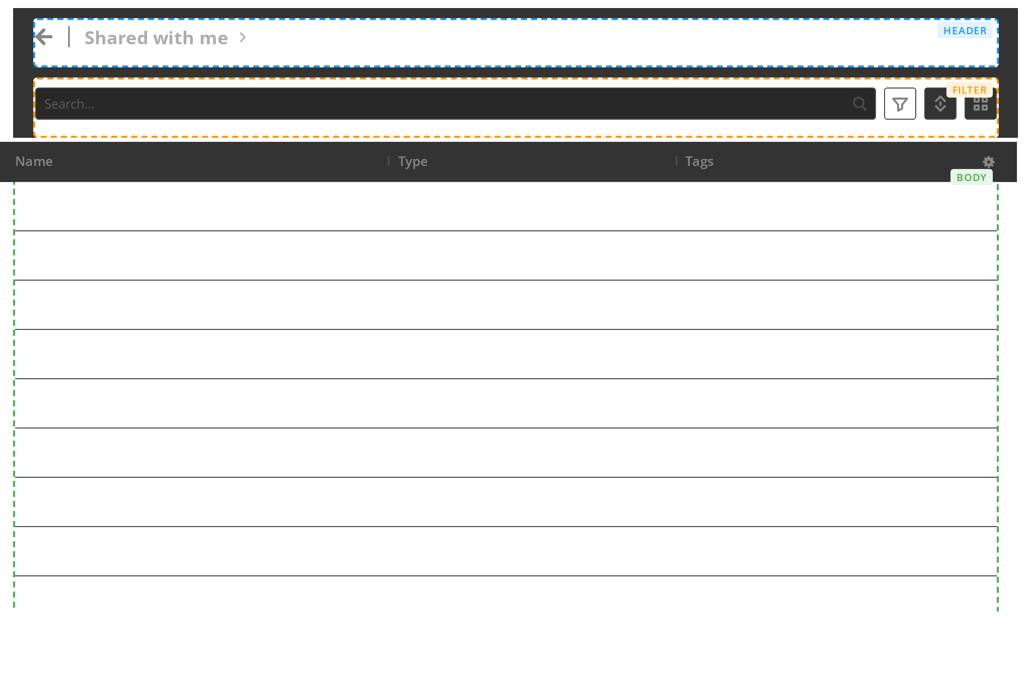
A whole page: breadcrumbs in the header, a search and filter bar under it and a table in the body, each outlined and labelled so you can see where the section puts its slots. Scroll the table to see the header and the filter stay pinned; change any other prop live in the Controls panel below.
With Info Panel
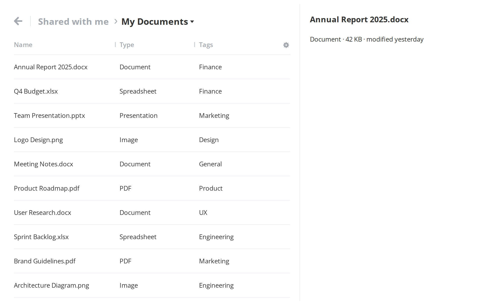
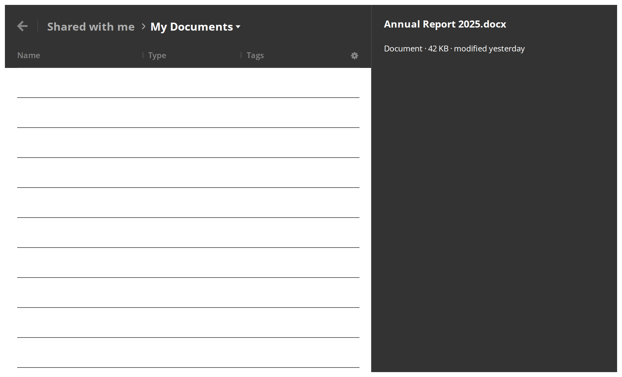
A details panel beside the listing, for the properties of the selected item without leaving the page. It shows only while both canDisplay and isInfoPanelVisible are on; switch either off in the Controls panel below to close it.
With Chat Panel
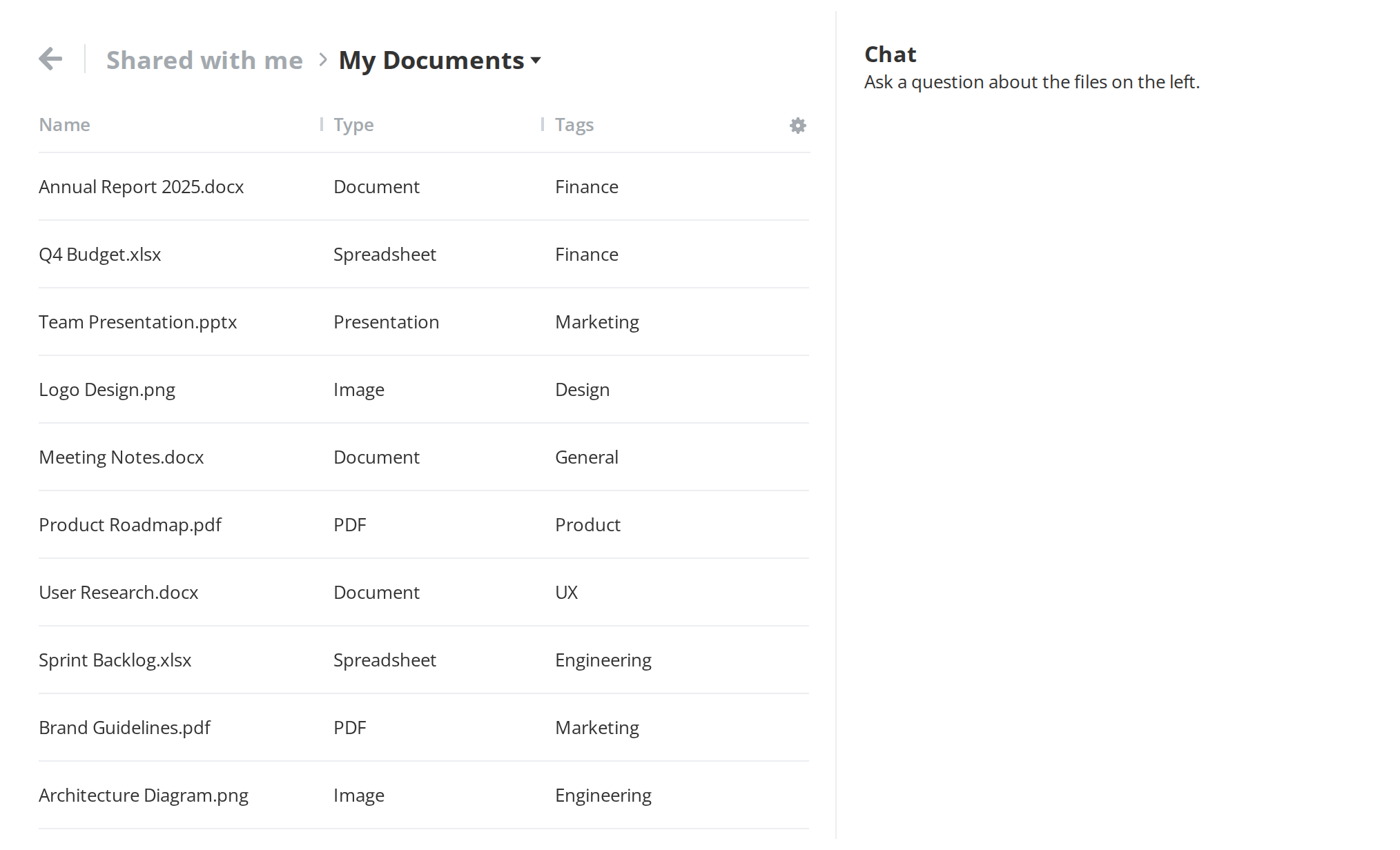
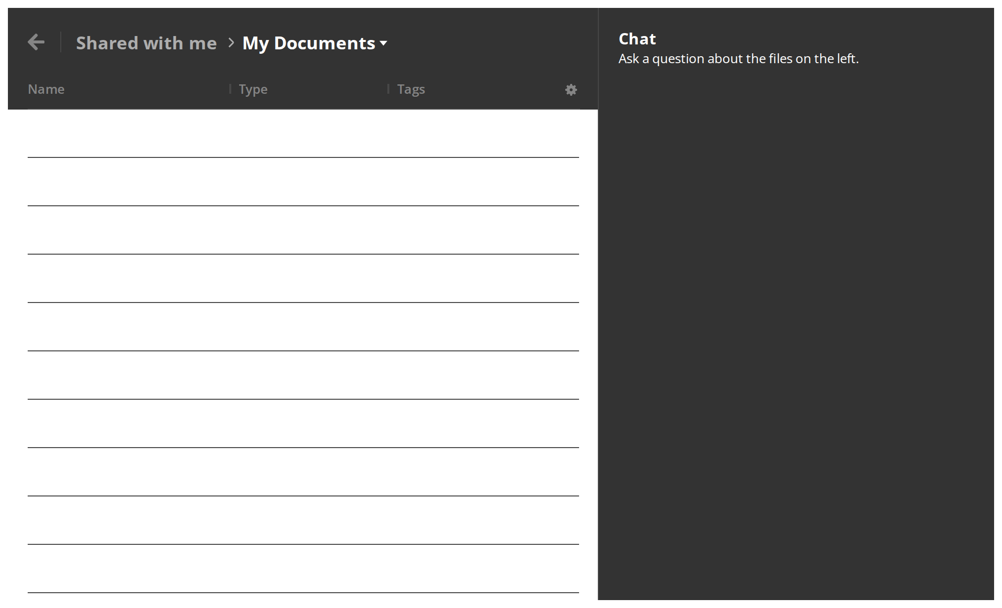
A chat docked beside the listing, so a conversation about the files stays open while you work with them. Drag its inner edge to make it wider or narrower (isChatPanelResizable); the new width arrives when you release the mouse (setChatPanelWidth).
With Banner
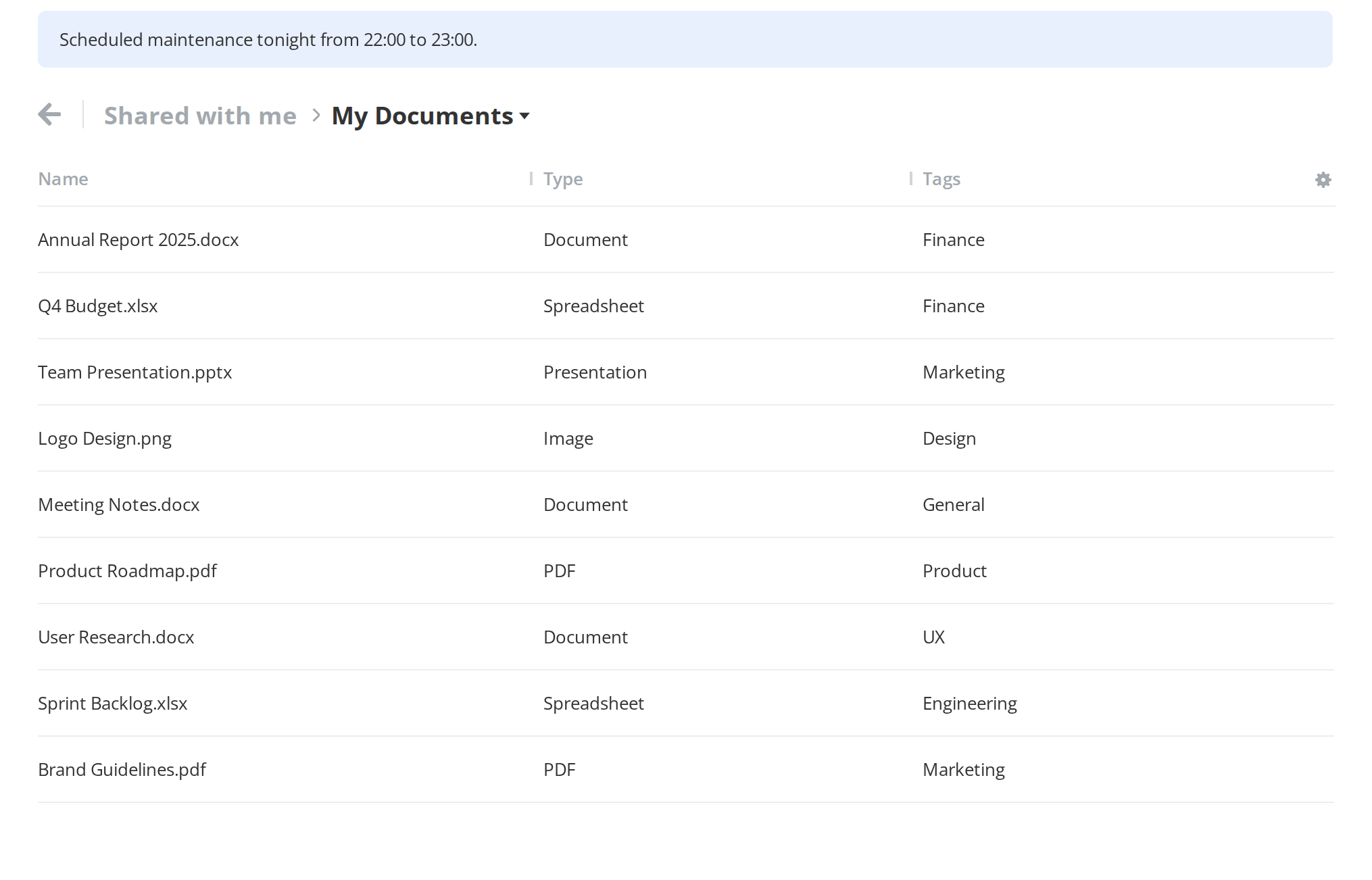
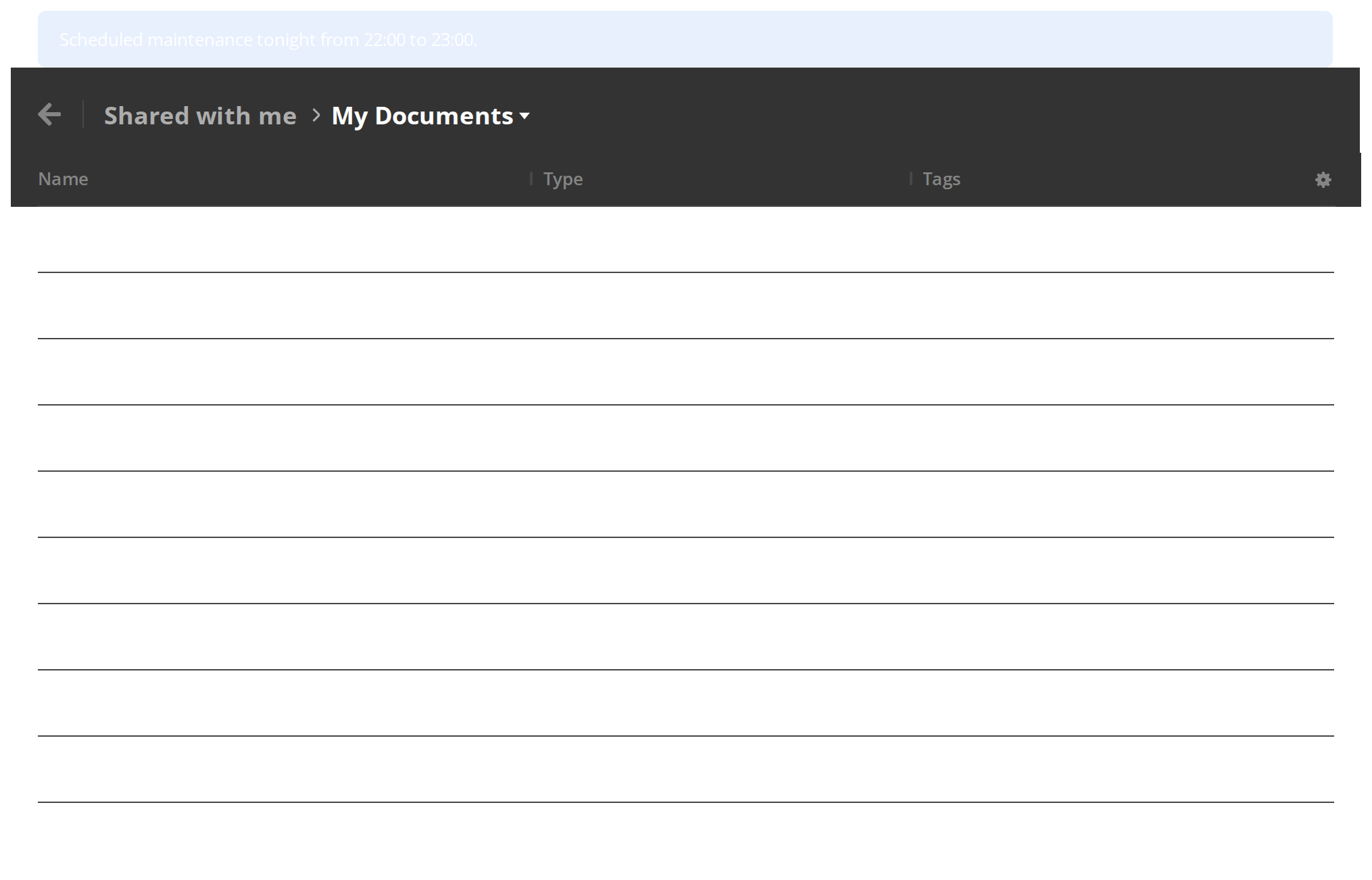
A notice above the header that stays in view while the table scrolls (Section.SectionBanner). Switch scrollableBanner on in the Controls panel below to put it at the top of the listing instead, where it scrolls away under the header.
With Submenu
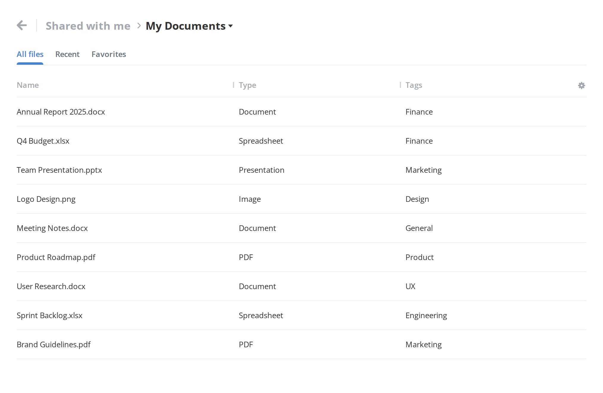
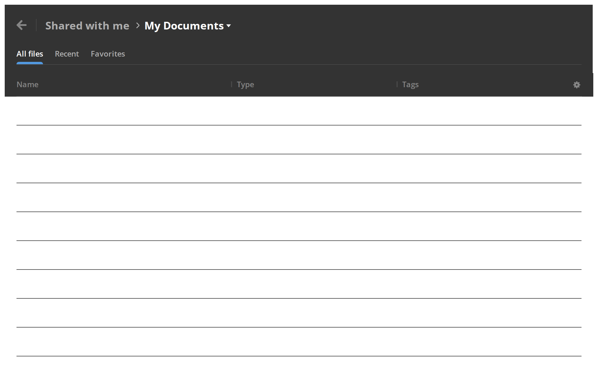
Tabs under the header that switch between views of the same page and stay pinned with it while the listing scrolls (Section.SectionSubmenu).
With Operations Progress
A round progress button in the bottom corner, so a long copy or upload stays visible while the user goes on working (secondaryActiveOperations). Hover it to read what is running; an empty list hides it again.
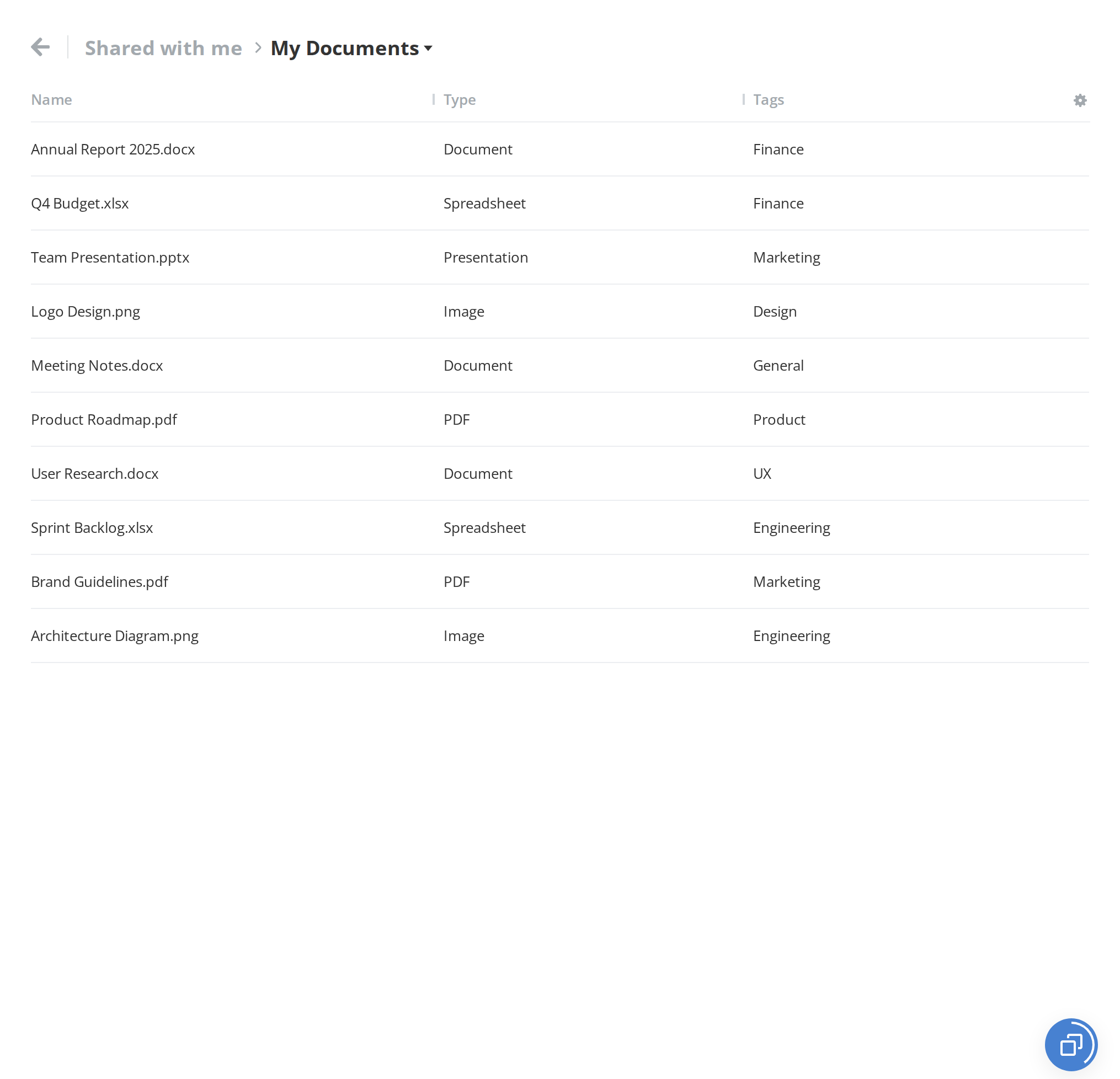
With Context Menu
A menu of page-wide actions on a right click anywhere in the body, for what applies to the folder rather than to one file (getContextModel). Right click the list to open it.
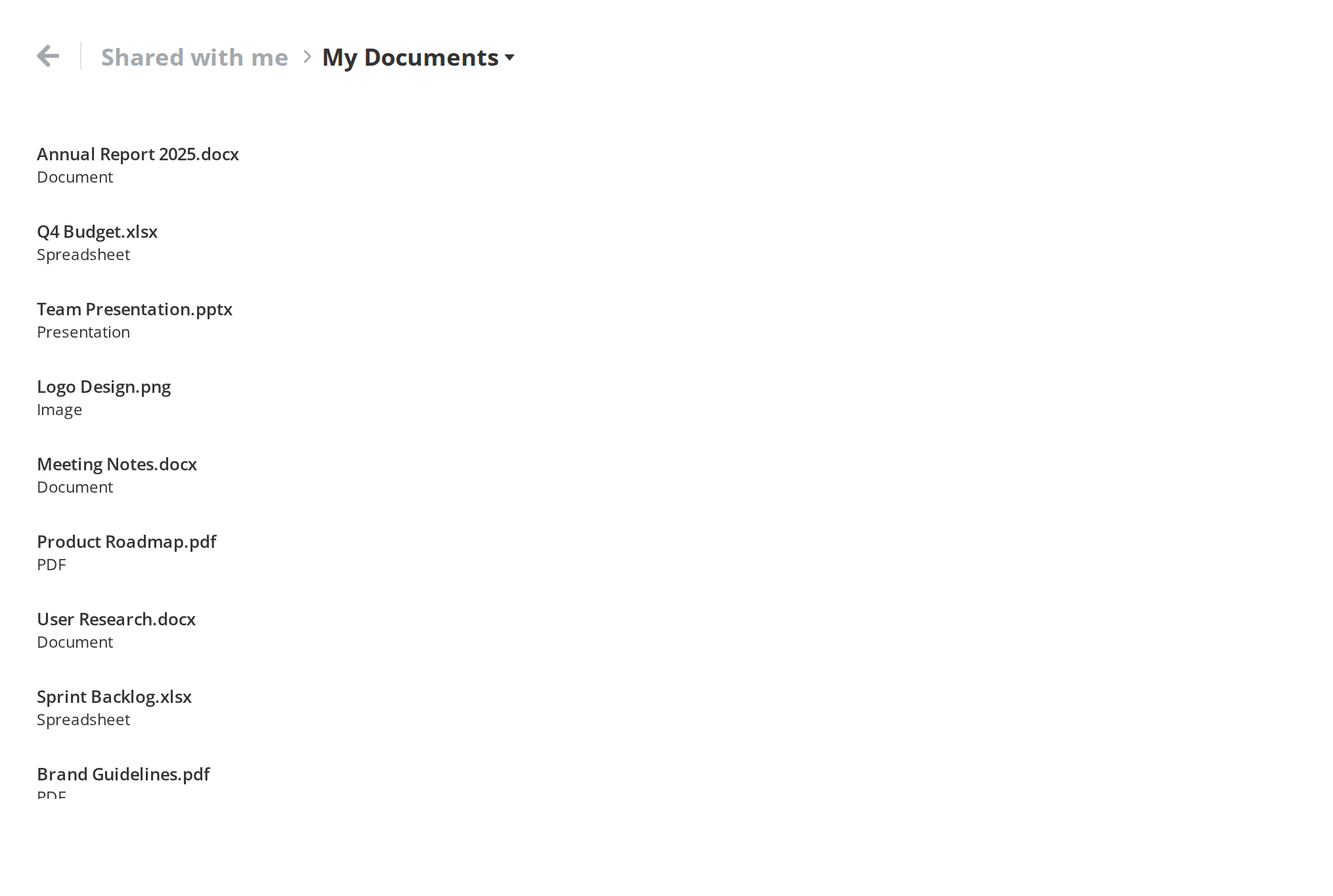
On Tablet
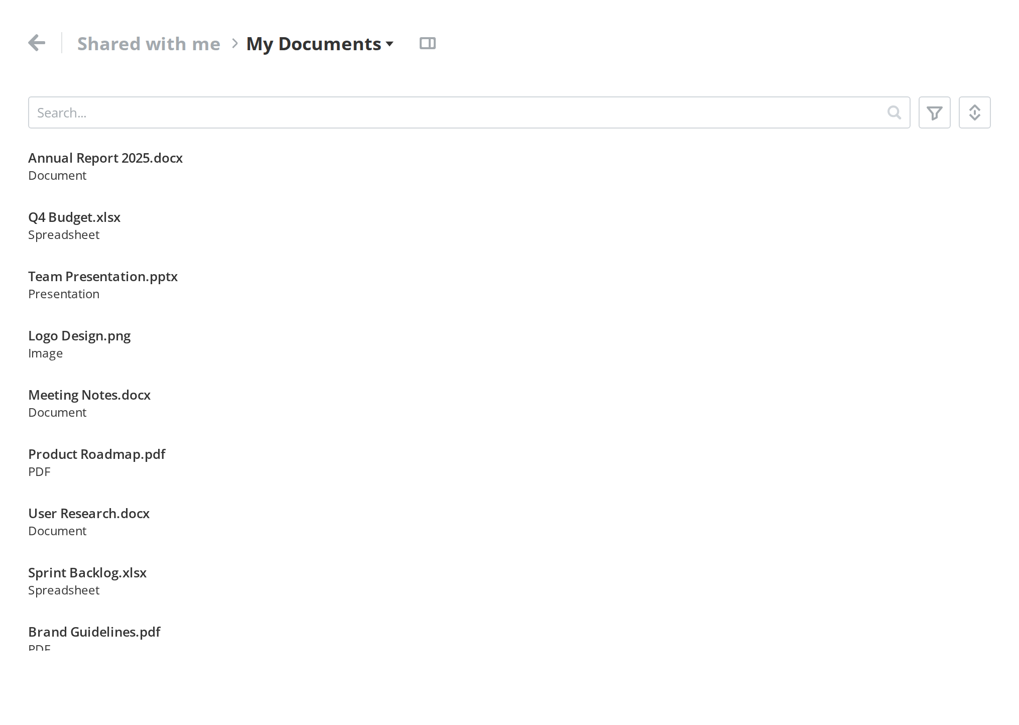
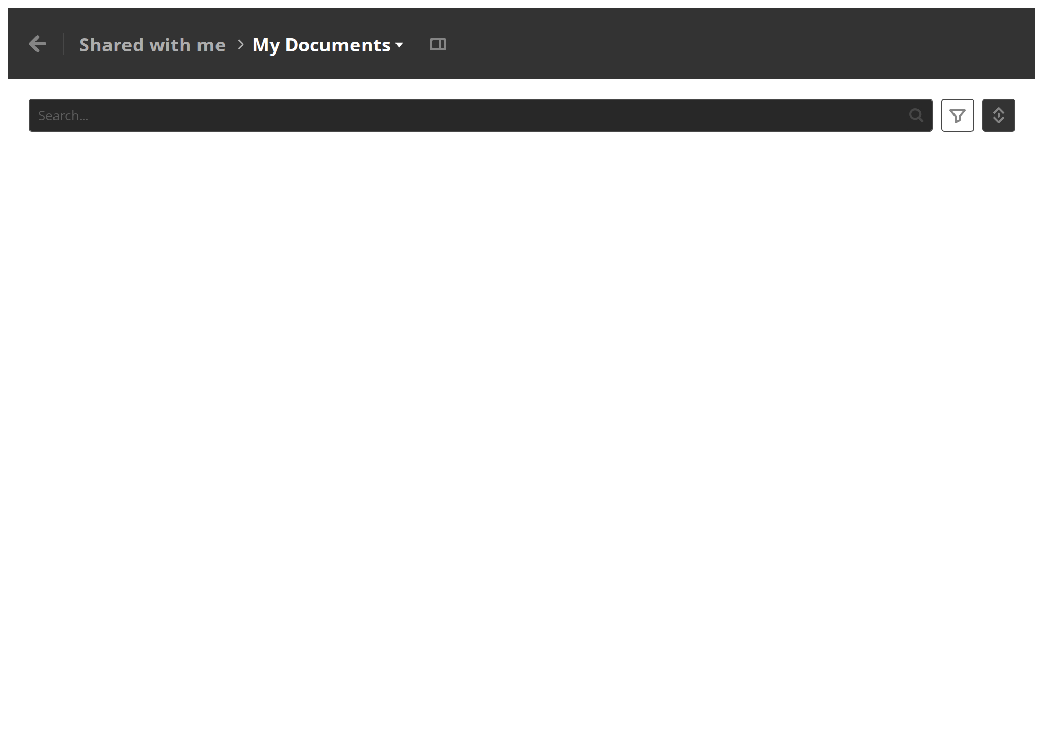
The page in a tablet-width window: the header stays pinned, while the filter bar moves into the listing and scrolls with it, leaving more room for the rows (currentDeviceType).
On Phone
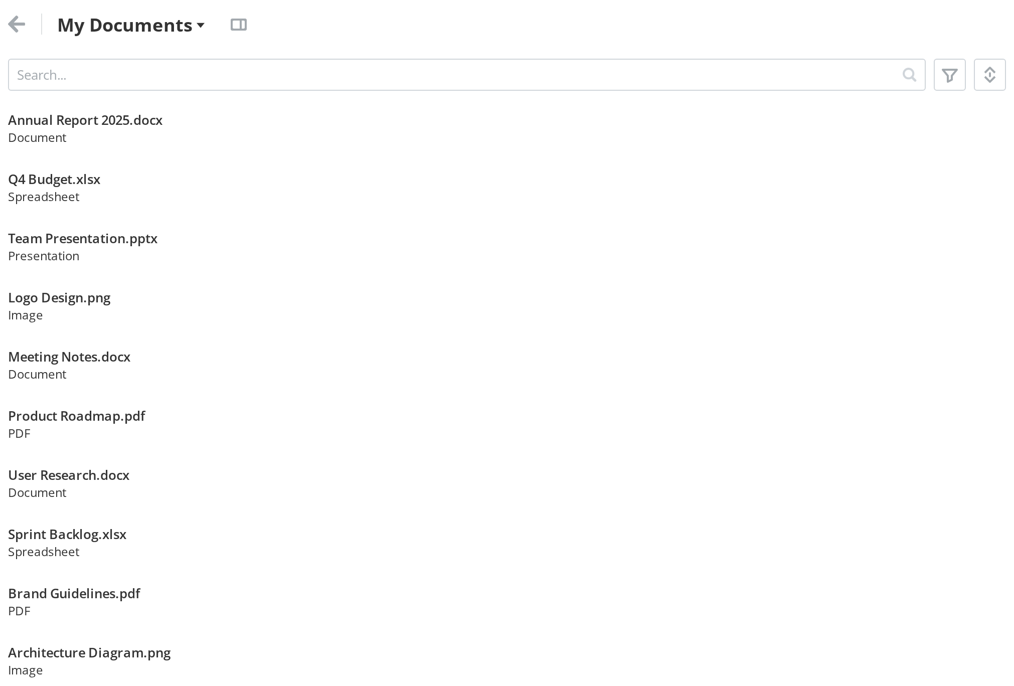
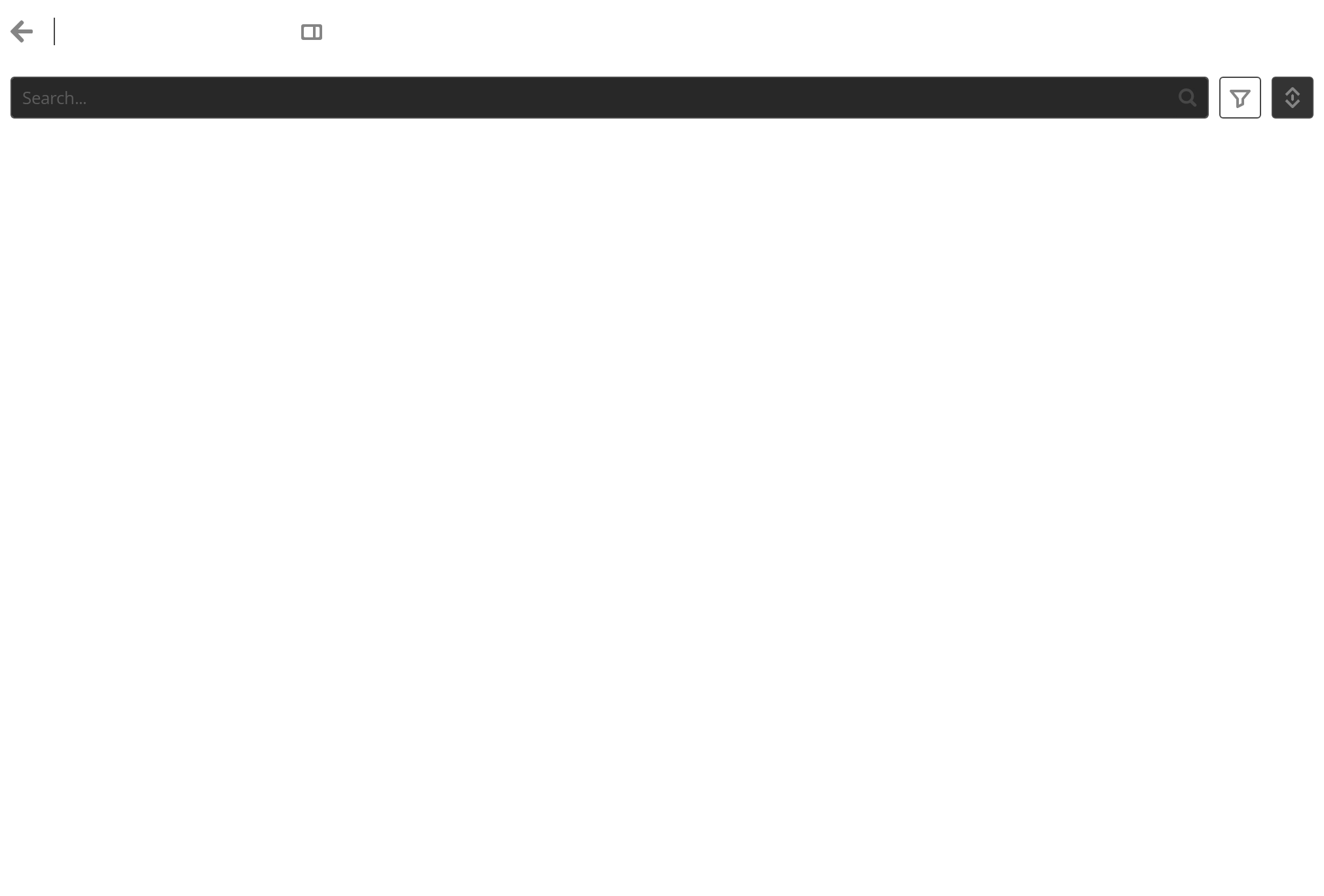
The page on a phone: the header and the filter bar both move into the listing and the whole page scrolls, so the rows get the full height of the screen (currentDeviceType).
Right To Left
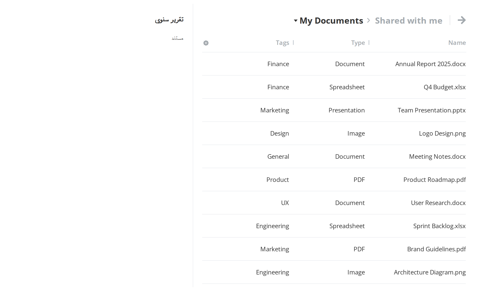
The page in a right-to-left interface: the info panel opens on the left, its border moves to its right edge, and the table's columns run from the right.
Css Customization
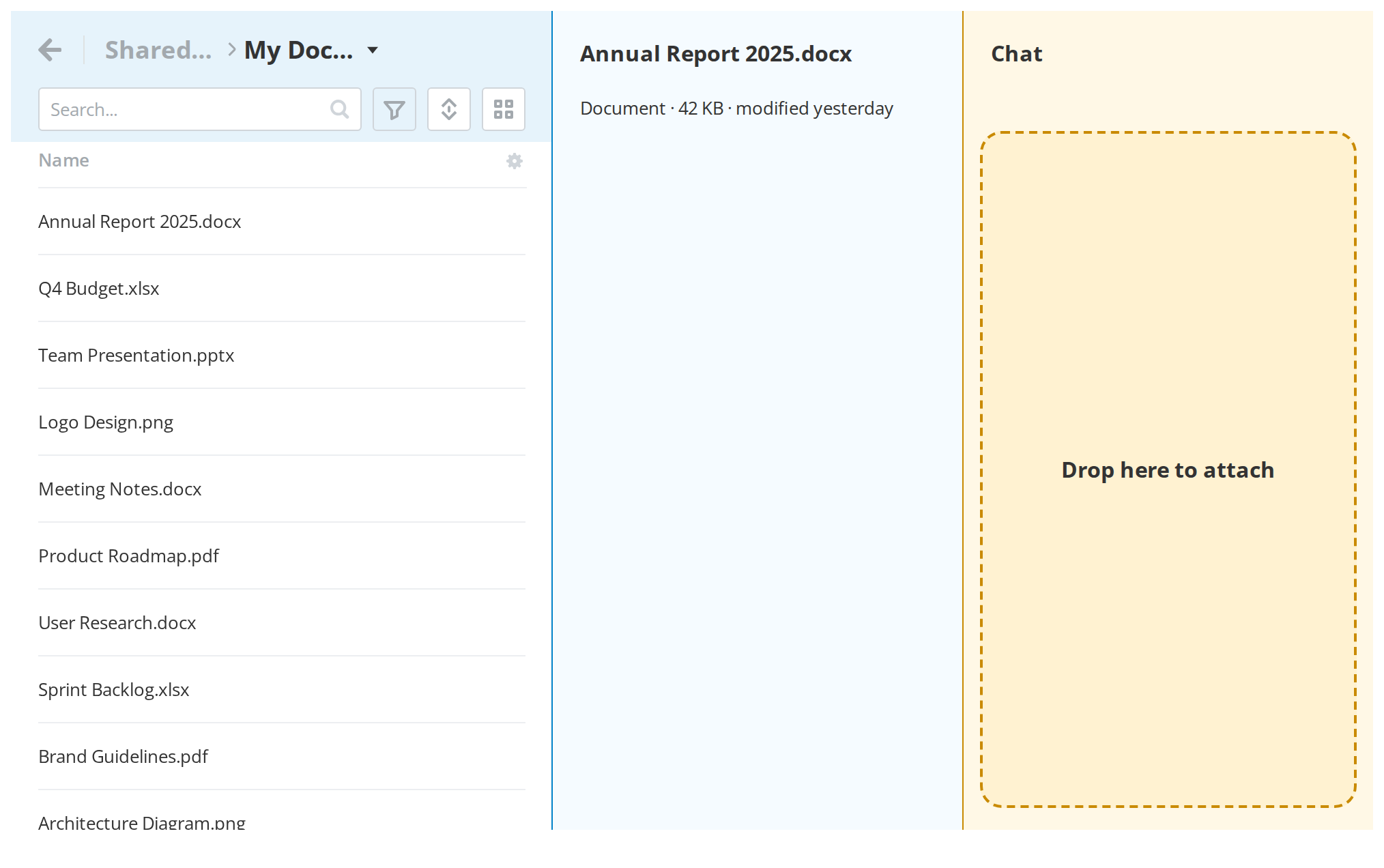
The variables are listed under CSS variables on this page. The example sets every desktop one on a wrapper around one section with both panels open: the blue strip is the pinned header, the pale blue column is the info panel and the yellow one is the chat panel, with its drop frame on. Navigation, Filter and the table have variables of their own, documented in their stories and set on the same wrapper.
Minimal example
import Section from "@onlyoffice/apps-ui-kit/components/section";
import { Text } from "@onlyoffice/apps-ui-kit/components/text";
import { DeviceType } from "@onlyoffice/apps-ui-kit/enums";

export function Page() {
  return (
    <div style={{ display: "flex", height: "100vh" }}>
      <Section
        withBodyScroll
        settingsStudio={false}
        currentDeviceType={DeviceType.desktop}
      >
        <Section.SectionHeader>
          <Text fontSize="18px" fontWeight={700}>
            Contracts
          </Text>
        </Section.SectionHeader>
        <Section.SectionBody>
          <Text>Two files</Text>
        </Section.SectionBody>
      </Section>
    </div>
  );
}
Props
Recipes
The info panel
Two props, not one. isInfoPanelVisible opens it and canDisplay permits it — and canDisplay
has no default, so the panel stays invisible until you pass it.
import { useState } from "react";

import Section from "@onlyoffice/apps-ui-kit/components/section";
import { Text } from "@onlyoffice/apps-ui-kit/components/text";
import { Button } from "@onlyoffice/apps-ui-kit/components/button";
import { DeviceType } from "@onlyoffice/apps-ui-kit/enums";

export function PageWithInfoPanel() {
  const [visible, setVisible] = useState(false);

  return (
    <div style={{ display: "flex", height: "100vh" }}>
      <Section
        withBodyScroll
        settingsStudio={false}
        currentDeviceType={DeviceType.desktop}
        canDisplay
        isInfoPanelVisible={visible}
        setIsInfoPanelVisible={setVisible}
      >
        <Section.SectionHeader>
          <Text fontSize="18px" fontWeight={700}>
            Contracts
          </Text>
        </Section.SectionHeader>
        <Section.SectionBody>
          <Button
            label={visible ? "Hide details" : "Show details"}
            onClick={() => setVisible((value) => !value)}
          />
        </Section.SectionBody>
        <Section.InfoPanelHeader>
          <Text fontWeight={600}>Details</Text>
        </Section.InfoPanelHeader>
        <Section.InfoPanelBody>
          <Text>Report.docx — 42 KB</Text>
        </Section.InfoPanelBody>
      </Section>
    </div>
  );
}
Disabled / read-only
inert marks the section's whole subtree inert: nothing inside can be focused, clicked or reached
by a screen reader. The portal uses it while the chat panel is fullscreen over the page.
import Section from "@onlyoffice/apps-ui-kit/components/section";
import { Text } from "@onlyoffice/apps-ui-kit/components/text";
import { DeviceType } from "@onlyoffice/apps-ui-kit/enums";

export function FrozenPage({ frozen }: { frozen: boolean }) {
  return (
    <div style={{ display: "flex", height: "100vh" }}>
      <Section
        inert={frozen}
        withBodyScroll
        settingsStudio={false}
        currentDeviceType={DeviceType.desktop}
      >
        <Section.SectionHeader>
          <Text fontSize="18px" fontWeight={700}>
            Contracts
          </Text>
        </Section.SectionHeader>
        <Section.SectionBody>
          <Text>Nothing here can be reached while it is frozen.</Text>
        </Section.SectionBody>
      </Section>
    </div>
  );
}
Where the filter goes
The filter slot moves with currentDeviceType: pinned above the scroller on a desktop, inside the
body below it. stickyTableHeader moves the desktop one into the body as well, where it sticks
natively and a table header can pin under it.
import Section from "@onlyoffice/apps-ui-kit/components/section";
import { Text } from "@onlyoffice/apps-ui-kit/components/text";
import { SearchInput } from "@onlyoffice/apps-ui-kit/components/search-input";
import { InputSize } from "@onlyoffice/apps-ui-kit/components/text-input";
import { DeviceType } from "@onlyoffice/apps-ui-kit/enums";

export function FilteredPage() {
  return (
    <div style={{ display: "flex", height: "100vh" }}>
      <Section
        withBodyScroll
        settingsStudio={false}
        currentDeviceType={DeviceType.desktop}
        stickyTableHeader
      >
        <Section.SectionHeader>
          <Text fontSize="18px" fontWeight={700}>
            Contracts
          </Text>
        </Section.SectionHeader>
        <Section.SectionFilter>
          <SearchInput value="" size={InputSize.base} onChange={() => {}} />
        </Section.SectionFilter>
        <Section.SectionBody>
          <Text>Two files</Text>
        </Section.SectionBody>
      </Section>
    </div>
  );
}
Behaviour the types don't state
- With no header, filter or body slot it renders nothing. A section holding only an info panel
or only a footer returns
null, panels included. - The slots are markers that render nothing themselves, matched by display name while the section renders. Wrapping one in a component of your own, or memoising it, hides its content.
- The info panel needs
canDisplayas well asisInfoPanelVisible, andcanDisplayis optional with no default — the single commonest reason the panel does not appear. - It is the only source of the kit's layout context.
sectionWidthandsectionHeightare measured from the container with aResizeObserverand a 100ms debounce and published to everything inside; components that read them fall back to zero elsewhere. - It renders the element
SelectionArearequires. WithwithBodyScrollset and outside a phone layout, the body's scroller carriesid="sectionScroll"; the container itself isid="section". - It dispatches a synthetic
resizeevent on the window whenever it measures itself, which is on mount and whenever the info or chat panel is toggled. - The body is a drop target. It is a
DragAndDrop, soonDropreceives every file dropped anywhere on the page body, nothing is filtered, and nothing is highlighted unless you draw it. - On a desktop the body takes focus and keeps it. It focuses itself on mount and on every
pathnamechange, and refocuses whenever focus leaves the document altogether. It also removes thetabindexfrom an element with the literal idcustomScrollBarwhile it is mounted. - The info panel assigns
window.onpopstatedirectly, replacing any handler already there, and never restores it. - About twenty-five props are dead, among them
user,getIcon,showText,isEmptyPage,maintenanceExist,snackbarExist,isTrashFolder,mainBarVisible, everyaiChat*prop except the panel's own,bannerContent,topInfoPanel,onClose,asideInfoPanel,isDesktop,uploadFilesand arefyou pass. The table above says so prop by prop. withBodyScrollandsettingsStudiohave destructuring defaults but are declared required, so the compiler asks for them anyway.- The header's height and background come from the theme, not from a prop. 69px on a desktop,
61px on a tablet, 53px on a phone, and white or black to match the
light/darkclass on<body>. Override any of them with the custom properties below rather than by styling the header element. - It is memoised with a deep equality check over all its props, arrays included, which is expensive on long operation lists and means an identity change alone does not re-render it.
- The progress button appears as soon as any operation array is non-empty or
startDropPreviewis passed — the handler's presence alone is enough.
Sub-components
They are static properties of the exported component, they take nothing but children, and they
render nothing themselves.
CSS variables
Every default above is the theme's own value, applied through the light/dark class on
<body>; the table lists what you get when you override nothing.
Below the desktop breakpoint the info panel is portalled to #root, out of any wrapper around
the section, so its variables have to be set on :root (or on an ancestor of #root) to reach it
there. A resizable chat panel owns its width: with isChatPanelResizable on a desktop, docked
and with chatPanelWidth set, the panel writes --chat-panel-width on itself, which outranks a
value set on a wrapper. --section-content-padding does nothing: it is read only on the
header, and the body's negative margin never sees it.
Accessibility
- The section is not a landmark. It is a
<div id="section">, not a<main>, with no role and no label, so the page has no main region unless you supply one around it. - On a desktop the body grabs focus on mount and takes it back whenever focus leaves the document, which overrides where a keyboard user had put it.
inertis the one honest state here: it marks the whole subtree non-focusable and hides it from assistive technology.- The info panel is a plain region even when it covers the page below the desktop breakpoint: focus is not moved into it, not trapped, and not restored when it closes, and Escape does not close it.
- PageUp, PageDown, Home and End pressed inside the info panel's scroller stop there, so they scroll the panel and not the listing behind it.
- The chat panel's resize handle is mouse-only and carries
role="presentation", so it cannot be reached from the keyboard and screen readers skip it. - Nothing announces the operations progress; the button that shows it is visual only.
Test ids
The component sets none, on any element. Select on the container's id section, on the scroller's
id sectionScroll, or on the stable classes section-header, section-body, section-banner and
info-panel.
Related
Article— the panel beside it, and the other half of the layout.Navigation— what normally fills the header slot.SelectionArea— needs the scroller this renders.