ThemeProviderComponent
The older theme provider: it writes the theme onto the document and supplies the kit's theme
context. Almost every component in the kit reads what this sets — the light or dark class on
<body>, the writing direction and the accent colours — so something has to do this job.
Use this when / not when
- Prefer
ThemeProviderfrom@onlyoffice/apps-ui-kit/providers/theme. That is the current entry point; it takes a theme name, a locale and a colour scheme, and it renders this component underneath. Reach for this one only when you already hold a full theme object. - Use it directly when you are porting code that built its own theme object and you want the same document-level effects without the provider's extra arguments.
- Not to theme a subtree — the effects are global. The classes and custom properties land on
<html>and<body>, so two of these on one page fight over the same document. - It is not a CSS-in-JS provider, whatever the previous version of this page said. It sets attributes and classes on the document in an effect; the kit's styling is CSS modules and custom properties throughout, and no runtime styling library is involved.
- Not for translations — that is
TranslationProviderfrom@onlyoffice/apps-ui-kit/providers/translation.
Import
import { ThemeProviderComponent } from "@onlyoffice/apps-ui-kit/components/theme-provider";
Also exported from the root barrel @onlyoffice/apps-ui-kit. The name is
ThemeProviderComponent, not ThemeProvider, and there is no default export — the form
import ThemeProvider from … does not resolve.
It is itself a provider and needs nothing above it.
Stories
Default
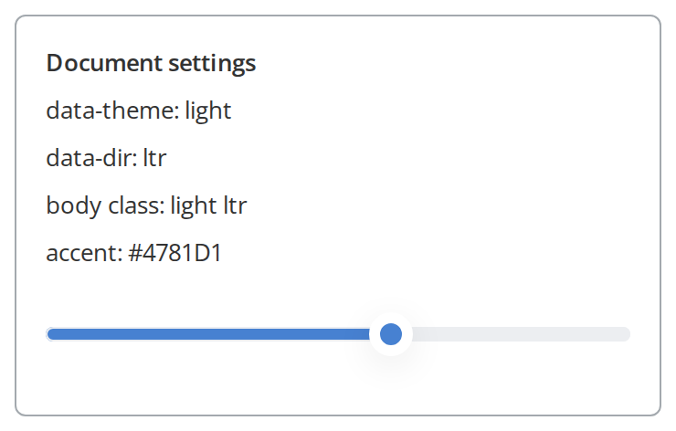
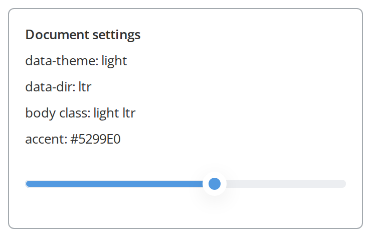
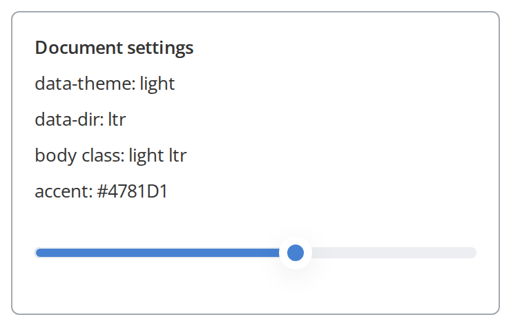
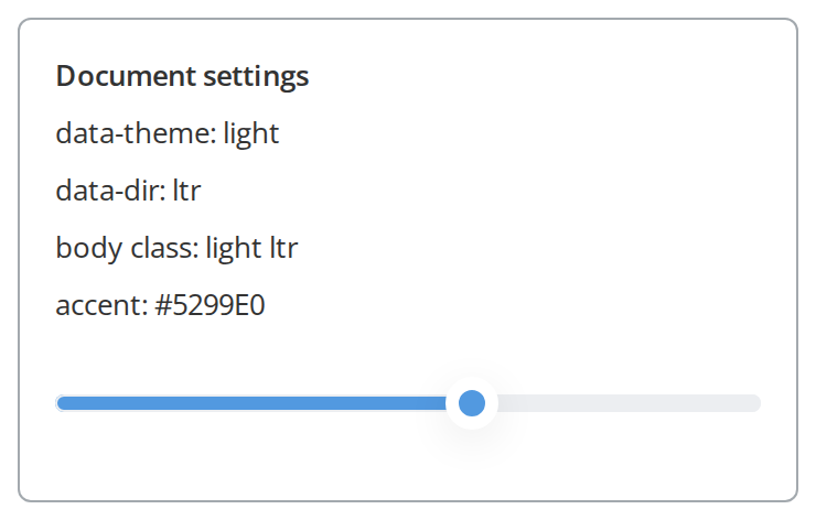
The light theme in the left-to-right direction: the panel reads back what the component wrote onto the page, and its background and text take the theme's colours. Change the theme object live in the Controls panel below; the toolbar's theme and direction switches write over it until the story reloads.
Dark Theme
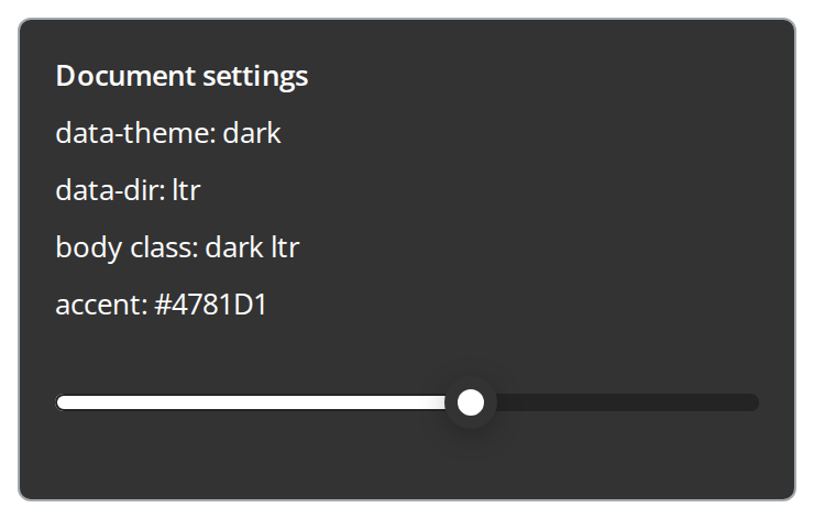
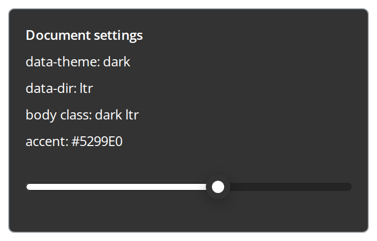
Use it to switch the page to the dark theme: the panel turns dark with light text, the body class reads dark, and the slider switches to its dark look (isBase: false).
With Accent Colors
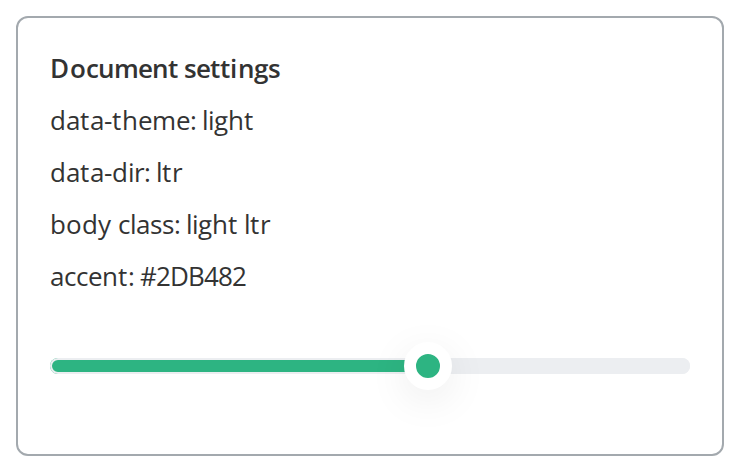
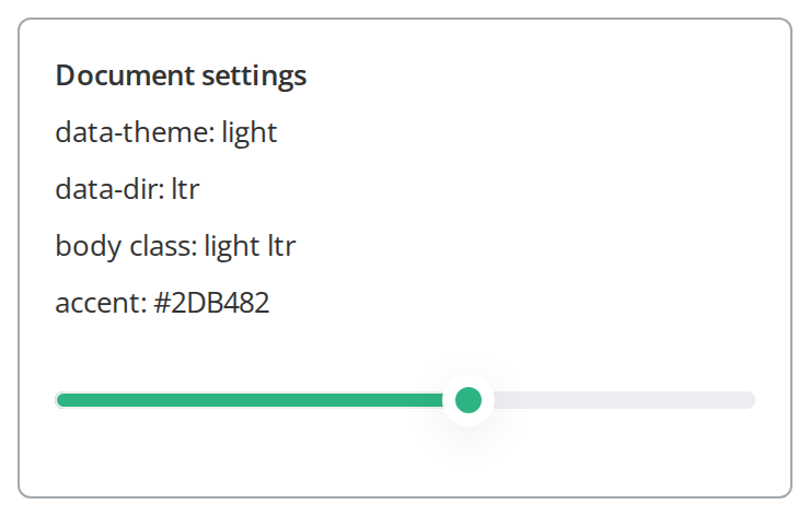
Use it to give accented components your own colour: the slider's thumb and filled track turn green, and the panel reads the new accent back (currentColorScheme).
Right To Left
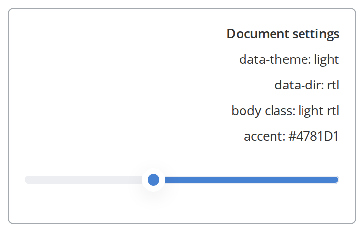
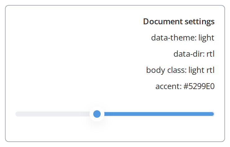
Use it for a right-to-left interface: the panel moves to the right edge, its lines align right, the slider fills from the right, and data-dir reads rtl (interfaceDirection: "rtl").
Minimal example
import { ThemeProviderComponent } from "@onlyoffice/apps-ui-kit/components/theme-provider";
import { Button } from "@onlyoffice/apps-ui-kit/components/button";

export function App() {
  return (
    <ThemeProviderComponent
      theme={{
        isBase: true,
        interfaceDirection: "ltr",
        fontFamily: "Open Sans, sans-serif, Arial",
      }}
    >
      <Button primary label="Save" onClick={() => {}} />
    </ThemeProviderComponent>
  );
}
Props
Recipes
Switching to the dark theme
isBase is the switch, and it has to be a real boolean: the class on <body> is chosen by
whether the key exists, while the React context is chosen by whether its value is truthy. Leave
it out and those two disagree.
import { useState } from "react";

import { ThemeProviderComponent } from "@onlyoffice/apps-ui-kit/components/theme-provider";
import { ToggleButton } from "@onlyoffice/apps-ui-kit/components/toggle-button";

export function ThemedApp() {
  const [light, setLight] = useState(true);

  return (
    <ThemeProviderComponent
      theme={{ isBase: light, interfaceDirection: "ltr" }}
    >
      <div style={{ width: 28, height: 16 }}>
        <ToggleButton
          isChecked={!light}
          onChange={() => setLight((value) => !value)}
        />
      </div>
    </ThemeProviderComponent>
  );
}
A right-to-left interface
interfaceDirection goes on the document as data-dir and as the --interface-direction
property that the stylesheet turns into direction on the body, and it is also what the kit's own
direction context reports to components that mirror themselves.
import { ThemeProviderComponent } from "@onlyoffice/apps-ui-kit/components/theme-provider";
import { Text } from "@onlyoffice/apps-ui-kit/components/text";

export function ArabicApp() {
  return (
    <ThemeProviderComponent theme={{ isBase: true, interfaceDirection: "rtl" }}>
      <Text>مرحبا</Text>
    </ThemeProviderComponent>
  );
}
Your own accent colour
currentColorScheme writes four properties twice — once on <html> and once on <body> — so
that a component can read them from either.
import { ThemeProviderComponent } from "@onlyoffice/apps-ui-kit/components/theme-provider";
import { Button } from "@onlyoffice/apps-ui-kit/components/button";

export function BrandedApp() {
  return (
    <ThemeProviderComponent
      theme={{ isBase: true, interfaceDirection: "ltr" }}
      currentColorScheme={{
        id: 1,
        name: "brand",
        main: { accent: "#0f4071", buttons: "#0f4071" },
        text: { accent: "#ffffff", buttons: "#ffffff" },
      }}
    >
      <Button primary label="Save" onClick={() => {}} />
    </ThemeProviderComponent>
  );
}
Behaviour the types don't state
themeis typed as any object, and exactly three keys are read:isBase,interfaceDirectionandfontFamily. Nothing checks that they are there.- A theme without
isBasegives light CSS and a dark context. The document classes are chosen by"isBase" in theme ? … : "light", while the React context is chosen bytheme.isBase ? "Base" : "Dark"— so an absent key meanslighton the body andDarkin JavaScript, and components that read the theme in code disagree with the ones that read it in CSS. - Importing this folder applies a global reset. Its stylesheet sets
margin, background, colour and a 13px font size onhtml, body, andfont-familyon every element in the document. That happens as soon as the module is imported, with or without the component on screen. - The effects are never undone. Unmounting leaves
data-theme,data-dir, the body classes and every custom property exactly as they were. - The colour scheme becomes four custom properties:
--color-scheme-main-accent,--color-scheme-main-buttons,--color-scheme-text-accentand--color-scheme-text-buttons, the colours and the text drawn on them. Accented components such asSlider,Tabs,ToggleButtonandProgressBarread them from their stylesheets, while the scheme object itself goes into the theme context for components that read it in code. - The colour scheme is only written when
mainis present, and only forwards — passing a scheme withoutmain, or removing it later, leaves the previous accent in place. fontFamilydefaults toOpen Sans, sans-serif, Arial, and the kit does not ship that font: load it yourself, or pass a family you do have.interfaceDirectionis cast, not checked. A theme without it gives the direction contextundefinedwhile the document still getsltr.- The
.lightand.darkclasses this folder defines carry the portal's payment-page colours alongside the page background and text colour — seven--payment-callback-*properties that only the DocSpace billing screens read.
Accessibility
- The component renders no element of its own: it is two effects and two context providers around
children. - The theme change is not announced, and nothing here honours
prefers-color-schemeorprefers-reduced-motion— deciding the theme is the application's job. - Setting
interfaceDirectiontortlsetsdirectionon the body through a custom property, so the document direction is correct for a screen reader as well as visually.
Test ids
The component sets none, on any element. Assert on document.body.classList or on the
data-theme attribute of <html> instead.
Related
PortalLogo— reads the theme in JavaScript, so it needs this above it.NavMenu— one of the components whose colours come from the classes this sets.Section— the portal layout that normally sits under a theme provider.