Tabs
Sticky tab bar that scrolls sideways and renders the selected tab's content under itself. One
component draws two different bars — an underlined row and a segmented control — chosen with
type.


Use this when / not when
- Use to split one page into sections the user switches between, where the bar should stay visible as the section scrolls.
- Not for a single pill or a row of filters:
TabItemis the standalone one, and this component does not accept it. - Not for navigation between pages of the application — render links, so the address bar and the back button keep working.
- Not for hiding a long form's steps; the bar gives no sense of order or progress.
Import
import { Tabs, TabsTypes } from "@onlyoffice/apps-ui-kit/components/tabs";
Also exported from the root barrel @onlyoffice/apps-ui-kit.
Needs ThemeProvider from @onlyoffice/apps-ui-kit/providers/theme; the selected underline and
the segmented fill are both theme tokens.
Stories
Default
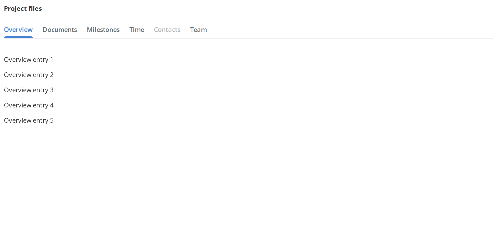
The underlined row, for splitting one page into sections the reader switches between: click a tab to show its content below the bar. Contacts is greyed out and ignores clicks (isDisabled). Change any other prop live in the Controls panel below.


Secondary
The segmented control (type={TabsTypes.Secondary}), for switching between views of the same content; every tab takes the width of the widest label and the selected background slides to the clicked tab. Click a tab, then press Tab and use the arrow keys, Home, End and Enter to pick one from the keyboard.


Scaled
The segmented control spread across the whole width of its container, every tab an equal share (scaled) — for a bar that should line up with the edges of the panel it sits in. The underlined row ignores scaled.


Loading
While the labels are still arriving, the segmented bar is kept hidden so that it is not sized to placeholder text (isLoading); only the selected tab's content shows. Turn isLoading off in the Controls panel below and the bar appears, every tab as wide as the widest label. The component draws no loader of its own, and the underlined row ignores isLoading.


With Badges
A count after the label of Overview and Documents (the item's badge) — for telling the reader how many new entries wait behind a tab. The segmented control does not draw badges.


With Icons
An icon before every label of the segmented control (the item's iconName, an SVG URL), recoloured with the label as a tab is selected or hovered — for tabs that are recognised faster by a picture. The underlined row does not draw icons.


Animated Selection
Click Documents: its underline grows and the old content stays dimmed for the second and a half the tab's onClick promise takes, then the new content replaces it (withAnimation) — for tabs whose content is fetched when they are selected. The segmented control ignores withAnimation.


With Sticky Header
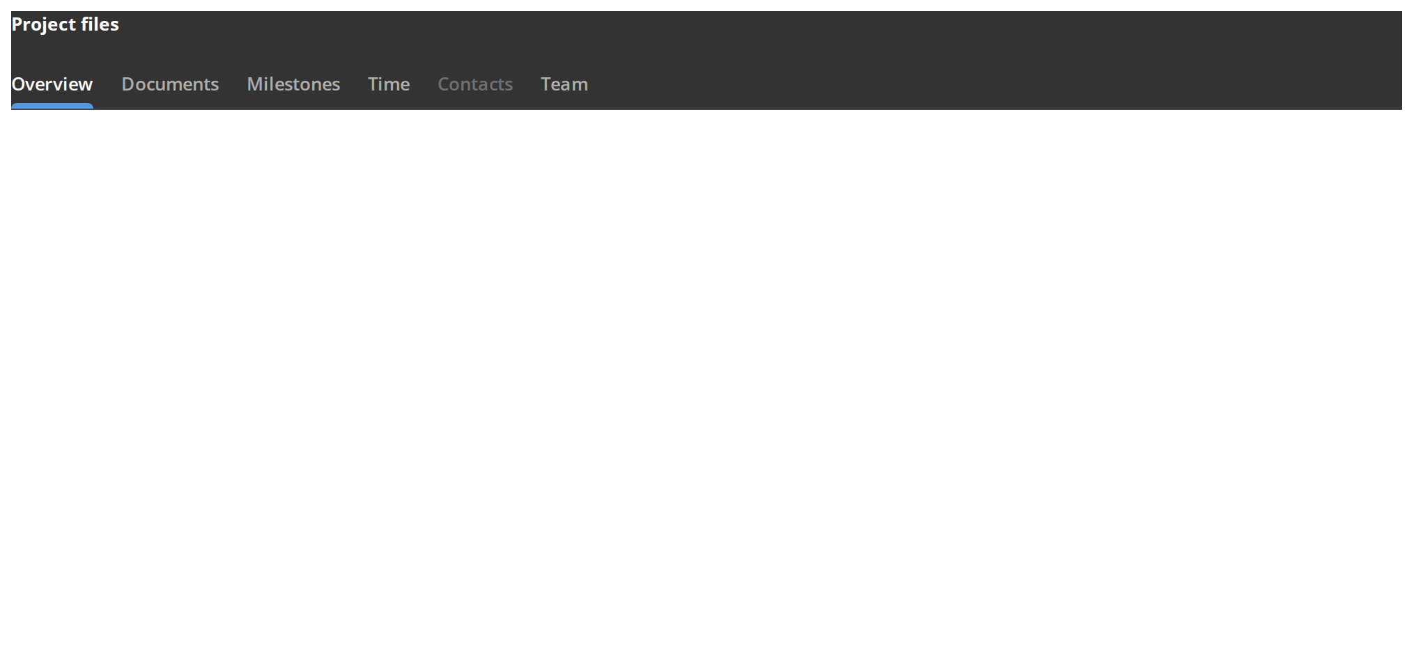
Scroll the box: the heading and the tab bar stay at its top while the content moves under them (stickyHeader) — for a section title that should stay in view together with the bar. The heading sticks only with stickyTop set, here to 0px; a larger value moves both further down. The segmented control does not draw a sticky header.
Overflowing Tabs
More tabs than a 360px column holds, for a bar whose tabs cannot be cut down:
- Underlined row — scrolls sideways; the edge that hides more tabs fades out
- Segmented control — adds an arrow at each end that selects the previous or next tab, not only scrolls to it (the arrows are left out on phones)


Right To Left
The overflowing bars in a right-to-left layout: the first tab sits at the right-hand end, the fade moves to the left edge, and the segmented arrows swap sides so the right one selects the previous tab. The wrapper carries dir="rtl" for the layout; the fade direction and the scroll correction come from the theme's interfaceDirection (the Direction toolbar).


Css Customization
Every variable either bar can show without overflowing, set on one wrapper -- the variables are listed under CSS variables on this page. The first instance is the underlined row, for the --tabs-primary-*, underline and weight variables; the second is the segmented control (type={TabsTypes.Secondary}), for the --tabs-secondary-* ones. Hover the tabs to see the hover colours.


Minimal example
This is a controlled component: hold the selected id and set it from onSelect.
import { useState } from "react";
import { Tabs } from "@onlyoffice/apps-ui-kit/components/tabs";

const ITEMS = [
  { id: "general", name: "General", content: <p>General settings</p> },
  { id: "members", name: "Members", content: <p>Members</p> },
  { id: "history", name: "History", content: <p>History</p> },
];

export function RoomSettings() {
  const [selected, setSelected] = useState("general");

  return (
    <Tabs
      items={ITEMS}
      selectedItemId={selected}
      onSelect={(item) => setSelected(item.id)}
    />
  );
}
Props
Each entry of items:
Enums
Recipes
The segmented bar
type={TabsTypes.Secondary} draws the pill-shaped control instead of the underlined row; the
selected background slides to the tab that is clicked. Only this type accepts iconName,
scaled and hotkeysId.
import { useState } from "react";
import { Tabs, TabsTypes } from "@onlyoffice/apps-ui-kit/components/tabs";

const VIEWS = [
  { id: "list", name: "List", content: <p>List</p> },
  { id: "tiles", name: "Tiles", content: <p>Tiles</p> },
];

export function ViewSwitch() {
  const [view, setView] = useState("list");

  return (
    <Tabs
      type={TabsTypes.Secondary}
      items={VIEWS}
      selectedItemId={view}
      onSelect={(item) => setView(item.id)}
      hotkeysId="views"
      scaled
    />
  );
}
Loading a tab's content on demand
With withAnimation the newly selected tab's underline grows from the left, the item's own
onClick is awaited, and the body is covered by a loader until it settles. Without it, onClick is called and not waited for.
import { useState } from "react";
import { Tabs } from "@onlyoffice/apps-ui-kit/components/tabs";

export function LazyTabs() {
  const [selected, setSelected] = useState("summary");
  const [rows, setRows] = useState<string[]>([]);

  const load = async () => {
    const response = await fetch("/api/history");
    setRows((await response.json()) as string[]);
  };

  const items = [
    { id: "summary", name: "Summary", content: <p>Summary</p> },
    {
      id: "history",
      name: "History",
      onClick: load,
      content: <p>{rows.length} entries</p>,
    },
  ];

  return (
    <Tabs
      items={items}
      selectedItemId={selected}
      onSelect={(item) => setSelected(item.id)}
      withAnimation
    />
  );
}
Behaviour the types don't state
- Clicking the selected tab does nothing at all — neither
onSelectnor the item'sonClickfires, so a tab cannot be used to re-run its own load. - An unknown
selectedItemIdselects nothing. The id is matched byfindIndex, so a value that is not initemsleaves the bar with no tab marked and the body empty. A falsy id —""or0— is a special case and selects the first tab instead. - The two types are separate components behind one name.
badge,stickyHeaderandwithAnimationonly exist on the primary bar;iconName,layoutId,scaled,isLoadingandhotkeysIdonly on the secondary one. Props belonging to the other type are spread onto the wrapper<div>, where React reports them as unknown DOM attributes in the console. idlands in a different place per type: on the tab list for primary tabs, on the outermost element for secondary ones.isLoadingrenders no loader. It only holds off the measurement of the tab widths until the labels are final; drawing something while data loads is yours to do.- The bar is
position: sticky, not fixed. It sticks inside the nearest scrolling ancestor, andstickyTopis written straight intotop— if nothing scrolls above it, the bar never moves.withoutStickyIntendremoves the spacer element drawn under it. - The arrows on the segmented bar move the selection, not the scroll. They call
onSelectwith the neighbouring item, and they only appear when the tabs overflow and the device is not a phone. - Keyboard navigation exists only on the segmented bar and only with
hotkeysId. Tab moves focus into the scroller, then the arrows move a focus ring and Enter or Space selects; Home and End jump to the ends. While that is active, a window-level key listener swallows PageUp, PageDown, Home, End, Space and the arrow keys. - The RTL scroll correction reads the interface direction from a context only the legacy
components/theme-providersupplies. Underproviders/themethe value stays at its"ltr"default, so in a right-to-left interface the primary bar scrolls to the wrong end. - Primary tabs keep the rendered content in state, refreshed by an effect, so the body lags
the selection by one commit while an awaited
onClickis in flight. - Secondary tabs measure the widest label once and give every tab that width, capped at
218px, unless
scaledis set — then the tabs divide the container equally, and the overflow check measures the labels rather than the stretched tabs, so a row with room for every label shows no arrows. layoutIdis also the DOMidof the tab list, as well as the shared id framer-motion uses to slide the background between two bars.TTabItem.valueis declared and never read.
CSS variables
Set them on any ancestor.
--tabs-secondary-tab-radius also rounds the sliding selected background, and
--tabs-underline draws only under the underlined bar. --tabs-fade shows only while the tabs
overflow, and --tabs-secondary-hover-icon only while the segmented tabs overflow and so have
arrows.
Accessibility
- The bar has no tab semantics. Tabs are
<div>s with click handlers: norole="tablist", norole="tab", noaria-selected, and the body is not atabpanel. A screen reader reads a run of text followed by the content, with nothing tying them together. - Only the segmented bar can be operated from the keyboard, and only when
hotkeysIdis set. The underlined bar has no keyboard path at all. - On the segmented bar, Tab moves focus to the tab list and switches the arrow-key mode on; pressing Tab again switches it off and leaves focus on the list. The arrows move the highlight and wrap around at either end, Home and End jump to the first and last tab, and Enter or Space selects the highlighted one.
- That keyboard mode also takes over window-level keys while it is focused, which can swallow keys another part of the page was listening for.
- A disabled item is greyed and made inert in CSS; nothing announces that it is unavailable.
- The horizontal scroller is a
Scrollbar— overflowing tabs are reachable by dragging or with the arrows, not by tabbing.
Test ids
<id> is the item's own id. The bar itself sets none; query it by className.