Aside
Panel that slides in from the side of the viewport, with a header and a scrolling body. On a phone it comes up from the bottom instead, as a sheet.
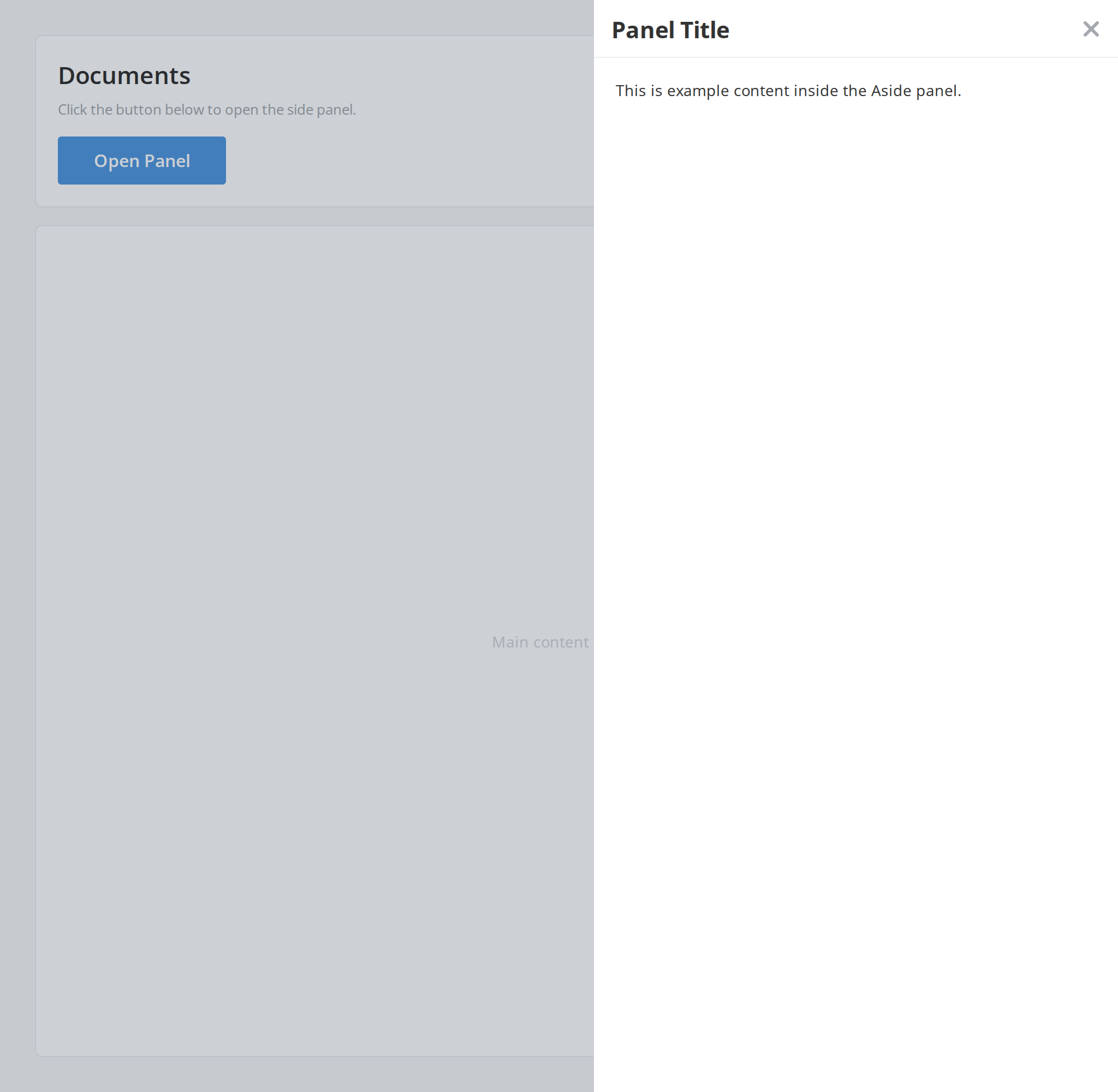
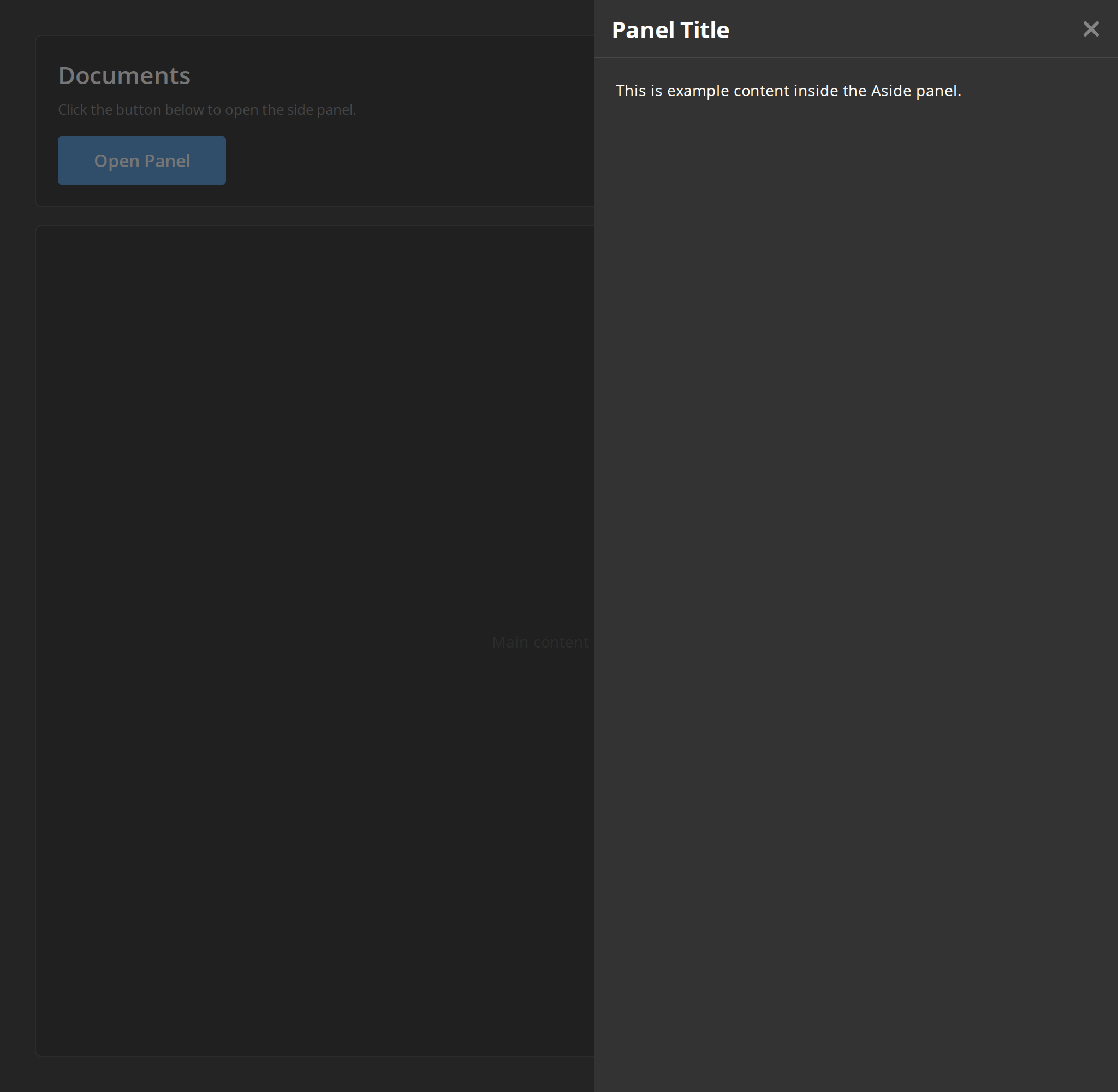
Use this when / not when
- Use for content beside the page rather than over it: details of a selected row, a filter panel, a list of members.
- Not for a confirmation or a short form the user must answer before continuing — that is
ModalDialog, which also has an aside display type if you want this shape with a dialog's behaviour. - Not for the dimming layer itself: this component renders none, and
Backdropis what you put behind it.
Import
import { Aside } from "@onlyoffice/apps-ui-kit/components/aside";
Also exported from the root barrel @onlyoffice/apps-ui-kit.
Also exported: AsideHeader and AsideHeaderProps, which the folder re-exports. AsideProps
itself is not exported — type a wrapper's props yourself, or import the type from its file
path.
Needs ThemeProvider from @onlyoffice/apps-ui-kit/providers/theme above it in the tree, for
the panel's background and the header's border.
Stories
Default
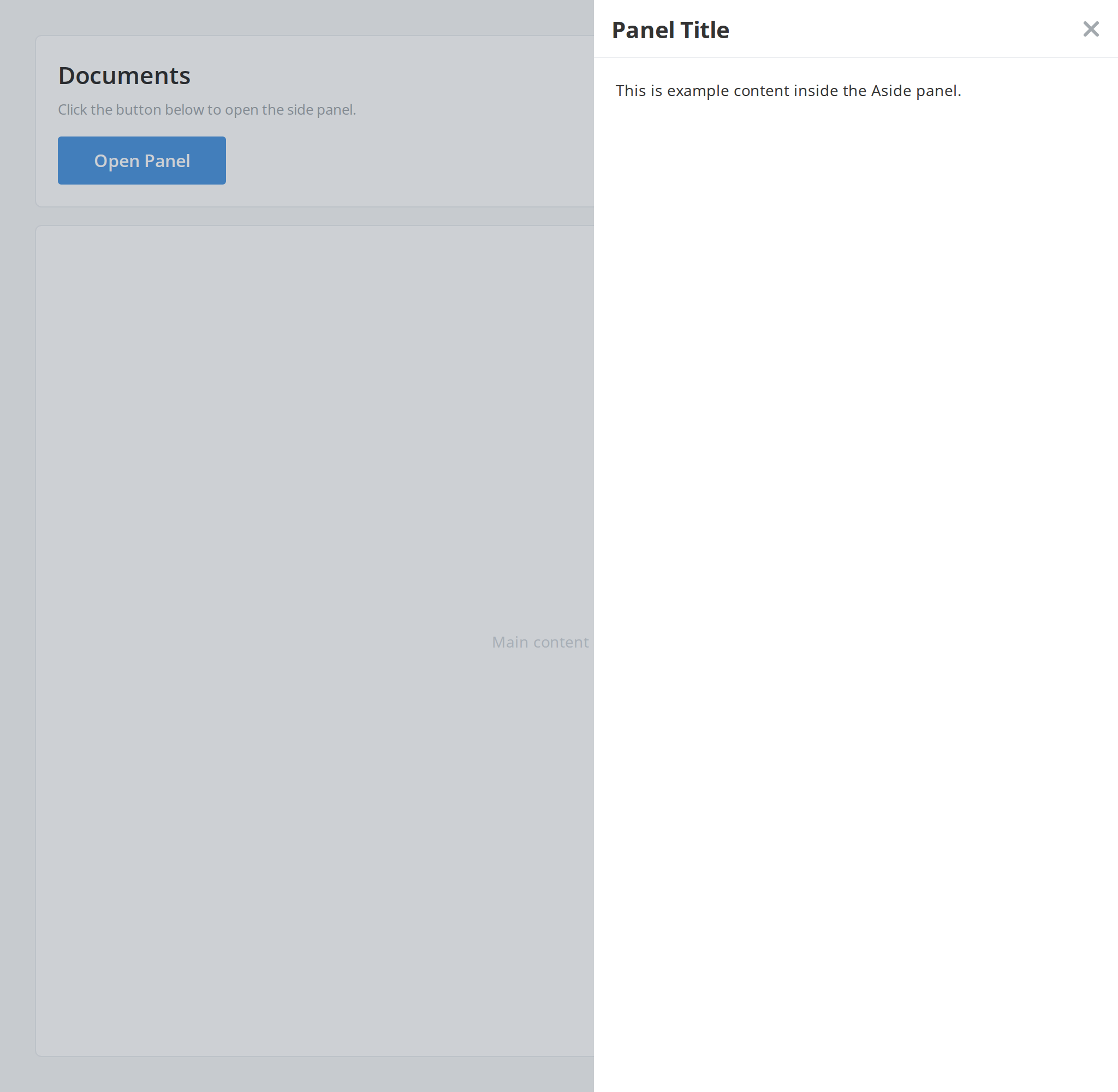
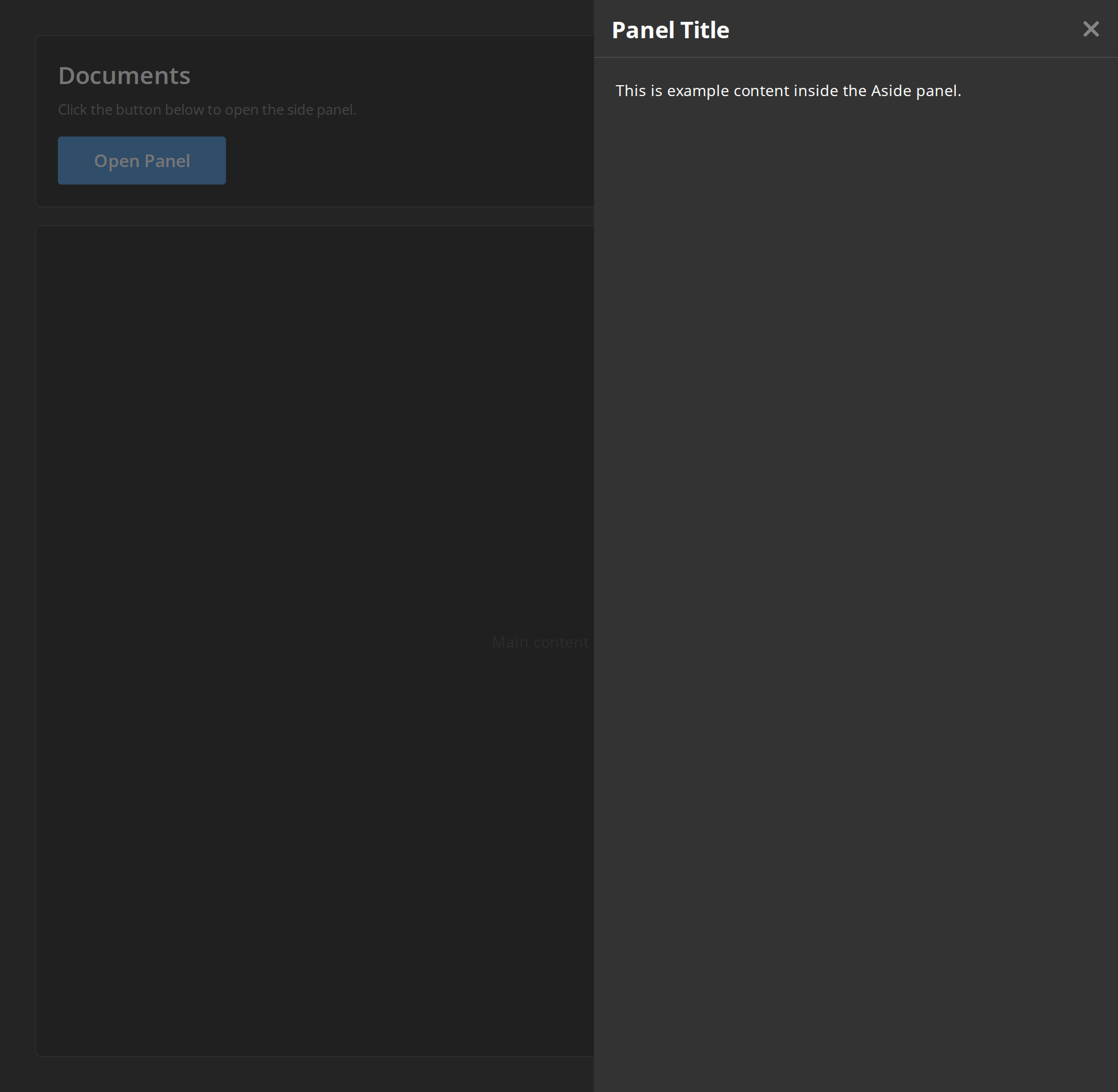
The panel with a title and a short text, opened by the button on the page. Close it with the cross or by clicking the dimmed page — that dimming is a Backdrop of the story's own, since Aside renders none. Change any other prop live in the Controls panel below.
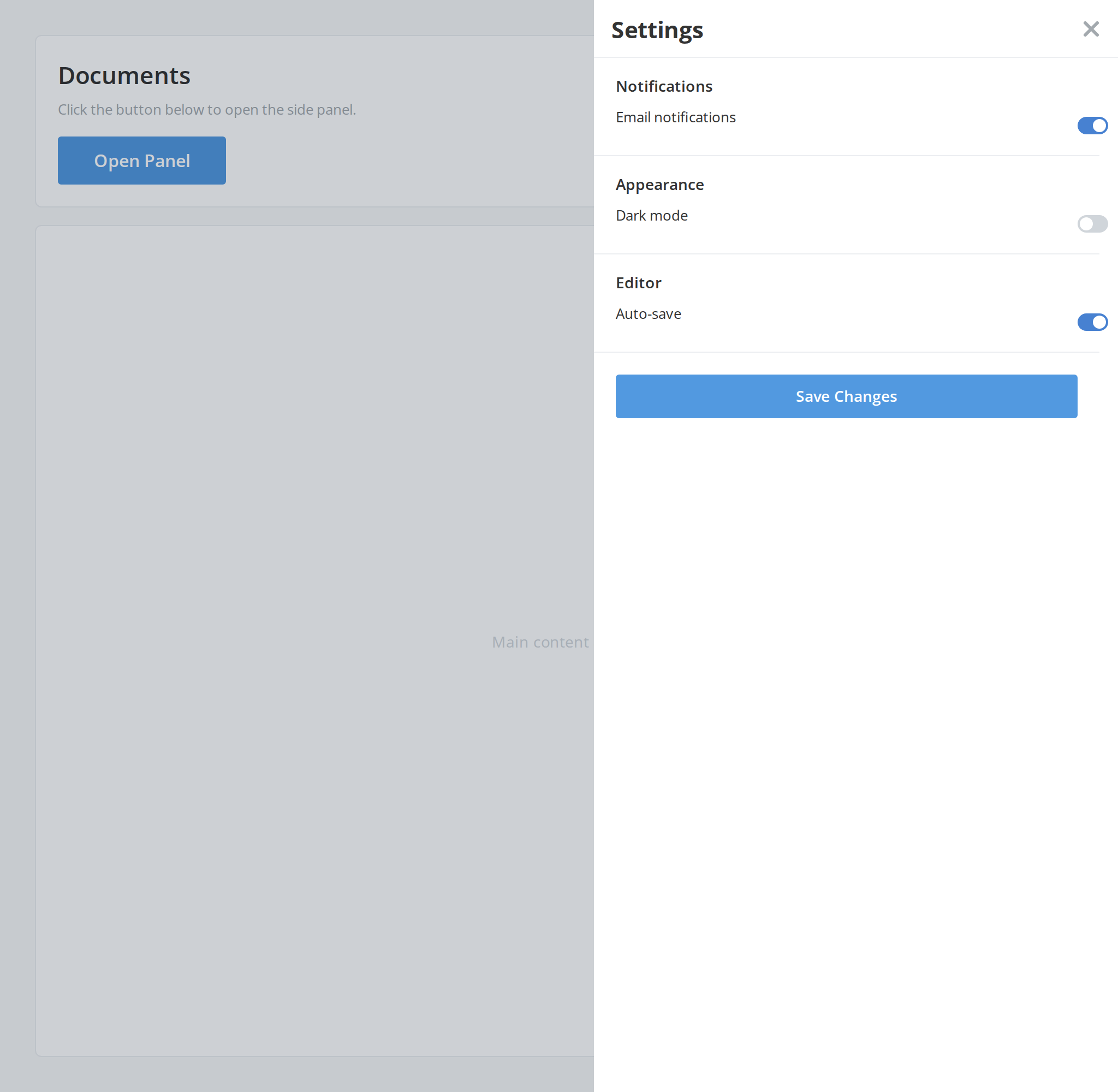
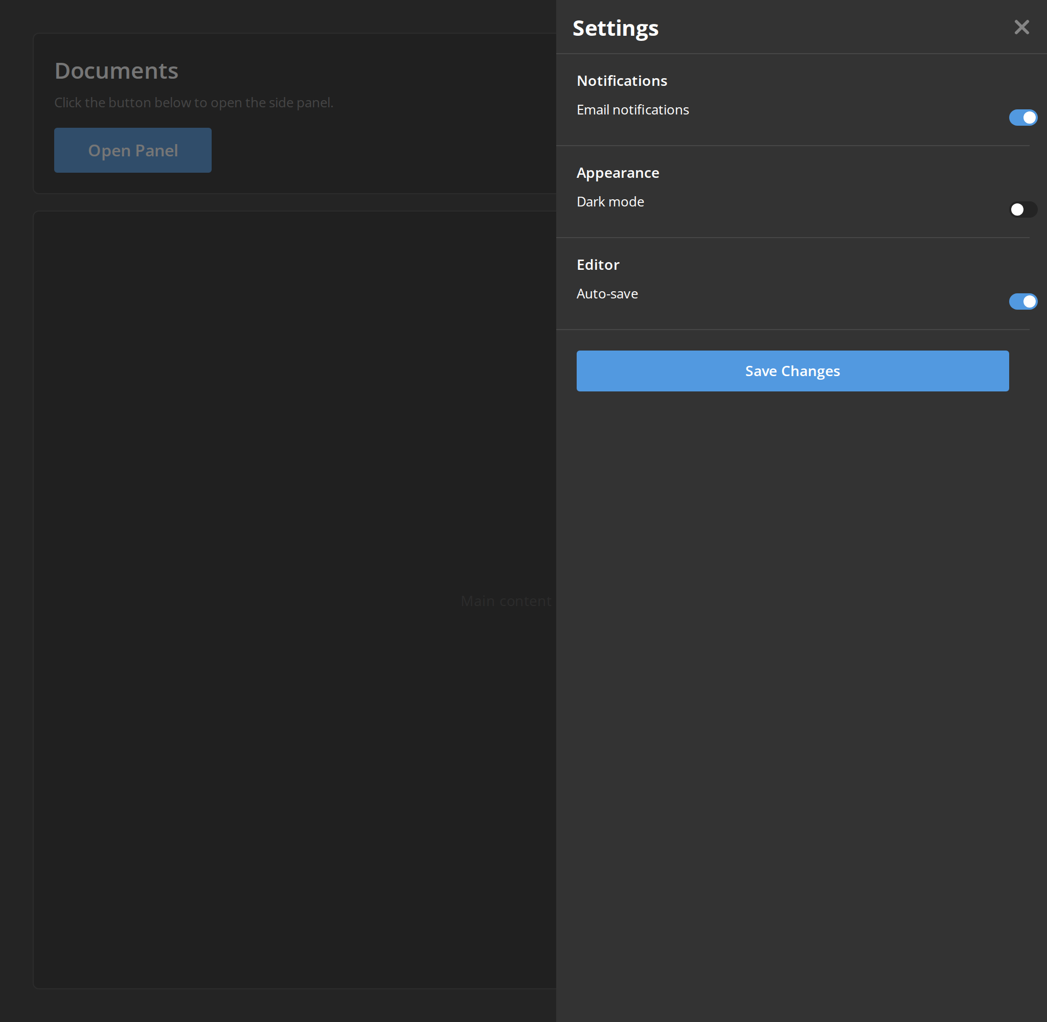
Settings
A short settings form with switches and a save button — the kind of form a side panel holds beside the page it configures.
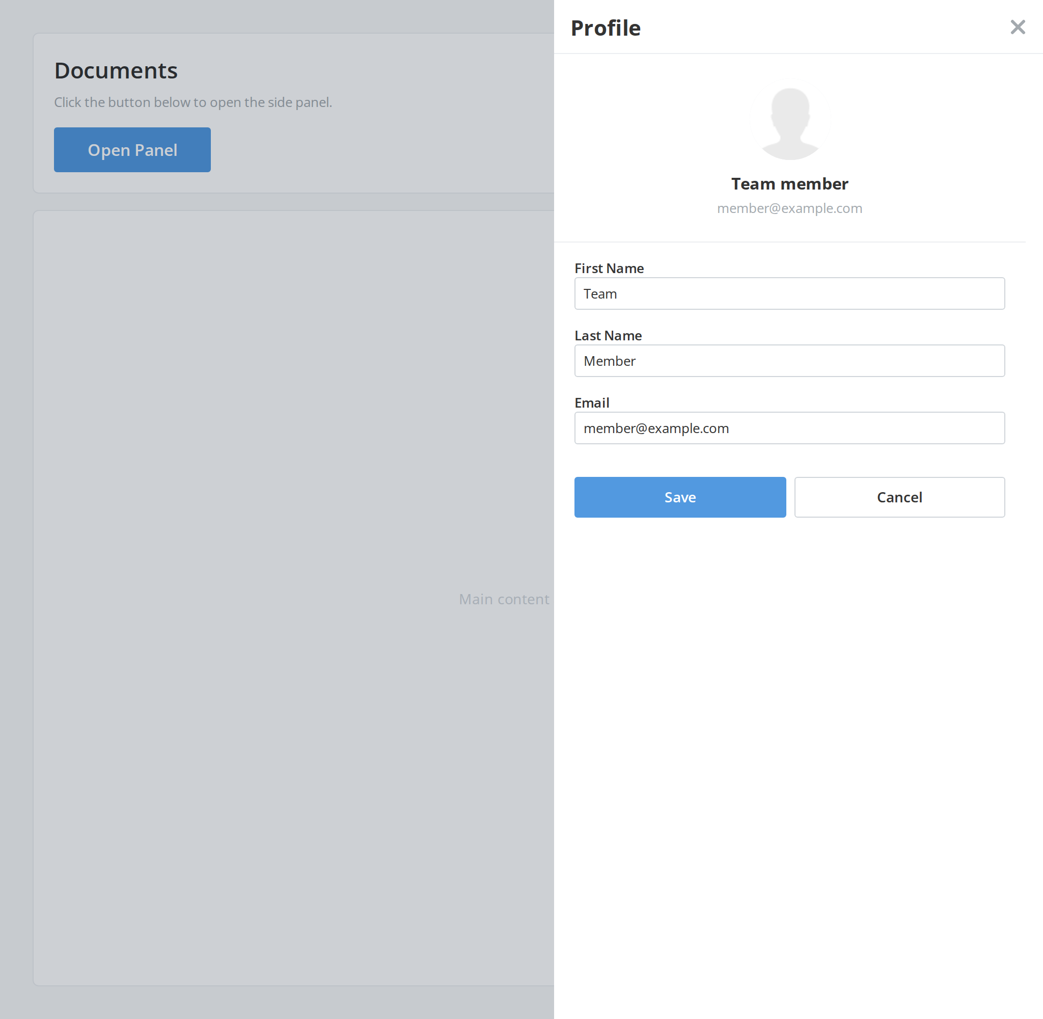
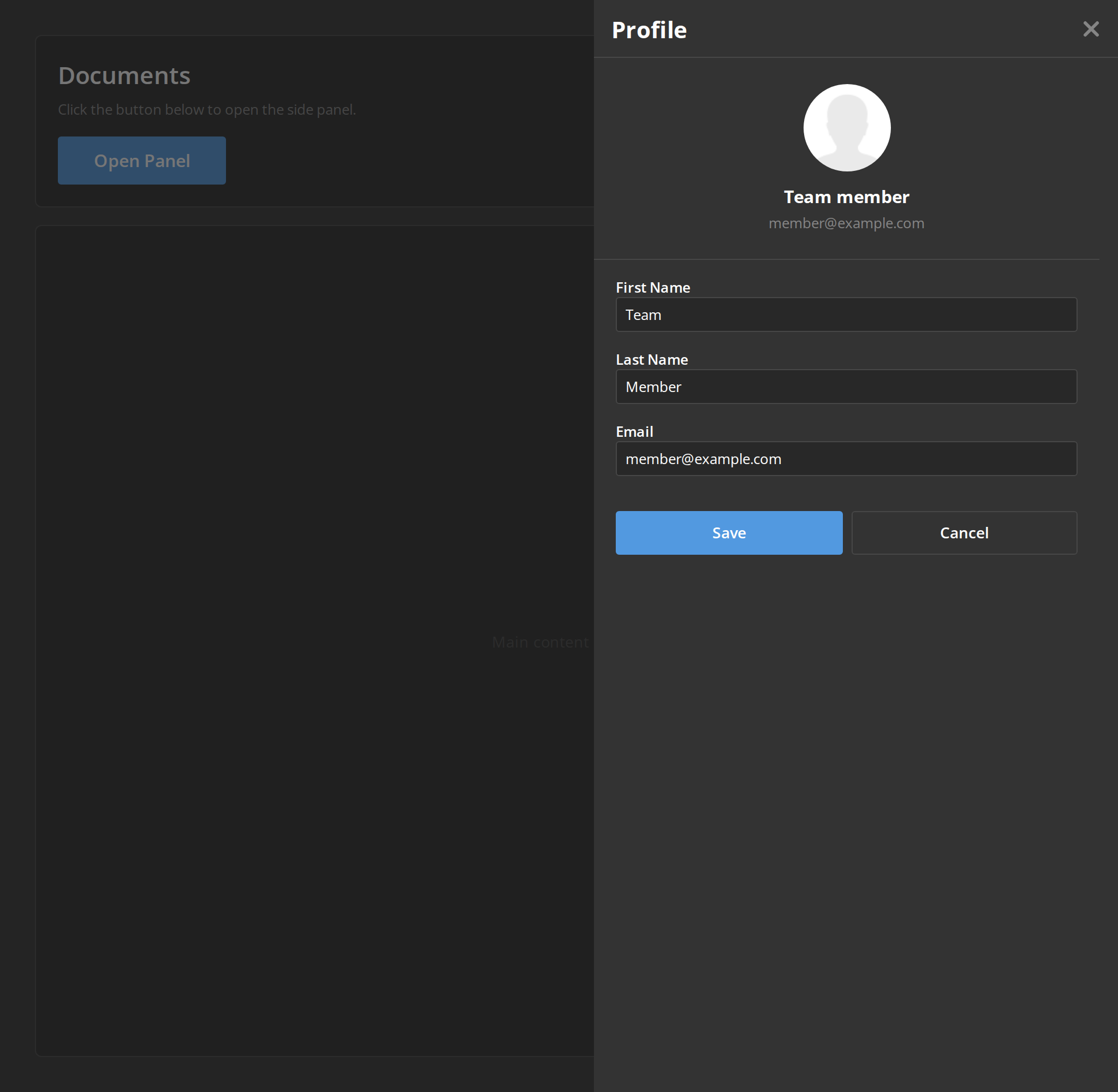
User Profile
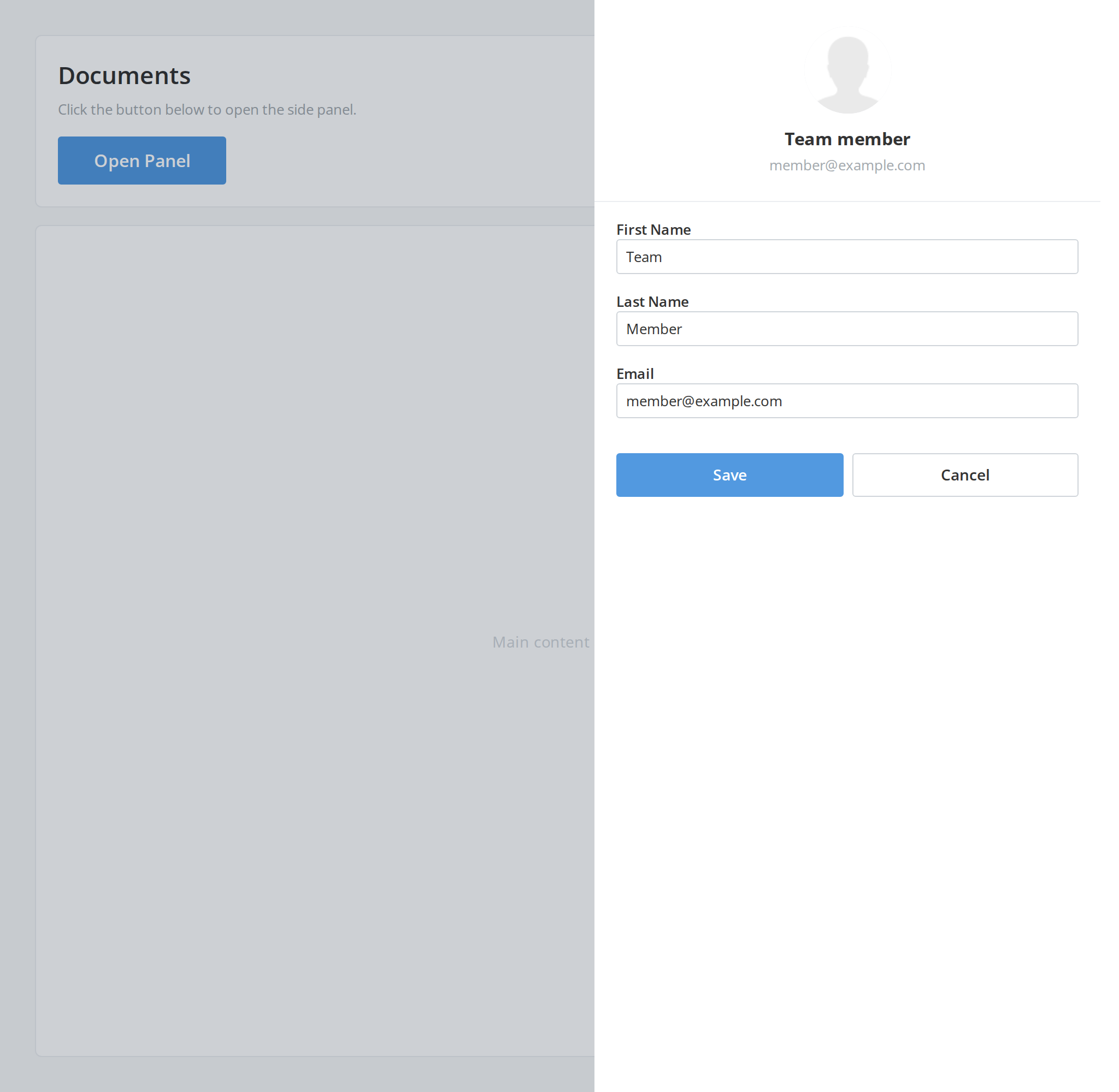
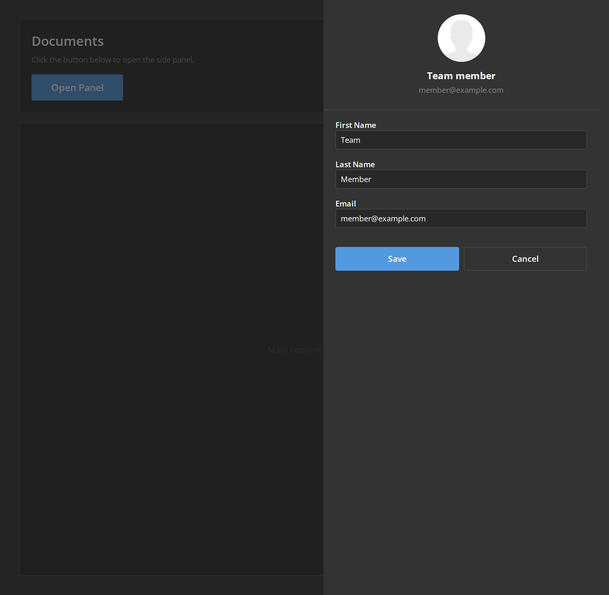
An edit form with an avatar, labelled text fields and two buttons, for changing an item without leaving the page.
File Details
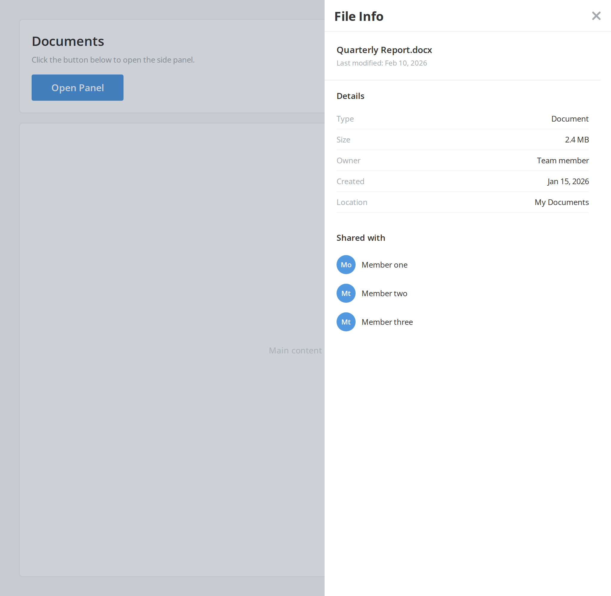
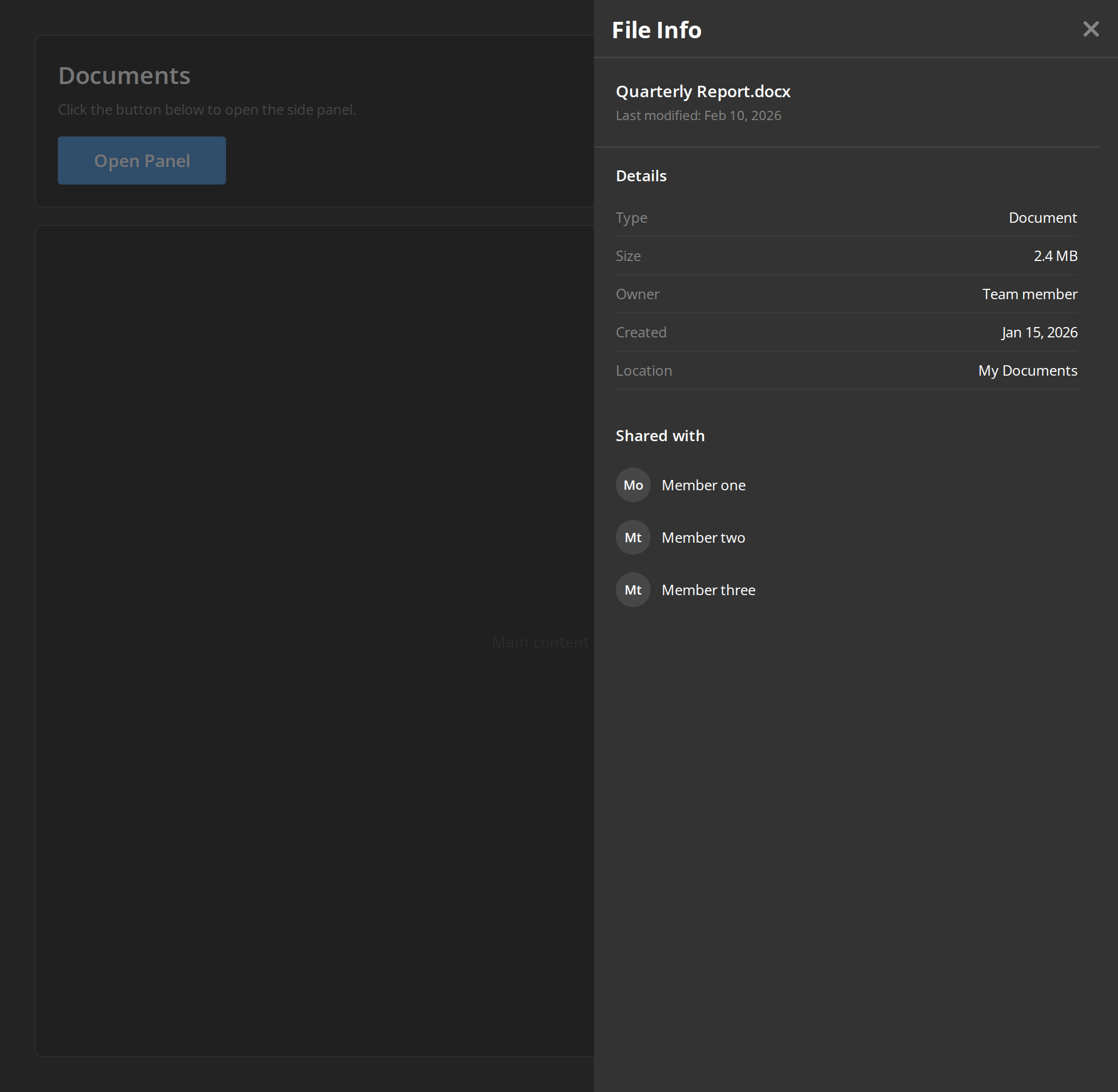
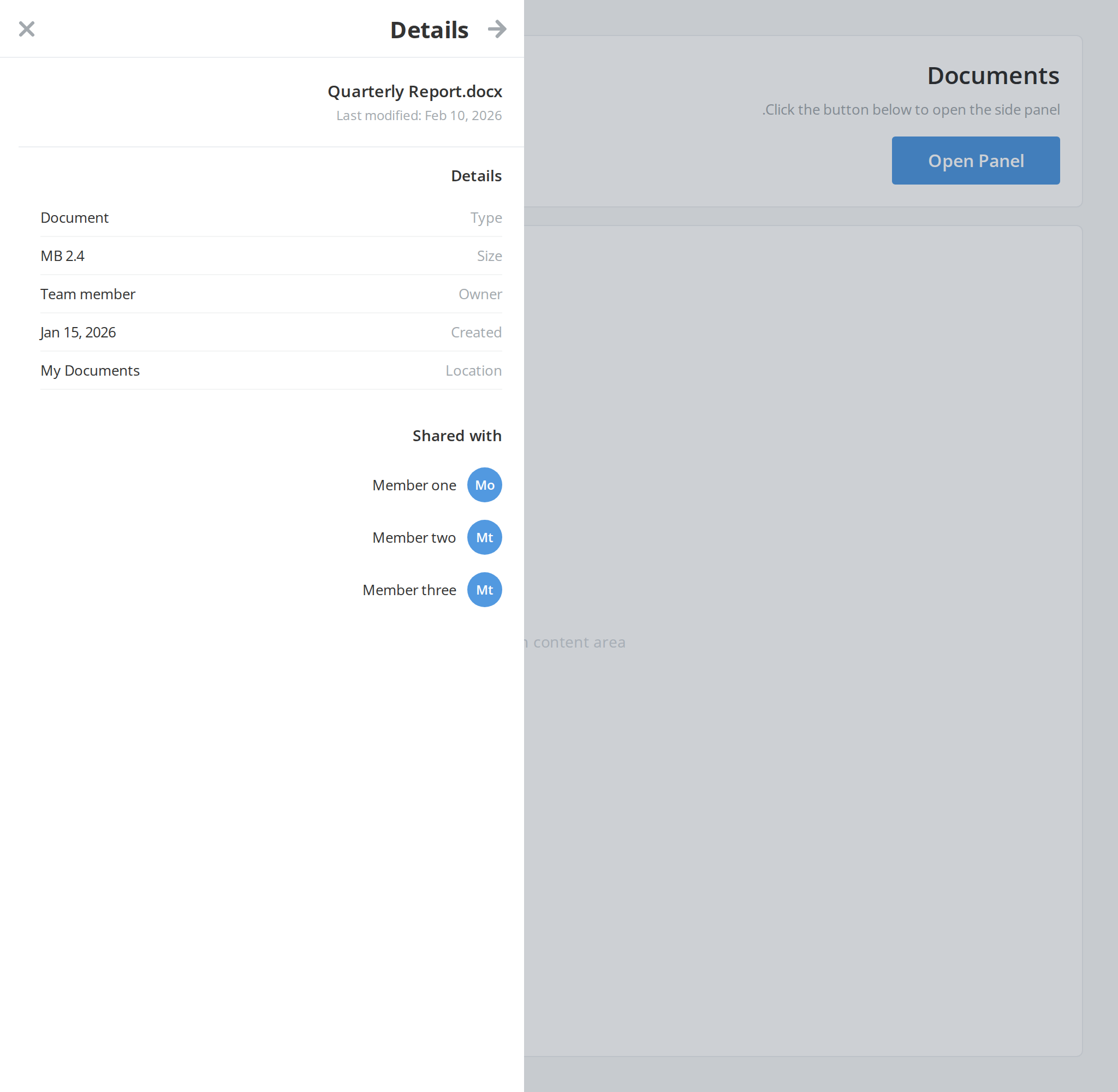
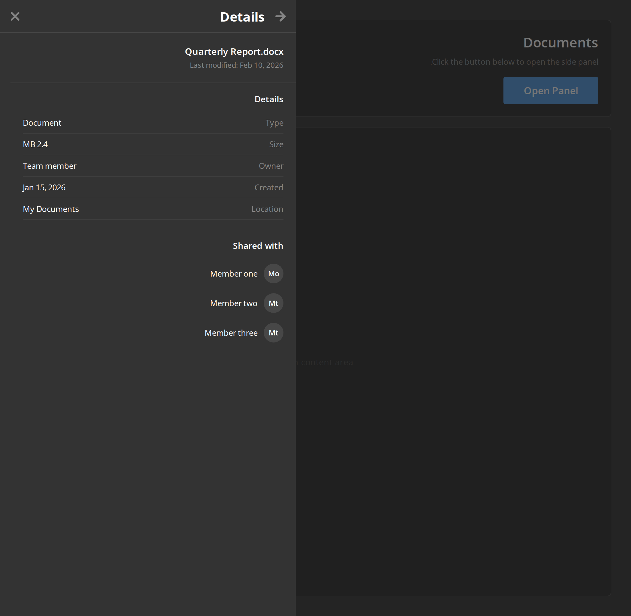
The details of a selected file — its properties and the people it is shared with — the most common content of a side panel next to a list.
With Back Button
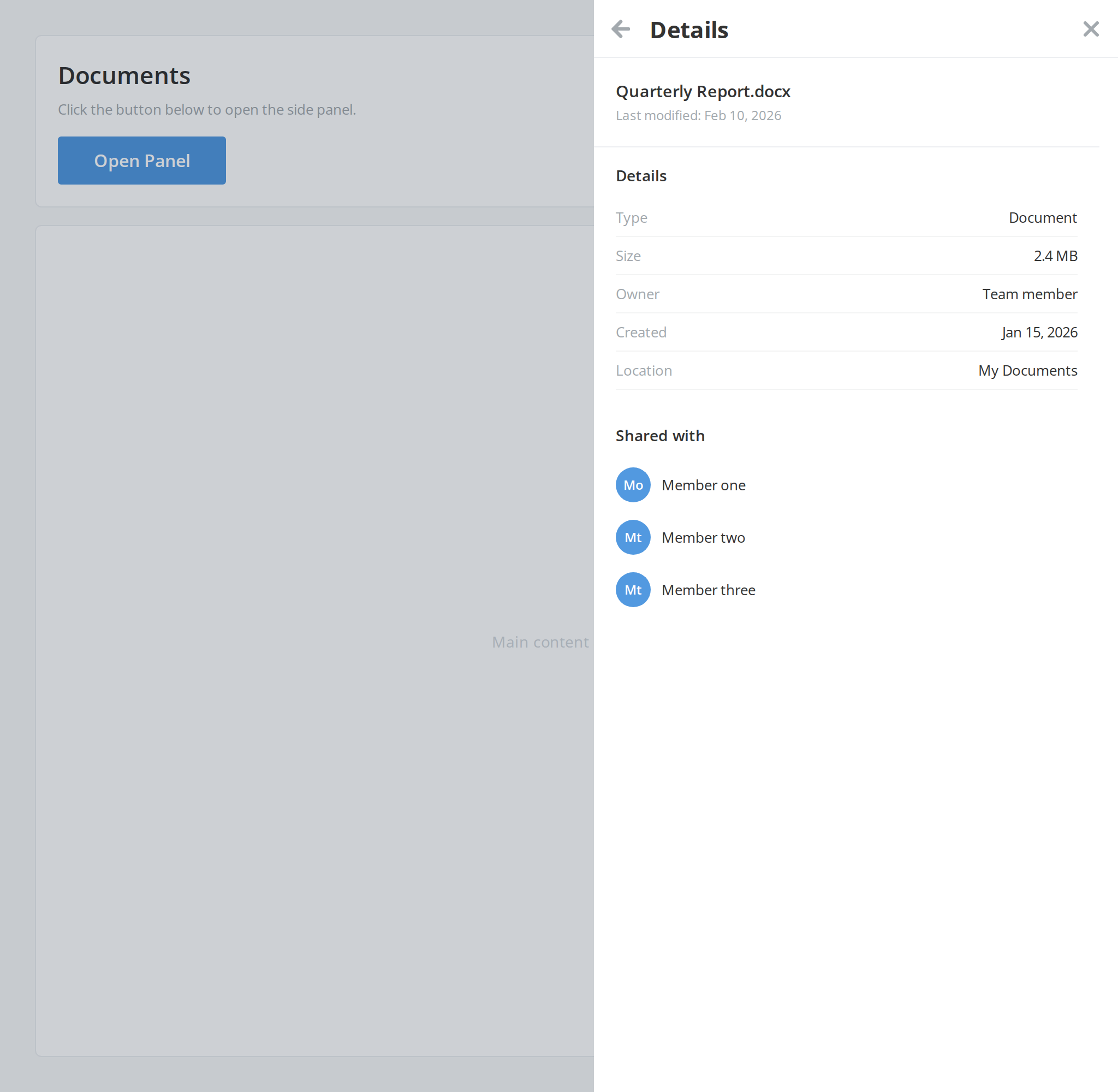
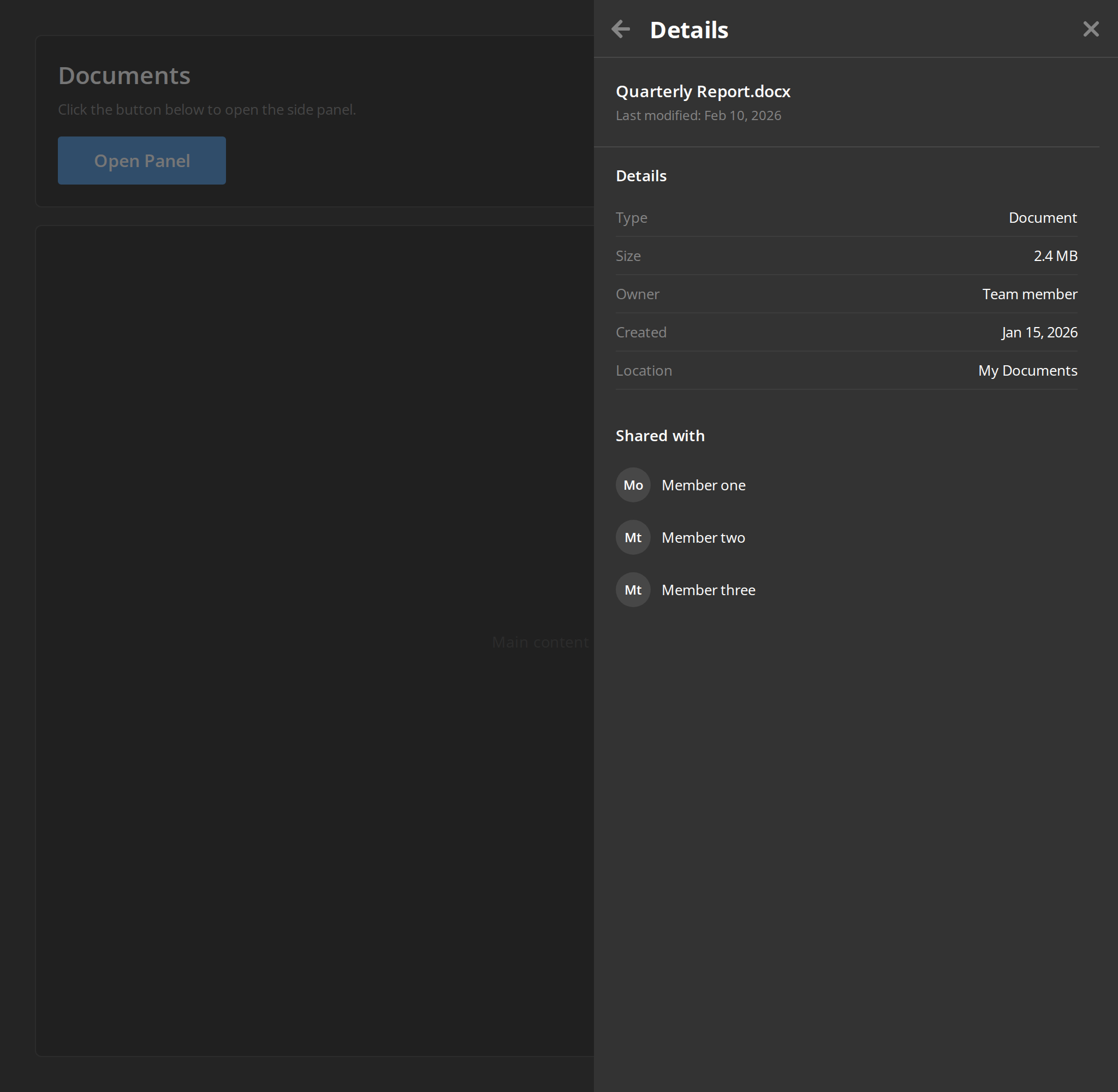
A back arrow before the title, for a panel with several levels: the arrow calls onBackClick, logged in the Actions panel, while the cross still closes the panel (isBackButton).
Without Header
A panel with no header, for content that brings its own title bar. The close cross goes with the header, so the page has to close the panel itself — here a click on the dimmed page does (withoutHeader).
Scaled
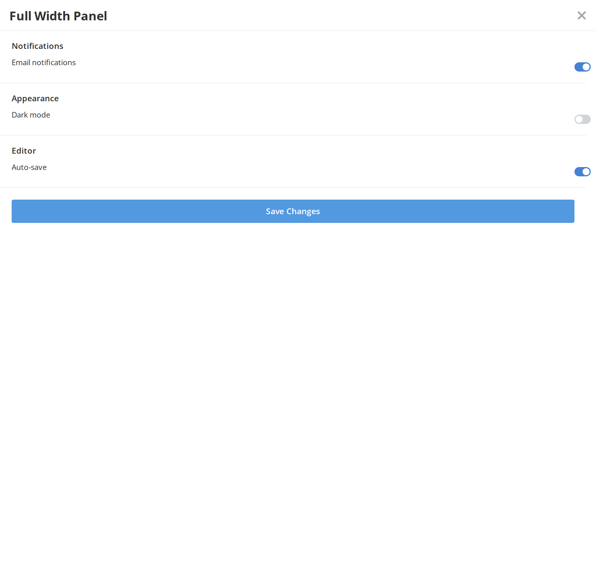
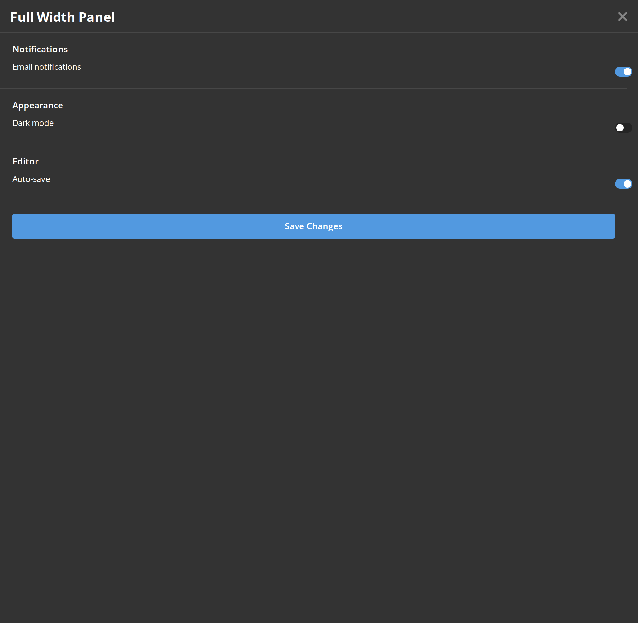
The panel across the full width of the window instead of 480px, for content that needs the room (scale).
Right To Left
The same panel under a right-to-left interface: it is attached to the left edge instead of the right and slides in from there, the back arrow points the other way and the close cross sits on the left of the header. The direction comes from the theme's interfaceDirection (the Direction toolbar); the wrapper also carries dir="rtl" for the rules that read the DOM direction.
Css Customization
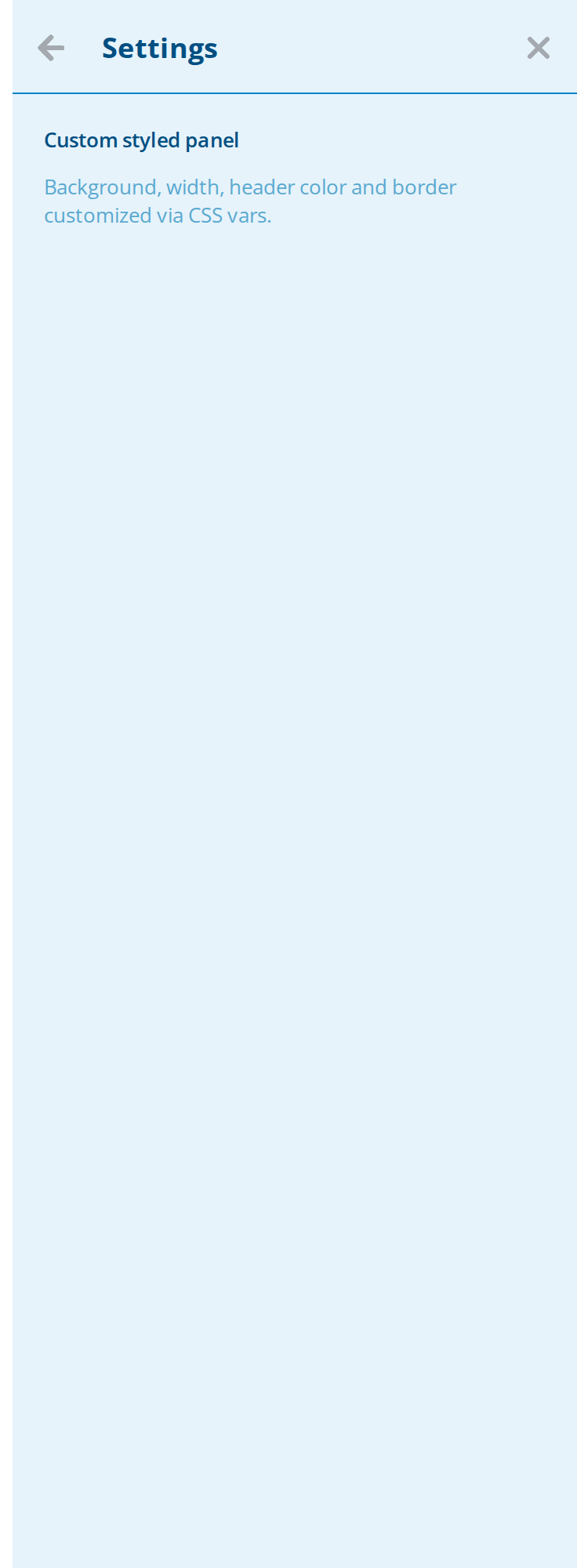
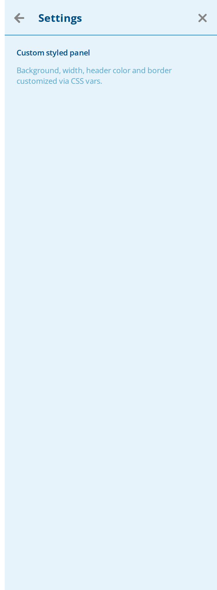
The panel and its header restyled through CSS variables on one wrapper -- the variables are listed under CSS variables on this page, and the header's on the AsideHeader page.
The title here is a node rather than a string, so the color and font-size variables reach it. The back arrow is on to show the gap between it and the title; the phone footer offset shows only in a phone-width window. The margin is left alone because the border does not follow it.
Minimal example
The panel is position: fixed and always rendered, so mount it conditionally — see the first
behaviour note.
import { useState } from "react";
import { Aside } from "@onlyoffice/apps-ui-kit/components/aside";
import { Backdrop } from "@onlyoffice/apps-ui-kit/components/backdrop";
import { Button } from "@onlyoffice/apps-ui-kit/components/button";

export function MembersPanel() {
  const [open, setOpen] = useState(false);

  return (
    <>
      <Button label="Members" onClick={() => setOpen(true)} />
      {open ? (
        <>
          <Backdrop visible zIndex={399} onClick={() => setOpen(false)} />
          <Aside visible header="Members" onClose={() => setOpen(false)}>
            <p style={{ padding: 16 }}>Nobody has joined this room yet.</p>
          </Aside>
        </>
      ) : null}
    </>
  );
}
Props
Inherited from AsideHeaderProps
Declared by components/aside/aside-header and accepted here too.
Plus 53 more props inherited from React.AriaAttributes, forwarded to the element.
Recipes
Open and close, controlled
import { useState } from "react";
import { Aside } from "@onlyoffice/apps-ui-kit/components/aside";
import { Button } from "@onlyoffice/apps-ui-kit/components/button";

export function DetailsPanel({ name }: { name: string }) {
  const [open, setOpen] = useState(false);

  return (
    <>
      <Button label="Details" onClick={() => setOpen(true)} />
      {open ? (
        <Aside
          visible
          header={name}
          isBackButton
          onBackClick={() => setOpen(false)}
          onClose={() => setOpen(false)}
        >
          <p style={{ padding: 16 }}>Details of {name}.</p>
        </Aside>
      ) : null}
    </>
  );
}
Loading
The header's isLoading replaces the title with a skeleton, for a panel opened before its
content is known.
import { Aside } from "@onlyoffice/apps-ui-kit/components/aside";
import { Loader, LoaderTypes } from "@onlyoffice/apps-ui-kit/components/loader";

export function LazyPanel({ ready }: { ready: boolean }) {
  return (
    <Aside visible header="Room members" isLoading={!ready} onClose={() => {}}>
      {ready ? (
        <p style={{ padding: 16 }}>Three members.</p>
      ) : (
        <div style={{ display: "flex", justifyContent: "center", padding: 24 }}>
          <Loader type={LoaderTypes.oval} size="32px" label="Loading" />
        </div>
      )}
    </Aside>
  );
}
Behaviour the types don't state
visibleonly animates. The panel isposition: fixedand always in the document; the prop switches atransformbetween off-screen and zero. Its children keep running and its controls stay in the tab order of the page behind it, so an unmounted panel is the only closed panel — render it conditionally, as every example here does.- Nothing closes it but the header's cross. There is no backdrop, no Escape handler and no
click-outside.
onCloseis wired to the cross alone; add aBackdropwith a lowerzIndexfor the usual behaviour. withoutBodyScrolldoes not lock the page's scroll. It decides whether the children are wrapped in the kit'sScrollbar; the page behind keeps scrolling either way.- The panel is a flex column, and the body takes the space the header leaves. A list long
enough to scroll reaches its last item without anything on your side. If you pass
withoutBodyScrolland bring a scroller of your own, give itflex: 1 1 0andmin-height: 0for the same result — a plainheight: 100%there resolves against the whole panel and hangs its bottom below the edge. withoutHeaderremoves the only way out. With no header there is no cross, so a panel that hides its header has to be closed by something of yours.- The props it does not read itself are split, not copied.
aria-*attributes go on the<aside>element; every other one —header,isBackButton,onBackClick,id,styleand the rest — goes to the header alone, which is whyidandstyleland on the header rather than on the panel. - The panel is 480px wide and slides in from the right edge — from the left one under a right-to-left interface. On a phone it becomes a full-width bottom sheet that slides up and leaves room for the mobile footer.
CSS variables
The header reads its own --aside-header-* set — colour, border, height, font size, margin
and gap among them; AsideHeader lists them. Set on a wrapper
around the panel, they reach its header too.
Accessibility
- Renders a real
<aside>element, so it is exposed as a complementary landmark. It is not a dialog: norole="dialog", noaria-modal, and focus is neither moved into it nor trapped. - Because the markup stays in the document while
visibleis false, everything inside it is reachable by keyboard from the page behind. Conditional rendering is what prevents that. - The header's close cross carries
aria-label="close", but it is a<div>with no button role and no tab stop, so a keyboard cannot reach it — and it is the only control that callsonClose. A keyboard user needs a way out of yours. AriaAttributesare part of the props type and land on the<aside>element alone, so anaria-labelnames the landmark.
Test ids
Related
ModalDialog— a dialog, optionally shaped as an aside.Backdrop— the dimming layer this component does not render.AsideHeader— the header, and the props this component passes through to it.