AsideHeader
Title bar of a side panel or a dialog, with a back arrow, extra icons and the close cross. Both
Aside and ModalDialog render one and accept
its props, so this page is where those props are explained.


Use this when / not when
- Use it directly only when you are building a panel of your own that should look like the
kit's. Inside
AsideorModalDialogthe header is already there — passheader,isCloseableand the rest to the panel itself. - Not as a page heading: it is a 53px bar with a bottom border and side margins meant for a
panel. A heading in the page flow is
Heading. - Not for a toolbar of actions. It fits a back arrow, a title, a few icons and a close cross; anything more crowds the title out.
Import
import { AsideHeader } from "@onlyoffice/apps-ui-kit/components/aside/aside-header";
components/index.ts does not list this folder, but it lists aside, and export *
is transitive — so the name arrives from @onlyoffice/apps-ui-kit/components/aside and from
the root barrel @onlyoffice/apps-ui-kit as well.
Needs ThemeProvider from @onlyoffice/apps-ui-kit/providers/theme above it in the tree for
the title colour and the border colour.
Stories
Default
A title and the close cross, the header every side panel starts with; clicks on the cross are logged in the Actions panel. Change any other prop live in the Controls panel below.
With Back Button
A back arrow before the title, for a panel that opens a second level and needs a way back to the first; the arrow calls its own handler, logged in the Actions panel (isBackButton).


With Icons
Two icon buttons between the title and the close cross, for actions on what the panel shows without a toolbar of their own; each icon has its own click handler (headerIcons).


Loading
A skeleton bar in place of the whole header while the panel waits for its data. The close cross goes too, so a panel that may load for long needs another way out (isLoading).


Without Border
The header with no line under it, for a panel whose first block already draws its own separator (withoutBorder).


Custom Height
A 70px header instead of 53px, for a title bar that has to line up with a taller bar next to the panel (headerHeight).


Back And Close
The back arrow and the close cross around a title too long for the panel: the title is cut off with an ellipsis rather than pushing the close cross out of the header.


With Custom Control
A button between the title and the close cross, for an action that needs a label rather than an icon (headerComponent).


Right To Left
The same header under a right-to-left interface: the back arrow moves to the right edge and points right, the title follows it, and the close cross sits on the left. The direction comes from the theme's interfaceDirection (the Direction toolbar); the wrapper also carries dir="rtl" for the rules that read the DOM direction.


Css Customization
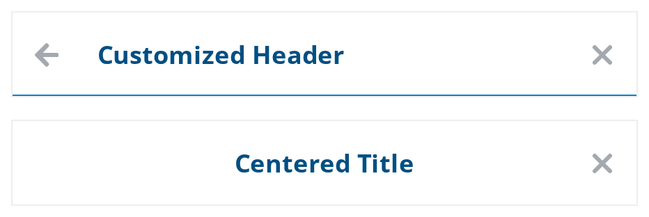
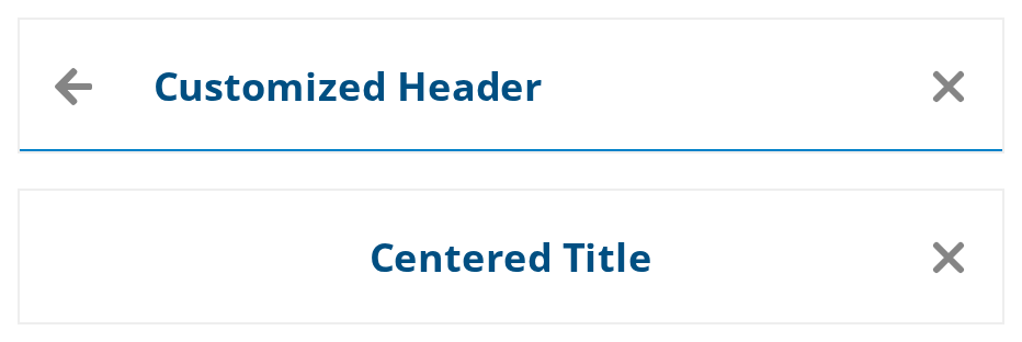
Two headers restyled through CSS variables -- the variables are listed under CSS variables on this page.
- Customized Header — the wrapper's color, border, font size, height and gap; the back arrow is on to show the gap before the title.
- Centered Title — the title taken out of the row and centered, with the line removed. These variables are set through the header's own
style, because in the wrapper they would also move the first header's title away from its back arrow.
Minimal example
The close cross is rendered unless you turn it off, so onCloseClick is what makes the header
useful on its own.
import { AsideHeader } from "@onlyoffice/apps-ui-kit/components/aside/aside-header";

export function PanelHeader({ onClose }: { onClose: () => void }) {
  return <AsideHeader header="Members" onCloseClick={onClose} />;
}
Props
Recipes
Loading
isLoading replaces everything, so a header that is loading cannot be closed. Keep the panel
closable by something of yours while it loads.
import { AsideHeader } from "@onlyoffice/apps-ui-kit/components/aside/aside-header";

export function LazyPanelHeader({
  ready,
  onClose,
}: {
  ready: boolean;
  onClose: () => void;
}) {
  return (
    <AsideHeader
      header="Room members"
      isLoading={!ready}
      onCloseClick={onClose}
    />
  );
}
A back arrow and extra icons
import { AsideHeader } from "@onlyoffice/apps-ui-kit/components/aside/aside-header";

const INFO_ICON = (
  <svg viewBox="0 0 17 17" width="17" height="17" aria-hidden="true">
    <circle cx="8.5" cy="8.5" r="7" fill="none" stroke="currentColor" />
  </svg>
);

export function DetailsHeader({
  onBack,
  onClose,
  onInfo,
}: {
  onBack: () => void;
  onClose: () => void;
  onInfo: () => void;
}) {
  return (
    <AsideHeader
      header="Document.docx"
      isBackButton
      onBackClick={onBack}
      headerIcons={[{ key: "info", iconNode: INFO_ICON, onClick: onInfo }]}
      onCloseClick={onClose}
    />
  );
}
Behaviour the types don't state
- A string header and a node header are rendered differently. A string becomes bold 21px
Text; anything else goes into aHeading. Both stay on one line and cut off with an ellipsis, but only a node title reads--aside-header-colorand--aside-header-font-size— a string title keeps the text colour and 21px whatever you set. Wrap it in a<span>to restyle it. isLoadinghides the close cross. The skeleton replaces the whole content, back arrow and cross included, so the panel has no way out while it is loading.- The border is wider than the header. The header has
margin: 0 16px, and the bottom border is drawn by an::afterofcalc(100% + 32px)pulled 16px past each side, so it reaches the panel's edges.withoutBorderremoves it. headerHeightis written as a custom property in an effect, not as a style, and it is only ever set — clearing the prop removes the class that reads it, but the property stays on the element.- The close cross carries a hard-coded English
aria-labelof "close". It is not translated, and nothing else in the header has a name at all. - The element is a
<div>, not a<header>, and takes no landmark role. - An icon in
headerIconsgiven aurlhands it toIconButton'siconName, which fetches it at runtime;iconNoderenders JSX inline and needs no request. - While
isLoading, the skeleton's owndata-testidofrectangle-skeletonwins over theloaderthe header asks for, becauseRectangleSkeletonwrites its test id last.
CSS variables
Set these on the header or an ancestor; each is read through a bridge variable, so the theme's own value is the fallback.
--aside-header-custom-height is the exception to setting a variable on an ancestor: the theme
rules redefine it on the header itself, so only headerHeight changes it.
--aside-header-margin moves the bar but not its border, which keeps reaching 16px past each
side; any value other than 0 16px leaves the line short of the panel's edges or overflowing
them.
To centre the title, take it out of the row: --aside-header-title-position: absolute,
--aside-header-title-inset: 50% and --aside-header-title-transform: translateX(-50%). Set
these on the header's own style rather than on a shared ancestor, where they would also pull
a neighbouring header's title away from its back arrow.
Accessibility
- The header is a plain
<div>: no<header>element, norole="banner", and the title is not associated with the panel. A dialog that needs an accessible name has to supply one itself. - The close cross is an
IconButton, which renders a<div>— it has anaria-labelbut no button role, no tab stop and no Enter or Space activation. The header is not operable by keyboard. - The back arrow and the
headerIconsareIconButtons too, and have not even the label: no name, no role and no tab stop. - That
aria-labelis the literal string"close", in English, whatever the locale. - The title, string or node, is truncated with an ellipsis, so a long one is unreadable rather than wrapped; keep titles short.
Test ids
| Element | data-testid |
|---|---|
| The header | aside-header, overridable with dataTestId |
| The back arrow | aside_header_back_icon_button |
| The close cross | aside_header_close_icon_button |
| The icon strip | icons-container |
While isLoading, the header's only child is the skeleton, which carries rectangle-skeleton.
Related
Aside— the panel this header belongs to, which accepts these props.ModalDialog— the dialog, whose header is this one.IconButton— what the cross, the arrow andheaderIconsare made of.