AvatarEditorDialog
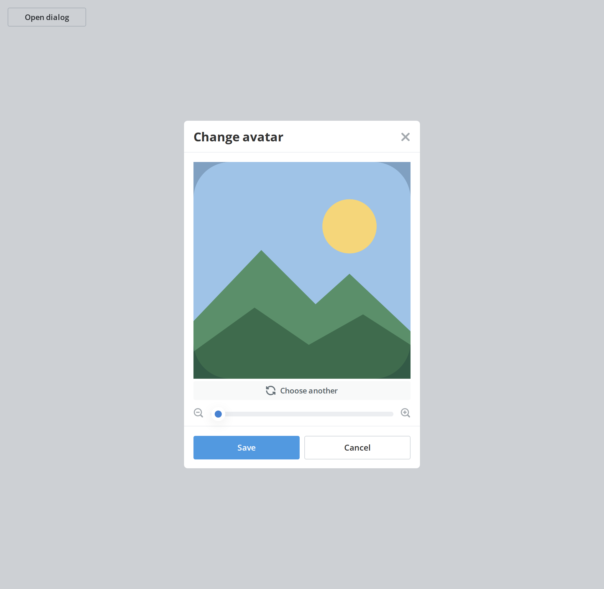
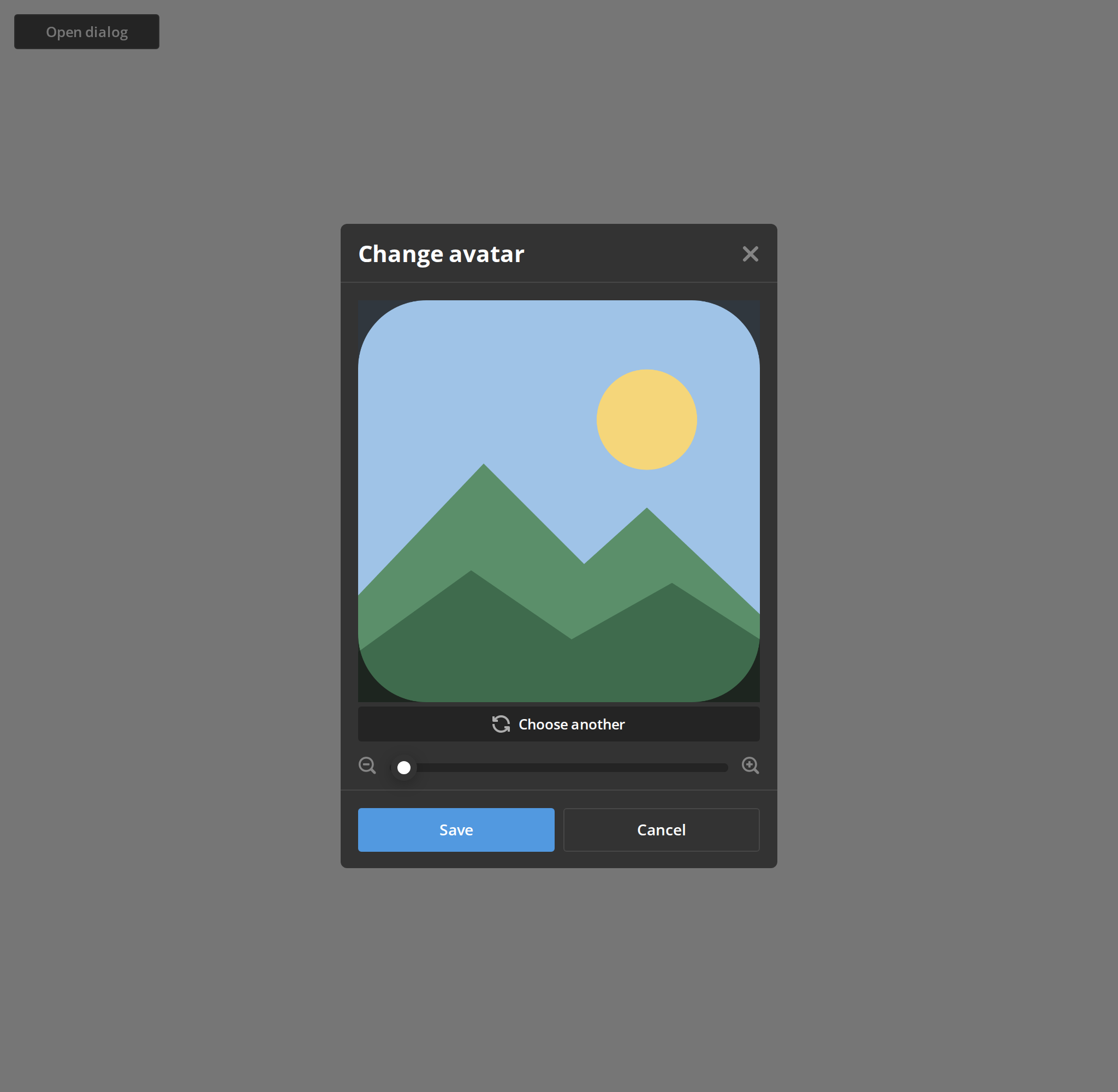
Works only inside an ONLYOFFICE Apps portal: it needs the portal's API client, stores and translations, and is not part of the public API.
Modal that frames an uploaded picture: the kit's crop window between a title and a save and cancel pair. It owns the preview it hands back on save, and nothing else — the picture, the crop and the open state all stay in your code.
Portal-internal. t is required, and the two footer labels and the editor's replace control
are asked for by key, so the component needs the portal's translation context. Outside DocSpace,
supply a t of your own.
Use this when / not when
- Use for the whole "change your picture" flow once a file has been chosen.
- Not without a file — the body is empty until
image.uploadedFileis set, so pick the file before opening the dialog, or put your own input in the page behind it. - Not for the cropper on its own —
ImageEditoris the same crop window without the modal. - Not for a room's cover —
RoomLogoCoverDialogis the colour-and-glyph picker. - There is no file size or dimension check.
maxImageSizeis accepted and ignored all the way down; validate inonChangeFile. - Saving does not close it.
onSaveis awaited and then nothing happens: close the dialog from your own handler.
Import
import { AvatarEditorDialog } from "@onlyoffice/apps-ui-kit/components/avatar-editor-dialog";
Also exported from the root barrel @onlyoffice/apps-ui-kit.
Needs ThemeProvider above it in the tree for the dialog's own colours and for the crop mask,
which is chosen in JavaScript from the theme context. TranslationProvider — or a t of your
own — supplies Common:SaveButton, Common:CancelButton and Common:ChooseAnother; without it
those three labels are empty.
Stories
Default
The dialog as it opens on a chosen picture: drag the picture to frame it, zoom with the slider or the buttons, and press Save or Cancel. The story keeps the picture in its own state and closes the dialog from both handlers, as your code has to; reopen it with the button. Change any other prop live in the Controls panel below.
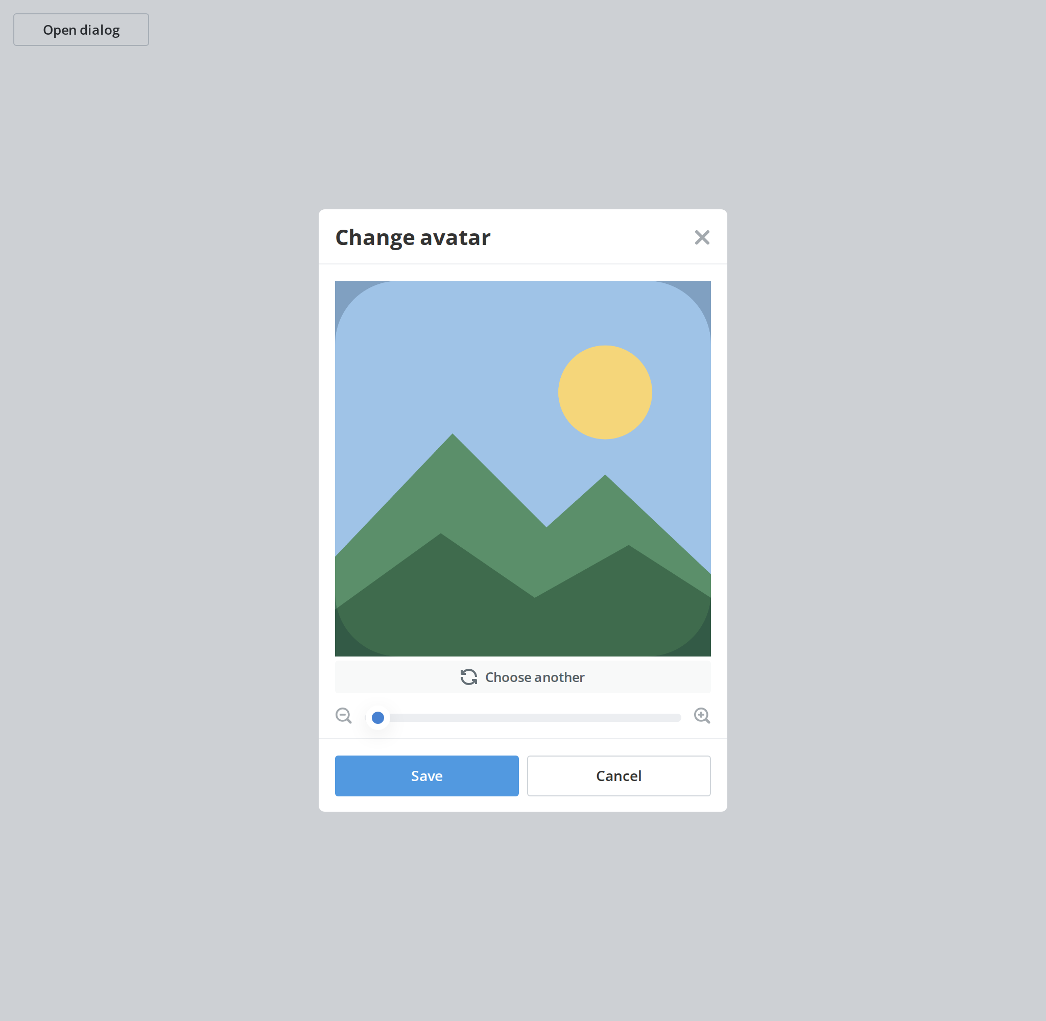
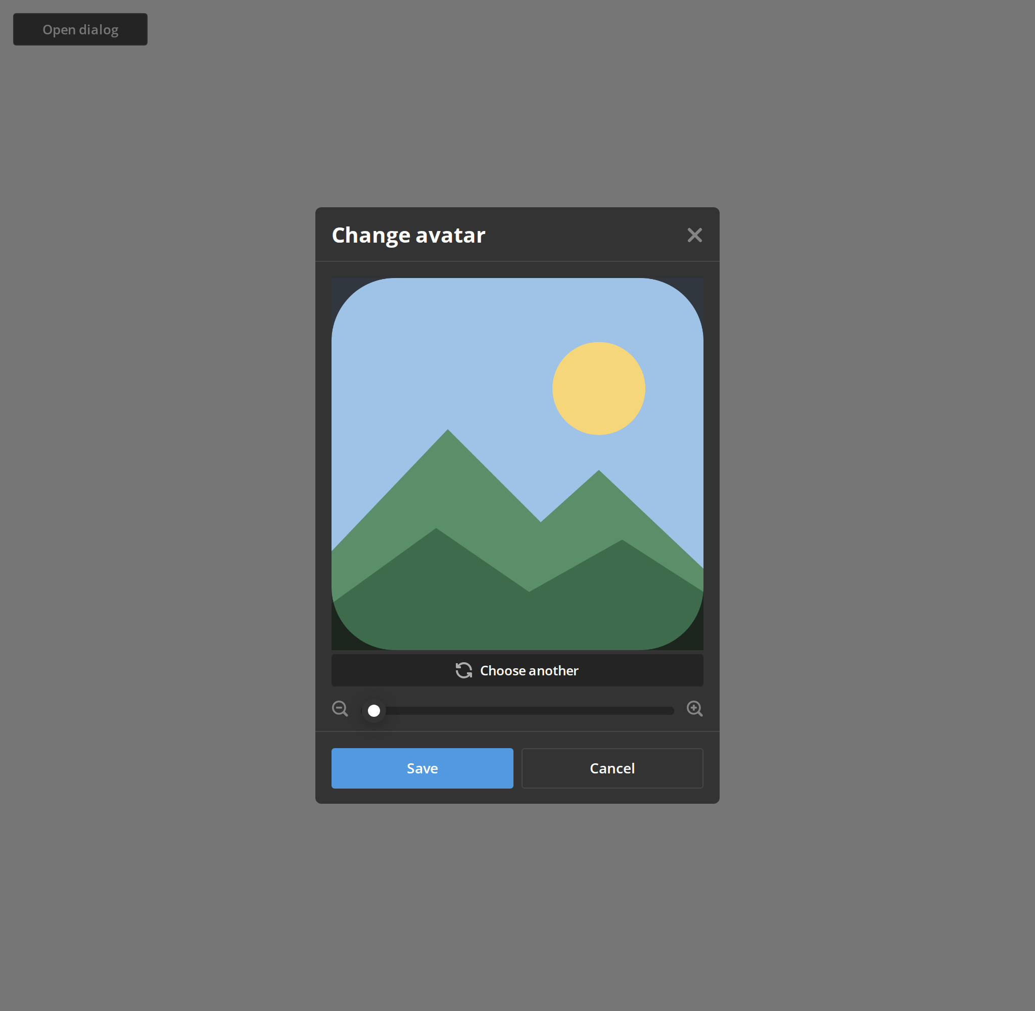
Loading
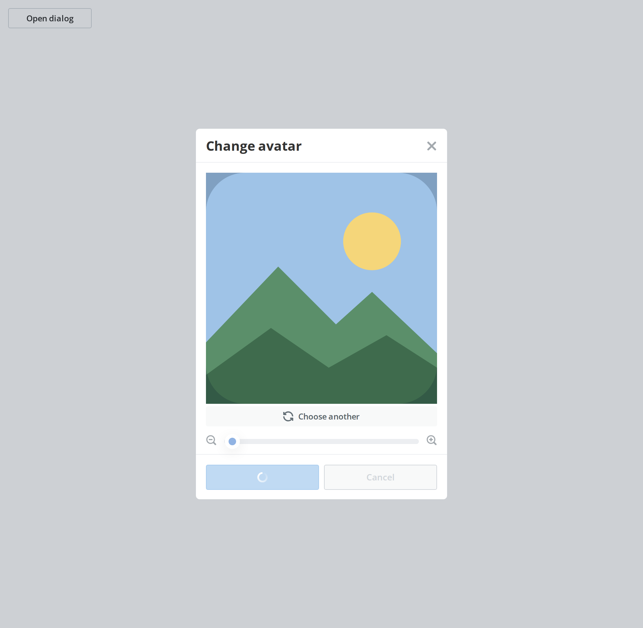
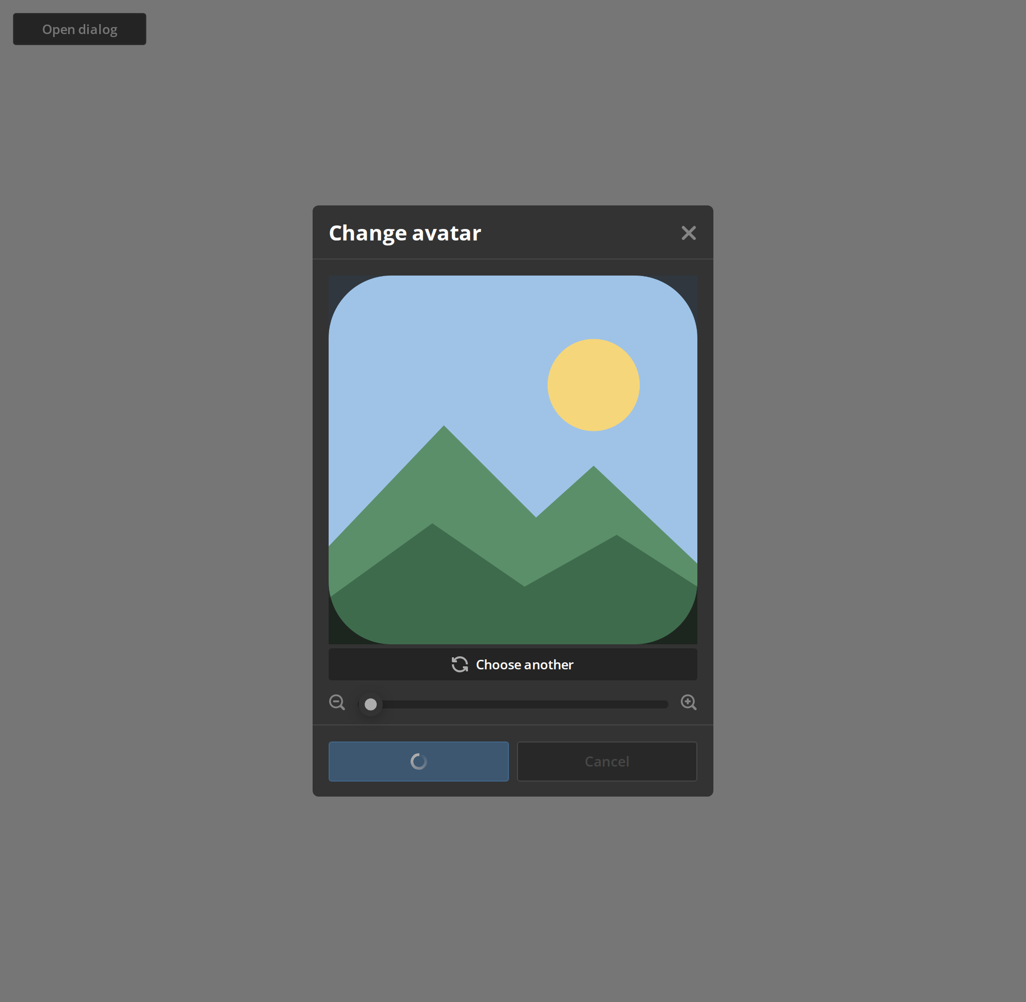
What the user sees while the cropped picture uploads: a spinner on Save and Cancel greyed out, while the picture no longer drags and the zoom row no longer responds (isLoading). The header cross, Escape and the backdrop still close the dialog, so guard onClose yourself if a close must wait for the upload.
Square Crop
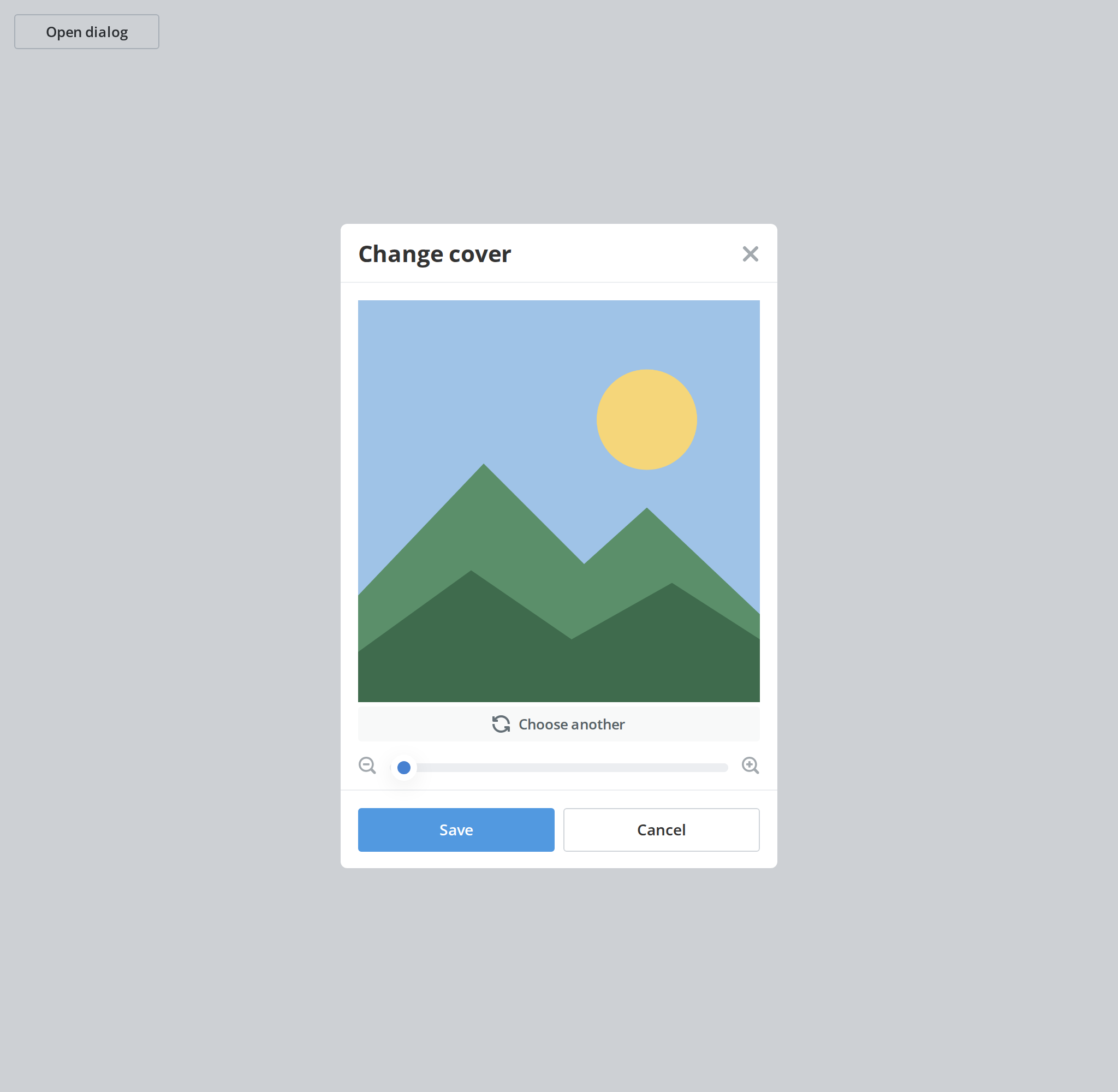
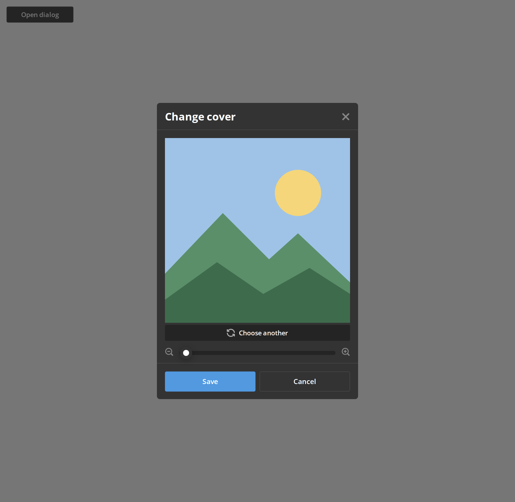
A crop window with square corners, for a picture that is not shown round, such as a logo or a cover (editorBorderRadius of 0). The radius is measured on the editor's 648px canvas: the default 110 gives rounded corners, 324 a circle.
Minimal example
import { useState } from "react";

import { AvatarEditorDialog } from "@onlyoffice/apps-ui-kit/components/avatar-editor-dialog";
import type { TImage } from "@onlyoffice/apps-ui-kit/components/image-editor";
import type { TTranslation } from "@onlyoffice/apps-ui-kit/utils";

const EMPTY: TImage = { zoom: 1, x: 0.5, y: 0.5 };

export function ChangeAvatar({ t }: { t: TTranslation }) {
  const [visible, setVisible] = useState(false);
  const [image, setImage] = useState<TImage>(EMPTY);

  const pick = (e: React.ChangeEvent<HTMLInputElement>) => {
    const file = e.target.files?.[0];
    if (!file) return;
    setImage({ ...EMPTY, uploadedFile: file });
    setVisible(true);
  };

  return (
    <div>
      <input type="file" accept="image/png,image/jpeg" onChange={pick} />
      <AvatarEditorDialog
        t={t}
        visible={visible}
        title="Change photo"
        image={image}
        onChangeImage={setImage}
        onChangeFile={pick}
        onClose={() => setVisible(false)}
        onSave={(_cropped, preview) => {
          console.info(preview.slice(0, 32));
          setVisible(false);
        }}
      />
    </div>
  );
}
Props
Recipes
Open / close (controlled)
visible is the only thing that puts the dialog on screen. Every way out — the cancel button,
the header cross, Escape and the backdrop — goes through onClose, and the dialog resets your
image to an empty one just before calling it.
import { useState } from "react";

import { AvatarEditorDialog } from "@onlyoffice/apps-ui-kit/components/avatar-editor-dialog";
import { Button } from "@onlyoffice/apps-ui-kit/components/button";
import type { TImage } from "@onlyoffice/apps-ui-kit/components/image-editor";
import type { TTranslation } from "@onlyoffice/apps-ui-kit/utils";

export function AvatarButton({ t, file }: { t: TTranslation; file: File }) {
  const [visible, setVisible] = useState(false);
  const [image, setImage] = useState<TImage>({
    zoom: 1,
    x: 0.5,
    y: 0.5,
    uploadedFile: file,
  });

  return (
    <>
      <Button label="Edit photo" onClick={() => setVisible(true)} />
      <AvatarEditorDialog
        t={t}
        visible={visible}
        title="Edit photo"
        image={image}
        onChangeImage={setImage}
        onChangeFile={() => {}}
        onClose={() => setVisible(false)}
        onSave={() => setVisible(false)}
      />
    </>
  );
}
Loading
isLoading puts the save button in its spinner state and disables the editor and the cancel
button. It does not disable the header cross, Escape or the backdrop, and closing that way
resets the image while the upload is still running — guard the close yourself.
import { useState } from "react";

import { AvatarEditorDialog } from "@onlyoffice/apps-ui-kit/components/avatar-editor-dialog";
import type { TImage } from "@onlyoffice/apps-ui-kit/components/image-editor";
import type { TTranslation } from "@onlyoffice/apps-ui-kit/utils";

export function UploadingAvatar({
  t,
  file,
  upload,
}: {
  t: TTranslation;
  file: File;
  upload: (preview: string) => Promise<void>;
}) {
  const [visible, setVisible] = useState(true);
  const [busy, setBusy] = useState(false);
  const [image, setImage] = useState<TImage>({
    zoom: 1,
    x: 0.5,
    y: 0.5,
    uploadedFile: file,
  });

  return (
    <AvatarEditorDialog
      t={t}
      visible={visible}
      title="Edit photo"
      image={image}
      isLoading={busy}
      onChangeImage={setImage}
      onChangeFile={() => {}}
      onClose={() => {
        if (!busy) setVisible(false);
      }}
      onSave={async (_cropped, preview) => {
        setBusy(true);
        await upload(preview);
        setBusy(false);
        setVisible(false);
      }}
    />
  );
}
A square logo instead of a round avatar
editorBorderRadius is measured on the editor's 648px canvas, not on the 368px the crop window
is displayed at. The default, 110, is a rounded square; 324 is a circle; 0 is a hard square.
import { useState } from "react";

import { AvatarEditorDialog } from "@onlyoffice/apps-ui-kit/components/avatar-editor-dialog";
import type { TImage } from "@onlyoffice/apps-ui-kit/components/image-editor";
import type { TTranslation } from "@onlyoffice/apps-ui-kit/utils";

export function LogoDialog({ t, file }: { t: TTranslation; file: File }) {
  const [image, setImage] = useState<TImage>({
    zoom: 1,
    x: 0.5,
    y: 0.5,
    uploadedFile: file,
  });

  return (
    <AvatarEditorDialog
      t={t}
      visible
      title="Company logo"
      image={image}
      editorBorderRadius={0}
      onChangeImage={setImage}
      onChangeFile={() => {}}
      onClose={() => {}}
      onSave={() => {}}
    />
  );
}
Behaviour the types don't state
- Closing wipes your image state. Before calling
onClosethe dialog callsonChangeImagewith{ x: 0.5, y: 0.5, zoom: 1, uploadedFile: undefined }. That is what makes reopening start clean, and it also means a close during a save leaves you with no file. isLoadingdoes not lock the dialog. It disables the cancel button and the editor and puts the save button in its loading state; the header cross, the Escape key and a click on the backdrop all still close it.onSaveis awaited and then ignored. Nothing closes, nothing resets and no error is caught — a rejected promise surfaces as an unhandled rejection.maxImageSizeis passed to the editor, which does not read it. There is no size check at either level.- The body height is measured against the viewport. A resize listener compares the document height with 590px — the crop window plus the header and footer — and, when the screen is shorter, pins the body to what is left and turns on its scrollbar.
- The picture is never shown on open until you supply one: the editor renders an empty
element for an unset
uploadedFile, and also for a string containingdefault_user_photo. - The dialog has no width of its own. It takes the kit's modal sizing, with its header fixed at 54px and its footer capped at 72px.
CSS variables
| Variable | Default | Effect |
|---|---|---|
--modal-body-height | auto | Height of the dialog body. The component sets it inline on short screens, which wins over any value you set. |
Accessibility
- The dialog itself is the kit's
ModalDialog: it renders into a portal, traps nothing by itself, and closes on Escape. Its accessibility notes apply here. - The header is a
Text, not a heading element, and nothing labels the dialog: add your own heading insidetitleonly if you also wrap the dialog, since the prop takes a plain string. - The controls inside the editor are not keyboard-operable — the replace control and both
zoom buttons are
<div>s. The zoom slider is reachable; the crop position is pointer-only. A keyboard user can save the picture at its default framing and nothing more. - The save and cancel buttons are real buttons, labelled from the translation function; when that function returns an empty string the buttons are unlabelled.
Test ids
Everything inside carries the ids of ImageEditor and the kit's
button.
Related
ImageEditor— the crop window on its own, for your own layout.ModalDialog— the dialog this is built from.Avatar— where the result is usually shown.