DropDownItem
One row of a dropdown menu: a label, an optional icon and badges, or a separator. It is what
DropDown expects its children to be.


Use this when / not when
- Use inside a
DropDown, aContextMenuor aComboBox's list — anywhere a menu row is needed. - Not on its own as a button or a list row: it is a
<div>withrole="option", which is wrong outside a menu.Buttonor a row of your own is the honest choice there. - Not for a checkbox row of a form.
withToggleexists for a setting inside a menu, not for a form control — that isToggleButtonin aFieldContainer.
Import
import { DropDownItem } from "@onlyoffice/apps-ui-kit/components/drop-down-item";
Also exported from the root barrel @onlyoffice/apps-ui-kit.
Needs ThemeProvider from @onlyoffice/apps-ui-kit/providers/theme for the text, hover and
icon colours, and TranslationProvider from @onlyoffice/apps-ui-kit/providers/translation for
the default text of the paid badge — pass paidLabel if you would rather not depend on it.
Stories
Default
A plain item with a label, the row a menu is made of; change any other prop live in the Controls panel below.
With Description
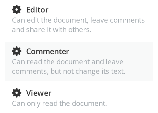
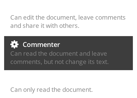
Each item reads as two lines: the label, and under it an always-visible explanation of what choosing it means (description). Use it where picking an item has consequences the label alone cannot convey.
Item Types
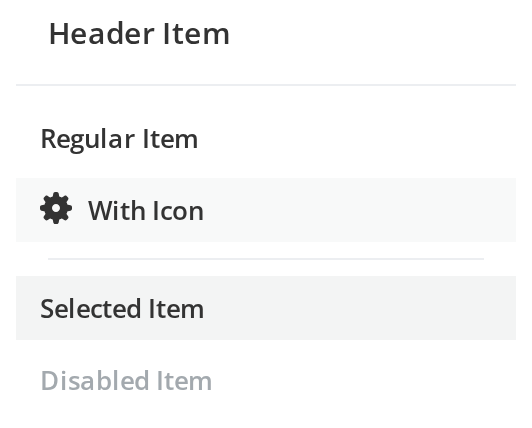
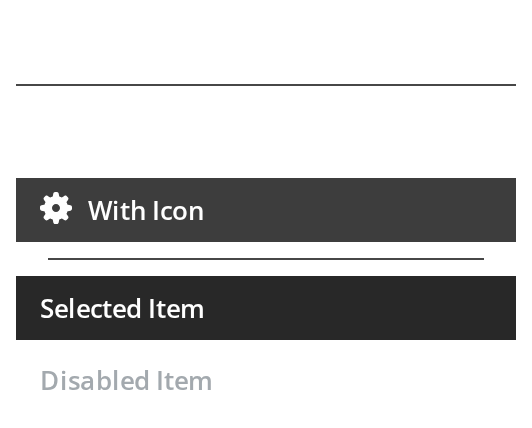
The building blocks of a menu, top to bottom: Header Item — a section title with a line under it (isHeader); Regular Item and With Icon — plain rows, with and without an icon (icon); a separator line (isSeparator); Selected Item — the current choice, highlighted (isActive) and announced as selected (isSelected); Disabled Item — greyed out and not clickable (disabled).
With Toggle
A menu entry that switches an option on and off in place, without opening a dialog: Toggle Off and Toggle On show both positions (withToggle, checked); a change of the switch calls onClick.


With Badges
Badges tell the reader before clicking that an entry is new or needs a paid plan: New Feature carries a beta badge (isBeta, betaLabel), Premium Feature a paid one (isPaidBadge, paidLabel).


Submenu
An arrow at the end of the row tells the reader the entry leads to more options: Open Submenu shows it pointing sideways (isSubMenu), Active Submenu — the entry whose submenu is open — highlighted with the arrow turned down (isActive).


With Additional Element
Any element can sit at the end of the row, such as the keyboard shortcut of a command: Save and Copy show theirs on the right (additionalElement).


Header With Arrow
A nested menu level needs a way back: Header with Back shows an arrow before the title (isHeader, withHeaderArrow); click it to see headerArrowAction in the Actions panel.


With Text Overflow
A label longer than the menu is cut off with an ellipsis instead of wrapping or widening the menu (textOverflow).


With External Link
An entry can carry a second target at its end: Help center shows an external-link icon (withExternalLink, externalLinkPath); click the icon to see onExternalLinkClick in the Actions panel while onClick stays silent, and open the link from that callback yourself.


Right To Left
The same rows under a right-to-left interface: the icons move to the right of the labels, and the submenu arrow and the switch move to the left end, the arrow mirrored to point left. The direction comes from the theme's interfaceDirection (the Direction toolbar); the wrapper also carries dir="rtl" for the rules that read the DOM direction.


Css Customization
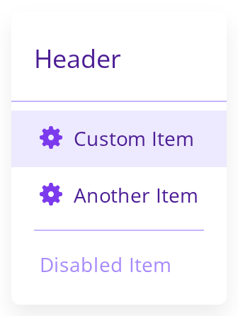
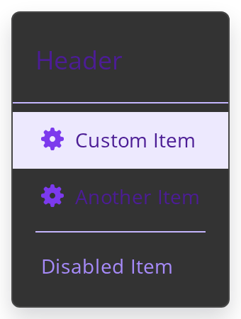
Every overridable variable set on one wrapper -- the variables are listed under CSS variables on this page. Header shows the header height, font size and the line under it, Custom Item and Another Item the text and icon colors, row height, font and padding — hover them for the hover background — the separator its color, and Disabled Item the disabled text color (showDisabledItems keeps it in the list).
Minimal example
import { DropDownItem } from "@onlyoffice/apps-ui-kit/components/drop-down-item";

export function RenameItem({ onRename }: { onRename: () => void }) {
  return <DropDownItem label="Rename" onClick={onRename} />;
}
Props
Recipes
Disabled, with a separator above it
A separator is its own item, and the enclosing menu drops one that ends up first or last.
import { DropDownItem } from "@onlyoffice/apps-ui-kit/components/drop-down-item";

export function DeleteSection({
  canDelete,
  onDelete,
}: {
  canDelete: boolean;
  onDelete: () => void;
}) {
  return (
    <>
      <DropDownItem isSeparator />
      <DropDownItem
        label="Delete for ever"
        disabled={!canDelete}
        tooltip="Only the room owner can delete it"
        onClick={onDelete}
      />
    </>
  );
}
A setting with a toggle, and a second line
description renders under the label and makes the row taller — tell the enclosing menu about
it with height.
import { useState } from "react";
import { DropDownItem } from "@onlyoffice/apps-ui-kit/components/drop-down-item";

export function NotificationsItem() {
  const [on, setOn] = useState(false);

  return (
    <DropDownItem
      label="Notify me"
      description="Send an email whenever a file changes"
      withToggle
      checked={on}
      height={56}
      onClick={() => setOn(!on)}
    />
  );
}
A nested level: a header with a way back
A submenu level opens with a header row; withHeaderArrow puts a back arrow before its title.
import { DropDownItem } from "@onlyoffice/apps-ui-kit/components/drop-down-item";

export function SharingLevel({
  onBack,
  onCopyLink,
}: {
  onBack: () => void;
  onCopyLink: () => void;
}) {
  return (
    <>
      <DropDownItem
        isHeader
        withHeaderArrow
        headerArrowAction={onBack}
        label="Sharing"
      />
      <DropDownItem label="Copy link" onClick={onCopyLink} />
    </>
  );
}
Behaviour the types don't state
childrenreplaces the label, it does not follow it. The item renderslabelif there is one andchildrenonly when there is not. Content after the label isadditionalElement.heightandheightTabletdo not resize the item. They are read byDropDownto lay out its virtualised list; the row itself is 32px of line height until you also set--drop-down-item-height. Get them out of step and the rows overlap or leave gaps. They also reach the DOM as attributes, since the component spreads what it does not read.- A disabled item still closes the menu.
onClickis skipped, butsetOpen(false)is called on every click regardless. - Every string label gets a hover tooltip. The label is wrapped in the kit's
TooltipContainerwith the label as its title, so it needsRootTooltipmounted to show anything — and nothing appears if you have not mounted it. tooltipis for disabled items on touch devices only. With a pointer, or on an enabled item, it does nothing at all.- An icon given as a string is resolved by its path: one containing
.svgorimages/is fetched byreact-svgand inlined, a data URL likewise, and anything else becomes an<img>with the hard-coded alt textplugin-logo. - A separator renders a non-breaking space and a border, and the enclosing menu reserves 12px for it (16 on a tablet) rather than the usual 32.
isHeaderalso turns off the hover and active styling, whatevernoHoverandnoActivesay.isSubMenuonly draws a trailing arrow. It opens nothing by itself — the enclosing menu does that fromonClick. The arrow turns downwards whileisActiveis set and is mirrored in a right-to-left interface.isActiveandisSelecteddo different jobs.isActivepaints the selected background;isSelectedonly setsaria-selectedand routes a click toonClickSelectedItem— on every click of a selected item, a disabled one included — and paints the background only when the item is also disabled.- The row clips a long label but shows no ellipsis on its own, because it is a flex row.
truncateTextputs the ellipsis on the label, andtextOverflowmakes the whole row a block so its own ellipsis applies.
CSS variables
On a tablet-width viewport the row ignores --drop-down-item-height and --drop-down-item-padding:
its line height is 36px and its padding 0 16px regardless.
--drop-down-min-width is written by the component from the minWidth prop.
Accessibility
- The row is a
<div role="option">— orrole="separator"— witharia-selectedandaria-disabled, but its parent is arole="listbox"that is not linked to any control, so the pattern is incomplete on its own. tabIndexis -1 by default, and that is correct here, unlike on the kit's inputs: an option inside a listbox is meant to stay off the tab order while the container keeps focus and the arrow keys move a highlight. That is the active-descendant pattern: the menu setsisActiveDescendanton the highlighted row, which paints it and setsdata-focused. What is incomplete is the container, per the point above — not this. The arrow keys also work only when the menu has amaxHeight.- Clicks are handled on the row, and there is no key handler: Enter and Space do nothing unless the enclosing menu's keyboard navigation is on.
- The badges are text inside the row, so their meaning is announced; the external-link icon is not labelled.
Test ids
Related
DropDown— the menu this belongs in, and whereheightis read.ContextMenu— the menu that opens at the pointer.ComboBox— builds its list out of these.