ModalDialog
Dialog rendered in a portal, as a centred modal or a side panel, assembled from Header, Body,
Footer and Container slots. Which of the two it is can be fixed with displayType or chosen
per breakpoint with displayTypeDetailed.
Use this when / not when
- Use for a confirmation, a short form, or a detail panel that has to sit above the page.
- Not when you only need a sliding side panel with your own content and no modal variant —
Asideis that component, and this one renders it internally for its aside display type. - Not for a dimming layer on its own — that is
Backdrop. - Not for rendering arbitrary content elsewhere in the DOM — that is
Portal.
Import
import {
  ModalDialog,
  ModalDialogType,
} from "@onlyoffice/apps-ui-kit/components/modal-dialog";
Also exported from the root barrel @onlyoffice/apps-ui-kit.
Needs ThemeProvider from @onlyoffice/apps-ui-kit/providers/theme above it in the tree,
for the surface, backdrop and border colours.
Note that ModalDialogProps is not exported — index.tsx re-exports only the values
listed above. Type a wrapper's props yourself, or import the type from its file path.
Stories
Default
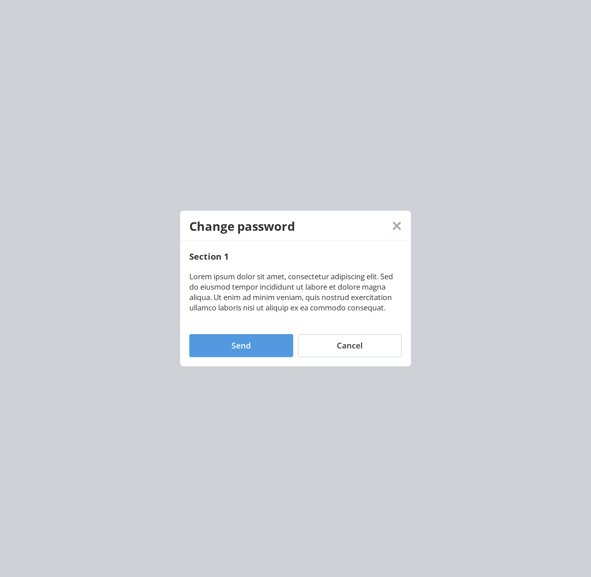
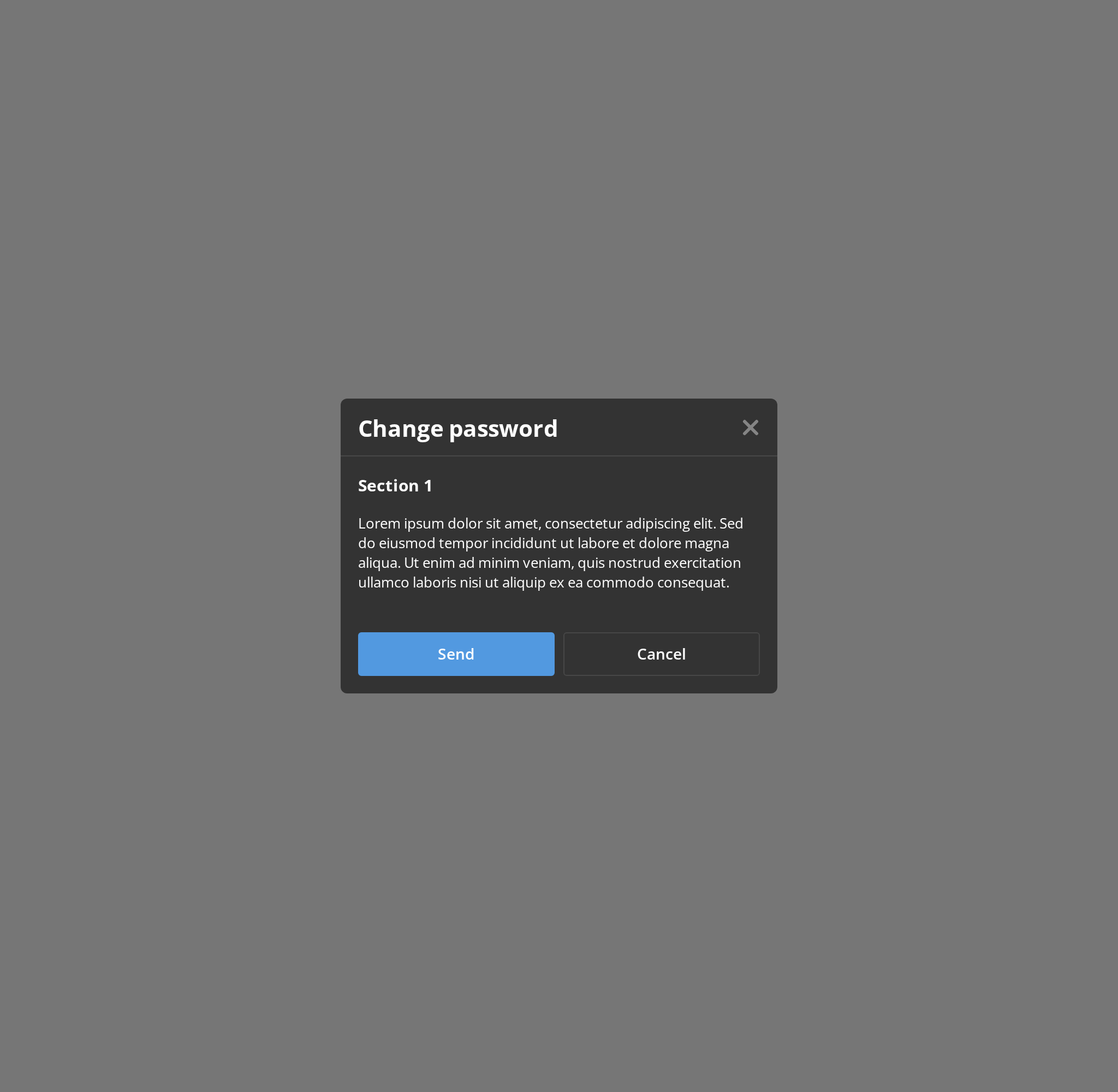
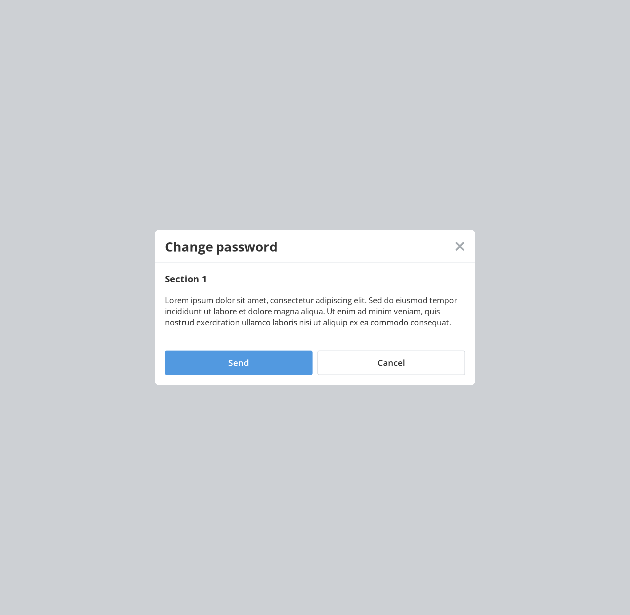
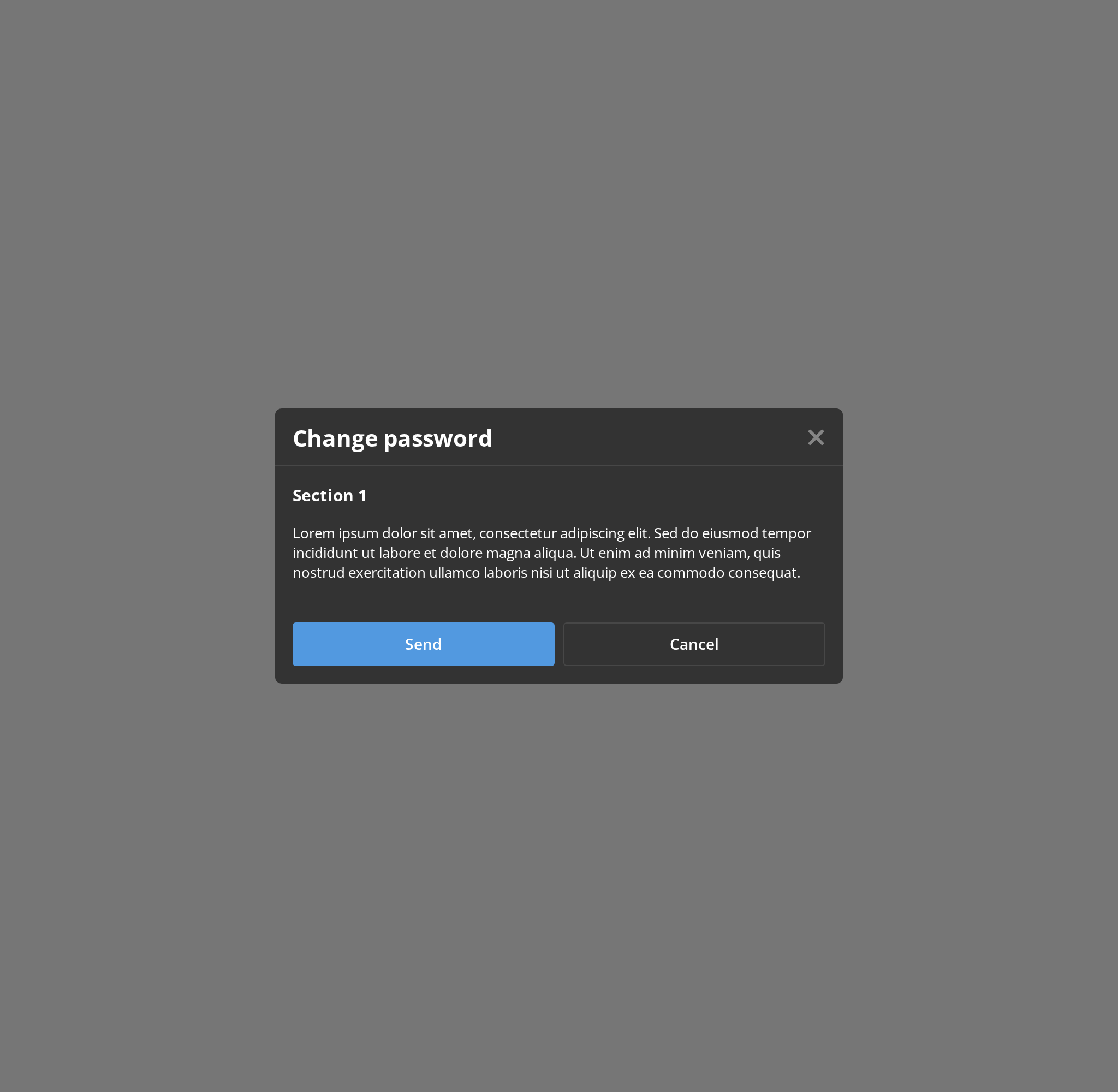
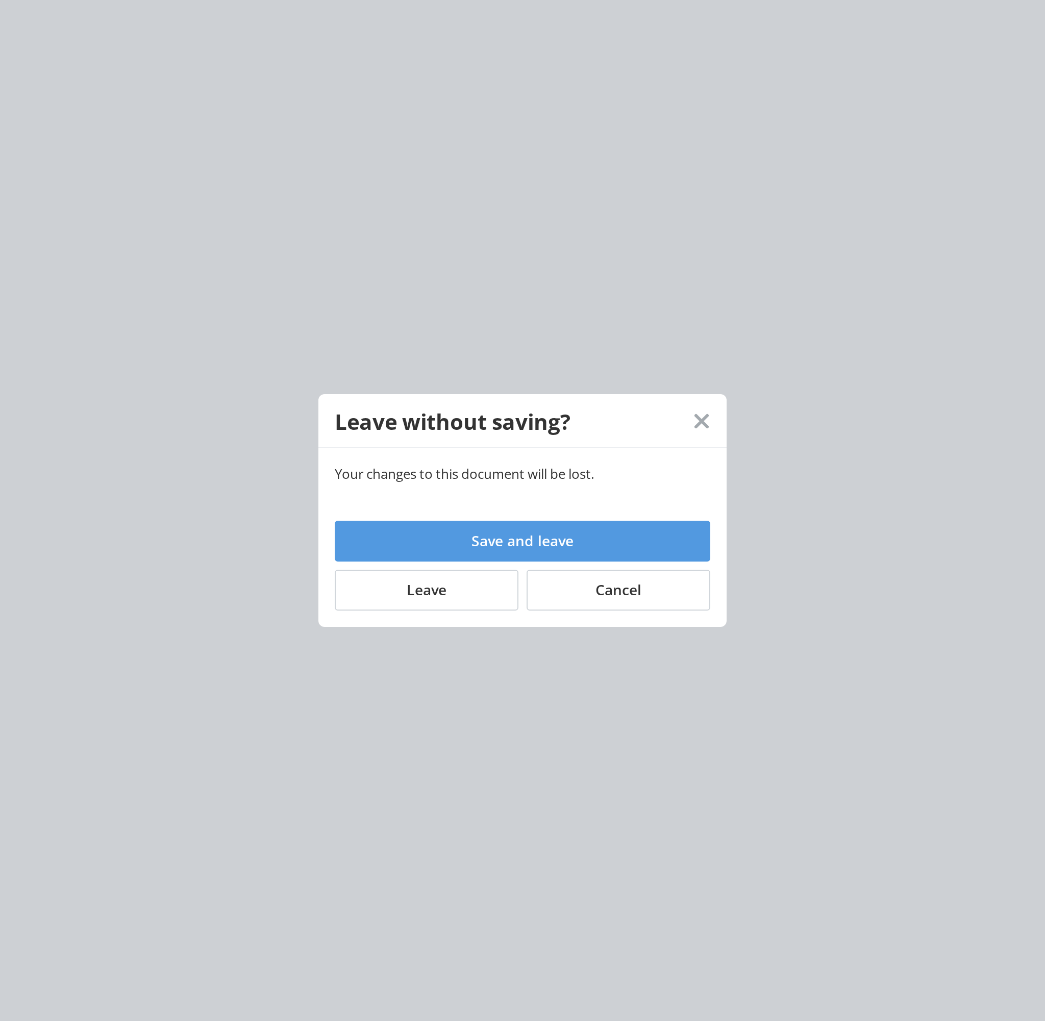
The centered modal, for a short task that needs an answer before the page is used again. Click Show to open it and close it with the cross, Escape or a click on the dimmed page; change any other prop live in the Controls panel below.
Aside Display
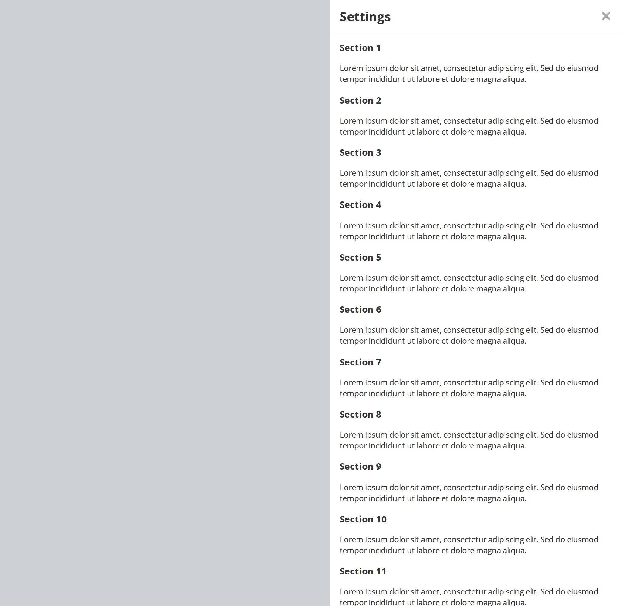
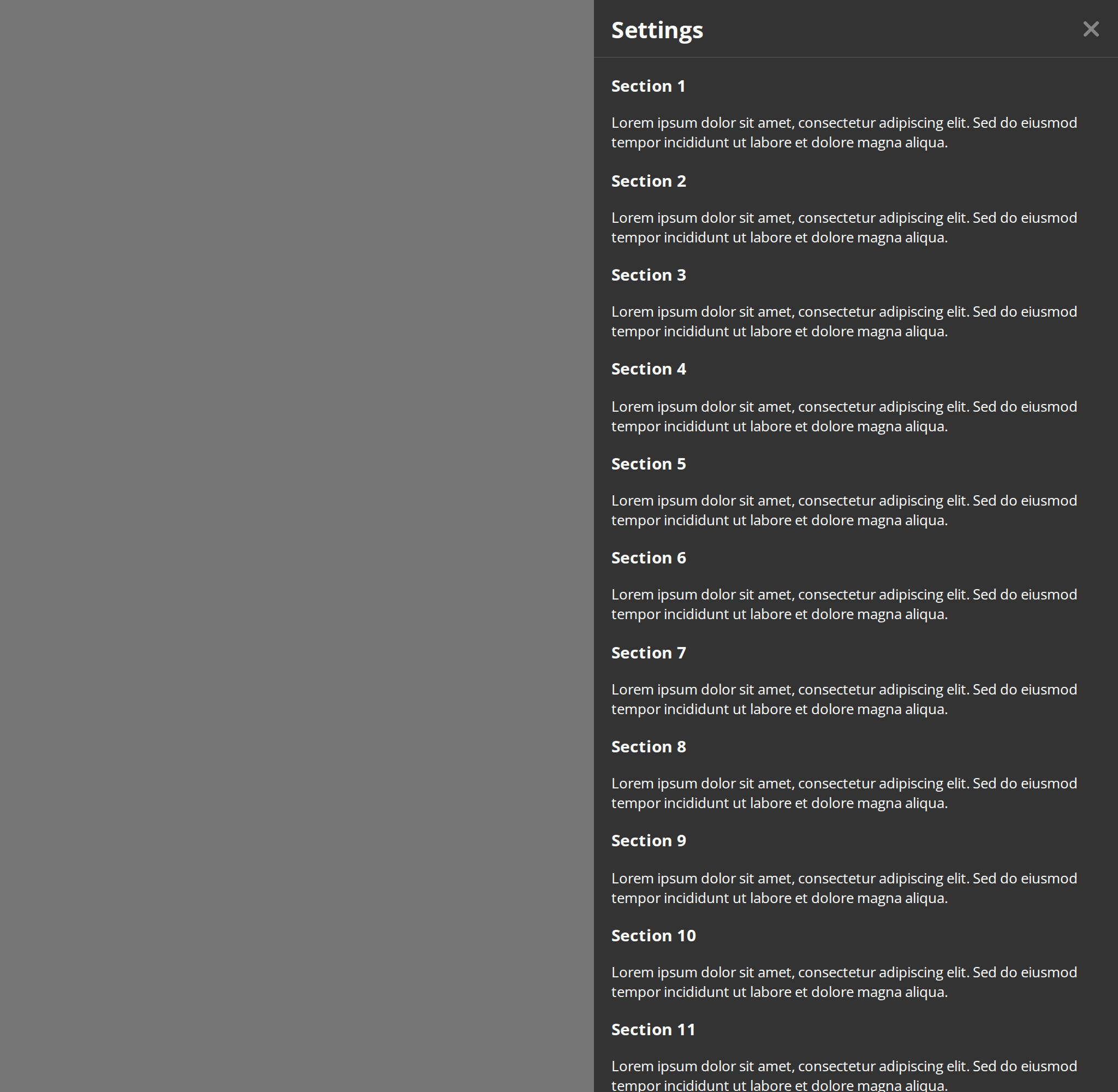
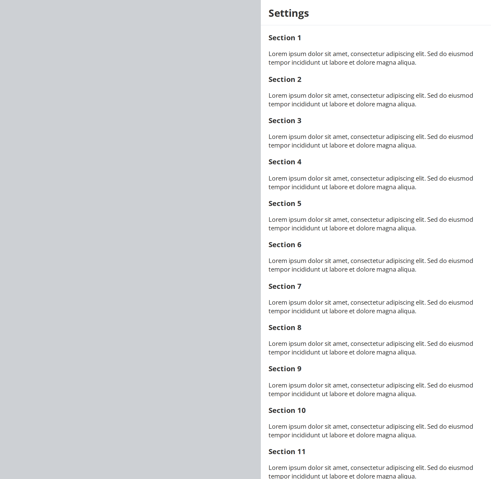
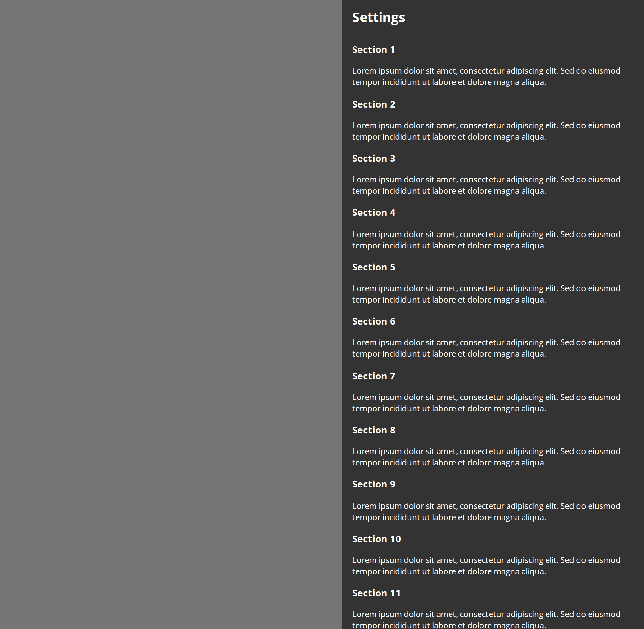
A panel that slides in from the side of the window, for longer content such as settings (displayType). On a phone-sized window it rises from the bottom instead.
Loading State
While the content is being fetched, the header, body and footer give way to a skeleton of the same size (isLoading), so the dialog does not jump when the data arrives.


Aside Loading State
The side panel's own skeleton, a header bar and rows of placeholders, shown while its content loads (isLoading).


Large Modal
Large modal variant with increased width (520px) and max-height (400px).
Huge Modal
Huge modal variant with auto max width and height. Requires autoMaxWidth to be enabled.
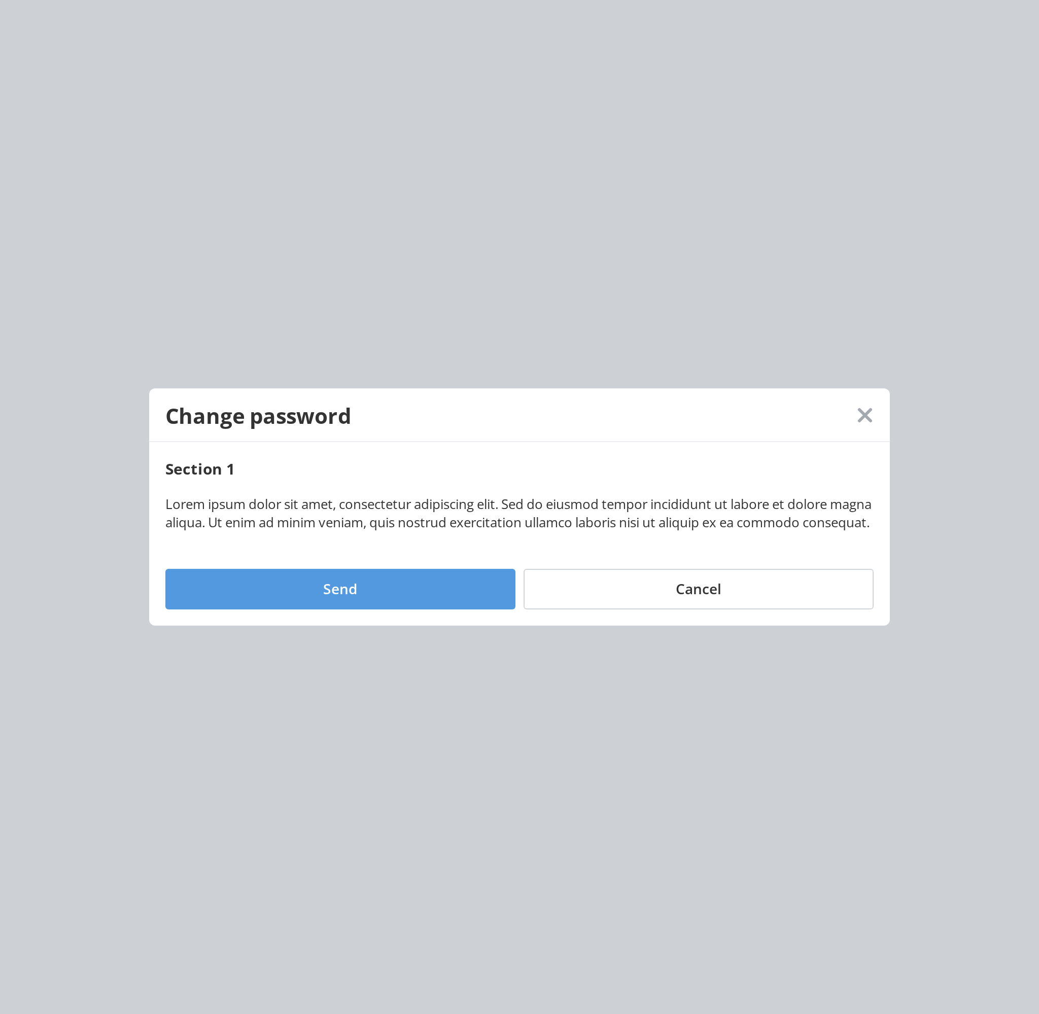
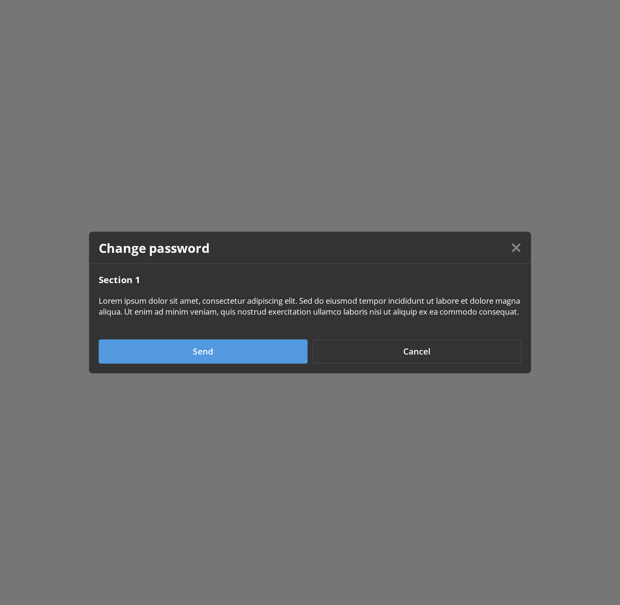
Auto Size Modal
Modal with automatic max width and height that adjusts to content size.
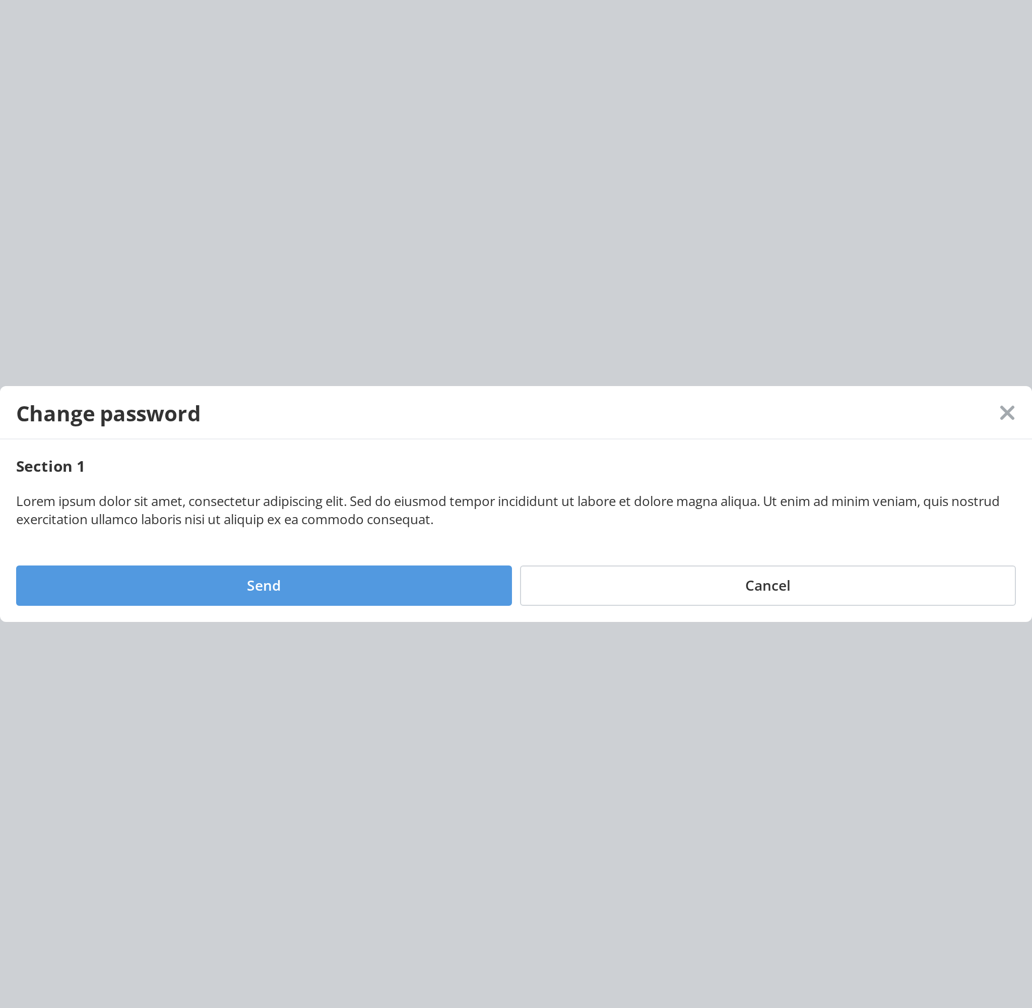
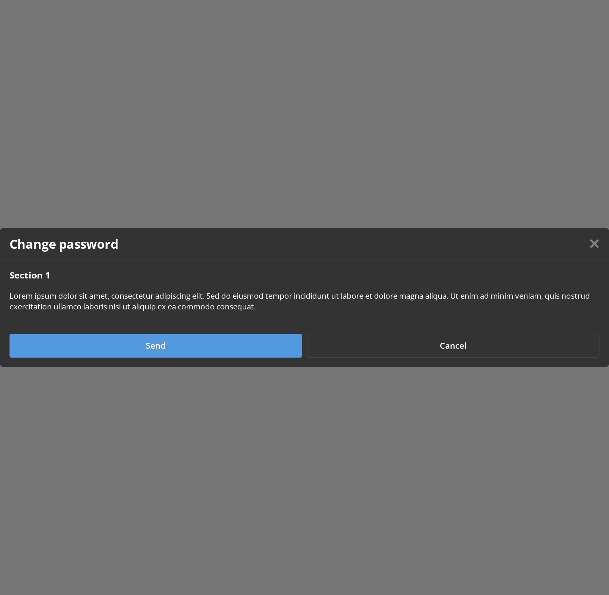
With Footer Border
Modal with a visible border between the body and footer sections for visual separation.
Non Closeable
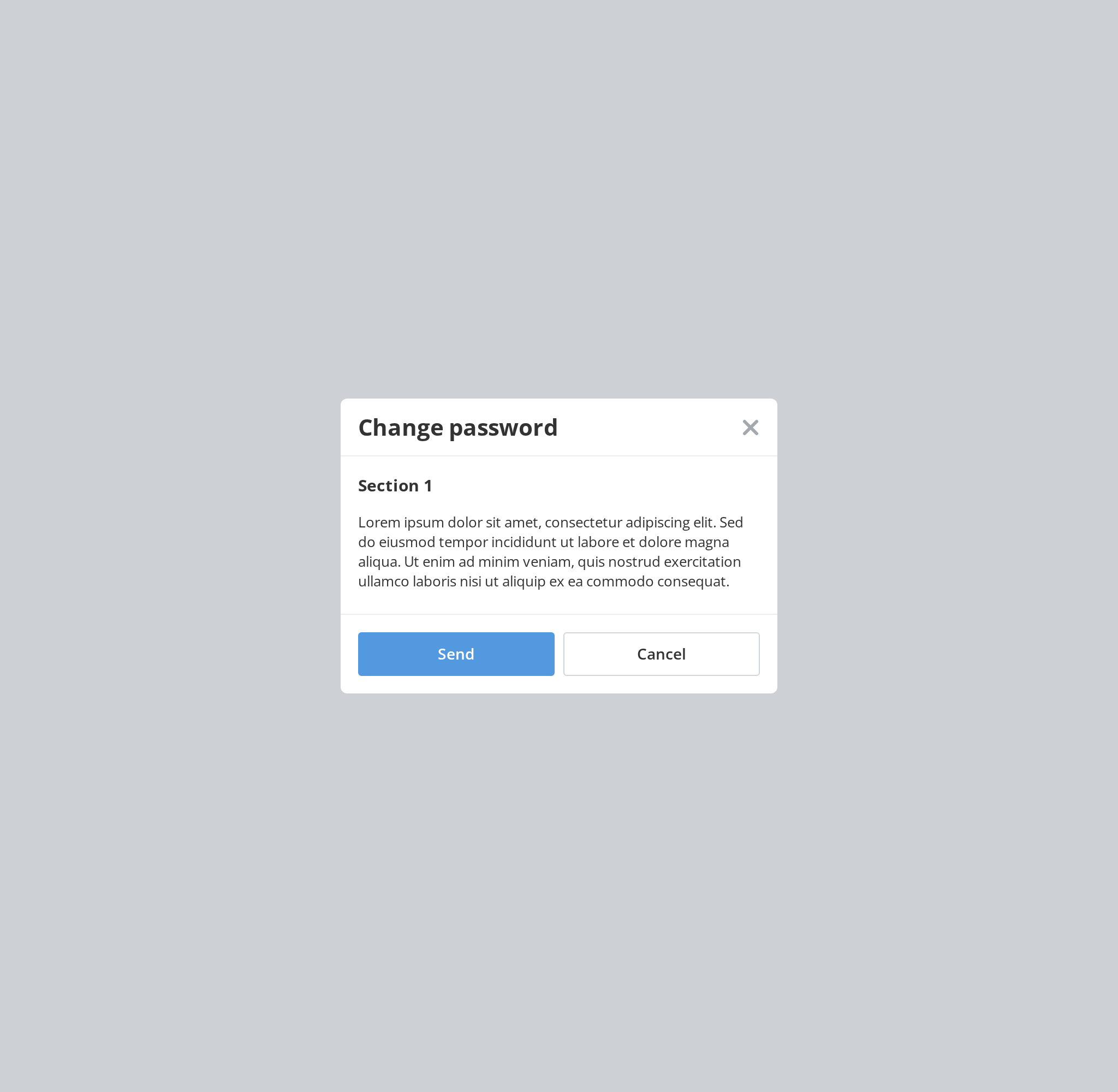
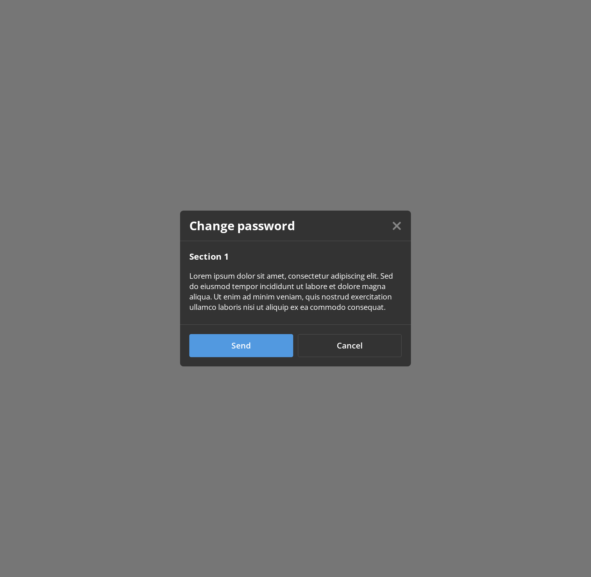
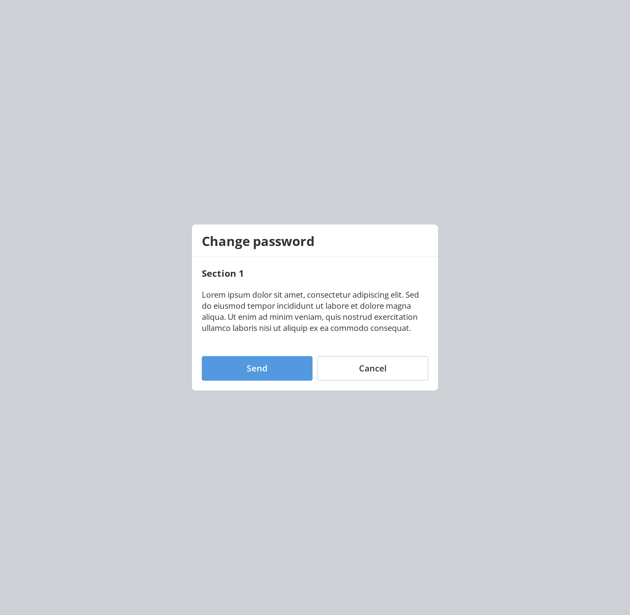
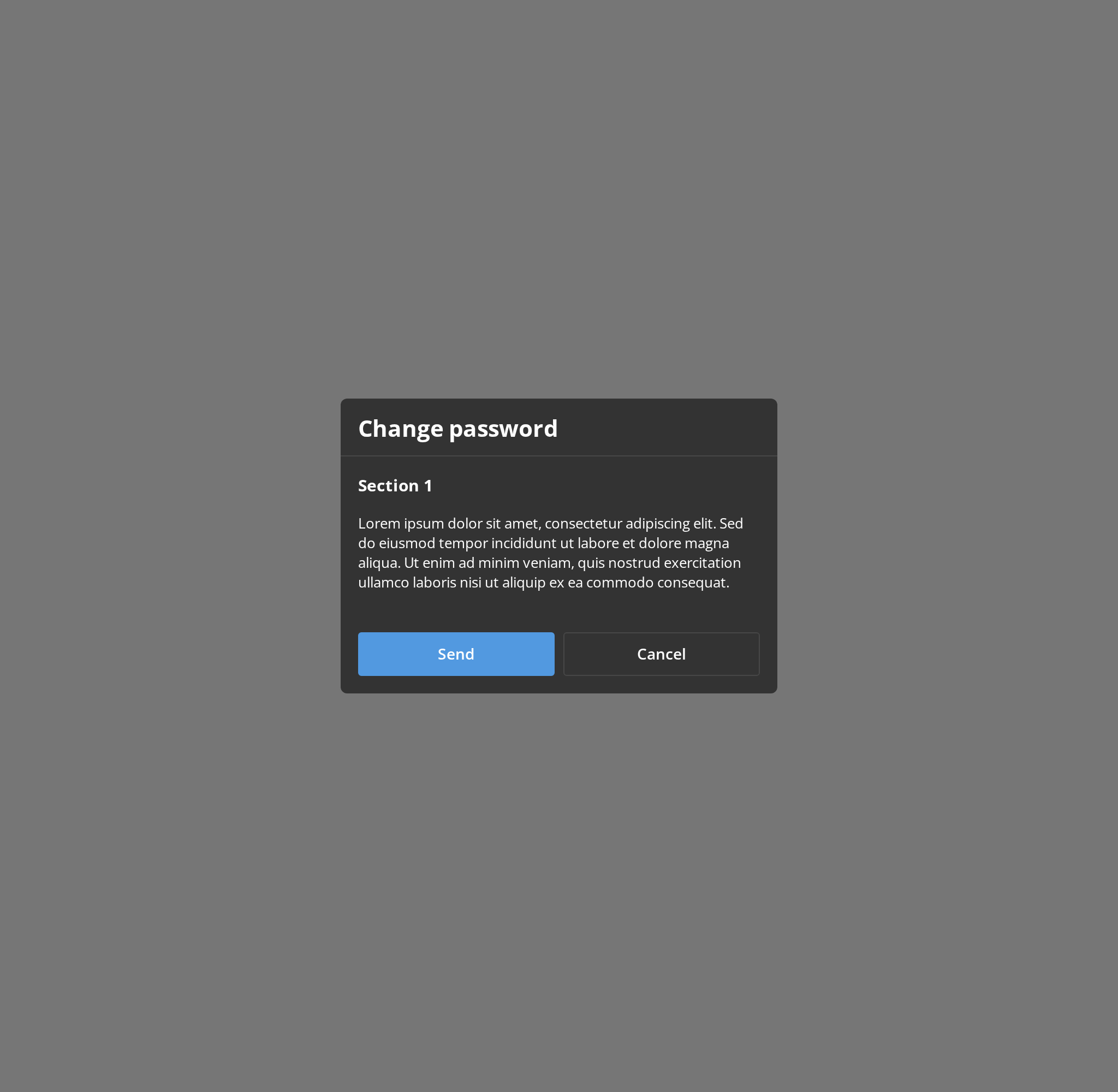
For a choice the user has to make: there is no close cross, and Escape and a click on the dimmed page do nothing (isCloseable={false}). Only the footer buttons close it here.
Aside Scroll Locked
The same long panel with its scrolling switched off (isScrollLocked), for a moment when the content must stay where it is, such as while a menu inside it is open.
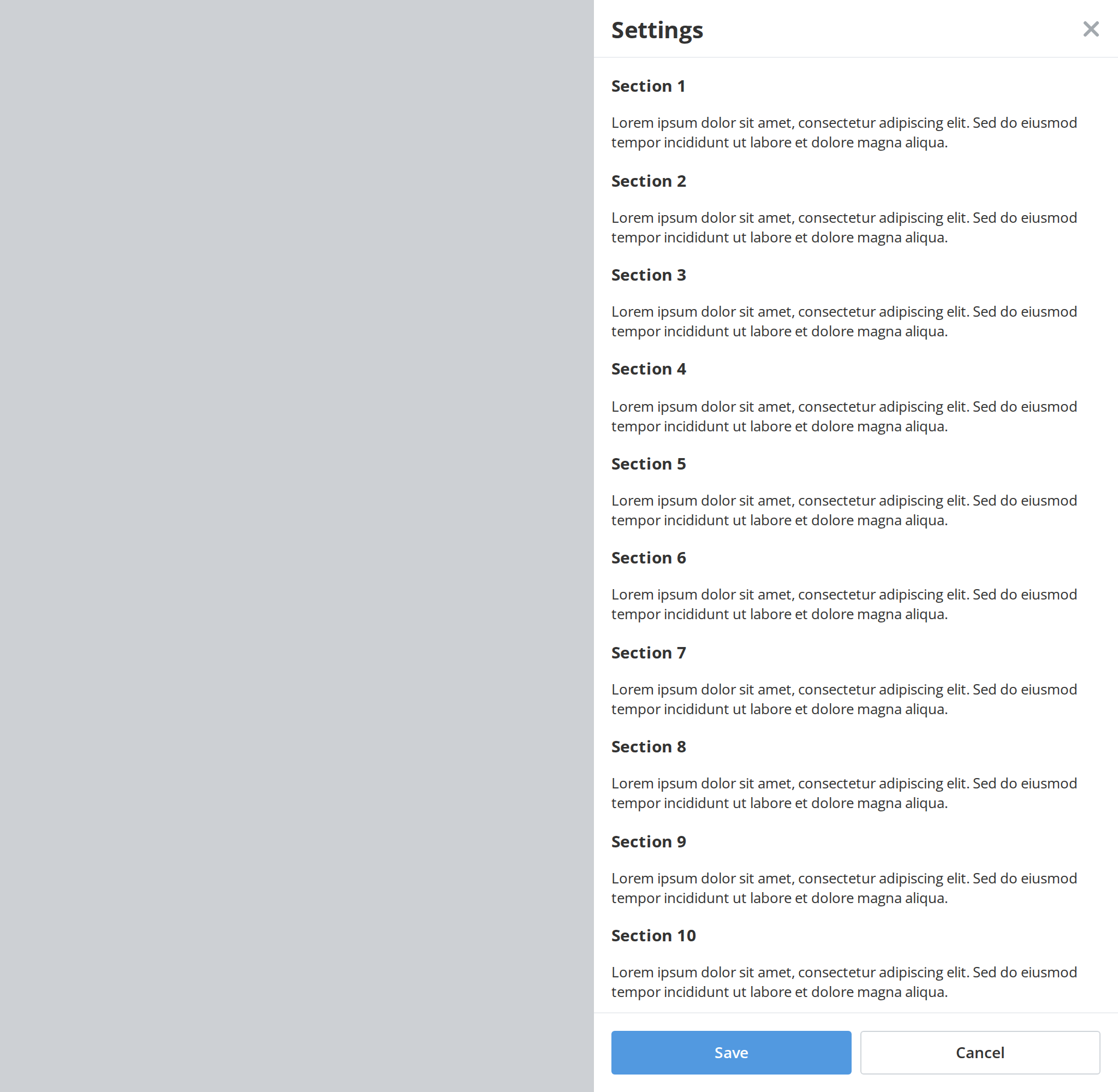
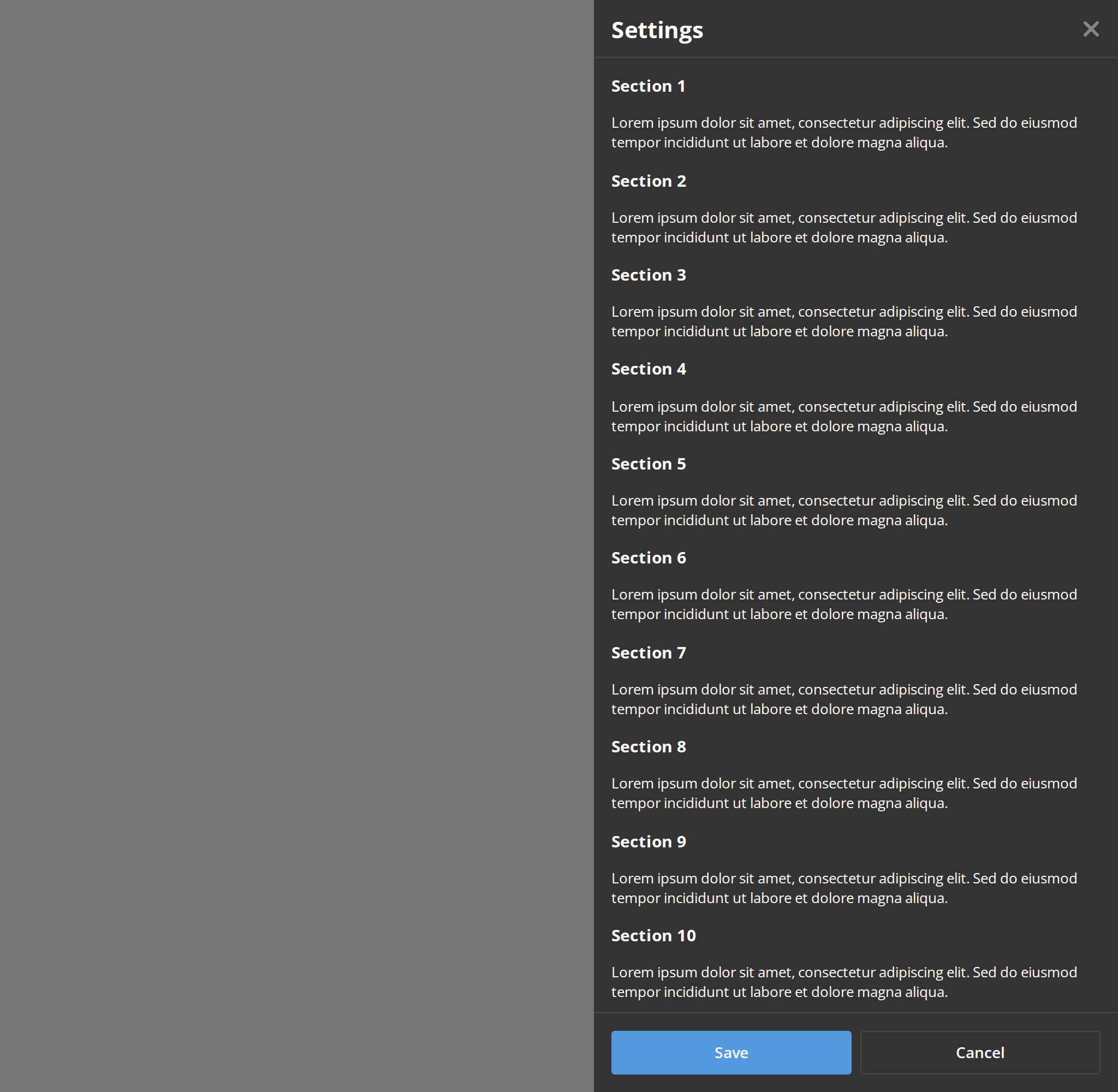
Aside With Body Scroll
Aside panel with body scroll enabled, allowing content to scroll within the panel.
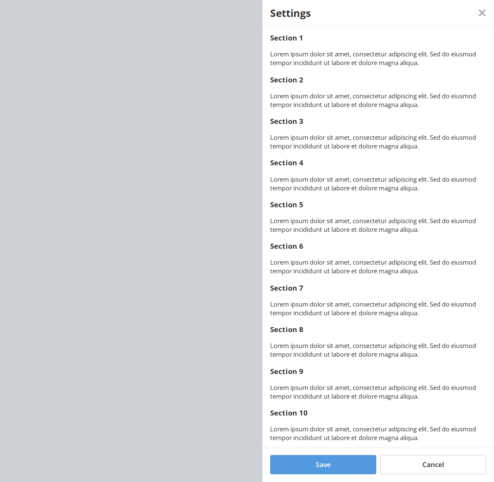
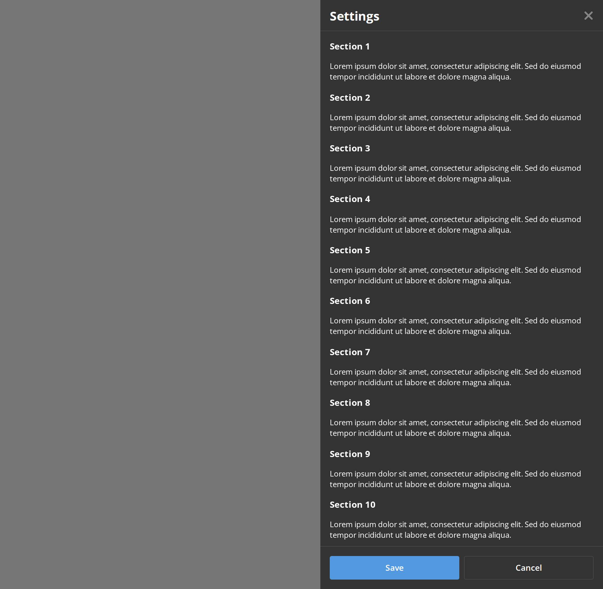
Aside Non Closeable
The side panel with no close cross; Escape and a click on the dimmed page do nothing either (isCloseable={false}). Only the footer buttons close it here.
With Back Button
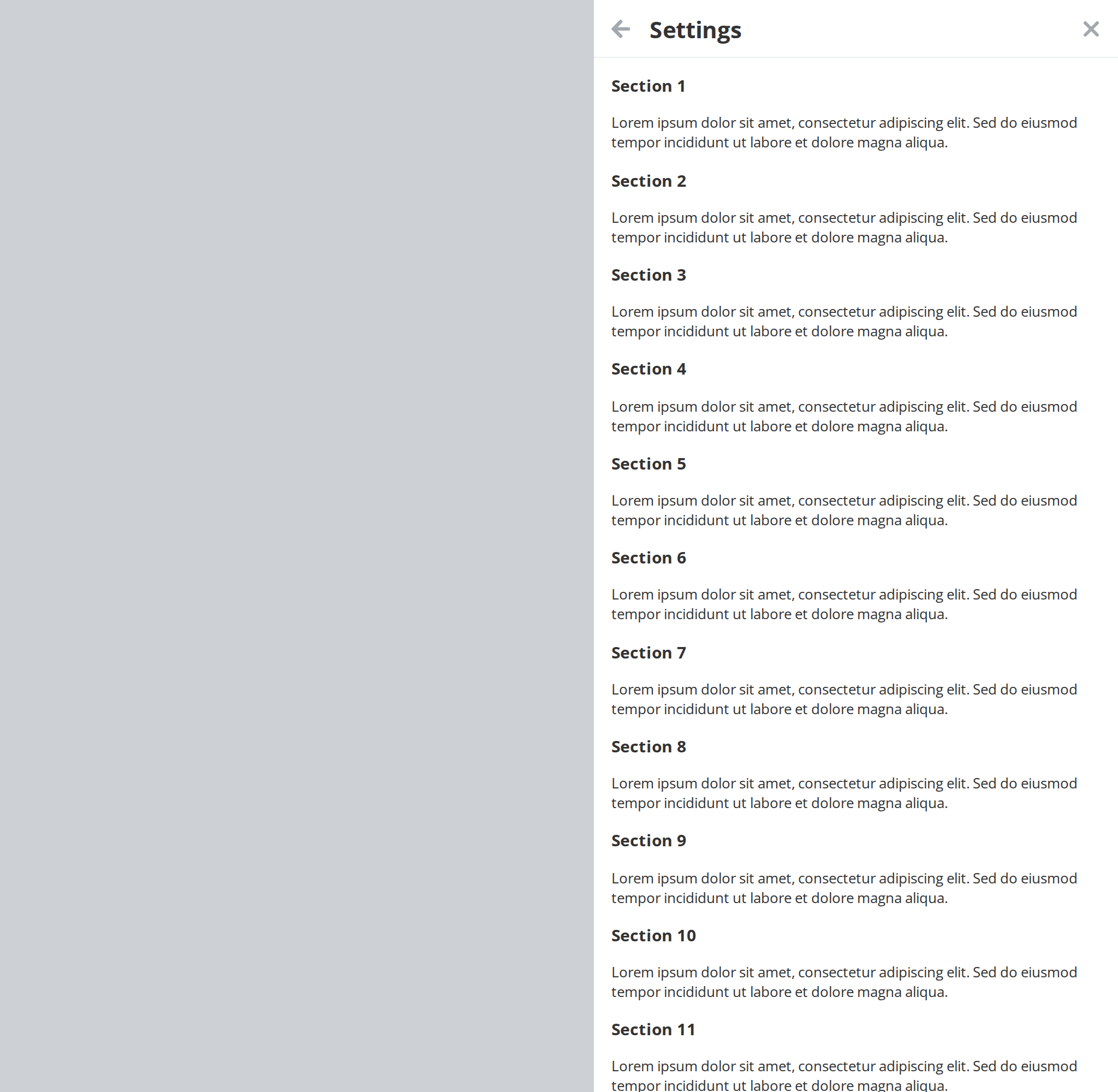
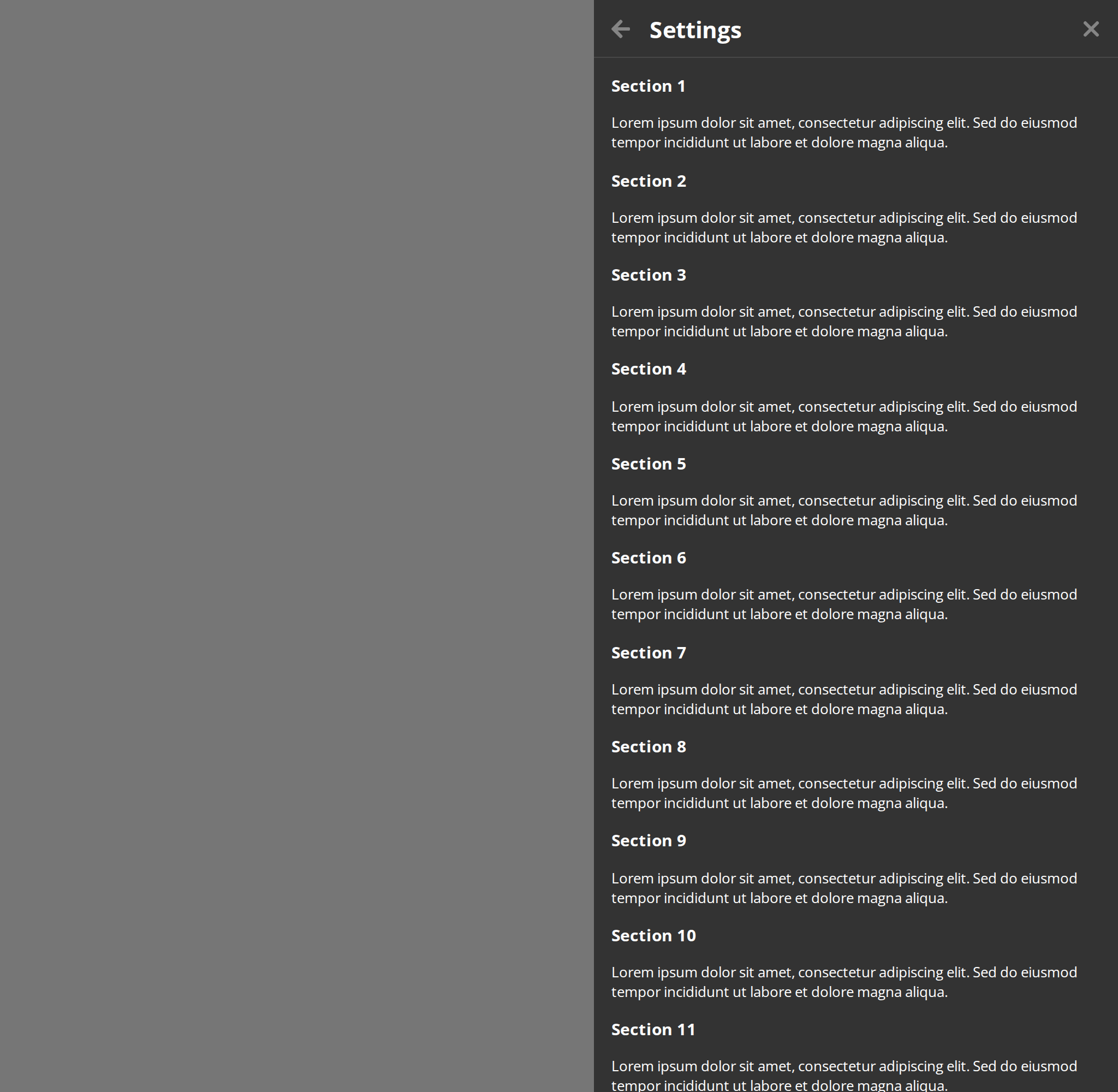
A panel reached from another one gets a back arrow before its title (isBackButton). The arrow and Backspace pressed outside a text field both call onBackClick; watch the Actions panel.
Backdrop Click Disabled
A click on the dimmed page leaves the dialog open (closeOnBackdropClick={false}), so a stray click cannot throw away what the user typed. The close cross and Escape still close it.
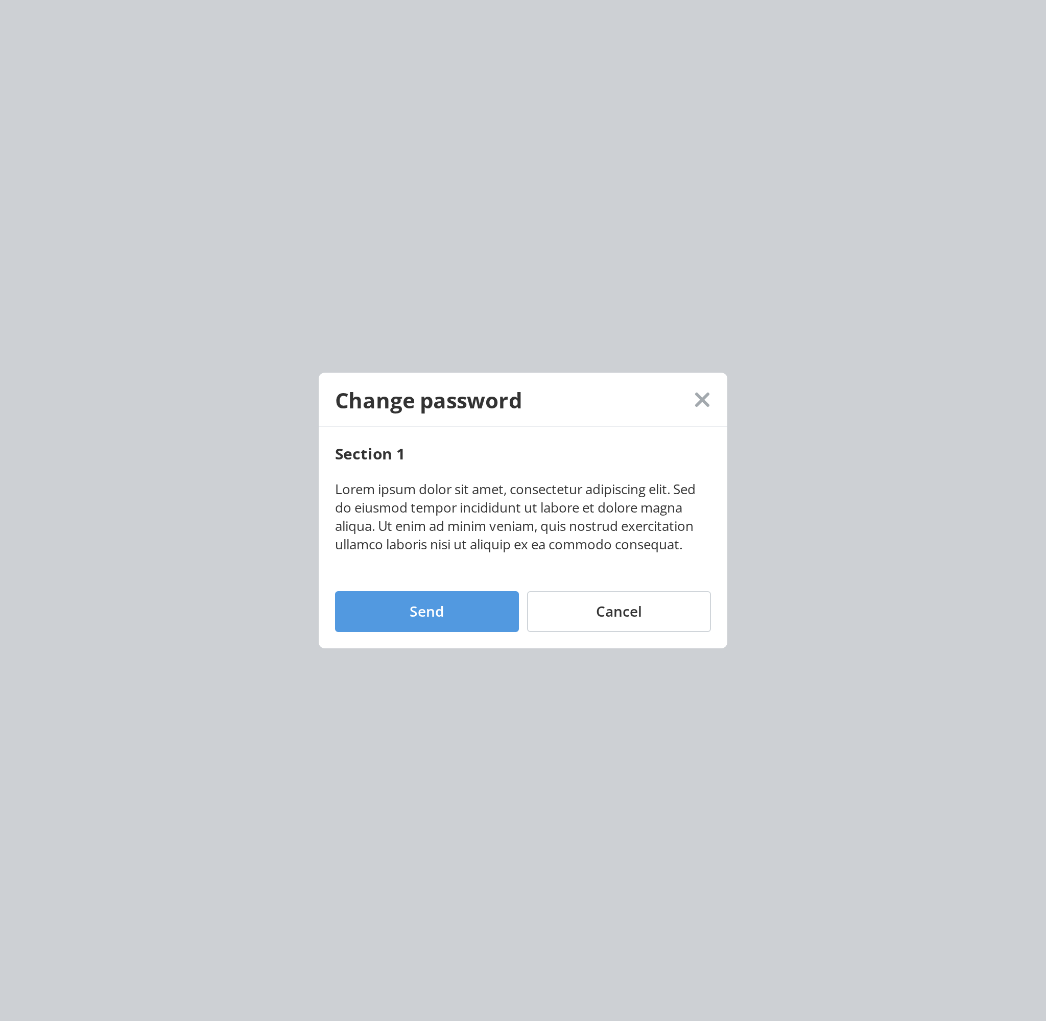
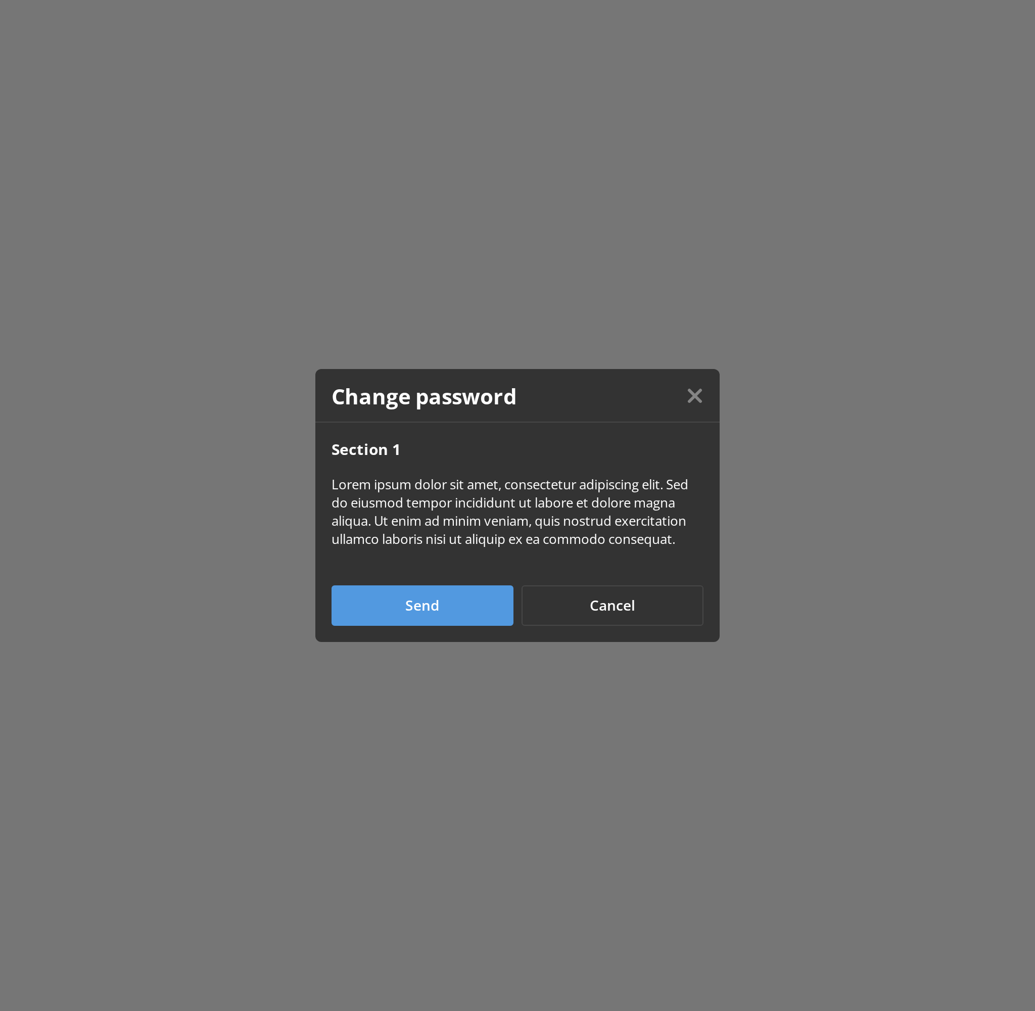
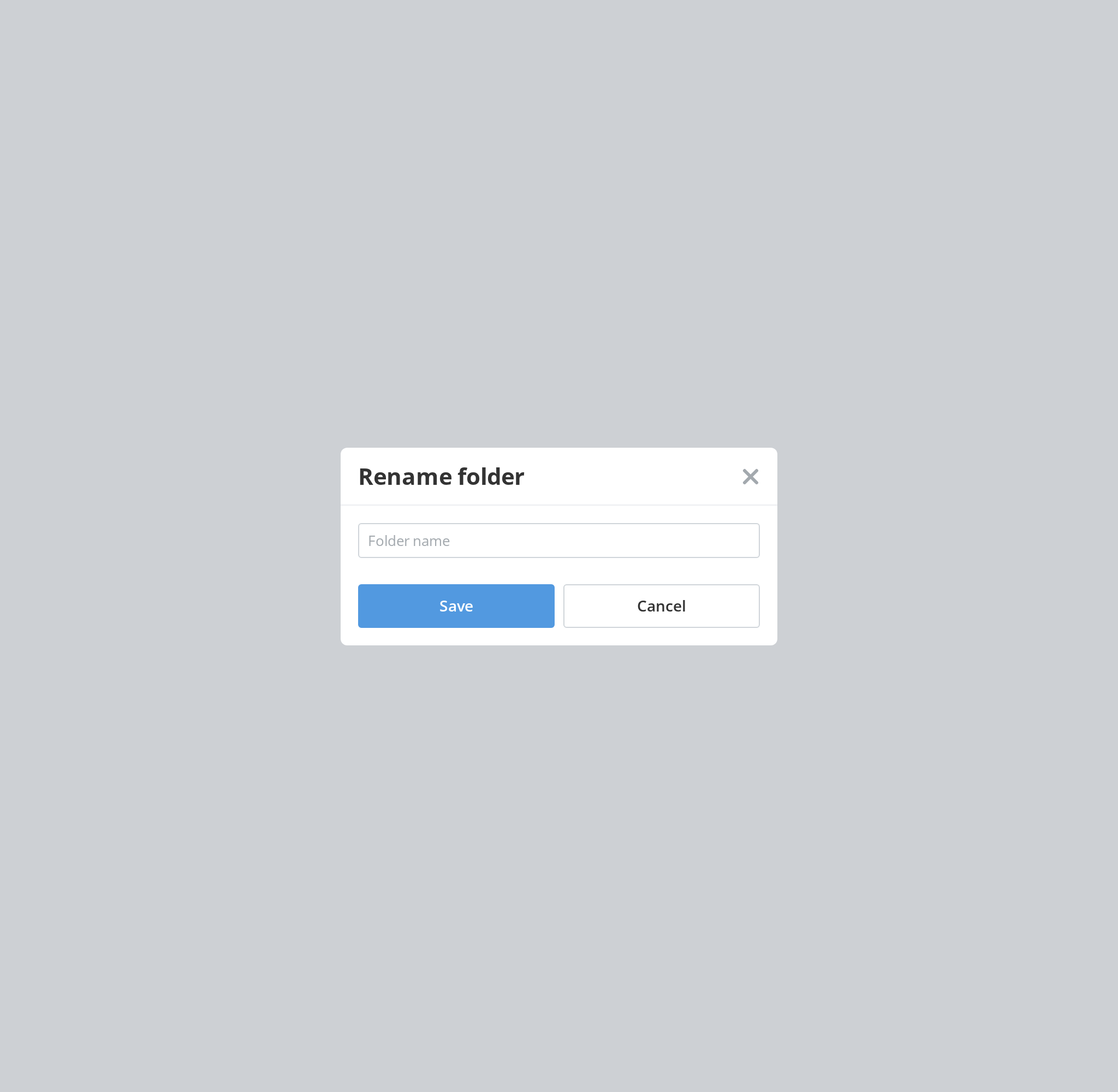
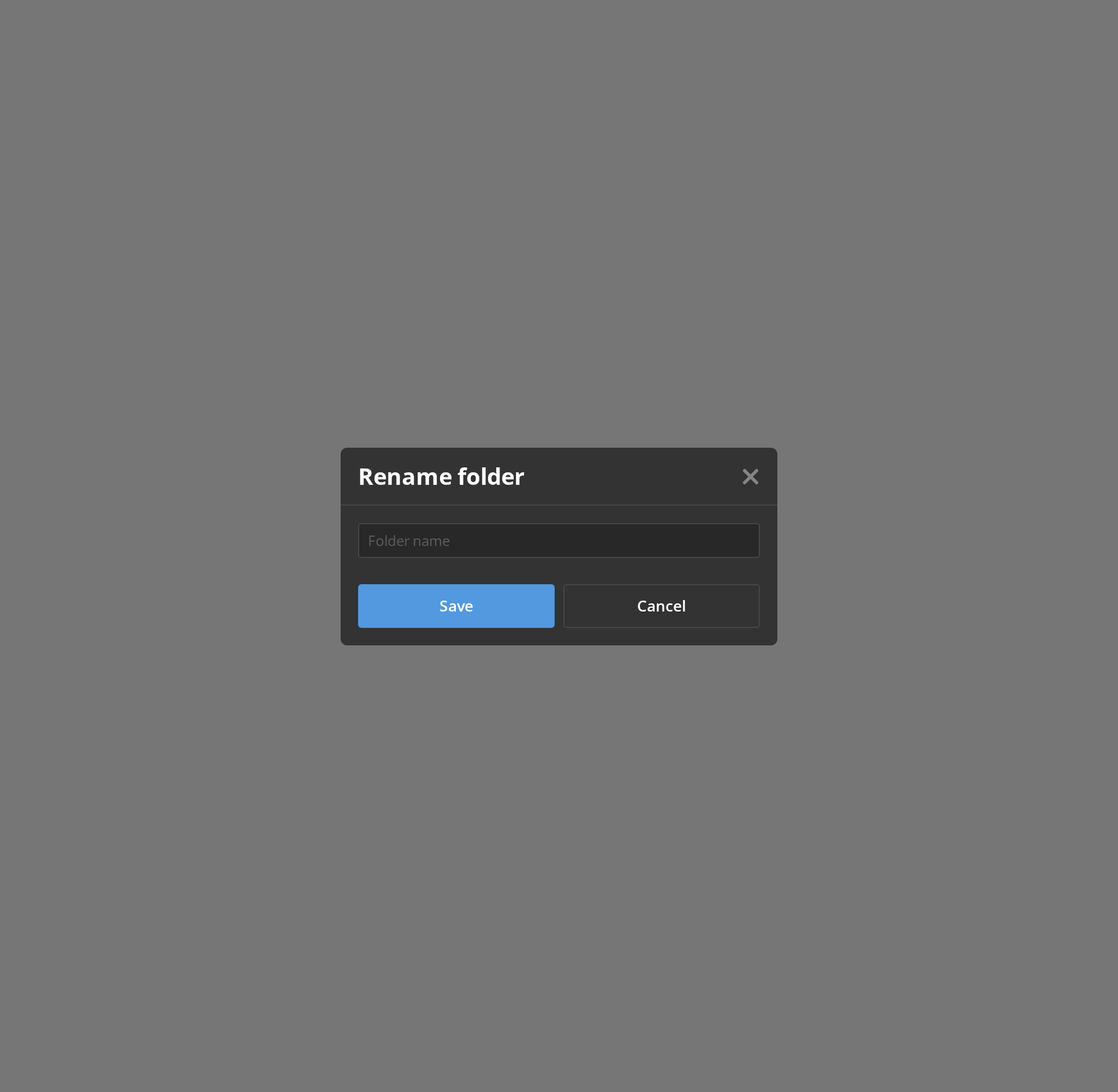
Form Dialog
A dialog that collects a value: Enter in the field or the Save button submits it (withForm), and onSubmit receives the event with the page reload already prevented; watch the Actions panel.
Two Footer Rows
Three actions do not fit one row of a 400px dialog, so the footer stacks its children (isDoubleFooterLine): each <div> inside it becomes a row of its own, here the main action above the other two.
Aside With Container
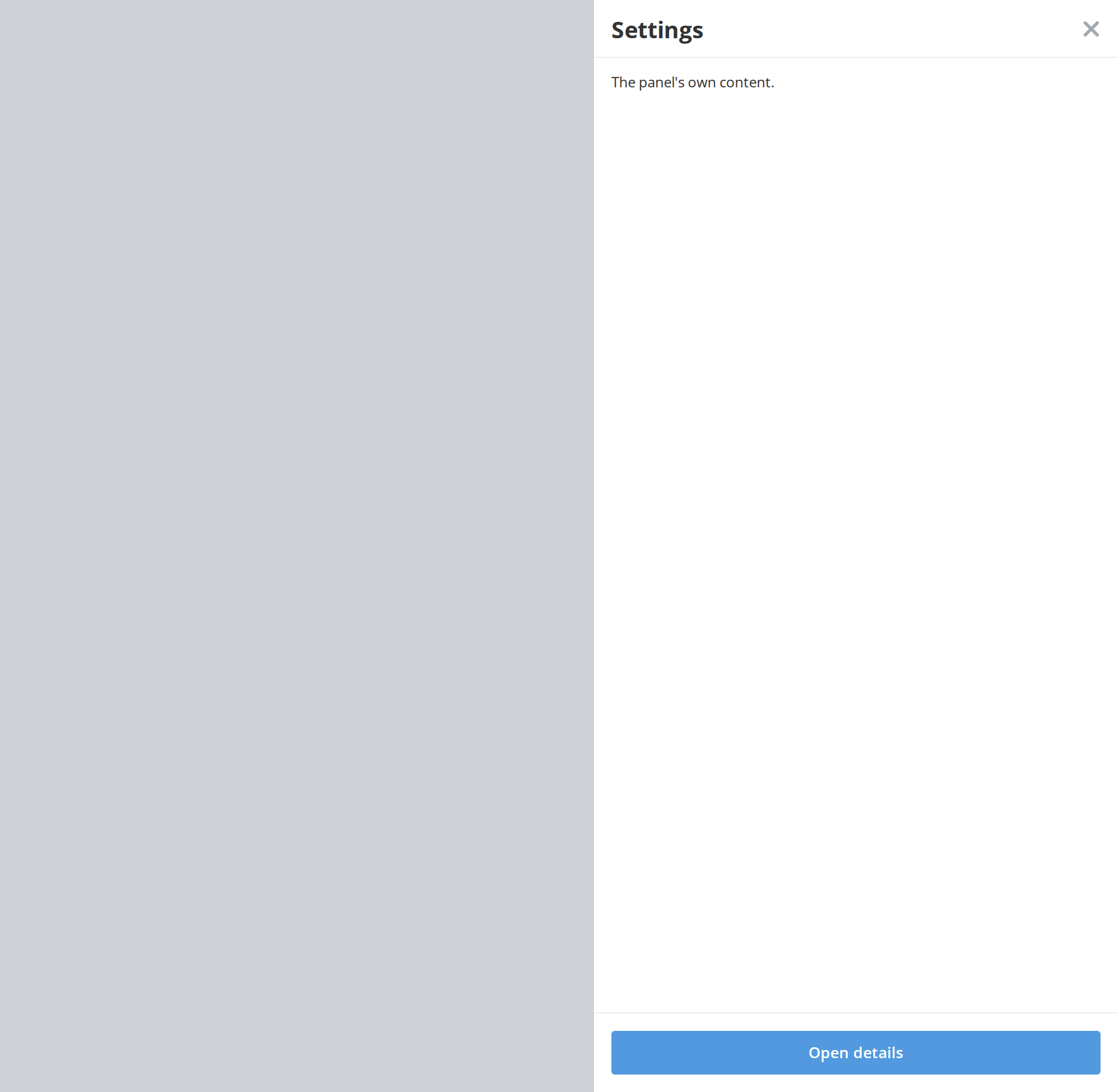
A side panel that swaps in a second view without closing: Open details shows the ModalDialog.Container slot in place of the header, body and footer (containerVisible), and Back returns. The slot is ignored in the centered modal.
Right To Left
The side panel under a right-to-left interface: it is attached to the left edge and slides in from there, the back arrow points the other way and the close cross sits on the left of the header. The dialog renders outside the story's <div dir="rtl">, so it takes the direction from the theme's interfaceDirection (the Direction toolbar).
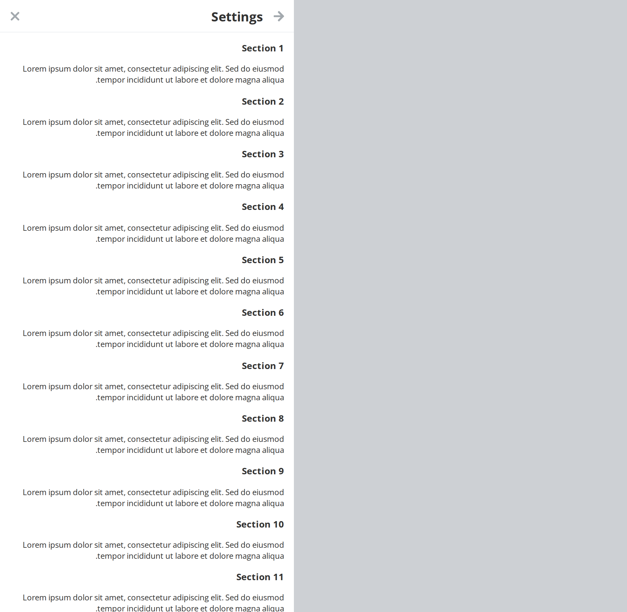
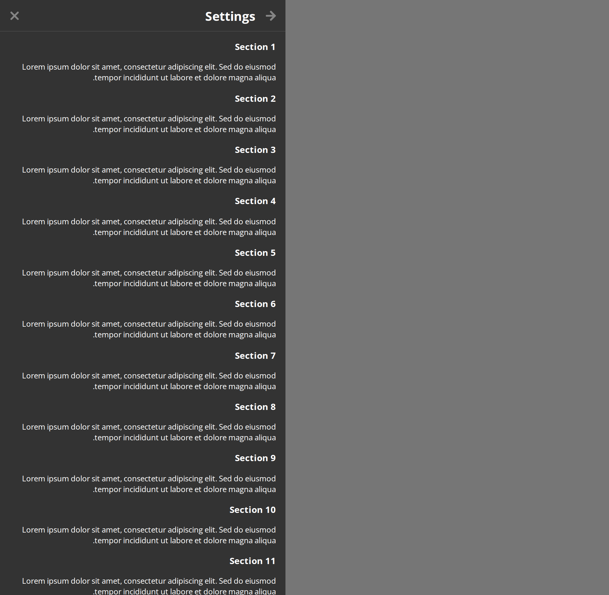
Css Customization
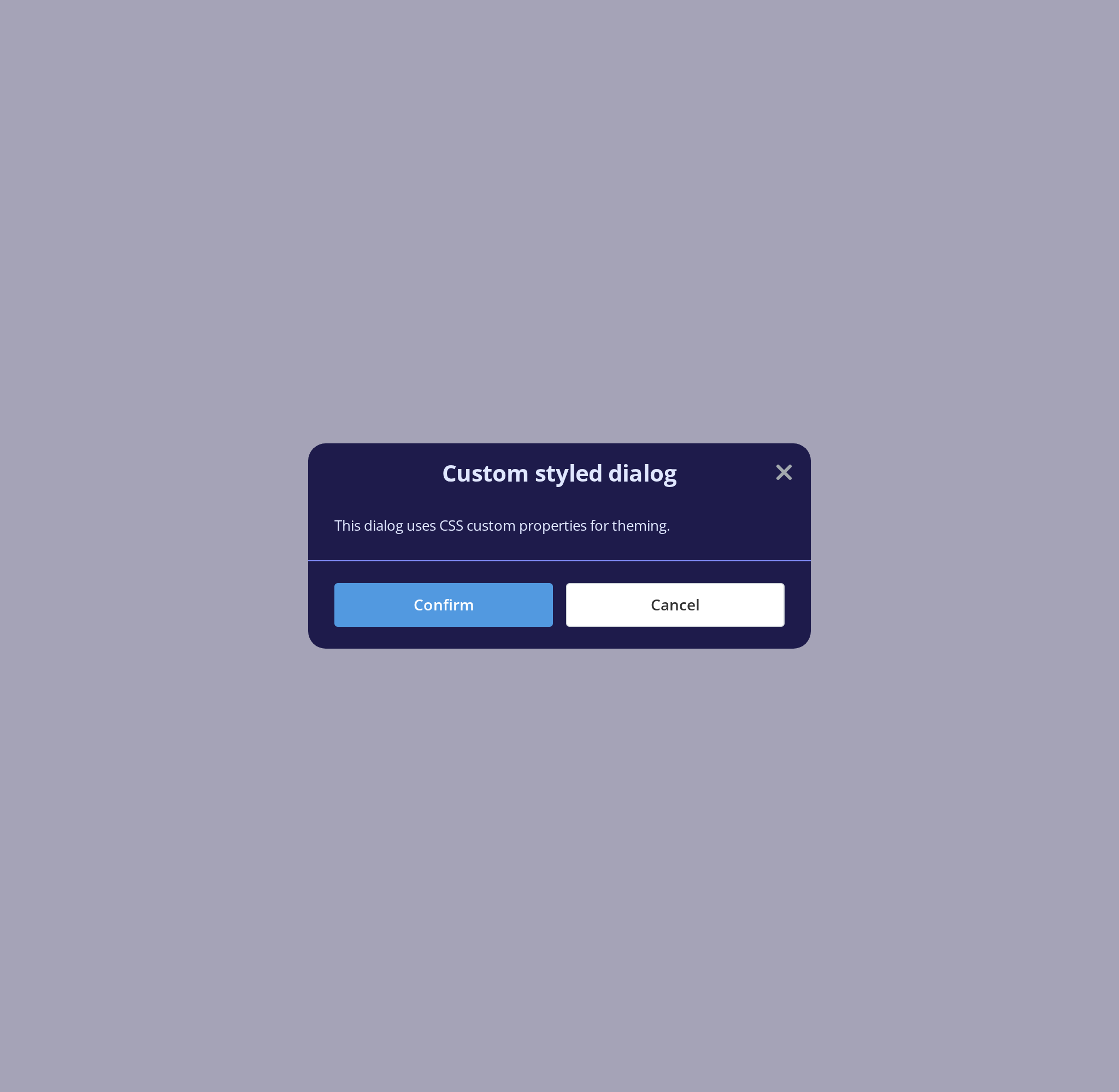
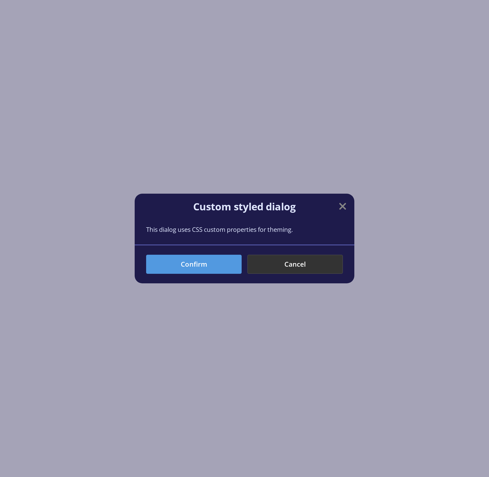
Every overridable variable in use -- the variables are listed under CSS variables on this page, which also says which ones must be set on body or :root rather than on the dialog. This example puts the colours on each dialog's style prop and sets the page-level ones on body while a dialog is open.
- Show — the modal with
withFooterBorder: colors from itsstyleprop, and radius, width, height cap, paddings, gaps, backdrop and a centered title with no line under it from the page - Show Aside — the side panel with
withBorder, for--modal-dialog-aside-borderand--modal-dialog-aside-default-width
Minimal example
The four slots must be direct children of ModalDialog; see the behaviour notes below.
Two things about visible that the example below encodes. It only toggles CSS classes, so
mounting the dialog conditionally is what actually closes it — and inside that conditional
the prop is always true, which is why it is written bare rather than as visible={visible}.
import { useState } from "react";
import { Button, ButtonSize } from "@onlyoffice/apps-ui-kit/components/button";
import { ModalDialog } from "@onlyoffice/apps-ui-kit/components/modal-dialog";

export function DeleteRoomDialog({ onDelete }: { onDelete: () => void }) {
  const [visible, setVisible] = useState(false);

  return (
    <>
      <Button label="Delete room" onClick={() => setVisible(true)} />
      {visible ? (
        <ModalDialog visible onClose={() => setVisible(false)}>
          <ModalDialog.Header>Delete room?</ModalDialog.Header>
          <ModalDialog.Body>
            The room and everything in it will be moved to Trash.
          </ModalDialog.Body>
          <ModalDialog.Footer>
            <Button
              primary
              scale
              size={ButtonSize.normal}
              label="Delete"
              onClick={() => {
                onDelete();
                setVisible(false);
              }}
            />
            <Button
              scale
              size={ButtonSize.normal}
              label="Cancel"
              onClick={() => setVisible(false)}
            />
          </ModalDialog.Footer>
        </ModalDialog>
      ) : null}
    </>
  );
}
Props
Inherited from AsideHeaderProps
Declared by components/aside/aside-header and accepted here too.
Enums
Recipes
Open / close (controlled)
visible alone does not mount or unmount anything — see the behaviour notes. Render the
dialog conditionally as well when its body has effects, subscriptions or fetches.
import { useState } from "react";
import { Button } from "@onlyoffice/apps-ui-kit/components/button";
import { ModalDialog } from "@onlyoffice/apps-ui-kit/components/modal-dialog";

export function DetailsDialog() {
  const [visible, setVisible] = useState(false);

  return (
    <>
      <Button label="Details" onClick={() => setVisible(true)} />
      {visible ? (
        <ModalDialog visible onClose={() => setVisible(false)}>
          <ModalDialog.Header>Details</ModalDialog.Header>
          <ModalDialog.Body>Everything worth knowing.</ModalDialog.Body>
        </ModalDialog>
      ) : null}
    </>
  );
}
Loading
The header, body and footer are not rendered while isLoading is on — a skeleton shaped like
the current display type takes their place.
import { ModalDialog } from "@onlyoffice/apps-ui-kit/components/modal-dialog";

export function UserDialog({
  user,
  isLoading,
  onClose,
}: {
  user?: { name: string };
  isLoading: boolean;
  onClose: () => void;
}) {
  return (
    <ModalDialog visible isLoading={isLoading} onClose={onClose}>
      <ModalDialog.Header>Profile</ModalDialog.Header>
      <ModalDialog.Body>{user?.name}</ModalDialog.Body>
    </ModalDialog>
  );
}
A side panel on small screens
import {
  ModalDialog,
  ModalDialogType,
} from "@onlyoffice/apps-ui-kit/components/modal-dialog";

export function ResponsiveDialog({ onClose }: { onClose: () => void }) {
  return (
    <ModalDialog
      visible
      onClose={onClose}
      displayType={ModalDialogType.modal}
      displayTypeDetailed={{
        mobile: ModalDialogType.aside,
        tablet: ModalDialogType.aside,
        desktop: ModalDialogType.modal,
      }}
    >
      <ModalDialog.Header>Filters</ModalDialog.Header>
      <ModalDialog.Body>…</ModalDialog.Body>
    </ModalDialog>
  );
}
A form dialog
import type { FormEvent, ReactNode } from "react";
import { Button, ButtonSize } from "@onlyoffice/apps-ui-kit/components/button";
import { ModalDialog } from "@onlyoffice/apps-ui-kit/components/modal-dialog";

export function RenameDialog({
  onSubmit,
  onClose,
  children,
}: {
  onSubmit: (e: FormEvent<HTMLFormElement>) => void;
  onClose: () => void;
  children: ReactNode;
}) {
  return (
    <ModalDialog visible withForm onSubmit={onSubmit} onClose={onClose}>
      <ModalDialog.Header>Rename</ModalDialog.Header>
      <ModalDialog.Body>{children}</ModalDialog.Body>
      <ModalDialog.Footer>
        <Button
          primary
          scale
          size={ButtonSize.normal}
          type="submit"
          label="Save"
        />
        <Button
          scale
          size={ButtonSize.normal}
          label="Cancel"
          onClick={onClose}
        />
      </ModalDialog.Footer>
    </ModalDialog>
  );
}
Behaviour the types don't state
visibledoes not mount or unmount anything. The dialog and all of its children are rendered into the document whethervisibleis true or false; the prop only toggles CSS classes. Effects, subscriptions and fetches inside the body therefore run while the dialog is invisible. Render<ModalDialog>conditionally when that matters.- The four slots render nothing by themselves.
ModalDialog.Header,.Body,.Footerand.Containerare marker components that returnnull; the dialog scans its children for their display names and renders the content itself. Consequences: a slot must be a direct child, a slot wrapped in a fragment or in a component of your own disappears without an error, and any child that is not one of the four is dropped. If two slots of the same kind are given, the last one wins. - Escape and Backspace are handled on
window. Escape closes whenevervisibleis true, wherever focus is. Backspace callsonBackClickunder the same conditions, skipped only when the event target is an<input>or a<textarea>— a contenteditable or a third-party editor inside the dialog will still trigger it. embeddeddisables closing altogether, ahead ofisCloseable: the close button is gone, Escape does nothing, andonCloseis never called.isCloseable={false}does the same for the button, Escape and the backdrop click but leaves embedded behaviour aside;closeOnBackdropClick={false}stops only the backdrop click.isLoadingreplaces the whole content, not just the body. Header, body and footer give way to a skeleton shaped like the current display type —DialogModalSkeletonfor the modal,DialogAsideSkeletonfor the side panel. The slots' children are not rendered at all while it is on, so state inside them is lost on each toggle.withFormwraps the content in a<form>and prevents its default submit before callingonSubmit, so atype="submit"button in the footer never reloads the page.isHugedoes nothing on its own. It only caps the width at 730px, and the modal keeps its fixed 400px width untilautoMaxWidthlets it grow with its content.ModalDialog.Containerneeds bothdisplayType="aside"andcontainerVisible. In the modal display type it is dropped even withcontainerVisibleset.- The dialog renders through a portal into
document.body, so it is not affected by a parent'soverflowor stacking context; layering is controlled byzIndexon the backdrop, 310 by default. - The footer is a flex row and its buttons share it. Give each button
scaleand the two come out the same width, because each asks for the full row and they shrink against one another. Wrapping one of them in an element of your own — to scope a CSS variable, say — takes it out of that arrangement: the wrapper sizes to its content and the other button takes the rest of the row. Put the variable on the button instead;Buttonforwardsstyleto its<button>. OnlyisDoubleFooterLineexpects wrapper elements, one per line. withFooterBorderdefaults differently per display type —truefor aside,falsefor modal — unless you pass it.- Anything the component does not read itself is forwarded last to the internal modal and
overrides the value the component computed,
modalSwipeOffsetincluded. - Swipe-to-close is mobile-touch only and only starts on the element with the literal id
modal-header-swipe; dragging it down more than 120px callsonClose.
Sub-components
Three skeletons ship alongside for the loading state of a dialog you build yourself:
DialogAsideSkeleton, DialogModalSkeleton and DialogReassignmentSkeleton.
CSS variables
Two groups, and where you set them matters. The first four are read inside the dialog, so they
can go on the style prop. The rest are read on the dialog's outer element, above the layer
style and className reach, and the dialog renders into document.body, so a wrapper around
it cannot carry them either: set them on body or :root.
Page-level:
Accessibility
role="dialog"andaria-modal="true"sit on the dialog surface, the#modal-dialogelement. They used to sit on the click-to-close layer, which spans the whole viewport.- Name it with
aria-labelledbyoraria-label. Both reach the element carrying the role. Preferaria-labelledbypointing at the heading you already render inModalDialog.Header— give that heading anid— and fall back toaria-labelwhen there is no visible title. A dialog with neither is announced as an unnamed dialog. aria-describedbyreaches the same element, for the sentence that explains what the dialog is asking.- Focus is not managed. The component neither moves focus into the dialog when it opens
nor traps it, and because the markup stays in the document while
visibleis false, its controls remain in the tab order of the page behind it. Conditional rendering — as in the examples above — is what keeps that from happening. - The close button carries
aria-label="close";isCloseable={false}andembeddedremove it.
Test ids
The inner sheet also carries the literal element id modal-dialog, which the swipe handler
and sheetRef rely on.