RoomLogoCoverDialog
Works only inside an ONLYOFFICE Apps portal: it needs the portal's API client, stores and translations, and is not part of the public API.
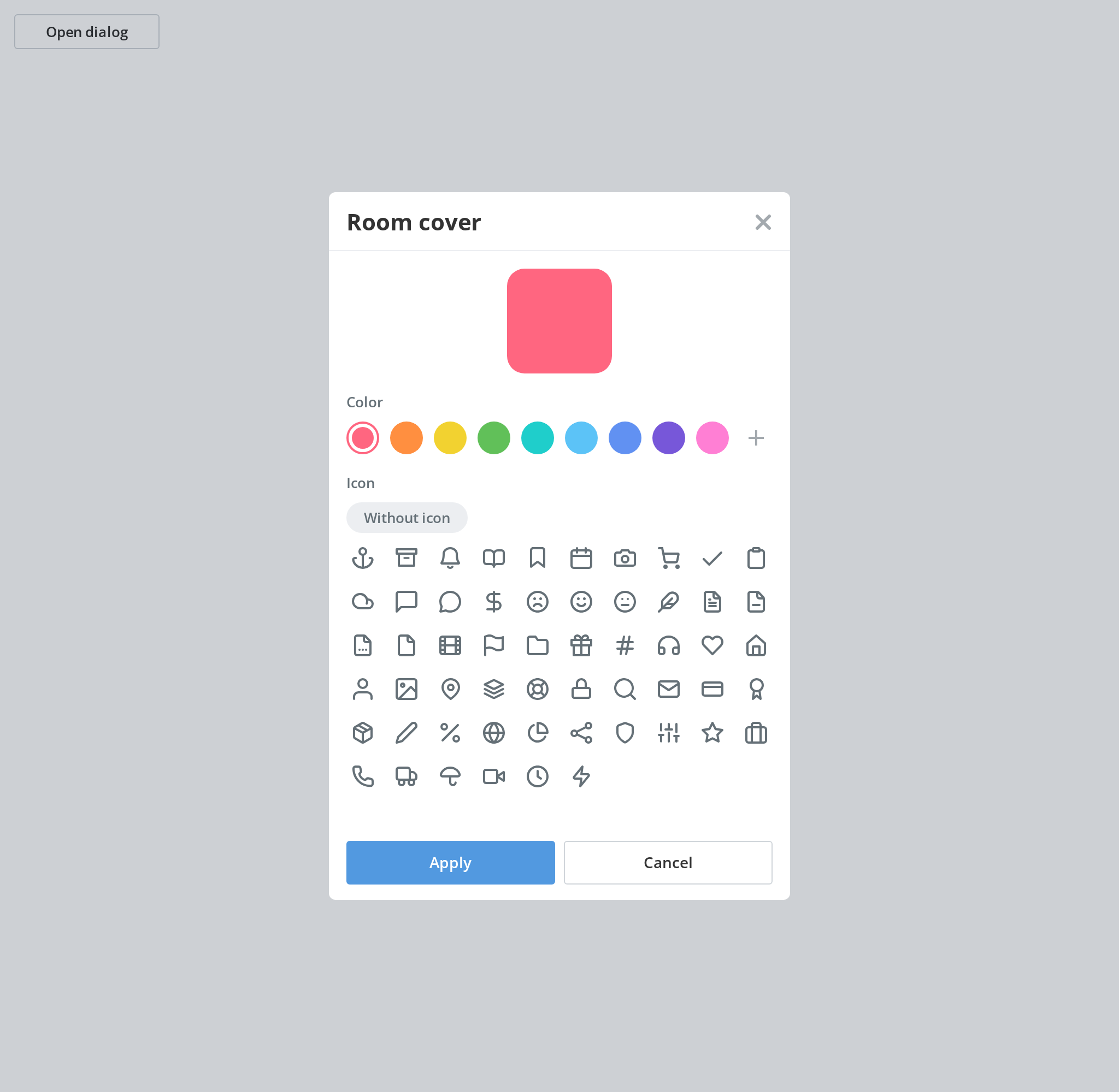
Dialog for a room's generated logo: a colour from the palette and an optional glyph, over a live
preview. It is what a room gets instead of an uploaded picture — the tile that
RoomIcon then draws.
Portal-internal. t is required, and the icon picker asks for keys outside the Common
namespace the package ships, so two of its labels are empty anywhere but in DocSpace.
Use this when / not when
- Use to let someone choose the colour and glyph of a room's generated logo.
- Not for uploading a picture — that is
AvatarEditorDialogwithImageEditor. - Not for showing the result —
RoomIcondraws the tile the choice produces. - Not for a colour on its own —
ColorPickeris the picker this dialog opens for a custom colour. - It does not apply anything.
onApplyhands you a colour and a cover; saving them, and closing the dialog afterwards, is yours to do. - The glyphs are your data, injected as markup. Each cover's
datais written into the page withdangerouslySetInnerHTML, in the picker and again in the preview. Serve them only from a source you trust.
Import
import {
  RoomLogoCoverDialog,
  RoomLogoCover,
} from "@onlyoffice/apps-ui-kit/components/room-logo-cover-dialog";
Also exported from the root barrel @onlyoffice/apps-ui-kit.
Needs ThemeProvider above it in the tree: the preview reads the theme in JavaScript to decide
whether to wash the colour out, and that context falls back to light rather than failing.
TranslationProvider — or a t of your own — supplies Common:RoomCover,
Common:ApplyButton, Common:CancelButton and Common:Color.
Stories
Default
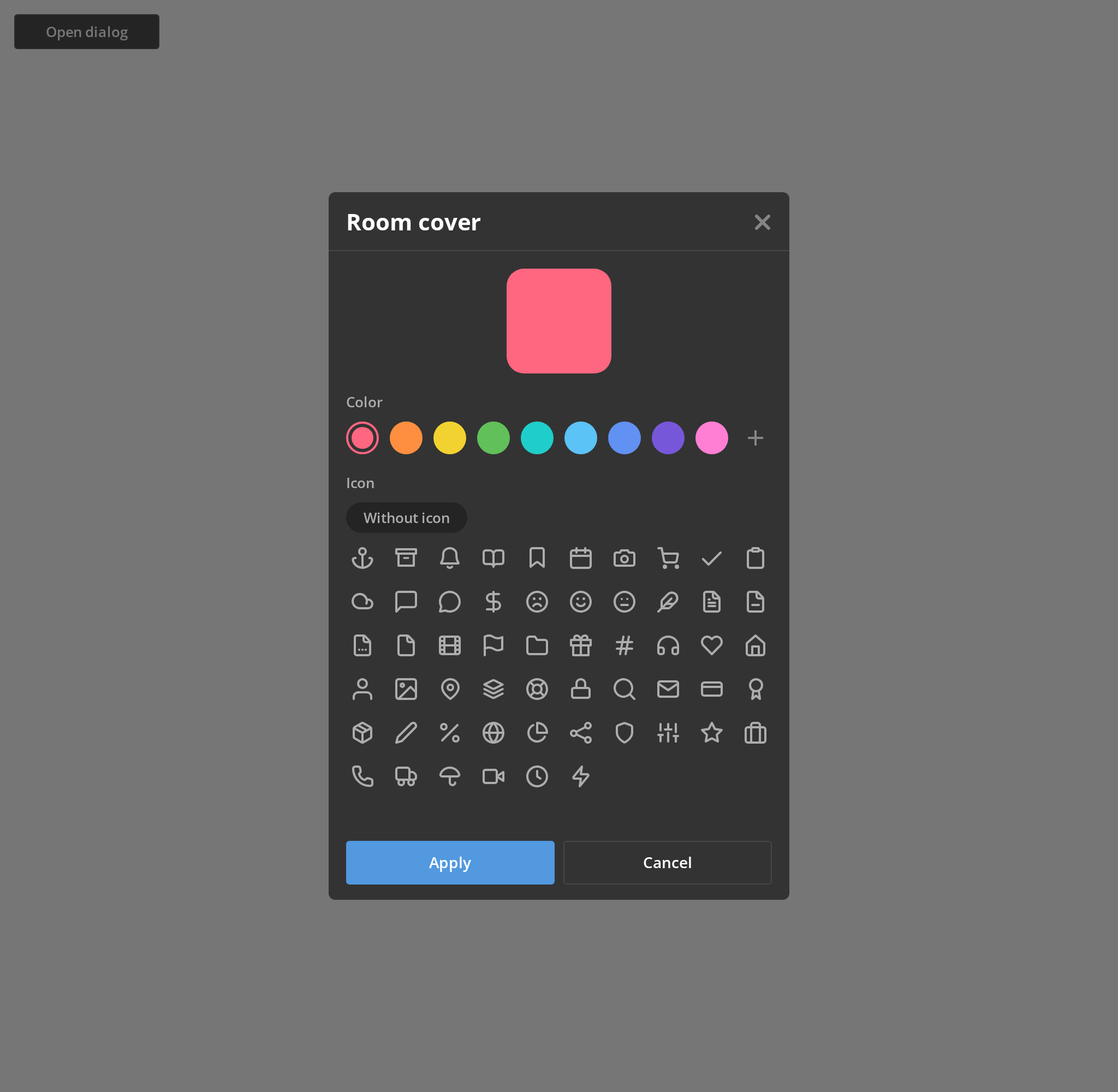
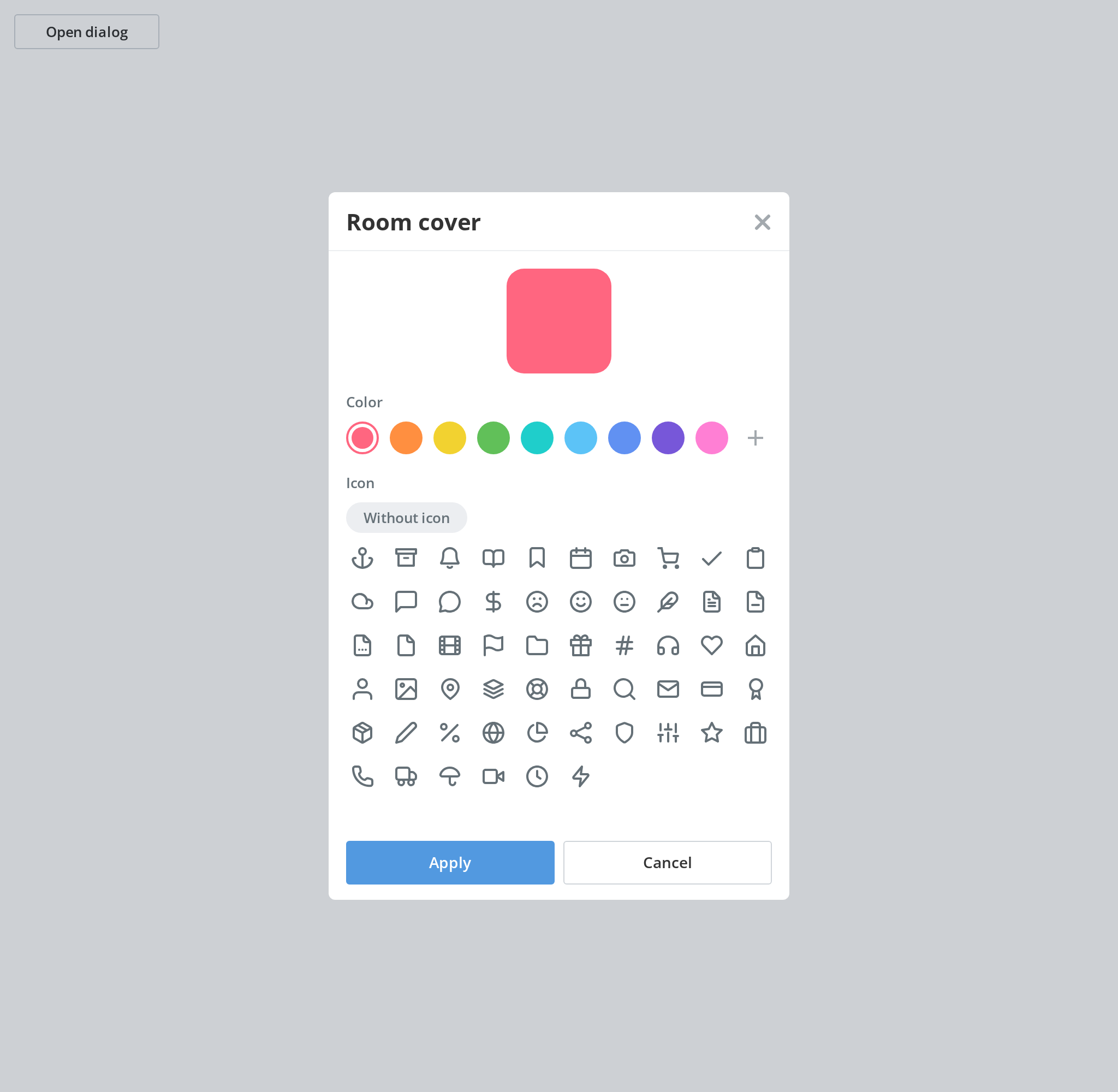
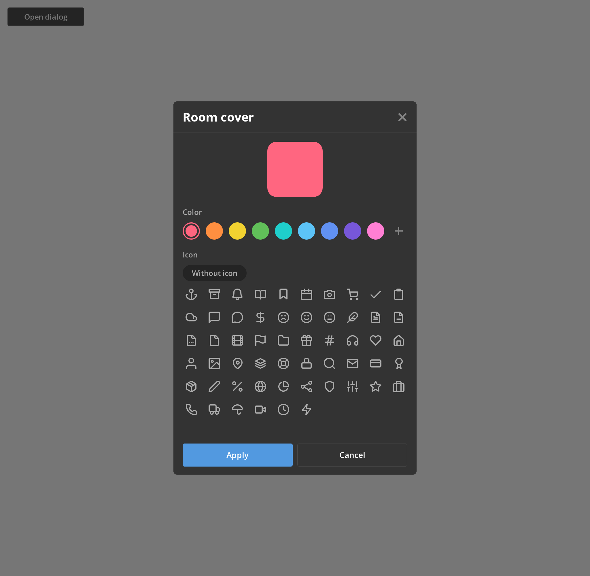
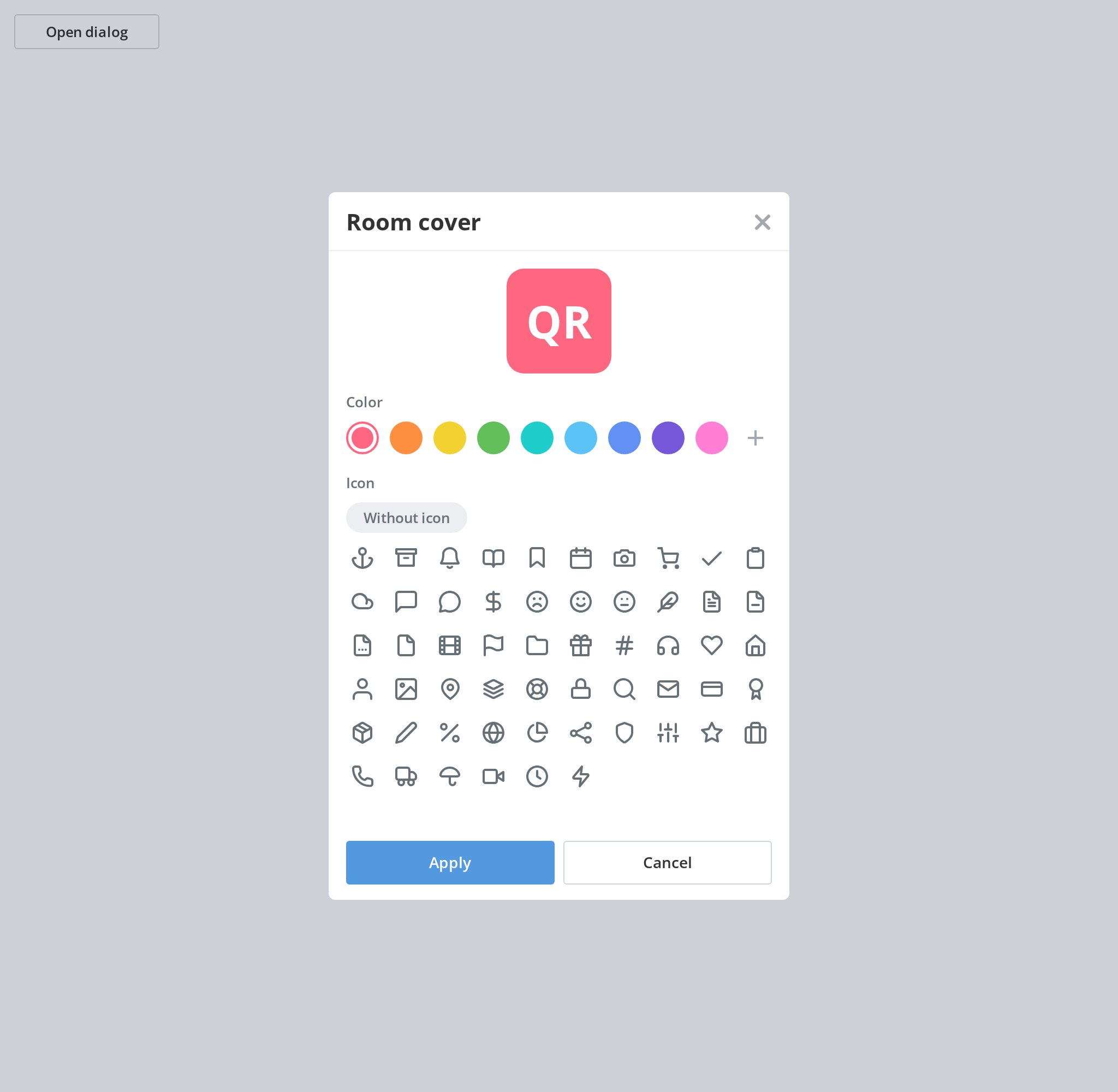
The dialog as it opens for a room with no logo yet: the first preset colour, no icon and no title. Pick a colour and an icon to watch the preview change, and apply or cancel to see the callbacks in the Actions panel; the button reopens it.
With Preselected Cover
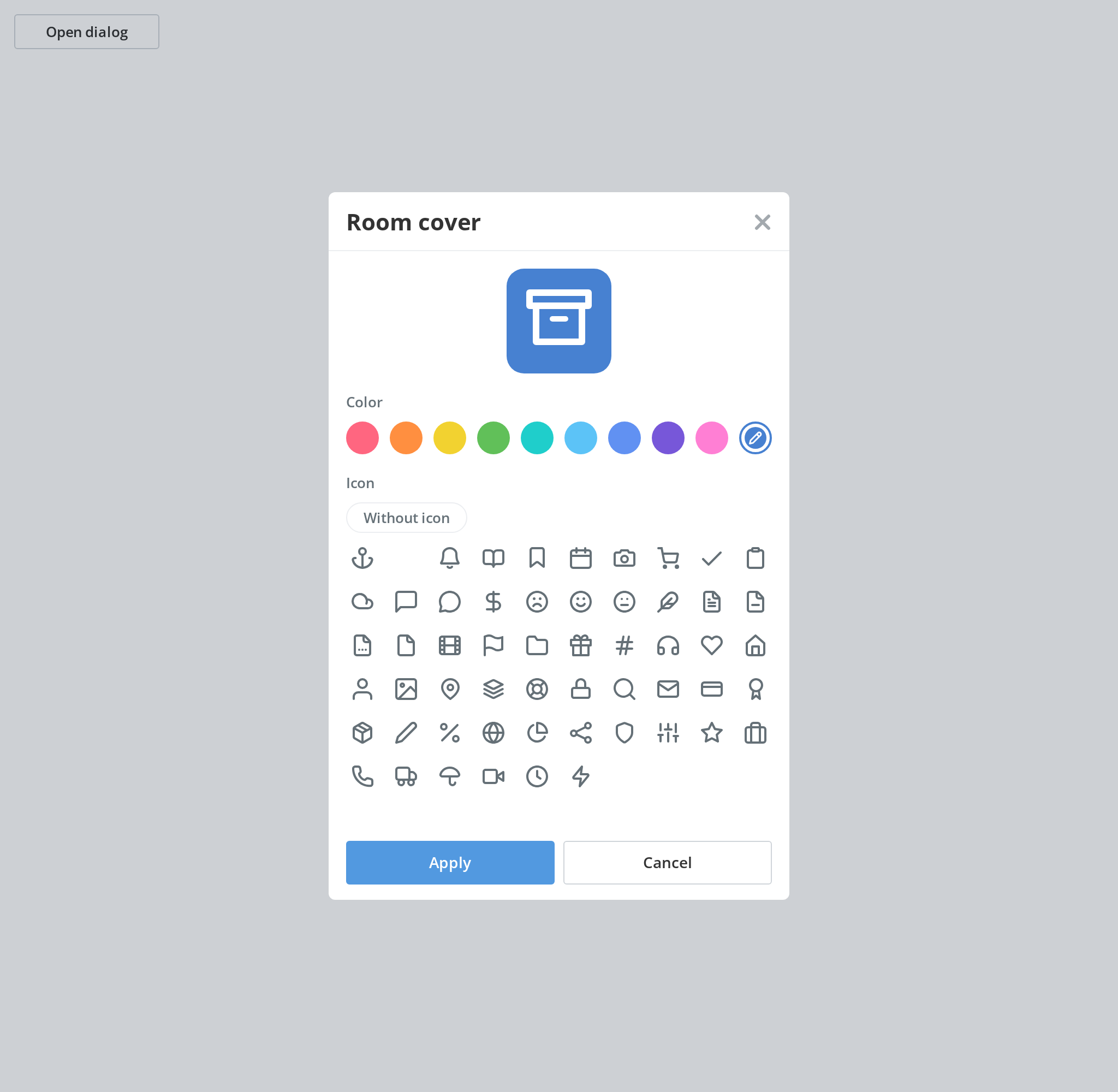
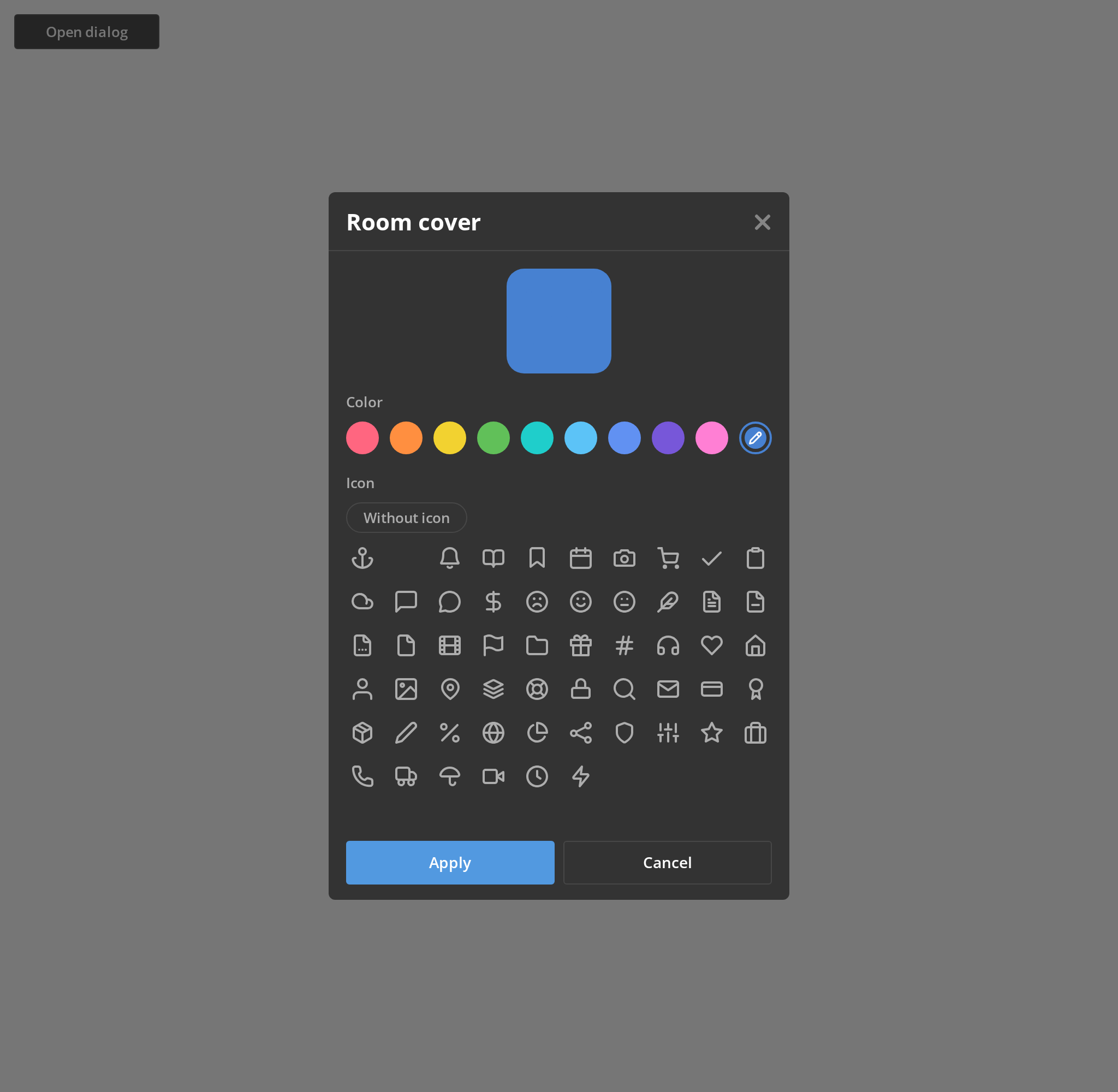
Reopening the dialog for a room that already has a logo: its icon is on the tile and its colour, which is not one of the presets, sits as an extra swatch after them with a pencil to change it (initialCover, initialColor).
Initials From Title
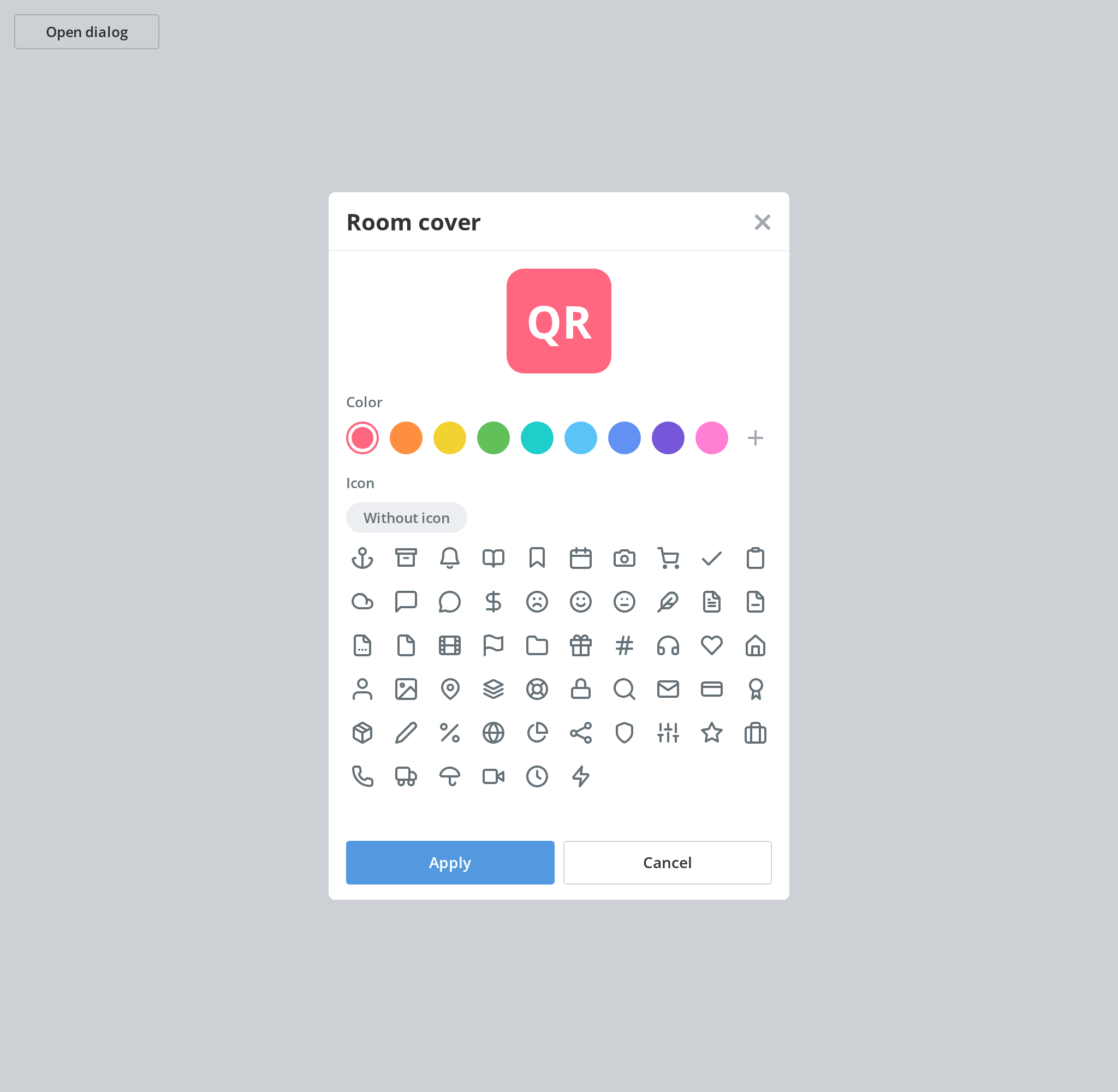
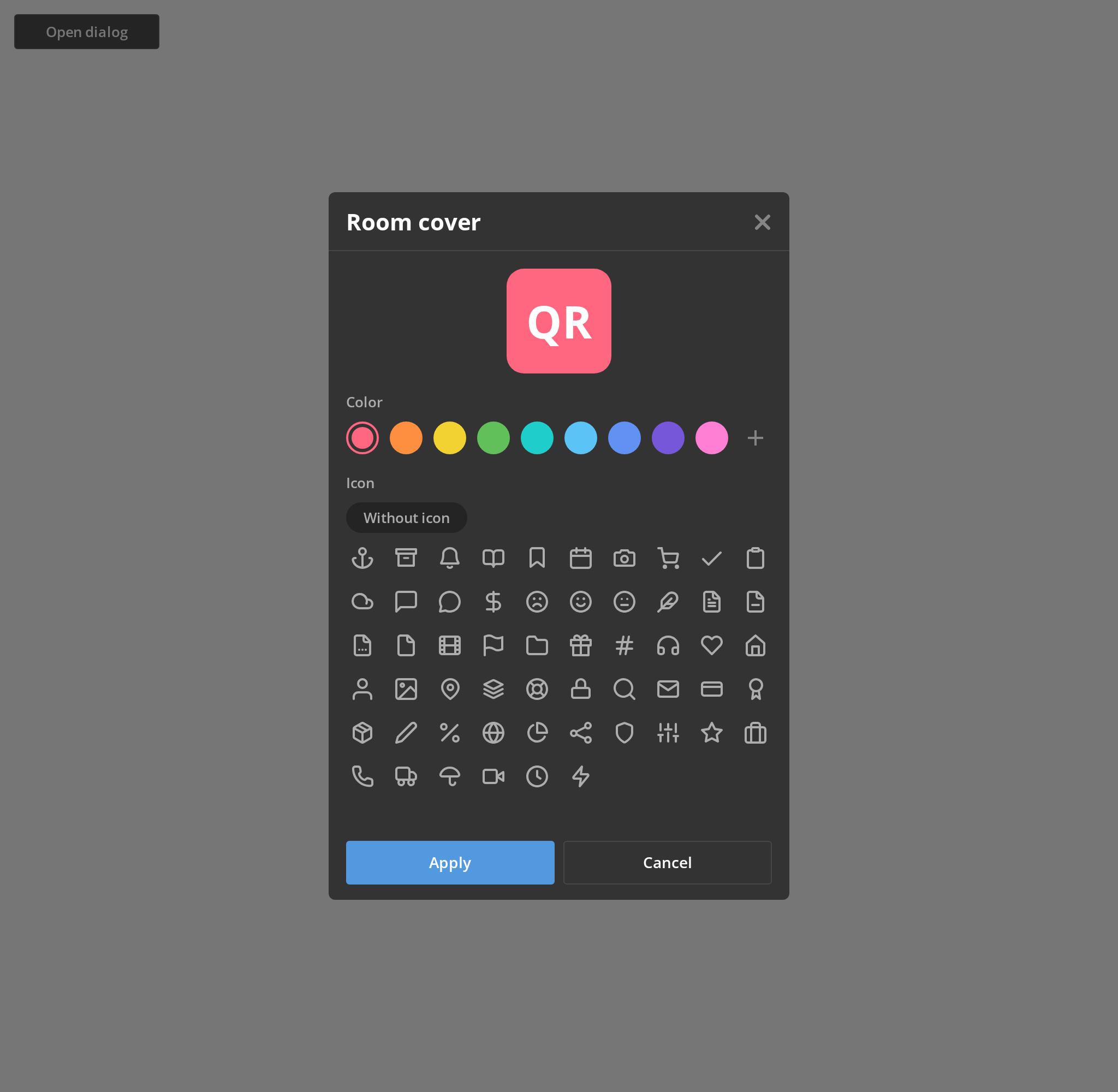
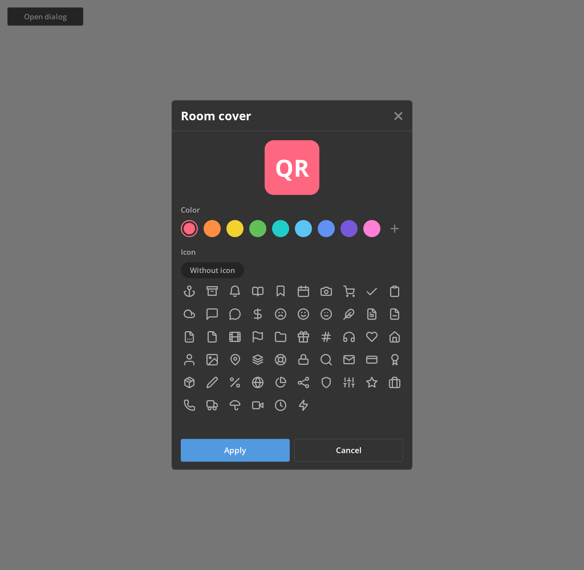
With no icon chosen the tile carries the room's initials, here QR for a room called Quarterly reports (title). Pick an icon and it replaces them; the without-icon chip brings them back.
With Accent Colors
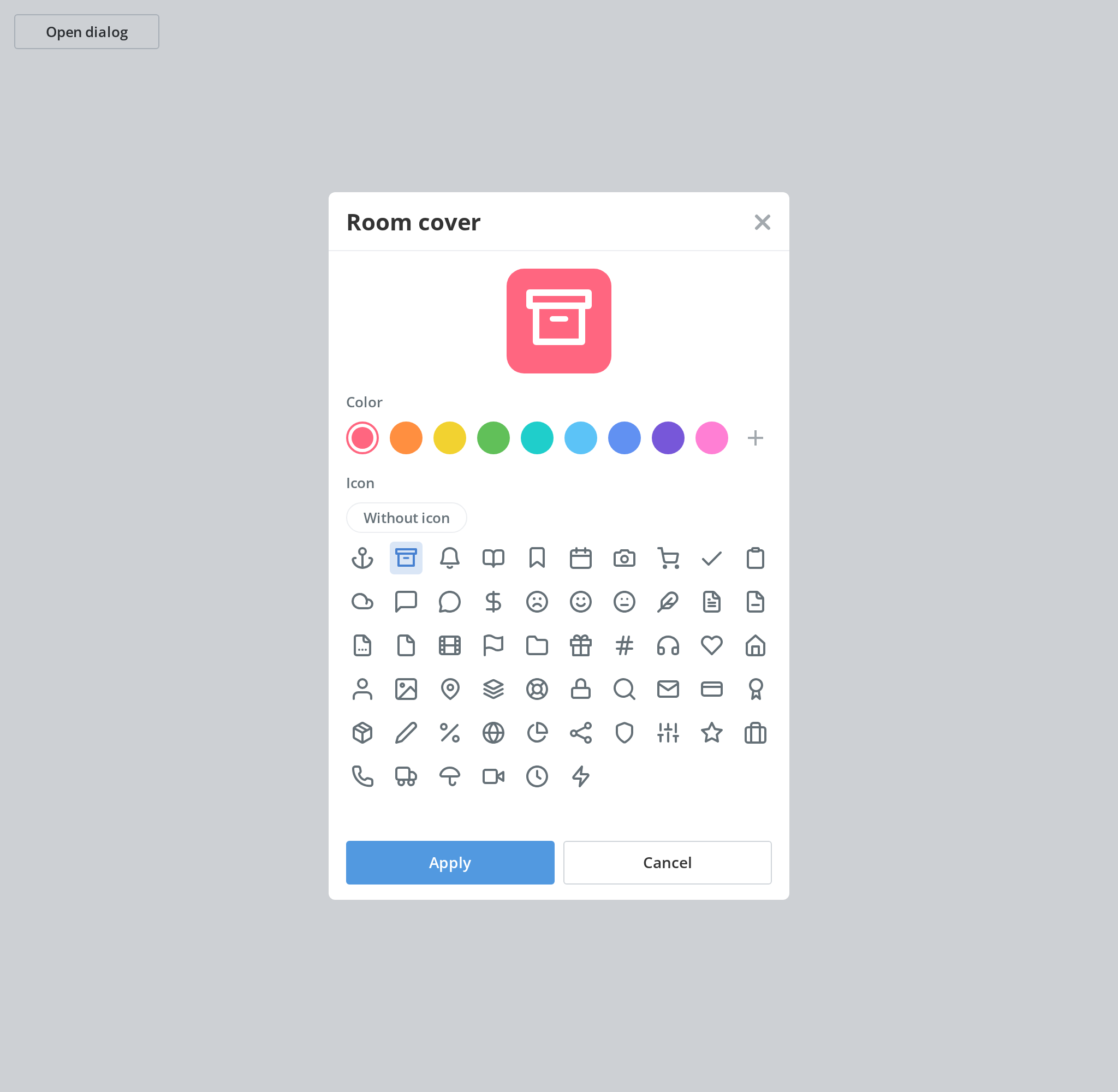
Pass the portal's colour scheme so the chosen icon sits on a tint of its accent colour; without it the chosen icon looks like the rest (currentColorScheme).
Without Icon Picker
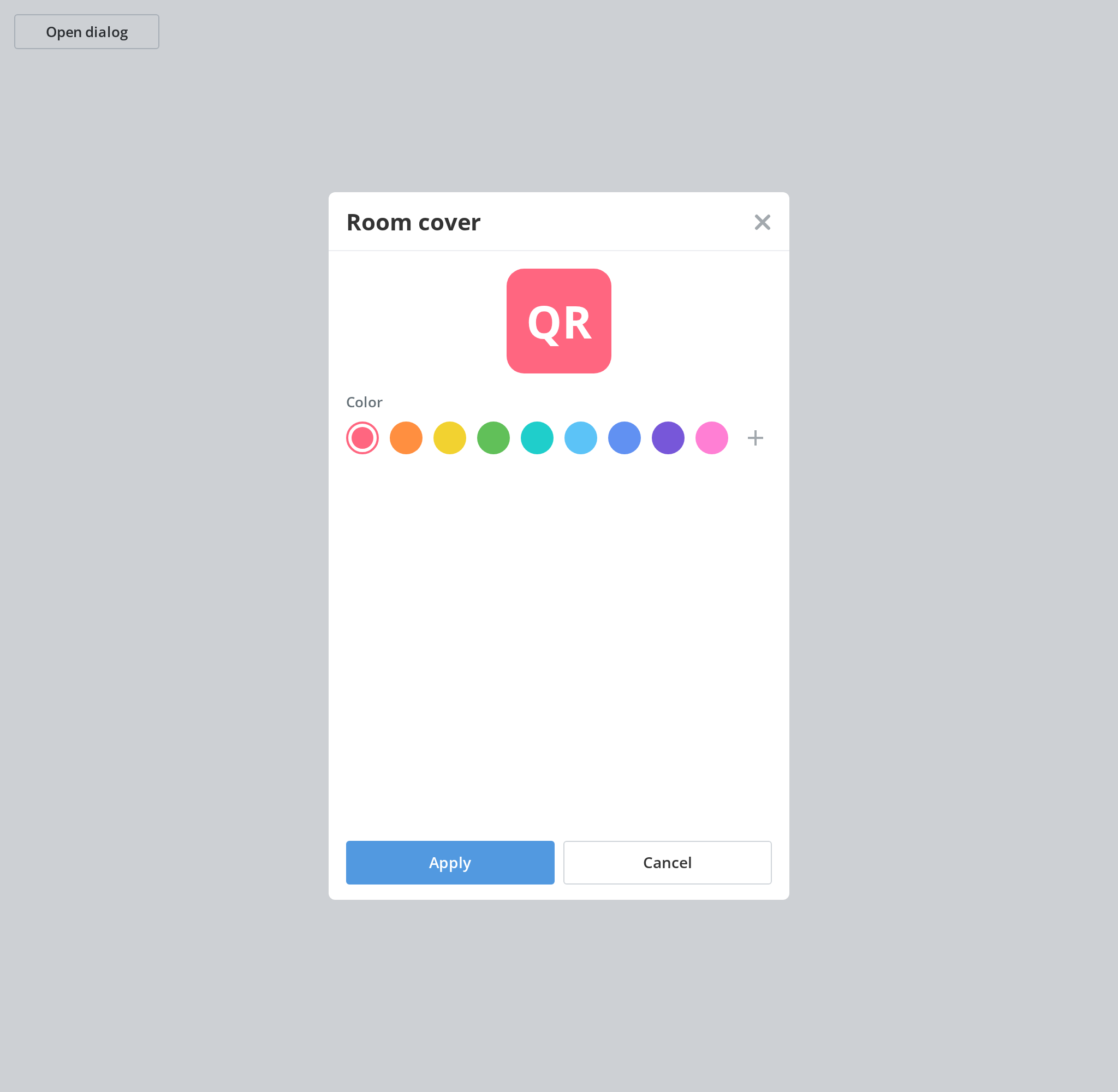
When there are no icons to offer, the icon picker is left out and the dialog chooses only the colour behind the initials (covers={[]}).
On Phone
On a phone the dialog becomes a full-screen panel, with the preview and the icons centred, and the plus button opens the colour picker in a modal of its own.
Minimal example
import { useState } from "react";

import {
  RoomLogoCoverDialog,
  type ICover,
} from "@onlyoffice/apps-ui-kit/components/room-logo-cover-dialog";
import type { TTranslation } from "@onlyoffice/apps-ui-kit/utils";

const covers: ICover[] = [
  {
    id: "folder",
    data: '<svg viewBox="0 0 24 24"><rect width="24" height="24" /></svg>',
  },
];

export function RoomCoverButton({ t }: { t: TTranslation }) {
  const [visible, setVisible] = useState(false);

  return (
    <>
      <button type="button" onClick={() => setVisible(true)}>
        Change cover
      </button>
      <RoomLogoCoverDialog
        t={t}
        visible={visible}
        covers={covers}
        title="Marketing"
        onClose={() => setVisible(false)}
        onApply={(color, cover) => {
          console.info(color, cover?.id);
          setVisible(false);
        }}
      />
    </>
  );
}
Props
Recipes
Open / close (controlled)
visible puts the dialog on screen; onClose is called by the cancel button, the header cross,
Escape and the backdrop — except while the custom-colour picker is open, which swallows all four.
import { useState } from "react";

import { Button } from "@onlyoffice/apps-ui-kit/components/button";
import {
  RoomLogoCoverDialog,
  type ICover,
} from "@onlyoffice/apps-ui-kit/components/room-logo-cover-dialog";
import type { TTranslation } from "@onlyoffice/apps-ui-kit/utils";

export function CoverDialog({
  t,
  covers,
}: {
  t: TTranslation;
  covers: ICover[];
}) {
  const [visible, setVisible] = useState(false);
  const [cover, setCover] = useState<ICover | null>(null);
  const [color, setColor] = useState("#4781D1");

  return (
    <>
      <Button label="Cover" onClick={() => setVisible(true)} />
      <RoomLogoCoverDialog
        t={t}
        visible={visible}
        covers={covers}
        title="Marketing"
        initialColor={color}
        initialCover={cover}
        onClose={() => setVisible(false)}
        onApply={(nextColor, nextCover) => {
          setColor(nextColor);
          setCover(nextCover);
          setVisible(false);
        }}
      />
    </>
  );
}
Colour only
An empty covers array leaves the glyph picker out, and the dialog becomes a palette over the
preview of the room's initials.
import { useState } from "react";

import { RoomLogoCoverDialog } from "@onlyoffice/apps-ui-kit/components/room-logo-cover-dialog";
import type { TTranslation } from "@onlyoffice/apps-ui-kit/utils";

export function ColourOnlyDialog({ t }: { t: TTranslation }) {
  const [visible, setVisible] = useState(true);

  return (
    <RoomLogoCoverDialog
      t={t}
      visible={visible}
      covers={[]}
      title="Design system"
      onClose={() => setVisible(false)}
      onApply={(color) => {
        console.info(color);
        setVisible(false);
      }}
    />
  );
}
The picker without the dialog
RoomLogoCover is exported on its own, for a settings page rather than a modal. It owns the
selection and reports it through onChange, and the colour picker's open state is yours to hold.
import { useState } from "react";

import {
  RoomLogoCover,
  type ICover,
} from "@onlyoffice/apps-ui-kit/components/room-logo-cover-dialog";
import type { TTranslation } from "@onlyoffice/apps-ui-kit/utils";

export function CoverSection({
  t,
  covers,
}: {
  t: TTranslation;
  covers: ICover[];
}) {
  const [openColorPicker, setOpenColorPicker] = useState(false);
  const [choice, setChoice] = useState<{ color: string; cover: ICover | null }>(
    {
      color: "#4781D1",
      cover: null,
    },
  );

  return (
    <RoomLogoCover
      t={t}
      covers={covers}
      title="Marketing"
      initialColor={choice.color}
      initialCover={choice.cover}
      generalScroll
      openColorPicker={openColorPicker}
      setOpenColorPicker={setOpenColorPicker}
      onChange={(color, cover) => setChoice({ color, cover })}
    />
  );
}
Behaviour the types don't state
- While the custom-colour picker is open the dialog cannot be closed. The close handler returns early, so the cancel button, the header cross, Escape and the backdrop all do nothing. The picker itself closes on a click outside it, which then restores the dialog's own close.
- The dialog never re-renders on a choice. The colour and cover are kept in a ref and read when apply is clicked, so nothing outside can observe the selection while the dialog is open, and the footer cannot reflect it.
- Opening the dialog throws the previous selection away. The picker is keyed on
visible, so it is remounted each time and starts again frominitialColorandinitialCover. onApplydoes not close the dialog, and there is no loading state to hold it open while you save.- Below 600px the dialog is a side panel, not a centred modal — the display type is chosen once, from the window width, when the component renders.
- Clicking the glyph that is already chosen turns it off rather than re-selecting it: the handler on a selected icon is the same toggle as the "without icon" control.
- That control does nothing until a glyph has been chosen. Turning "without icon" on is
refused while no cover is selected, which is the state the dialog opens in when
initialCoverisnull. - Two of the icon picker's labels are asked for outside
Common. It asks forCreateEditRoomDialog:Icon, which is not in theCommonbundle the package ships, so atof your own has to supply it outside the portal. It also asks for a bareWithoutIconwith no namespace: that key is inCommon, so it resolves through atwhose default namespace isCommonand shows the key itself through any other. - Cover markup is injected, not parsed.
dangerouslySetInnerHTMLis used for every glyph in the picker and for the chosen one in the preview. - The dialog's height is computed from fixed constants — 648px on desktop, 854px on tablet — measured against the body once it is mounted, the first opening included, recalculated on every resize, and forced to a scrolling body when the viewport is landscape and shorter than 640px.
- A custom colour is anything outside the kit's palette of nine presets. The extra swatch
appears only once
selectedColoris not one ofglobalColors.logoColors; before that the same slot is the plus button that opens the picker. The extra swatch carries a pencil button that opens the picker again to change it. - Where the colour picker opens depends on the width. On a phone (600px and below) it is a modal of its own; otherwise it is a drop-down anchored to the plus button or custom swatch.
- The initials are the first letters of the title's first and last words, upper-cased, after special symbols are stripped — "Quarterly reports" gives QR, a one-word title a single letter.
- On
RoomLogoCoverthe raw-room fieldslogoColorandcoverColorare six hex digits without a leading#— the component prefixes it — whileinitialColoris a full#rrggbb.
Sub-components
RoomLogoCover — the preview and the two pickers, without the modal around them. The dialog
renders it, and it is exported for a settings page that needs the same choice inline. It holds
the selection itself and reports it through onChange; openColorPicker and its setter belong
to whatever wraps it, because the dialog uses that flag to refuse closing.
CustomLogo, SelectColor and SelectIcon are in the folder but are not exported; their prop
types are, for typing a re-implementation.
Accessibility
- The whole picker is pointer-only. Every swatch, every glyph and the "without icon" control
is a
<div>with a click handler: no role, notabindex, no key handling. A keyboard user can reach the apply and cancel buttons and nothing between them. - Nothing marks which swatch or glyph is chosen to a screen reader — the selected state is a
class and a ring, with no
aria-pressedoraria-selected. - The glyphs are injected SVG with no titles and no
aria-hidden, so they are announced, if at all, as unlabelled graphics. - While the colour picker is open, Escape does not close the dialog. That is deliberate, so that Escape belongs to the picker, but the picker itself is dismissed by clicking outside it and offers no keyboard way out.
- The header is a plain string inside
ModalDialog.Header, not a heading element.
Test ids
The swatches are color_item_<index>, the chosen one color_item_selected_<index>, a chosen
custom colour color_item_custom_selected, and the glyphs room_logo_cover_icon_<index>; each
glyph also carries the element id cover-icon-<id>. None of them is settable.
Related
RoomIcon— draws the tile this dialog configures.ColorPicker— the picker behind the plus button.ModalDialog— the dialog this is built from.