Selector
Panel for picking one or many things out of a list too long to render at once. It is the portal's people picker, room picker and "save as" browser, and it brings its own search, breadcrumbs, pagination and footer.
Use this when / not when
- Use to choose users, groups, rooms, folders or files from a list you fetch a page at a time — it virtualises the rows, asks for the next page as they scroll past, and gives you the selection back in one callback.
- Not for a short, fixed list of options —
ComboBoxis that, and it costs none of the pagination machinery. - Not for a table of data with columns —
Tableis that. - Not as a dialog on its own. Selector has no visibility prop; it fills whatever box you put it
in.
useAsideis the one switch that turns it into a panel, and for anything else wrap it inModalDialogyourself.
Import
import { Selector } from "@onlyoffice/apps-ui-kit/components/selector";
Also exported from the root barrel @onlyoffice/apps-ui-kit.
The folder also exports the three skeletons its own props ask for — RowLoader,
SearchLoader, BreadCrumbsLoader — and every type on this page.
Needs ThemeProvider from @onlyoffice/apps-ui-kit/providers/theme, and TranslationProvider
from @onlyoffice/apps-ui-kit/providers/translation for the strings Selector prints on its own:
the user-type labels beside each person, and the empty screen's "Back" and "Clear filter" links.
Stories
Default
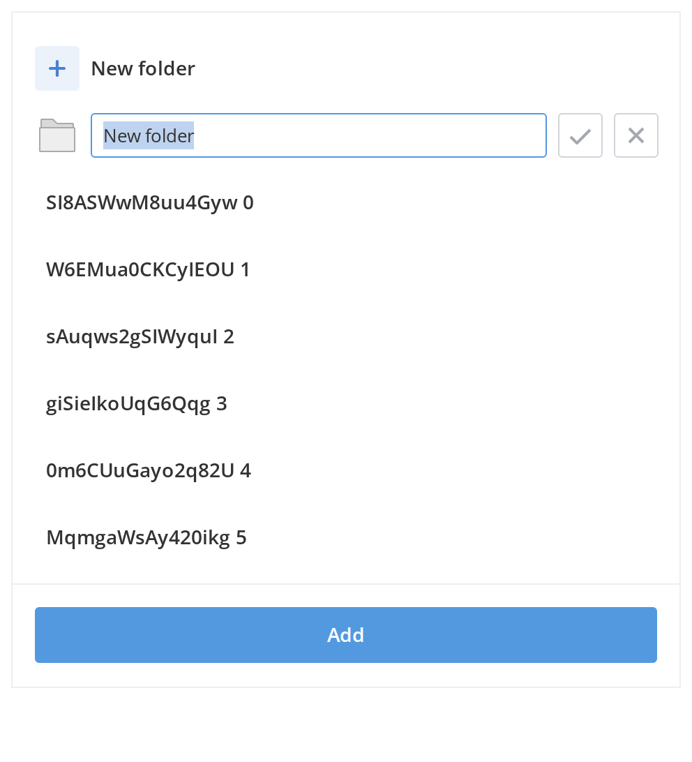
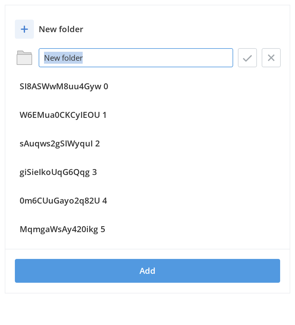
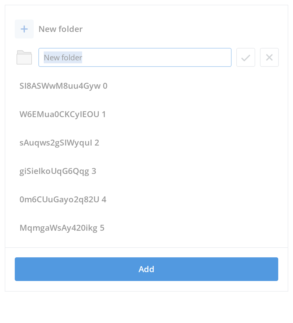
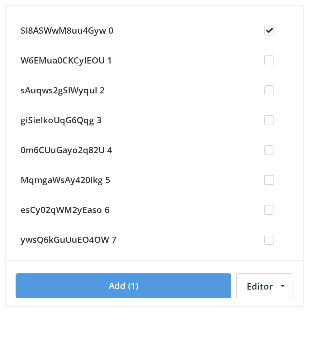
A long list that loads 100 rows at a time as you scroll, with one row picked at a time. The first row opens a "New folder" entry and the second is the inline name field for it (isCreateNewItem, isInputItem); change any other prop live in the Controls panel below.
Content Loading
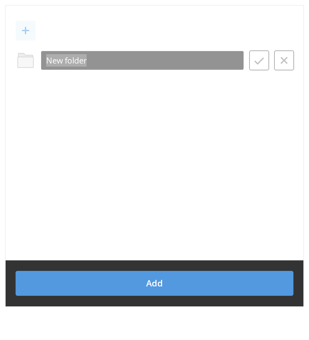
Content refresh state: while new data is loading (search, tab change or folder navigation), the current list stays on screen dimmed and non-interactive instead of being replaced with a skeleton.
Bread Crumbs
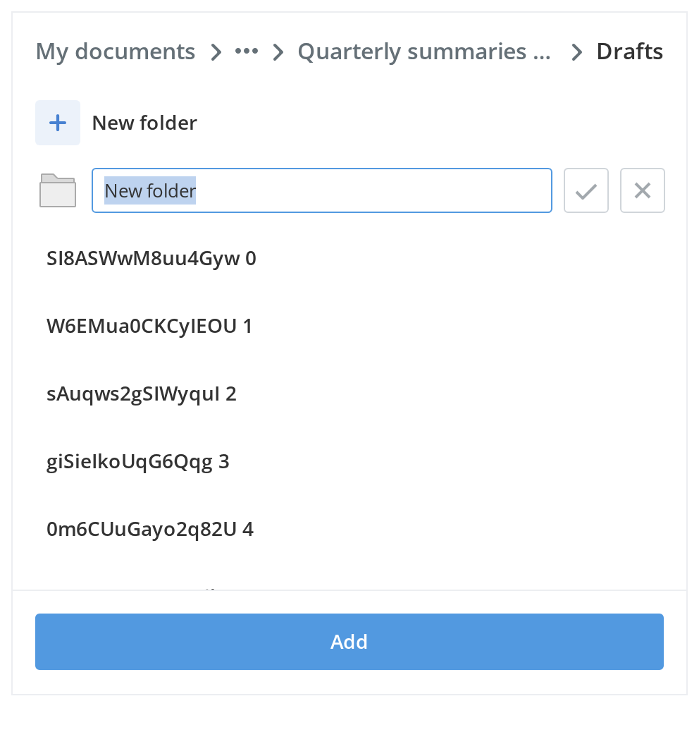
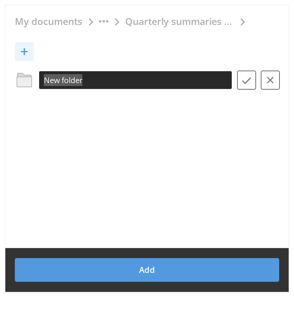
Use a folder trail when the list is one level of a folder tree. With more than three folders, the ones between the first and the last two collapse into a menu behind the dots; click an earlier folder and onSelectBreadCrumb reports it, so you can load that folder and pass new items and breadCrumbs.
New Name
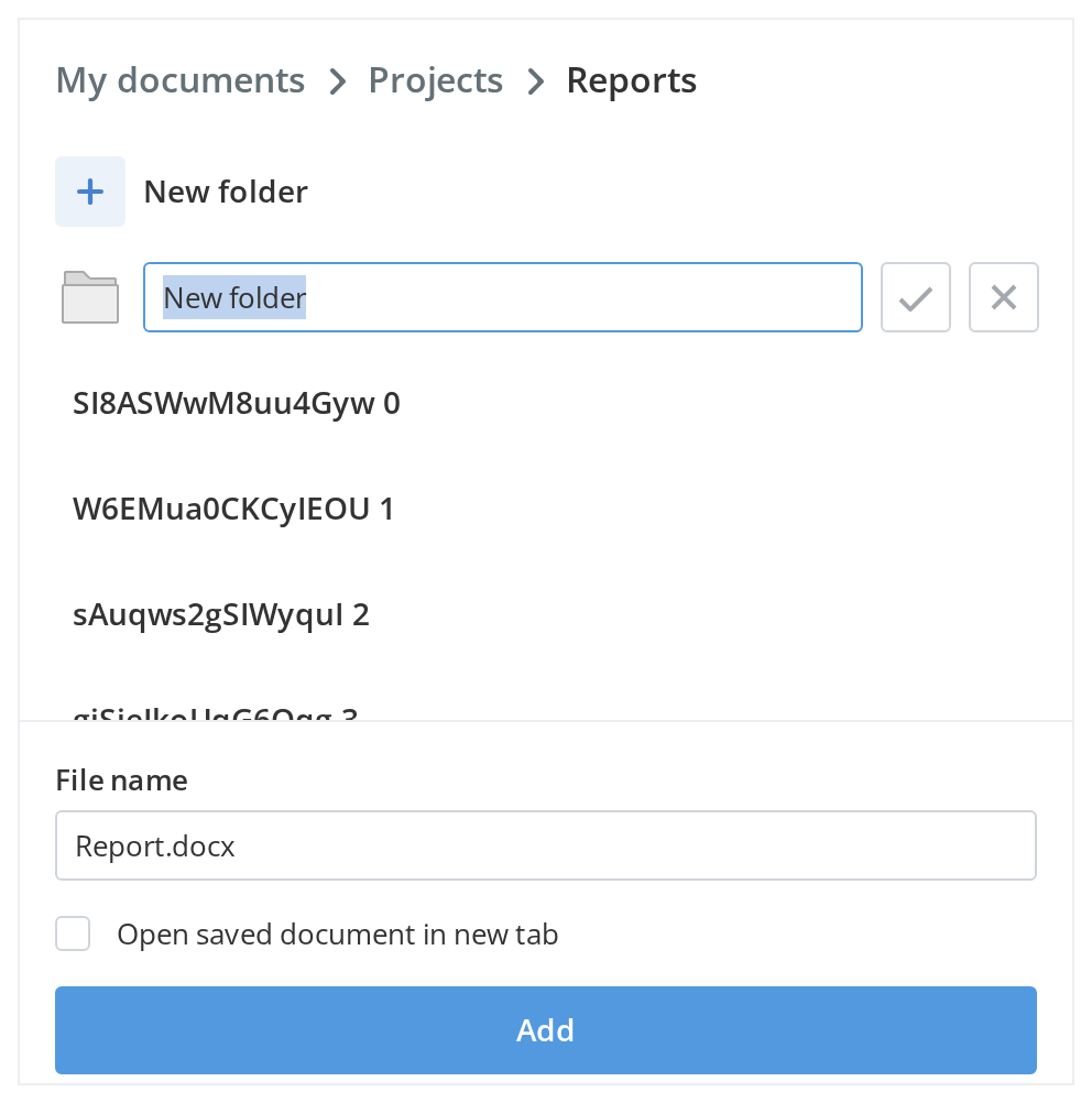
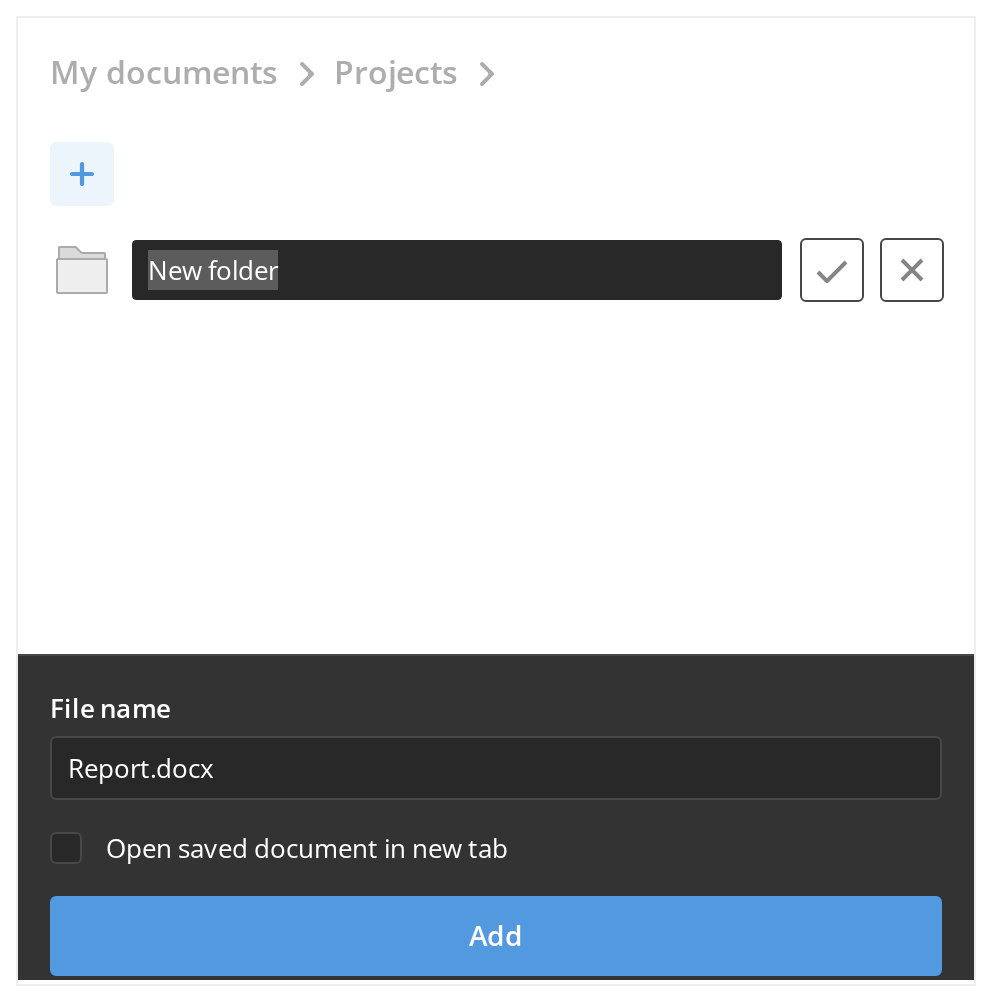
Use a name field in the footer for a "save as" or copy flow, where the reader picks the destination folder and names the file in one step. The checkbox under the field is a second choice handed to onSubmit with the name (withFooterCheckbox); clear the field and the Add button goes dead.
With Header
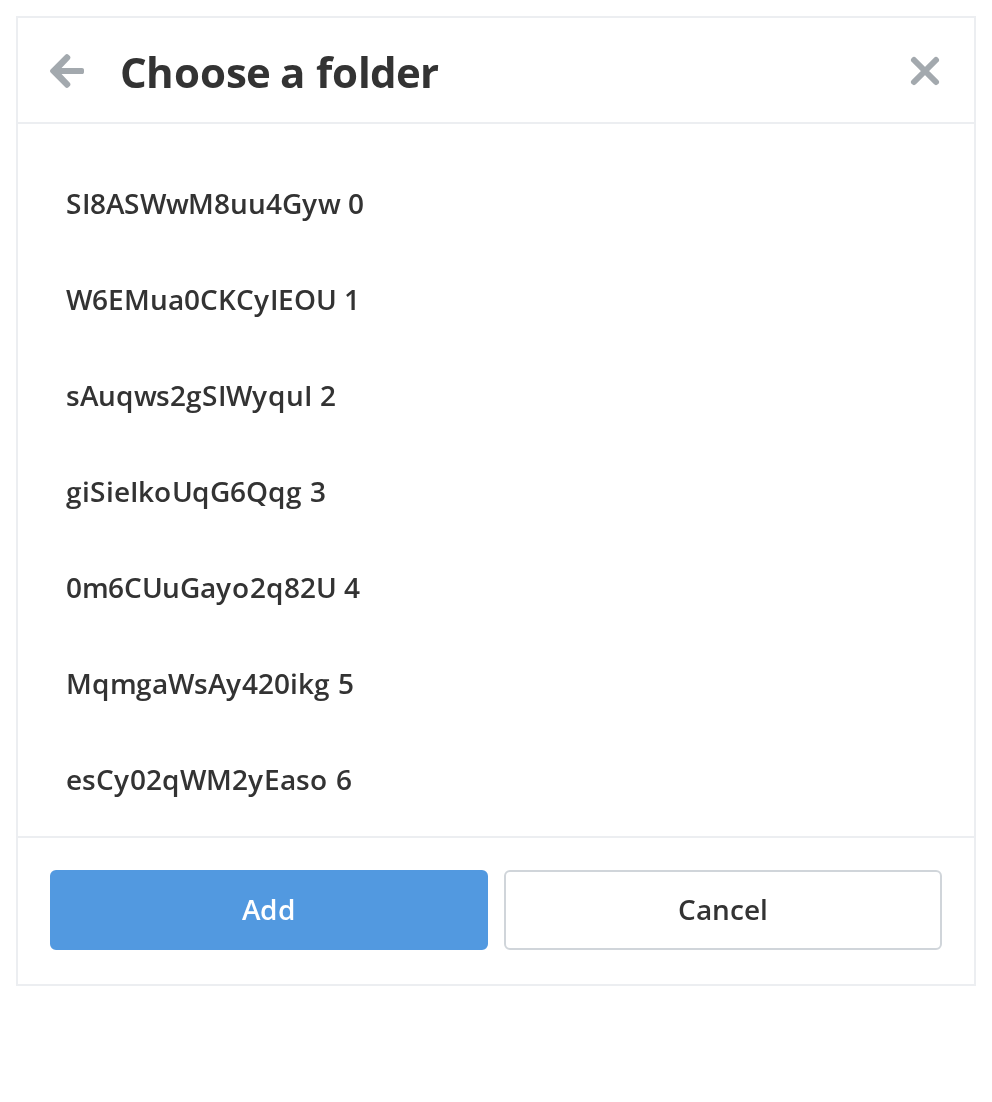
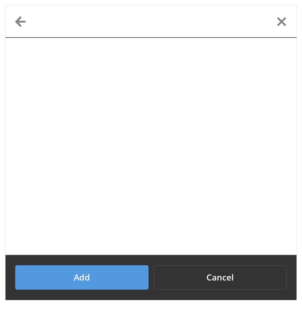
Give the panel a header when it stands on its own, in a dialog or a side panel. The title comes with a closing cross and, here, a back arrow for a step-by-step flow (headerProps.withoutBackButton: false); the footer gets a second button that calls onCancel, as Escape does.
With Search
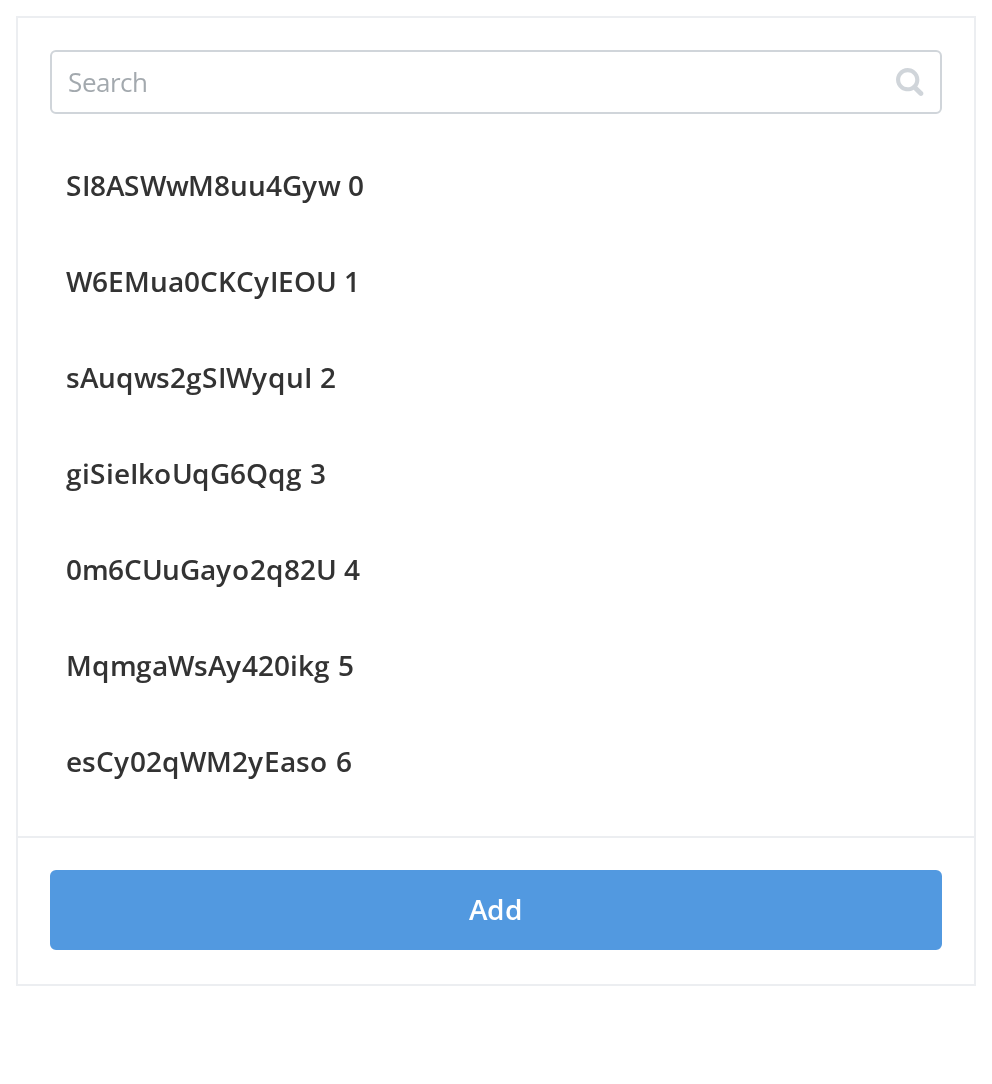
Add a search box when the reader knows the name they are looking for. Type part of a label to narrow the list; type something no label contains, such as zzz, to see the search empty screen (searchEmptyScreenHeader), and clear the box with its cross to get the whole list back. The filtering is the story's own: Selector hands over the query in onSearch and shows what items you give back.
Multi Select
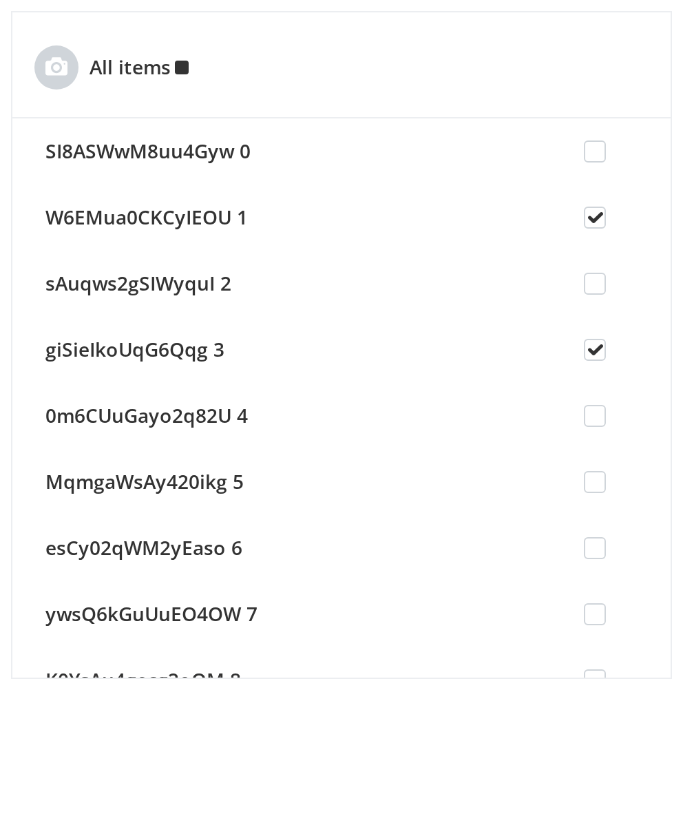
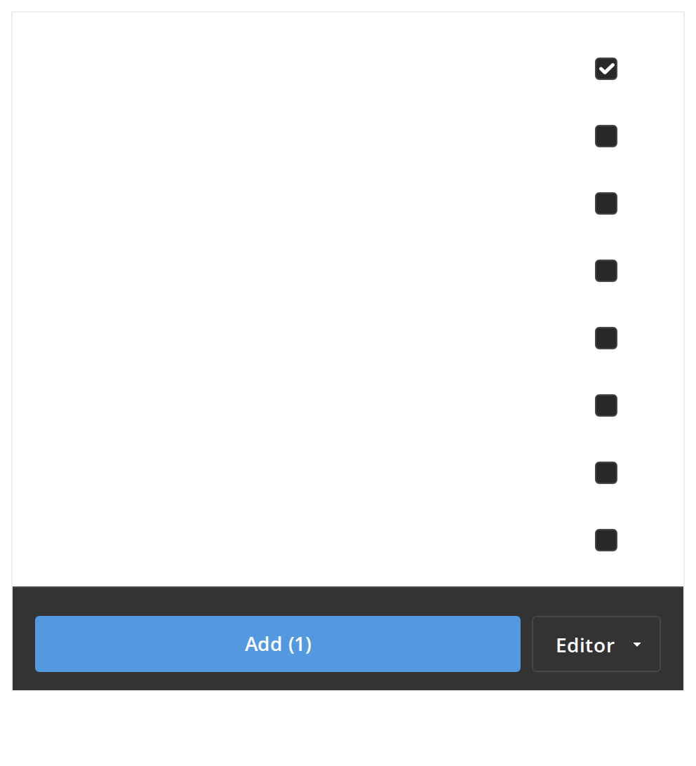
Use multi-select when the reader adds several items in one go, such as people to a share. Every row gets a checkbox, the footer appears with the first tick and its Add button shows how many are ticked, and the "All items" row above the list ticks or unticks every loaded row (withSelectAll). Two rows start out ticked (selectedItems).
Selection Limit
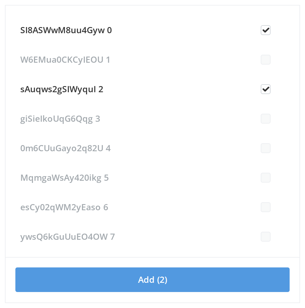
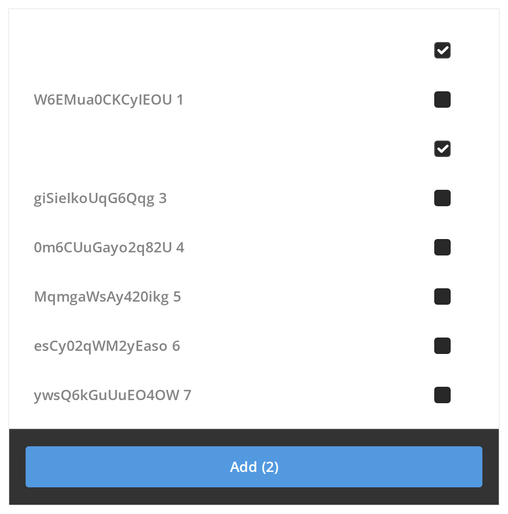
Cap the selection when the target can take only so many items. Two rows are ticked and the limit is two, so every other row is greyed out and ignores clicks (maxSelectedItems); untick one and the rest come back. Selector shows no message of its own, so say what the limit is somewhere near the panel.
Disabled Items
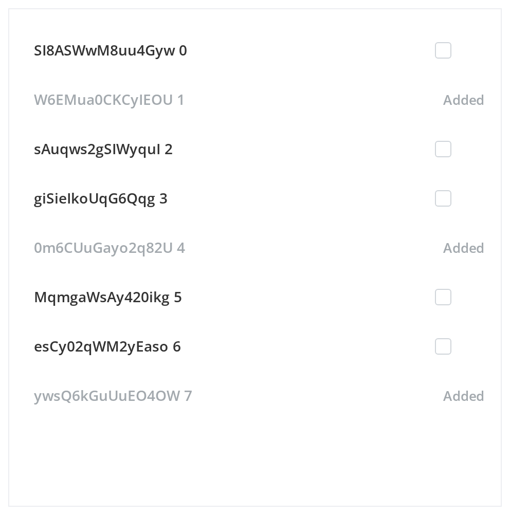
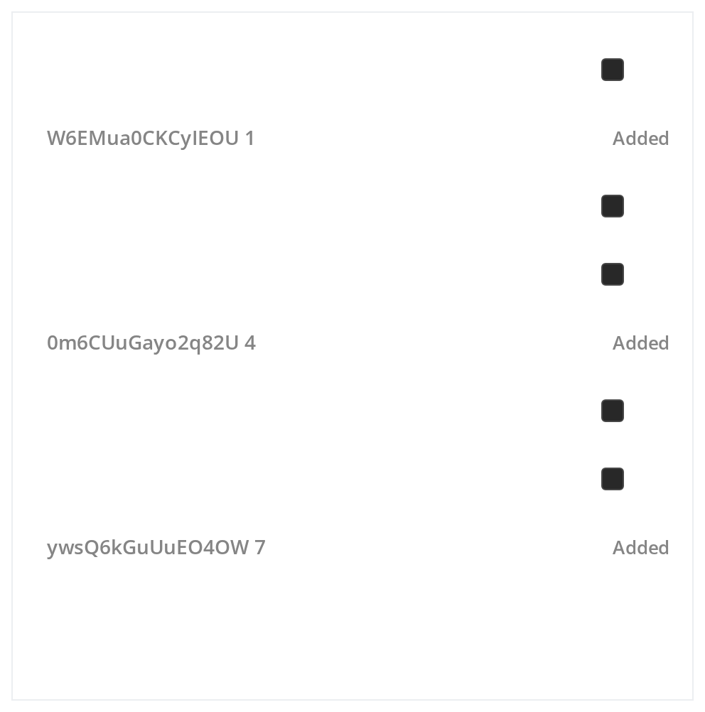
Keep an item in the list but out of reach when the reader should see it and know why it cannot be picked. The greyed rows ignore clicks and show a reason in place of their checkbox (isDisabled, disabledText on the item).
With Access Rights
Add an access drop-down to the footer when the items being added need a permission as well. Open it beside the Add button to pick one; the choice is handed to onSubmit with the ticked items. Switch accessRightsMode to detailed in the Controls panel below to open the menu as wide as the footer instead.
Empty Folder
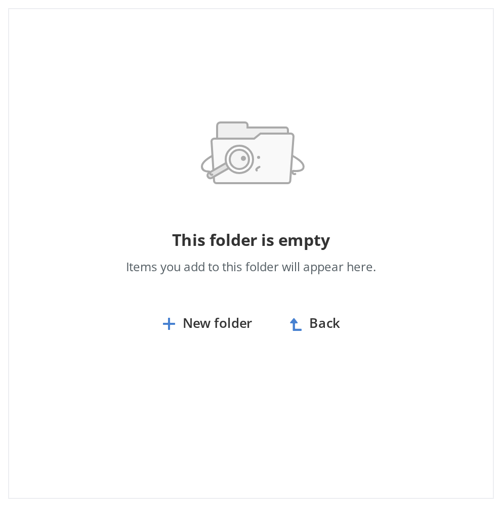
What the reader sees in a folder with nothing in it: the picture, heading and paragraph you pass (emptyScreenImage, emptyScreenHeader, emptyScreenDescription). The "New folder" link is the list's isCreateNewItem row turned into a link, and "Back" goes to the previous folder of the trail; hideBackButton removes it.
Loading State
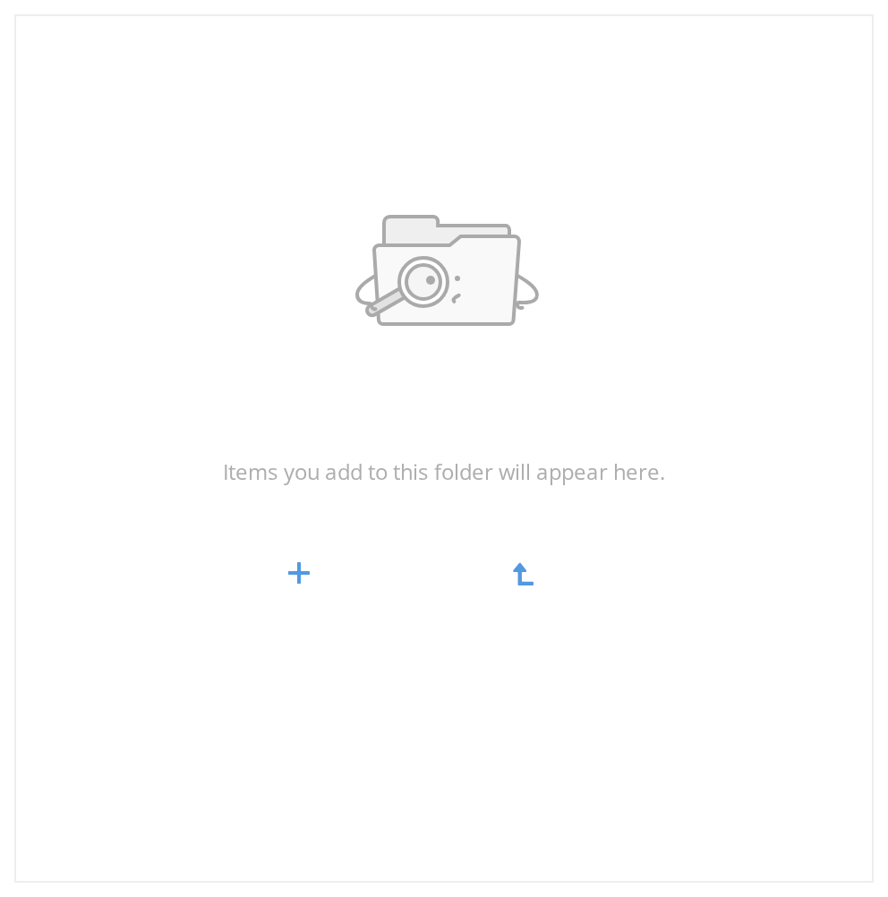
Show skeletons while the first page is on its way, so the panel keeps its shape instead of flashing an empty screen. The trail, the search box and the list each have a skeleton of their own, and each is switched on separately (isBreadCrumbsLoading, isSearchLoading, isLoading); the folder exports all three loaders.


With Tabs
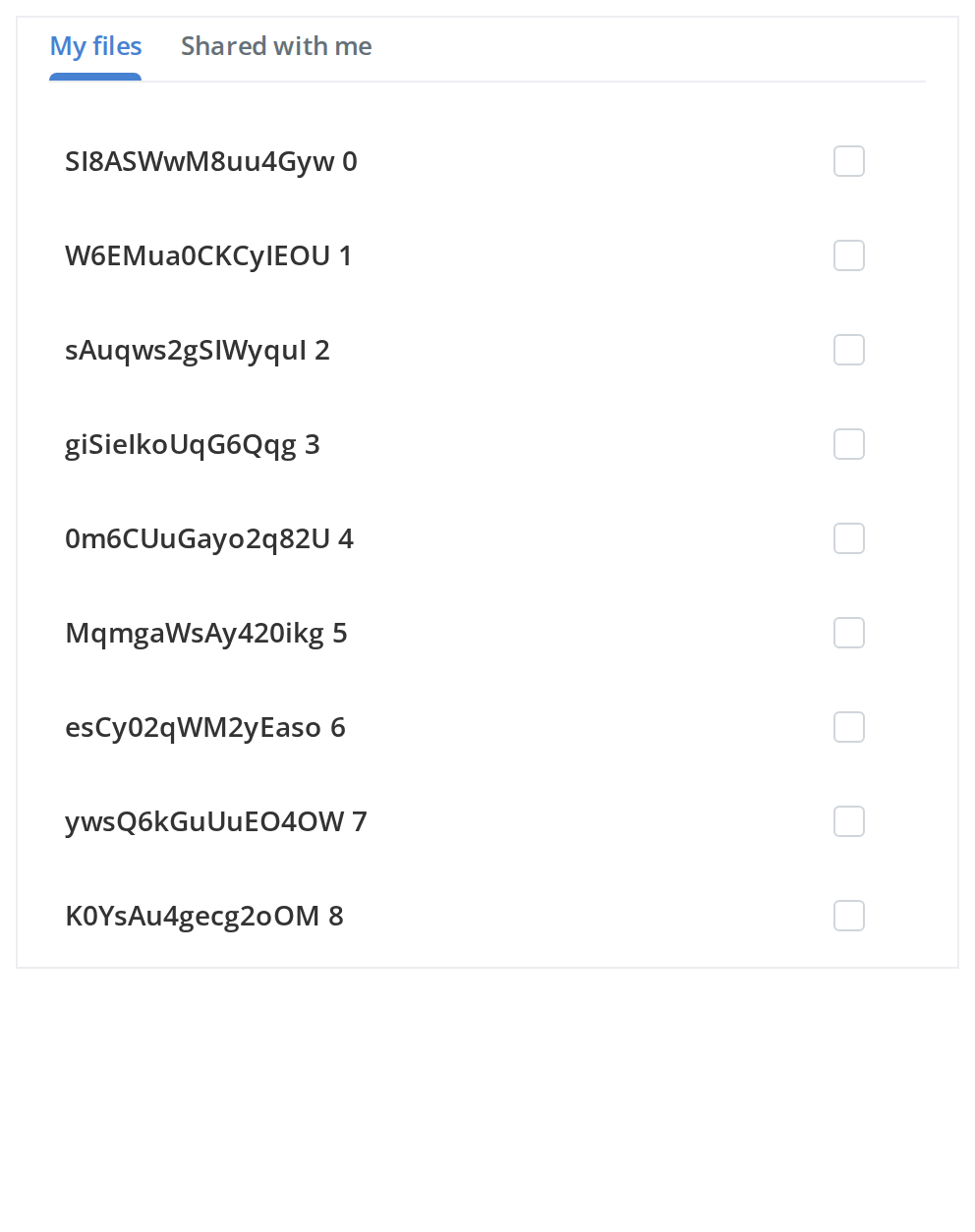
Split the list into tabs when the items come from separate sources. Tick a row, switch to the other tab and tick another: the Add button counts both, because Selector keeps a selection per tab (withTabs, tabsData, activeTabId). Switching tabs is yours to do from each tab's onClick.
With Info
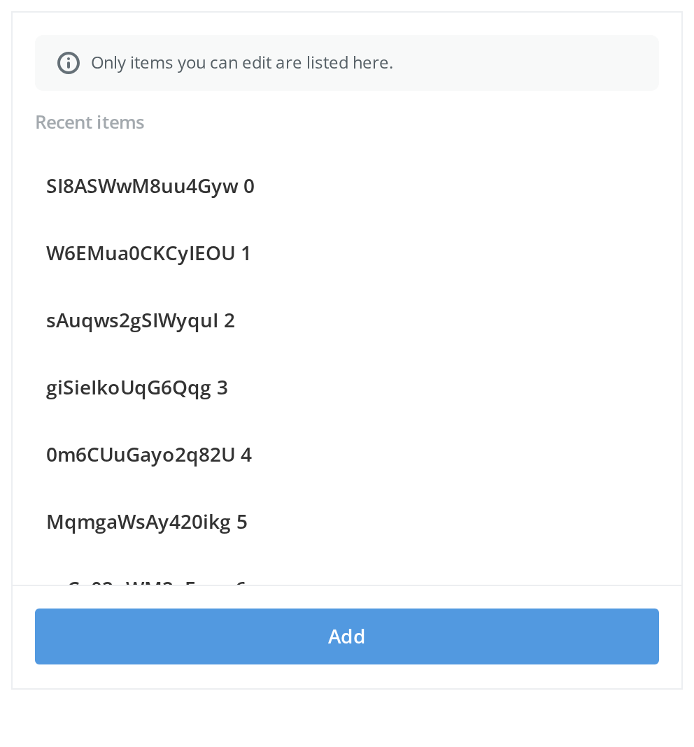
Two ways to say something about the list before the reader picks from it:
- Only items you can edit are listed here. — a tinted note with an info icon, for a condition that explains what the list holds (
withInfo,infoText,withInfoBadge) - Recent items — a bold line right above the rows, for a short heading (
descriptionText)
With Info Bar
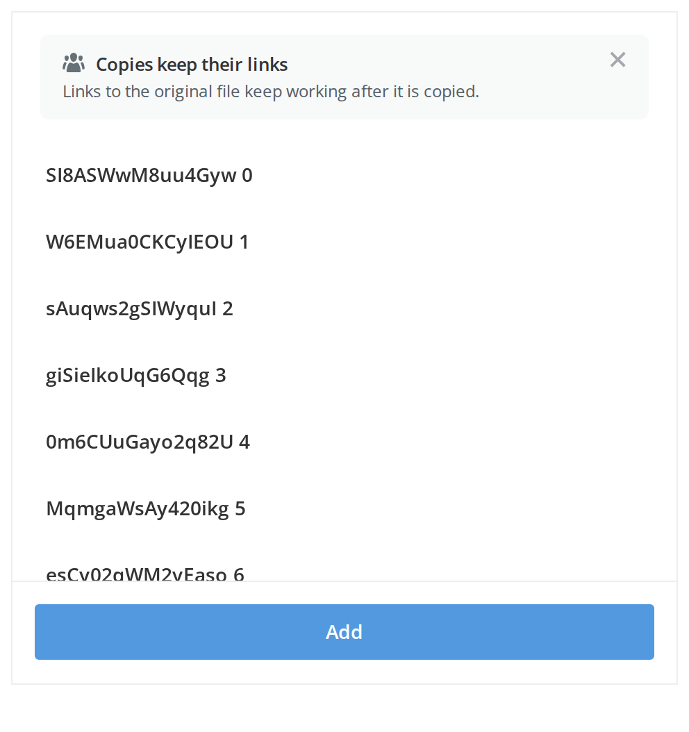
Put a dismissable bar above the list for a notice the reader can read once and close. The cross appears because the bar has an onClose; hiding the bar when it is clicked is up to you (withInfoBar, infoBarData).
In Side Panel
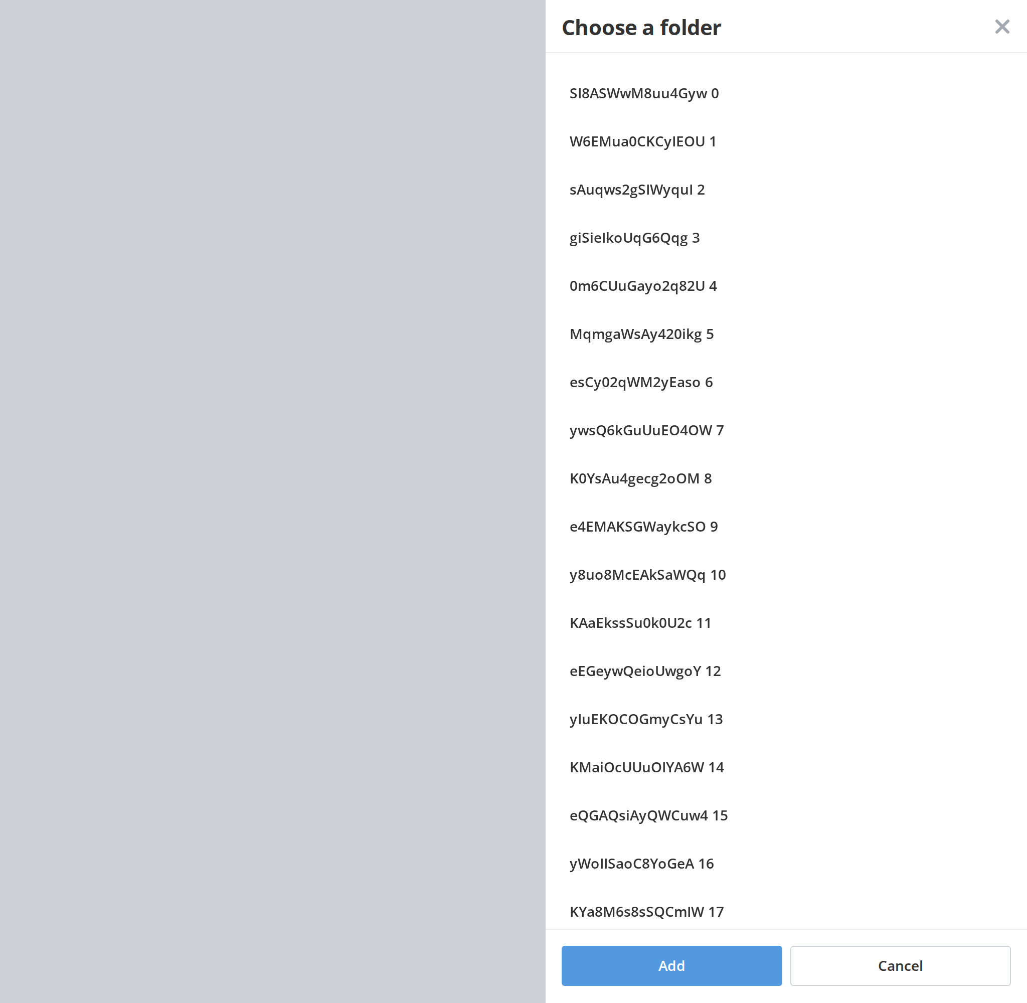
Open Selector as a side panel over the page when picking is a step on its own. The panel slides in from the edge of the window over a dimmed backdrop, and a click on the backdrop calls onClose (useAside); without it, Selector is a plain box that fills its parent.
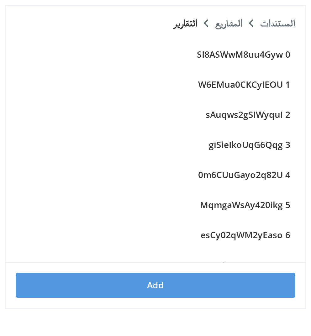
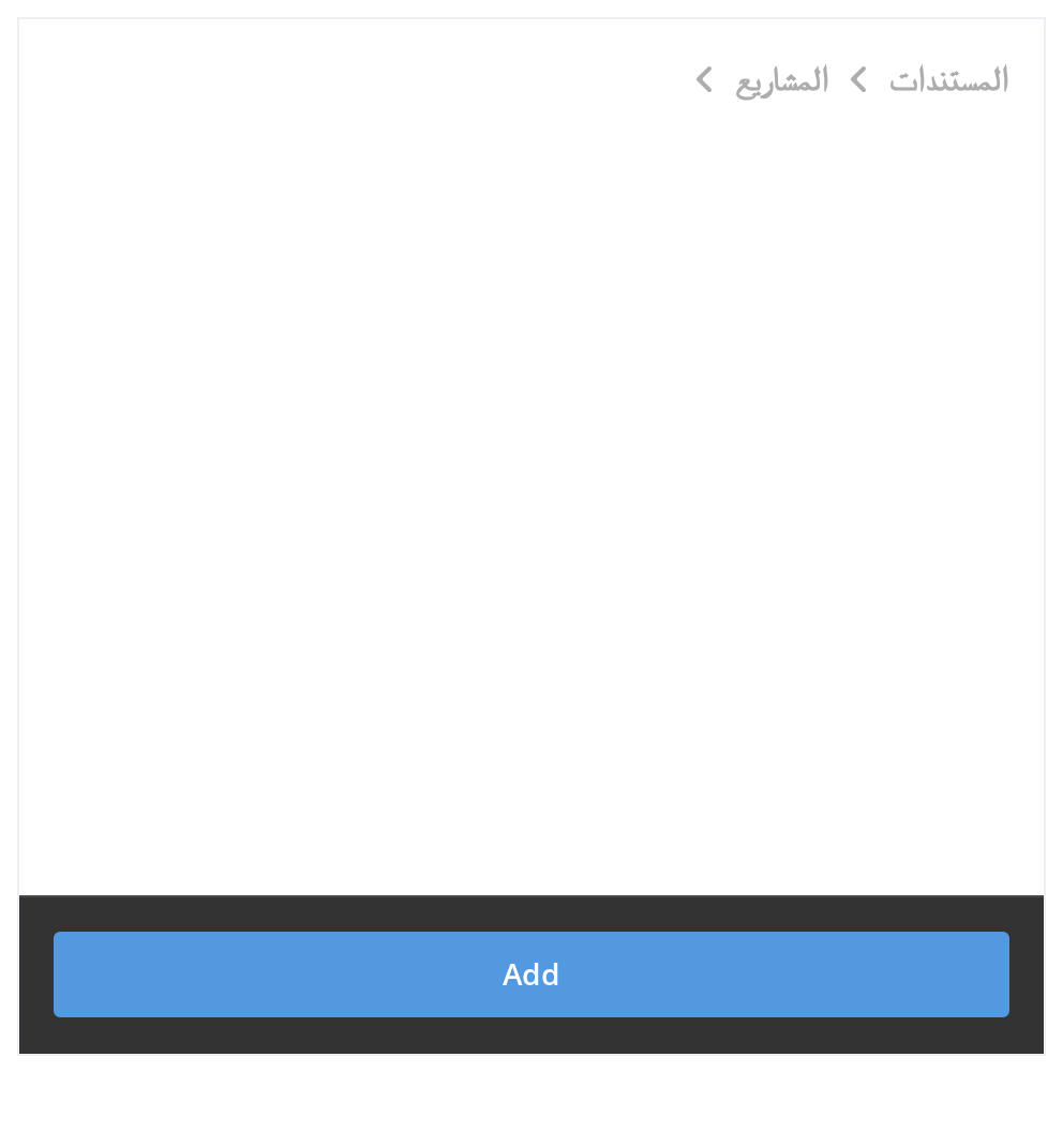
Right To Left
The panel in a right-to-left layout: the folder trail starts at the right edge with its arrows pointing left, and the row labels and the footer button line up from the right.
Css Customization
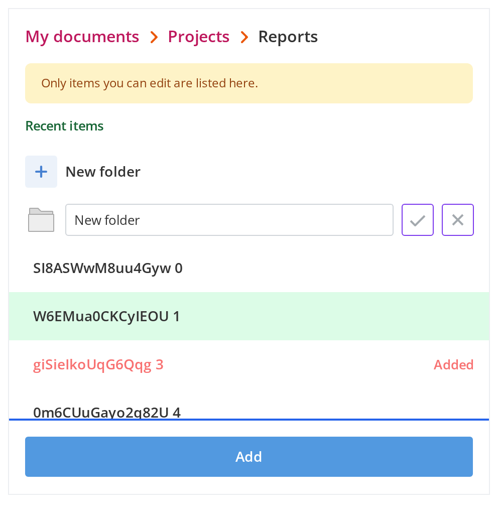
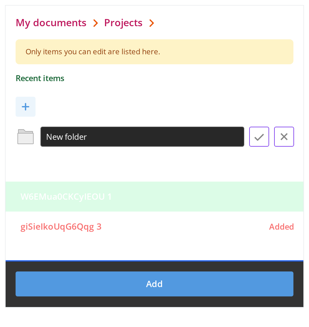
Every overridable variable set on one wrapper -- the variables are listed under CSS variables on this page. Hover a row to see the hover background and hover the tick beside the name field to see its hover colour. The two empty-screen variables are set too but show only when the list is empty.
Minimal example
The six empty-screen fields and the pagination four are required even for a list that never paginates, so the smallest working Selector is still a dozen props.
import { useCallback, useState } from "react";
import {
  RowLoader,
  Selector,
  type TSelectorItem,
} from "@onlyoffice/apps-ui-kit/components/selector";

export function PickOnePerson({ people }: { people: TSelectorItem[] }) {
  const [chosen, setChosen] = useState<TSelectorItem | null>(null);

  const loadNextPage = useCallback(async () => {}, []);

  return (
    <div style={{ width: 480, height: 485 }}>
      <Selector
        items={people}
        totalItems={people.length}
        hasNextPage={false}
        isNextPageLoading={false}
        isLoading={false}
        disableFirstFetch
        loadNextPage={loadNextPage}
        rowLoader={<RowLoader isContainer />}
        isMultiSelect={false}
        selectedItem={chosen}
        onSelect={(item) => setChosen(item)}
        submitButtonLabel="Add"
        disableSubmitButton={false}
        onSubmit={(selected) => {
          console.log(selected);
        }}
        emptyScreenImage=""
        emptyScreenHeader="Nobody here yet"
        emptyScreenDescription="Invite somebody and they will show up in this list."
        searchEmptyScreenImage=""
        searchEmptyScreenHeader="Nothing matches"
        searchEmptyScreenDescription="Try a shorter query."
      />
    </div>
  );
}
Props
Every with… flag below takes true or nothing at all — withSearch={false} does not
type-check. Setting one makes the props listed beside it required, which is how the type says
"a search box needs somewhere to send the query".
headerProps
Required once withHeader is set.
TSelectorItem
One entry of items. Only label is required; which of the rest matter depends on what the
row stands for — a person carries email and status, a room carries roomType and shared,
and the two marker fields isCreateNewItem and isInputItem turn the row into the create link
and the inline name field.
TBreadCrumb
TAccessRight
TInfoBarData
Enums
| Enum | Members |
|---|---|
SelectorAccessRightsMode | Compact, Detailed |
AvatarRole | owner, admin, guest, user, manager, collaborator, none |
Recipes
Loading
isLoading replaces the body with rowLoader on the first fetch. isContentLoading is the
other one: it leaves the rows where they are and dims them, which is what a search or a folder
change wants — and it wins when both are set.
import { useCallback, useState } from "react";
import {
  RowLoader,
  SearchLoader,
  Selector,
  type TSelectorItem,
} from "@onlyoffice/apps-ui-kit/components/selector";

export function SearchablePeople({
  fetchPage,
}: {
  fetchPage: (query: string) => Promise<TSelectorItem[]>;
}) {
  const [items, setItems] = useState<TSelectorItem[]>([]);
  const [query, setQuery] = useState("");
  const [isFirstLoad, setIsFirstLoad] = useState(true);
  const [isRefreshing, setIsRefreshing] = useState(false);

  const run = useCallback(
    async (next: string, first: boolean) => {
      if (first) setIsFirstLoad(true);
      else setIsRefreshing(true);

      setItems(await fetchPage(next));
      setIsFirstLoad(false);
      setIsRefreshing(false);
    },
    [fetchPage],
  );

  const loadNextPage = useCallback(async () => {
    await run(query, true);
  }, [query, run]);

  return (
    <div style={{ width: 480, height: 485 }}>
      <Selector
        items={items}
        totalItems={items.length}
        hasNextPage={false}
        isNextPageLoading={false}
        isLoading={isFirstLoad}
        isContentLoading={isRefreshing}
        loadNextPage={loadNextPage}
        rowLoader={<RowLoader isContainer />}
        withSearch
        searchLoader={<SearchLoader />}
        isSearchLoading={false}
        searchValue={query}
        searchPlaceholder="Search"
        onSearch={(value, entered) => {
          setQuery(value);
          entered?.();
          void run(value, false);
        }}
        onClearSearch={(left) => {
          setQuery("");
          left?.();
          void run("", false);
        }}
        isMultiSelect={false}
        submitButtonLabel="Add"
        disableSubmitButton={false}
        onSubmit={(selected) => {
          console.log(selected);
        }}
        emptyScreenImage=""
        emptyScreenHeader="Nobody here yet"
        emptyScreenDescription="Invite somebody and they will show up in this list."
        searchEmptyScreenImage=""
        searchEmptyScreenHeader="Nothing matches"
        searchEmptyScreenDescription="Try a shorter query."
      />
    </div>
  );
}
Many at once, with a header and a cancel button
isMultiSelect puts a checkbox on every row and appends the count to the submit label, so pass
"Add", not "Add (3)". The footer appears with the first tick unless alwaysShowFooter is set.
import { useCallback, useState } from "react";
import {
  RowLoader,
  Selector,
  type TSelectorItem,
} from "@onlyoffice/apps-ui-kit/components/selector";

export function PickSeveral({
  people,
  onDone,
}: {
  people: TSelectorItem[];
  onDone: (chosen: TSelectorItem[]) => void;
}) {
  const [isSaving, setIsSaving] = useState(false);
  const loadNextPage = useCallback(async () => {}, []);

  return (
    <div style={{ width: 480, height: 485 }}>
      <Selector
        withHeader
        headerProps={{
          headerLabel: "Add people",
          onCloseClick: () => onDone([]),
          onBackClick: () => {},
          withoutBackButton: false,
          withoutBorder: false,
        }}
        items={people}
        totalItems={people.length}
        hasNextPage={false}
        isNextPageLoading={false}
        isLoading={false}
        disableFirstFetch
        loadNextPage={loadNextPage}
        rowLoader={<RowLoader isContainer isMultiSelect />}
        isMultiSelect
        withSelectAll
        selectAllLabel="All accounts"
        selectAllIcon=""
        onSelectAll={() => {}}
        withCancelButton
        cancelButtonLabel="Cancel"
        onCancel={() => onDone([])}
        submitButtonLabel="Add"
        disableSubmitButton={isSaving}
        onSubmit={async (chosen) => {
          setIsSaving(true);
          onDone(chosen);
          setIsSaving(false);
        }}
        emptyScreenImage=""
        emptyScreenHeader="Nobody here yet"
        emptyScreenDescription="Invite somebody and they will show up in this list."
        searchEmptyScreenImage=""
        searchEmptyScreenHeader="Nothing matches"
        searchEmptyScreenDescription="Try a shorter query."
      />
    </div>
  );
}
As a side panel
useAside is the only thing that makes Selector a panel: it wraps itself in a
Backdrop and an Aside at z-index 310. There
is still no visibility prop — mount it when it should be open.
import { useCallback, useState } from "react";
import {
  RowLoader,
  Selector,
  type TSelectorItem,
} from "@onlyoffice/apps-ui-kit/components/selector";

export function PeoplePanel({ people }: { people: TSelectorItem[] }) {
  const [isOpen, setIsOpen] = useState(false);
  const loadNextPage = useCallback(async () => {}, []);

  return (
    <>
      <button type="button" onClick={() => setIsOpen(true)}>
        Members
      </button>

      {isOpen ? (
        <Selector
          useAside
          onClose={() => setIsOpen(false)}
          withHeader
          headerProps={{
            headerLabel: "Members",
            onCloseClick: () => setIsOpen(false),
          }}
          items={people}
          totalItems={people.length}
          hasNextPage={false}
          isNextPageLoading={false}
          isLoading={false}
          disableFirstFetch
          loadNextPage={loadNextPage}
          rowLoader={<RowLoader isContainer />}
          isMultiSelect={false}
          submitButtonLabel="Add"
          disableSubmitButton={false}
          onSubmit={() => setIsOpen(false)}
          emptyScreenImage=""
          emptyScreenHeader="Nobody here yet"
          emptyScreenDescription="Invite somebody and they will show up in this list."
          searchEmptyScreenImage=""
          searchEmptyScreenHeader="Nothing matches"
          searchEmptyScreenDescription="Try a shorter query."
        />
      ) : null}
    </>
  );
}
"Save as": a folder trail and a file name
withBreadCrumbs draws the trail above the list and withFooterInput puts a name field in the
footer. A crumb click only reports the crumb — loading that folder is yours — and the edited
name comes back as onSubmit's third argument.
import { useCallback, useState } from "react";
import {
  BreadCrumbsLoader,
  RowLoader,
  Selector,
  type TBreadCrumb,
  type TSelectorItem,
} from "@onlyoffice/apps-ui-kit/components/selector";

export function SaveAs({
  folders,
  trail,
  openFolder,
  save,
}: {
  folders: TSelectorItem[];
  trail: TBreadCrumb[];
  openFolder: (crumb: TBreadCrumb) => void;
  save: (folder: TSelectorItem | undefined, name: string) => void;
}) {
  const [folder, setFolder] = useState<TSelectorItem | null>(null);
  const loadNextPage = useCallback(async () => {}, []);

  return (
    <div style={{ width: 480, height: 485 }}>
      <Selector
        withBreadCrumbs
        breadCrumbs={trail}
        onSelectBreadCrumb={openFolder}
        isBreadCrumbsLoading={false}
        breadCrumbsLoader={<BreadCrumbsLoader />}
        bodyIsLoading={false}
        withFooterInput
        footerInputHeader="File name"
        currentFooterInputValue="Report.docx"
        items={folders}
        totalItems={folders.length}
        hasNextPage={false}
        isNextPageLoading={false}
        isLoading={false}
        disableFirstFetch
        loadNextPage={loadNextPage}
        rowLoader={<RowLoader isContainer />}
        isMultiSelect={false}
        selectedItem={folder}
        onSelect={(item) => setFolder(item)}
        submitButtonLabel="Save"
        disableSubmitButton={false}
        onSubmit={(selected, _access, fileName) => save(selected[0], fileName)}
        emptyScreenImage=""
        emptyScreenHeader="This folder is empty"
        emptyScreenDescription="Save here, or pick another folder."
        searchEmptyScreenImage=""
        searchEmptyScreenHeader="Nothing matches"
        searchEmptyScreenDescription="Try a shorter query."
      />
    </div>
  );
}
Behaviour the types don't state
- It needs a parent with a real height. The body measures itself and hands the pixel count
to the virtual list; in a box of automatic height the list is zero tall and you see the
chrome with nothing under it.
isSSRis the escape hatch — it renders every row as plain markup until a height is measured. - The list height is arithmetic, not layout. Each part is subtracted from the measured
body: search 44px, tabs 33px, breadcrumbs 38px, "select all" 61px,
descriptionText32px, padding 16px, header 54px (70px without tabs), footer 73px — 110px with the checkbox, 145px with the input, 181px with both, plus 20px while the input is in error. A part you style to a different height will not move the list. - Selection is seeded, not controlled.
selectedItems,selectedItem,isCheckedandcurrentFooterInputValueare copied into Selector's own state; changing them afterwards does not move the ticks, and the current values come back to you throughonSubmit, never through a change handler. - It fetches on mount.
loadNextPage(0)runs in an effect on the first render unlessdisableFirstFetchis set — including when you have already put a page initems. - Escape and Enter are bound to the window, not to the panel: Escape calls
onCanceland Enter submits wherever focus happens to be on the page, and both stand down only while the inline name row is open. Two Selectors on one page both answer the same key. - The search callback is what shows the search empty screen.
onSearchhands you the trimmed query and a callback; until you call it Selector does not consider itself searching, so a query that matches nothing shows the folder empty screen. A query that trims to nothing routes toonClearSearchinstead. - The back arrow is drawn only for
withoutBackButton: false. Leaving the prop out hides it, exactly astruedoes. - Rows are 48px, always. A separator row is 16px, or 25px with
isSectionSeparator. Nothing measures a row's content. - Two rows have fixed positions. The
isCreateNewItemrow must be first initems, and theisInputItemrow second; the inline name field takes over the whole body while it is there, and the empty screen turns the create row into its link. maxSelectedItemsfails silently. Past the limit the unticked rows go grey and stop responding, with no message and no callback.- A row with
isSystemis sorted to the top and a divider is spliced in beneath it. bodyIsLoadingandwithBlurare dead. The first is overwritten with Selector's ownisLoadingbefore the breadcrumbs see it — the type still demands it oncewithBreadCrumbsis set. The second is destructured and never read.- The strings Selector prints itself — the user-type labels, "Back", "Clear filter" and the footer's "contains special characters" — come from the app's i18n instance, not from props.
CSS variables
The two empty-screen variables show only while the list is empty. The theme also defines
--selector-empty-screen-button-color and --selector-empty-screen-hover-button-color, but
the stylesheet reads neither, so setting them changes nothing.
Accessibility
- The list is not reachable from the keyboard. Rows are
<div>s with anonClick, carry no role and are never focusable; only the rows near the viewport exist in the DOM at all, so assistive technology is given no list, no count and no position. In multi-select the row's checkbox is focusable with Tab and toggled with Space, and that is the only way through the list; outside multi-select a row can be picked only with the pointer. - Focus moves into the selector when it mounts: to the list's scroll container, unless the
search box already has it, and to the new-name field when that field appears, with its text
selected. Neither scrolls the page (
preventScroll), so a selector further down a page takes focus without pulling the page to itself. - The search box is given
tabIndex={1}, a positive tab index, which pulls it ahead of everything else on the page in tab order. - Escape and Enter are listened for on the window, so they act even when focus is outside the panel — and Enter submits without the button being focused.
- The empty screen's create and back controls are
<div>s with click handlers, not buttons. - The footer's submit and cancel buttons are native buttons, reached with Tab and pressed with Enter or Space.
- Give the panel a name yourself:
headerProps.headerLabelrenders as text, not as a label for the region.
Test ids
Only the first can be overridden by a prop.
Related
Aside— the paneluseAsidewraps this in.SearchInput— the search box, whoseonChangegives a string.Table— for rows with columns rather than a single label.