LoaderWrapper
Dims whatever is inside it and stops the mouse reaching it while something is loading. It draws nothing itself — no spinner, no overlay, no text — so the busy state has to be visible some other way.
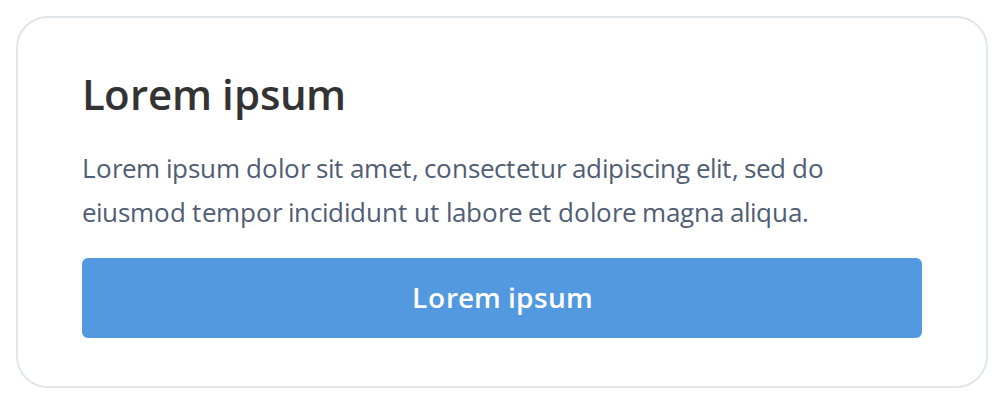
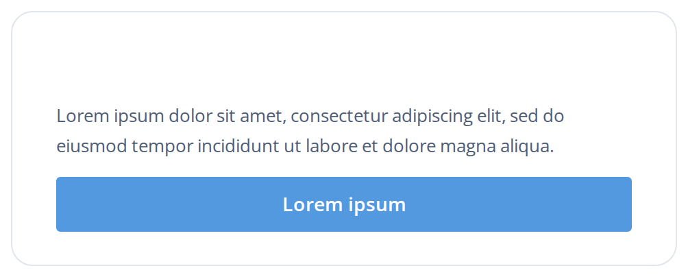
Use this when / not when
- Use to keep a form or a panel on screen, greyed out, while it is being saved or refreshed.
- It shows no loading indicator. Put a
Loader, a skeleton or aProgressBarnext to it, or the screen just fades with no explanation. - Not for the first paint of a whole application — that is
AppLoader, which covers the viewport. - It is not a disabled state. Only the pointer is blocked; see the accessibility section.
- Not a replacement for unmounting. The children stay mounted and keep running their effects.
Import
import { LoaderWrapper } from "@onlyoffice/apps-ui-kit/components/loader-wrapper";
Also exported from the root barrel @onlyoffice/apps-ui-kit.
It needs no provider above it: everything it sets is an inline style, and it has no colours.
Stories
Default
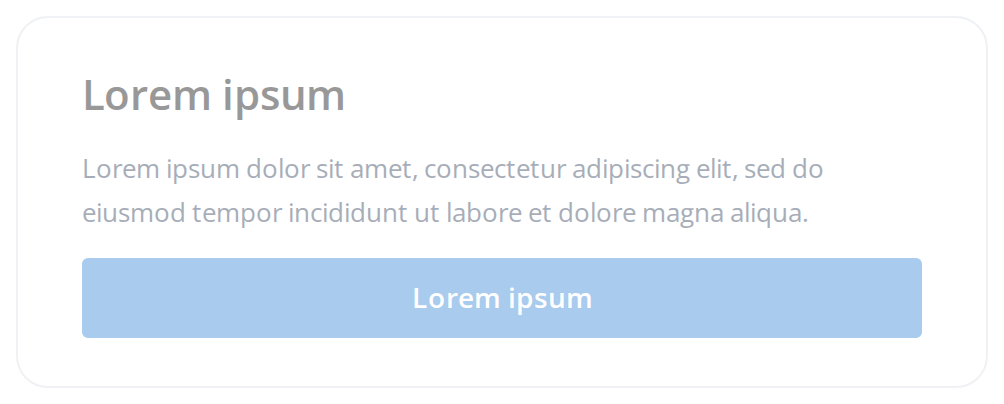
The content as it looks when nothing is loading: fully opaque and clickable. Switch isLoading in the Controls panel below to watch it fade and back.
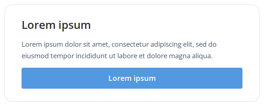
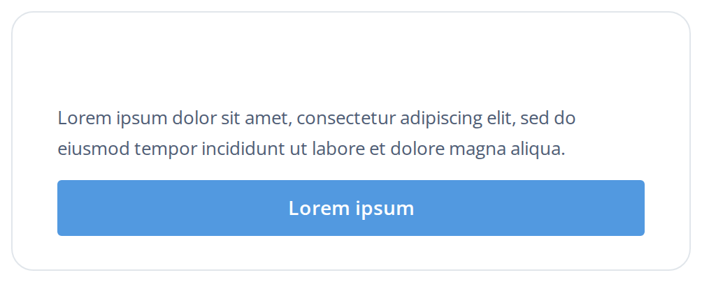
Loading Content
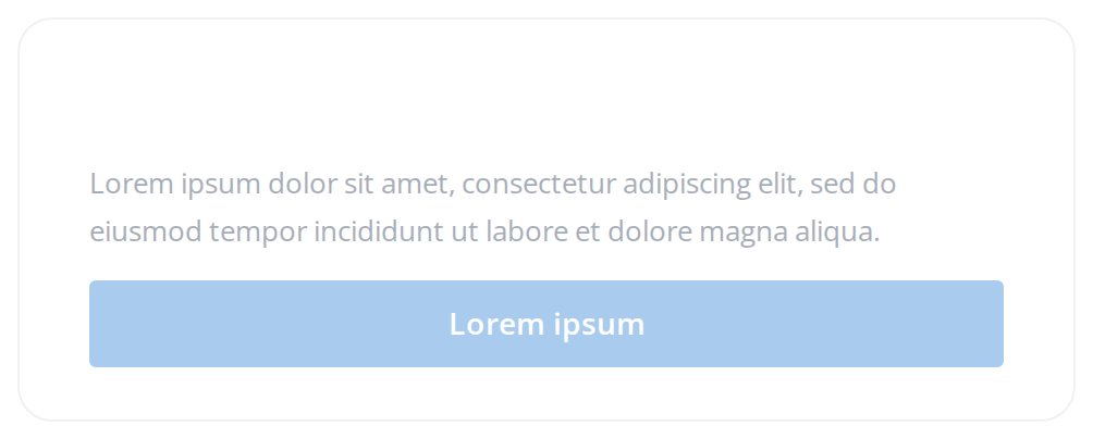
The same card while loading: it stays on screen at half opacity so the reader keeps their place, and the button no longer answers the mouse (isLoading). Place a loader beside it to say why.
Css Customization
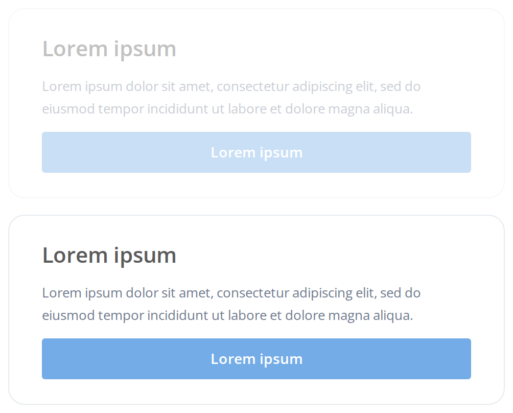
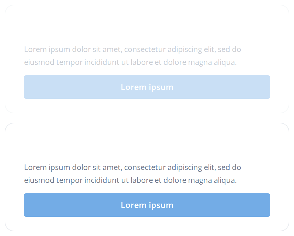
Both opacities and the transition set on one wrapper -- the variables are listed under CSS variables on this page. The first card is loading and shows --loader-wrapper-loading-opacity; the second is idle and shows --loader-wrapper-idle-opacity. --loader-wrapper-transition takes effect only when isLoading changes on an instance, which these two cards never do.
Minimal example
import { useState } from "react";

import { LoaderWrapper } from "@onlyoffice/apps-ui-kit/components/loader-wrapper";
import { Button } from "@onlyoffice/apps-ui-kit/components/button";

export function SavePanel() {
  const [saving, setSaving] = useState(false);

  const save = async () => {
    setSaving(true);
    await new Promise((resolve) => setTimeout(resolve, 1000));
    setSaving(false);
  };

  return (
    <LoaderWrapper isLoading={saving}>
      <Button primary label="Save" isLoading={saving} onClick={save} />
    </LoaderWrapper>
  );
}
Props
Recipes
Loading
The wrapper only fades. Pair it with something that says why, and keep that something outside the wrapper so it is not dimmed as well.
import { useState } from "react";

import { LoaderWrapper } from "@onlyoffice/apps-ui-kit/components/loader-wrapper";
import { Loader, LoaderTypes } from "@onlyoffice/apps-ui-kit/components/loader";
import { Text } from "@onlyoffice/apps-ui-kit/components/text";

export function Members({ names }: { names: string[] }) {
  const [loading, setLoading] = useState(true);

  return (
    <div style={{ position: "relative" }}>
      <LoaderWrapper isLoading={loading}>
        {names.map((name) => (
          <Text key={name}>{name}</Text>
        ))}
      </LoaderWrapper>
      {loading ? (
        <div
          style={{
            position: "absolute",
            inset: 0,
            display: "grid",
            placeItems: "center",
          }}
        >
          <Loader type={LoaderTypes.oval} size="24px" />
        </div>
      ) : null}
      <button type="button" onClick={() => setLoading((value) => !value)}>
        toggle
      </button>
    </div>
  );
}
Dimming less, or not at all
The two opacities are custom properties with fallbacks, so an ancestor can change them without a class. This is also how you switch the effect off for a viewer who has asked for less motion.
import type { CSSProperties } from "react";

import { LoaderWrapper } from "@onlyoffice/apps-ui-kit/components/loader-wrapper";
import { Text } from "@onlyoffice/apps-ui-kit/components/text";

export function SubtleDim() {
  return (
    <div
      style={
        {
          "--loader-wrapper-loading-opacity": "0.8",
          "--loader-wrapper-transition": "opacity 0.6s ease-in-out",
        } as CSSProperties
      }
    >
      <LoaderWrapper isLoading>
        <Text>Barely dimmed while it loads</Text>
      </LoaderWrapper>
    </div>
  );
}
Behaviour the types don't state
- It renders no loading indicator of any kind. The whole component is one
<div>with an opacity, apointer-eventsvalue and a transition; nothing spins, and nothing says "loading". - The pointer lock covers clicks, hovers and wheel scrolling. Hover styles inside do not react, and the wheel over the dimmed content scrolls whatever is behind it instead.
pointer-events: nonedoes not stop the keyboard. Everything inside stays in the tab order and still fires on Enter or Space, so a button that is visibly greyed out can still be pressed by a keyboard user. Disable the controls themselves as well.- It is a flex column that grows.
display: flex,flex-direction: columnandflex-grow: 1are always on, so inside a flex parent it takes the free space, and children are laid out in a column whatever they were before. min-height: 0is deliberate. Without it the wrapper could not shrink below its content and a bounded flex parent would scroll the whole page instead of the inner viewport. In a content-sized parent it changes nothing.- There is no stylesheet. Every declaration is an inline style, which beats any class you add, and the three custom properties below are the only way to change the result.
- An empty
testIdfalls back, because the value is chosen with||rather than??. - The children are never unmounted, so their timers, subscriptions and requests keep running while the wrapper is dimmed.
CSS variables
They are read from inline styles, so they must be declared on this element or on one of its ancestors; a rule matching a class of your own will not reach them.
The transition animates the fade both ways, but only when isLoading changes on a mounted
instance; a wrapper that mounts already loading starts at the dimmed opacity with no fade.
Accessibility
- Nothing here is announced. There is no
aria-busy, no live region and no role. Setaria-busyon the region yourself and move focus deliberately when the content arrives. - The dimmed content is still operable from the keyboard, and still read in full by a screen
reader, at odds with what the fade suggests. Disable or
aria-disabledthe controls inside for the state to be true for everyone. - At the default 0.5 the text contrast is halved, which will fail WCAG for body text. Raise
--loader-wrapper-loading-opacitywhere the dimmed text still has to be read.
Test ids
Related
Loader— the spinner to put next to it.AppLoader— the full-viewport version, for the first paint.ProgressBar— when the wait has a measurable end.