BaseTile
The tile shell: an icon that turns into a checkbox, a slot for the content, a three-dot menu and a
lower half. RoomTile and
TemplateTile are this component with their halves filled in; the
file and folder tiles are not, and repeat the same logic separately.


Use this when / not when
- Use for a tile the kit does not already have — anything that wants the same selection behaviour, context menu and two-part layout.
- Not for a file or a folder —
FileTileandFolderTileadd the thumbnail and the click-to-select handling that this component does not have. - Not for a room or a template —
RoomTileandTemplateTilealready wrap this one. - A plain click does not select. Unlike the file and folder tiles, this one only selects
through the checkbox, or through a tap on the icon below 600px.
onRoomClickis where you put your own handler. - There is no thumbnail.
thumbnailClickis in the type and is read by nothing; the picture, if you want one, goes intopContent.
Import
import { BaseTile } from "@onlyoffice/apps-ui-kit/components/tiles/base-tile";
components/index.ts does not list this folder, but it lists tiles, and export *
is transitive — so the name arrives from @onlyoffice/apps-ui-kit/components/tiles and from
the root barrel @onlyoffice/apps-ui-kit as well.
Needs ThemeProvider for its colours and TranslationProvider for the three-dot button's
tooltip, which it asks the kit's own translation hook for under the key
TitleShowFolderActions; without it that tooltip is empty.
Stories
Default
A document as a tile: its icon, its name, and a checkbox that takes the icon's place on hover. Tick it, right-click the tile for its menu, and change any other prop live in the Controls panel below.
Checked
A selected tile, as it looks among others the reader has picked: the checkbox stays ticked in place of the icon and the background stays tinted (checked).


Active
The tile whose menu is open or that an action is running on keeps the hover background after the pointer leaves, so the reader can tell which one it is (isActive).


In Progress
A tile whose item is busy, being copied or converted: a small loader stands where the icon and the checkbox were (inProgress).


With Hotkey Border
The tile the keyboard is on while the reader moves through the grid with the arrow keys: an accent border marks it (showHotkeyBorder). The tile does not handle the keys itself.


With Bottom Content
A tile with a second row under the title, for tags or a line of details (bottomContent).


With Menu Button
A tile whose actions are reachable without a right-click: the three-dot button opens the same menu. It is drawn only when the item carries a contextOptions key of its own, whatever the contextOptions prop holds.


Renaming State
A tile whose name is being edited: the icon and the checkbox go, so the title row can hold a text field across the tile, and hovering no longer tints it (isEdit).


Blocking Operation
A tile an operation is running over, which must not be picked or opened until it ends: hover it, click it or right-click it and nothing happens (isBlockingOperation). It looks the same as an idle tile, so show the operation somewhere else.
Css Customization
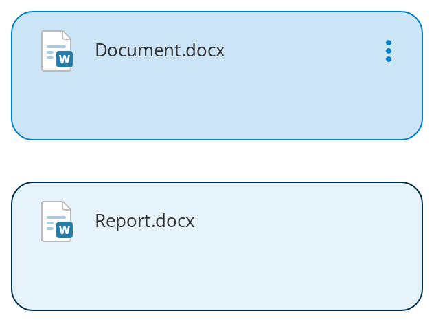
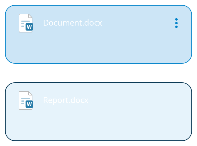
Every overridable variable set on one wrapper -- the variables are listed under CSS variables on this page. The first tile shows every variable but the hotkey colour; hover it for the hover background. The second is there for --tile-hotkey-color, which only a tile with showHotkeyBorder draws.
Minimal example
import { BaseTile } from "@onlyoffice/apps-ui-kit/components/tiles/base-tile";
import { TileContent } from "@onlyoffice/apps-ui-kit/components/tiles/tile-content";
import { Text } from "@onlyoffice/apps-ui-kit/components/text";

const item = { id: "a1", title: "Quarterly report" };

export function SimpleTile() {
  return (
    <BaseTile
      item={item}
      contextOptions={[]}
      topContent={
        <TileContent>
          <Text truncate>{item.title}</Text>
        </TileContent>
      }
    />
  );
}
Props
Recipes
Selection
The checkbox is drawn next to element and reports through onSelect. Hold checked yourself:
the tile has no state.
import { useState } from "react";

import { BaseTile } from "@onlyoffice/apps-ui-kit/components/tiles/base-tile";
import { TileContent } from "@onlyoffice/apps-ui-kit/components/tiles/tile-content";
import { Text } from "@onlyoffice/apps-ui-kit/components/text";

const item = { id: "a1", title: "Quarterly report" };

export function SelectableTile() {
  const [checked, setChecked] = useState(false);

  return (
    <BaseTile
      item={item}
      checked={checked}
      onSelect={(next) => setChecked(next)}
      contextOptions={[]}
      element={<span aria-hidden="true">📄</span>}
      topContent={
        <TileContent>
          <Text truncate>{item.title}</Text>
        </TileContent>
      }
    />
  );
}
Loading
inProgress replaces the icon and the checkbox with the kit's track loader. On its own it is an
indicator, not a lock; isBlockingOperation, added here, is what stops the pointer reaching the
tile until the operation ends.
import { BaseTile } from "@onlyoffice/apps-ui-kit/components/tiles/base-tile";
import { TileContent } from "@onlyoffice/apps-ui-kit/components/tiles/tile-content";
import { Text } from "@onlyoffice/apps-ui-kit/components/text";

const item = { id: "a1", title: "Uploading…" };

export function BusyTile() {
  return (
    <BaseTile
      item={item}
      inProgress
      isBlockingOperation
      contextOptions={[]}
      element={<span aria-hidden="true">📄</span>}
      topContent={
        <TileContent>
          <Text truncate>{item.title}</Text>
        </TileContent>
      }
    />
  );
}
The context menu
Two conditions have to hold before the three-dot button appears: contextOptions must be
non-empty and item must have a contextOptions key of its own. The key's value is never
read — only its presence. For the right-click menu, add getContextModel.
import { BaseTile } from "@onlyoffice/apps-ui-kit/components/tiles/base-tile";
import { TileContent } from "@onlyoffice/apps-ui-kit/components/tiles/tile-content";
import { Text } from "@onlyoffice/apps-ui-kit/components/text";

const options = [{ key: "open", label: "Open", onClick: () => {} }];
// The key on the item is the switch; its value is ignored.
const item = { id: "a1", title: "Quarterly report", contextOptions: [] };

export function TileWithMenu() {
  return (
    <BaseTile
      item={item}
      contextOptions={options}
      getContextModel={() => options}
      element={<span aria-hidden="true">📄</span>}
      topContent={
        <TileContent>
          <Text truncate>{item.title}</Text>
        </TileContent>
      }
    />
  );
}
Behaviour the types don't state
- The three-dot button needs the flag on the item as well as the prop. The component tests
hasOwnProperty(item, "contextOptions")and only then checks that thecontextOptionsprop is non-empty.TileItemdoes not declare that key, so the type system will not remind you; passcontextOptionsalone and you get an empty placeholderdivwith the classexpandButtoninstead of a button. - The right-click menu needs
getContextModel. Right-clicking always stops propagation and callstileContextClick(true), but the menu is only shown when that prop is set — a tile withcontextOptionsand nogetContextModelswallows the browser's own menu and offers nothing in its place. - A right-click also clicks
forwardRef. When the menu is not mounted yet, the component calls.click()on whatever that ref points at. It attaches the ref to nothing itself, so this fires a click on an element you own. - A tap on the icon selects, but only below 600px. The handler returns immediately on a wider window, so the same gesture does nothing on a narrow desktop window.
- The context menu's header comes from the first child of
topContent. If that child has anitemprop, its title, icon and logo are used; otherwise the tile's ownitemis. Passing a wrapperdivas the first child therefore changes the menu's header. elementis the switch for the whole corner. Without it neither the icon nor the checkbox is rendered, so a tile with noelementcannot be selected at all.- The checkbox shows when the pointer is over the icon, not over the whole tile, and stays
shown while
checked. UnderinProgresshovering the corner shows nothing, because the loader has taken its place. isBlockingOperationispointer-events: noneand nothing else. Hover, clicks and right-clicks stop reaching the tile, but it looks exactly like an idle one, so show the operation somewhere else. Keyboard focus still reaches the checkbox.isEditremoves that corner too, leavingtopContentthe full width for a rename field.thumbnailClickis dead — declared and never read.onRoomClickis the tile'sonClick. The name is the portal's; it fires on any click anywhere in the tile, including on the checkbox.
CSS variables
Accessibility
- The tile is a plain
<div>with click and context-menu handlers: no role, notabindex, no key handling. Nothing in it is reachable by keyboard except the checkbox and whatever you put intopContentandbottomContent. - The checkbox is the kit's
Checkboxand is a real input, so selection is operable — but it carries no label. Give it one through the content, or mark the tile up as a list item yourself. - The three-dot button has a tooltip title from the translation function, which is also its accessible name; without a translation provider it is an unlabelled control.
- Neither
isBlockingOperationnorinProgresssetsaria-busyoraria-disabled.inProgresschanges only the appearance;isBlockingOperationturns off the pointer but not the keyboard, so a busy tile's checkbox can still be toggled from it. - The right-click menu replaces the browser's own and is not reachable from the keyboard: the three-dot button is the only path to those actions, so keep it available.
Test ids
Everything inside carries the ids of Checkbox, ContextMenuButton and ContextMenu.
Related
Tiles— the family this belongs to.RoomTile— this component with the room's tags in its lower half.TemplateTile— this component with the owner and storage lines.