RoomTile
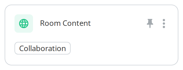
Tile for a room: the logo and name on top, and the room's tags along the bottom. It is
BaseTile with a tag row built for it, and the tag row is the part that
makes it worth using rather than building your own.
Use this when / not when
- Use for a room in a tile listing, where the tags and the room type should be visible and clickable.
- Not for a folder or a document —
FolderTileandFileTile. - Not for a template —
TemplateTileshows the owner and the storage instead of tags. - Not for a card of your own —
BaseTileis the same shell with an empty lower half. - Four props are required and have no sensible empty value:
columnCount,selectTag,selectOptionandgetRoomTypeName. The last one is how a room type becomes a readable label; the kit does not know the portal's room types.
Import
import { RoomTile } from "@onlyoffice/apps-ui-kit/components/tiles/room-tile";
components/index.ts does not list this folder, but it lists tiles, and export *
is transitive — so the name arrives from @onlyoffice/apps-ui-kit/components/tiles and from
the root barrel @onlyoffice/apps-ui-kit as well.
Needs ThemeProvider for its colours and TranslationProvider for two labels it asks the kit's
own translation hook for: the three-dot button's tooltip, and the NoTags line an AI agent gets
when it has no tags.
Stories
Default
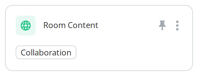
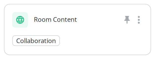
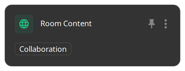
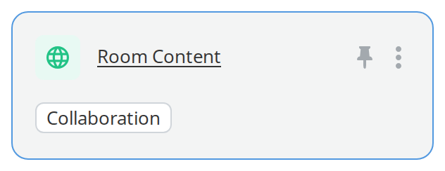
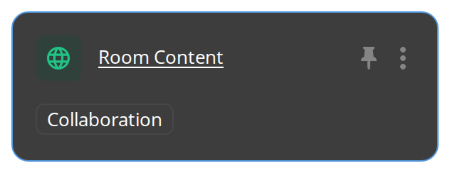
A room with one tag: the logo, the name with a pin badge, the menu, and the tag row below. Hover the logo and tick the checkbox to select the room, click anywhere else or on the tag to see the callbacks in the Actions panel, and change any other prop live in the Controls panel below.
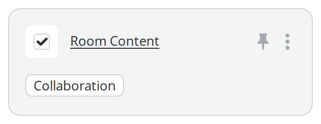
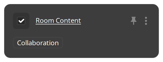
Checked
A selected room, as it looks among others the reader has picked: the checkbox stays ticked in place of the logo and the tile and its tags are tinted (checked).
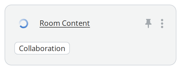
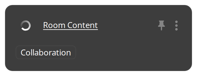
In Progress
A room that is busy, being created or copied: a small loader stands where the logo and the checkbox were (inProgress).
Blocking Operation
A room an operation is running over, which must not be picked or opened until it ends: hover it, click it or right-click it and nothing happens (isBlockingOperation). It looks the same as an idle room, so show the operation somewhere else.
Generated Tags
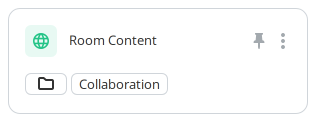
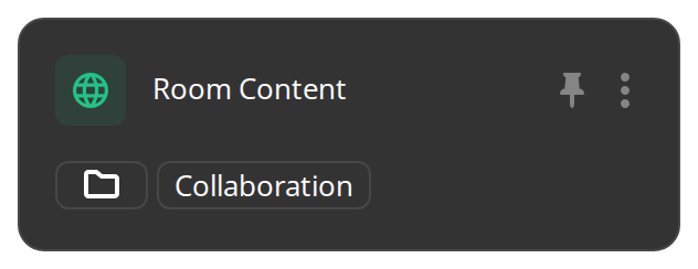
A room with no tags of its own, kept on a connected storage: the tile makes two tags for it: first the storage, drawn as its icon alone (providerType, thirdPartyIcon), then the room type (getRoomTypeName). Click either to see selectOption in the Actions panel.
With Hotkey Border
The tile the keyboard is on while the reader moves through the grid with the arrow keys: its border turns the accent colour (showHotkeyBorder). The tile does not handle the keys itself.
Renaming State
A room whose name is being edited: the logo and the checkbox go, so the name can become a text field, and hovering no longer tints the tile (isEdit).


Custom Bottom Row
A room whose bottom row is the host's own: here a line of text that counts the tags and changes when the pointer is over the tile (customBottomContent). The tile no longer draws its tags.


Css Customization
The variables are listed under CSS variables on this page.
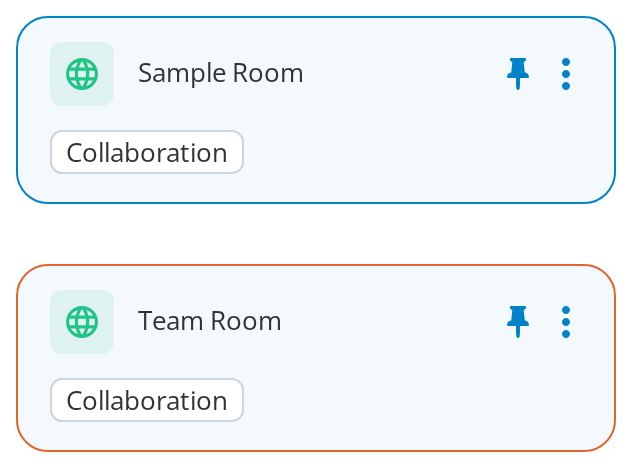
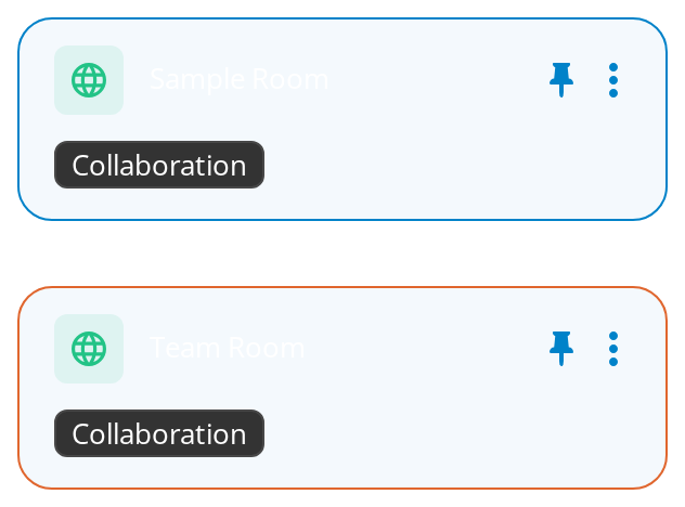
Two instances:
- Sample Room — for every variable but the hotkey colour; hover it for
--tile-hover-bgand--tile-tag-hover-bg. - Team Room —
showHotkeyBorder, for--tile-hotkey-color.
Minimal example
import { RoomTile } from "@onlyoffice/apps-ui-kit/components/tiles/room-tile";
import { TileContent } from "@onlyoffice/apps-ui-kit/components/tiles/tile-content";
import { Text } from "@onlyoffice/apps-ui-kit/components/text";

const room = {
  id: "r1",
  title: "Marketing",
  roomType: "2",
  isRoom: true,
  contextOptions: [],
};

export function SimpleRoomTile() {
  return (
    <RoomTile
      item={room}
      contextOptions={[]}
      columnCount={2}
      selectTag={() => {}}
      selectOption={() => {}}
      getRoomTypeName={(type) => (type === "2" ? "Collaboration room" : "Room")}
    >
      <TileContent>
        <Text truncate>{room.title}</Text>
      </TileContent>
    </RoomTile>
  );
}
Props
Recipes
Opening the room
thumbnailClick is the tile's open handler despite its name: it fires on a click anywhere except
the checkbox, the tags, the badges, an open dialog, the three-dot button and the menu.
import { RoomTile } from "@onlyoffice/apps-ui-kit/components/tiles/room-tile";
import { TileContent } from "@onlyoffice/apps-ui-kit/components/tiles/tile-content";
import { Text } from "@onlyoffice/apps-ui-kit/components/text";

const room = {
  id: "r1",
  title: "Marketing",
  roomType: "2",
  contextOptions: [],
};

export function OpenableRoomTile({ open }: { open: () => void }) {
  return (
    <RoomTile
      item={room}
      contextOptions={[]}
      columnCount={2}
      thumbnailClick={open}
      selectTag={() => {}}
      selectOption={() => {}}
      getRoomTypeName={() => "Collaboration room"}
    >
      <TileContent>
        <Text truncate>{room.title}</Text>
      </TileContent>
    </RoomTile>
  );
}
Filtering from a tag
A room with tags of its own gets them in the bottom row; a room without gets one generated tag
carrying its type. Clicking a real tag reaches selectTag, clicking a generated one reaches
selectOption with which of the two kinds it was.
import { RoomTile } from "@onlyoffice/apps-ui-kit/components/tiles/room-tile";
import { TileContent } from "@onlyoffice/apps-ui-kit/components/tiles/tile-content";
import { Text } from "@onlyoffice/apps-ui-kit/components/text";

const room = {
  id: "r1",
  title: "Marketing",
  roomType: "2",
  tags: [{ label: "Q4", roomType: 2 }],
  contextOptions: [],
};

export function FilterableRoomTile({
  filterByTag,
  filterByType,
}: {
  filterByTag: (label: string) => void;
  filterByType: (value: string) => void;
}) {
  return (
    <RoomTile
      item={room}
      contextOptions={[]}
      columnCount={2}
      selectTag={(tag) => filterByTag(String(tag.label))}
      selectOption={(option) => filterByType(option.value)}
      getRoomTypeName={() => "Collaboration room"}
    >
      <TileContent>
        <Text truncate>{room.title}</Text>
      </TileContent>
    </RoomTile>
  );
}
Your own bottom row
customBottomContent replaces the tag row entirely. It is called on every render with the hover
state and the tags the component worked out, so you can keep those and lay them out differently.
import { RoomTile } from "@onlyoffice/apps-ui-kit/components/tiles/room-tile";
import { TileContent } from "@onlyoffice/apps-ui-kit/components/tiles/tile-content";
import { Text } from "@onlyoffice/apps-ui-kit/components/text";

const room = {
  id: "r1",
  title: "Marketing",
  roomType: "2",
  contextOptions: [],
};

export function RoomTileWithFooter() {
  return (
    <RoomTile
      item={room}
      contextOptions={[]}
      columnCount={2}
      selectTag={() => {}}
      selectOption={() => {}}
      getRoomTypeName={() => "Collaboration room"}
      customBottomContent={(isHovered, tags) => (
        <Text fontSize="12px">
          {isHovered ? "Open room" : `${tags.length} tag(s)`}
        </Text>
      )}
    >
      <TileContent>
        <Text truncate>{room.title}</Text>
      </TileContent>
    </RoomTile>
  );
}
Behaviour the types don't state
thumbnailClickis the tile's click handler, not a thumbnail's. There is no thumbnail here. It fires for a click anywhere in the tile except inside.checkbox,.tags,.advanced-tag,.badges,#modal-dialog,.expandButton,.p-contextmenu, or the element holding the logo and the checkbox.- The bottom row is always populated. With
item.tagsit shows them; without, it shows one generated tag carrying the room type fromgetRoomTypeName— or, for an AI agent, aNoTagslabel from the translations. - A third-party room gets an extra tag first, built from
providerKeyorproviderType, and clicking it callsselectOptionwithtypeProvider. selectTagis not called for every tag. A tag only reaches it if it carries both alabeland aroomType, so a plain string tag is inert; and on an AI agent with no tags of its own, nothing reaches it at all.- The menu's own props are missing from this type.
hideContextMenuandtileContextClickare forwarded to the base tile untouched, butRoomTilePropsdoes not declare either, so TypeScript rejects them on the JSX element and there is no way to be told when the menu closes. - A plain click does not select. Unlike the file and folder tiles, selection here is the checkbox, or a tap on the logo below 600px.
- The three-dot button needs the flag on the item as well as the prop, and the right-click menu
needs
getContextModel— seeBaseTile, which this component wraps. - Only the first child is rendered, above the badges; the rest of
childrenis dropped. isBlockingOperationturns off the pointer and nothing else: hover, clicks and right-clicks stop reaching the tile, but it looks exactly like an idle one, so show the operation elsewhere.elementis the switch for the whole corner: without it neither the logo nor the checkbox is rendered, and the tile cannot be selected.
CSS variables
All but --tile-tag-hover-bg and the logo box are read by BaseTile,
which this component wraps; its section has the details. Hovering the tile also underlines the
name when the content is a link, and that underline has no variable.
Accessibility
- The tile is a plain
<div>with click and context-menu handlers: no role, notabindex, no key handling. The checkbox and whatever you put in the content are the only focusable parts. - The tags are the kit's
Tags; a tag that filters the listing is not a button, so filtering by tag is pointer-only. thumbnailClickis not reachable from the keyboard — make the room's name a real link if the room has to be openable without a mouse.- The room type shown in the generated tag is the only place the type is stated; it is a label, not an accessible description of the tile.
Test ids
The tags, the checkbox and the menu carry their own components' ids.