TileContent
The title slot of a tile: three nested wrappers that give the name its width and its truncation.
It is what goes in a tile's children, and it exists so that every tile in the family lays its
title out the same way.


Use this when / not when
- Use as the single child of
FileTile,FolderTile,RoomTileorTemplateTile. - Not in a row —
RowContentis the same idea for the list view, and it takes several children and splits them into columns. - Not for the badges or the quick actions: those are separate props on the tile, not children.
- It is one slot, not a layout. There is no second column and no side info; whatever you pass is stacked by your own markup inside it.
Import
import { TileContent } from "@onlyoffice/apps-ui-kit/components/tiles/tile-content";
components/index.ts does not list this folder, but it lists tiles, and export *
is transitive — so the name arrives from @onlyoffice/apps-ui-kit/components/tiles and from
the root barrel @onlyoffice/apps-ui-kit as well.
It needs no provider of its own: it sets no colours and reads no context. Whatever you put inside it usually does.
Stories
Default
A file name as a link, the way a tile usually shows it. Click it to see onClick in the Actions panel, and change any other prop live in the Controls panel below.


With Text
A name that should not look clickable, for an item the reader cannot open: plain Text in place of a link.


With Multiple Elements
A name with a badge beside it. The slot takes one element, so the name and the badge go inside a wrapper of your own.
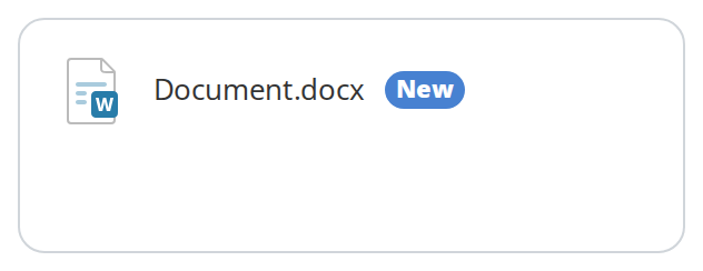

Fixed Title Width
A name held to a set width whatever room the tile has, so the names in a grid end at the same point: the slot takes its width from the child's own containerWidth prop, and truncate on the Text cuts the rest off.


Css Customization
TileContent reads no variables of its own -- the tile's variables it sits in are listed under CSS variables on the BaseTile, FileTile, FolderTile and RoomTile pages. This example sets four of the BaseTile ones on a wrapper; hover the tile to see the hover background.
Minimal example
import { Link } from "@onlyoffice/apps-ui-kit/components/link";
import { TileContent } from "@onlyoffice/apps-ui-kit/components/tiles/tile-content";

export function FileName({ name }: { name: string }) {
  return (
    <TileContent>
      <Link className="item-file-name">{name}</Link>
    </TileContent>
  );
}
Props
Recipes
Giving the title a fixed width
The wrapper's width is taken from the child's own containerWidth prop. The kit's Text and
Link accept it, ignore it themselves and pass it on to the DOM — it exists precisely so that
this component and RowContent can read it back off the element.
import { Text } from "@onlyoffice/apps-ui-kit/components/text";
import { TileContent } from "@onlyoffice/apps-ui-kit/components/tiles/tile-content";

export function FixedWidthTitle({ name }: { name: string }) {
  return (
    <TileContent>
      <Text containerWidth="180px" truncate>
        {name}
      </Text>
    </TileContent>
  );
}
A title with something beside it
children is typed as one element, so anything richer goes inside a wrapper of your own. Put the
class item-file-name on the name itself: the file and folder tiles check for it and skip
selecting the tile when the click landed there.
import { Link } from "@onlyoffice/apps-ui-kit/components/link";
import { Text } from "@onlyoffice/apps-ui-kit/components/text";
import { TileContent } from "@onlyoffice/apps-ui-kit/components/tiles/tile-content";

export function TitleWithSize({ name, size }: { name: string; size: string }) {
  return (
    <TileContent>
      <div style={{ display: "flex", alignItems: "baseline", gap: 8 }}>
        <Link className="item-file-name" truncate>
          {name}
        </Link>
        <Text fontSize="12px" color="#a3a9ae">
          {size}
        </Text>
      </div>
    </TileContent>
  );
}
Behaviour the types don't state
childrenmust be a single element. The component callsReact.isValidElementon it and readsprops.containerWidth; a string, a number or an array does not type-check and gives the wrapper no width.- The title truncates only between 600px and 1023px. The ellipsis rule sits in the tablet media query alone, so on a phone and on a desktop a long name wraps or overflows instead.
- The slot sets the title font: 12px, weight 600. It applies to anything inside that does not choose its own font.
- A link still wraps on a tablet. The tile around the slot clamps a link to two lines with
white-space: normal, which beats the slot's single-line rule, so only plain text gets the ellipsis between 600px and 1023px. containerWidthon the child wins over everything. Without it the wrapper iswidth: inheritall the way down, which means the tile decides; with it the wrapper is exactly that wide whatever the tile says.- The outer element is
inline-flexatwidth: 100%, and the middle wrapper pushes everything to the start with an automatic trailing margin. classNameis concatenated, not merged. It is appended to the component's own class with a template string, so the attribute carries a trailing space when you pass nothing — harmless, but an exact-string assertion onclassNamewill notice.- It reads no CSS variables. Colours, border and radius around it are the tile's — see the
variables on
BaseTileand the other tiles' pages. - The two inner wrappers carry the row view's class names —
row-main-wrapperandrow-main-container— which portal stylesheets target. They are stable hooks, and they are shared with the list view.
Accessibility
- Three plain
<div>s with no roles and no ARIA. Everything a screen reader gets comes from the element you put inside. onClicklands on the outer wrapper, which is not focusable and has no key handler: if the title is meant to open the item, make the child itself a link or a button rather than relying on this prop.- The truncation is visual only — the full name stays in the accessibility tree, so a
titleattribute on the child is what a sighted mouse user needs, not a screen reader.
Test ids
The component sets none. Select it by the text inside it, or by the row-main-container class on
its inner wrapper.
Related
Tiles— the family this belongs to.FileTile— the usual host for this component.RowContent— the same slot for the list view.