ThemeProvider
Resolves the light, dark or system theme and writes it onto the document for every component to read. Almost nothing in this kit has a colour of its own: a component reads custom properties that this provider's output defines, so a tree without it renders with those properties unset.
Use this when / not when
- Mount it once, at the root of an application of your own, around everything that uses the kit.
- Not inside a DocSpace plugin. The portal has already mounted it, and a second one would write the same attributes twice.
- Not
ThemeProviderComponentdirectly — that is the older layer this provider is built on, and it takes a whole theme object rather than a name, which makes it easy to hand it one whose CSS and JavaScript sides disagree. - Not
Providersfrom@onlyoffice/apps-ui-kit/providers/Providers: it also mounts an API client and expects a portal URL and an API key, neither of which an application of its own has.
Import
import { ThemeProvider } from "@onlyoffice/apps-ui-kit/providers/theme";
Also exported from the root barrel @onlyoffice/apps-ui-kit.
Needs no provider of its own. Pair it with
TranslationProvider, which the components that carry labels of
their own read.
Stories
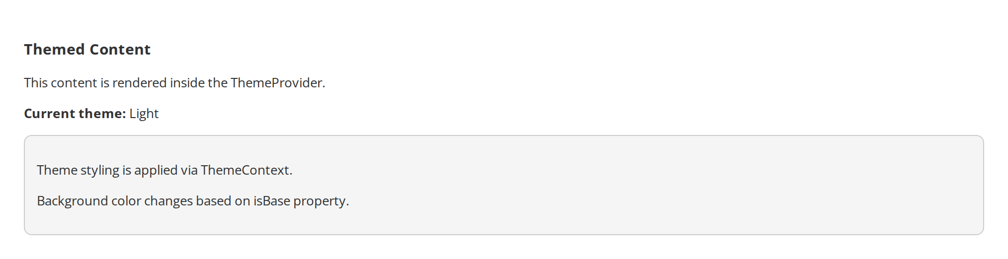
Light Theme
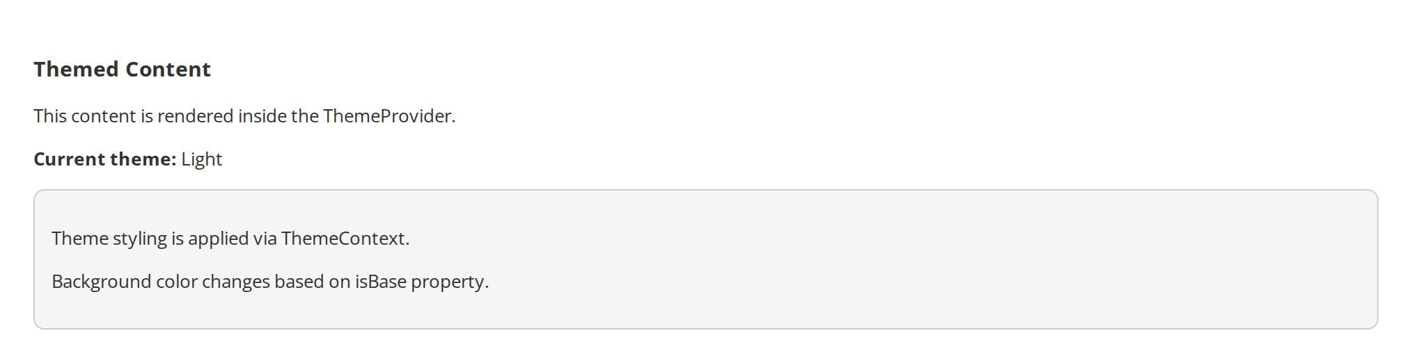
Light (Base) theme — the default.
Dark Theme
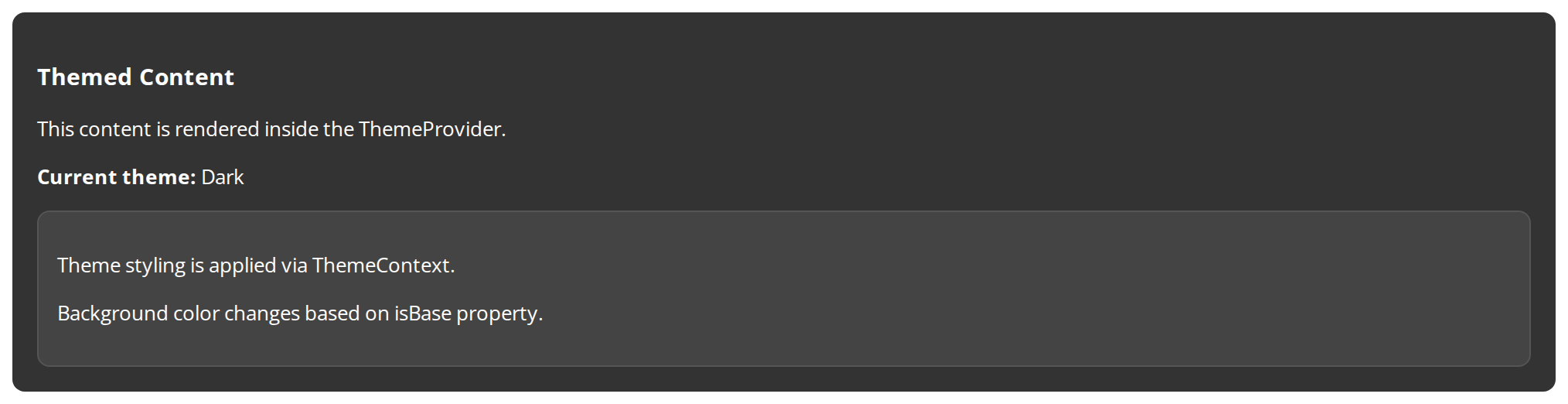
Dark theme variant.
System Theme
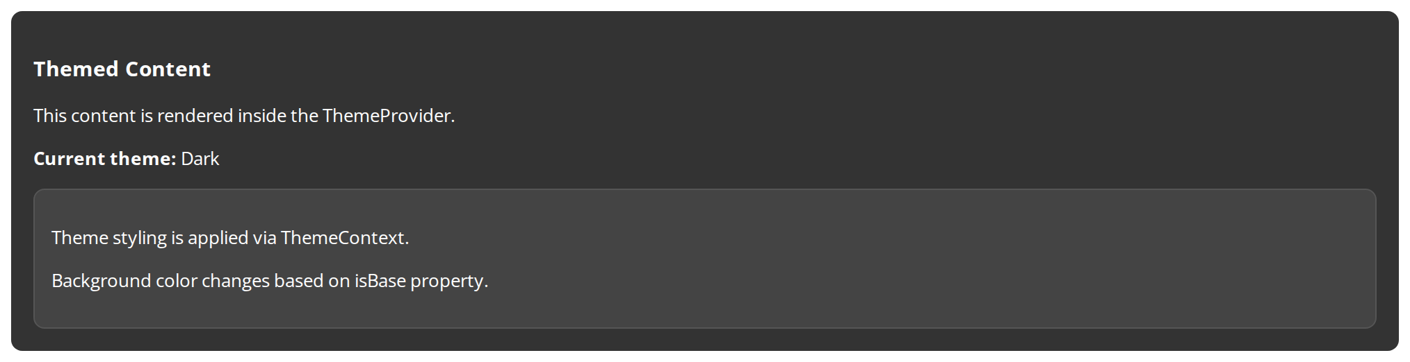
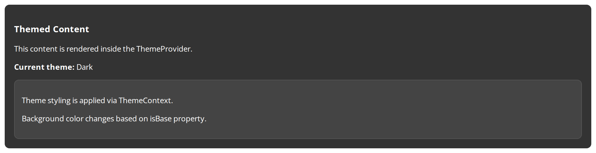
System theme follows the OS preference via prefers-color-scheme.
Minimal example
import { ThemeProvider } from "@onlyoffice/apps-ui-kit/providers/theme";
import { ThemeKeys } from "@onlyoffice/apps-ui-kit/enums";
import { Button } from "@onlyoffice/apps-ui-kit/components/button";

export function App() {
  return (
    <ThemeProvider initialTheme={ThemeKeys.BaseStr} locale="en">
      <Button primary label="Save" onClick={() => {}} />
    </ThemeProvider>
  );
}
Props
Recipes
Follow the operating system
Left out, initialTheme follows the system anyway — but saying so is worth a line, because the
provider keeps following it: it listens to prefers-color-scheme for as long as it is mounted,
so a theme switched in the OS switches here without a reload.
import { ThemeProvider } from "@onlyoffice/apps-ui-kit/providers/theme";
import { ThemeKeys } from "@onlyoffice/apps-ui-kit/enums";

export function SystemThemed({ children }: { children: React.ReactNode }) {
  return (
    <ThemeProvider initialTheme={ThemeKeys.SystemStr} locale="en">
      {children}
    </ThemeProvider>
  );
}
Let the reader choose
The choice lives in your own state and reaches the provider as initialTheme. A new value is
applied where it stands — nothing below the provider is remounted, so a form keeps what the
reader has typed while the theme changes under it.
import { useState } from "react";

import { ThemeProvider } from "@onlyoffice/apps-ui-kit/providers/theme";
import { ThemeKeys } from "@onlyoffice/apps-ui-kit/enums";
import { Button } from "@onlyoffice/apps-ui-kit/components/button";

export function ThemeSwitch() {
  const [theme, setTheme] = useState(ThemeKeys.BaseStr);

  return (
    <ThemeProvider initialTheme={theme} locale="en">
      <Button
        label="Switch"
        onClick={() =>
          setTheme(
            theme === ThemeKeys.BaseStr ? ThemeKeys.DarkStr : ThemeKeys.BaseStr,
          )
        }
      />
    </ThemeProvider>
  );
}
Right to left
locale decides the direction, from a list of thirteen right-to-left languages. Nothing else
has to be set: the rtl class and data-dir go on the document, and the kit's logical
properties do the rest.
import { ThemeProvider } from "@onlyoffice/apps-ui-kit/providers/theme";
import { ThemeKeys } from "@onlyoffice/apps-ui-kit/enums";

export function Arabic({ children }: { children: React.ReactNode }) {
  return (
    <ThemeProvider initialTheme={ThemeKeys.BaseStr} locale="ar">
      {children}
    </ThemeProvider>
  );
}
Behaviour the types don't state
- It writes on the document, not into a React context.
lightordarkandltrorrtlgo on<body>,data-themeanddata-diron<html>, and--font-familywith them. That is why a component outside the provider is unstyled rather than merely uncoloured, and why two providers in one page fight over the same attributes. initialThemekeeps being read. The name says otherwise, and so did this page until two readers checked it against the source: the theme is re-resolved by an effect keyed on that prop, so a new value applies in place with no remount and no state lost below the provider.- The system theme keeps being followed. With
ThemeKeys.SystemStr, or withinitialThemeleft out, aprefers-color-schemelistener stays attached for the provider's whole life. colorThemeis the portal's accent palette, and the only way to one. Nothing is fetched: without the prop the kit's own accent is kept. The provider used to look as though it asked a portal for the palette, but the call was the API SDK's parameter builder — it returns{ url, options }and sends nothing, so the result was read as a response and the branch ended in silence. Removing it also took@onlyoffice/docspace-api-sdkandaxiosout of every application that mounts this provider; the palette's type is still imported, as a type.- A
colorThemethat arrives later is picked up. The prop is watched, so a portal that loads its palette after the first render can pass it in without remounting the provider. systemThemeoverrides detection, not preference. It stands in for whatprefers-color-schemewould have said, and only matters while the theme is the system's.- The font is not shipped. The family resolves to
Open Sans, sans-serif, Arial, and this repository'scss/fonts.cssis not published. Load Open Sans yourself or override--font-familyon the document.
Accessibility
- The
lightanddarkclasses are what give every component its contrast; a tree rendered outside this provider has neither, and its text can land on a background it was never checked against. localesets the writing direction for the whole document. Set it to the language you are actually rendering, or a right-to-left interface reads left to right with the characters reversed against their layout.- The provider follows
prefers-color-scheme, which is a reader's accessibility setting on many systems. Overriding it with a fixedinitialThemeis a choice worth making deliberately.
Related
TranslationProvider— the other provider an application mounts.ErrorBoundary— catches what the tree below throws.ThemeProviderComponent— the older layer this is built on; do not mount it yourself.