GroupsSelector
Portal only
Works only inside an ONLYOFFICE Apps portal: it needs the portal's API client, stores and translations, and is not part of the public API.
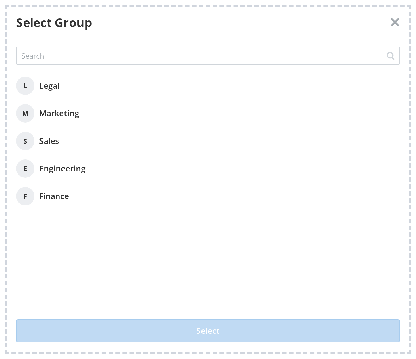
GroupsSelector is a searchable, paginated selector panel for choosing a user group.
Features
- Live API mode — Fetches groups from the ONLYOFFICE Apps Groups API in batches of 100 with infinite scroll
- Single-select — The user can pick exactly one group at a time
- Search — Filters groups by name; resets and re-fetches the list automatically
- Header — Optional configurable header with a close button via
withHeader/headerProps - Aside mode — Can render inside an Aside panel with backdrop and optional blur via
useAside - Callbacks —
onSubmitandonClosehooks
Default
A basic GroupsSelector with default settings.
import GroupsSelector from "@onlyoffice/apps-ui-kit/selectors/Groups";

<GroupsSelector
  withHeader
  headerProps={{
    headerLabel: "Select Group",
    onCloseClick: () => setOpen(false),
  }}
  onSubmit={(items) => console.log(items[0])}
/>