跳到主要内容

RoomSelector

Portal only

Works only inside an ONLYOFFICE Apps portal: it needs the portal's API client, stores and translations, and is not part of the public API.

RoomSelector is a searchable, paginated selector for choosing rooms from the ONLYOFFICE Apps system.

Features​

  • Live API mode — Fetches rooms from the ONLYOFFICE Apps API with infinite scroll
  • Single / multi-select — Controlled by isMultiSelect
  • Room type filter — Pass roomType to restrict the list to specific room types
  • Search — Enable with withSearch
  • Third-party rooms — Optionally hide third-party storage rooms via disableThirdParty
  • Room creation — Show a create-room button via withCreate + createDefineRoomLabel
  • Pre-selection — Pass selectedItems with sortSelectedFirst to float already-selected rooms to the top
  • Header / aside / cancel — Fully composable via withHeader, useAside, withCancelButton

Default​

A basic RoomSelector with default settings.
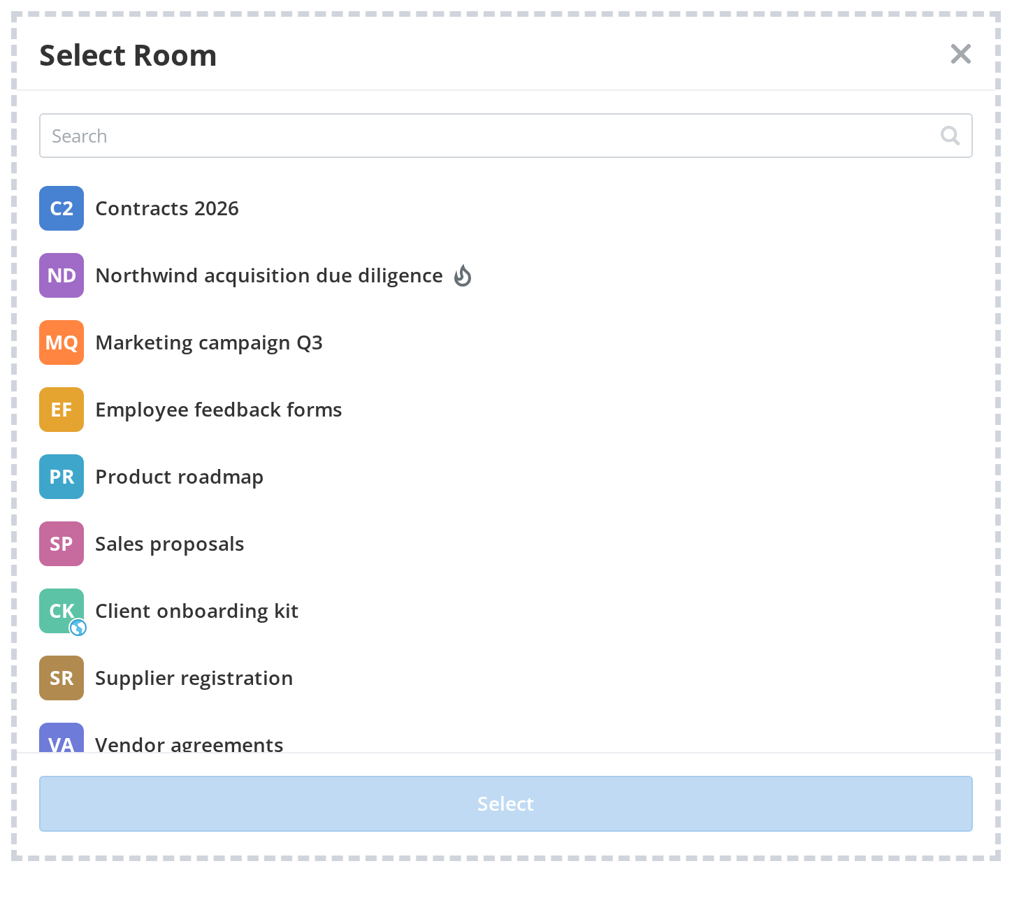
DefaultDefault
import RoomSelector from "@onlyoffice/apps-ui-kit/selectors/Room";

<RoomSelector
isMultiSelect={false}
withSearch
withHeader
headerProps={{ headerLabel: "Select Room", onCloseClick: () => setOpen(false) }}
onSubmit={(items) => console.log(items[0])}
/>

Properties​

PropertyTypeDescription
withHeader?booleanShow the header bar with a label and close button. Default: false.
headerProps?object
withSearch?booleanShow a search input above the room list. Default: false.
isMultiSelect?booleanAllow selecting multiple rooms at once. Default: false.
onSubmit?functionCalled with the array of selected TSelectorItem(s) on confirm.
onClose?functionCalled when the selector panel is dismissed.
id?-HTML id attribute for the root element.
className?-Additional CSS class name for the root element.
roomType?-Filter rooms by type. Omit to show all room types.
searchArea?-Search scope — Active rooms, Archive, or Templates.
excludeItems?-Array of room IDs to exclude from the list.
disableThirdParty?-Hide rooms backed by third-party storage. Default: false.
useAside?-Render the selector inside an Aside panel with a backdrop. Default: false.
withoutBackground?-Remove the background overlay in Aside mode. Default: false.
withBlur?-Apply blur effect to the Aside backdrop. Default: false.
withCancelButton?-Show a cancel button in the footer. Default: false.
cancelButtonLabel?-Label for the cancel button.
withPadding?-Add padding inside the selector. Default: false.
withCreate?-Show a create-room button at the top of the list. Default: false.
createDefineRoomLabel?-Label for the create-room button (requires withCreate).
createDefineRoomType?-Room type to pre-fill on create (requires withCreate).
forceIsMultiSelect?-Force multi-select UI behavior regardless of the isMultiSelect prop. Default: false.
sortSelectedFirst?-Float pre-selected rooms to the top of the list. Default: false.
disableSubmitUntilChanged?-Keep submit disabled until the selection differs from the initial state. Default: false.
submitButtonLabel?-Custom label for the submit button.
emptyScreenHeader?-Custom header text for the empty state screen.
emptyScreenDescription?-Custom description text for the empty state screen.
onCancel?-Called when the cancel button is clicked.