CategoryItem
Settings-page entry: a linked title, a line of explanation, an arrow, and an optional paid badge. It is one row of a settings index — the list that sends the reader on to General, Security, Backup and the rest.


Use this when / not when
- Use for a list of destinations, each with a name and a sentence saying what is behind it.
- Not for a bare link —
Linkis the link itself, without the layout. - Not for a block of arbitrary content —
Cardtakes children and a border; this component's shape is fixed. - Not for a badge on its own —
Badgeis exported separately and takes any colour. - There is no icon slot and no selected state. The only glyph is the trailing arrow, it is not settable, and nothing marks the row the reader is currently on.
Import
import { CategoryItem } from "@onlyoffice/apps-ui-kit/components/category-item";
Also exported from the root barrel @onlyoffice/apps-ui-kit.
Needs ThemeProvider above it in the tree. The description and arrow colours are declared only
under the .light and .dark classes the provider puts on <body>, and the paid badge picks
its gold in JavaScript from the same provider's context — which falls back to the light theme
rather than failing, so on a dark page without a provider the badge keeps its light colour.
Stories
Default
An entry as it sits in an index of destinations: the title link, the explanation under it and the arrow. Change any prop live in the Controls panel below.


With Paid Badge
Marks a destination that needs a paid plan: the badge beside the title carries its own text (withPaidBadge, badgeLabel). The badge is not shown on a page whose path contains management.


Disabled State
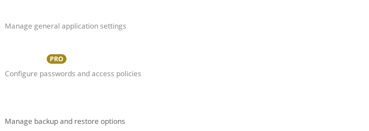
For a destination the reader cannot open right now: the title is no longer a working link (isDisabled). Nothing else marks it in the light theme, where the disabled subtitle colour matches the normal one; in the dark theme the subtitle dims. Say in the subtitle why the entry is unavailable.


All Variants
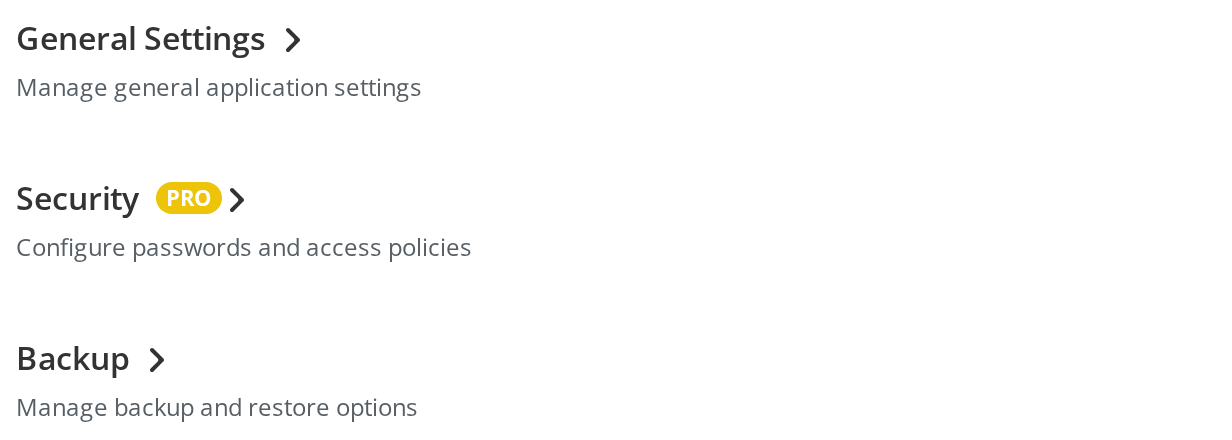
The three looks side by side, as they appear together in one index:
- General Settings — a plain entry
- Security — the same entry with the paid badge (
withPaidBadge) - Backup — an unavailable entry whose title is no longer a link (
isDisabled)
Right To Left
The same entry under a right-to-left interface: the title and subtitle align to the right, the badge follows the title leftwards and the arrow sits at the left end, mirrored to point left. The direction comes from the theme's interfaceDirection (the Direction toolbar); the wrapper also carries dir="rtl" for the rules that read the DOM direction.


Css Customization
The variables set on one wrapper -- they are listed under CSS variables on this page. Files shows the title, subtitle and arrow colours and the margin below it; Security is disabled (isDisabled) to show --category-item-disabled-color on its subtitle.


Minimal example
import { CategoryItem } from "@onlyoffice/apps-ui-kit/components/category-item";

export function SettingsIndex() {
  return (
    <CategoryItem
      title="Security"
      subtitle="Password strength, two-factor authentication, trusted mail domains"
      url="/settings/security"
      onClickLink={() => {}}
      withPaidBadge={false}
      badgeLabel=""
    />
  );
}
Props
Recipes
Disabled / read-only
isDisabled takes the href and the handler away, so the row does nothing. What it does
not do is look disabled: only the subtitle changes colour — and only in the dark theme —
while the title keeps its colour and the arrow still points onward. Say why the row is
unavailable in the subtitle.
import { CategoryItem } from "@onlyoffice/apps-ui-kit/components/category-item";

export function SsoRow() {
  return (
    <CategoryItem
      title="Single sign-on"
      subtitle="Available on the Business plan — upgrade to configure SSO"
      url="/settings/sso"
      onClickLink={() => {}}
      isDisabled
      withPaidBadge
      badgeLabel="PRO"
    />
  );
}
Routing in JavaScript
The click handler runs and then the browser follows url, because nothing calls
preventDefault for you. A client-side router needs it called explicitly, and url still has
to be the real path so that the row is a working link for middle-click and for a screen reader.
import type { MouseEvent } from "react";

import { CategoryItem } from "@onlyoffice/apps-ui-kit/components/category-item";

export function GeneralRow({ go }: { go: (path: string) => void }) {
  const open = (e: MouseEvent<Element>) => {
    e.preventDefault();
    go("/settings/general");
  };

  return (
    <CategoryItem
      title="General"
      subtitle="Language, time zone and the portal name"
      url="/settings/general"
      onClickLink={open}
      withPaidBadge={false}
      badgeLabel=""
    />
  );
}
A list of them
Each row brings a 20px bottom margin of its own, so a column with its own gap spaces them by
the sum of the two. Set --category-item-margin to 0 when you want the gap to be the only
spacing.
import type { CSSProperties } from "react";

import { CategoryItem } from "@onlyoffice/apps-ui-kit/components/category-item";

const rows = [
  { title: "General", subtitle: "Language, time zone and the portal name" },
  { title: "Security", subtitle: "Passwords, two-factor authentication" },
  { title: "Backup", subtitle: "Automatic backup and restore" },
];

export function SettingsList() {
  return (
    <div
      style={
        {
          display: "flex",
          flexDirection: "column",
          gap: 24,
          "--category-item-margin": "0px",
        } as CSSProperties
      }
    >
      {rows.map((row) => (
        <CategoryItem
          key={row.title}
          title={row.title}
          subtitle={row.subtitle}
          url={`/settings/${row.title.toLowerCase()}`}
          onClickLink={() => {}}
          withPaidBadge={false}
          badgeLabel=""
        />
      ))}
    </div>
  );
}
Behaviour the types don't state
- A disabled row is still in the DOM as an
<a>, without anhref. That element is not focusable and is not announced as a link, so the row disappears from keyboard and screen reader navigation rather than being announced as unavailable. Nothing setsaria-disabled. isDisableddoes not dim the title. The stylesheet has a rule for a disabled title, but the class that would trigger it is never put on the link — only the subtitle is recoloured. Even that is invisible in the light theme, where the disabled colour is the same grey as the normal subtitle; only the dark theme dims it.- The click handler does not stop the navigation.
onClickLinkruns and the browser then followsurl; callpreventDefaultyourself when you route in JavaScript. - The paid badge is suppressed on management pages. The component calls a helper that tests
whether
window.location.pathnamecontainsmanagement, and hides the badge when it does — a portal detail that also fires for any path of yours containing that word. - Every row brings a 20px bottom margin, through
--category-item-margin. Inside a flex or grid column it adds to yourgapinstead of replacing it. - The title link's colour has no fallback.
--category-item-title-coloris read bare, so while it is unset the declaration is invalid and the title inherits the surrounding text colour rather than takingLink's own. That is what makes the row's title look like a heading; set the variable if you want it to look like a link. - The arrow always renders, disabled or not, and carries two literal class names for portal
stylesheets —
settings_unavailableon the arrow andheaderon the title link. It flips in RTL through the.rtlclass the theme provider puts on<body>. --category-item-subheader-sizedoes nothing. The class that reads it is not applied to any element the component renders.- The subtitle stops growing at 1024px, whatever the width of its container.
CSS variables
Accessibility
- The title is the link, and
Linkgives it anaria-labelequal to that title, so it is announced by its own text. - A disabled row loses its
hrefand therefore its place in the tab order. There is noaria-disabledand no other announcement — if the reason matters, put it in the subtitle, which is the one part that visibly changes. - The subtitle is a separate element with no
aria-describedbytying it to the link; a screen reader reaching the link by keyboard hears the title alone. - The arrow is an inline SVG with no
aria-hiddenand no title, so some screen readers announce it as an unlabelled graphic after the link. - Nothing here manages focus, and the row is not a
listitem— wrap the set in a<ul>of your own if the count matters to the reader.
Test ids
| Element | data-testid |
|---|---|
| Wrapper | the value of dataTestId; the attribute is absent without it |
| Title link | <dataTestId>_category_link, or link when dataTestId is unset |
| Subtitle | text, from the Text it renders into |
The paid badge carries Badge's own ids (badge, badge-inner, badge-text).