Heading
Section title rendered as a real heading element, sized by a preset rather than by its level. The
two are deliberately separate: level picks the h1–h6 tag that a screen reader builds the
page outline from, size is how large the title looks, and a h3 can be the biggest thing on
the page.


Use this when / not when
- Use for the title of a page, a panel, a dialog body or a settings block — anything that belongs in the document outline.
- Not for body text or a caption — use
Text, which is 13px, 400 and takes its element fromas. - Not for the caption of a form control — use
Label, which associates itself with the control and draws the required marker. - Not for a title that navigates — wrap
Linkinside it, or useLinkon its own;Headinghas no interactive behaviour at all.
It brings no spacing. margin: 0, unlike the browser's own h1–h6. Two headings in a row
sit flush against each other until the container supplies a gap or a margin.
Import
import {
  Heading,
  HeadingLevel,
  HeadingSize,
} from "@onlyoffice/apps-ui-kit/components/heading";
Also exported from the root barrel @onlyoffice/apps-ui-kit.
Needs ThemeProvider above it in the tree. Without one the heading always draws in the light
theme's black — the white it uses on a dark background comes from the dark class the provider
puts on <body> — and its font family falls back to whatever the page inherits, because the
provider is what sets --font-family.
Stories
Default
A large h1, the title of a page or panel; change the level, size, type or any other prop live in the Controls panel below.
Levels
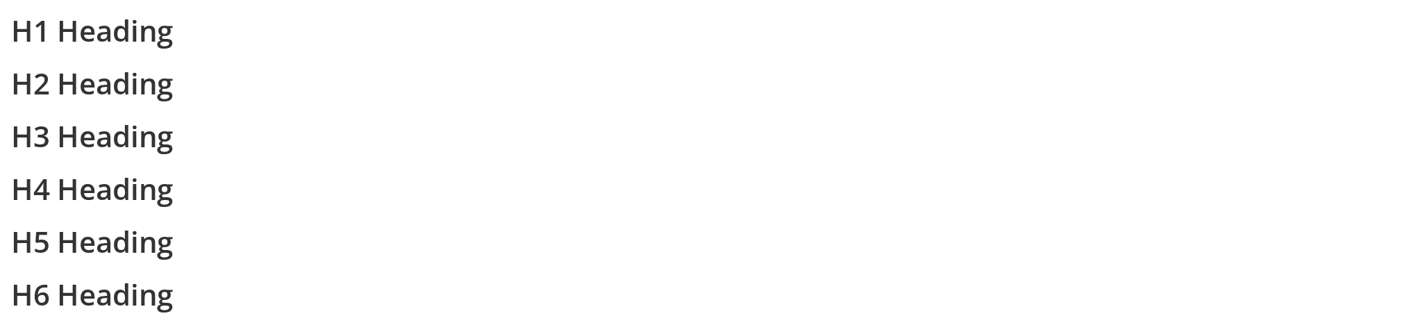
Six headings, h1 through h6, all at the same medium size: the level decides the element a screen reader builds the page outline from, not how large the text looks (level).
Sizes
Five h1 headings from 15px to 27px: pick the size for the visual weight the layout needs, whatever level the heading has (size).


Types
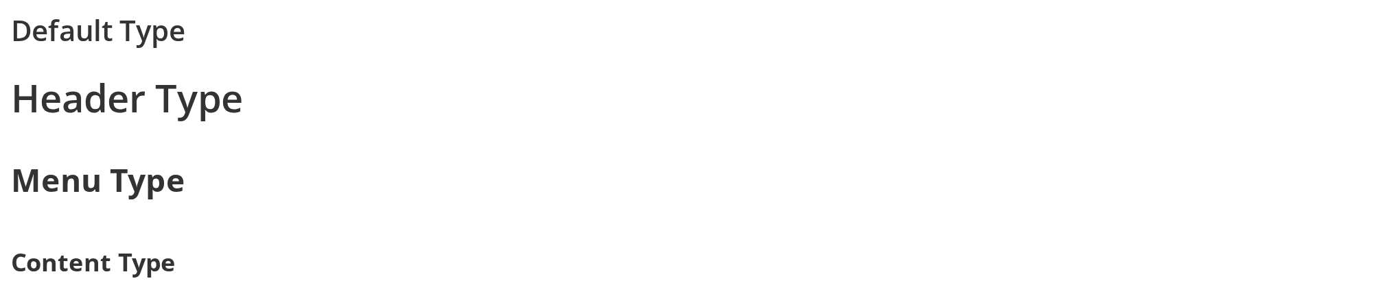
Default Type has no type and follows size; Header Type is 28px at weight 600, Menu Type 23px bold and Content Type 18px bold, all three on a 50px line height, for titles that must line up with a 50px row (type).
Truncated Heading
A long title in a 250px column stays on one line and ends with an ellipsis, for headers that must not wrap; without a bounded parent the heading grows instead (truncate).


Custom Styled
One-off looks without a stylesheet: Blue Heading sets the colour through the color prop, Italic Heading and Underlined Heading pass other CSS through style.


Css Customization
Every overridable variable set on one wrapper -- the variables are listed under CSS variables on this page. Custom Heading (type="content") shows the colour, --heading-size-content and --heading-lh; Plain Heading has no type and is there for --heading-weight; Menu Heading and Header Heading show --heading-size-menu and --heading-size-header.


Minimal example
import {
  Heading,
  HeadingLevel,
  HeadingSize,
} from "@onlyoffice/apps-ui-kit/components/heading";

export function PanelTitle() {
  return (
    <Heading level={HeadingLevel.h2} size={HeadingSize.small}>
      Sharing settings
    </Heading>
  );
}
Props
HeadingProps is TextProps plus the three below, but the component reads only part of what it
inherits: as, children, className, color, fontSize, fontWeight, id, isInline,
lineHeight, style, title and truncate. The rest of TextProps — isBold, isItalic,
noSelect, textAlign, backgroundColor, dir, view, tag, dataTestId and the two
container* props — is spread onto the element unread, where React passes it through as an
unknown attribute and warns in the console.
Inherited from TextProps
Declared by components/text and accepted here too.
Plus 278 more props inherited from React.AriaAttributes, React.DOMAttributes and React.HTMLAttributes, forwarded to the element.
Enums
Recipes
A title that truncates
truncate is inherited from Text and behaves the same: one line, an ellipsis, and it needs a
parent of bounded width to have anything to clip against.
import {
  Heading,
  HeadingLevel,
} from "@onlyoffice/apps-ui-kit/components/heading";

export function RoomTitle({ name }: { name: string }) {
  return (
    <div style={{ width: 220 }}>
      <Heading level={HeadingLevel.h3} truncate title={name}>
        {name}
      </Heading>
    </div>
  );
}
A title with the kit's tooltip
Heading is not wrapped in the tooltip HOC, so its title is a plain HTML attribute and the
browser draws the tooltip. HeadingWithTooltip is the same component wrapped, which turns
title into the kit's own tooltip — and that one needs <RootTooltip /> mounted once near the
root of the app, or nothing appears.
import { HeadingWithTooltip } from "@onlyoffice/apps-ui-kit/components/heading";
import { RootTooltip } from "@onlyoffice/apps-ui-kit/components/tooltip";

export function TruncatedTitle({ name }: { name: string }) {
  return (
    <>
      <RootTooltip />
      <div style={{ width: 200 }}>
        <HeadingWithTooltip truncate title={name}>
          {name}
        </HeadingWithTooltip>
      </div>
    </>
  );
}
Behaviour the types don't state
typewins oversize. The threetypepresets come later in the stylesheet at the same specificity as the five size classes, sosize={HeadingSize.xsmall} type="header"renders at 28px.typealso fixes the line height at 50px, which the sizes do not touch.typesets its own weight.contentandmenuarebold(700);headerstays at 600, from a private variable rather than--heading-weight.fontWeightstill wins over all three, because it is an inline style.- The five sizes are 15px, 19px, 21px, 23px and 27px for
xsmallthroughxlarge, and 600 weight throughout. They are declared on the element itself rather than read with a fallback, so they cannot be retuned from a container — onlyfontSizeon the component, or thetypepresets, which do read consumer variables. - The inline style props win over
style, the opposite ofText:styleis spread first andcolor,fontSize,fontWeightandlineHeightare written over it. Astyle={{ color: "red" }}is silently replaced bycolor, and passingcolor=""counts as unset. - Alignment is an attribute, not a prop.
textAlignis inherited fromTextPropsand never read; the stylesheet aligns ondata-align="left" | "right" | "center", which you pass as a plain attribute. dataTestIddoes nothing here. Thedata-testidis the literalheading, and the only way to change it is thedata-testidattribute itself, which lands through the spread.- Every heading carries a class named
undefined. The component asks for anot-selectableclass the stylesheet does not define, so the lookup yieldsundefinedandclassNamesrenders it as a literal class name. Nothing styles it, which also means headings are selectable despite the intent — but the class is in the DOM, so do not write a CSS rule or a test that keys on the element's fullclassstring. asreplaces the element but not the styling, and it also removes the heading semantics:as="div"renders a div that looks like a heading, so the outline a screen reader builds loses the entry.levelis then only the source of a tag name nobody uses.Headingis memoised (React.memo), so a new inlinestyleobject or a newchildrenfragment on every parent render defeats it; nothing else in the component depends on that.
CSS variables
Only the type presets and the colour and weight are exposed; the five size steps are private.
The inline style props win over every variable here: color over --heading-text-color,
fontWeight over --heading-weight, fontSize and lineHeight over the type sizes and line
height.
Accessibility
- Renders
h1–h6fromlevel, which is what a screen reader uses to build the page outline. Pick it from the document structure, not from how large the title should look — that issize. asoverrides the element and so removes those semantics; a heading renderedas="div"disappears from the outline.- The component sets no ARIA of its own.
aria-*attributes are accepted and reach the element. - Nothing here is focusable or operable, and there is no keyboard behaviour to describe.
titleis a native tooltip onHeading, so it is announced; onHeadingWithTooltipit becomes the kit's tooltip, which is not.