Text
Body text at the kit's size and weight, rendered through whichever element you name. It is the
typography primitive the rest of the kit builds its labels out of: a <p> by default, 13px and
400, with the styling knobs as props instead of a class.


Use this when / not when
- Use when you need a line or a paragraph of text that matches the rest of the kit, or a piece of text that must truncate, stay unselectable, or follow the reader's writing direction.
- Use when a component of yours wants the kit's default body size without hard-coding 13px.
- Not for a section title — use
Heading, which carries the sizes, the weight and the theme's text colour, and renders a realh1–h6. - Not for a form field's label — use
Label, which ties itself to the control and draws the required asterisk. - Not for something clickable — use
Link.Texttakes anonClick, but it renders a<p>with no role, no focus and no keyboard handling, so a click handler on it is unreachable without a pointer.
It paints no colour of its own. Unlike every other text component in the kit, Text sets
neither color nor font-family; both are inherited from whatever contains it. On a page that
never set them you get the browser's defaults, in the light theme and the dark one alike. Pass
color, or set color on a container.
Import
import { Text } from "@onlyoffice/apps-ui-kit/components/text";
Also exported from the root barrel @onlyoffice/apps-ui-kit.
No provider is required: the component reads only --text-size and --text-weight, both with
built-in fallbacks, so it renders correctly on its own.
Stories
Default
A paragraph at the kit's body size and regular weight, the starting point for any line of text; change any other prop live in the Controls panel below.
Font Sizes
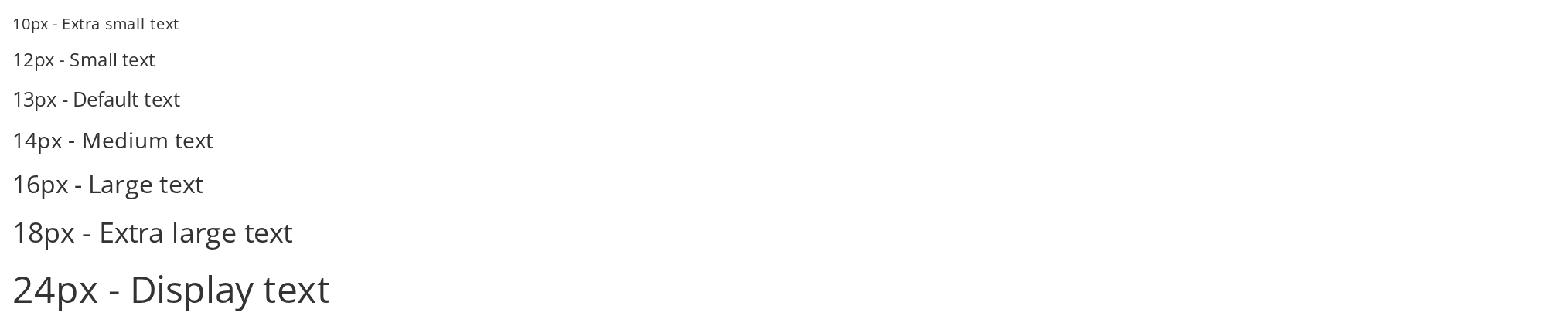
Seven lines from 10px to 24px, to pick a size against the 13px body text (fontSize).
Font Weights
Five lines from light (300) to bold (700), to compare weights at the same size (fontWeight); a weight shows only if the font carries it.


Text Styles
Emphasis without choosing a weight: Bold text sets 700 (isBold), Italic text slants it (isItalic), and the last line combines both.


Text Alignment
The four alignments in one column (textAlign); the justified paragraph stretches every line but the last to both edges.


Inline Text
Three pieces of text on one line, for mixing styles inside a sentence without a wrapper (isInline).


Truncated Text
A sentence longer than its 200px box stays on one line and ends with an ellipsis (truncate); without a box of bounded width it would grow instead.


Heading Elements
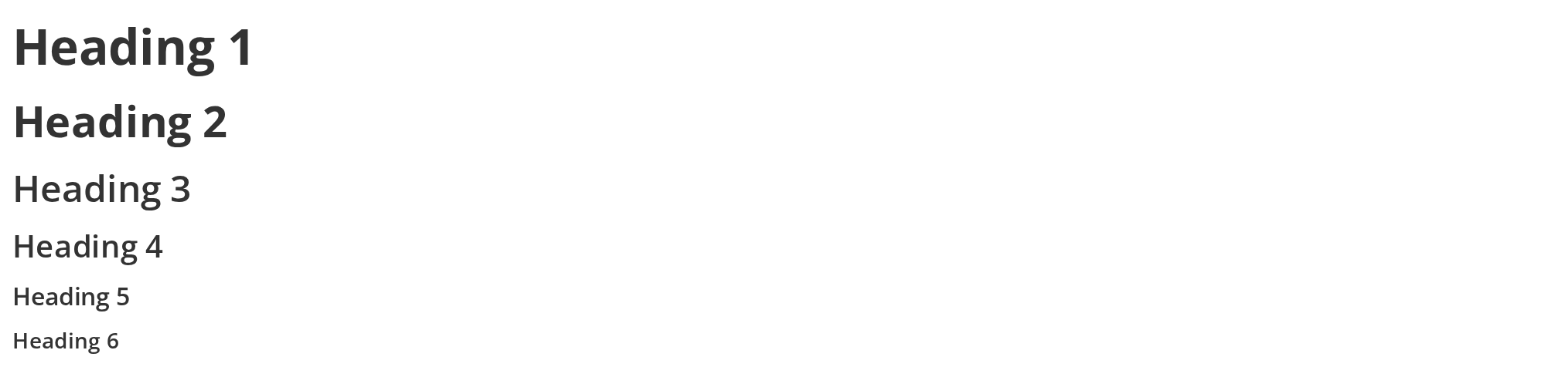
Real h1-h6 elements for a document outline, each given its size and weight by hand (as, fontSize, fontWeight); Heading carries these sizes already.
Direction
For text whose language is not known in advance: the first line is set left to right and the second right to left (dir); the last two leave the direction to the browser, which reads it from the text itself (dir="auto").


No Select Text
For captions that should not be copied by accident: drag across both lines, and only the first one is selected (noSelect).


With Tooltip
For text that needs a word of explanation without taking space on the page: rest the pointer on the line to read the tooltip (title). It opens the kit's shared tooltip, which needs RootTooltip mounted, as this story does.


Css Customization
Both variables set on one wrapper -- the variables are listed under CSS variables on this page. The line of text inside comes out larger and semibold.


Minimal example
import { Text } from "@onlyoffice/apps-ui-kit/components/text";

export function FileMeta() {
  return (
    <div>
      <Text isBold>Quarterly report.docx</Text>
      <Text color="#a3a9ae">Modified 12 minutes ago</Text>
    </div>
  );
}
Props
Added by the wrapper the folder exports
The index module exports a wrapped component, so these are accepted on top of the props above.
Recipes
Truncating in a flex row
truncate is one line plus an ellipsis, and it only bites inside a parent whose width is
bounded. In a flex row that means min-width: 0 on the item as well — without it a flex child
refuses to shrink below its content and the text overflows instead of clipping.
import { Text } from "@onlyoffice/apps-ui-kit/components/text";

export function FileRow({ name, size }: { name: string; size: string }) {
  return (
    <div style={{ display: "flex", gap: 8, width: 240 }}>
      <div style={{ minWidth: 0, flex: 1 }}>
        <Text truncate>{name}</Text>
      </div>
      <Text color="#a3a9ae">{size}</Text>
    </div>
  );
}
Text whose direction follows its content
dir="auto" does not set the attribute on the element. It wraps the children in an inner span
that carries dir="auto", so the browser picks the direction from the first strong character of
the content — which is what you want for a user-supplied file name in a mixed-script portal.
import { Text } from "@onlyoffice/apps-ui-kit/components/text";

export function FileName({ name }: { name: string }) {
  return (
    <Text dir="auto" truncate>
      {name}
    </Text>
  );
}
Rendering as another element
as takes the element, and the text keeps its styling. This is how you get semantic markup
without giving up the kit's typography.
import { Text } from "@onlyoffice/apps-ui-kit/components/text";

export function Legend() {
  return (
    <ul>
      <Text as="li">Owners can invite members</Text>
      <Text as="li">Members can upload files</Text>
    </ul>
  );
}
Behaviour the types don't state
- The element is a
<p>unless you say otherwise.aswins overtagwhen both are set, and a<p>cannot legally contain a<div>— a block child inside the default element is closed by the browser's parser and ends up as a sibling. Passas="div"oras="span"when the children are not phrasing content. styleis merged last, overfontSize,fontWeight,color,textAlign,lineHeightandbackgroundColor. Astyle={{ fontSize: "16px" }}beatsfontSize="13px", not the other way round.isBoldoverridesfontWeightrather than combining with it: the inline weight becomes 700 and theboldclass sets the same, soisBold fontWeight={500}renders at 700.displayis dead. It is declared, nothing reads it, and it reaches the DOM as an unknown attribute. It does not set the CSS property its name suggests —isInlineandstyleare the ways to do that.containerWidthandcontainerMinWidthdo nothing here, and are not dead. This component ignores both and passes them to the DOM, butRowContentandTileContentread them back off the child element they are given and use them as the width of the slot they put it in. That is the only reason to set them: inside one of those two wrappers, and nowhere else.titleis a tooltip, not atitleattribute. The folder exportswithTooltip(TextUi), and the wrapper consumestitlebefore the element is built. It opens the kit's system tooltip on hover after 700ms — which means nothing appears at all until<RootTooltip />fromTooltipis mounted once near the root of the app. The component's own test asserts atitleattribute; that only holds because the wrapper passestitlestraight through whileNODE_ENV === "test", and it is not what a browser renders.TextUiis the same component without that wrapper, exported for the cases where you want a realtitleattribute or no hover handlers at all.truncateclips, it does not wrap to a line count. The only multi-line clamp in the component isview="tile", it is two lines, and it applies only together withdir="auto", because it is a class on the span that direction mode introduces.- The auto-direction span takes the pointer events off the text (
pointer-events: none), so withdir="auto"the children cannot receive a hover or a click of their own — the handler has to sit on theTextelement or above it. noSelectcovers the whole element, including any children you pass, and it isuser-select: nonein every engine the kit supports, not a class you can undo from outside.
CSS variables
Both are read with a fallback, so setting either on any ancestor changes every Text below it.
| Variable | Default | Effect |
|---|---|---|
--text-size | 13px | Font size, unless the fontSize prop or style overrides it |
--text-weight | 400 | Font weight, unless fontWeight, style or isBold does |
There is no variable for the colour: Text does not declare one and inherits instead.
Accessibility
- The element is a
<p>with no role and no ARIA of its own.asis how you give it structural meaning —as="li"inside a list,as="label"withhtmlFor,as="span"inside a sentence — androle,aria-label,aria-liveandaria-hiddenare passed to it unchanged, so a line that reports an outcome isrole="status"orrole="alert"without a wrapper element. - An
onClickdoes not make it operable: there is notabIndex, norole="button"and no key handler. PasstabIndexandrole="button"yourself, or useLinkor a button. titleproduces the kit's own tooltip rather than the native one, and the kit's tooltip is not announced by a screen reader. Text that must be read aloud belongs in the content or in anaria-labelon the element.dir="auto"is the accessible way to render names in an unknown script;dir="rtl"forces the direction whatever the content is.