Calendar
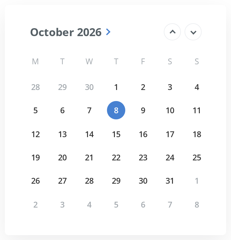
Month grid for picking a day, with month and year views behind it. It is always visible — it has no trigger, no popup and no visibility prop.
Use this when / not when
- Use when the grid should be on the page permanently, or inside a popup you are positioning yourself.
- Prefer
DatePickerfor a form field: it is this calendar behind a button and a chip, with opening, closing and clearing handled. - Not for a date and a time —
DateTimePickeris that. - Not for a range. Only one day can be highlighted; two calendars and your own state are the way to a range.
Import
import { Calendar } from "@onlyoffice/apps-ui-kit/components/calendar";
Also exported from the root barrel @onlyoffice/apps-ui-kit.
Needs ThemeProvider from @onlyoffice/apps-ui-kit/providers/theme for the grid's colours.
Dates are Luxon DateTime objects, not JavaScript Dates. selectedDate must be a DateTime;
minDate, maxDate and initialDate take either.
Stories
Default
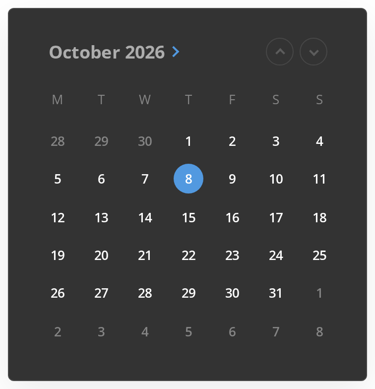
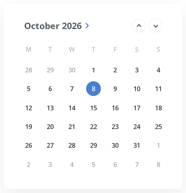
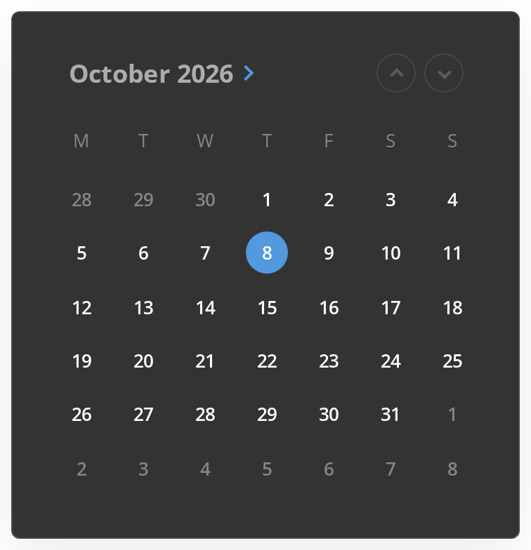
The calendar as it opens: today is filled with the accent colour. Click a day to select it and watch the Actions panel, click the title to switch to months and then years, and change any other prop live in the Controls panel below.
With Date Constraints
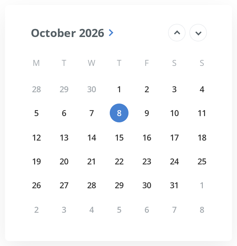
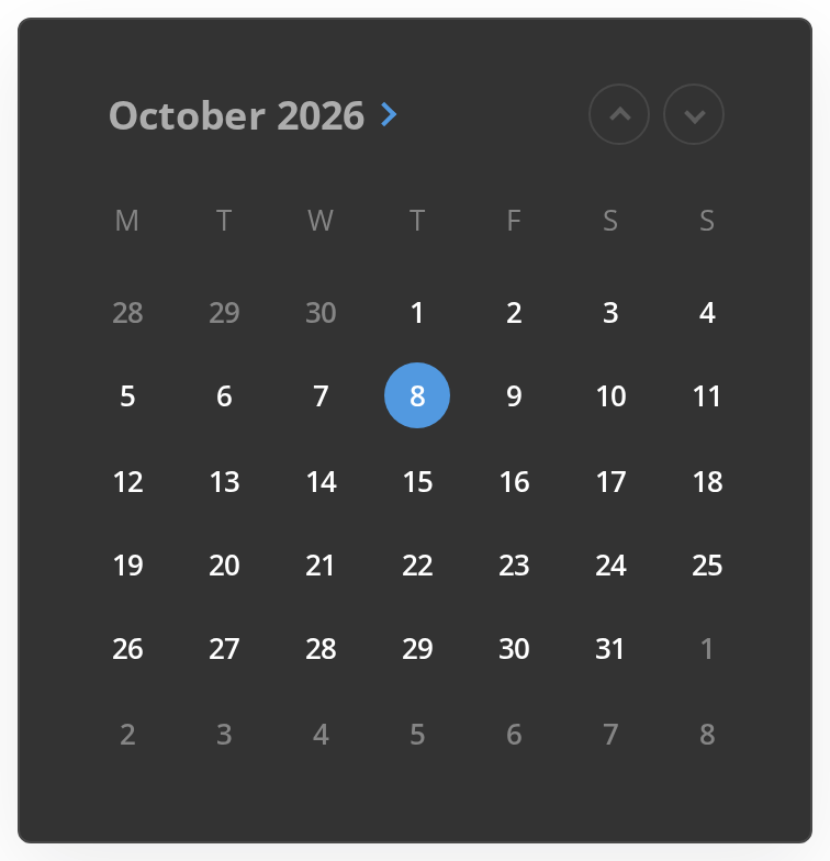
Calendar with min and max date constraints. Only dates within the current year are selectable.
Locale Examples
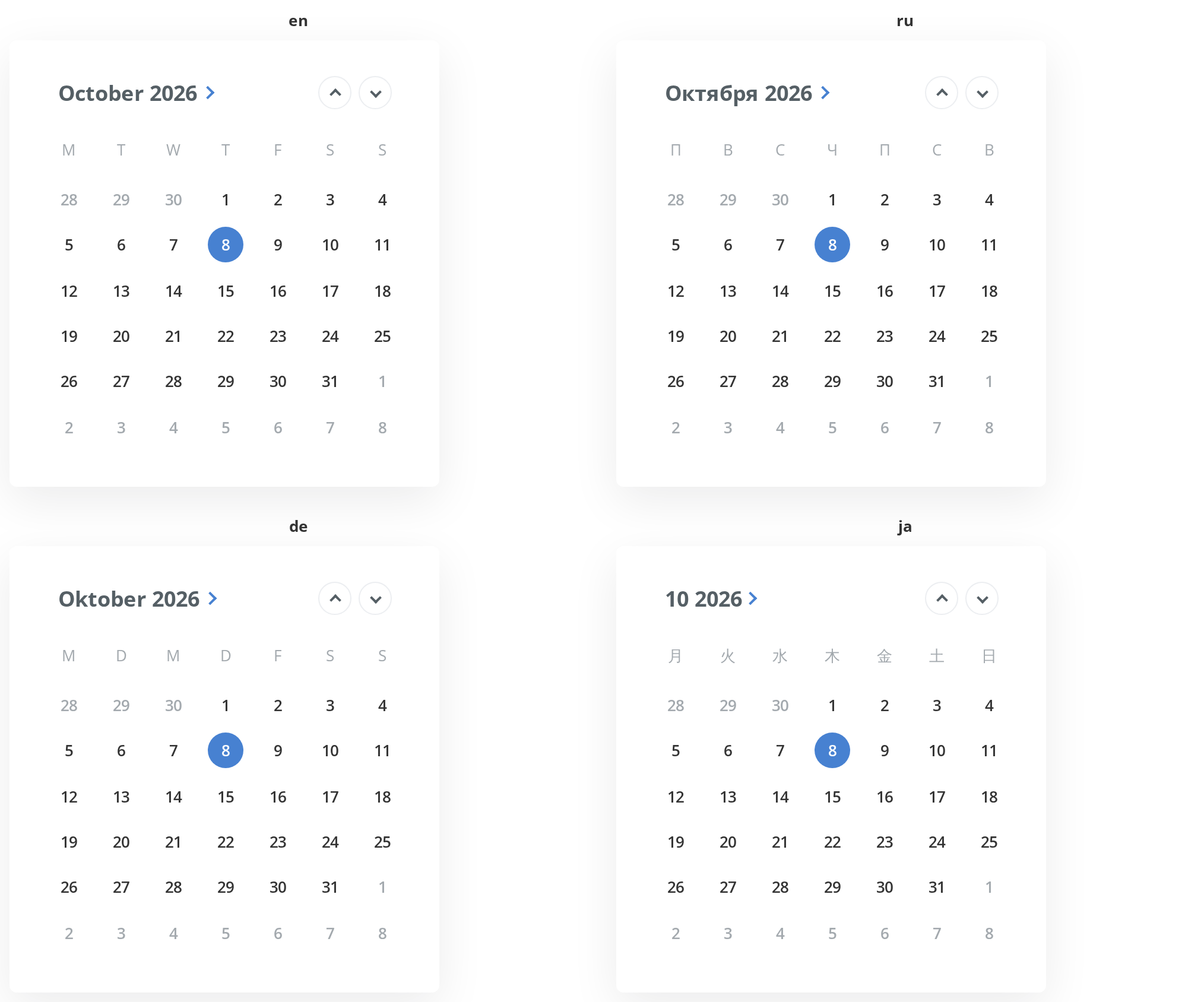
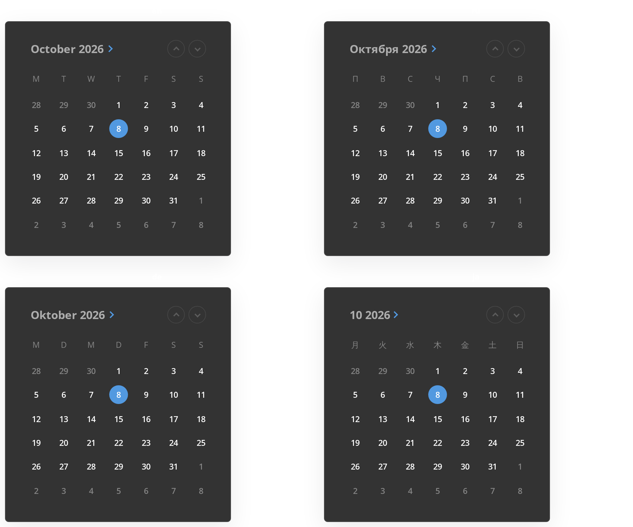
Calendar rendered in different locales. Shows how month names, weekday headers, and date formatting adapt to each locale.
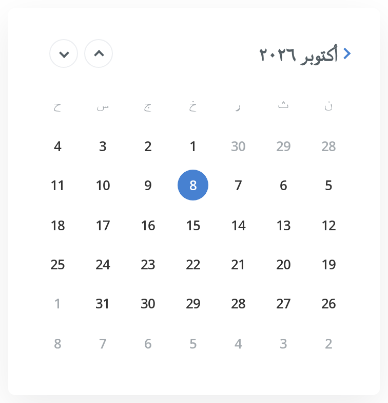
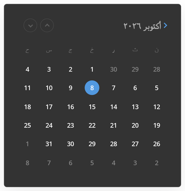
Right To Left
The calendar in a right-to-left layout with Arabic names: the weeks run from right to left, the title moves to the right edge and the arrows to the left, while the chevron after the title stays on its right, before the text. The wrapper carries dir="rtl"; the direction also comes from the theme's interfaceDirection (the Direction toolbar).
Css Customization
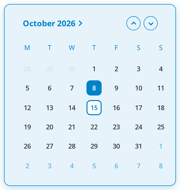
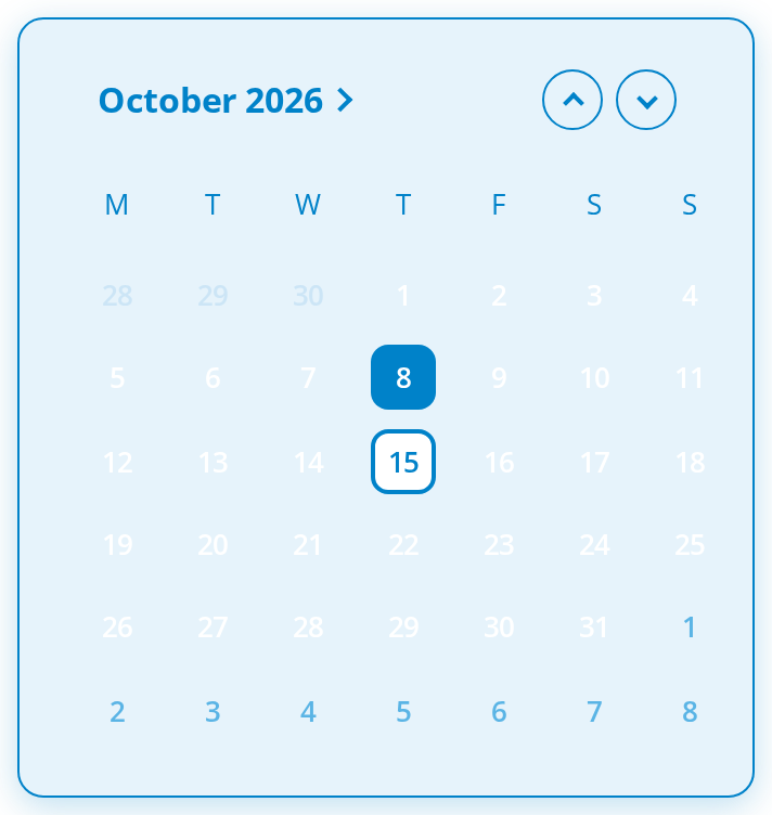
Every overridable variable set on one wrapper -- the variables are listed under CSS variables on this page. The calendar opens with a selected day other than today, so the today and selected-day variables both show, and with minDate at the start of this month, so the days of the previous month and the left arrow show their disabled colours. Hover a day and an arrow to see the hover variables.
Minimal example
selectedDate is required, so hold it yourself and move it from onChange.
import { useState } from "react";
import { DateTime } from "luxon";
import { Calendar } from "@onlyoffice/apps-ui-kit/components/calendar";

export function DueDate() {
  const [due, setDue] = useState(DateTime.now());

  return (
    <Calendar
      locale="en"
      selectedDate={due}
      onChange={setDue}
      minDate={DateTime.now()}
    />
  );
}
Props
Recipes
Keeping the time when only the day changes
Picking a day replaces the date part of selectedDate and keeps its time, which is what makes
this usable as half of a date-and-time control. useMaxTime overrides that with the end of the
chosen day — the shape a "valid until" field wants.
import { useState } from "react";
import { DateTime } from "luxon";
import { Calendar } from "@onlyoffice/apps-ui-kit/components/calendar";

export function ExpiresAt() {
  const [expires, setExpires] = useState(DateTime.now());

  return (
    <div>
      <Calendar
        locale="en"
        selectedDate={expires}
        onChange={setExpires}
        minDate={DateTime.now()}
        useMaxTime
      />
      <p>Expires {expires.toFormat("dd MMM yyyy HH:mm:ss")}</p>
    </div>
  );
}
Behaviour the types don't state
- It is not a popup. The calendar renders where you put it and has no visibility prop; mounting and unmounting it is the caller's job.
- The time of
selectedDatesurvives. Picking a day builds the new value from the chosen date plus the existing time, so a calendar fed a date-time keeps the minutes.useMaxTimereplaces that with 23:59:59.999. onChangeandsetSelectedDateare the same event. Both are called with the same value,setSelectedDatefirst. There is no confirm step and no difference in meaning.- It opens on today, whatever
minDatesays. Without aninitialDatethe view starts at the current month even when today is outside the allowed range — the clamping the code sets up is overwritten immediately afterwards. PassinitialDatewhen the range does not include today. - An out-of-range
initialDateis clamped and logged. It moves to whichever ofminDateandmaxDateis nearer, and a warning is written to the console. localeis typed as required but defaults to"en". The type will not let you leave it out; the component would cope if it could.- There are three views behind one component: days, months and years. Clicking the title of the days view opens the months, and the title of the months view opens the years; the years title does nothing. Picking a month or a year goes back one view, to that month or year. The arrows step one month, one year or ten years, depending on the view. The view resets to days when the calendar remounts, not when the date changes.
- Today is filled, the selected day is ringed, both in the accent colour; the same goes for the current and the selected month and year. When the selected day is today, only the fill shows.
- The mobile layout follows the window, not
isMobile. Below 600px of window width the calendar takes the full width, is 420px high with 16px padding and uses larger items and title.isMobileonly widens the gap between the two arrows from 8px to 12px. isScrollwraps the grid in aScrollbar, which needs the container to have a height; without it the grid sizes itself.- Out-of-range days, months and years are greyed and
disabled, so they cannot be picked, and the header arrows stop at the boundary.
CSS variables
Set these on an ancestor to retheme or resize the calendar. Without them it takes its colours from the theme; everything else the stylesheet defines is private to it.
"The mobile layout" is the one below 600px of window width, not isMobile.
Accessibility
Every day, month, year and arrow is a native <button>, so the keyboard support is the
platform's:
- Tab and Shift+Tab move through the arrows and the grid one item at a time; Enter and Space
pick the focused item. The arrow keys do not move between days, and there is no
gridrole. - Out-of-range items and arrows are
disabled, so Tab skips them and they cannot be picked. - The arrows are named
aria-label="Previous"andaria-label="Next"; changing the month is announced only by the grid re-rendering. - The title that opens the month and year views is an
<h2>with a click handler, so those views are reachable by mouse only. - Nothing states which day is selected or which is today other than colour — there is no
aria-selectedoraria-current, and each day is named only by its number.
Test ids
Related
DatePicker— this calendar as a form field.DateTimePicker— with a time beside it.Scrollbar— whatisScrollwraps the grid in.