ColorPicker
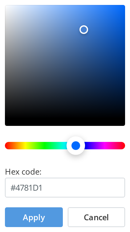
Saturation square with a hue strip for choosing a colour, with or without a hex field and
buttons. It is the vendored react-colorful picker wrapped in the kit's own chrome.
Use this when / not when
- Use inside a panel or drop-down of your own where a colour has to be chosen and confirmed.
- Prefer
ColorInputfor a form field: it is this picker behind a hex field with a swatch, and it handles opening and closing. - Not as a palette of fixed choices — build those from
DropDownItems, since this picker offers the whole spectrum. - Not on its own as a dialog. It has
role="dialog"but no backdrop, no positioning and no focus trap; something has to place it.
Import
import { ColorPicker } from "@onlyoffice/apps-ui-kit/components/color-picker";
Also exported from the root barrel @onlyoffice/apps-ui-kit.
ColorPickerProps is not exported — type a wrapper's props yourself.
Needs ThemeProvider from @onlyoffice/apps-ui-kit/providers/theme, and TranslationProvider
from @onlyoffice/apps-ui-kit/providers/translation for the "Custom" title in isPickerOnly
mode. The button and field labels are props, and are not translated for you.
Stories
Default
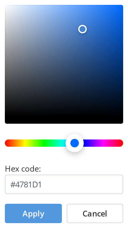
The full picker a settings form shows: drag either pointer or type a hex code, then apply or cancel. Change any other prop live in the Controls panel below.
Picker Only
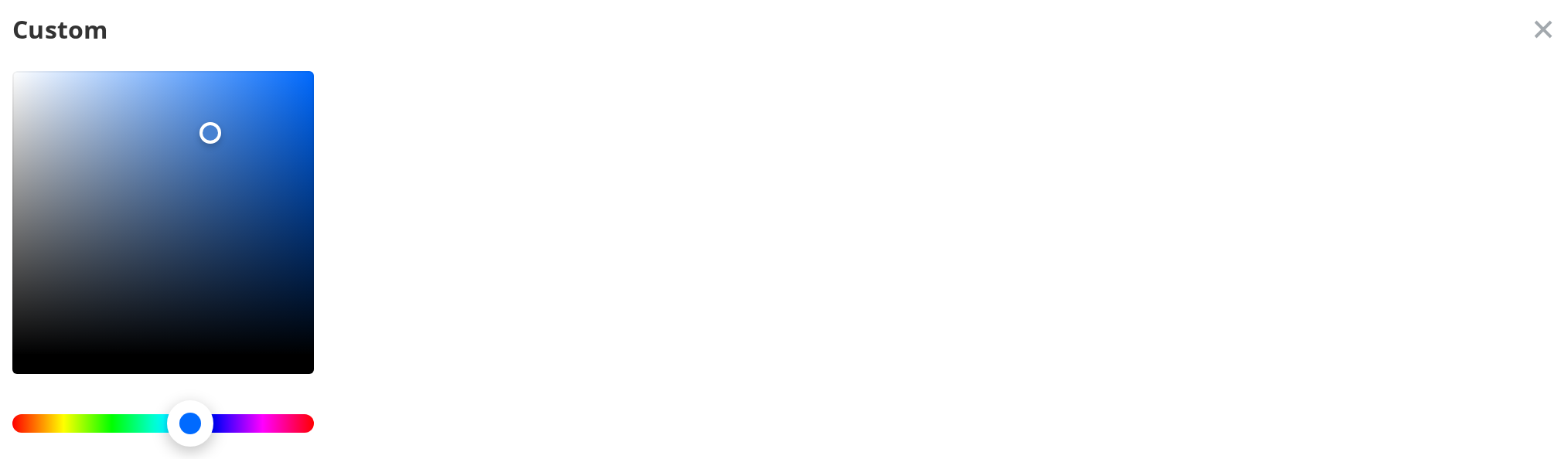
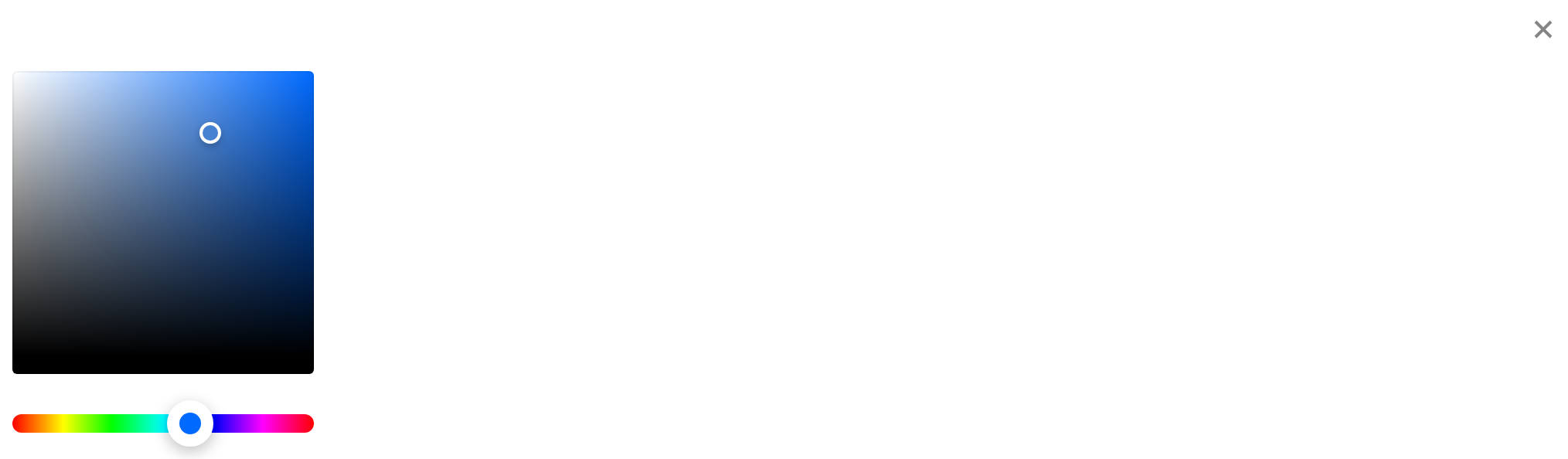
The compact shape for a drop-down: a "Custom" title and a closing cross above the square and the strip, with no hex field and no buttons (isPickerOnly). The caller reads the color from handleChange and hides the picker from onClose.
Custom Labels
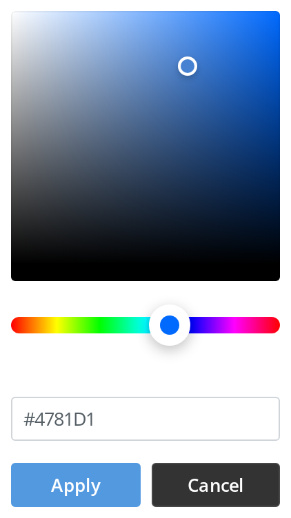
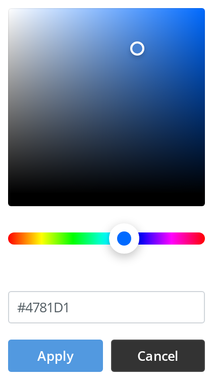
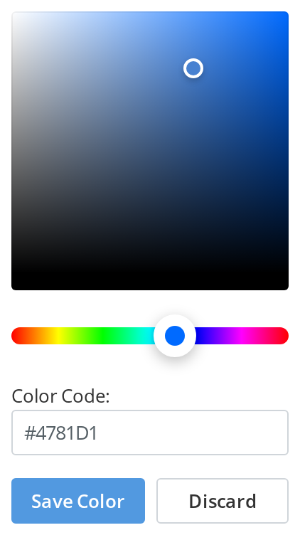
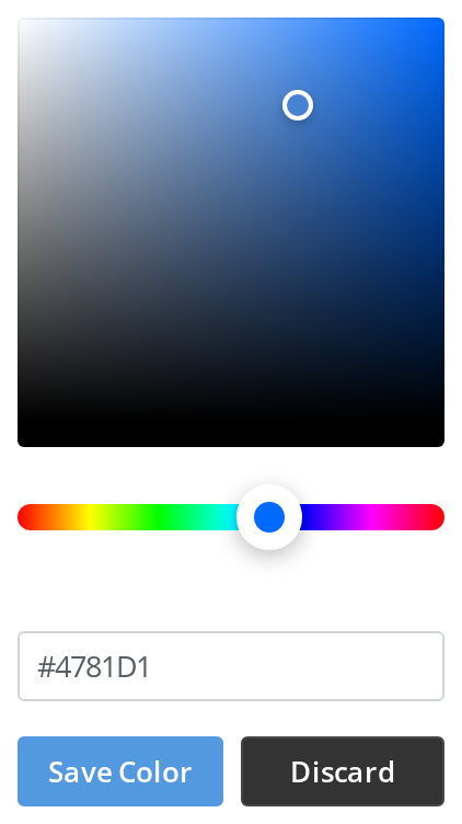
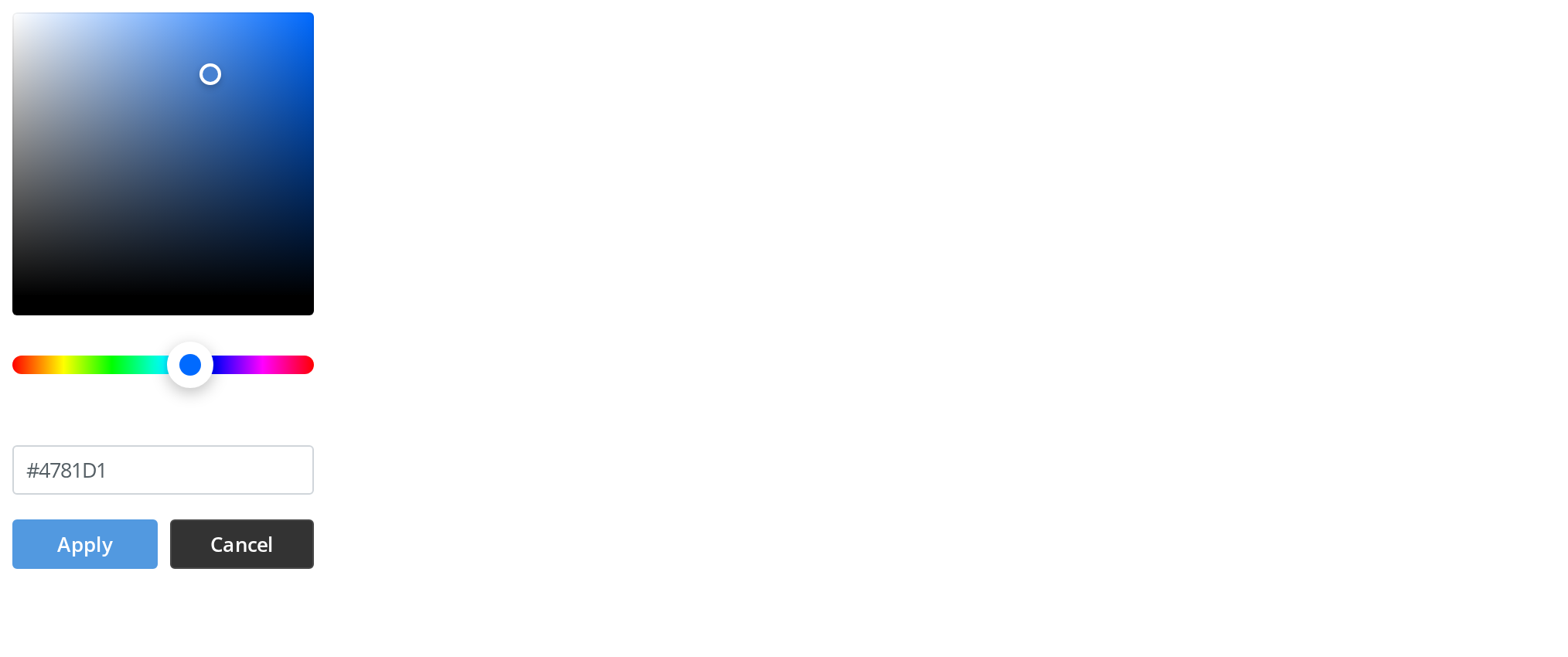
The component translates none of its texts, so a caller passes its own for the buttons and the hex caption (applyButtonLabel, cancelButtonLabel, hexCodeLabel).
Live Color Readout
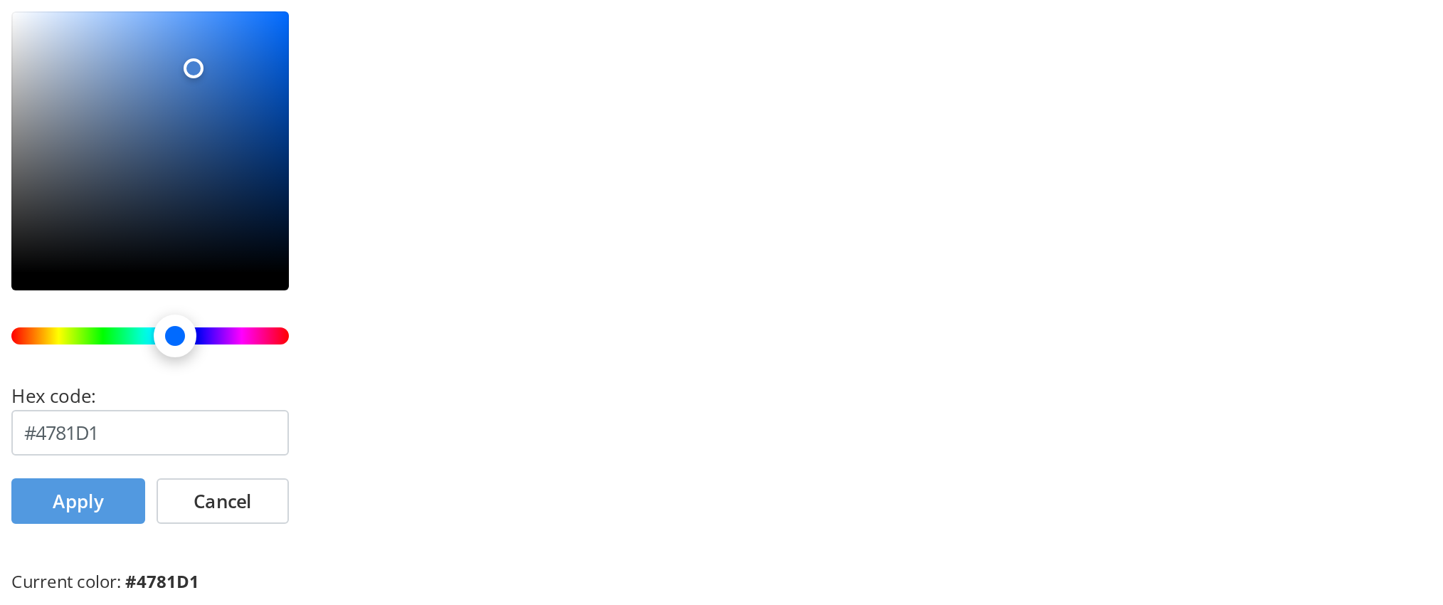
Drag a pointer or type a hex code and watch the line under the picker follow: the caller keeps its own copy of the color from every change (handleChange), which is how it previews a color before it is applied. The picker keeps its own state, so the caller cannot move the pointers by changing appliedColor afterwards.
Preset Color
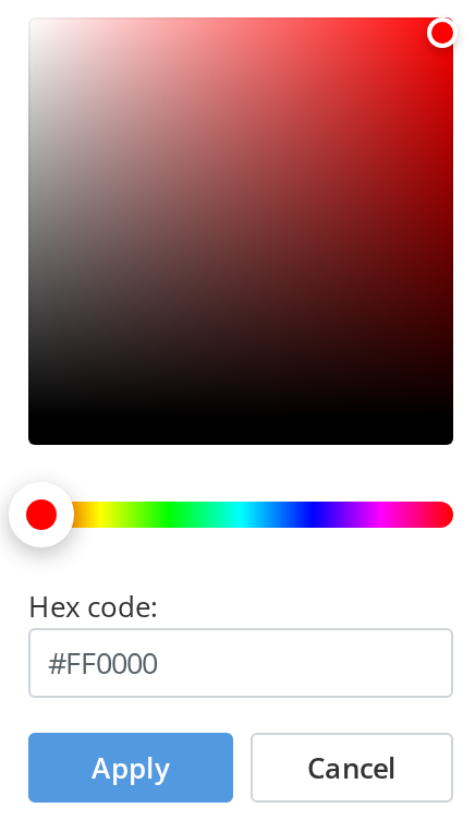
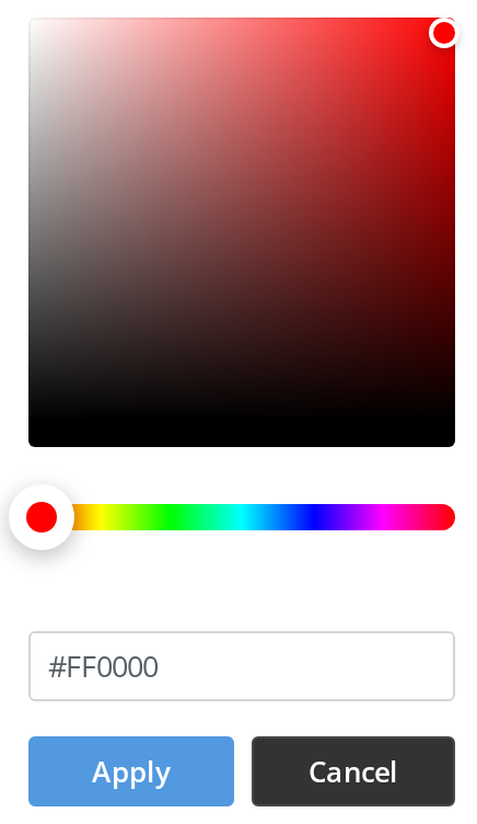
A picker that opens on a color the user saved earlier starts from it: here red (appliedColor="#FF0000"), with the hex field showing the same code.
Right To Left
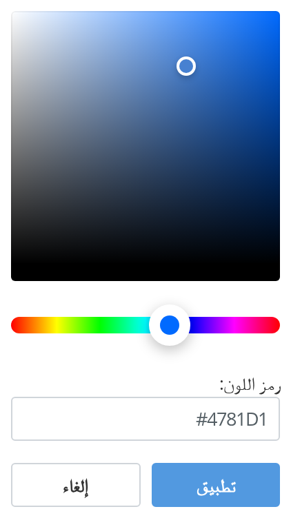
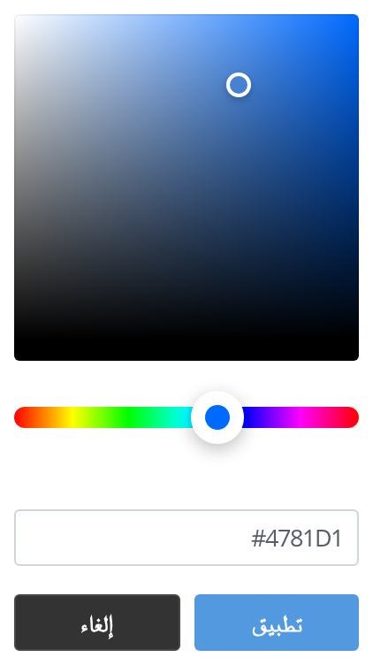
The picker in a right-to-left layout with Arabic texts: the picker moves to the right edge, the hex caption and code align right and the apply button sits to the right of cancel, while the square and the strip keep their left-to-right gradients. The wrapper carries dir="rtl"; the direction also comes from the theme's interfaceDirection (the Direction toolbar).
Css Customization
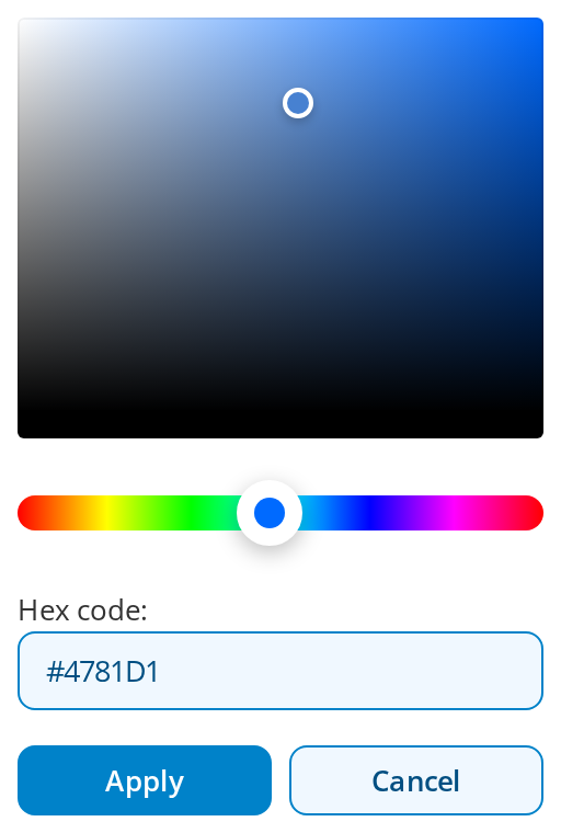
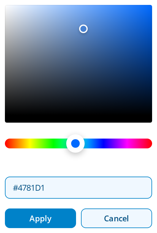
Every overridable variable set on one wrapper -- the variables are listed under CSS variables on this page. The button variables reach the apply and cancel pair through the same wrapper; hover either button to see its hover background.
Minimal example
appliedColor is the starting colour and onApply gives you the chosen one; the picker never
changes anything by itself.
import { useState } from "react";
import { ColorPicker } from "@onlyoffice/apps-ui-kit/components/color-picker";

export function BrandColour() {
  const [colour, setColour] = useState("#4781D1");

  return (
    <div>
      <p>Current: {colour}</p>
      <ColorPicker
        isPickerOnly={false}
        appliedColor={colour}
        applyButtonLabel="Apply"
        cancelButtonLabel="Cancel"
        hexCodeLabel="Hex code"
        onApply={setColour}
        onClose={() => {}}
      />
    </div>
  );
}
Props
Recipes
Inside a drop-down
isPickerOnly is the shape ColorInput uses: a title bar with a
closing cross, and no buttons — so the colour is taken from handleChange as it moves.
import { useState } from "react";
import { ColorPicker } from "@onlyoffice/apps-ui-kit/components/color-picker";
import { DropDown } from "@onlyoffice/apps-ui-kit/components/drop-down";
import { DropDownItem } from "@onlyoffice/apps-ui-kit/components/drop-down-item";

export function SwatchButton() {
  const [colour, setColour] = useState("#4781D1");
  const [isOpen, setIsOpen] = useState(false);

  return (
    <div style={{ position: "relative" }}>
      <button
        type="button"
        style={{ background: colour, width: 32, height: 32 }}
        onClick={() => setIsOpen(true)}
      />
      <DropDown
        open={isOpen}
        withBackdrop
        isDefaultMode={false}
        clickOutsideAction={() => setIsOpen(false)}
      >
        <DropDownItem>
          <ColorPicker
            isPickerOnly
            appliedColor={colour}
            handleChange={setColour}
            onClose={() => setIsOpen(false)}
          />
        </DropDownItem>
      </DropDown>
    </div>
  );
}
Behaviour the types don't state
appliedColoris read once. The picker seeds its own state from it on mount and never looks again, so changing the prop later leaves the picker where it was. Remount it — akeytied to the colour is the simplest way — if it has to follow an outside value.isPickerOnlyswaps parts in as well as out. The name says it removes the hex field and the buttons, which it does; it also adds a header with the "Custom" title and a closing cross. The two modes are different components in practice.- In
isPickerOnlymode there is no apply step. Nothing callsonApply, so the only way to learn the colour ishandleChange, which fires continuously as the pointer moves. handleChangefires on every pointer move. Debounce it before doing anything expensive, and expect a stream of values rather than one. From the hex field it fires only once the typed text is a valid hex code, and the field in turn follows every move of either pointer.- The labels are not translated.
applyButtonLabel,cancelButtonLabelandhexCodeLabeldefault to English strings baked into the component; only the "Custom" title goes through the kit's translations. onCloseis both the cancel button and the cross, and neither unmounts anything. It is a notification that the user is done.- The hex field accepts hex only. It is
react-colorful's own input, so named colours,rgb()and anything else are rejected as you type. - On a phone it ignores its width. At 600px and below the picker stretches to the window
width less 16px on each side, whatever
--color-picker-widthsays. forwardedRefis dead — the prop is declared and never destructured, so no ref is attached.role="dialog"andaria-label="Color picker"are hardcoded on the wrapper, English included.
CSS variables
The three hex-field colours are the light theme's; under a .dark ancestor the defaults turn
dark, and a variable you set still wins in both.
The apply and cancel pair are ordinary Buttons, so its variables reach
them through the same wrapper: the --button-primary-* set styles apply, the --button-root-*
set styles cancel, and --button-root-border-radius rounds both.
Accessibility
- The square and the strip are sliders.
react-colorfulgives themrole="slider", named "Color" and "Hue"; the square announces its saturation and brightness in percent, the strip its hue in degrees. Each is focusable, and the arrow keys move its pointer by a twentieth of its range per press. - The wrapper claims
role="dialog"without being one: nothing traps focus, nothing returns focus on close, and Escape is not handled. Put it inside a real dialog if that matters. aria-label="Color picker"is hardcoded English and cannot be overridden.- The hex field is named "Hex color value" by its own
aria-label; the caption beside it is not tied to it. The closing cross is named "Close color picker", and each button by its label. - Colour alone is the only feedback that a colour is selected.
Test ids
None of them can be overridden by a prop.
Related
ColorInput— this picker behind a hex field, with the opening and closing handled.DropDown— what to put it in.Button— the apply and cancel pair it renders.