FileInput
Read-only field with a folder icon that opens the file dialog and accepts a drop. The whole field is the drop target, and the names of the chosen files are written into it.


Use this when / not when
- Use where a file is one field of a form, beside the other fields — an import, an avatar, a certificate.
- Not for a large drop area.
Dropzoneis the panel-sized one; this is an input-sized control. - Not to show upload progress.
isLoadingis a spinner in place of the icon and nothing more; there is no percentage and no cancel. - Not when you need the file list to be editable. The field is read-only and shows every name joined with commas, with no way to remove one.
Import
import { FileInput } from "@onlyoffice/apps-ui-kit/components/file-input";
Also exported from the root barrel @onlyoffice/apps-ui-kit.
FileInputProps is not exported — type a wrapper's props yourself.
Needs ThemeProvider from @onlyoffice/apps-ui-kit/providers/theme, and TranslationProvider
from @onlyoffice/apps-ui-kit/providers/translation for the message it raises when a file is
rejected. That message is a toast, so mount Toast once in your app or it
goes nowhere.
Stories
Default
The field as a form shows it before anything is chosen; change any prop live in the Controls panel below.
Sizes
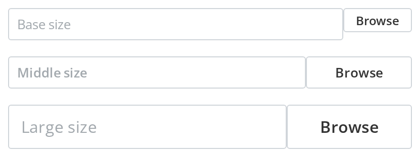
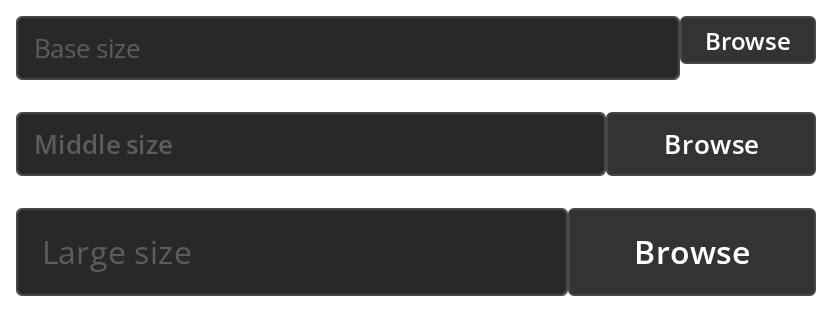
Pick the size that matches the other fields of the form: each one also sets the field's width and the size of its icon box (size).


States
Use these to tell the user about the chosen file: Error state and Warning state recolour the border (hasError, hasWarning), Disabled greys the field and ignores clicks (isDisabled), and Loading shows a spinner in place of the icon (isLoading).


With Accept Filter
Limit the field to the types the host can handle: the picker offers only these extensions, and a dropped file of another type is refused with an error toast (accept).


Scaled Input
Use it when the field should line up with a full-width form column: it stretches to the width of its container (scale).


With Button
Use a labelled button when an icon alone would not tell the user what the field does: the button takes the place of the icon and grows with the field's size (buttonLabel). The field is given the full width of its container here (scale), because at a fixed size the button is laid out past the field's own width.
Document Icon
Use the document icon when the field takes a single document rather than any file: Folder icon is the default, Document icon the alternative (isDocumentIcon).


With Path
Use this when the file comes from somewhere other than the device, such as a folder picker of the host's own: the field shows the path it is given (fromStorage, path), and a click on it or its icon calls the host instead of opening the file picker (onClick) — click it and watch the Actions panel.


Css Customization
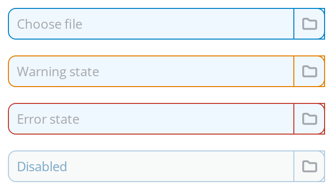
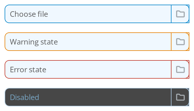
Every overridable variable set on one wrapper -- the variables are listed under CSS variables on this page.
- Choose file — the border, background, text and radius variables; hover it for
--file-input-hover-borderand press it for--file-input-focus-border - Warning state —
--file-input-warning-border(hasWarning) - Error state —
--file-input-error-border(hasError) - Disabled —
--file-input-disabled-borderand--file-input-placeholder-color(isDisabled)
Minimal example
onInput gives you one File or an array, depending on how many were chosen.
import { useState } from "react";
import { FileInput } from "@onlyoffice/apps-ui-kit/components/file-input";
import { InputSize } from "@onlyoffice/apps-ui-kit/components/text-input";

export function AttachmentField() {
  const [names, setNames] = useState<string[]>([]);

  return (
    <FileInput
      size={InputSize.base}
      placeholder="Choose a file"
      scale
      aria-label="Attachment"
      onInput={(file) => {
        const files = Array.isArray(file) ? file : [file];
        setNames(files.map((one) => one.name));
      }}
    />
  );
}
Props
Enums
Recipes
Loading
isLoading swaps the icon for a spinner and disables the field. It does not survive
buttonLabel: the button form has no loading state.
import { useState } from "react";
import { FileInput } from "@onlyoffice/apps-ui-kit/components/file-input";
import { InputSize } from "@onlyoffice/apps-ui-kit/components/text-input";

export function UploadField({
  upload,
}: {
  upload: (file: File) => Promise<void>;
}) {
  const [isUploading, setIsUploading] = useState(false);

  return (
    <FileInput
      size={InputSize.base}
      placeholder="Choose a file"
      scale
      isMultiple={false}
      isLoading={isUploading}
      aria-label="Upload"
      onInput={async (file) => {
        setIsUploading(true);
        await upload(Array.isArray(file) ? file[0] : file);
        setIsUploading(false);
      }}
    />
  );
}
Disabled / read-only
isDisabled greys the field and stops a click from opening the dialog. It does not stop a drop,
or Enter and Space on the focused field (see below). The field itself is always read-only —
nothing can be typed into it.
import { FileInput } from "@onlyoffice/apps-ui-kit/components/file-input";
import { InputSize } from "@onlyoffice/apps-ui-kit/components/text-input";

export function LockedAttachment() {
  return (
    <FileInput
      size={InputSize.base}
      placeholder="Ask an administrator"
      scale
      isDisabled
      aria-label="Attachment"
    />
  );
}
Picking from somewhere else
fromStorage turns the control into a button: no hidden file input is rendered, path is shown
in the field, and clicks are handed to onClick so you can open a picker of your own.
import { useState } from "react";
import { FileInput } from "@onlyoffice/apps-ui-kit/components/file-input";
import { InputSize } from "@onlyoffice/apps-ui-kit/components/text-input";

export function StorageField({ openPicker }: { openPicker: () => void }) {
  const [path] = useState("");

  return (
    <FileInput
      size={InputSize.base}
      placeholder="Choose from storage"
      scale
      fromStorage
      path={path}
      aria-label="File from storage"
      onClick={openPicker}
    />
  );
}
Behaviour the types don't state
- A rejected file raises a toast, not a callback. Anything
acceptturns away produces the kit's "not supported format" message throughtoastr, soToasthas to be mounted somewhere andTranslationProviderset up. Your code is not told. onInput's argument changes shape with the count. One file arrives as aFile, two or more asFile[].isMultipledefaults totrue, so this is the common case, not the rare one.acceptneeds setting. It is handed toreact-dropzone11, which reads an array of extensions and MIME types —[".pdf", ".docx"],["image/*"]— for both the dialog and the drop. The default of[""]matches only a file with no MIME type, so a PDF or an image chosen with the default is rejected with the toast.isDisabledandisLoadingonly stop the click. They reachreact-dropzoneasnoClick, so a dropped file is still accepted andonInputstill fires, and Enter or Space on the focused field still opens the dialog.onClickonly works withfromStorage. Without it the handler is never attached, because the click has to reach the hidden file input instead.idandidButtongo to different elements:idto the hidden<input type="file">,idButtonto the wrapper. The one you want for a label is usuallyidButton.- The component is memoised on a deep comparison. A new object or array passed inline —
accept,style— does not force a re-render the way it normally would, and a handler that closes over stale state will keep doing so until something else changes. - The field shows names, not paths, joined with
", "when there are several, and there is no way to clear it from the outside short of remounting. - The width is fixed per size unless
scaleis set: 173px forbase, 300px formiddle, 550px forlarge. The icon box at the end is 30 × 30px forbaseandmiddleand 48 × 42px forlarge. isLoadingalso disables the field, and both it andisDisabledare passed to the innerTextInput.nameis dead — the prop is declared and nothing reads it.
CSS variables
Each is read with a fallback to a theme value, so set any of them on an ancestor. The field is
the inner TextInput; the icon box is the bordered square at its end.
The field's background, text colour and radius are TextInput's own --text-input-bg,
--text-input-color and --text-input-radius, which reach it from the same ancestor. The
icon's colour cannot be changed from outside: the icon sets --icon-button-color on itself, so
a wrapper's value never reaches it.
Accessibility
- The wrapper is a
<div>withrole="button"andtabIndex="0", both fromreact-dropzone, so it is reached with Tab and announced as a button. Enter and Space on it open the file dialog. - There is no accessible name unless you pass
aria-label. The placeholder is not a label.aria-labelandaria-descriptionare both applied to the wrapper. aria-disabledis"true"underisDisabledand"false"otherwise. The wrapper stays in the tab order while disabled, and Enter and Space still open the dialog.- A rejected file is announced only through a toast, which may be missed entirely.