FormWrapper
White card of a fixed width that the portal's sign-in and wizard forms sit on. It is a shadowed, rounded box 320px wide that drops all of its decoration on a phone.

Use this when / not when
- Use for a short standalone form on a page of its own — sign in, create a portal, reset a password — where the form is the page's only content.
- Not for a form inside an existing page or panel. The card is 320px wide and cannot be widened by a prop, and its shadow reads as a second surface on top of one you already have.
- Not as a general-purpose card —
Cardis that, without the fixed width. - Not around a field on its own.
FieldContaineris what arranges a label, a control and an error line.
Import
import { FormWrapper } from "@onlyoffice/apps-ui-kit/components/form-wrapper";
Also exported from the root barrel @onlyoffice/apps-ui-kit.
FormWrapperProps is not exported — type a wrapper's props yourself.
Needs ThemeProvider from @onlyoffice/apps-ui-kit/providers/theme: the background and the
shadow are chosen by the light and dark classes the provider sets.
Stories
Default
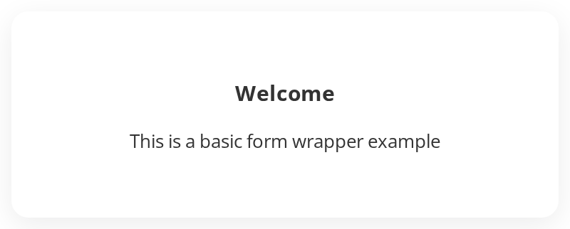
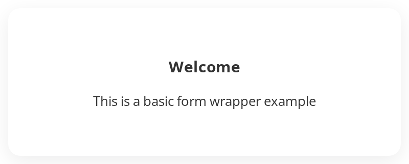
The card on its own around a heading and a line of text, to judge its width, padding, corners and shadow before a form goes in. Change the class, id or inline styles live in the Controls panel below.

With Login Form
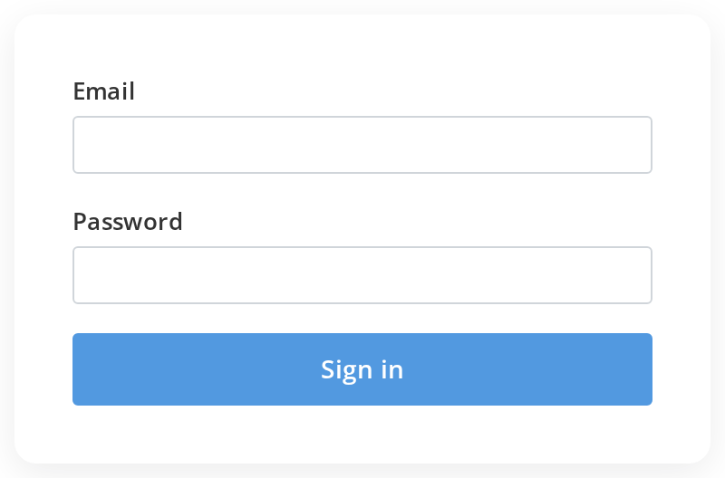
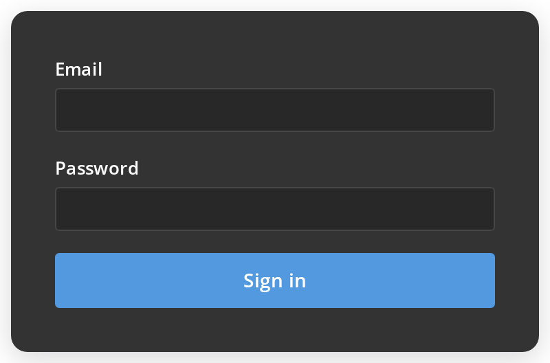
A sign-in form as the card is meant to hold it: an email field, a password field and a primary button. Each field row is given a width of 100% and each control scale, so they span the card instead of shrinking to their content.
With Registration Form
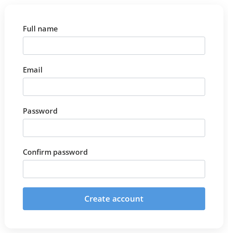
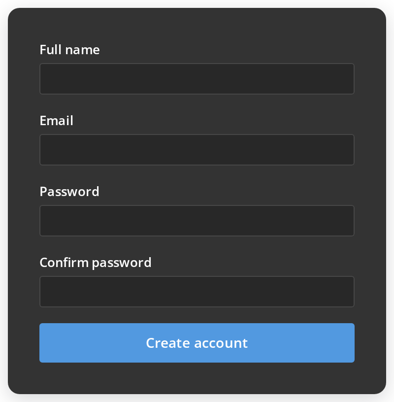
A longer form with four fields, to show that the card keeps its fixed width and only grows taller as fields are added.
Css Customization
Every overridable variable set on a wrapper around one card -- the variables are listed under CSS variables on this page. Set the minimum and the maximum width together: either one alone is clamped by the other.


Minimal example
The card centres its children and sizes itself, so the page only has to place it.
import { Button, ButtonSize } from "@onlyoffice/apps-ui-kit/components/button";
import { FieldContainer } from "@onlyoffice/apps-ui-kit/components/field-container";
import { FormWrapper } from "@onlyoffice/apps-ui-kit/components/form-wrapper";
import {
  InputSize,
  InputType,
  TextInput,
} from "@onlyoffice/apps-ui-kit/components/text-input";

export function SignIn({
  email,
  onEmailChange,
  onSubmit,
}: {
  email: string;
  onEmailChange: (event: React.ChangeEvent<HTMLInputElement>) => void;
  onSubmit: () => void;
}) {
  return (
    <div style={{ display: "flex", justifyContent: "center", padding: 48 }}>
      <FormWrapper>
        <FieldContainer
          isVertical
          labelVisible
          labelText="Email"
          style={{ width: "100%" }}
        >
          <TextInput
            type={InputType.email}
            size={InputSize.base}
            value={email}
            onChange={onEmailChange}
            scale
          />
        </FieldContainer>
        <Button
          primary
          scale
          size={ButtonSize.normal}
          label="Sign in"
          onClick={onSubmit}
        />
      </FormWrapper>
    </div>
  );
}
Props
Recipes
A wider card
Both min-width and max-width are set, so widening the card means moving the pair. Setting
only the maximum leaves the minimum holding it at 320px.
import { FormWrapper } from "@onlyoffice/apps-ui-kit/components/form-wrapper";

export function WideForm({ children }: { children: React.ReactNode }) {
  return (
    <FormWrapper
      style={
        {
          "--form-wrapper-min-width": "480px",
          "--form-wrapper-max-width": "480px",
        } as React.CSSProperties
      }
    >
      {children}
    </FormWrapper>
  );
}
Behaviour the types don't state
- The width is fixed, and it is not a prop.
min-widthandmax-widthare both 320px on a desktop and both 416px on a tablet, so the card ignores its container. Override--form-wrapper-min-widthand--form-wrapper-max-widthtogether — setting one leaves the other clamping. - On a phone the card stops being a card. Under the mobile breakpoint the padding, radius,
shadow and background are all removed — the last two with
!important, so neitherstylenor a class of yours can put them back. The form ends up flush against the page. - Children are centred. The card is a flex column with
align-items: center, so a child without a width of its own shrinks to its content instead of filling the card. Give inputs and buttonsscaleto make them span it — and aFieldContainerrowstyle={{ width: "100%" }}as well, since it is a flex box with no width of its own andscaleonly fills the row the control sits in. - It brings 32px of padding, which is on top of any margin the children carry —
FieldContainer's own 16px bottom margin among them. id,classNameandstyleare spread onto the card, and any other DOM attribute you pass goes with them even though the type does not list it.
CSS variables
Under the mobile breakpoint the card sets its own padding, radius, shadow and background, so none
of those four variables has an effect on a phone — the background and the shadow with
!important, which a style or a class of yours cannot beat either. The two width variables work
on a desktop only: a tablet fixes the width at 416px and a phone at 100%. Set the minimum and the
maximum together, since either one alone is clamped by the other.
Accessibility
- The card is a plain
<div>: it carries no landmark and no heading. Put your own<form>inside it, and a heading above the fields, or the page has no structure at all. - Centring is visual only; the reading order is the order of the children.
- Nothing here is focusable, and the card does not trap focus — it is not a dialog.
Test ids
It cannot be overridden by a prop.
Related
FieldContainer— the label and field rows that go inside.TextInput— passscaleso it spans the card.Button— the same.