SearchInput
Search field with a magnifier, an optional clear button and a debounced change callback. It is the control above a list that the list filters itself by.


Use this when / not when
- Use above a list, a table or a panel whose contents narrow as the user types.
- Not as an ordinary text field —
TextInputreports every keystroke through the change event, which this one does not. - Not for the portal's own filter bar with its sort and view controls, which is
Filterand only works inside DocSpace.
Import
import { SearchInput } from "@onlyoffice/apps-ui-kit/components/search-input";
import { InputSize } from "@onlyoffice/apps-ui-kit/components/text-input";
Also exported from the root barrel @onlyoffice/apps-ui-kit.
Needs ThemeProvider from @onlyoffice/apps-ui-kit/providers/theme above it in the tree, for
the field's border, icon and background colours.
Note that SearchInputProps is not exported — the folder's index re-exports only the
component. Type a wrapper's props yourself, or import the type from its file path.
Stories
Default
A search field as it first appears above a list: type to see the magnifier turn into a cross, pause for a second to see onChange in the Actions panel, click the cross to see onClearSearch; change any other prop live in the Controls panel below.
Sizes
Match the search field to the inputs around it: Base size and Middle size share the 13px text, Large size is taller with 16px text (size).


States
The looks a search field takes on a page. Normal holds text, so it shows the cross that clears it. Disabled is greyed, cannot be typed into and shows neither magnifier nor cross (isDisabled). Scaled fills the width of its container (scale); in this grid every field already fills its cell, so the difference shows in a wider container. Empty with placeholder shows the magnifier and the placeholder text.


Auto Refresh Mode
Decide how the parent hears about the search term. Type into Type to auto-refresh (1s): the line under it catches up a second after you stop (autoRefresh, refreshTimeout). Type into No auto-refresh: the line under it never changes, because with autoRefresh off the component does not call onChange at all.


With Button
Put the create action next to the search it belongs with: the Create button with its plus icon sits to the left of the field (showMainButton, mainButtonProps), and the field takes the rest of the row.


With Button And Menu
Offer several things to create from one button: click New to open its menu of items, one of them with a submenu (model in mainButtonProps).


Persistent Clear Button
Keep a way out of a search the parent still applies after the field was emptied: Cross on an empty field shows the cross with no text in it (showClearButton), Magnifier on an empty field is the usual look. With text in the field both show the cross.


Content Before Text
Show what the search is limited to without a separate label: the folder icon sits inside the field, before the text (children).


Disabled Main Button
Keep the create action in place while it is unavailable: the Create button is dimmed (isDisabled in mainButtonProps), the search field next to it still works.


Right To Left
The same field under a right-to-left interface: the Create button moves to the right edge, the cross moves to the left end of the field and the text starts at the right. The direction comes from the theme's interfaceDirection (the Direction toolbar); the wrapper also carries dir="rtl" for the rules that read the DOM direction.


Css Customization
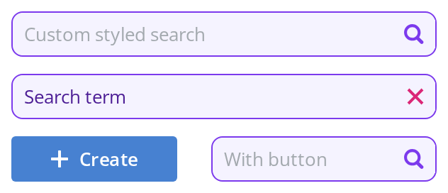
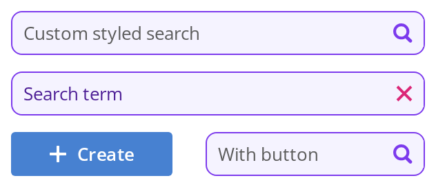
Every overridable variable set on one wrapper -- the variables are listed under CSS variables on this page.
Custom styled search is empty and shows the magnifier color; With value holds text and shows the cross color; With button carries the main button, for the gap. Hover a field and click into it to see the two other border colors.
Minimal example
size and value are both required, and the change callback receives the string.
import { useState } from "react";
import { SearchInput } from "@onlyoffice/apps-ui-kit/components/search-input";
import { InputSize } from "@onlyoffice/apps-ui-kit/components/text-input";

const ROOMS = ["Design", "Development", "Marketing"];

export function RoomSearch() {
  const [term, setTerm] = useState("");

  const shown = ROOMS.filter((room) =>
    room.toLowerCase().includes(term.toLowerCase()),
  );

  return (
    <div>
      <SearchInput
        size={InputSize.base}
        value={term}
        placeholder="Search rooms"
        showClearButton
        onChange={(value) => setTerm(value)}
        onClearSearch={() => setTerm("")}
      />
      <ul>
        {shown.map((room) => (
          <li key={room}>{room}</li>
        ))}
      </ul>
    </div>
  );
}
Props
Recipes
Disabled
import { SearchInput } from "@onlyoffice/apps-ui-kit/components/search-input";
import { InputSize } from "@onlyoffice/apps-ui-kit/components/text-input";

export function DisabledSearch() {
  return (
    <SearchInput
      size={InputSize.base}
      value=""
      isDisabled
      placeholder="Search is unavailable while the room loads"
      onChange={() => {}}
    />
  );
}
Filtering as the user types
The default one-second debounce is right for a request and wrong for filtering an array already
in memory. Lower it rather than switching autoRefresh off, which stops the callback entirely.
import { useState } from "react";
import { SearchInput } from "@onlyoffice/apps-ui-kit/components/search-input";
import { InputSize } from "@onlyoffice/apps-ui-kit/components/text-input";

export function InstantSearch({ onSearch }: { onSearch: (t: string) => void }) {
  const [term, setTerm] = useState("");

  return (
    <SearchInput
      size={InputSize.base}
      value={term}
      scale
      refreshTimeout={0}
      showClearButton
      onChange={(value) => {
        setTerm(value);
        onSearch(value);
      }}
      onClearSearch={() => {
        setTerm("");
        onSearch("");
      }}
    />
  );
}
Behaviour the types don't state
onChangereceives the string, not the event. Every other input in this kit passes theChangeEvent; writinge.target.valuehere gets youundefinedon a string.- It is debounced by a whole second by default.
autoRefreshis on andrefreshTimeoutis 1000, so the callback runs a second after the user stops typing. A list that filters in memory should setrefreshTimeout={0}. autoRefresh={false}does not make it immediate — it silences it. The component only callsonChangethrough the debounced path, so switching the flag off means no change callback ever fires; a parent that wants that reads the field itself throughforwardedRef.- Clearing does not go through
onChange. The clear button empties the field, callsonClearSearchand deliberately suppresses the change callback, so a handler that only listens toonChangekeeps filtering by the old term. - The field keeps its own copy of the text while the user types and re-seeds it from
valuewhenever that prop changes, so a parent can reset it but cannot override a keystroke. - The icon at the end of the field is a magnifier while the field is empty and turns into the
clear cross as soon as it holds text.
showClearButtononly adds the cross to an empty field too; a field with text always has it. Only the cross is clickable. isDisabledblocks typing and removes the icon altogether, magnifier and cross alike.sizefollows the kit's input sizes:baseandmiddleset the text at 13px,largeis taller and sets it at 16px.- The main button needs both
showMainButtonandmainButtonProps; either alone renders nothing. It carries the plus icon (ormainButtonIcon), and a click anywhere on its blue wrapper, padding included, is passed to theMainButton, which opens the dropdown built frommainButtonProps.model.
CSS variables
The field itself is a TextInput inside an InputBlock, so its
colours and radius come from that component's variables, set on a wrapper around the search
field: --text-input-bg (background), --text-input-border-color (border at rest),
--text-input-border-hover and --text-input-border-focus (border on hover and while the text
field has focus), --text-input-color (text and caret) and --text-input-radius (corner
radius). The gap only shows with the main button.
Accessibility
- Renders a plain text input; it sets no
role, noaria-labeland notype="search", so a screen reader announces an unnamed text field. Label it yourself through the surrounding markup — the component accepts noaria-*props. - It is not in the tab order unless you pass
tabIndex. The prop goes straight toInputBlock, whose own default is-1, so a search box given notabIndexcannot be reached from the keyboard. PasstabIndex={0}. The default was removed fromTextInput,Textarea,CheckboxandComboBox;InputBlockkept it. idlands on two elements, the wrapper<div>and the<input>, so aFieldContainer'slabelForresolves to the wrapper — the first match — and captions nothing. Until that is fixed, the field cannot be named by a visible caption at all; with noaria-*props either, the only way to name it is to setaria-labelon the input element yourself.- The clear button is an icon button with no text; nothing gives it an accessible name.
- Keyboard behaviour is the platform's own. Escape does not clear the field.
Test ids
| Element | data-testid |
|---|---|
| Outer element | search-input, overridable with dataTestId |
| The main button, when shown | main-button, with the wrapper's own id from mainButtonDataTestId |
Related
TextInput— an ordinary text field, with the change event.InputBlock— a field with an icon or a button inside it.Filter— the portal's search, sort and view bar.