Slider
Range input with the kit's own track and handle. It is a styled <input type="range"> and
nothing more — no ticks, no value bubble, no label.


Use this when / not when
- Use for a rough setting on a continuous range where the exact number does not matter much: a quality, a zoom, an opacity.
- Not when the number matters — a
TextInputlets someone type it exactly. - Not to show progress. It is an input, and it invites dragging;
ProgressBaris the read-only one. - Not for a handful of discrete choices; use
RadioButtonGroup.
Import
import { Slider } from "@onlyoffice/apps-ui-kit/components/slider";
Also exported from the root barrel @onlyoffice/apps-ui-kit.
SliderProps is not exported — type a wrapper's props yourself.
Needs ThemeProvider from @onlyoffice/apps-ui-kit/providers/theme for the track and handle
colours.
Stories
Default
A 0–100 slider with the track filled up to the handle (withPouring), the usual choice for a setting such as volume or zoom; drag the handle or change any other prop live in the Controls panel below.
Disabled State
For a setting that cannot be changed right now: the handle and the filled part of the track turn paler, the unfilled track stays as it is, and the handle no longer moves by mouse or keyboard (isDisabled).


With Custom Steps
Slider with a custom step size of 5, allowing values of 0, 5, and 10 only.
Without Pouring
Slider without the pouring (filled track) effect. The track remains a single color.


With Custom Size
Slider with larger custom thumb and track dimensions for improved touch targets.


Right To Left
In a right-to-left interface the minimum sits at the right edge: the fill starts there and grows to the left as the handle is dragged left.


Css Customization
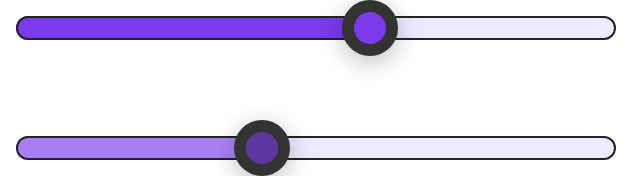
Every overridable variable set on one wrapper -- the variables are listed under CSS variables on this page.
The first slider shows every variable. The second is disabled, to show that the theme does not swap in its own colors there: it mixes the disabled thumb and fill from --slider-handle-color, so a custom accent survives as a paler version of itself.

Minimal example
The input is controlled: hold the value yourself and move it from onChange.
import { useState } from "react";
import { Slider } from "@onlyoffice/apps-ui-kit/components/slider";

export function Quality() {
  const [quality, setQuality] = useState(70);

  return (
    <label>
      Quality: {quality}%
      <Slider
        min={0}
        max={100}
        step={5}
        value={quality}
        withPouring
        onChange={(event) => setQuality(Number(event.target.value))}
      />
    </label>
  );
}
Props
Recipes
Disabled / read-only
There is no read-only state — a range input that may be seen but not moved has to be disabled, which also greys the handle.
import { Slider } from "@onlyoffice/apps-ui-kit/components/slider";

export function LockedQuality({ quality }: { quality: number }) {
  return (
    <Slider
      min={0}
      max={100}
      value={quality}
      withPouring
      isDisabled
      onChange={() => {}}
    />
  );
}
Behaviour the types don't state
onChangeis optional in the type and required in practice.valueis passed straight to a controlled<input>, so leaving the handler out freezes the handle and React warns about a form field with a value and noonChange.- The value arrives as a string. It is a DOM change event, so
event.target.valueneedsNumber(...)before it goes back into state. - It is 100% wide and brings its own vertical margin. The input fills its container, has no
width prop, and carries
margin: 24px 0so that the handle has room to overhang the track — which adds to a columngaprather than collapsing into it. withPouringis computed, not native. The filled part is a background sized from(value - min) / (max - min), so aminequal tomaxdivides by zero and the fill comes out asNaN%— nothing is drawn.- The text direction is read once, on mount. Whether the fill starts from the left or the
right is decided by an effect with no dependencies — it pours from the right when
document.dir, the<html>element'sdiror the input's own computeddirectionis right-to-left at that moment. Switching the interface to right-to-left after mount leaves the fill on the wrong side until the component remounts; the stylesheet'sdata-dirrule cannot correct it, because the inline position wins. - The size props are custom properties, not attributes.
thumbWidth,thumbHeight,thumbBorderWidthandrunnableTrackHeightare written into the inlinestyleas--thumb-*and--runnable-track-height, so they take CSS lengths ("16px"), not numbers. styleis spread before those properties, so it cannot override them.- There is no label, no tick marks and no value readout; all three are yours to add.
CSS variables
--slider-pouring-image is a background-image, so it takes a linear-gradient(...) or another
<image>, not a plain colour; and it is used only while the slider is enabled. A disabled slider
does not switch to theme colours: its handle and its poured part are mixed from
--slider-handle-color, so a custom accent survives as a paler version of itself.
--thumb-width, --thumb-height, --thumb-border-width, --runnable-track-height and
--size-prop are written inline by the props and beat all of the above; set the props rather than
these.
Accessibility
- A native
<input type="range">, so it is focusable, is moved onestepwith the arrow keys and in larger jumps with Page Up and Page Down, goes tominandmaxwith Home and End, and reports its value, minimum and maximum to assistive technology by itself. - It has no accessible name. Wrap it in a
<label>, or give it anidand point a<label htmlFor>at it, or a screen reader announces only "slider".aria-labelcannot be passed: the props are not spread onto the input. - The value is announced as a bare number, and
aria-valuetextcannot be passed either; where the number means something else — a percentage, a duration — show it in the label. isDisabledsets the nativedisabled, which blocks dragging and the keyboard and takes the slider out of the tab order.- Keyboard focus is shown as a 3px halo around the handle, drawn on
:focus-visibleonly and mixed from the handle's own colour. The browser's outline is turned off, so a browser that does not support:focus-visibleshows nothing.
Test ids
Related
TextInput— for a number that has to be exact.ProgressBar— to show progress rather than take a value.RadioButtonGroup— for a few discrete steps instead.